10 new color palettes and pairings designers are using in 2023 that will elevate your decor
These 10 new color palettes are refreshing, exciting and the height of current design trends, sure to totally elevate your home

The Livingetc newsletters are your inside source for what’s shaping interiors now - and what’s next. Discover trend forecasts, smart style ideas, and curated shopping inspiration that brings design to life. Subscribe today and stay ahead of the curve.
You are now subscribed
Your newsletter sign-up was successful
Each season, designers surprise us by decorating with new color palettes, putting together new color pairings, and just generally creating spaces we'd never have quite thought of before.
This years's interior design trends might be focussed around pistachio (seen in projects by the likes of Brigette Romanek and YSL Studio) and honeyed tones, used by designers like Noa Santos, but aside from those headline shades new ideas are emerging about pairing specific hues. After all, rooms dominated by one color can be striking, but color-focused spaces that combine hues in unexpected ways truly make a statement.
If you too are a keen color enthusiast, then consider these ideas suggested by top designers, and choose these paint color ideas for every room to immediately elevate your interiors.
Aditi is an experienced homes writer and editor. She has written hundreds of articles for various international titles helping readers make the best home design choices, and spends her days interviewing interiors industry experts to bring the latest ideas to her readers. For this piece she spoke to the world's best designers to find out the most interesting color
10 new color palettes and pairings for 2023
1. Red, blue and black
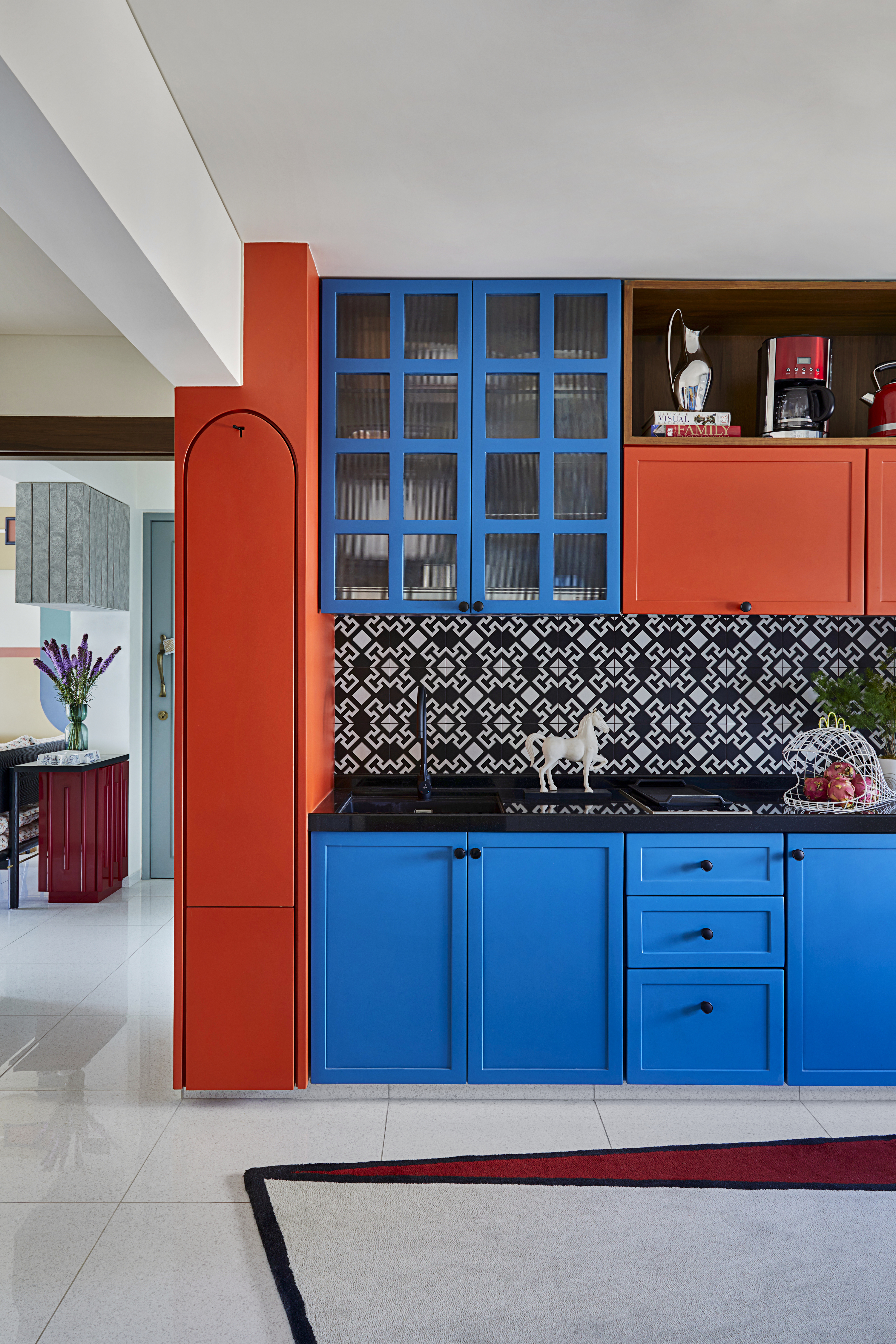
It may go slightly against all the rules of color theory, but why go big on just one primary color when you can have two? The trick, as seen here, is to underscore them with a hit of black, a negative color that breaks through their inherent brightness.
'In this space,we decided to evolve the design around the concept of the color block. While blue and red being primary colors create a striking look, we used Aztec print for balance,' says Ali Baldiwala, founder of Baldiwala Edge.
Cook's Blue from Farrow & Ball
Choose this bright and deeply pigmented color to add a splash of fun to kitchens or outdoor dining areas.
2. Red, green and yellow
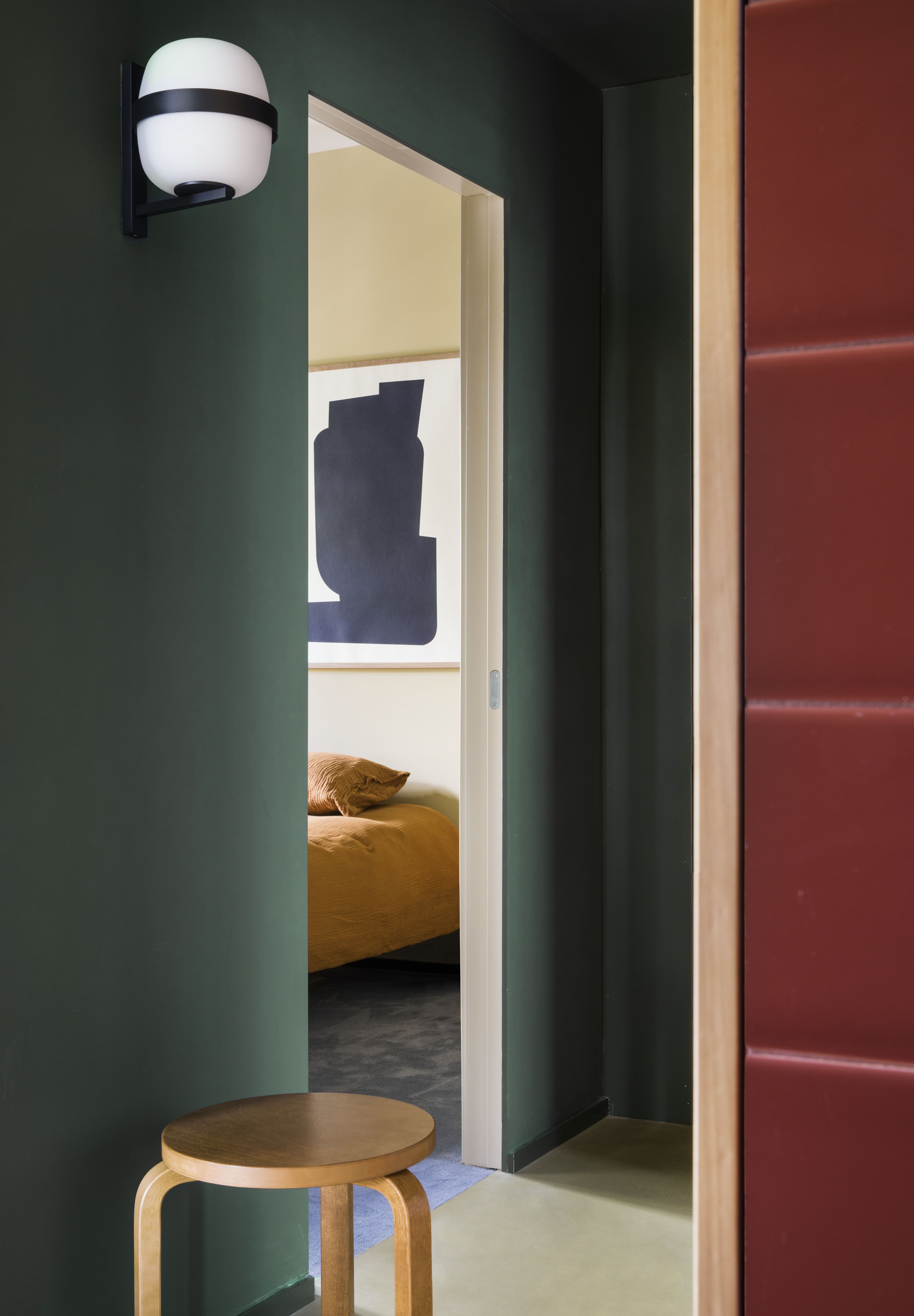
It almost sounds like a Christmas scheme, doesn't it? Red, green and mustardy yellow that's almost gold. But this festive pairing works all year, as long as the green and red are pitched at the same level as each other, both equally dark and moody. Red is one of those colors that goes with green, but only when it's the same tone.
'It was all about the transition from a warm red tiled foreground to a more quiet warm yellow, with cold green and blue tones standing in the middle,' says Carlos Tomás, founder of EstudioReciente. 'All the colors pair well together and were used to create a soft transition of spaces, and to look visually appealing.'
The Livingetc newsletters are your inside source for what’s shaping interiors now - and what’s next. Discover trend forecasts, smart style ideas, and curated shopping inspiration that brings design to life. Subscribe today and stay ahead of the curve.
3. Pastel pink, pastel green and bold yellow
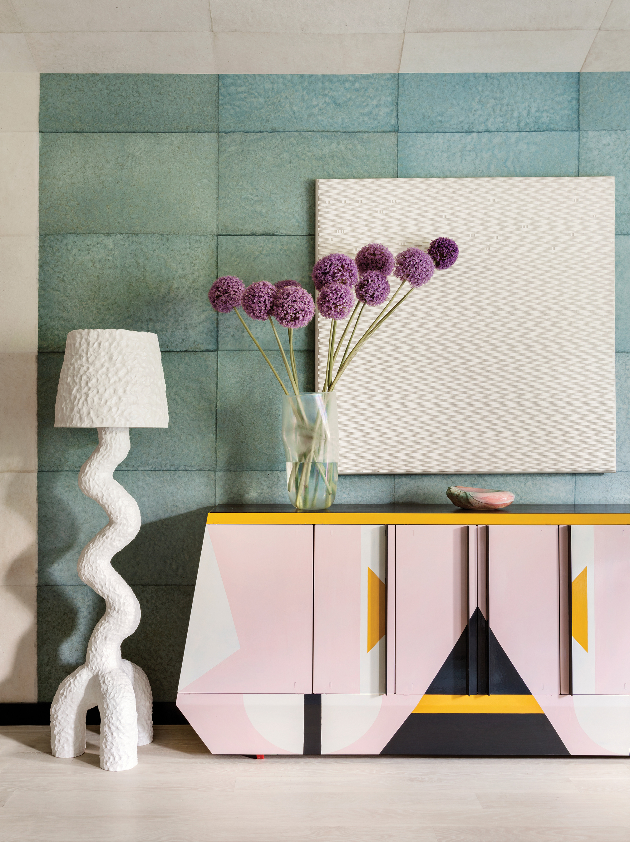
The first impression is the last, and with a thoughtful dose of color, you can create the most charming entryway; one guests won't forget for a long time.
Pink is a timeless color that has never gone out of fad. Plus, several colors go with pink, like in this project, where deep, grounding tones of teal along with pink help create a welcoming and comfortable feel.
'To carry the overall design narrative, a grid of hand-dyed paper pulp sheets in a variety of rich colors was applied to the walls throughout the house, providing a subtle continuity that creates a smooth transition between spaces,' says interior designer Kelly Wearstler.
4. Blue, brown and beige

We've seen a big rise in beige living rooms lately, as minimalism in interior design becomes a key aesthetic for people craving calm and peace at home. But neutral schemes aren't for everyone, and it's been interesting to see how this apporach has evolved to include bolder shades.
'We were inspired by mid-century ceramics and we utilized a pro-trick when pairing colors: we mixed a small amount of several colors to the entire mix, so we essentially gave contrasting tones a common DNA, for a wholesome look,' says Kim Gordon, founder of Kim Gordon Designs.
5. Bold yellow, fuschia and green
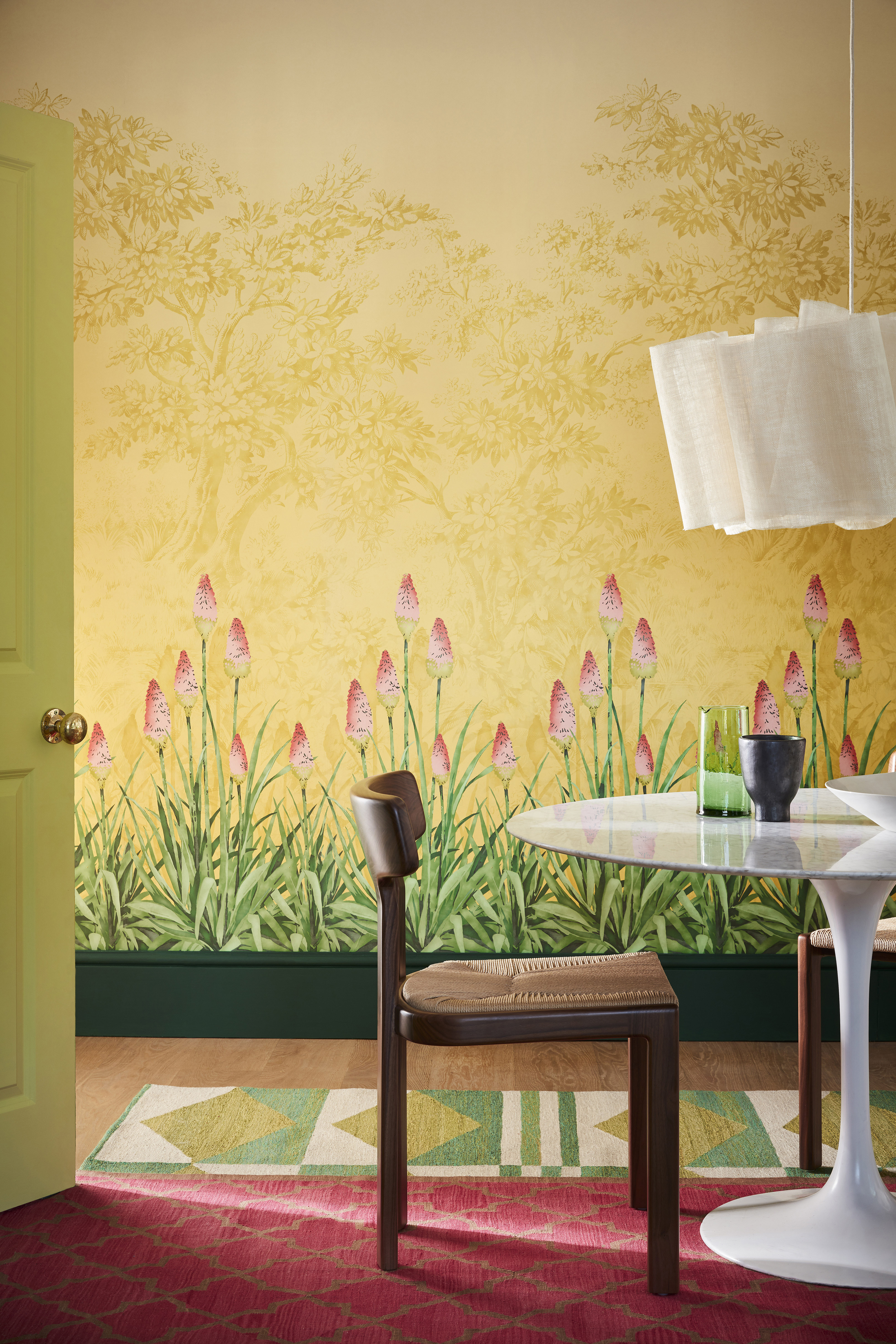
Looking for truly stand-out dining room color ideas? Wash the walls, floor, and even joinery in color, creating a jewel box effect in the house.
'We developed the design scheme for this joyful and positive dining space around the Upper Brook St. mural in 'Soleil’ which features deep pink kniphofia flowers with green leaves against a bold sunny yellow,' says Ruth Mottershead, creative director at Little Greene. 'Deep green ‘Puck’ on the skirting serves to ground the space, whilst zesty ‘Pale Lime’ on the door ties the mural design in with the patterned rug, which also reflects the hot pink of the flowers. The furniture and accessories have been kept neutral, with natural wood and white allowing the colors of the walls and flooring to remain the focus.'
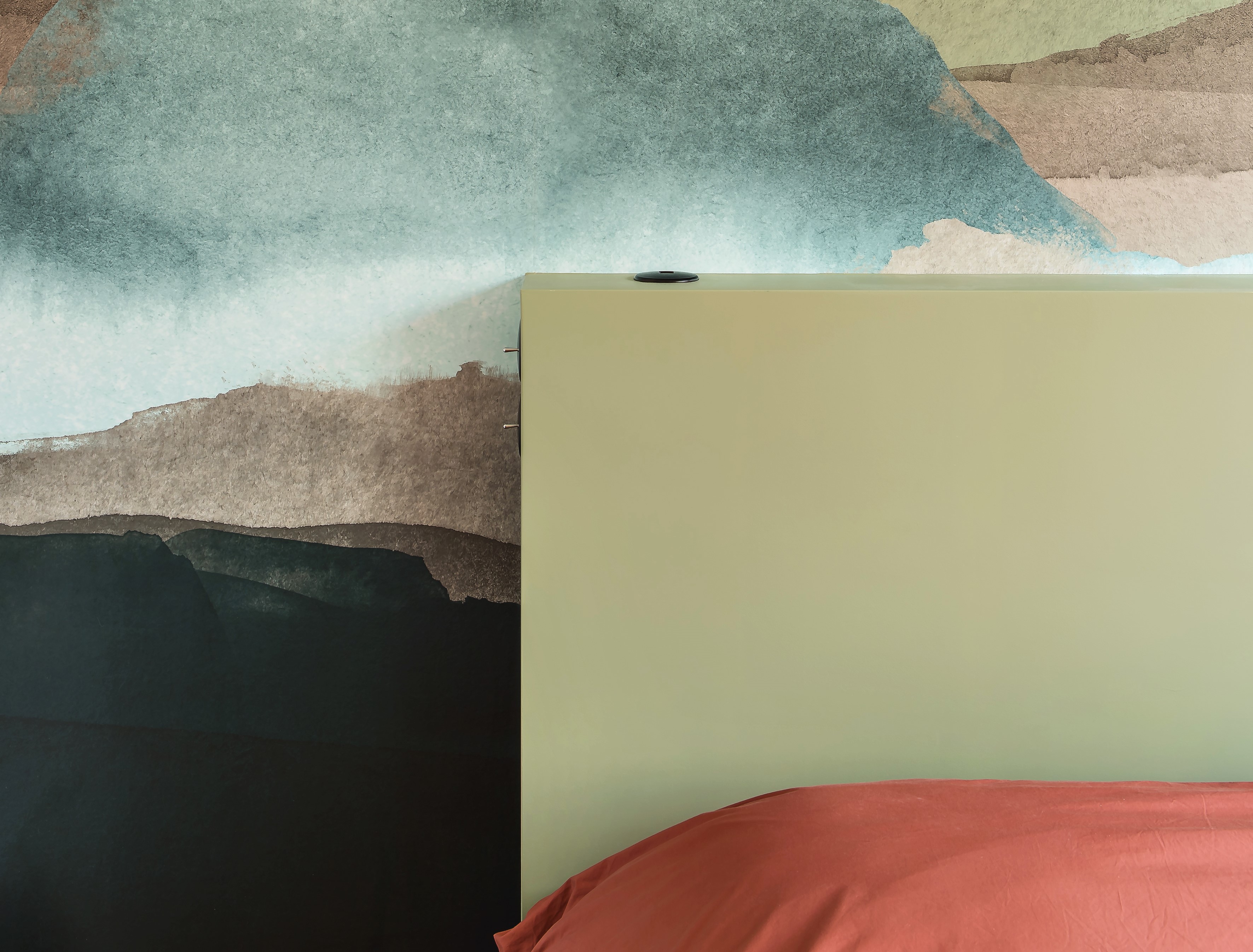
6. Blue, brown, green and rust

Layering warm tones is the perfect way to approach bedroom color, creating a space that cocoons you. BUt this palette would work in so many spaces - the kitchen, for example, with dark wood cabinets, a rust colored pantry, green and blue accessories.
'In this bedroom, we wanted to create a kind of dreamlike feel, with this soft green bed frame, and this watercolor wallpaper,' says Ophélie Doria, founder of Space Factory.
7. Turquoise and blue
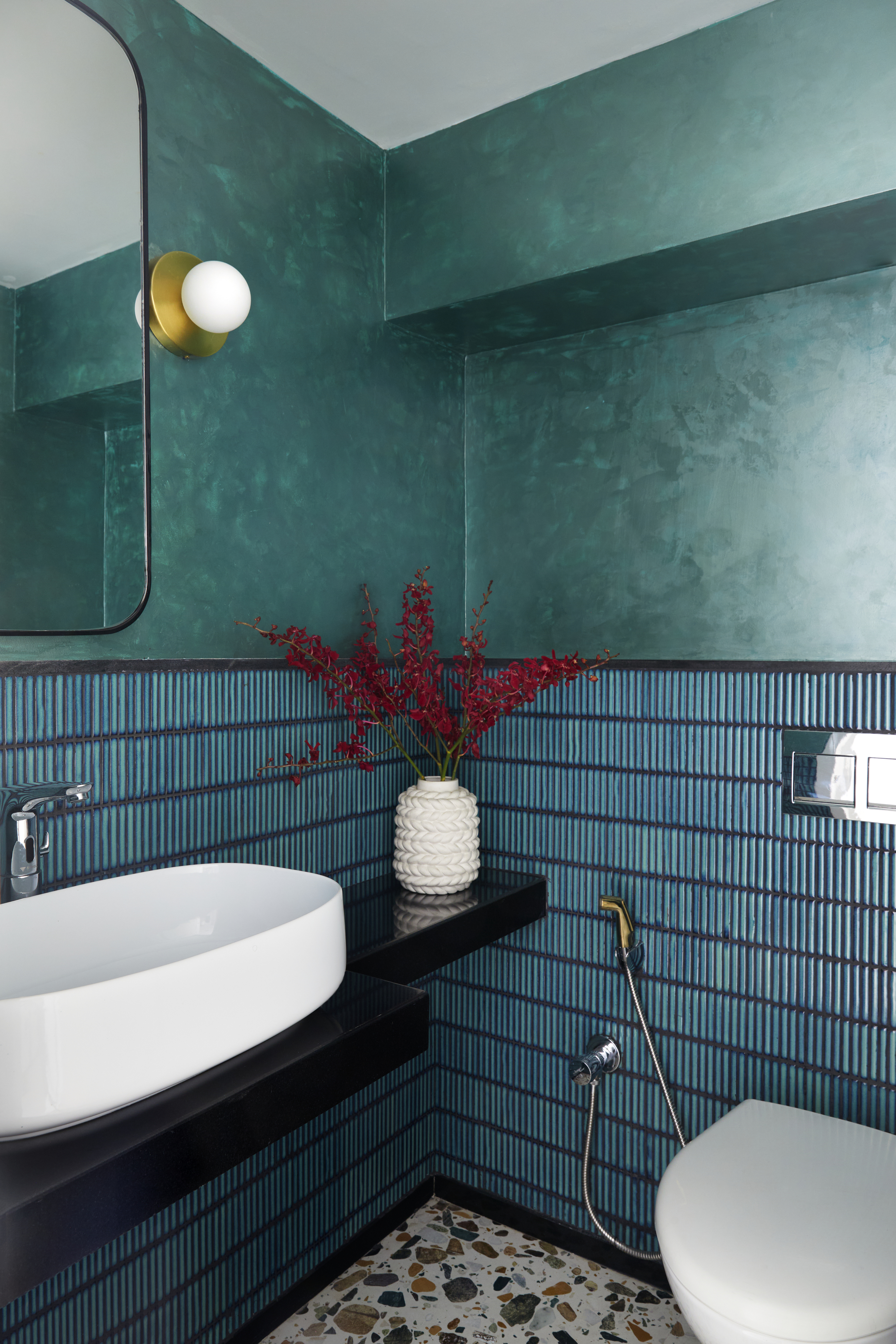
Do blue and green work together? This has been a design questions decorators have grappled with for years. Conventional wisdom says no, but both the bedroom in the idea above this one and this bathroom say otherwise. Especially when that green is more of a turquioise, closer to blue on the color wheel.
When pairing two such bold colors the trick is to think about their texture. Ther blue tiles have a gloss to them which bounces light around the space, while the turquoise limewash has a real depth to it, pigments within that make it seem less jarring to the blue below.
8. Purple, dark blue and beige
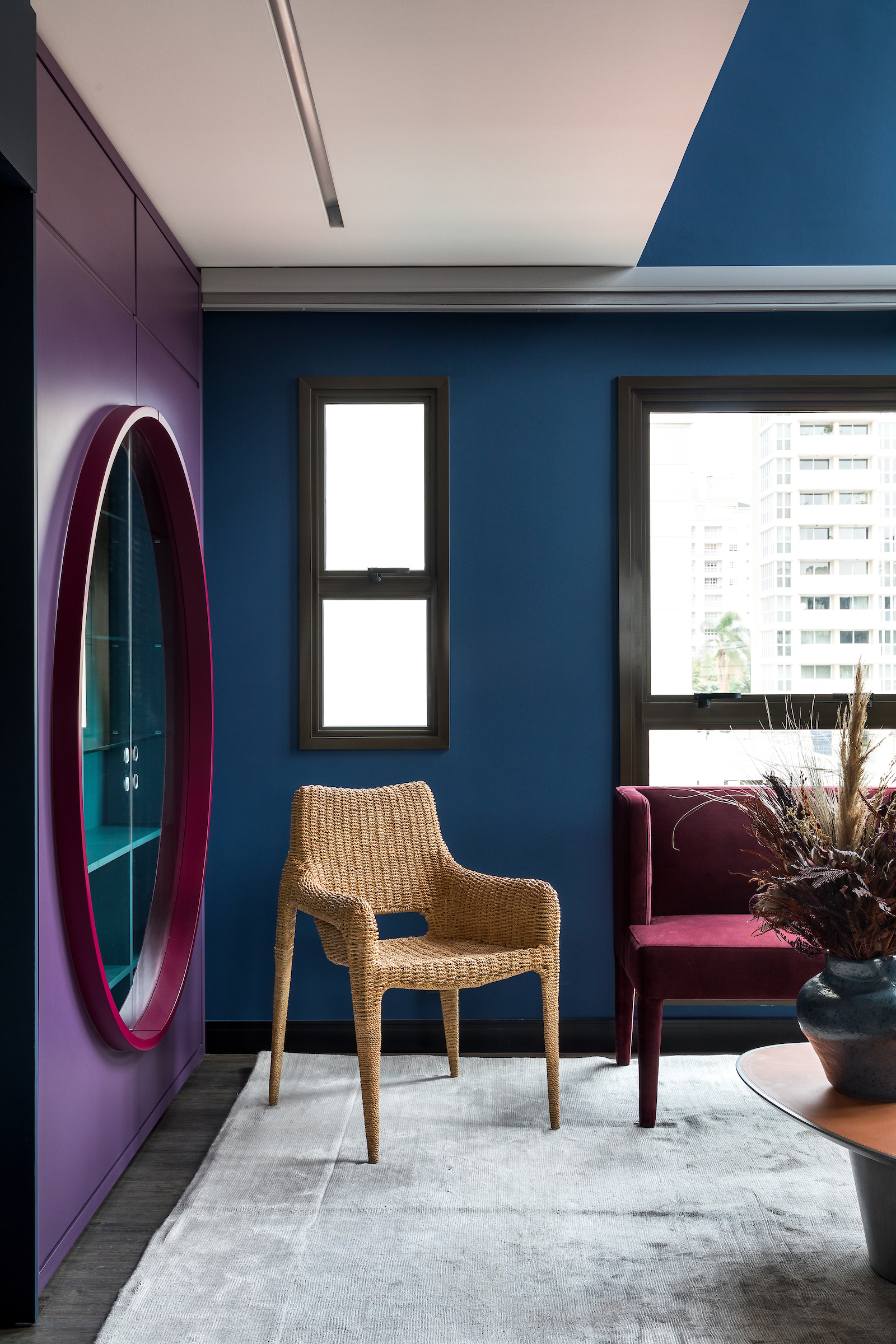
Because blue and purple sit next to each other on the color wheel and are analogous they need something to break them up, a point of difference, if you like. Here, the beige chair does just that, seeming to shine out from the dark wall colors behind.
This palette could easily be used as dark blue and purple soft funishings against wood, or a natural jute rug against these jewel box tones.
As rich as plum or port wine, this Purple 09 will add a sophisticated vibe to your interiors. Consider painting it on the joinery or walls.
9. Powder blue and soft pink
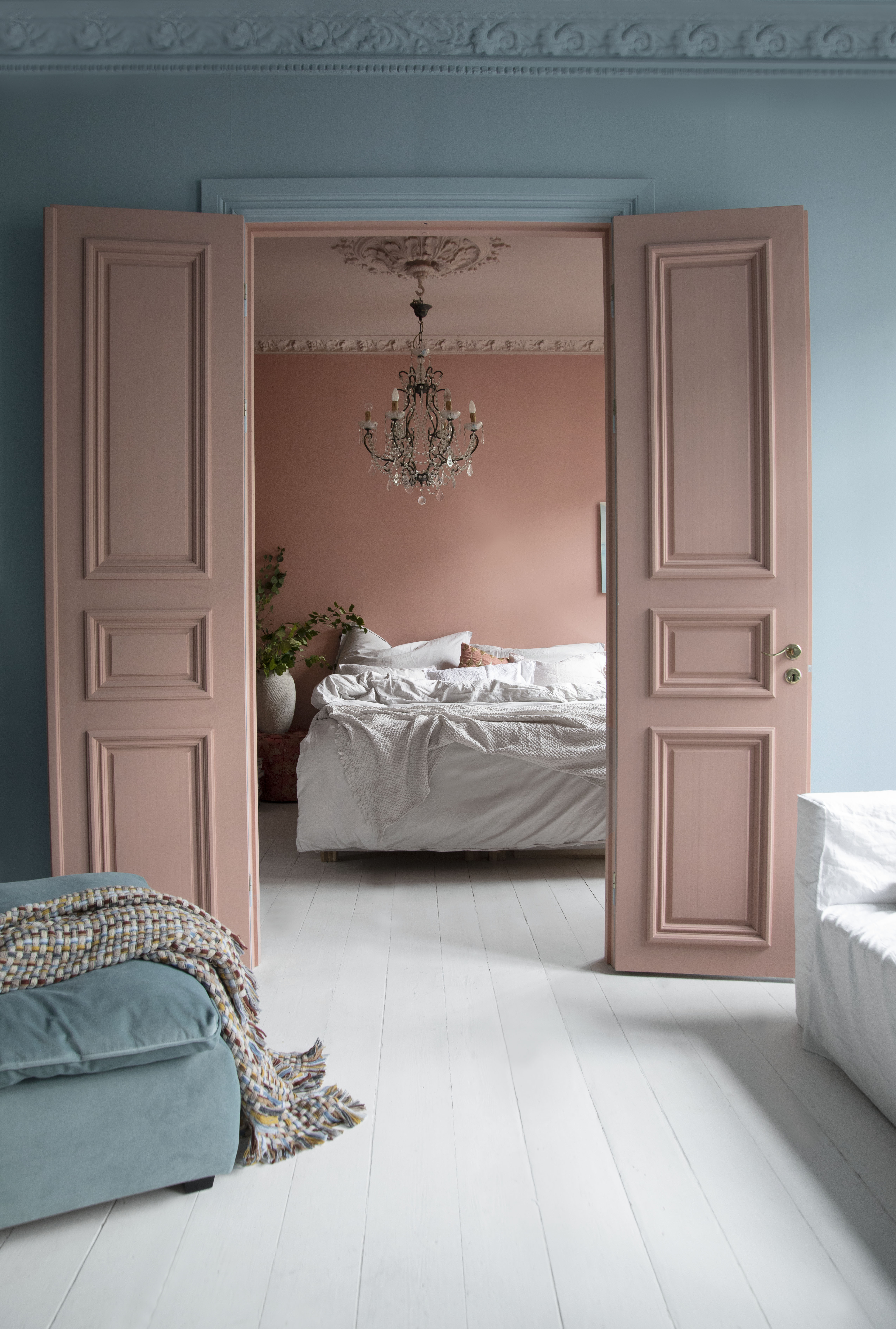
When any two colors are at the same level - both dark, both pastel, both bright - they tend to work. And there is no better example of that than soft pink and soft blue - babyish shades that have been upgraded with the use of greyed pigments in both. For an unforgettable interior palette that extends across the home, and ensures charming, long sightlines, consider interesting paint techniques for walls across rooms.
As seen here, both shades catch the light in the same way, the greyness in them offering up a soft and subtle gleam. Beautifully calming.
10. Red and terracotta
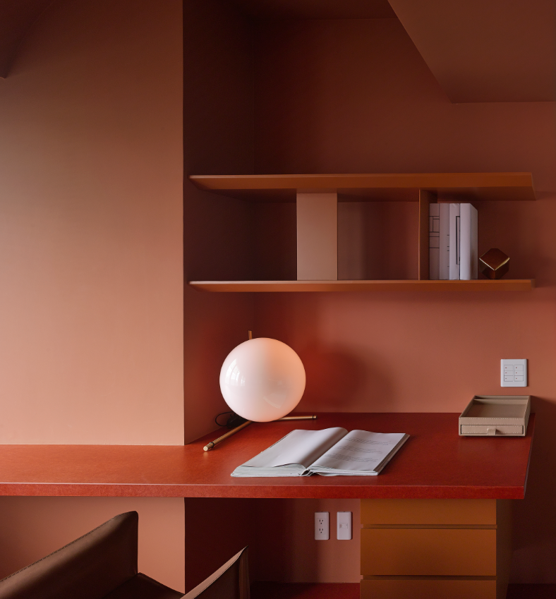
Terracotta continues to be a big color trend, evoking as it does warmth and vacations and sunlit terraces in the Med, But which colors complement terracotta? New thinking says red.
Both have the same level of heat, the same level of intensity, both give off the sense of being in a space that nurtures you. It's a look that isn't for the fainthearted, but does create a showstopping scheme.
'Inspired by artworks of René Gruau, a well-known fashion illustrator, the colors employed in the space take on the look of a French-style vividness and audacity,' says Nic Lee, design director at Waterfrom Design.

Aditi Sharma Maheshwari started her career at The Address (The Times of India), a tabloid on interiors and art. She wrote profiles of Indian artists, designers, and architects, and covered inspiring houses and commercial properties. After four years, she moved to ELLE DECOR as a senior features writer, where she contributed to the magazine and website, and also worked alongside the events team on India Design ID — the brand’s 10-day, annual design show. She wrote across topics: from designer interviews, and house tours, to new product launches, shopping pages, and reviews. After three years, she was hired as the senior editor at Houzz. The website content focused on practical advice on decorating the home and making design feel more approachable. She created fresh series on budget buys, design hacks, and DIYs, all backed with expert advice. Equipped with sizable knowledge of the industry and with a good network, she moved to Architectural Digest (Conde Nast) as the digital editor. The publication's focus was on high-end design, and her content highlighted A-listers, starchitects, and high-concept products, all customized for an audience that loves and invests in luxury. After a two-year stint, she moved to the UK and was hired at Livingetc as a design editor. She now freelances for a variety of interiors publications.
