10 Neutral Kitchen Ideas That Are Timeless But Feel Right for Right Now — There's One for Every Style of Home
Neutral doesn't have to mean boring. In fact, a refined palette is often the springboard for more exciting design details

The Livingetc newsletters are your inside source for what’s shaping interiors now - and what’s next. Discover trend forecasts, smart style ideas, and curated shopping inspiration that brings design to life. Subscribe today and stay ahead of the curve.
You are now subscribed
Your newsletter sign-up was successful
It's tempting to inject the heart of the home with color to reflect the lively nature of the space, but opting for neutral kitchen ideas is often the key to a timeless space you’ll love for years to come. "Warm-toned neutrals are naturally calming," adds Susana Simonpietri, creative director of Chango. "They provide an easy backdrop, and the opportunity to display beautifully made ceramics and accessories."
For a long time, traditional neutrals, including creams, off-whites, and magnolias have been popular, but these days, designers are broadening their palettes. From pale coffees, taupes, shades with soft undertones of browns, and even pale blushes, when it comes to choosing a neutral, kitchen color ideas are expanding.
And remember, it's not just about paint. Neutral room ideas can be introduced through your material palette, too — think of woods and natural stone — especially when it comes to the kitchen. Wondering how? See the curated selection of calming neutral kitchen ideas from designers below.
Article continues below1. Make Patterns Pop Against a Neutral Backdrop
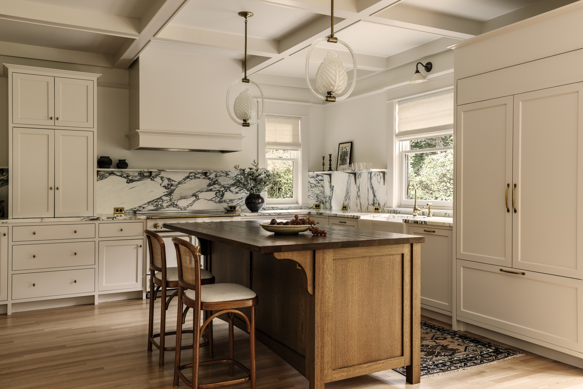
A neutral backdrop sets the scene to help other features sing — like the marble backsplash and walnut island.
In this serene and neutral kitchen designed by Lisa Staton, the color scheme is established through the paint color, an ever-so-slightly pink shade called Dimity from Farrow and Ball.
Initially, the space was accented with cool steel metals and modern, brightly-toned woods, and as a consequence, felt sterile and too contemporary. The new neutral aesthetic has been beautifully balanced through the choice of materials that add texture and interest to the scheme that could otherwise appear flat and two dimensional.
From the rich walnut kitchen island to the swirling marble backsplash, the material palette paired with this neutral paint color brings dynamism to the space. "We chose a neutral scheme here because the client wanted a classic and elegant home as well as a soothing one," explains Lisa. "Introducing natural materials helps create a calm neutral space."

Lisa Staton attended the Rhode Island School of Design (RISD), and has an undergraduate art history and architectural studies degree. She creates timeless and refined spaces with character, thanks to her affinity for antiquing, and doesn't need to rely on color to add depth.
2. Balance Neutral Colors With Brassy Accents
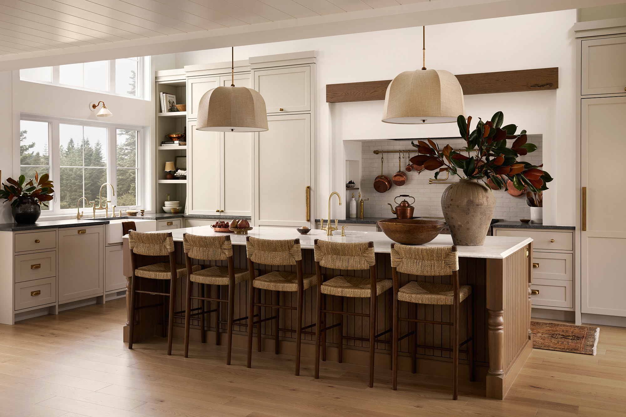
Consider how you'll warm up a neutral backdrop with your choice of hardware.
Bringing in copper, brassy, and metallic tones to any neutral kitchen idea is a surefire way to add warmth and dimension to your space. Without these pops of warmth, you run the risk of a kitchen that feels cold.
The Livingetc newsletters are your inside source for what’s shaping interiors now - and what’s next. Discover trend forecasts, smart style ideas, and curated shopping inspiration that brings design to life. Subscribe today and stay ahead of the curve.
This neutral kitchen, designed by AKB Design does exactly that, focusing on the hardware like faucets, kitchen handles, and subtle accents throughout the space, even considering the hanging pots and pans under the range hood.
Painted in Pale Oak by Benjamin Moore, the gray undertones meant the space required a bit of a lift. "The color scheme is soft but the brass hardware warms the space, alongside the wood island and ceiling beams," explains Audrée Kemp Bélanger from AKB Design.
For Audrée, it's about bringing neutral kitchen ideas into the modern day, instead of making them look fusty and traditional. "Neutral kitchens aren't anchored in a certain period, and we can easily update them by changing hardware, fixtures and accessories," she adds.
3. Give a Nod to Nature With Neutrals
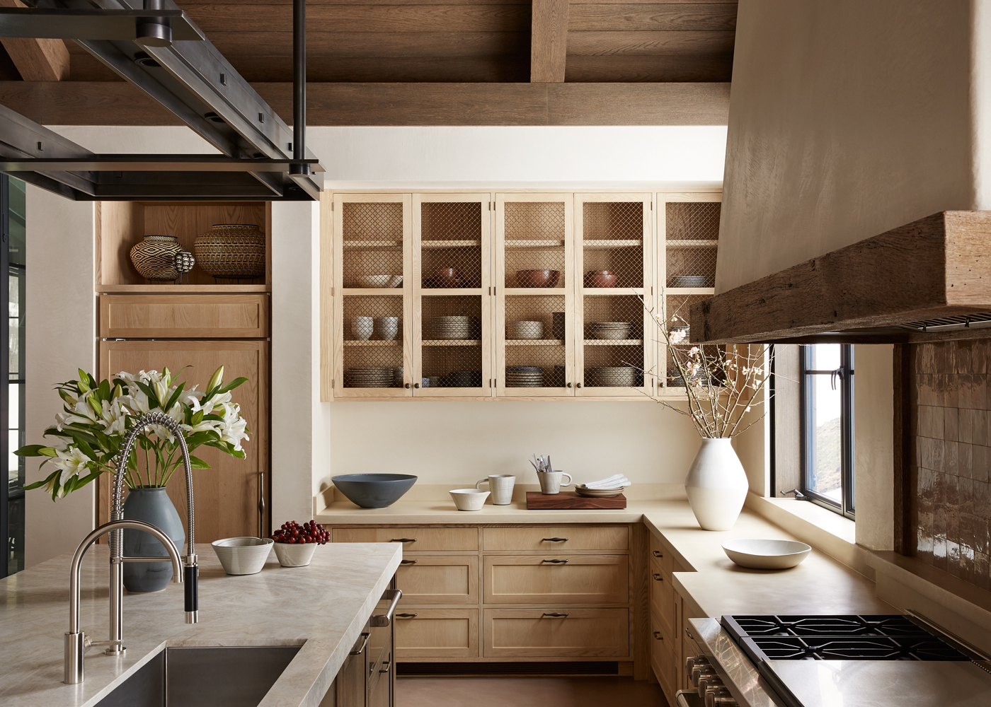
Neutral kitchens are inherently related to nature, and look great when that's considered throughout their palette.
Sometimes it’s all in the natural materials. Wood is a great addition to cabinetry, countertops, or even as a kitchen backsplash to help a space feel rooted in nature and ultimately turn your kitchen into a calming sanctuary.
"An honest expression of natural materials was a key part of the project’s ethos," explains Brad Krefman, who designed this space, where ash wood features throughout, creating a sense of calm and reflecting the home’s remote location.
Being in the mountains, the designer wanted to maintain a strong connection to the outdoors. "Celebrating the inherent beauty of wood, stone, and other neutral elements became a design objective," he explains. Even the addition of plants and flowers in the kitchen helps ground the space, relating it to the outside word.
"While each component of the kitchen brings its own interest, they all work together harmoniously," he adds. "I think this cohesive atmosphere naturally lends itself to an overall sense of calm."
Neutral kitchen ideas featuring wood are particularly timeless because the avoid relying on a single focal feature or point of interest, he adds. "Instead, the 'wow' factor comes from the seamless balance of colors and materials. By steering clear of notable kitchen trends, we focused on creating a warm, inviting space that celebrates the natural beauty of the materials we used."
4. Add Shimmery Reflections With Zellige Tiles
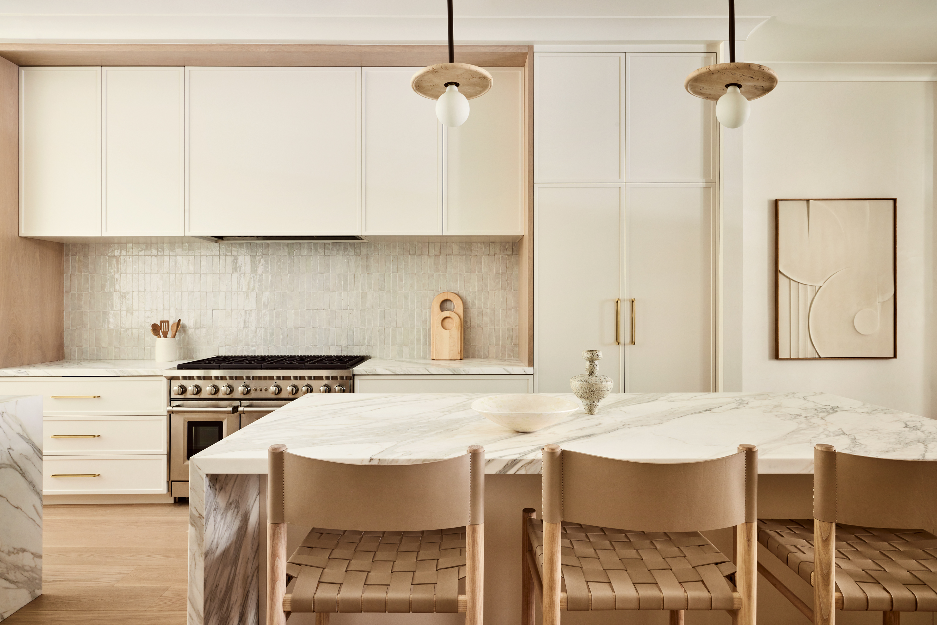
Glossy and reflective surfaces help a space feel three-dimensional.
Another way to introduce texture and dimension to your neutral kitchen ideas is to rely on tiles that shimmer in the light. Kitchens with Zellige tiles are seen all throughout the riads of Morocco, and their merits have spread worldwide, particularly picking up in popularity over the last few years.
With a handcrafted feel and ability to bounce light in different directions, designers have come to rely on these tiles to add texture in neutral kitchens. "The client's personal design tastes were modern, very airy and neutral, so we leaned in and created warmth through the various tones and textures we incorporated throughout the home," explains Susana Simonpietri, Creative Director of Chango, of the space shown above. "While this kitchen is neutral, it's the details, like the glossy Zellige tile, woven stools, and larger abstract art piece give the space such interest and contrast."
If you use high quality materials and opt for a warmer neutral palette, Susana says that kitchens with these tones will last a lifetime. "Neutral is easily layerable too, should you want to add in some color or more texture later down the line," she adds.
5. Anchor a Neutral Kitchen with Darker floors
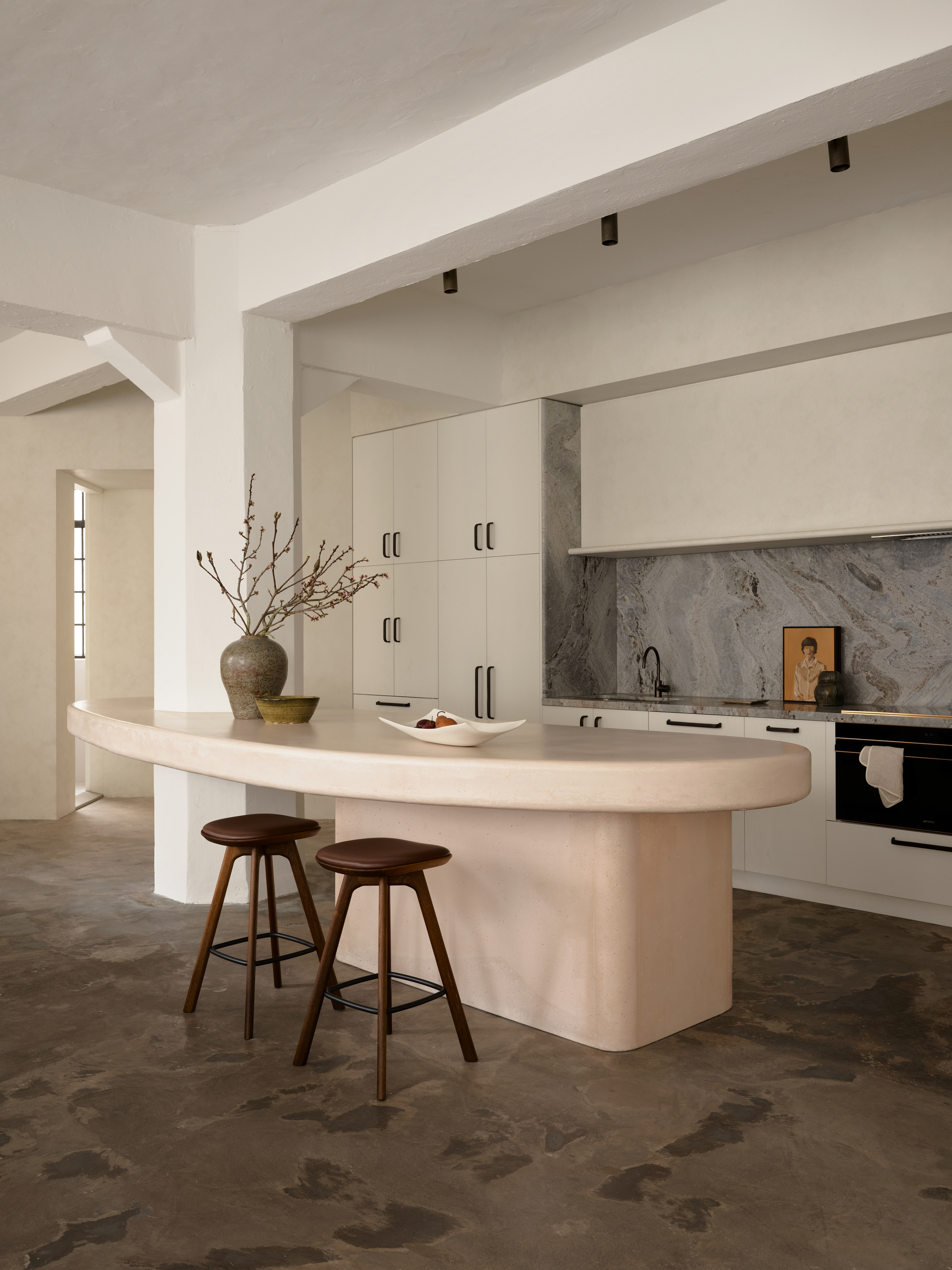
A light and bright palette requires something to anchor it — and your flooring choice is always an easy way.
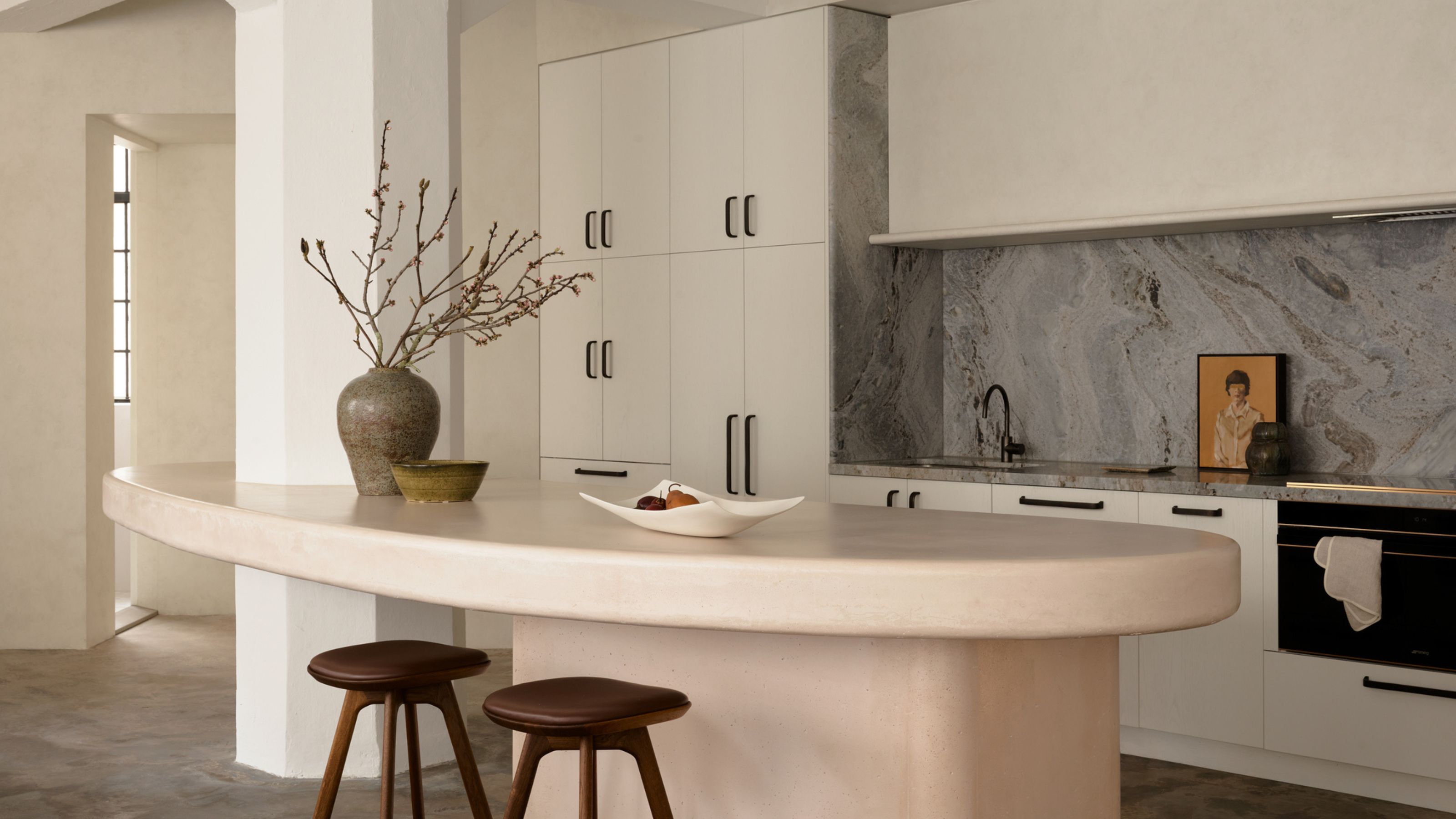
Remember, a neutral kitchen idea doesn't necessarily mean all one tone. To enrich the look, layer with a subtle color. In this kitchen, designed by Australian studio Alexander & Co., a variety of colors create the overall palette. From the dusky pink of the kitchen island to the deeper richness of the stone floor, the cream cupboards, and the white pillars, there is a spectrum of colors used to make the space feel impactful.
In this instance, the stone flooring takes on a textured quality. Leathered stone is different from other stones in that it has almost a leather-like appearance, with small cracks that add personality.
This apartment kitchen, located within a ex-industrial warehouse building, has been transformed into an urban sanctuary. "The neutral scheme allowed for this gallery-esqe feel; a gallery of daring handmade shapes in concert with one another," explains Alexander & Co. principal, Jeremy Bull.

Jeremey Bull, principal at Sydney-based Alexander & Co. believes in telling stories through design. His passion lies in materiality, where he deftly layered different textures and finishes to create a palette, rather than simply pulling together colors.
6. Add Visual Interest With Paneled Walls
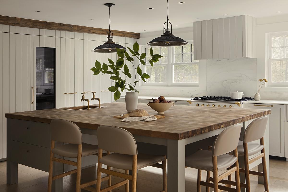
A neutral palette allows for other details in the space to sing — like panelled walls.
Another example of how you can layer and add interest to your neutral kitchen ideas is through wall paneling. By sticking to a more neutral palette, you let the panelling create the visual interest in the space, without overwhelming the entire room.
In the neutral kitchen shown above, designed by New York-based studio Stewart-Schafer, wall-panelling was installed to preserve the home's rustic colonial essence while infusing a touch of contemporary minimalism. "The kitchen embodies our approach to neutral spaces — layered, textural, and warm rather than stark or sterile," says James Veal of Stewart-Schafer. "Our goal was to craft a timeless kitchen that feels inviting while maintaining a clean, modern aesthetic."
The team focused on a nuanced palette of soft, earthy neutrals, using natural materials to add depth and richness. The oak millwork introduces warmth, while the stone countertops and backsplash bring a tactile, organic quality. By avoiding overly stark contrasts, the team created a space that feels serene and cohesive, yet full of character.
"The panelling was key to this neutral look," says James. "We designed it to add subtle architectural interest and a sense of craftsmanship, breaking up large expanses of cabinetry with refined detailing. The vertical lines bring a sense of rhythm and elongation to the space, reinforcing a sense of understated luxury."
7. Reconsider What You Know as 'Neutral'
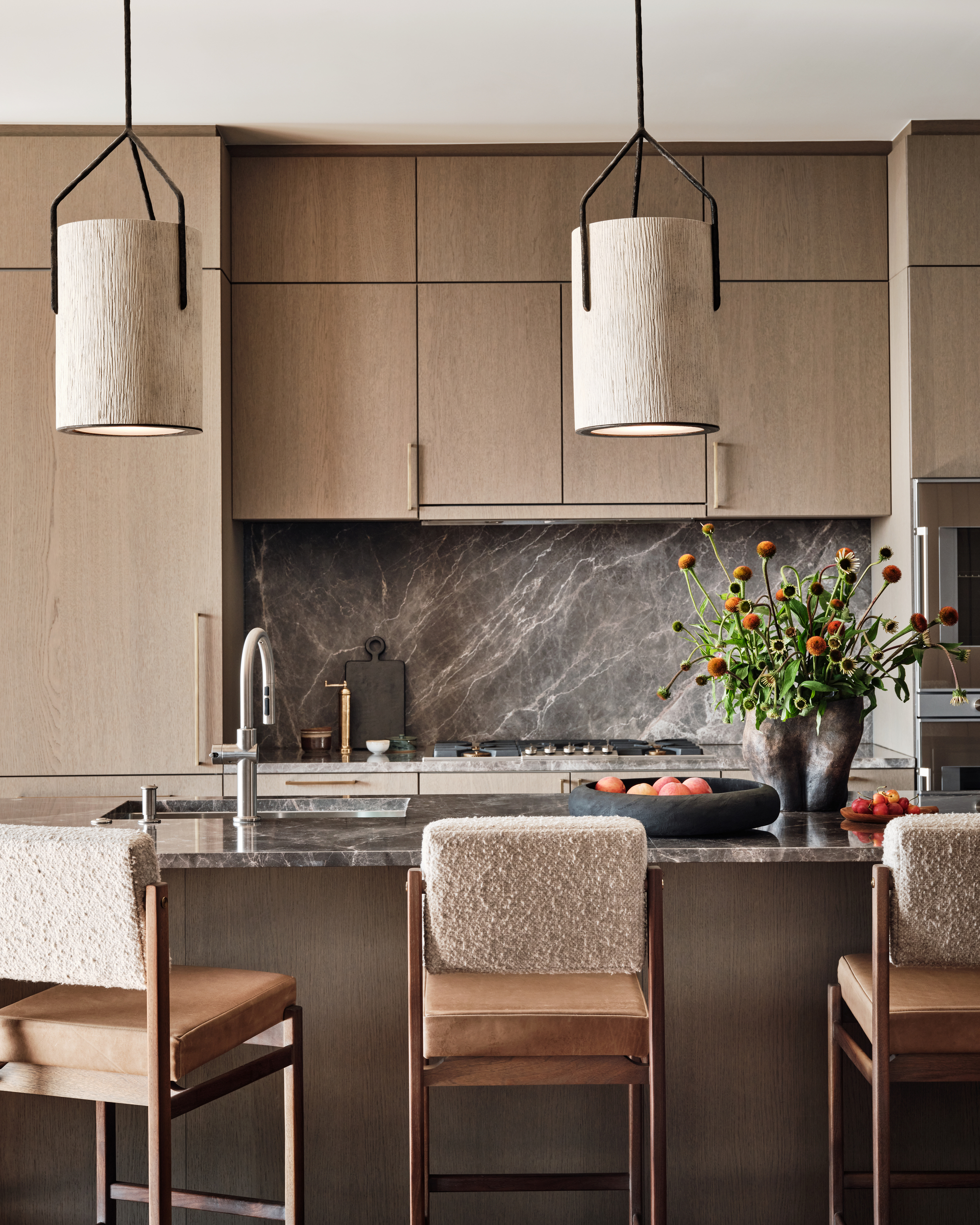
Neutral kitchen ideas are no longer restricted to shades of white and gray.
It wasn’t so long ago that neutral was thought of as explicitly pale creams and magnolia shades, but very pale pinks with undertones of red and coffee colors with undertones of brown are the latest shades to be introduced to the neutral palette. This broadening of colors means there is more space to have fun with your modern kitchen ideas.
"This kitchen was designed around the brief all feel our clients wished for in this penthouse which was luxury paired with comfort and functionality," explains Gina Pettinelli from Tribe Design Group, who designed this space with white oak cabinetry, dark marble countertops, and fuzzy fabrics on the pendant lights and bar stools. "Together it creates a cozy warm feeling," says Gina. "Going with a neutral kitchen is timeless and elegant and will always age well."
8. Combine a Neutral Kitchen With a Color Pop
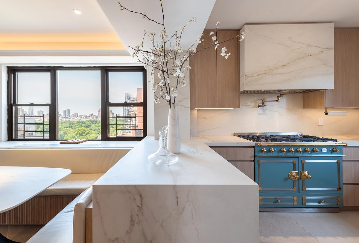
Opting for neutral kitchen ideas doesn't mean you can't still use a pop of color.
This neutral kitchen relies on its pared-back palette to add elegance and an inviting environment. But central to this idea is a color-pop appliance (a recent kitchen appliance trend) that adds drama, creates a focal point, and overall makes the space feel more luxe. "The client really wanted something that felt warm and inviting while also feeling high end and elevated," explains Matt Ruopoli of mr Architecture.
But for Matt, a big part of the neutral aesthetic was tied into the kitchen's location. "In a big city like NYC, where many have limited views and access to nature, it becomes really important to find ways to break from the aesthetic of man-made steel and plastics and ground ourselves with an interior that focuses on the natural," he explains. "Neutral tones, natural materials like wood and stone, create a level of warmth that soothes the mind."
Tying that into a more modern, luxury aesthetic with slabs and clean lines removes the visual clutter and creating a less over-stimulated environment. "Pops of color were reserved for special locations like oven, but were kept to less vivid tones so as to not overtake the space," he says.
9. Create a Cohesive Design That Flows Rather Than Disrupts
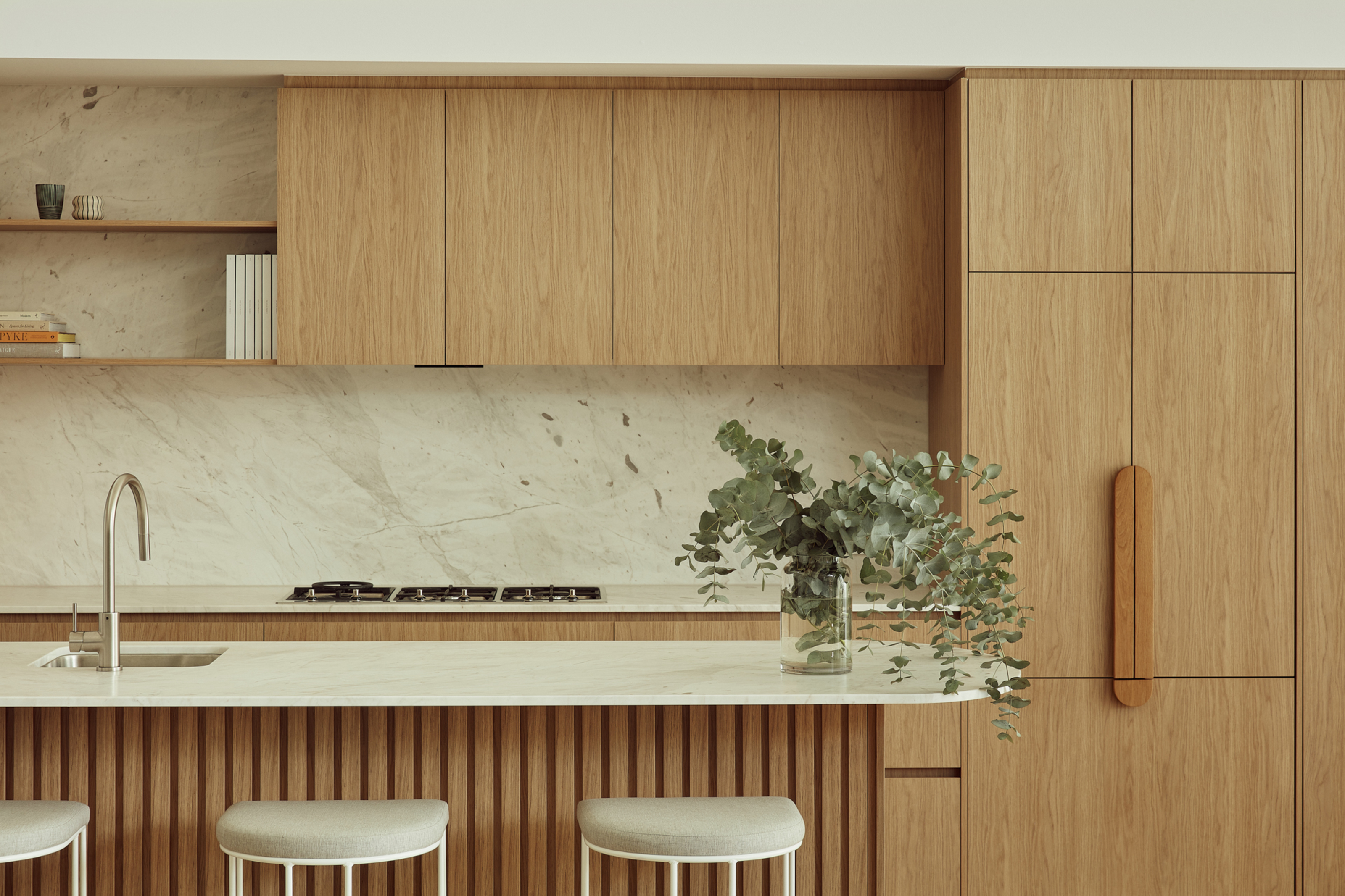
A neutral kitchen can sink into the background, creating a seamless design that flows.
This neutral kitchen idea aimed to maximize natural light, creating a bright, welcoming living space that would feel open and airy throughout the seasons.
"Clever joinery detailing and curves enhances the stunning oak veneer, while strategically placed stone elements and double-height ceilings forge a seamless connection to the outdoors," says Kellie French, studio manager of Atelier Bond, the designers.
Innovative hidden doors provide unexpected storage solutions and utility areas, maintaining a cohesive design throughout the kitchen facade. "This thoughtful integration not only optimizes functionality but also elevates the overall aesthetic," says Kellie. The result is a harmonious blend of modern comfort and classic charm.
10. Consider a Wooden Butcherblock Countertop
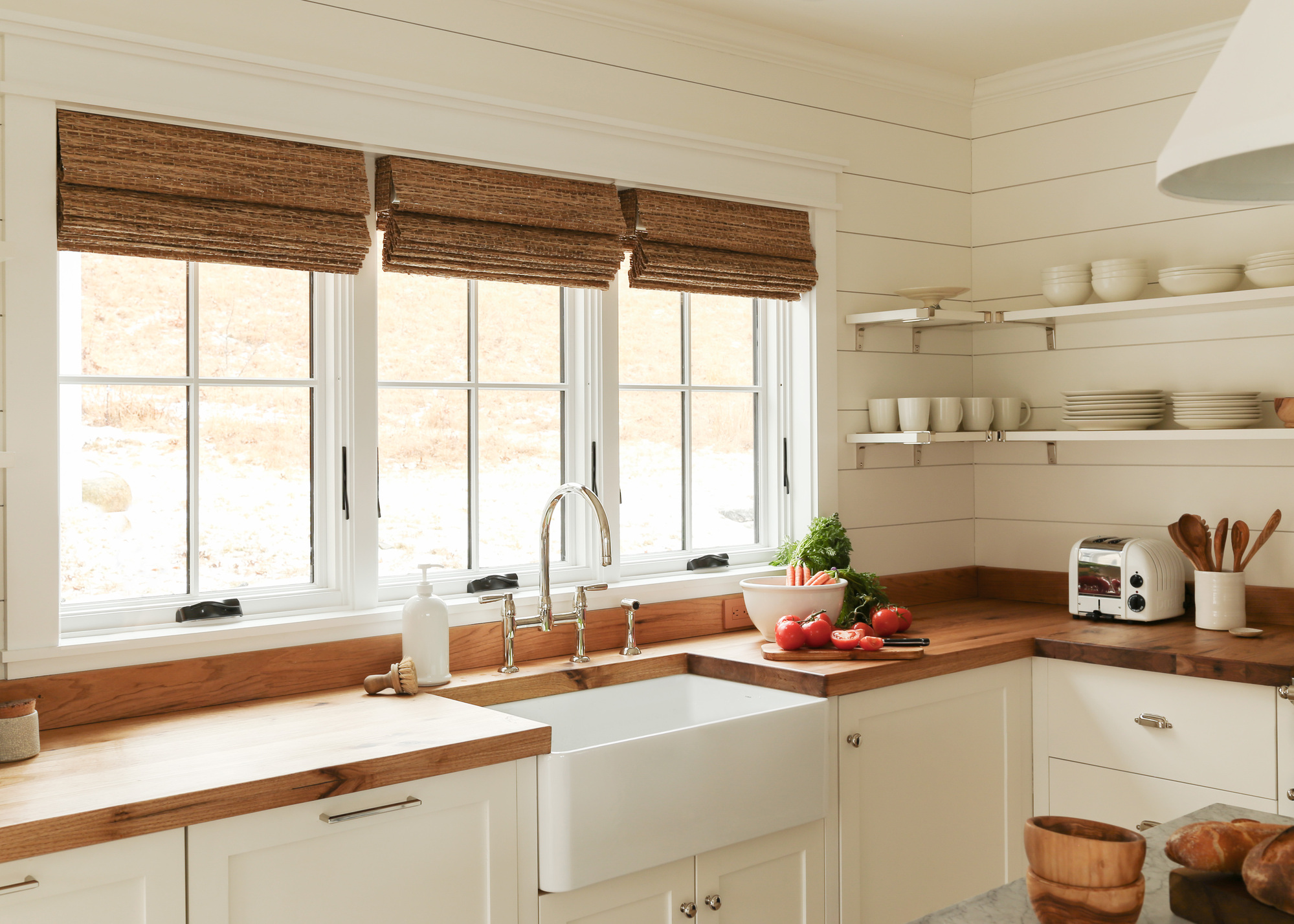
Butcher block is hardwearing, timeless, and layers beautifully with other neutral kitchen ideas.
Butcher block countertops are a great way to add interest to your neutral kitchen ideas. They are hardwearing, and have a traditional aesthetic that feels timeless. While wood isn't the most trustworthy of materials in the kitchen, if you seal your butcher block countertop properly (with a sealant or vanish) and take care of it, the surface will patina beautifully over time.
In this kitchen by New York design studio White Arrow, the white kitchen idea needed a wooden countertop to add warmth. The design firm decided to use reclaimed North American Chestnut with a marine grade varnish so it is waterproof and stain proof.
But a word of warning: Keren Richter from White Arrow doesn't use butcher block surfaces as cutting boards. "I use a secondary surface for food prep," she says. But "I love the color of a butcher block, the lower cost, the contrast of warmth with cooler tones like marble or lighter paint, and how the material makes a home feel down-to-earth and casual."
FAQs
What Is the Best Neutral Color for a Kitchen?
It can be difficult to know how to choose neutral paint colors for kitchens. While classic creams, taupes, and off-whites will always be popular, don't be afraid to opt for a darker neutral shade like a mushroom.
For a specific shade: "When going for a neutral kitchen, I always lean into natural materials, but when that’s not an option, Ammonite by Farrow and Ball is a nice alternative," says Brad Krefman.

Former content editor at Livingetc.com, Oonagh is an expert at spotting the interior trends that are making waves in the design world. She has written a mix of everything from home tours to news, long-form features to design idea pieces, as well as having frequently been featured in the monthly print magazine. She is the go-to for design advice in the home. Previously, she worked on a London property title, producing long-read interiors features, style pages and conducting interviews with a range of famous faces from the UK interiors scene, from Kit Kemp to Robert Kime. In doing so, she has developed a keen interest in London's historical architecture and the city's distinct tastemakers paving the way in the world of interiors.