6 'Energetic Colors' for Vitality and "Sophisticated Interiors", According To Psychologists And Design Experts
Need an energy boost? These hues do far more than add gusto to your interiors, here's how to shake up your home's vibe

The Livingetc newsletters are your inside source for what’s shaping interiors now - and what’s next. Discover trend forecasts, smart style ideas, and curated shopping inspiration that brings design to life. Subscribe today and stay ahead of the curve.
You are now subscribed
Your newsletter sign-up was successful
If you're looking to inject a little zest into your home decor and put a spring in your step, finding energetic colors to incorporate into your home's color scheme is a good place to start. In much the same way that certain places can help us feel revitalized, so, too, can surrounding ourselves with certain hues. From painting the walls to a simple decor switch up, you can add accents to your space that give you a buzz.
By understanding color psychology in interior design, we can create rounded spaces where function and atmosphere go hand in hand. "Energizing colors work well in spaces that encourage activity, focus, or social interaction, such as home offices, kitchens, workout areas, and hallways," says color psychology expert, Karen Haller.
So if your creative juices need a boost or you want your hosting space to feel more energized, this is your moment to start experimenting. From primary colors that ignite confidence to nuanced shades to lift you out of your brain fog, we asked experts which energetic colors work double duty to elevate both you and your space.
Article continues belowThe Most Energetic Colors
Inviting a vibrant color palette into your home can make a world of difference, and not just aesthetically. "Psychologically energizing colors are those that are bold, bright, and highly saturated, such as red, vivid orange, intense yellow, electric turquoise, and magenta," continues Karen Haller. "These colors stimulate the brain, activate the body's alert and nervous system, and create a sense of movement and urgency."
So if you need to zhuzh up your schedule, decorating with saturated color around the home will push you forward. "They demand attention, encouraging action rather than passivity," continues Karen.
Still, it's important to remember that we all interpret color differently. "Individual responses can vary based on personal preferences, cultural background, and the specific context in which the color is perceived," adds Karen. Here we explore some of the most energetic colors and vibrant palettes to promote vitality.
Author of The Little Book of Colour, Karen Haller is a leading international authority in applied color psychology. Having studied color for over 20 years, she understands how color can influence not just how we feel but how it can affect our behavior, too.
1. Warm Ambers and Burnt Hues

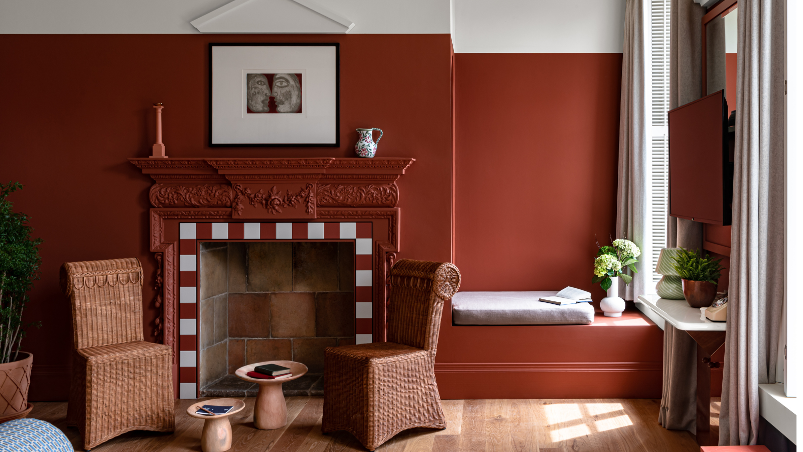
This indoor-outdoor space is brought to life with the warm colored backdrop.
In-keeping with the sun-baked shades, Ala Zreigat and Oscar Engroba, co-founders of Barcelona-based studio Astet, suggest decorating with earth tones for subtle drama and atmosphere, too. "For those looking for an alternative to red, deep burnt oranges and spiced browns offer a rich, dynamic energy with a grounded warmth," say Ala and Oscar. Dusty hues add layers of chic design detail, too.
The Livingetc newsletters are your inside source for what’s shaping interiors now - and what’s next. Discover trend forecasts, smart style ideas, and curated shopping inspiration that brings design to life. Subscribe today and stay ahead of the curve.
"Shades like rust, cinnamon, and amber bring a sense of vitality while remaining earthy and sophisticated. These tones work beautifully in social spaces like dining rooms and kitchens, where their warmth creates a welcoming and stimulating atmosphere," continue the Astet design duo.
Combine them with clean neutrals and lean into similar tones elsewhere in the space for best effect, as OWN LONDON has achieved above. One person's energetic colors might not be another's either. Alicia Meireles, Creative Director of the design studio, reminds us that demure, less intense color palettes can be enough, and that objects matter too. “When it comes to the psychology of colors: ‘each to their own'. Some people feel most at ease in a smooth, monochromatic interior — free of clutter and minimalistic. Others find calm in homely furnishings, surrounded by personal collectibles and feature walls."
2. Rich and Refreshing Coral

A vibrant walk-in shower showcasing a wonderful mixture of tiles using energetic colors — who wouldn't feel revitalized in this space?
Decorating with orange — principally bright orange — is a sprightly color choice, and one that is "social and stimulating," says Megan Collin, a psychotherapist (LMFT) specializing in neuroaesthetics and Art Therapy. "Energizing colors activate the sympathetic nervous system, increasing alertness and heart rate." If you are ready to embrace an orange vibe, go forth. However, energetic colors do not necessarily have to be super bright to be effective, but they do need to be saturated.
"Bright colors, like a bright yellow or bright turquoise, feel lively because they are both bright and saturated," explains Karen. "But a color can still be energizing if it’s highly saturated, even if it isn’t bright. A deep cobalt blue, bold magenta, or rich emerald green all have high saturation, making them just as full of energy as a bright orange. It’s the saturation that creates impact, not just the brightness."
Moving through the most vivid shades of orange, consider a striking and fresh look by pairing corals with other energetic colors. "I love using energetic colors like deep coral, rich teal, and vibrant emerald green to bring life and personality to a space," says Lauren Lerner, founder of Living with Lolo design studio. "Coral feels fresh and uplifting without being overpowering — perfect for an accent wall or bold decor piece." For a dreamy and energetic color palette, pair coral with hints of soft orange and contrast it against other brights.
3. Lively Sun-Kissed Yellow
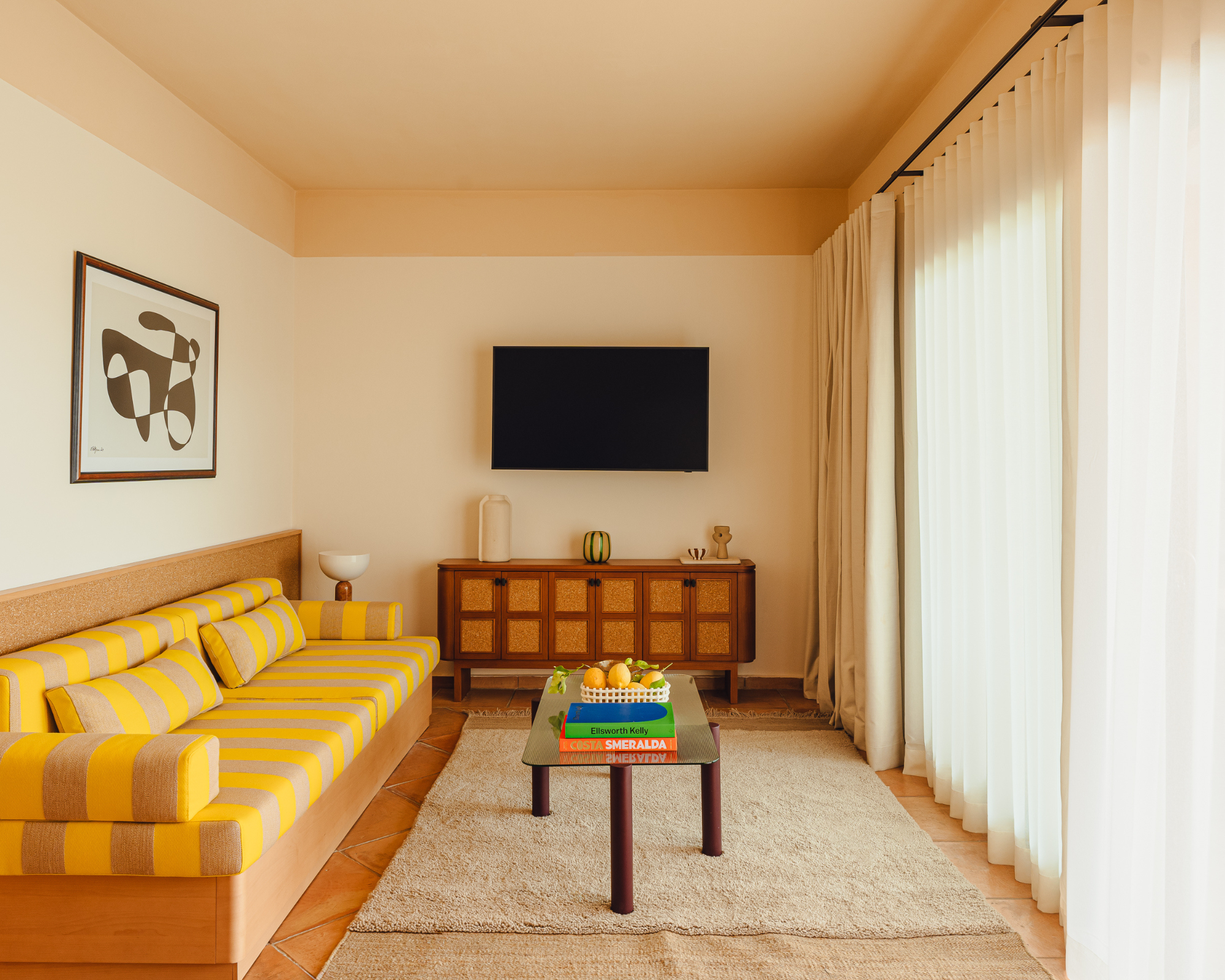
This otherwise neutral space is given a striking pop of color with the yellow stripe couch.
Fun and cheery, decorating with yellow is a brilliant contender for an energetic color scheme and, as we can see in the Aethos Sardinia hotel above, even just a dash of glorious lemon zest color brings pep to this room.
Helen Shaw, color expert and international marketing director of Benjamin Moore Paint notes: "As the brightest color of the visible spectrum, yellow is the most uplifting and refreshing of them all." There are plenty of colors that go with yellow, too — blues and terracottas can make a brilliant mood-boosting combination. "Yellow balances well with hues from the grayscale, from crisp white to deep black," adds Helen.
Consider color drenching the space for maximum impact, though a pop will go far. "Yellow in Feng Shui is synonymous with joy, happiness, life, and warmth," shares designer Faith Blakeney who used Farrow & Ball's cheery Babouche in a recent project as a bright and "fun color punch" to contrast lead gray Downpipe and other sultry colors in the rest of the classic loft. "We feel this yellow brings all of that into this playful yet sophisticated kitchen."
5. Electric Shades of Blue
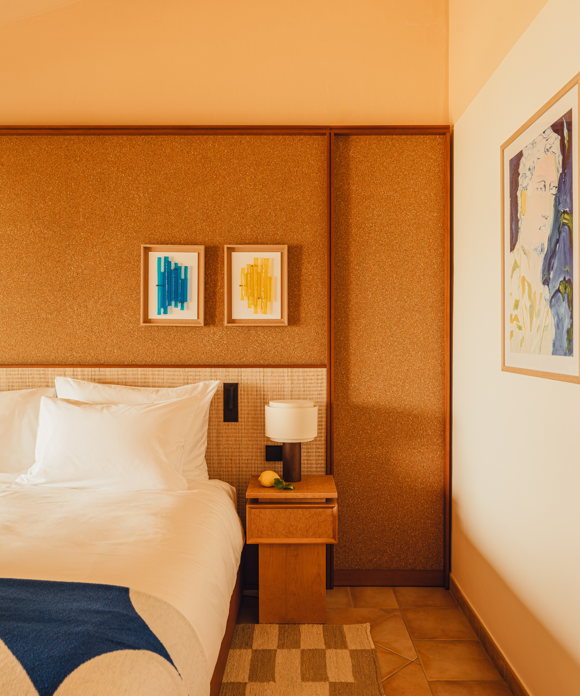
Your eyes are instantly drawn to the energetic blue in this warm-colored bedroom which is paired which a sunny yellow for an uplifting feel.
Speaking of highly saturated colors like "electric turquoise," Karen Haller considers them party colors, and for good reason. "Current color psychology theory suggests that the brain processes saturated, high-chroma colors rapidly, potentially triggering the body's alert system. This can lead to physiological changes such as increased pulse rate, faster breathing, and heightened muscle tension."
With this in mind, how much you use a bright, bold color will largely depend on where you place it. In the bedroom, for instance, where rest is a must, keep it light for a gentle lift, alongside other colors that go with blue. As we see from the artwork and throw above, the tonal layering of unique blue and yellow hues brings a nice energy boost to the space.
5. Tonal, Sunset Red
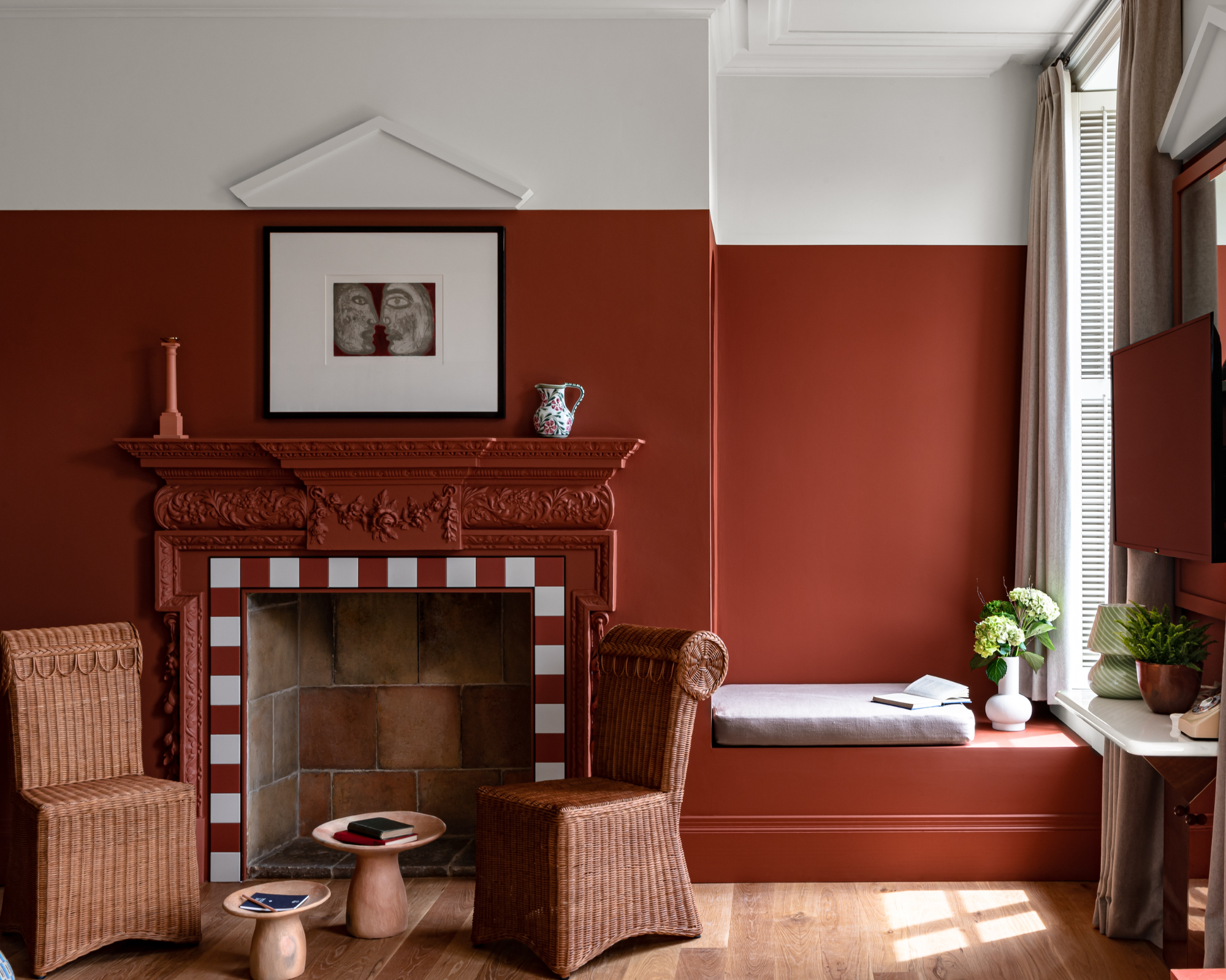
A vibrant, earthy red creates a toasty scene in Cowley Manor in the Cotswolds, as designed by Dorothée Meilichzon, founder of global design studio CHZON, Paris.
As Karen explains, red is unapologetically fiery. It's a fully charged color that can brilliantly shake up a room. In studies it has been linked to increased performance and focus, too. But, where a pure red might feel too aggressive, especially in large quantities, don't be afraid to choose a more tonal hue.
"Red is linked to passion, energy and action," adds Patrick O'Donnell, Farrow & Ball brand ambassador and color consultant. "The color is also associated with increasing our metabolism, hence its popularity in dining rooms."

Patrick O'Donnell is a paint color expert and has been the global brand ambassador (and 'face') of Farrow & Ball since 2012, working in the showroom and providing color consults to homeowners. Constantly playing with color combinations, Patrick is an expert in understanding the effects of color on a space.
Should you still want to go down the brightest route, tap into the unexpected red theory to add just the right dose of energetic color to a pantry or kitchen. "True reds tend to be too demanding for most bedrooms due to, as mentioned, their energizing characteristics," notes Patrick.
By decorating with red in a more subtle tone, you might even be able to bring it into calmer spaces associated with relaxation, too. "At the darker end, a reddish brown shade like Etruscan Red can look elegant and dramatic in a bedroom and deliver a super cozy and warm aesthetic," adds Patrick of the archive paint color making a resurgence. Colors with orange undertones like Vampire Red from Graham & Brown can take nicely to larger spaces, too.
6. Bright Emeralds and Greens
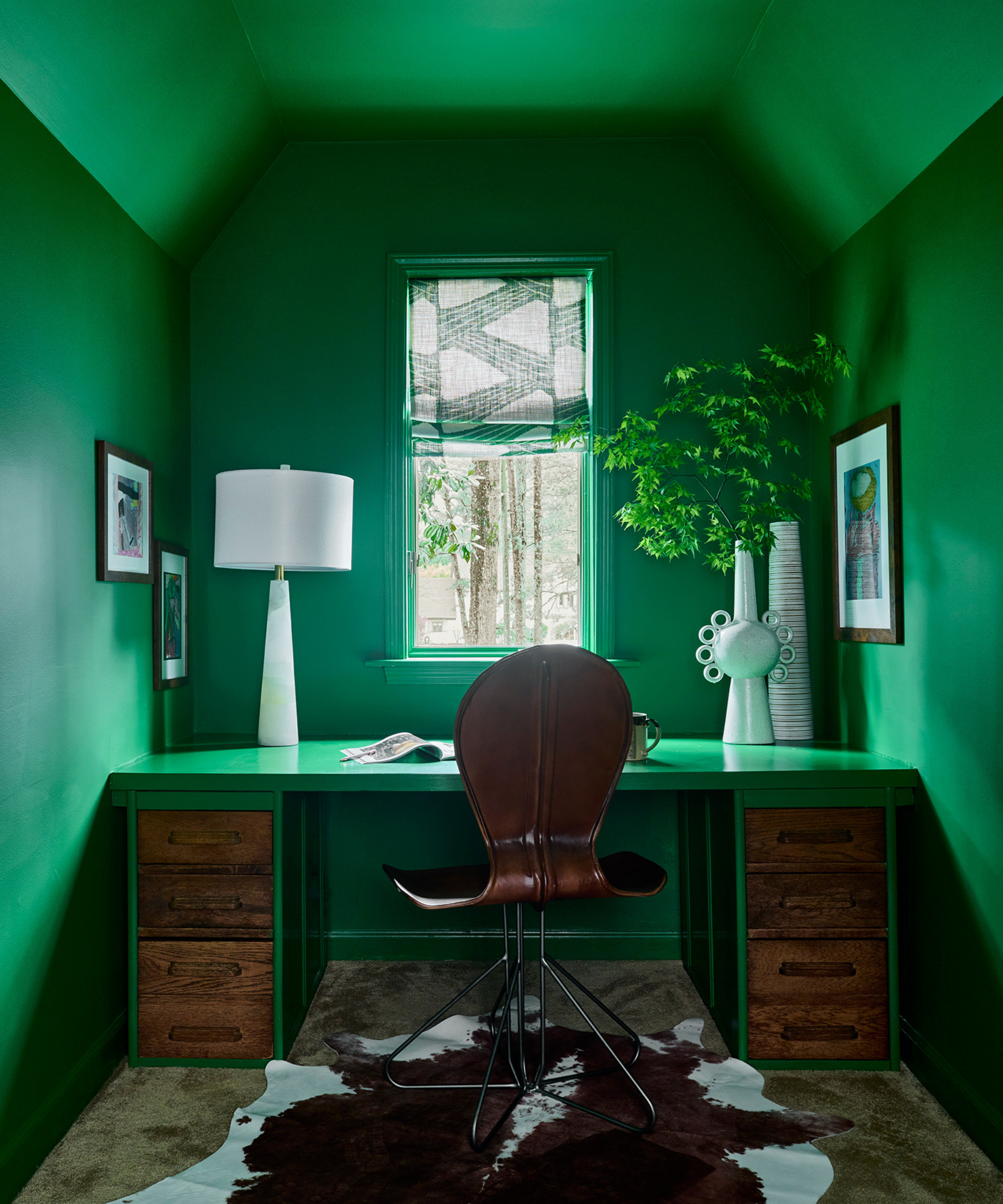
For a home office, why not color drench the space in your favorite energetic color to lift you from brain fog.
Jewel tones are lively, "And emerald green? It’s a showstopper," says Lauren Lerner. "Luxurious and grounding, it’s great for velvet sofas, dramatic wallpaper, or kitchen accents." The office space above speaks volumes; it's color drenched to the max and envelopes you in an energetic glow.
Paula Taylor, stylist and color expert at Graham & Brown expresses a fondness for this color group, too. "Bright green is associated with fresh new growth, stimulation, and bursts with energy and motivation, making it great for home office environments."
For a more relaxed finish, play with ratio and other design elements. "When using these bold hues, I recommend balancing them with neutrals and natural textures to keep the space refined and inviting," adds Lauren, who likes creating a tactile finish. "Layering textures like velvet, linen, or woven elements adds depth and keeps the space dynamic. The goal is a space that feels vibrant, inspiring, and liveable."
Similarly, "Purple is also a great color for sparking creative energy and works brilliantly when teamed with green to promote fresh ideas in a home office environment," adds Paula." Graham and Brown’s Sleepless paint is a good option for this, as well as Byron."
FAQs
Which Rooms Should I Paint Brightly?
Dorothée highlights how energetic colors and where you use them will change across different interior design schemes, and that's the fun of it: "I don't have a routine in colors, each project is different; it depends on the location, the amount of sun, the shape of the rooms," shares the designer.
Think of where you or guests might want a pick-me-up — like the hallway, living room or kitchen for a bright and energetic color scheme.
What Is a Good Energetic Color for a Home Office?
Consider bright emerald green or another prime jewel color like magenta. "Purple is also a great color for sparking creative energy and works brilliantly when teamed with green to promote fresh ideas in a home office environment," suggests Paula.
Saturated rose hues might make you feel more energized on long days, too. "Pink is often thought to be the color of hope and empowerment. The brighter shades can lead to increased energy and motivation and can promote fun, creativity and enthusiasm," continues Paula. This could make a good alternative to bright red or another color that might raise stress levels if not executed in the right way — or if you feel particularly sensitive to it.
Now that you know what colors are energetic, you might be interested in exploring our dedicated pages on joyful colors and wake up colors.

Camille is a freelance interiors writer and the former deputy editor of Real Homes where she covered a broad range of topics, including DIY, small space design, and gardens. She studied English language and Italian at the University of Manchester and it was during her year abroad studying in Bologna that she started documenting her adventures and observations in a blog. Camille has a passion for art and beautiful spaces. When not writing or refreshing her home, you will find her gallery hopping, taking photos, painting, and traveling to seek out interiors inspiration.

