I'm a Color Expert Who Thinks Decorating With Emerald Green Is the Secret to Curating Spaces Full of Richness and Allure
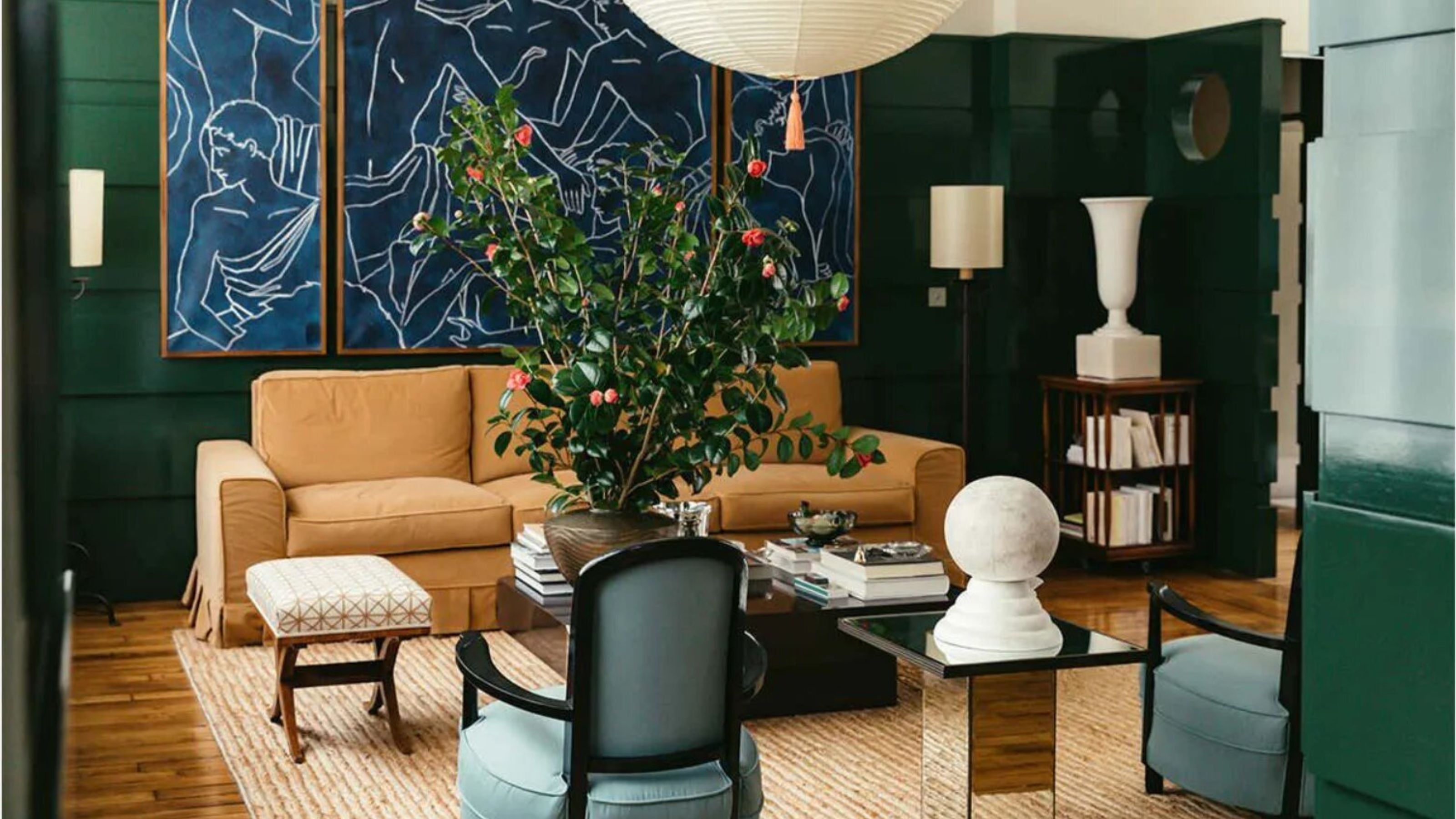
Thanks to its royal connotations, decorating with emerald green instantly imbues spaces with elegance, but can also add "bit of mischief"

The Livingetc newsletters are your inside source for what’s shaping interiors now - and what’s next. Discover trend forecasts, smart style ideas, and curated shopping inspiration that brings design to life. Subscribe today and stay ahead of the curve.
You are now subscribed
Your newsletter sign-up was successful
Ever considered decorating with emerald green? The rich shade is the most luxurious, the most bold, but also perhaps the most difficult shade of green to use. But it doesn't have to be.
It's true that the jewel tone does need careful consideration before you introduce it into your home, but when done right, decorating with green in this sophisticated shade can add instant charm, allure, and richness to a space.
Color and I have a longstanding relationship — I’ve been writing (and constantly thinking) about it for over a decade, most recently for the book I've written, which explores easy — and fun – ways to incorporate pigments of all kinds into the home. Below, I've broken down how to decorate with emerald green, whether that's splashed across your walls or with smaller accents. Here's how to do it.
Article continues below1. Embrace the Power of Emerald Green
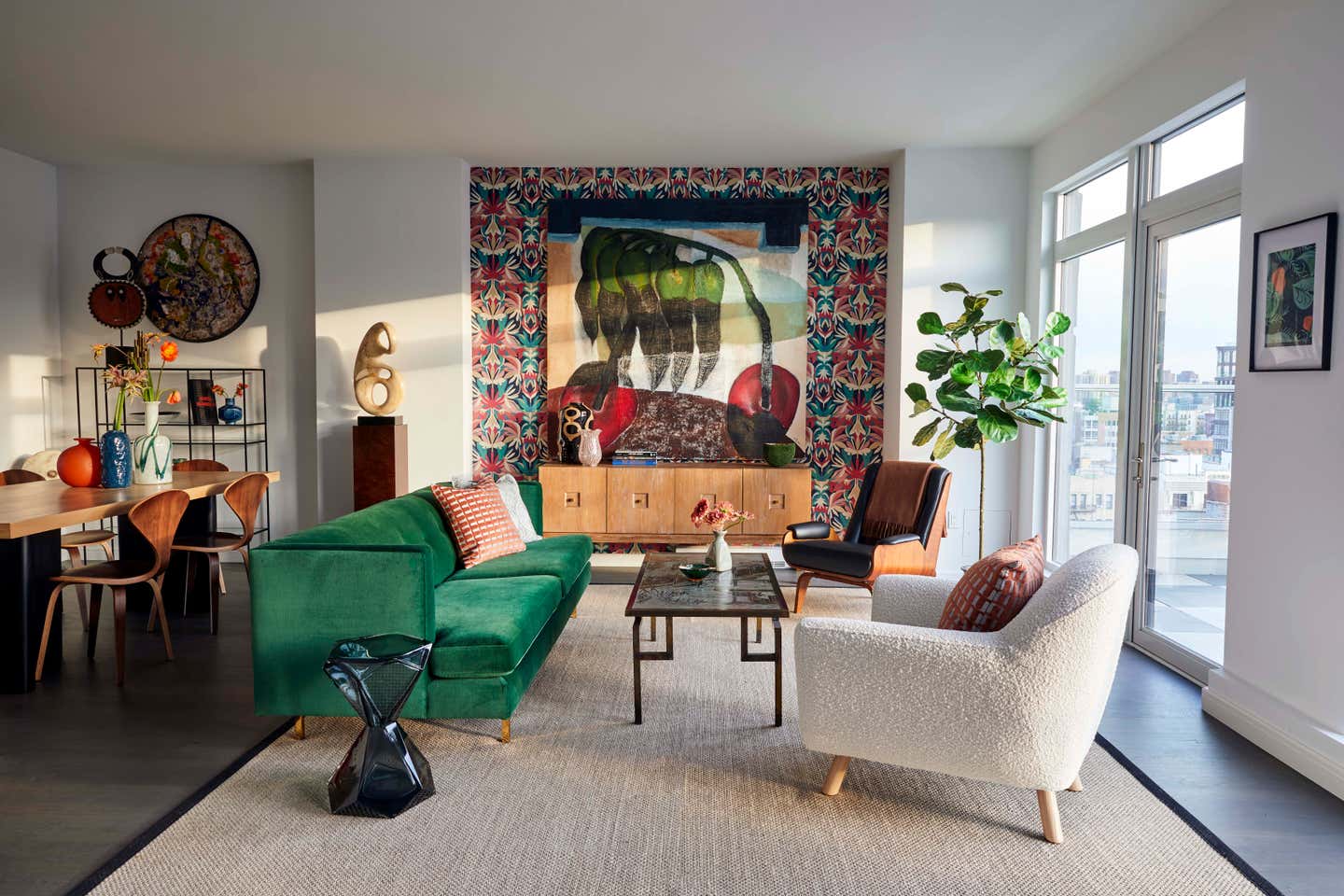
Incorporating green into our interiors is no new thing — but what is it we’re all so drawn to? The echo of nature the shade carries? Its inherent calm feel? The way it makes us want to take a breath and look at everything anew? Yes, yes and yes.
Emerald green holds a very specific power. It’s deep. It’s intense. It’s opulent. Such richness commands attention, evoking a sense of luxury and mystery while embodying a timeless, never-go-out-of-style allure.
To lean into this power, use emerald green in unexpected design details to create a dramatic yet elegant mood — think emerald-painted doors, staircases, and architectural details, or for the tiles around or in a fireplace, where the color’s vividity juxtaposes more neutral surroundings and causes the viewer to raise an eyebrow.
2. Sink Into the Feeling

When bringing any hue into the home, the first element I turn to when making a decision is how it makes you feel, and how the shade affects the atmosphere of the space and beyond. More often than not, green interiors make you happier.
The Livingetc newsletters are your inside source for what’s shaping interiors now - and what’s next. Discover trend forecasts, smart style ideas, and curated shopping inspiration that brings design to life. Subscribe today and stay ahead of the curve.
Emerald green straddles two emotional extremes — it can be both buzzy and brazen, as well as calm and comforting. “Most greens offer relaxation, but emerald is a little more energetic,” agrees Patrick O'Donnell, a paint expert and brand ambassador at Farrow & Ball. “In the right space can still feel calming — with just a little bit of mischief!”
Alongside its stimulating and impactful side comes an aura of opulence — there’s a hint at majesty and sumptuousness in emerald green which makes for rooms that are indulgent and sophisticated.
Conversely, emerald green also conjures a sense of balance and grounding, rooted as it is in the tranquility of the natural world. While, yes, it’s a more vivid tone than one tends to comes across while forest bathing, the color’s clear link to nature does resonate when it’s brought into the home. Decorating with emerald green exudes a centering sense of well-being and serenity that reminds us of walking barefoot in the open air — with a dynamic and contemporary twist.
3. Consider Complementary and Contrasting Colors
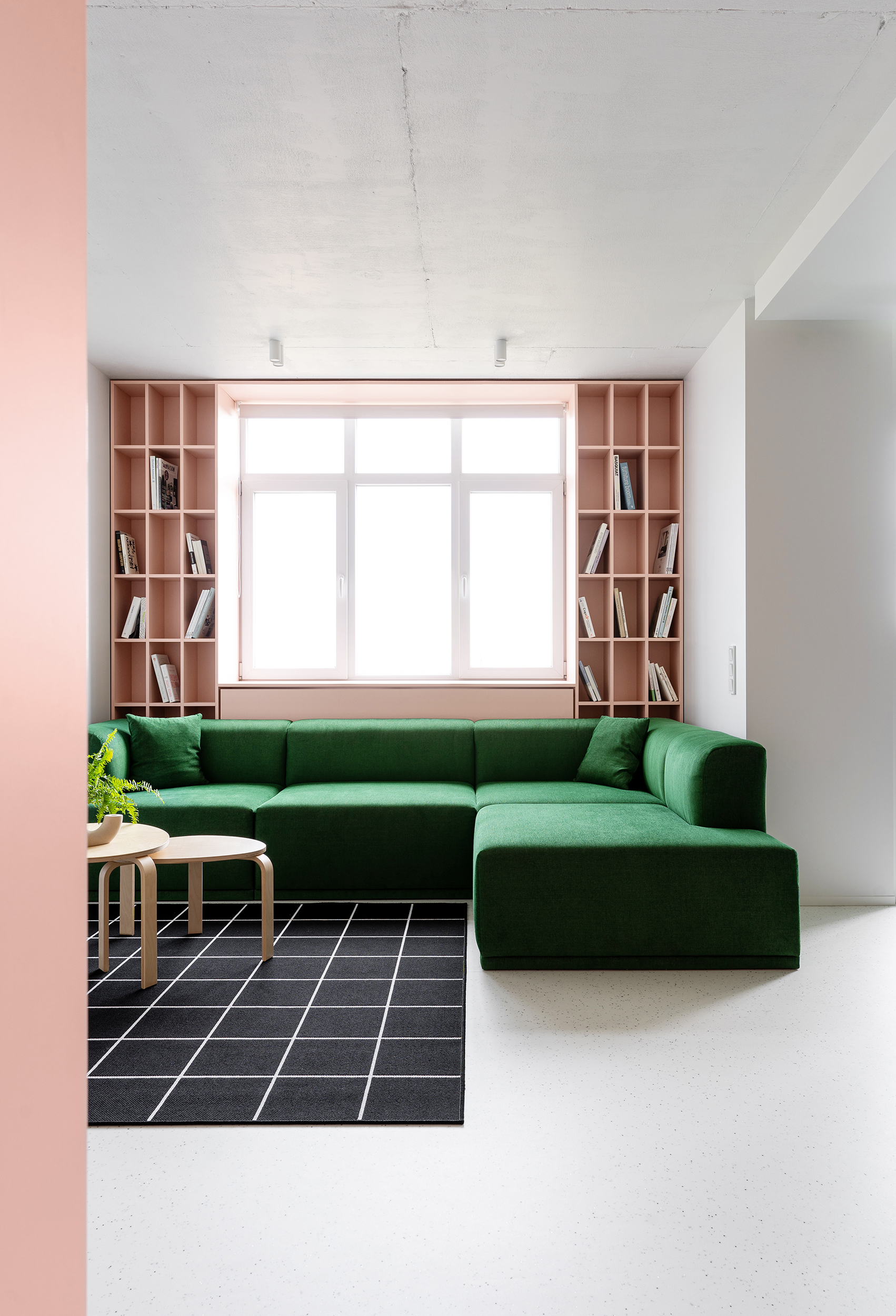
Green color trends are a continuous design staple in the home, so it makes sense that the tone syncs with a lot of other hues. Due to its natural links, our eyes welcome green color combinations — you never think “that flower is clashing with those leaves” — so the list of colors that go with green is, joyfully, endless.
Emerald green is a little trickier to pair — but don’t worry, there are still plenty of colors that go with emerald green too. "Classics that work paired with emerald green are soft pinks for a charming, ethereal look, or try a good mid brown to calm it down,” says Patrick O'Donnell. “Team emerald with a blue of a similar weight, something that has the same vibrancy — a hybrid blue/turquoise would work a treat. Have fun and experiment.”
“Emerald green is a color of many moods depending on who she is with,” says interior designer Gray Walker, principal of Gray Walker Interiors in North Carolina. “Navy blue and emerald green create a crisp and clean room with a bold clarity that is fresh and classic. But she becomes very moody and mysterious when paired with black and charcoal gray, and takes a sophisticated sassiness when she is with reds and maybe a pop of canary yellow.”
There’s also crisp white, which creates a fresh and clean contrast and emphasizes emerald’s dynamism, or ivory for something softer and warmer. Go for mustard when decorating with emerald green for a bold-yet-grounded contrast, or terracotta which adds more depth and an organic feel. Layer up on greens to soften emerald’s impact — I particularly love sage for a gentle and muted contrast, earthy olive which brings warmth, or an oceanic teal to up the ante even more.
4. Assess Your Natural Light
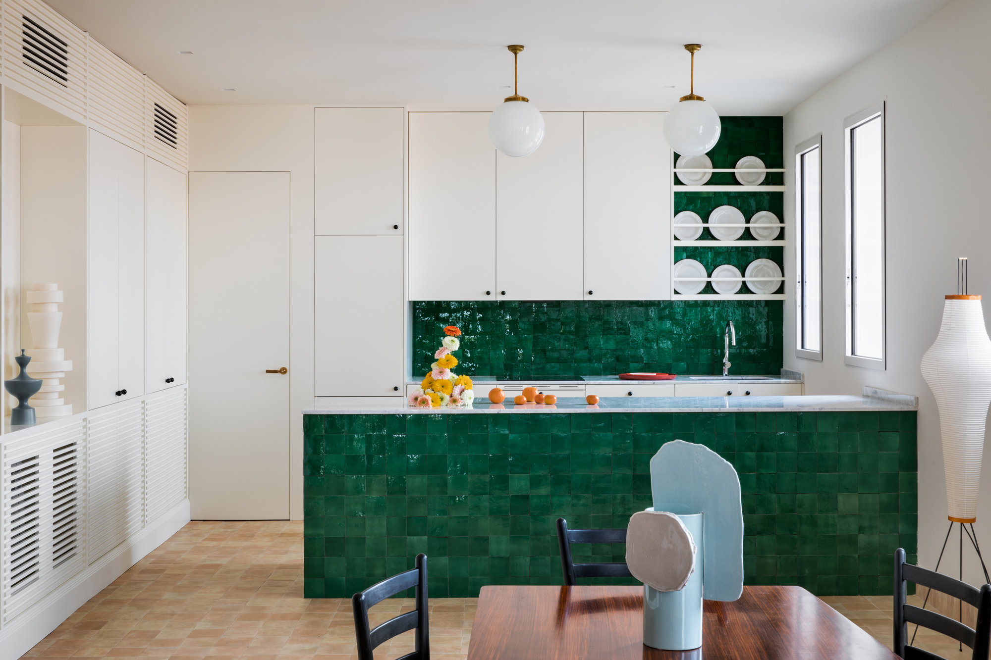
For me, the emerald green color trend belongs in a space with lashings of light so the shade’s complexity and brilliance can shine and be appreciated — but, there are moments when different light levels suit it too. It's important to consider how light effects green paint before committing to a color (this is why testing paint samples is a non-negotiable).
A south-facing room with bright, direct light will give emerald the oomph it deserves, making it appear at its most vibrant and saturated — these are good spaces to bring in large chunks of the color to make the most of its outgoing personality. Try glossy finishes to creative a reflective, jewel-like effect or linen for a striking contrast to the space’s brightness.
Bring emerald into a north-facing room filled with cooler and more diffused light, and the tone will turn moodier and more muted. This is where texture comes into play — choose emerald fabrics in velvets, wool, or bouclé to heighten depth and warmth, or use light-softening matte finishes for an effect that’s cozy and enveloping.
5. Understand the Undertones
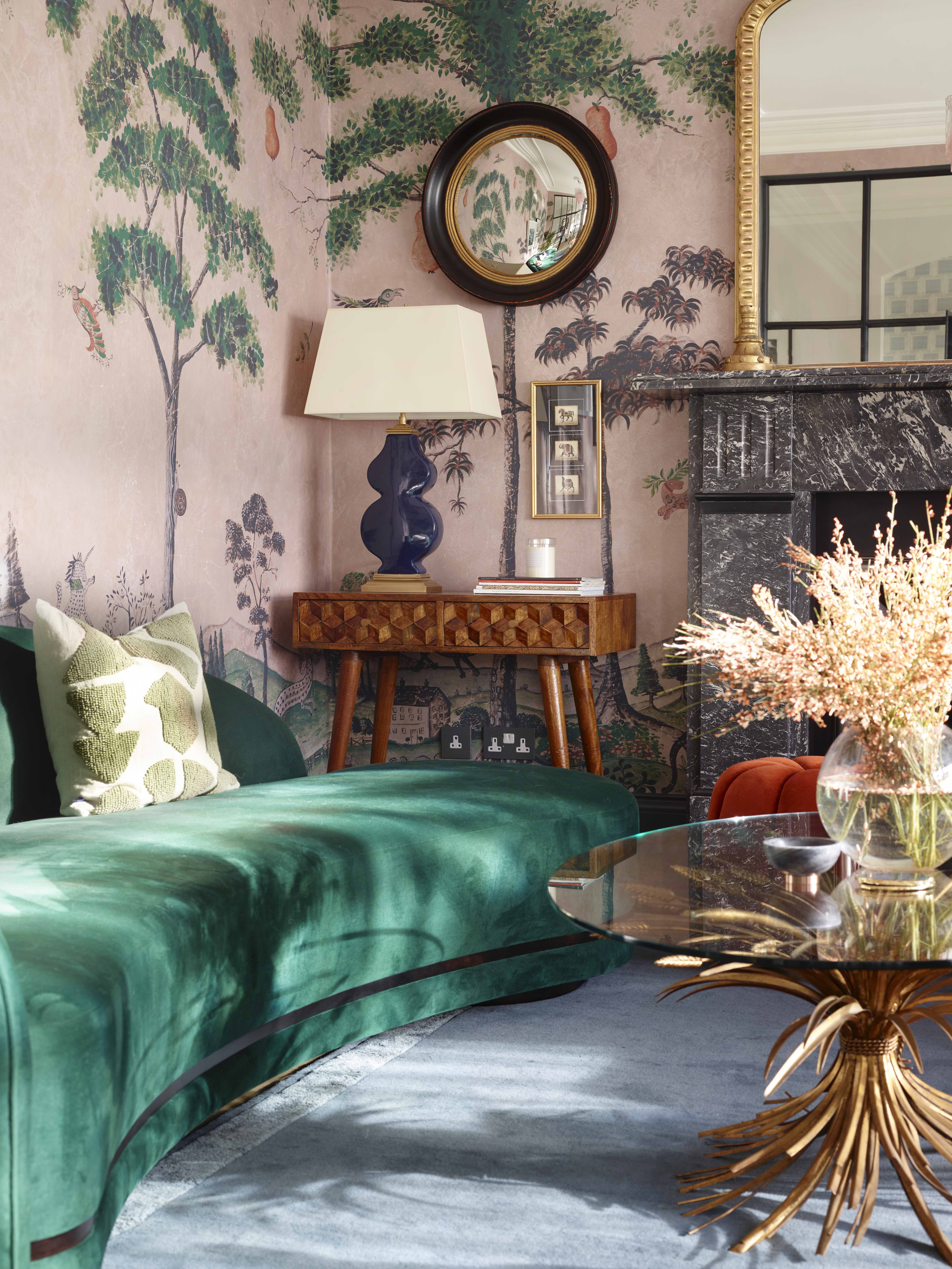
The magic of the enduring allure of decorating with emerald green lies in its undertones, which shift the impression of the color and the ambiance of a space it’s in.
Emerald greens tinted more heavily with blue undertones have a cool, serene edge, summoning the intoxicating hues of the ocean. They feel crisp, modern and sophisticated, adding depth and a sense of tranquility to a space while maintaining a fresh, contemporary appeal.
Warm, yellow-infused emerald greens create a richer and more traditional impression, radiating a sense of old-world glamour that exudes elegance and timeless charm reminiscent of historic estates and luxurious classic interiors.
How to understand which emerald your room needs? Test, test, test — use paint samples properly by positioning them on different walls at various times of day to see how specific shades work in your space. I find painting onto A4 pieces of paper works best for moveable samples. You’ll never regret putting the time in!
6. Get in on the Accents

If you’re (still) not feeling like a full-on emerald makeover, you’re in luck, as the color — thanks to its dazzling clarity — works beautifully as small touches within a room, too.
“Emerald green is a wildly effective accent color,” agrees interior designer Gray Walker. “Art, antique pieces, rugs and fabrics are key pieces that can be used to bring just a splash of emerald green into a room for great impact.”
Even decorating with emerald green in small touches can be transformative. A single element, whether it's an accent on a cushion, a vase, a piece of glass, or a candle, will inevitably draw the eye, creating a captivating focal point and a burst of vibrant energy. Like scattered precious jewels, multiple small emerald pieces dispersed throughout a room cultivate a sense of harmonious cohesion. Their deep, verdant hue imparts an understated elegance while simultaneously radiating a joyful, expressive energy.
FAQs
What Does Emerald Green Symbolize?
Emerald green isn’t just easy on the eye — it’s immersed in meaning and drama that echoes through the ages.
Universally tied to nature, emerald green represents growth, renewal, and vitality — picture lush jungles and fresh, verdant beginnings. It’s often associated with balance and harmony, evoking the type of serenity that only the power of nature can create.
Emerald green has long symbolized prosperity, wealth, and success, thanks to its association with the precious gemstone. Coveted for its deep hue and rarity, emeralds have adorned royal regalia throughout history, solidifying it as a color of status.

Amy Moorea Wong is a color authority and contemporary interior design writer who has specialized in all things decorating for over a decade. Amy is Livingetc magazine’s Colour Expert, Interiors Editor at The Glossary magazine and a Contributing Editor at Homes & Gardens magazine, and she frequently contributes to an array of global publications to share her insights on interior design zeitgeist. Her book Kaleidoscope: Modern Homes in Every Colour explores a collection of cool colorful homes fizzing with creativity, surprises, and inspiration.