5 Design Lessons We Can Learn From Lloyd Wright's Iconic 'Newman Residence' (Which Has Just Been Listed For Sale)
From exposed brick to chrome details in unexpected places, you bet I'm taking notes from this Hollywood design icon

The Livingetc newsletters are your inside source for what’s shaping interiors now - and what’s next. Discover trend forecasts, smart style ideas, and curated shopping inspiration that brings design to life. Subscribe today and stay ahead of the curve.
You are now subscribed
Your newsletter sign-up was successful
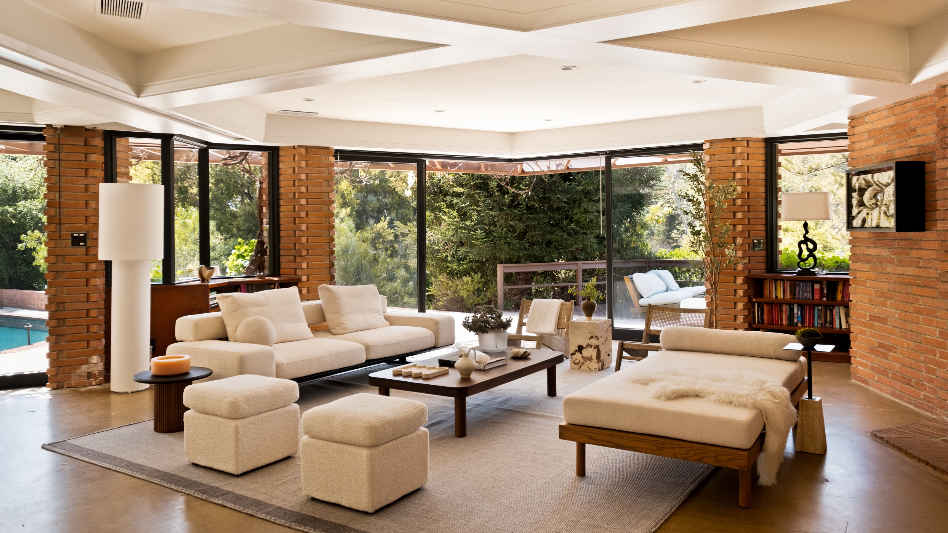
A house in the Hollywood hills with architectural pedigree — need I say more? Lloyd Wright's mid-century modern masterpiece, the 'Newman Residence', has just hit the market for USD$12.8 million. And while that may be slightly out of my current budget, it hasn't stopped me from insistently scrolling through the real estate listing, taking note of several design details for future reference.
Designed by Lloyd Wright, son of legendary architect Frank Lloyd Wright, this five-bedroom, three-and-a-half bath residence in the Pacific Palisades has hosted multiple stars throughout the years. Composer Alfred Newman originally commissioned the build, and Hollywood sweetheart Diane Keaton later bought and restored the retreat. But for all its star quality, the home itself is just as show-stopping.
While Lloyd Wright has taken much inspiration from his father's iconic Prairie style, he himself is known for his international-leaning, experimental, and unique style. And this California estate is no exception — think geometrically-shaped rooms, stunning combinations of modern materials, and captivating indoor/outdoor spaces. Below are five design ideas I'm saving to (one day, hopefully) steal from this masterfully crafted mid-century modern home.
Article continues below1. Don't Box Yourself Into Square Rooms
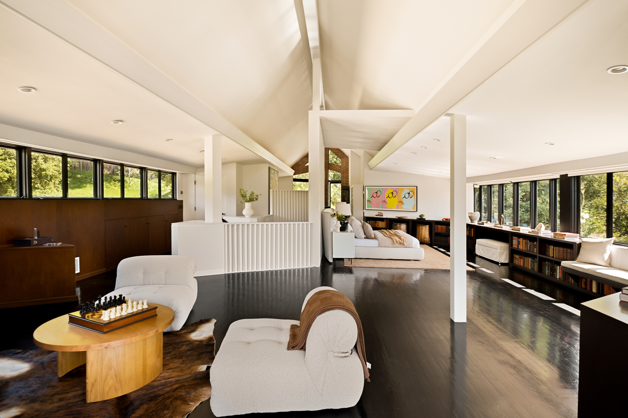
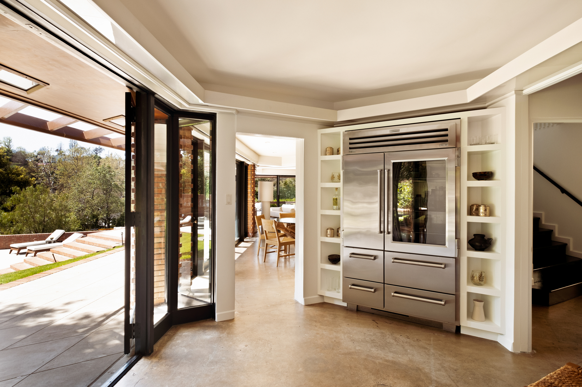
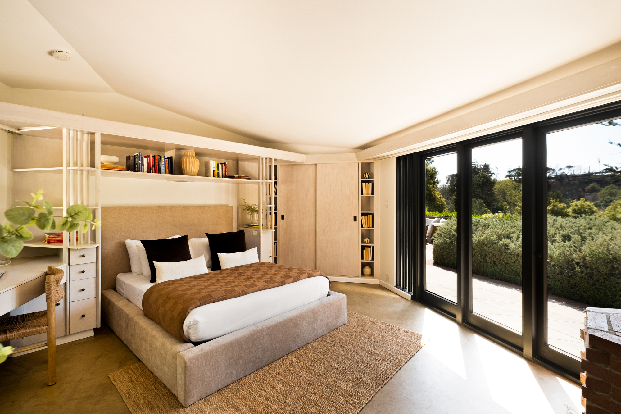
After looking at this home for the first time, there was one thing that stood out: the shape of the rooms. We've become accustomed to planning our living room layouts based on a basic square or rectangular shape, but the design basically begs us to think outside of the box.
Though intimidating to design, an angular room does a lot of the visual heavy lifting. Walls and ceilings become interesting on their own; it's just a matter of how you use them. For instance, the caddy-corner wall in the kitchen hosts both the fridge and shelving without taking up too much space.
Not only that, but Lloyd Wright has managed to make an open concept feel cozy through the unique shape of the space. Though there are not many walls to divide the rooms, the unique use of partitions, furniture, and bringing in the outdoors gives definitive character to each space.
2. Materials are Meant to Be Mixed
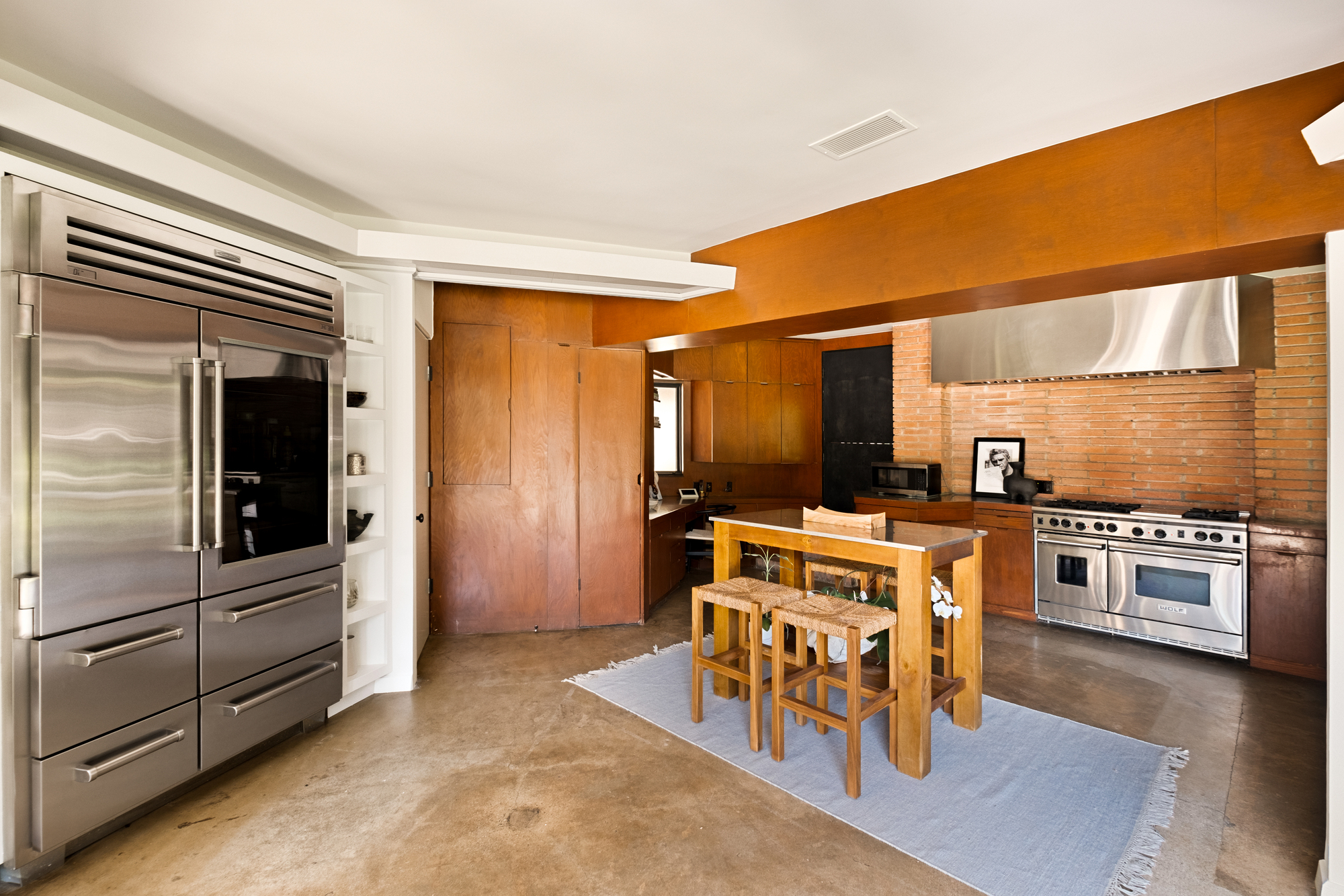
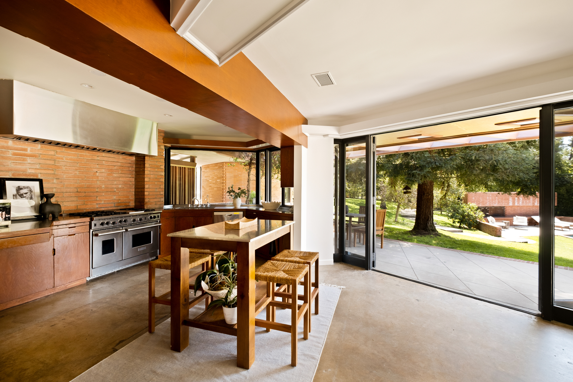
If mid-century modern design has taught me anything, it's that materials are meant to be mixed. Incorporating simple yet functional designs is the ethos of the movement after all. It's a bit industrial, but with a warm, everyday wow-factor.
The Livingetc newsletters are your inside source for what’s shaping interiors now - and what’s next. Discover trend forecasts, smart style ideas, and curated shopping inspiration that brings design to life. Subscribe today and stay ahead of the curve.
There couldn't be more texture happening in this mid-century modern kitchen, but that is the beauty of it. The brick backsplash, the wooden cabinetry, the concrete floors, and stainless steel appliances — something about the combination works perfectly.
And when paired with the signature large windows looking out to the outdoors, these otherwise industrial materials feel somehow softened. If you've been dying to try mixing chrome and wood, why not go all out?
3. Stainless Steel Belongs Outside of the Kitchen, Too
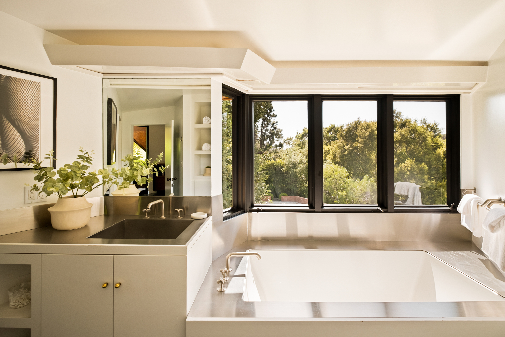
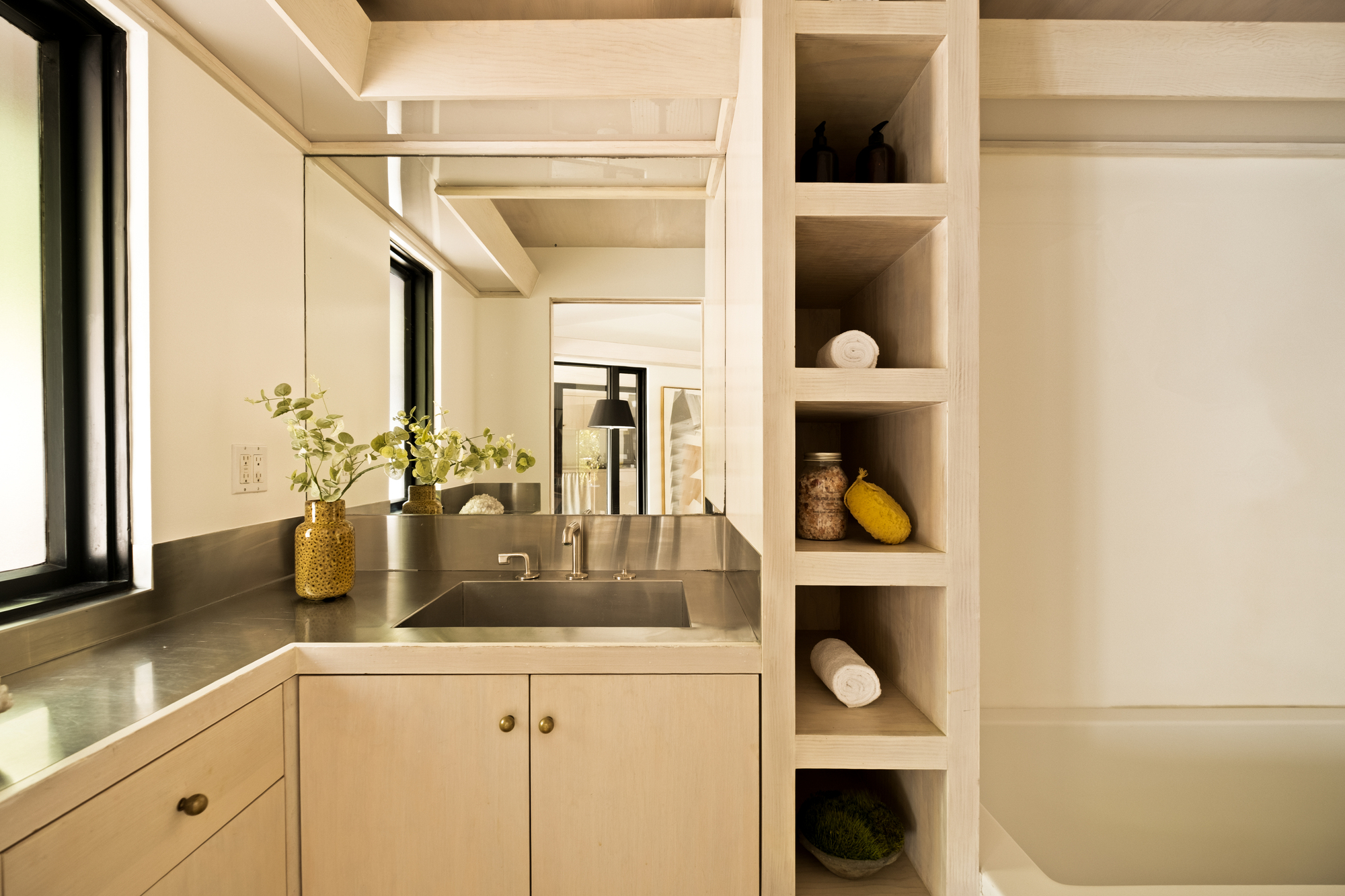
Kitchen countertop materials have always included stainless steel, but bathroom countertops? That's fresh.
If you've been paying attention to the latest trends, you may be aware that chrome decor and brushed metal finishes have had quite an influence on interiors right now.
While covering your bathtub in stainless steel may seem avant-garde, when expertly done, the result is something dynamic, yet timeless.
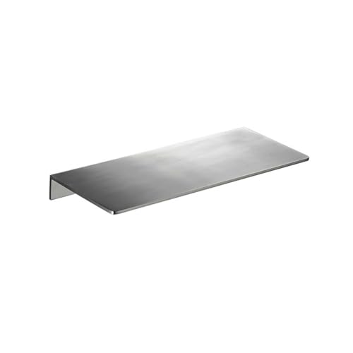
Though not quite a custom countertop, this floating wall shelf brings the best of beauty and utility with its stainless steel build. Plus, you can get the Lloyd Wright look for just under £30.
4. Long and Low Furniture Instantly Elevates
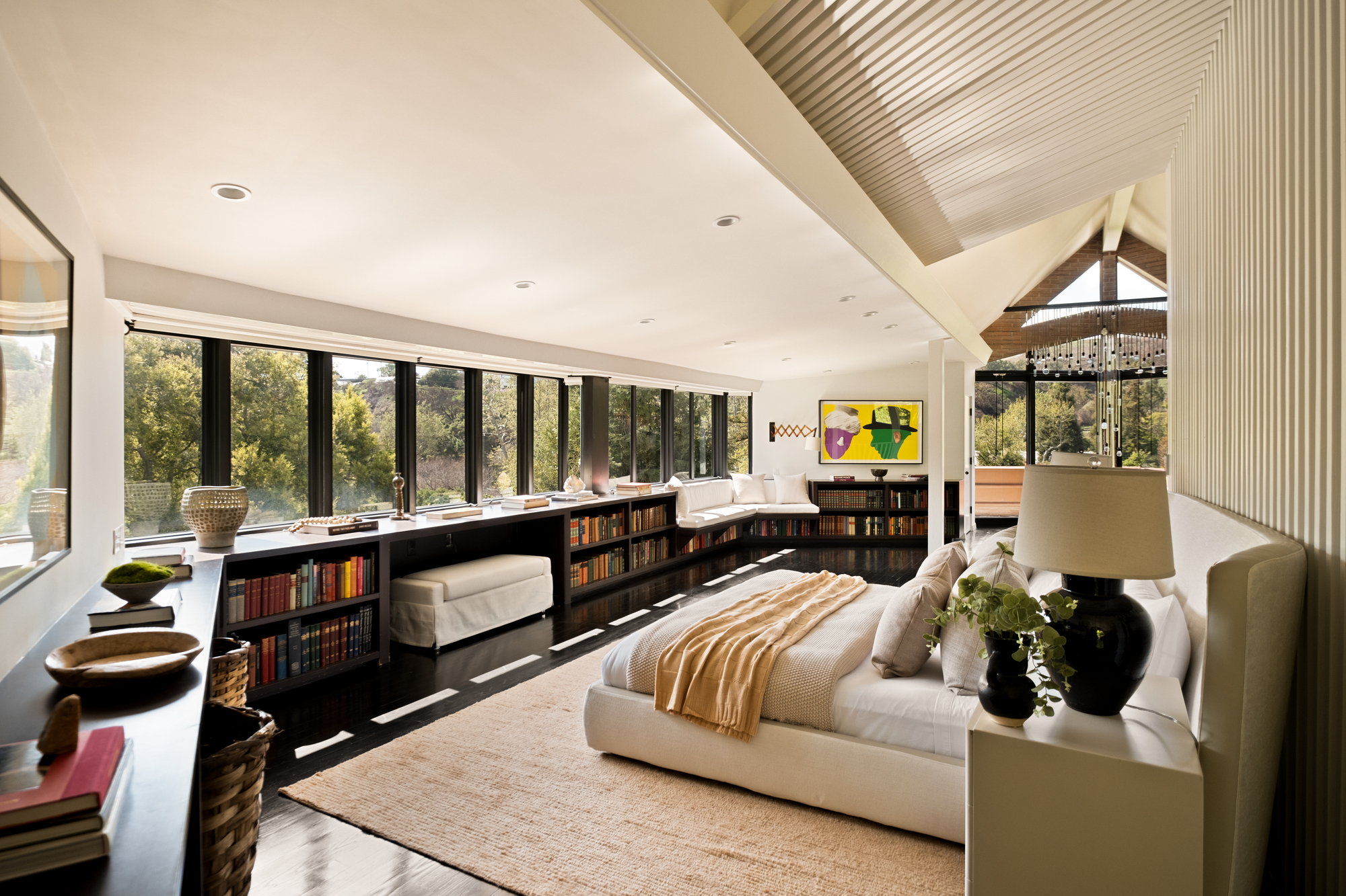
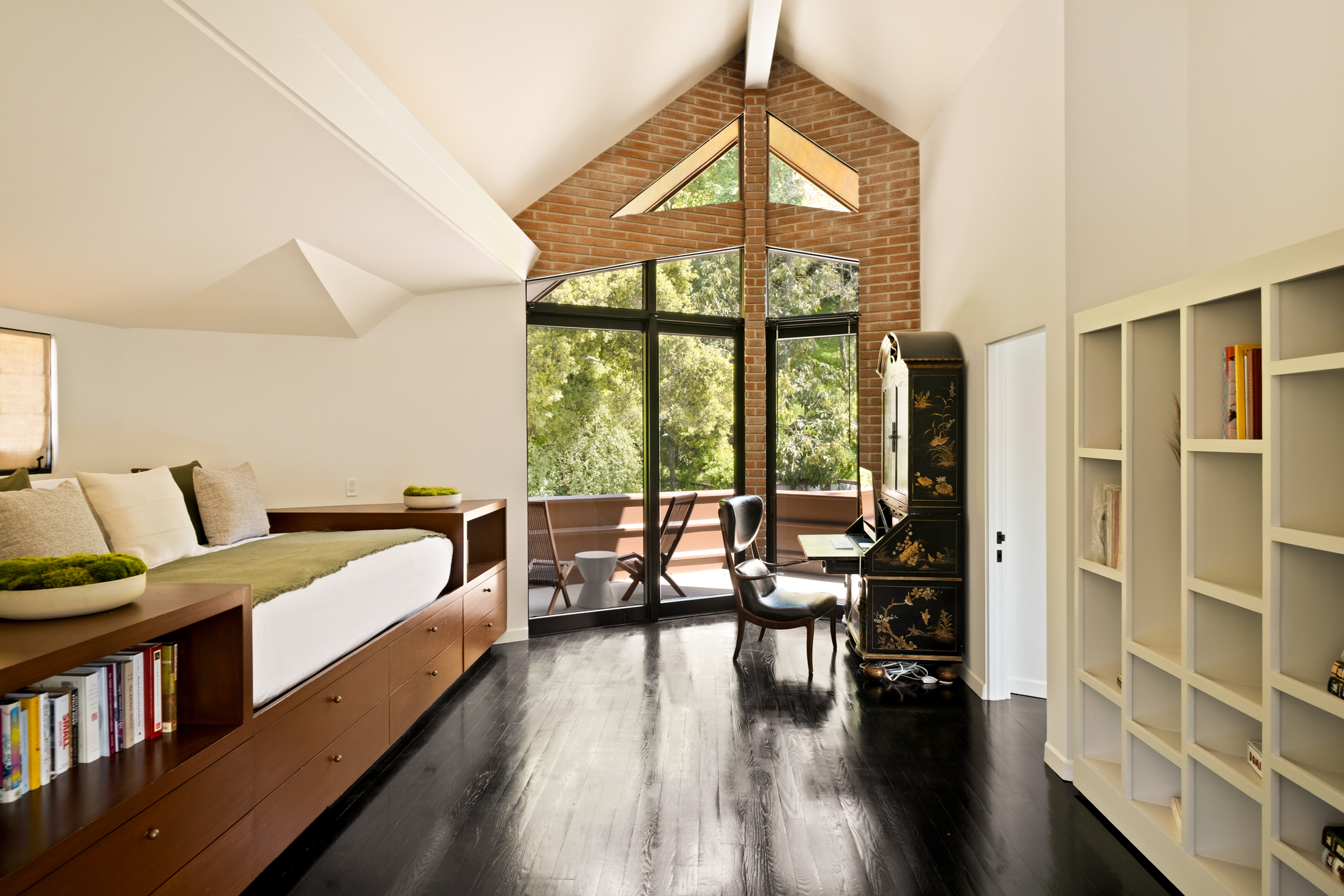
Maybe it's because of the current demand for retro and mid-century styles, but long and low furniture has recently become one of my favorite design details. Not only does this clever furniture provide ample storage, but it also boosts visual interest by drawing your eye throughout the room.
What starts as a simple storage idea becomes a unique architectural feature. Even the daybed in the image of the hallway becomes more interesting as a built-in element.
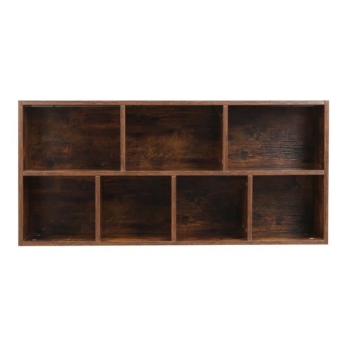
Though the custom styles with built-in bench seats and desks are the dream, you don't have to spend all your savings to recreate this look. Try finding a few shelving units to style side by side — even a good IKEA hack can mimic this Lloyd Wright style.
5. Brick Can be Beautiful
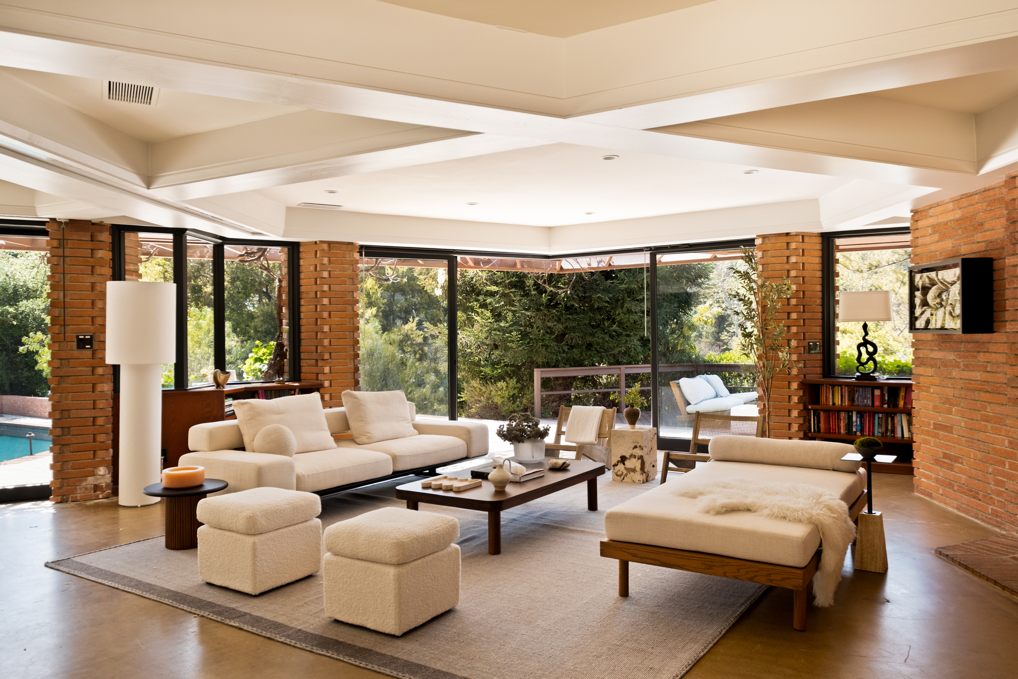
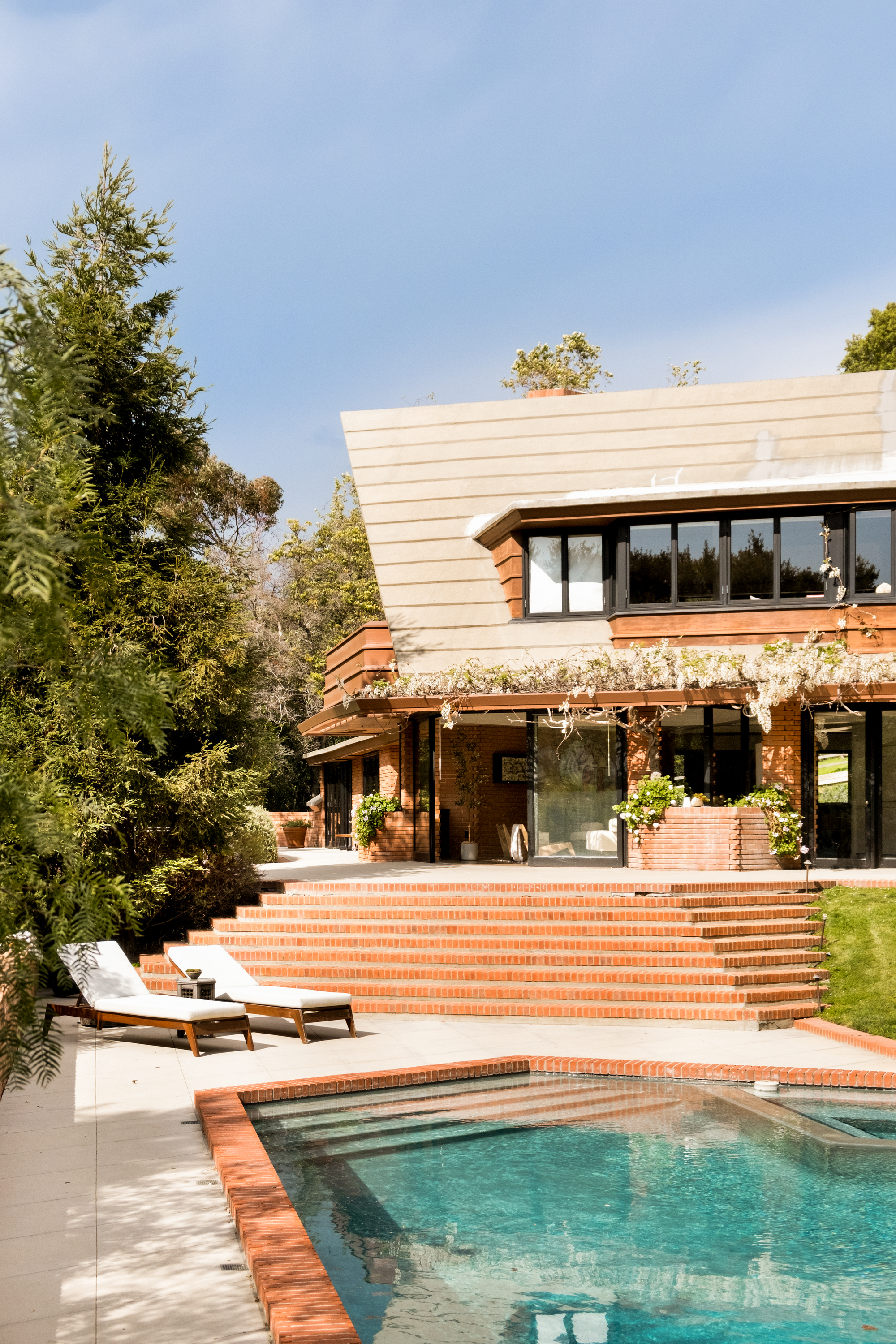
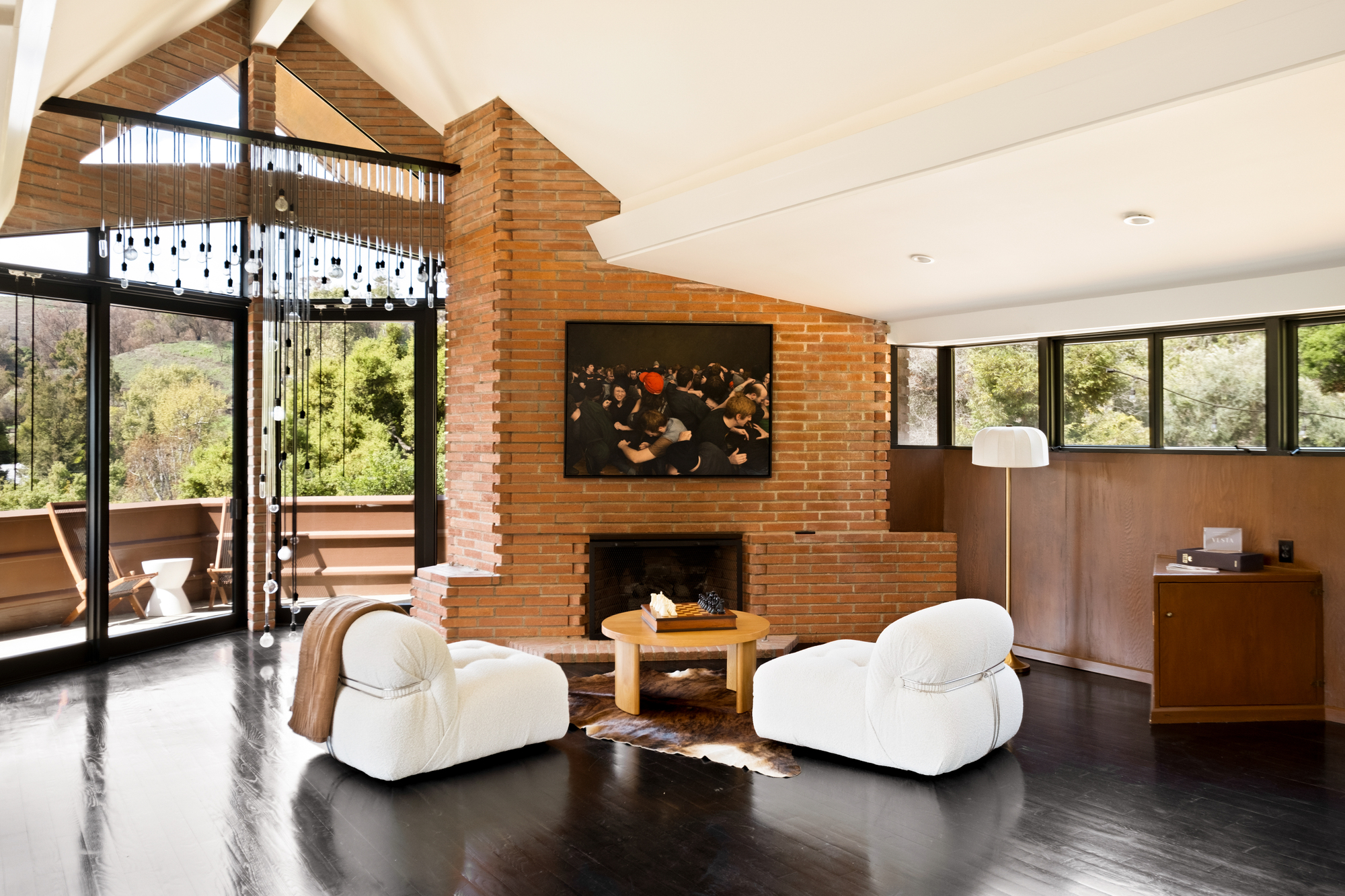
Most people love an old exposed brick wall, but modern brick sometimes gets a bad reputation in interior design trends. It can be perceived as too harsh, orange, or industrial. However, in this build, the more bricks the better.
Throughout the interior, brick is used as an accent wall idea and in statement-making features like the large fireplace in the upstairs living room. Both instances provide color and texture in the room, making what would otherwise be structural elements feel more like decor.
Even the strategic use of brick around the pool deck feels elevated rather than outdated.
Feeling inspired? There are plenty of other details from the homes of the Wright family to explore. The Winslow House inglenook by Frank Lloyd Wright is one of my personal favorites.

Olivia Wolfe is a Design Writer at Livingetc. She recently graduated from University of the Arts London, London College of Communication with a Masters Degree in Arts and Lifestyle Journalism. In her previous experience, she has worked with multiple multimedia publications in both London and the United States covering a range of culture-related topics, with an expertise in art and design. At the weekends she can be found working on her oil paintings, reading, or antique shopping at one of London's many vintage markets.
