The Livingetc newsletters are your inside source for what’s shaping interiors now - and what’s next. Discover trend forecasts, smart style ideas, and curated shopping inspiration that brings design to life. Subscribe today and stay ahead of the curve.
You are now subscribed
Your newsletter sign-up was successful
‘Derived from the oxidation of copper, this rich and striking shade is enjoying a renaissance due to the vibrancy that it brings to a setting,’ says Peter Gomez, head of design at Zoffany studio. ‘Not for the faint-hearted, it is definitely a choice for a colour-lover’s home.’
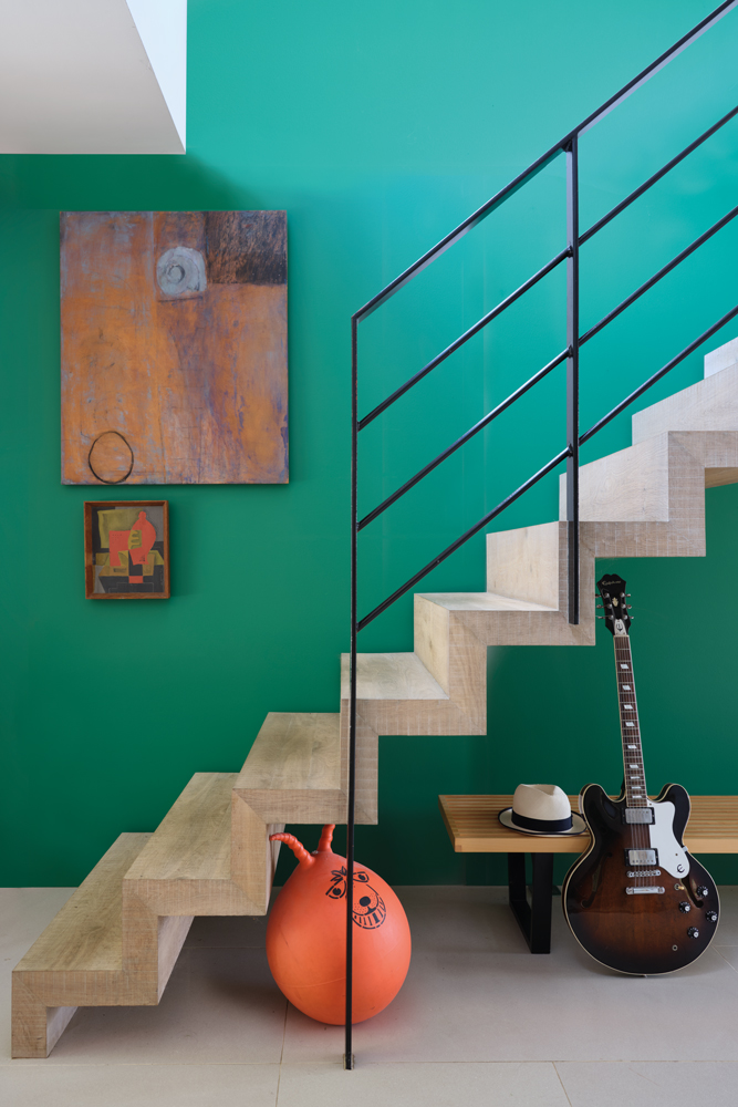
A minty fresh verdigris feature wall energises a space. Balance it out with a pale floor and contrasting white walls.
Verdigris green feels vibrant when teamed with lighter tones and more sober when partnered with darks.
Article continues belowVerdigris Green modern emulsion; Snow White estate emulsion (on ceiling), both £46.50 for 2.5L, Farrow & Ball.
‘I love pairing verdigris green with deep, warm reds and terracotta,’ explains Annie Sloan, founder of Annie Sloan.‘The key is to make sure the colours balance. Generally, green is a cool colour that recedes into the background. However, the more yellow it is, the warmer it looks and therefore the more attention it attracts.’
HOW TO USE VERDIGRIS GREEN
THE BEST VERDIGRIS GREEN PAINT COLOURS
BEST FOR CREATING A BOHO FEEL IN A SOUTH-FACING ROOM
The Livingetc newsletters are your inside source for what’s shaping interiors now - and what’s next. Discover trend forecasts, smart style ideas, and curated shopping inspiration that brings design to life. Subscribe today and stay ahead of the curve.

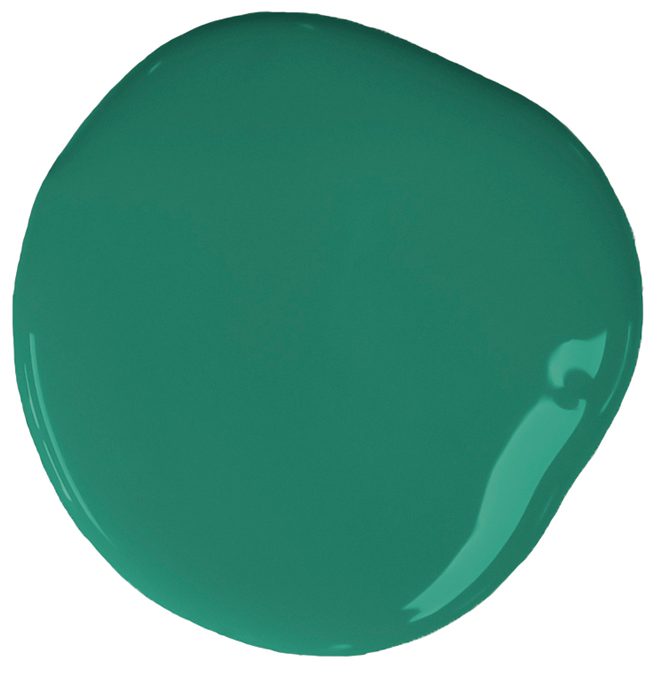
‘It usually has a copper green base, so although this colour appears to be happy and lively at first glance, it still retains a reassuring feel and underlying elegance,’ explains Joa Studholme, colour curator at Farrow & Ball. ‘In north-facing rooms this colour will feel more “green”, less dynamic, but more connected to nature.’
BEST FOR EAST OR WEST FACING ROOMS WITH FLUCTUATING LEVELS OF LIGHT

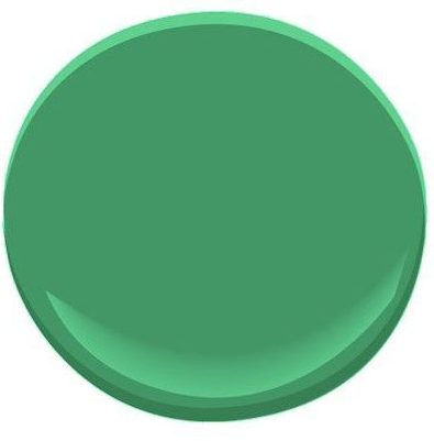
‘Verdigris is a versatile shade that can work all around the house,’ says Judy Smith , colour consultant at Crown. ‘It comes to life in natural light, so is perfect for a sunny living room. It also lends character to somewhere with little light, like a hallway. In this case, it is important to bring in warmth with terracotta and mid-tone wood.’
BEST FOR HIGH-TRAFFIC ROOMS WHERE A WASHABLE PAINT WILL GUARD AGAINST FINGERMARKS

‘Green is a fantastic hue to match with neutrals as it sits in the centre of the colour wheel and can be paired with both cold and warm undertones,’ says Helen Shaw, director at Benjamin MooreUK.‘A chalky, blue-toned grey can be combined with verdigris green to create a cool, calm scheme, whereas pairing it with a warmer, yellow-toned beige will create an earthy, outdoorsy feel.’
BEST FOR ADDING A POP OF COLOUR TO A FEATURE WALL

‘To create a colour statement, team verdigris green with vibrant pink soft furnishings to build a striking interior,’ says Rebecca Craig, head of design at Sanderson. ‘Crisp whites also work perfectly alongside verdigris green to give a fresh and defined look while bringing out the natural beauty of this elegant colour.’
BEST FOR FAST DRYING AND A BARELY THERE ODOUR

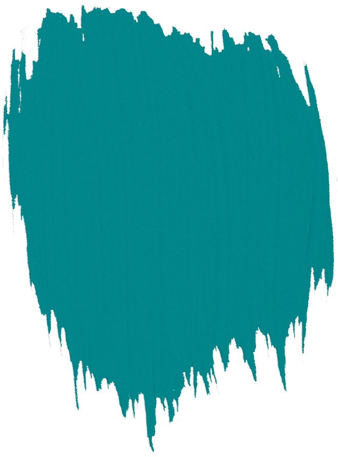
‘Vibrant, teal-toned verdigris is brimming with energy and it’s perfect for kitchens and bathrooms,’ says Colin Roby-Welford, creative director at Fired Earth. ‘Verdigris can be subtle and restful, too, so it’s also ideal for bedrooms and study spaces.’
BEST FOR CREATING A FABULOUS BACKDROP FOR WARM METALLICS

The homes media brand for early adopters, Livingetc shines a spotlight on the now and the next in design, obsessively covering interior trends, color advice, stylish homeware and modern homes. Celebrating the intersection between fashion and interiors. it's the brand that makes and breaks trends and it draws on its network on leading international luminaries to bring you the very best insight and ideas.