Lavender Bedrooms Are the Unexpectedly Modern Trend — Because Blue Schemes Have Been Done to Death
The forever-relevant lavender is a designer favorite; it's sophisticated, varied, and versatile, and sets the stage for a beautiful bedroom

The Livingetc newsletters are your inside source for what’s shaping interiors now - and what’s next. Discover trend forecasts, smart style ideas, and curated shopping inspiration that brings design to life. Subscribe today and stay ahead of the curve.
You are now subscribed
Your newsletter sign-up was successful
There's something innately charming about lavender. The tone — a mix of violet and white — encompasses an immense spectrum of colors, from light purples to pale pinks, to blues and even tinged-grays. Typically, the tone leans more towards purple and pink shades (whether they're light or dark), and evokes a sense of youth and freshness.
While lavender works beautifully in all spaces, it fits especially well within a bedroom scheme. That's because, while the color has a distinct decorative quality, it is also inherently relaxing. Designers, in fact, unanimously consider most purple bedroom ideas as a wonderful, modern tone to experiment with in your sleep space.
So, if you're in search of new bedroom color ideas, look no further. While the plant is said to help you sleep, perhaps the color of lavender could, too? Below, we've shared 10 lavender bedroom ideas to inspire.
Article continues below1. Contrast Lavender with a White Ceiling

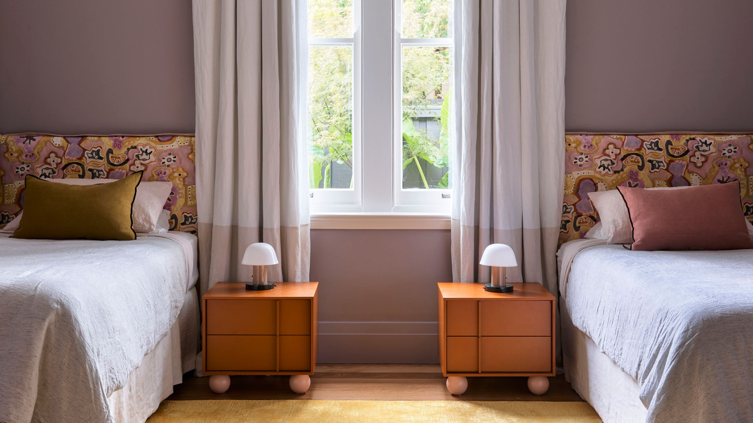
There are several colors that go with lavender, but a warm lavender looks particularly rich when contrasted with a crisp white ceiling or wainscoting. In fact, a lavender shade with a gray undertone can also be read as a neutral, which allows you to layer in more colors — say yellow or pink, for a pretty bedroom.
“Taking a cue from the original home’s Federation Arts and Crafts ethos, layers of color, materiality, and fine craftsmanship were carried through to bond the old and contemporary architecture, ensuring the new rooms had a current generation of detailing,” shares Sarah-Jane Pyke, principal at Australian-based studio, Arent&Pyke.
In this lavender bedroom, the designer had the opportunity to introduce warmth and color through the furnishing, wall paints, and décor. "Even though the natural light was diminished, the interiors were sunny," she explains. "Yellows, pale pinks, and lavender are all happily present, resulting in a home that is a warm bright embrace.”
2. Introduce Touches of Lavender Through Artwork
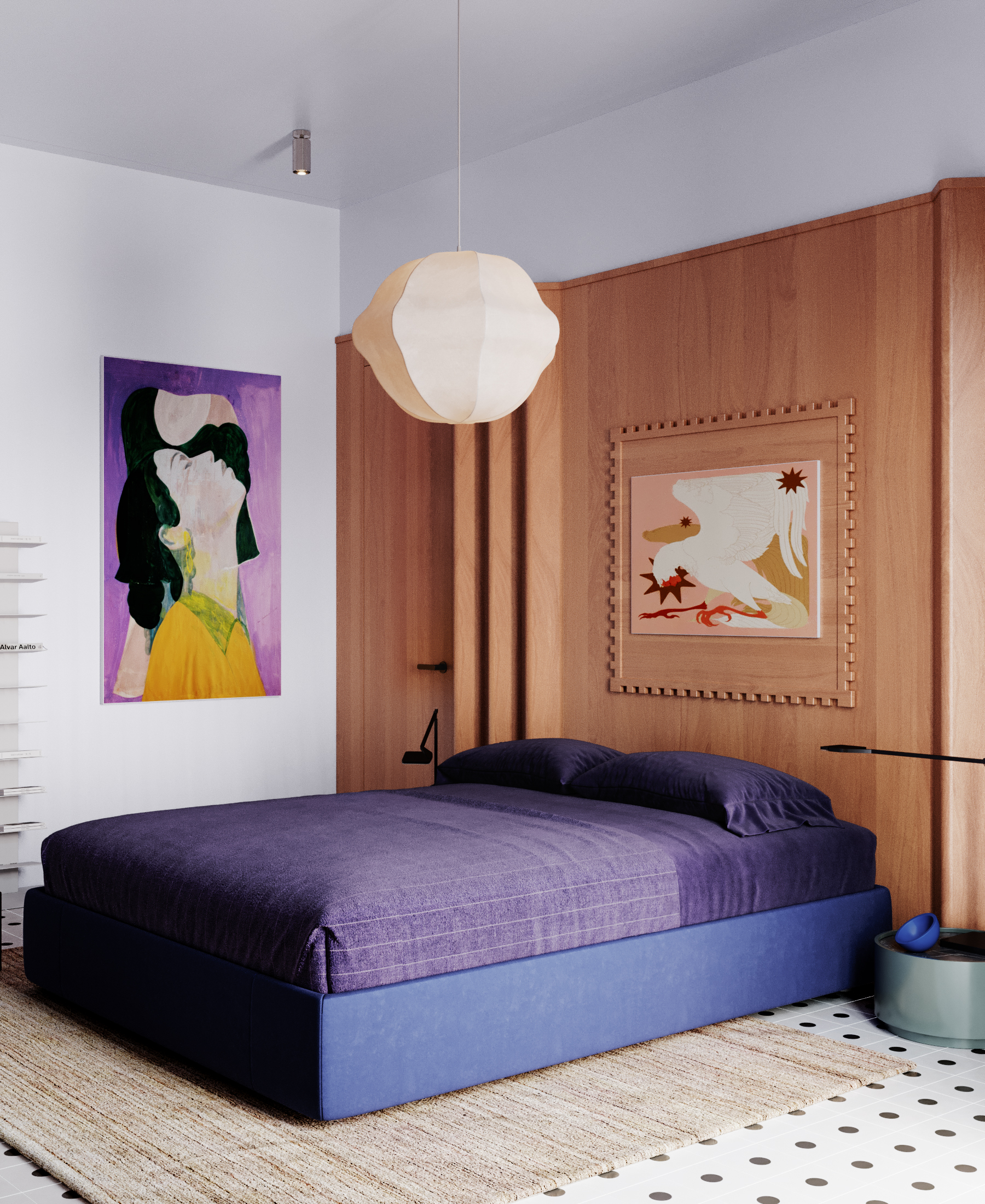
Painting your wall can feel a bit too permanent; furnishings, accessories, and artwork are a less risky way to add a new color to a room. In this colorful bedroom by Lake and Walls, the purple bedspread and lavender artwork both imbue a fresh, fun feel to the room, their tones lifted by the white walls and wooden elements in the space.
The Livingetc newsletters are your inside source for what’s shaping interiors now - and what’s next. Discover trend forecasts, smart style ideas, and curated shopping inspiration that brings design to life. Subscribe today and stay ahead of the curve.
“In this bedroom, we chose a purple-lavender scheme and added wooden elements to refrain the space from feeling cold,” say Zavarzina Oksana and Eugene Shevchenko of Lake and Walls. “The graphic floor acts as a neutral background and helps emphasize the main details of the room, making them even more expressive and bright.”
3. Layer Purple With Similar Shades
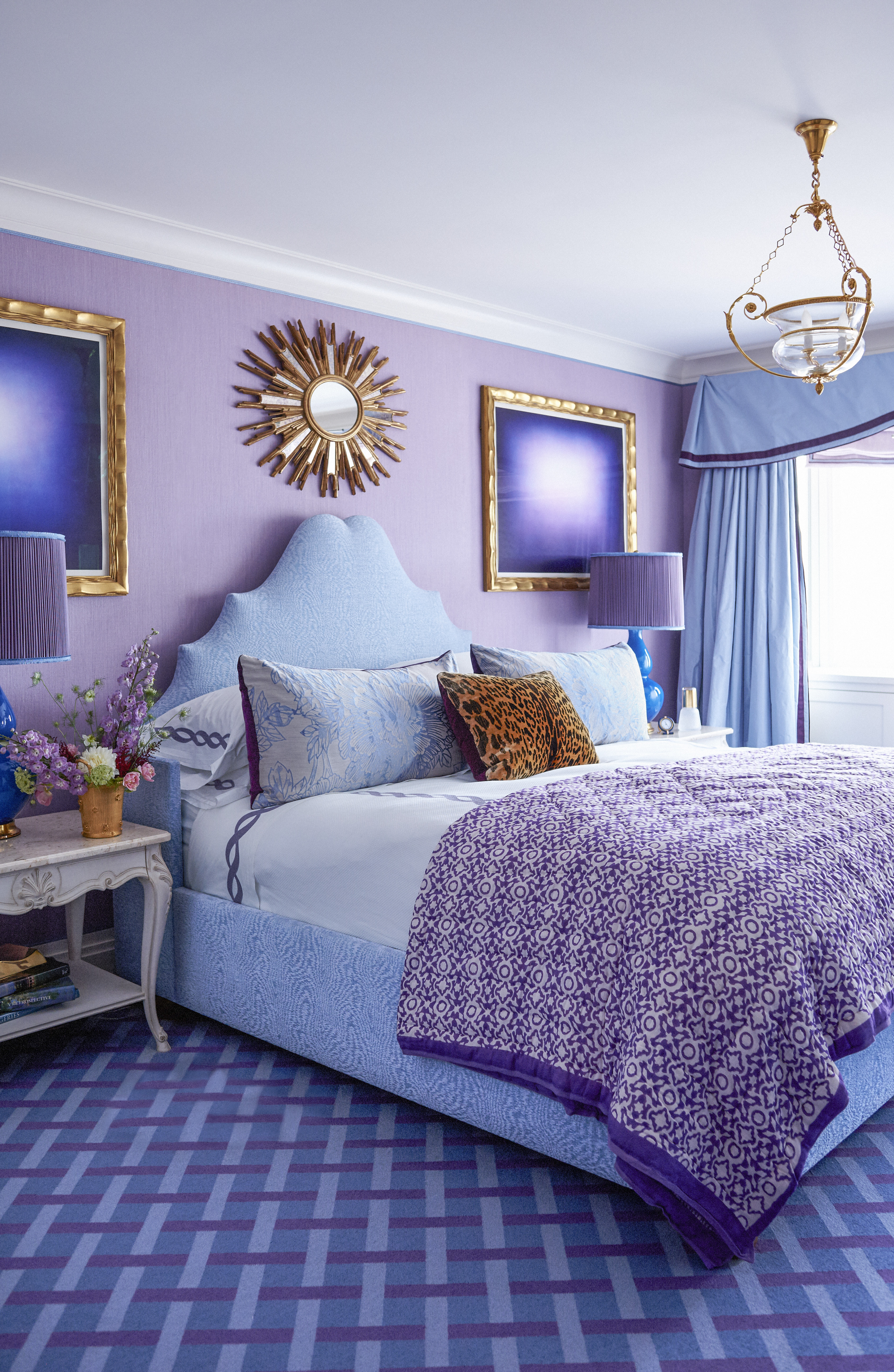
A warm lavender shade is a great way to add a punch to a more modern bedroom, while the tone also acts as a lovely contrast to black, blue, or dark gray, should you wish to add more layering to the scheme.
“This bedroom was for a husband and wife,” says Alex Papachristidis of Alex Papachristidis Interiors. “The wife loves purple, while the husband loves blue, so we brought the two colors together. We always like our projects to be a reflection of our client’s sensibility.”
4. Add Softness to a Kids' Bedroom
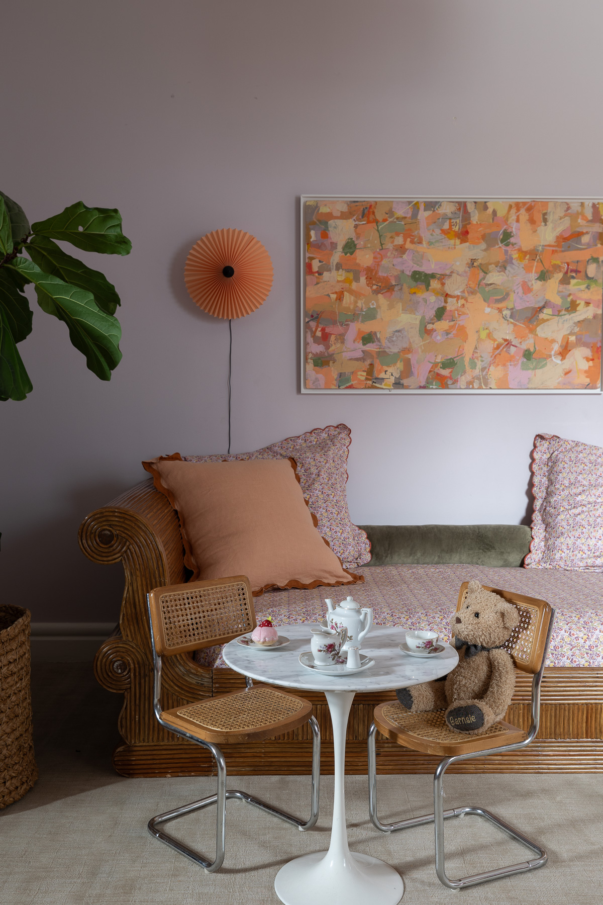
Parents often tend to choose pink, blue, or yellow for kids' rooms, and while these more conventional colors certainly work, there are plenty of lavender bedroom ideas worth considering — for girls or boys. Lavender makes for calming bedrooms, while still imbuing the space with personality. Take this space designed by Bethany Adams Interiors, for instance.
"When my daughter moved out of the nursery and into her new room, she chose Benjamin Moore's New Agefor her walls (from among some carefully pre-selected options, of course)," shares Bethany Adams of Bethany Adams Interiors. "To keep the lavender from feeling fussy, I accented it with rust drapery panels from Anthropolgie, charming floral and linen bedding from Garnet Hill and Bed Threads, and a vintage abstract painting. She calls the vintage rattan sleigh daybed bought at auction her "sled bed" and delights in its coziness."
5. Color Block Varying Shades of Lavender
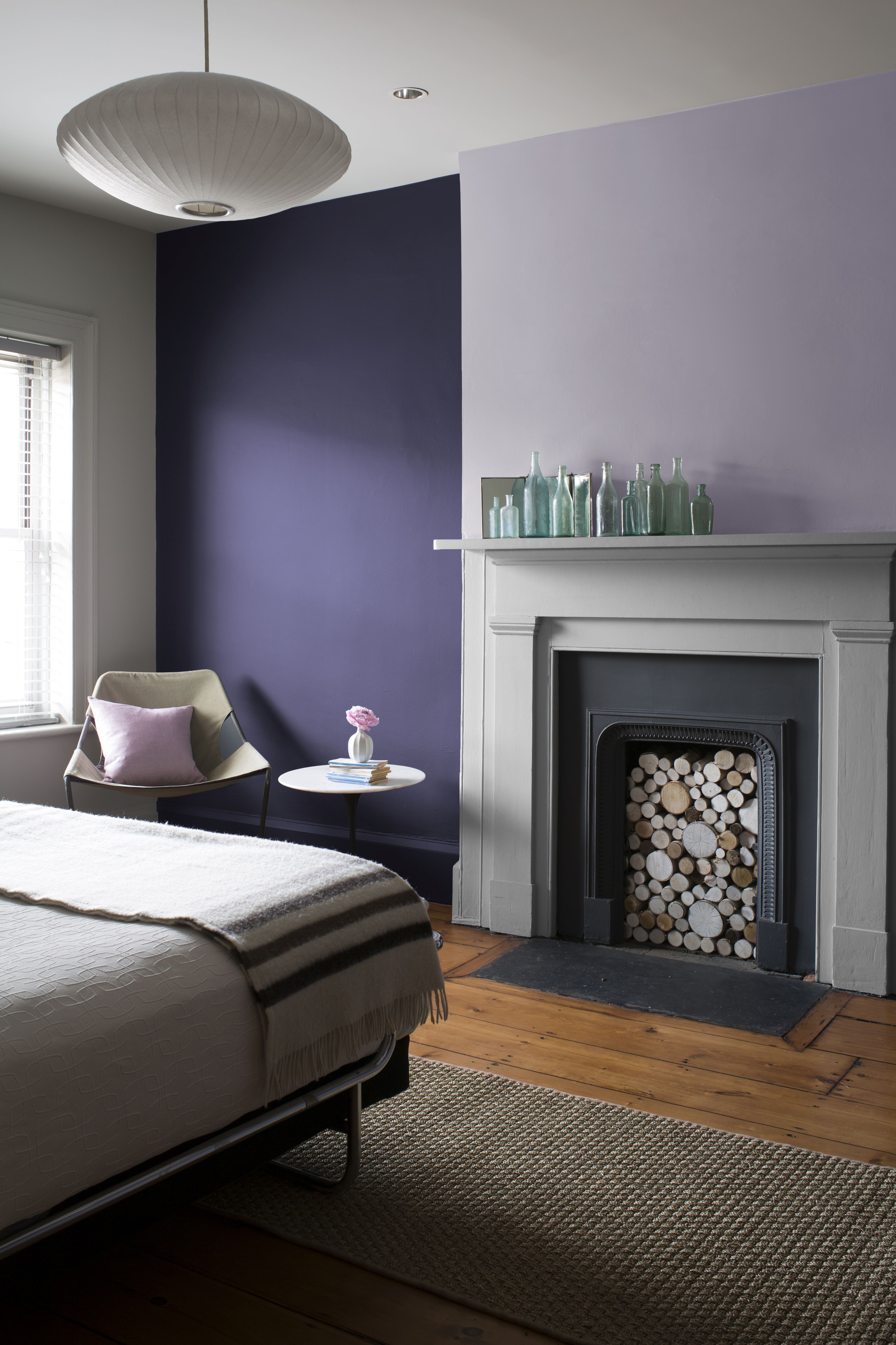
It's a technique recently referred to as 'double drenching', when you color block two shades of the same color in a space. In this lavender bedroom idea, the softer and more saturated shades come together to create a striking visual, and give the bedroom depth and dimension.
If you want to further elevate your lavender bedroom, consider introducing metal accents on the wall. "I love a deep, dark bronze mixed with purple," says Lauren Sands, founder of LES Collection. This will give the room an elegant, regal look.
6. Color Drench a Space in Lavender
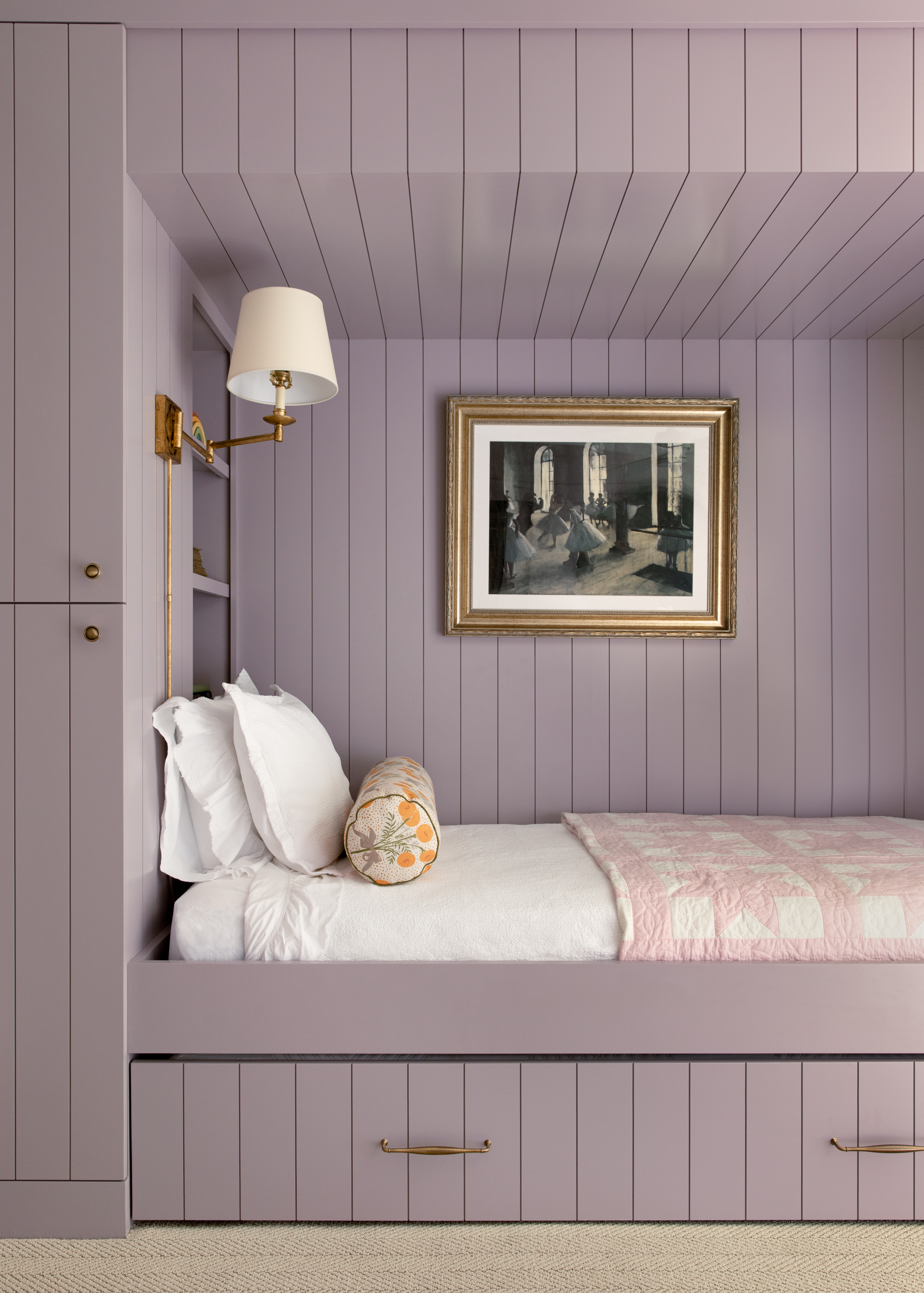
Everyone loves a good built-in structure; in fact a box bedroom storage unit like this is ideal in homes that are either too small or lack enough closet space. But more often than not, these built-ins tend to look too utilitarian. Color drenching is a good way to give this sort of a bed personality.
"We were looking for a color that lent itself to a feminine aesthetic but wasn’t overtly girly so naturally the color lavender came up," explains Shannon Eddings, founder of Shannon Eddings Interiors. "It reminds me of West Texas and New Mexico sage brush and this color is appropriately named ‘Desert Mauve’."
For this lavender bedroom idea, Patrick O'Donnell, color expert and ambassador at Farrow & Ball suggests using Brassica, which is a smoky lilac. “This shade is ideal for those who prefer grayer tones and are hesitant about using color. It creates drama and light in equal measure, feeling fresh and calm when bathed in natural light, while appearing deeply moody in darker environments. It is a deceptively calming color that pairs beautifully with Strong White on your woodwork," he adds.
7. Opt for a Feminine Pale Lilac
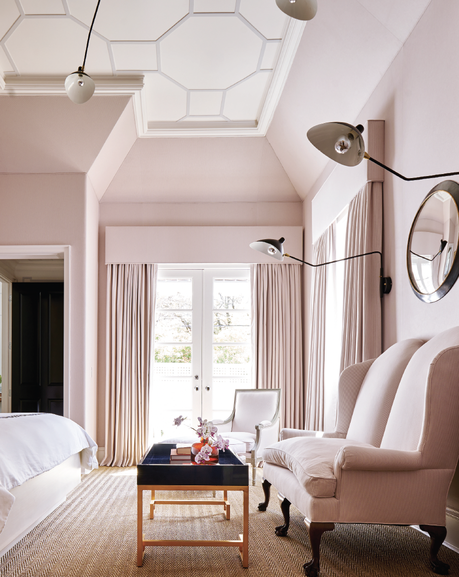
Lilac, a pale purple tone with a hint of pink. falls somewhere between lavender and mauve. It's a great tone to use if you're interested in drenching a space, and wish to use a tone that has more personality than white or cream, but isn't overwhelming.
In this lavender bedroom by interior designer Meredith Steinhart, the color also helps highlight the unique architecture of the room. "We used lavender and white together to create an intimate, “cocoon-like” effect," shares the designer.
If you're interested in trying this lavender bedroom idea, Farrow & Ball's Patrick O'Donnell suggests their Sugared Almond shade; "At the paler end of the lilac spectrum, it's a lovely, soft lilac," he says.
8. Create a Luxe Look With a Moodier Lavender
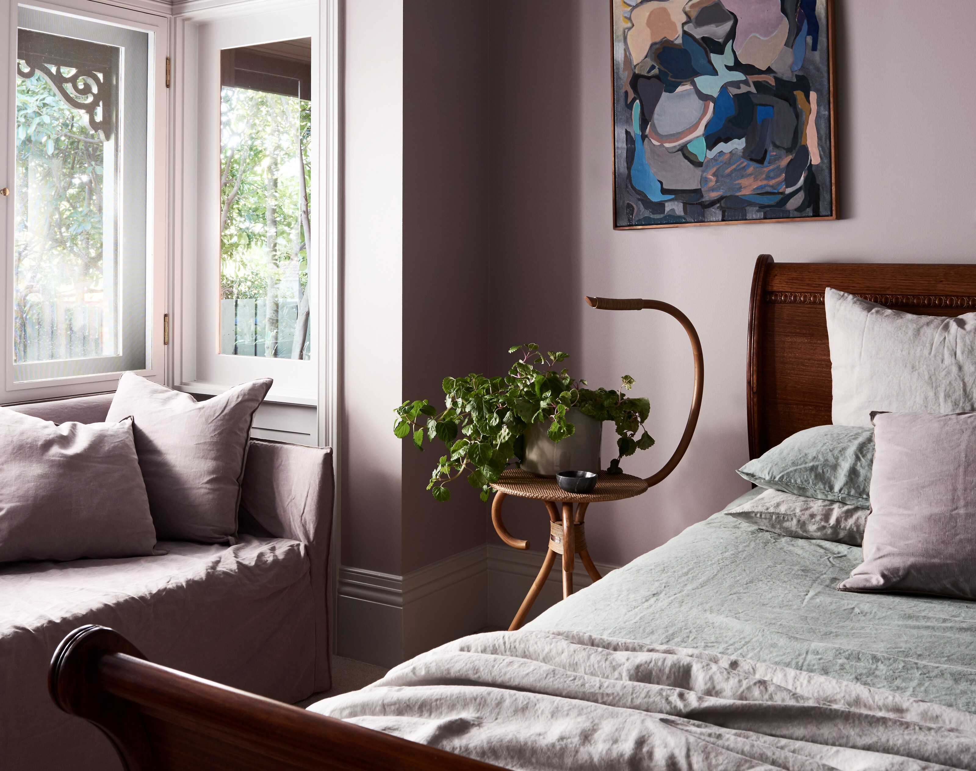
Add sumptuousness and create a cozy bedroom with a dark to mid-tone lavender. Was the walls and furnishings in this color, and complement the scheme with wood tones to add further warmth. It's best to use such a color scheme in a room that receives a lot of sunlight, as deeper tones can make a room feel too caved in and listless.
"If you think about it, the lavender plant is used in aromatherapy to promote deep sleep with its soothing fragrance, and by association, we connect the color lavender with the same properties," explains color expert Paula Taylor of Graham & Brown. "It is a calming color, gentle on the eyes, and it helps reduce visual stimulation and promotes relaxation. It is also associated with mindfulness making a space feel safe, cozy and inviting therefore it is a perfect color for the entire bedroom."
9. Style Your Bed With Lavender Bedding
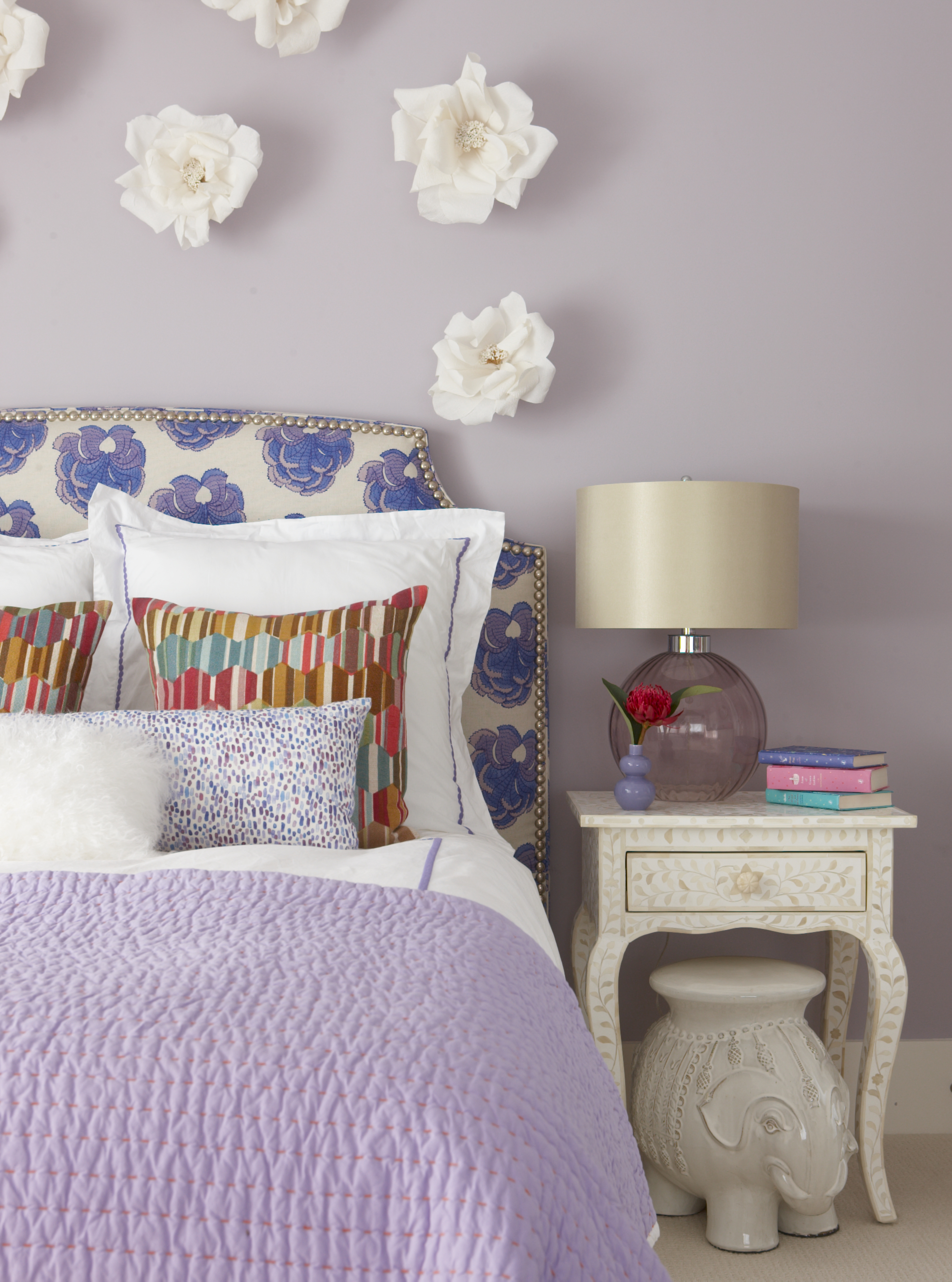
Unlike an eggplant-equivalent purple, lavender is a soft, easy color that looks great when styled as bedding (in fact, it's considered one of the best sheet colors for sleep). The shade is elegant and subtle, adding an attractive, and inviting feel to your space. What's more, lavender's light to medium tone makes it a versatile color for both dark spaces and sun-filled rooms.
“We designed this bedroom for a little girl who loved purple,” shares Rachel Reider of Reider + Co. “We wanted to ensure that it would resonate with her so balanced her current likes with a sophisticated palette that would be timeless.”
10. Make an Accent With a Half-Painted Wall
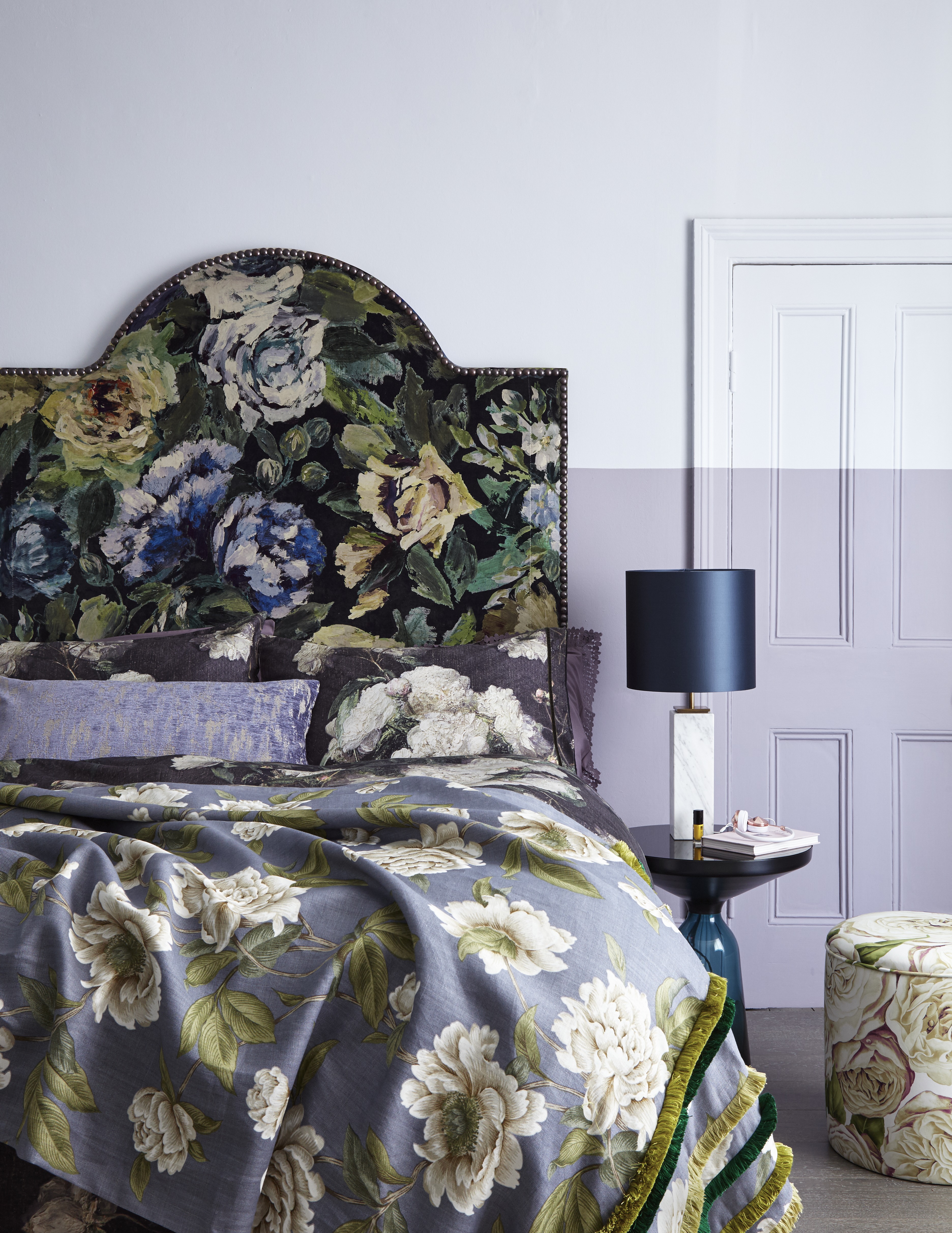
Fully painted, color-drenched rooms certainly have their own charm and effect, but if you want to create a more design-forward, architectural look, designers suggest you experiment with datum lines; a great paint technique for walls.
These half-painted lines work especially well in apartments with period details. It's like a nod to the period style and acts as a modern iteration of a wainscot or chair rail. Also, in exceptionally tall rooms, it helps reduce the visual scale, and makes the space feel more livable.
FAQs
Is Lavender a Good Color for the Bedroom?
Lavender has soothing and calming properties, creating a tranquil atmosphere that's easy to unwind in. It’s also versatile — the softer, lighter tones of lavender can be paired with almost any color on the spectrum, as it acts as a neutral. In rooms with natural light, lavender reflects light beautifully, creating a fresh and airy feel. In nature, the lavender plant is often associated with positive energy and freshness, and the color carries those same visual qualities.
What Colors Go in a Lavender Bedroom?
You’ll be surprised — there are several options. Choose a soft lavender and pair it with blush pink, mint green, and pale blue for a soft, dreamy look. For a strong contrast, opt for a mid-tone lavender and pair it with navy blue, charcoal, emerald green, or even metallic tones like gold or silver. Finally, for the lightest color scheme, layer lavender with cream, beige, or light gray.
Lavender bedroom ideas tend to be warm, inviting spaces packed with personality and a timeless elegance. Whether you use it to drench your space, or opt to incorporate it as more of a neutral shade, it's no surprise it's a designer favorite.

Aditi Sharma Maheshwari started her career at The Address (The Times of India), a tabloid on interiors and art. She wrote profiles of Indian artists, designers, and architects, and covered inspiring houses and commercial properties. After four years, she moved to ELLE DECOR as a senior features writer, where she contributed to the magazine and website, and also worked alongside the events team on India Design ID — the brand’s 10-day, annual design show. She wrote across topics: from designer interviews, and house tours, to new product launches, shopping pages, and reviews. After three years, she was hired as the senior editor at Houzz. The website content focused on practical advice on decorating the home and making design feel more approachable. She created fresh series on budget buys, design hacks, and DIYs, all backed with expert advice. Equipped with sizable knowledge of the industry and with a good network, she moved to Architectural Digest (Conde Nast) as the digital editor. The publication's focus was on high-end design, and her content highlighted A-listers, starchitects, and high-concept products, all customized for an audience that loves and invests in luxury. After a two-year stint, she moved to the UK and was hired at Livingetc as a design editor. She now freelances for a variety of interiors publications.
