What Colors Go With Pistachio Green? 13 Combinations That Prove the Versatility of This “Nutty” Tone
Experts and trendsetters have discovered the decorative side of pistachio and have found color pairings you'll want to experiment with


The Livingetc newsletters are your inside source for what’s shaping interiors now - and what’s next. Discover trend forecasts, smart style ideas, and curated shopping inspiration that brings design to life. Subscribe today and stay ahead of the curve.
You are now subscribed
Your newsletter sign-up was successful
Pistachio green is a trending color that's here to stay. This delectable shade, reminiscent of creamy gelato, lends spaces a sumptuous quality and a nature-inspired calmness. It's more refined than lime green and lighter than the somber teal. As a yellowish-green shade, it strikes a balance between eye-catching and mellow, drawing inspiration from the pistachio nut.
There are plenty of ways to incorporate this tone into your space. An accent wall painted pistachio, paired with a white ceiling, is one of the easiest ways to create a soothing combination. For those who wish to go bolder, this shade pairs effortlessly with deeper colors like charcoal, black, or even red. Additionally, the main colors that go with green — such as brown, pink, and beige — pair well with pistachio, too.
Explore these expert-recommended combinations to find a shade that perfectly suits your interiors.
Article continues below1. Lilac

Many colors go with pistachio green, and a great combination to try is lilac, particularly if you're interested in color-blocking walls for an eye-catching interior. The two tones wonderfully offset each other, and offer a confident interior scheme.
If the pairing appeals to you but you want to tone down its visuals, consider using them as accent colors; perhaps paint a wall pistachio green with lilac borders.
"Pistachio is a wonderful color to work with," says Amy Krane, architectural color consultant and founder of Amy Krane Color. "Green is a cool color but pistachio is a warm green. It’s a warm, cool color and that’s complex! It allows for endless combinations with mid-toned or dark neutrals, pales or pastels, and bright saturated colors as well. It’s the color of spring and signals freshness and new beginnings. It offers a wide field of opportunities."
2. Brown
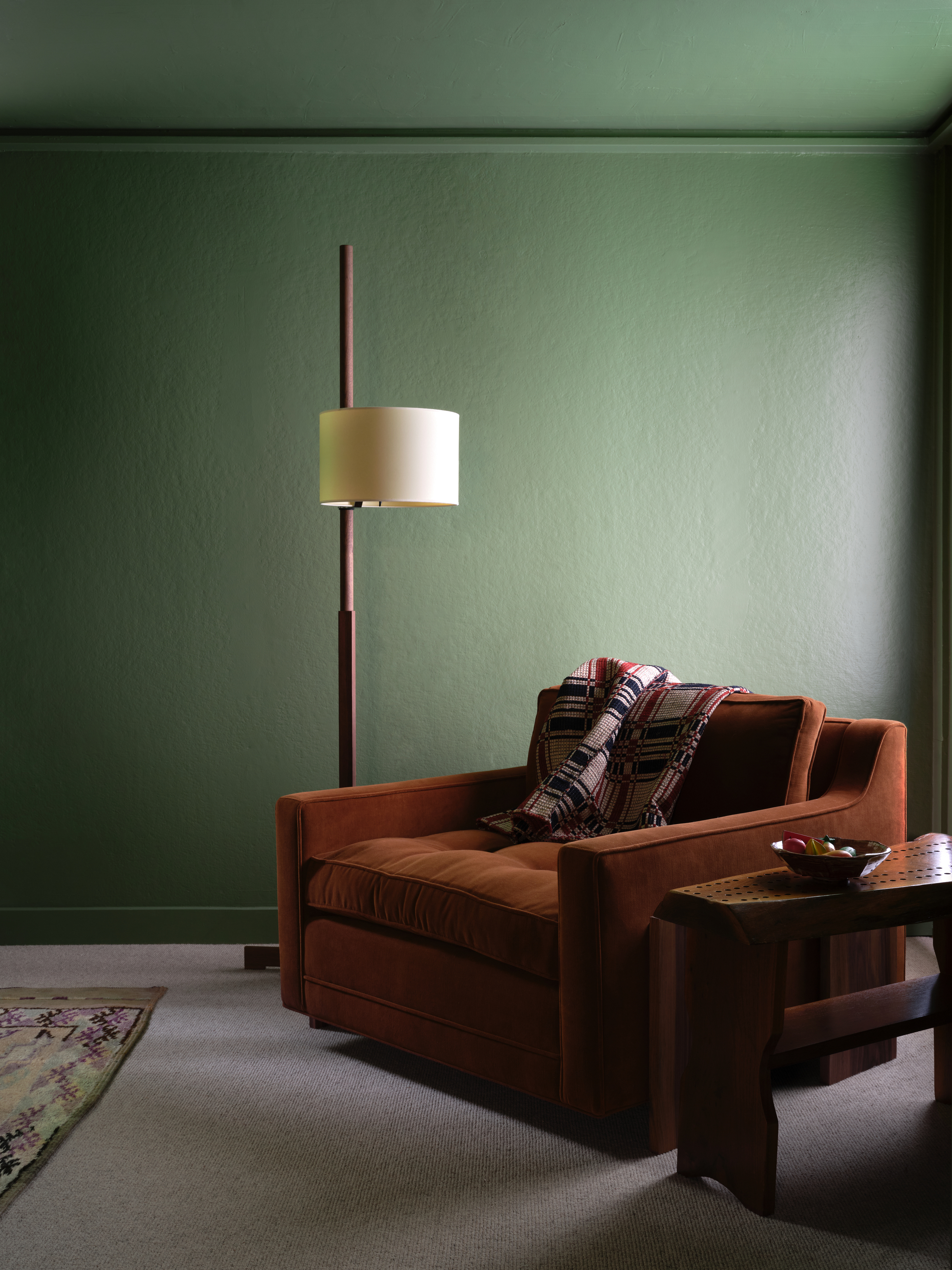
Among the colors that go with brown is pistachio — a soothing pairing usually seen in nature. This shade of green lifts the sober, grounding brown and adds a sprinkle of brightness. This is a great bedroom color idea or could even be used for a reading room, which needs to be both serene and well-designed. For a scheme that has more depth, consider choosing a darker shade of pistachio.
The Livingetc newsletters are your inside source for what’s shaping interiors now - and what’s next. Discover trend forecasts, smart style ideas, and curated shopping inspiration that brings design to life. Subscribe today and stay ahead of the curve.
"Browns are on the deepest part of the neutral color spectrum so, it is a naturally rich color or tone," says interior designer Christina Rottman. "This color is less contrived than a primary or secondary color like a dark green or a dark blue." When together, they balance each other well.
3. Blush pink

Pink and green are a match made in design heaven as they both bring out the best in each other. When done right, and used in the right quantities, the two can be effective in creating a calming mood in a space. You can also use these colors as simple touches in a more neutrally designed room.
When picking colors that go with blush pink, consider tones that have a similar, soft visual for a more timeless space. So a pistachio green — as opposed to a lime green — or a deep olive works really well. For a warmer interior, add wood elements (via furniture and accessories) as the natural tone will further ground the scheme.
4. Yellow
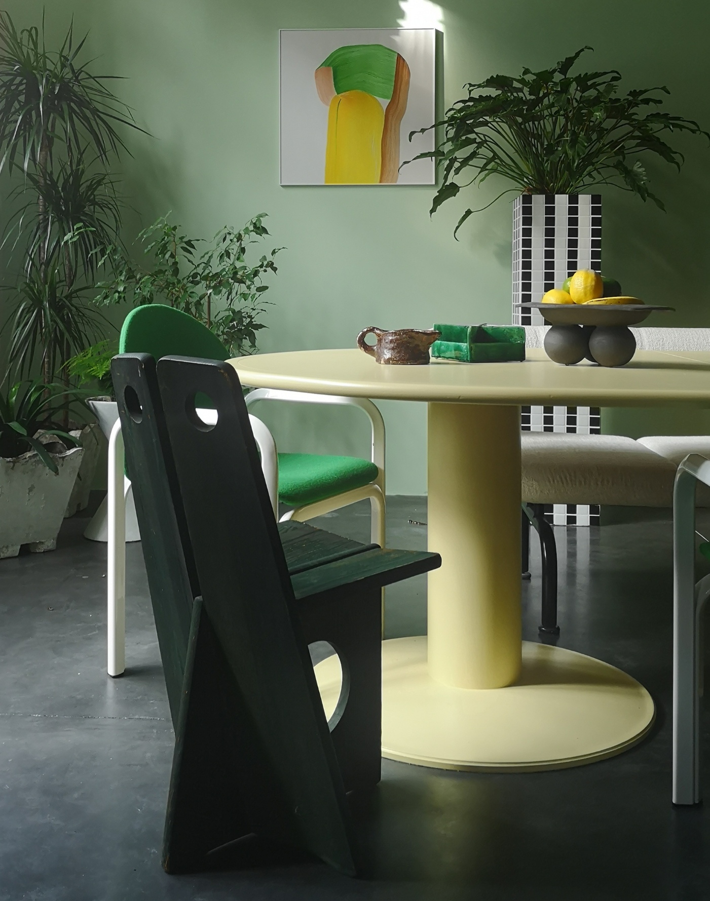
Many colors go with yellow, and the combination of green and yellow is particularly beautiful — especially when you choose yellow in lighter, greener tints that promote a springtime feel. This combination is fresh and perennially youthful. A super muted yellow can, in fact, even work as a neutral, upon which you can layer several tones.
"I really like to use analogous colors, and then energize certain areas with one or more complementary colors," says Hélène Rebelo, set designer and curator, interior styling consultant, and founder of Cool Machine. "I also choose a lot on a whim, and green is one of my favorite colors."
"For this space, I chose my color palette based on two things — a set of vintage Orsay chairs by Gae Aulenti for Knoll with wool in a vibrant sports green, and a Julie Lansom artwork on the wall," says Hélène. "The scheme was developed mostly from these items."
5. Wood tones
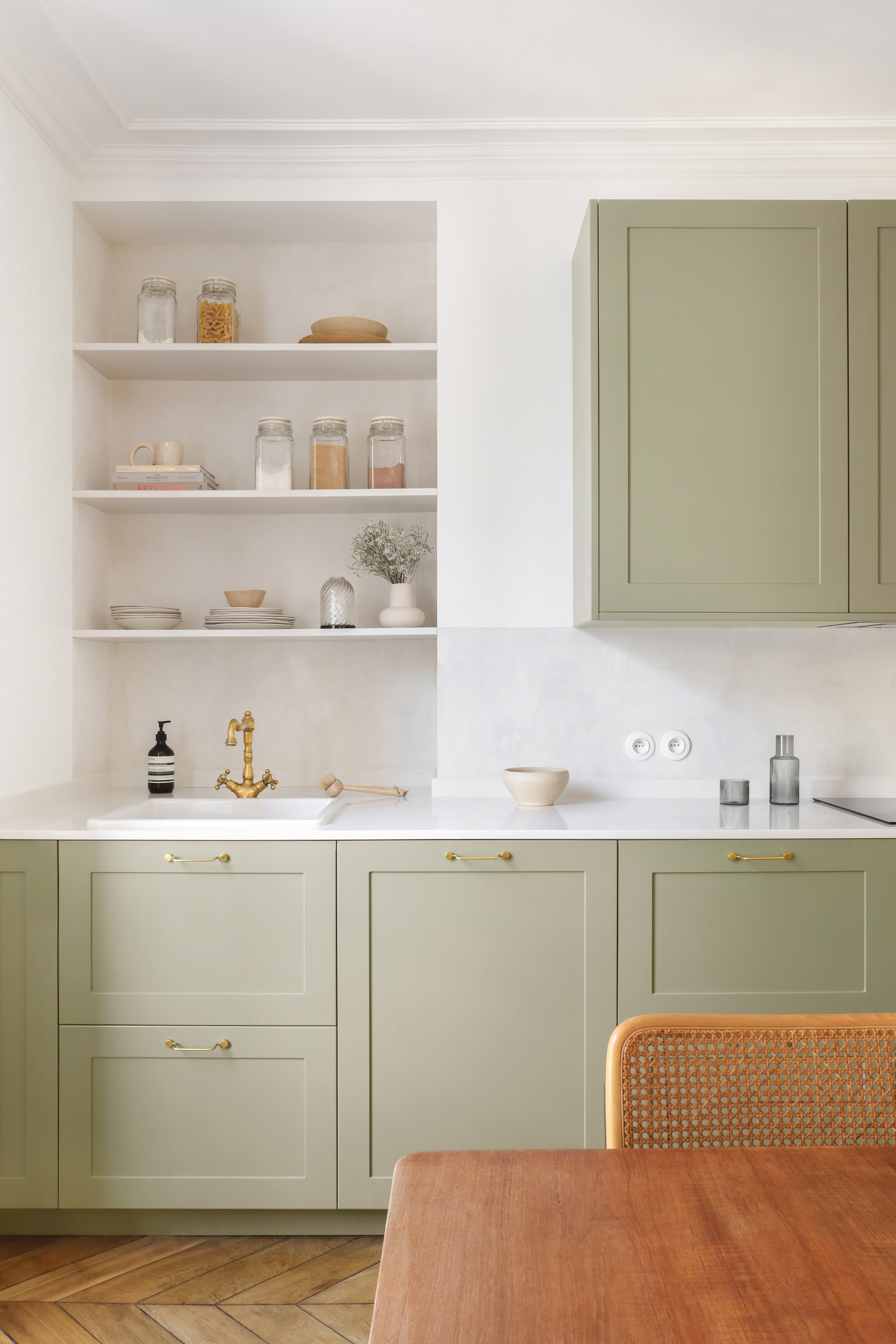
A color combination straight from nature, which means you can't go too far wrong — decorating with brown or other wood tones can, at first, feel a little dated but to lift it up, use ample green to create the interior of your dreams.
A softer shade of pistachio will allow you to subtly, yet noticeably, highlight interior features (such as cabinets, accent walls, decoratives, etc). To further ground the scheme, go with softer, more earthy browns, like a 'twig' brown, to a darker, more walnut brown.
6. Orange

If you're in the mood to create an impactful, dramatic interior, then pair pistachio with an equally deep-toned hue like bright orange.
Pistachio and bright orange is a creative, yet brave scheme. Due to their energetic and sometimes overwhelming visuals, it's a good idea to try them in smaller spaces or quantities — perhaps a children's bedroom, a corner, or a space where either of the shades is used on smaller surfaces. The advantage of using these as accent elements, like in this project by Space Factory, is that these can be changed up whenever required.
If you do want to keep the pistachio and orange scheme intact, think of other colors that go with orange to create a more layered scheme where the intensity of all colors is diluted for a more cohesive interior.
7. Pale pink
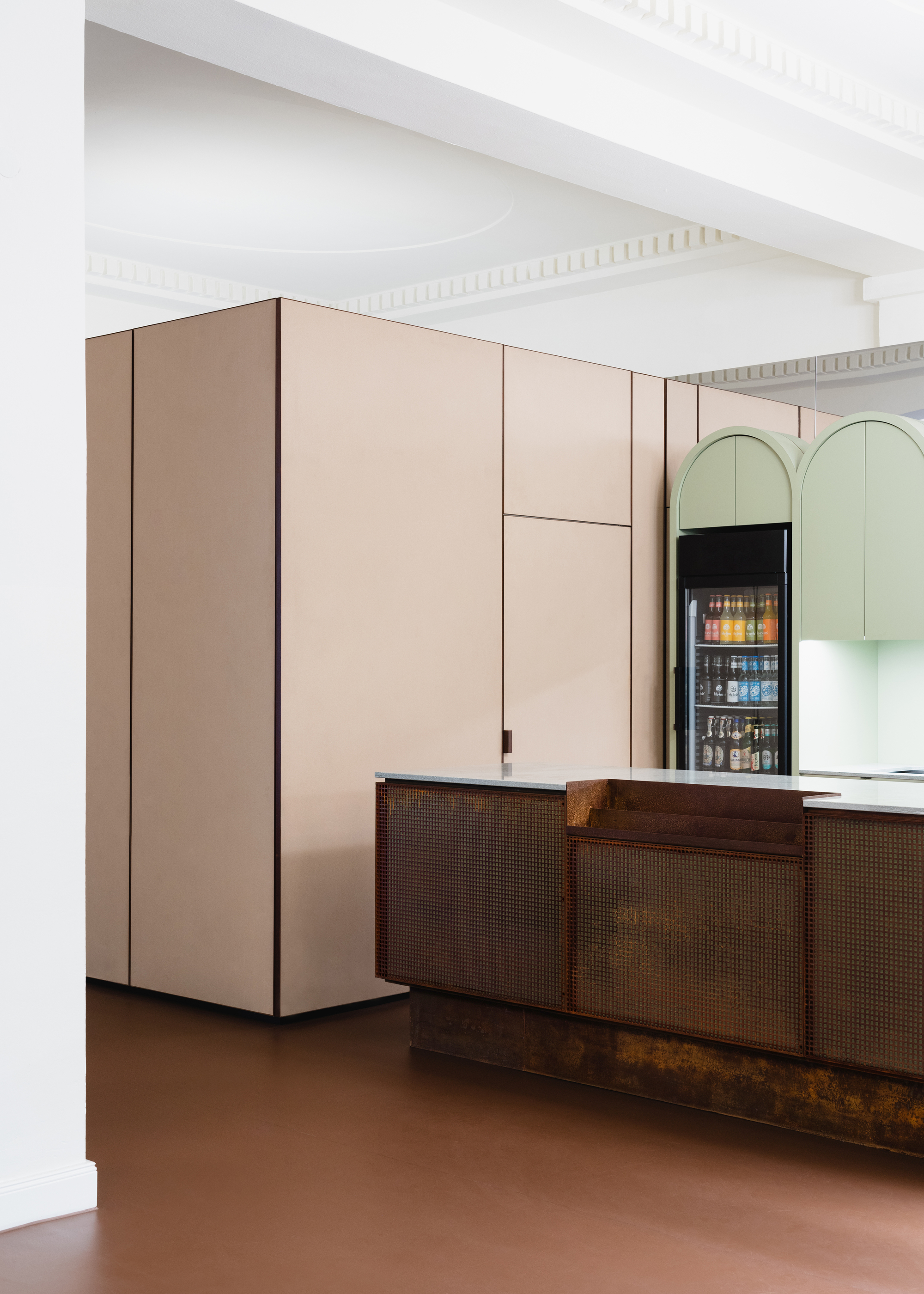
Pink is a tone that flows unabashedly through homes and creates some of the most eye-catching combinations. Many colors go with pink, and it's a great companion to pistachio green.
While a bolder version of each of these colors could create an interior that may be a little too OTT, the warmer, more grounded tones (think pink with a brown or grey undertone) would work great with a more diluted green. Instantly soothing to look at, this color combination would work especially well in spaces that need a little bit of calm — like the kitchen or a reading room.
"The natural tones of the color concept [above] follow the earthy reddish-brown color of the original preserved linoleum flooring in the foyer," says Patrick Batek, lead architect and founder of Batek Architekten. "The color palette is complemented by the surprising addition of a soft pistachio-green coat for the arched foyer bar and balanced by a pale natural cork covering on the cupboard fixtures."
8. White
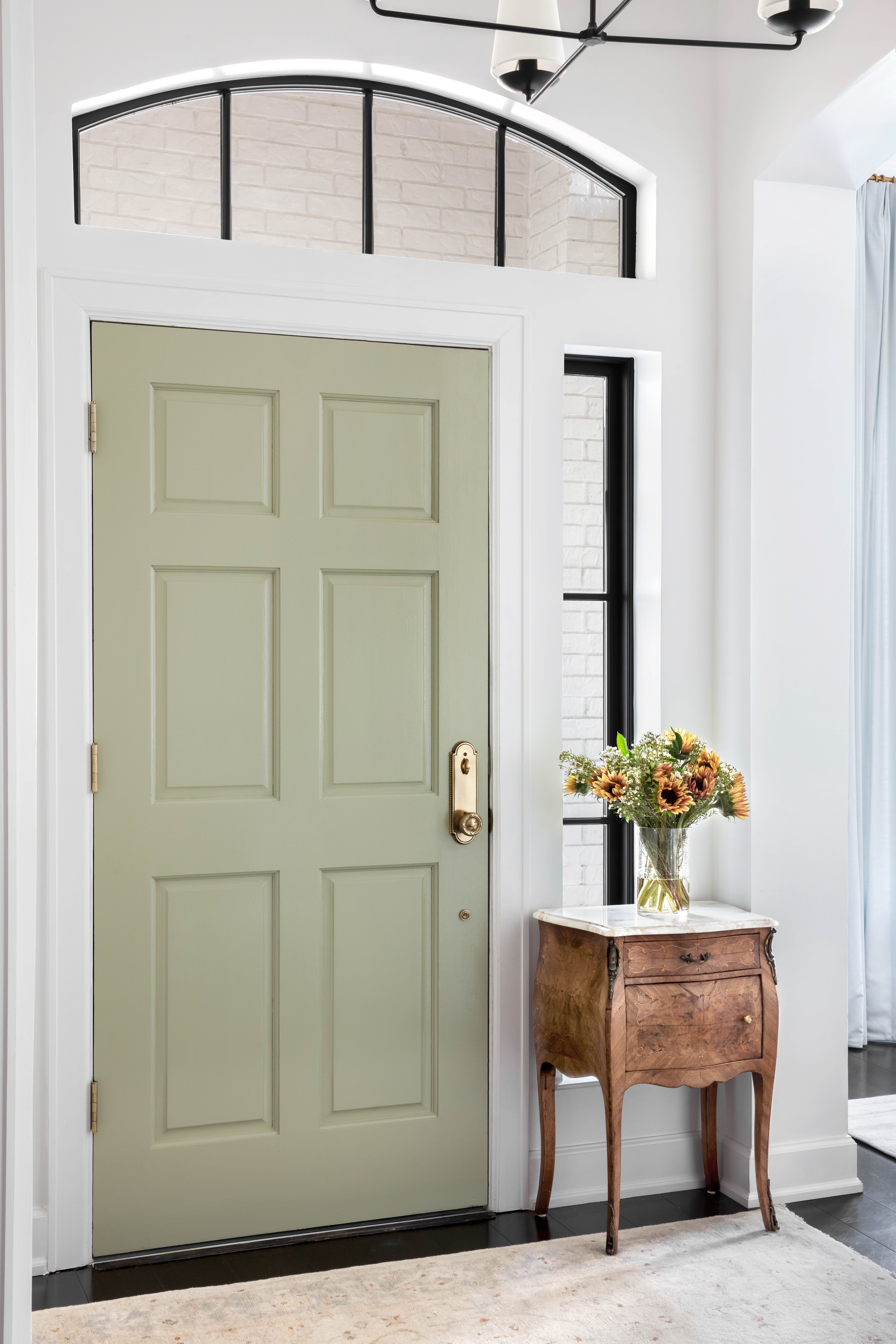
Decorating with neutrals is perhaps the easiest and most flexible way to play with hues. Every color on the color wheel goes with white, although you may want to opt for a warmer white, which can help create a more soothing scheme. A crisp, pure white can look a tad clinical and make the interior feel stark.
The other advantage of using white is that it allows the inclusion of at least two, or even three hues for a lovely color block or layered scheme. Keep in mind though, the more colors you add, the more care you need to exercise on the visual you're creating. The sweet spot is usually two or three; more than that and you run the risk of an interior feeling like a circus.
9. Black
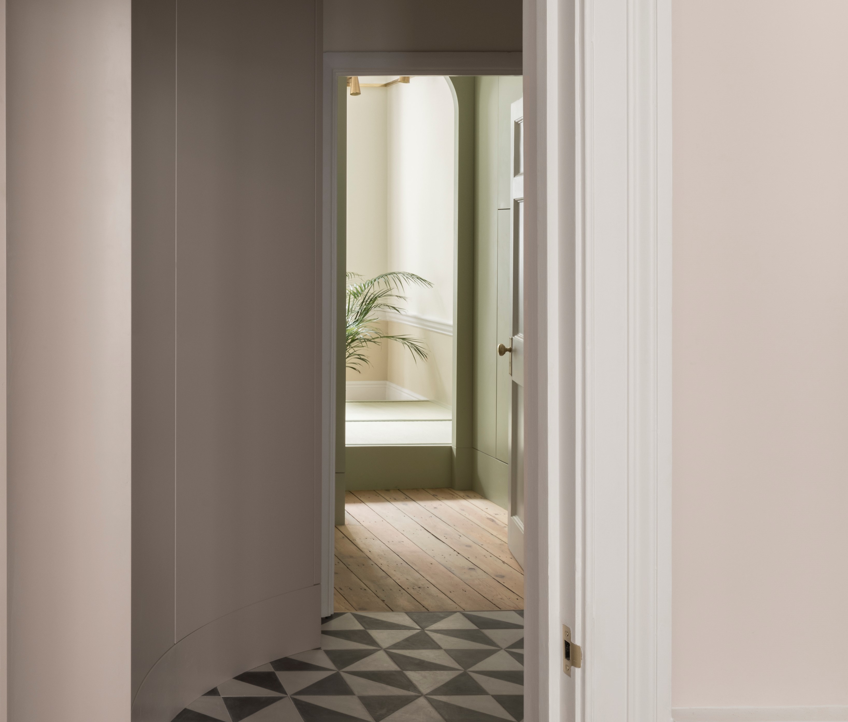
There is gravitas in a green and black combination. When used carefully, and in moderation, the two, with their sharp contrasts, can create an unforgettable interior.
If a black and green combination feels a little two-dimensional to you, there are plenty of other colors that go with black — you could add a softer tone of pink or cream to balance the scheme.
10. Pastel pink
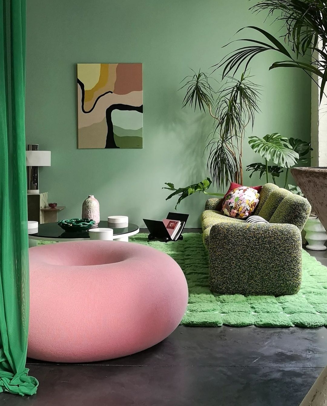
There are several ways to decorate with pastels, and a great combination to try is pistachio green and pink.
"We wanted to play with a wide range of greens and bring a touch of nature into the interior and create a feeling of inside/outside, like living in a garden," says Hélène of the space above. "I chose to create this garden feel with a thick, patterned rug that I designed myself and which was made by the craftsmen at Stitch Rugs. Plus, nature tones of green and pink accent the space."
11. Cream
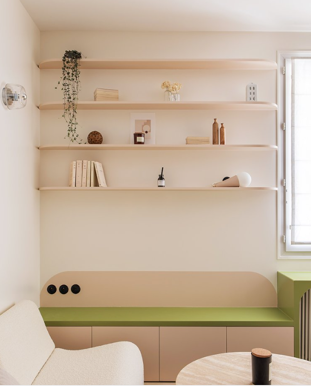
"Pistachio is a bright, saturated color," says Amy. "When combining it with others, make sure not to create an overpowering color scheme. If you choose pistachio walls, choose deeper, darker, or more muted colors for your decor. In an overall neutral room shots of bright colors like pistachio can be mixed with other saturated colors, if they’re used in moderation."
For an unexpected pop of color to a neutral living room color, bedroom, or kitchen, consider using pistachio on an accent feature such as a desk, a chair, a cabinet, or even a piece of art.
12. Red
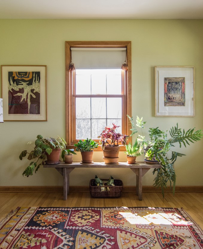
Red and green aren't just Christmas colors — the combination goes way beyond festivities and can help create a wonderful modern interior. The key is choosing the right intensity of shades, and how you plan to incorporate them in your home.
Plenty of colors go with red, though consider using this particular color combination with textures, furniture, wallpapers, or even cushions or decorative objects, to keep your space from looking too seasonal, but cheery all year round.
"Green and red are complementary, sitting opposite one another on the color wheel and using them together creates a dynamic space," says Amy. "As we are accustomed to seeing all types of warm and cool greens mixed in the natural world, replicating that indoors feels right. Also, consider mixing a springy yellow-green like pistachio with a cooler blue-green to create an exciting space."
13. Gold
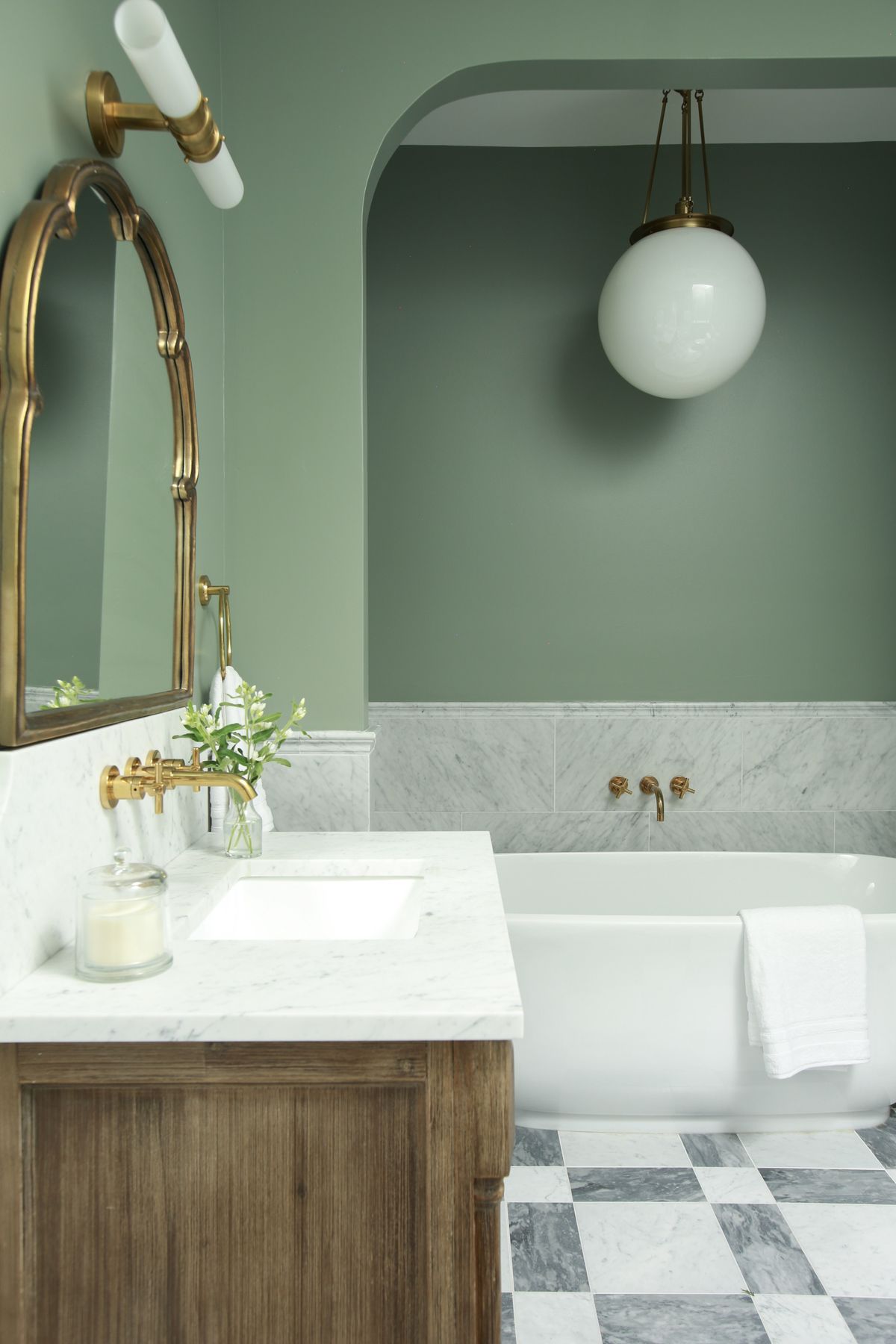
A while back, gold had the reputation for being gaudy, pretentious, and flamboyant but, over time, the color's various incarnations as satin gold, matte gold, and spun gold have taken over interiors, and their softer, more subtle glow is now a color trend that is ideal for modern homes.
The advantage of gold is that — when used in a restrained manner — it can lift the look and feel of any color. Case in point: pistachio.
In this bathroom color scheme, the more grounded and sober look of the pistachio is given a leg up with the antique gold faucets and mirror frame, lending the room a more decorated and stylish finish.
What matches with pistachio?
This shade of green is darker than lime or pale green and is more energetic than olive or teal. This is why it pairs wonderfully well with several tones. Pistachio goes with chocolate browns, orange, red, pink, and other greens. For a striking contrast, you can pair it with charcoal gray, black, or even indigo blue. For a calmer, more relaxing setting, it’s best to pair it with white, cream, beige, or light gray and pink.
Why is pistachio a trending color?
Pistachio is one of the more timeless greens, as the color can work in many areas of the home, and can create different moods. The tone is a strong blend of green with yellow undertones, creating a shade that is both refreshing and versatile. In fact, for a long time now, this shade has long been associated with elegance and timelessness.
In the living room, pistachio can create a sense of serenity and an inviting atmosphere. When used as an accent tone, it can add a slice of fun to the space. In the kitchen, pistachio green pairs beautifully with wooden cabinets and counters. When combined with neutrals, it can add a touch of sophistication while maintaining a relaxed ambiance in the space.

Aditi Sharma Maheshwari started her career at The Address (The Times of India), a tabloid on interiors and art. She wrote profiles of Indian artists, designers, and architects, and covered inspiring houses and commercial properties. After four years, she moved to ELLE DECOR as a senior features writer, where she contributed to the magazine and website, and also worked alongside the events team on India Design ID — the brand’s 10-day, annual design show. She wrote across topics: from designer interviews, and house tours, to new product launches, shopping pages, and reviews. After three years, she was hired as the senior editor at Houzz. The website content focused on practical advice on decorating the home and making design feel more approachable. She created fresh series on budget buys, design hacks, and DIYs, all backed with expert advice. Equipped with sizable knowledge of the industry and with a good network, she moved to Architectural Digest (Conde Nast) as the digital editor. The publication's focus was on high-end design, and her content highlighted A-listers, starchitects, and high-concept products, all customized for an audience that loves and invests in luxury. After a two-year stint, she moved to the UK and was hired at Livingetc as a design editor. She now freelances for a variety of interiors publications.


