In This Vancouver Home, the Kitchen Is Split in Two — And That’s What Makes It Genius
Organic materials and vintage furniture bring warmth and character to the new build by Atelier Fēn
The Livingetc newsletters are your inside source for what’s shaping interiors now - and what’s next. Discover trend forecasts, smart style ideas, and curated shopping inspiration that brings design to life. Subscribe today and stay ahead of the curve.
You are now subscribed
Your newsletter sign-up was successful
When your client is a cinematographer, you expect a certain element of drama. Well, designer Sha Wang of Atelier Fēn delivered just that in this multi-story home in Vancouver’s highly sought-after Point Grey neighborhood.
While the home, only recently completed, enjoys enviable views of the ocean and city from its top level, the interior leaves just as big of an impression.
One of the most impactful features? Its modern kitchen — or is that two kitchens?
Article continues below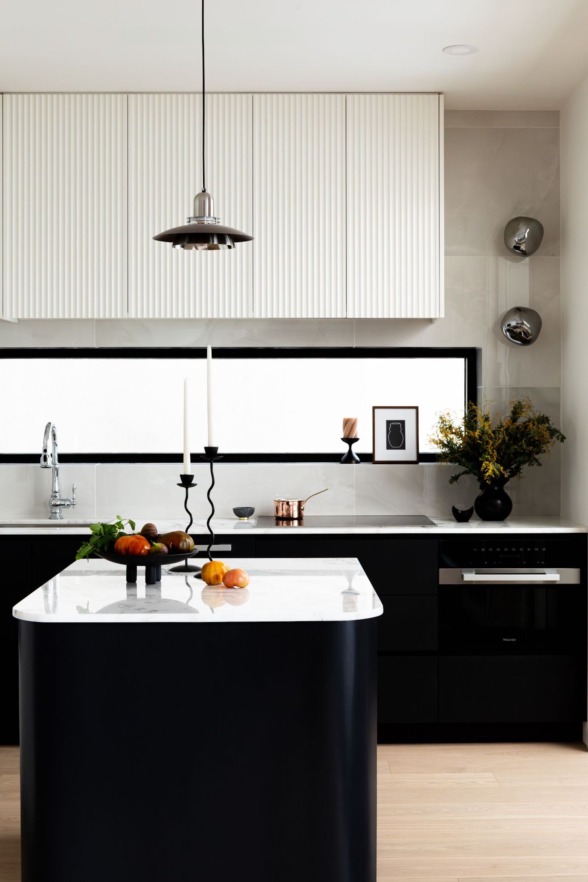
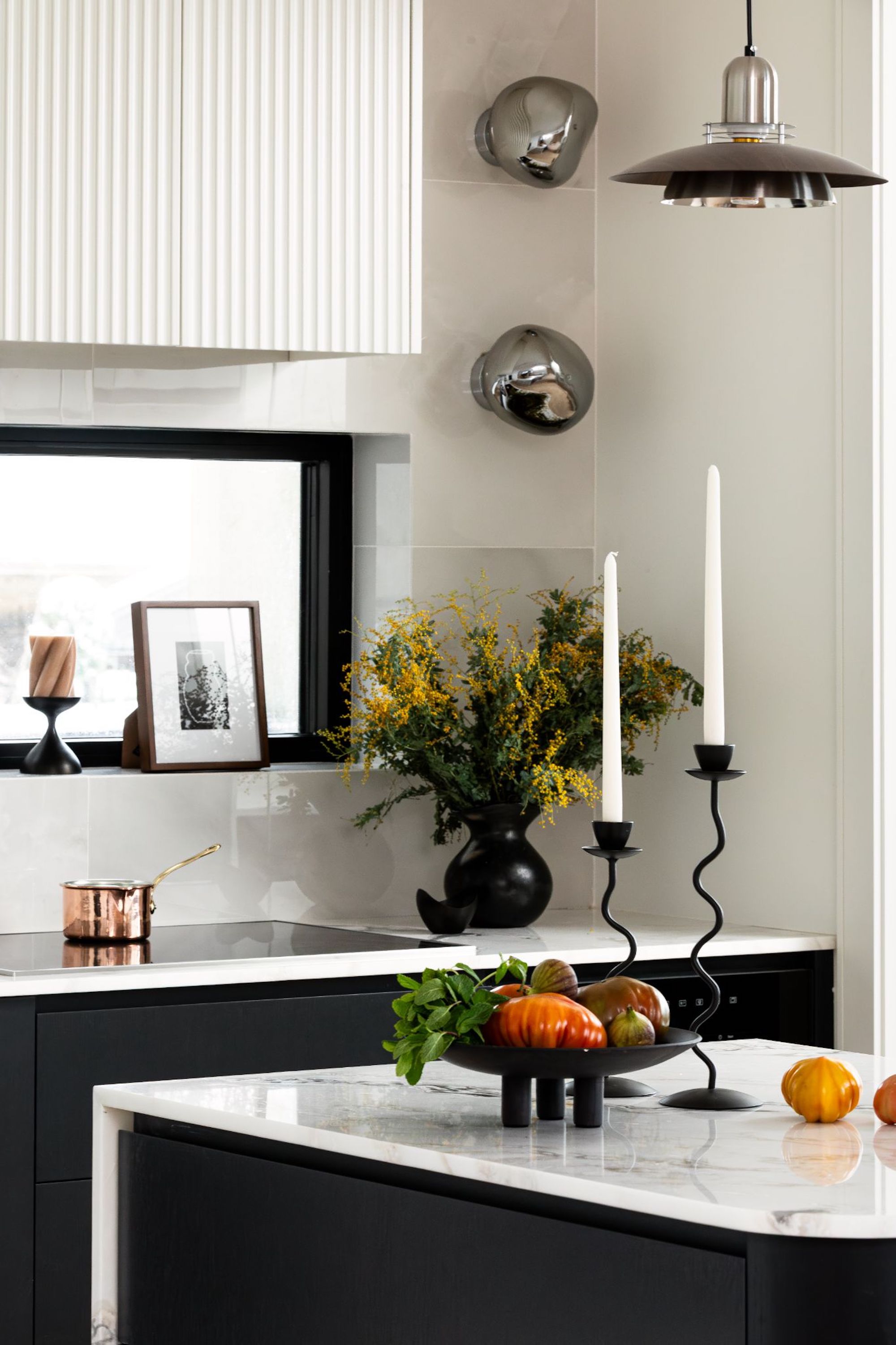
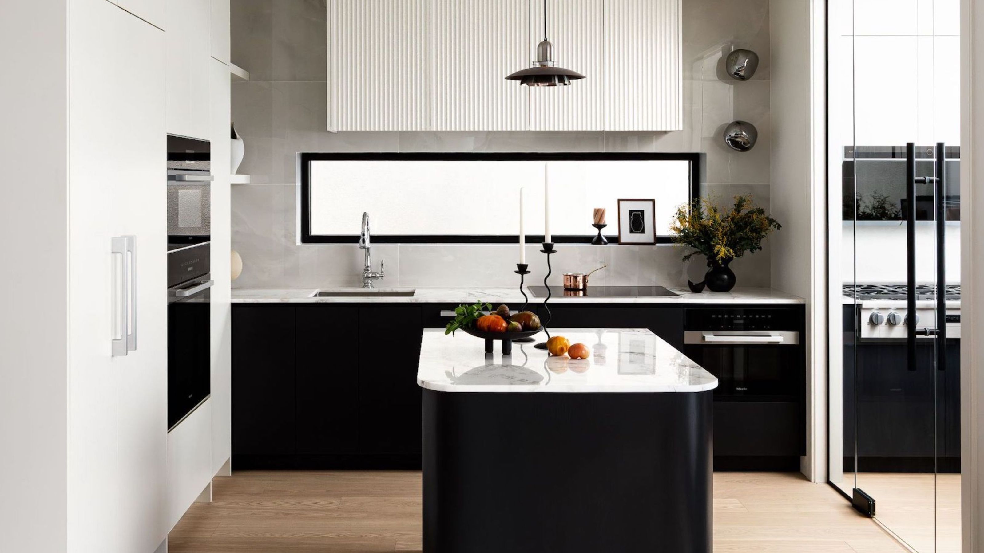
Instead of opting for a singular open-concept space, she designed two separate zones: a polished main kitchen with a small island and seamless panel-ready appliances, and a functional wok kitchen divided by a glass room divider.
“A lot of people in Vancouver have two kitchens, but having two can make your main kitchen look smaller,” says Sha Wang. “One design intention here was we wanted the wok kitchen to look bigger and feel bigger, so we used an almost full-height glass partition to have it open.”
Not only does this clever solution maximize light and spatial flow, but “it makes the wok kitchen feel more spacious without compromising its utility,” she adds.
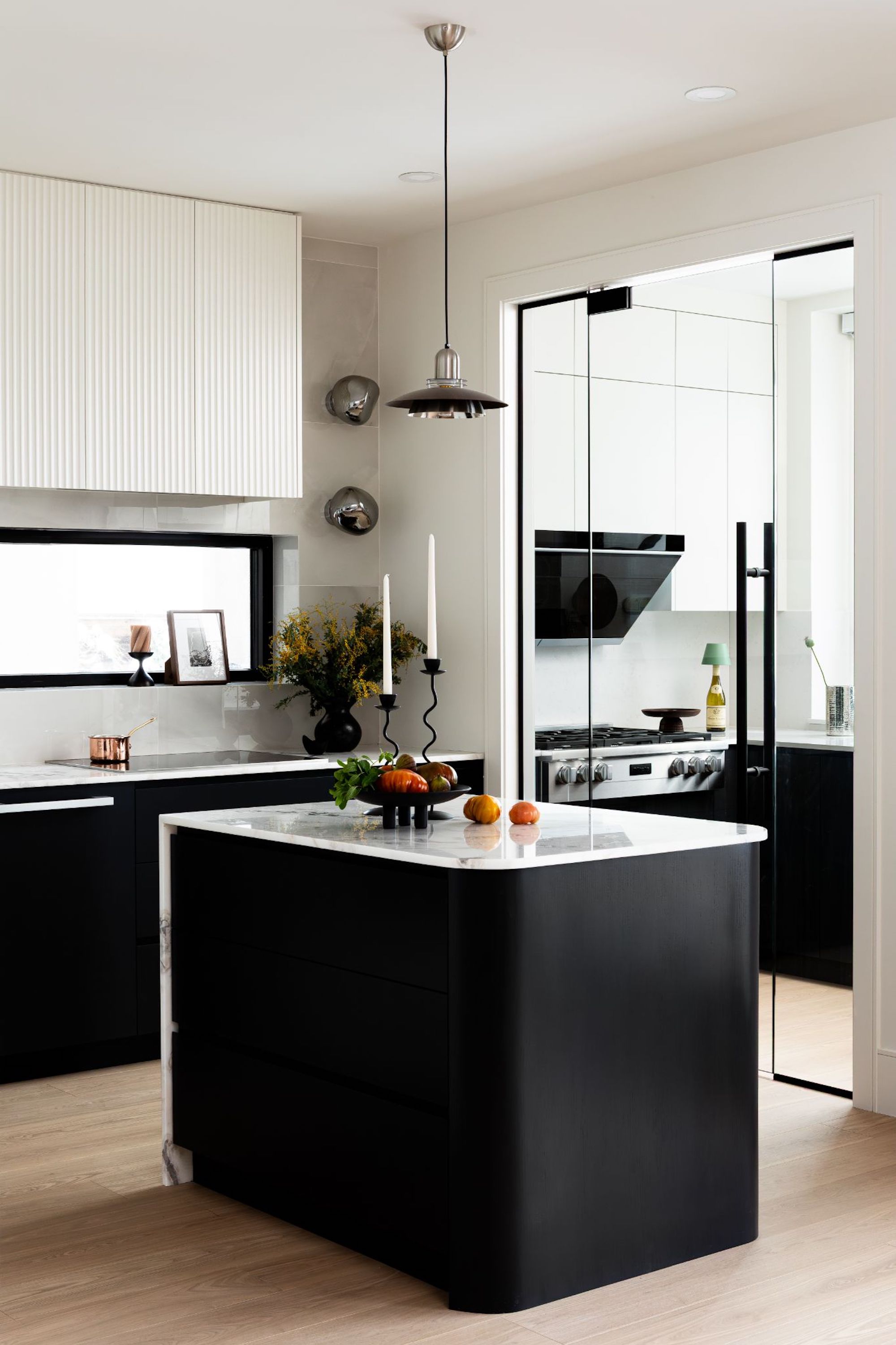
The wok kitchen, typical in Vancouver homes, gets an airy update thanks to a glass partition.
Both kitchens follow a deliberately contrasting palette of black and white, softened with a marble countertop and large-scale tile backsplash. Painted MDF cabinetry, as well as a fluted MDF hood, “maintain the architectural purity that defines the space,” says the designer.
The Livingetc newsletters are your inside source for what’s shaping interiors now - and what’s next. Discover trend forecasts, smart style ideas, and curated shopping inspiration that brings design to life. Subscribe today and stay ahead of the curve.
The central kitchen island features full-depth drawers on one side and open shelving on the other, making it prime for entertaining. The homeowner, a single man in his 30s who loves to host friends, found unfussy and cost-effective materials that still look elevated to be perfect.
“People can spend $3 million to build a custom home and still not enjoy the kitchen,” she says. “We wanted this space to work hard and feel good.”
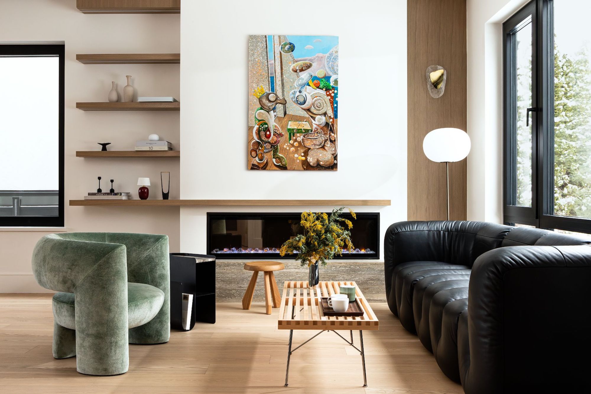
Artwork from Pepe Hidalgo adds vibrancy to the otherwise neutral-leaning living space.
Throughout the home, she brought the same energy of practicality meeting playfulness, inspired by both her client’s vibrant personality and the understanding that this isn’t his forever home.
While his “appreciation for thoughtful, timeless design, something that resonates with Atelier Fen’s philosophy” certainly led each design decision, it was also important to consider future resale.
“Yes, it should appeal to a future buyer, but it was not about interior design trends, but about creating a lasting atmosphere — refined, warm, and emotionally connected,” she adds.
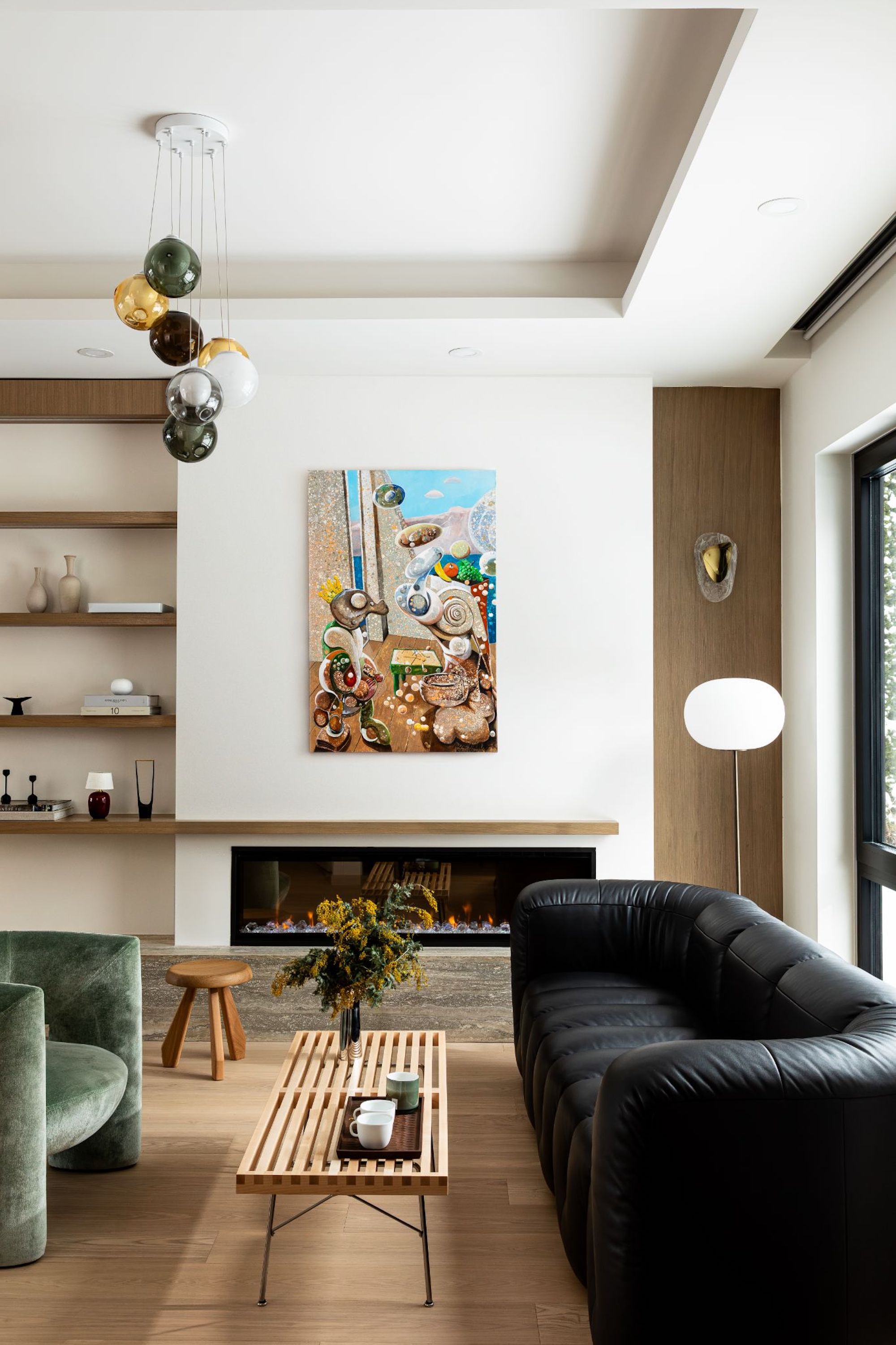
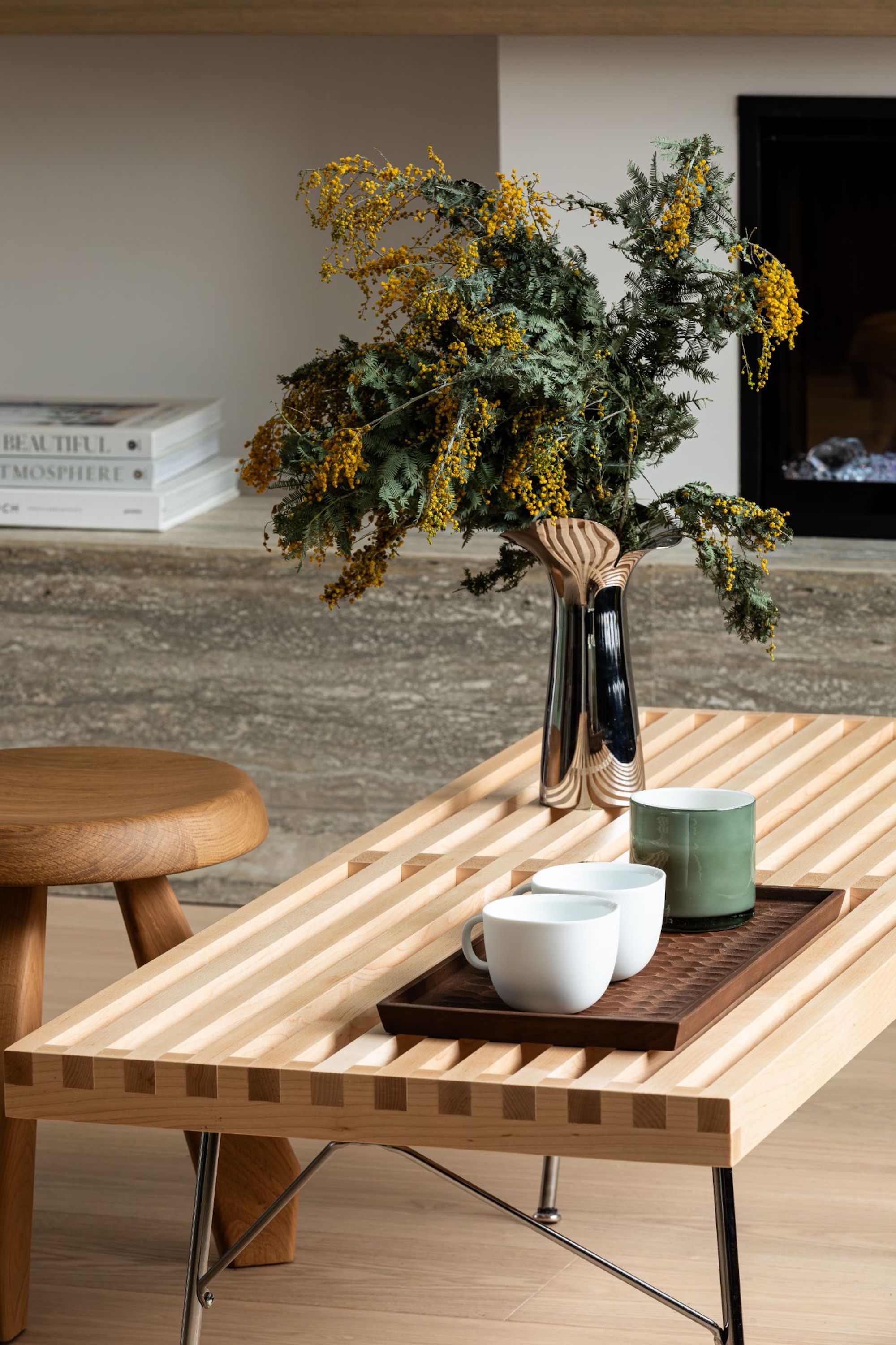
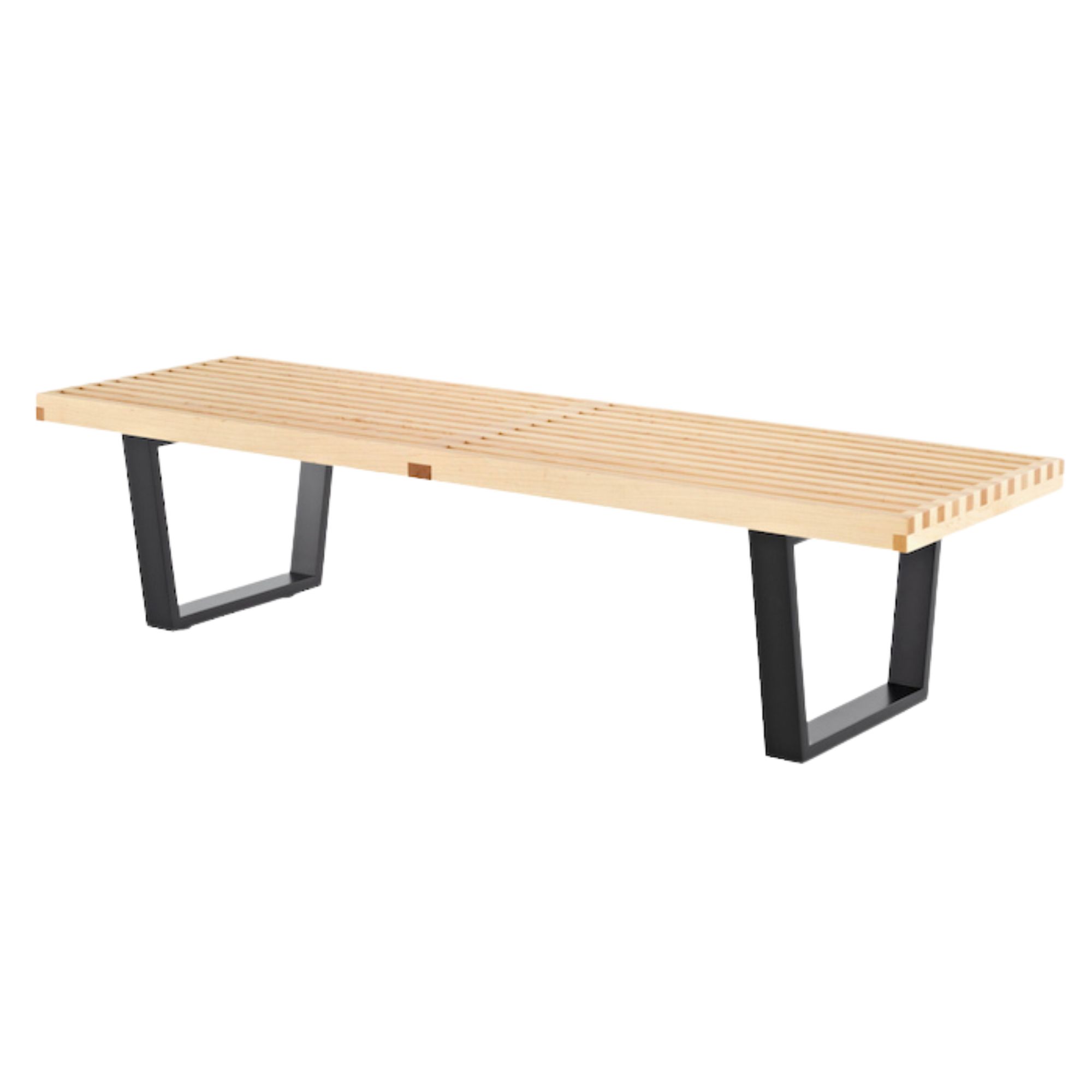
Iconic furniture like a De Sede sofa and Nelson platform bench from Herman Miller make the cut, while bold yet complementary pops of blues and greens are added through art and fixtures.
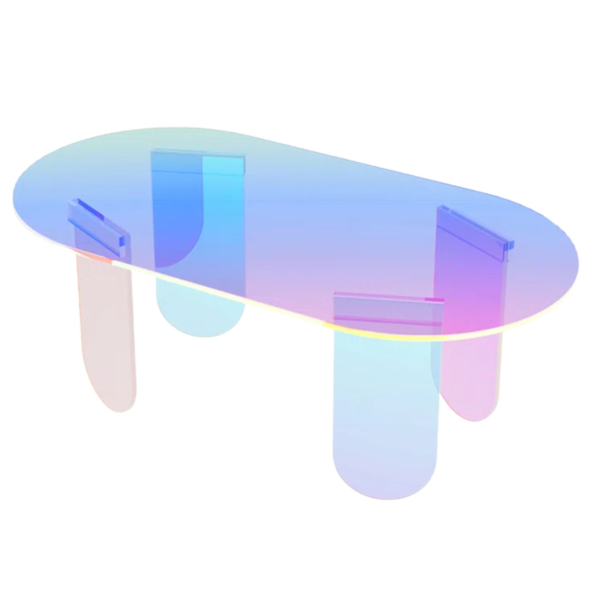
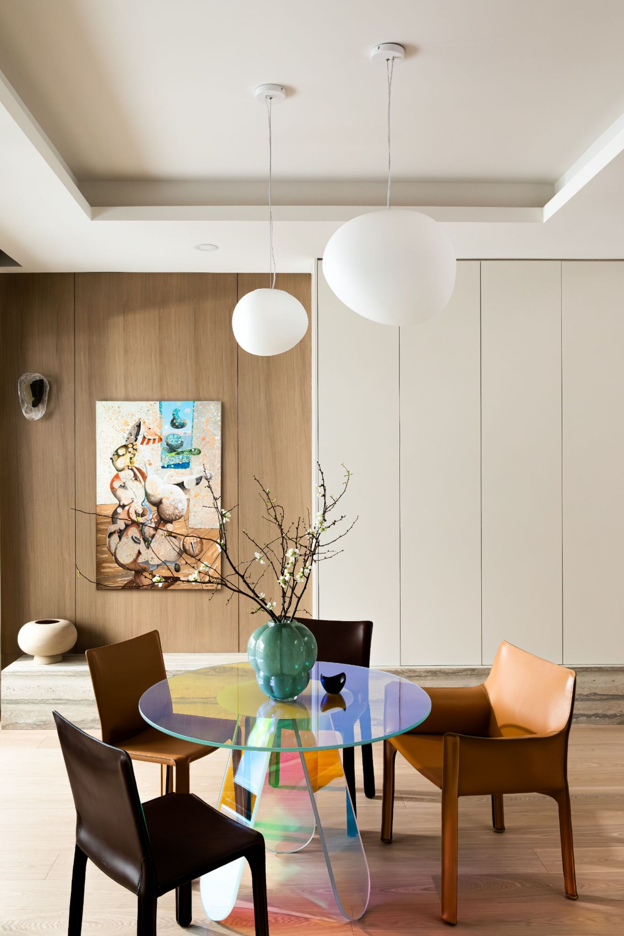
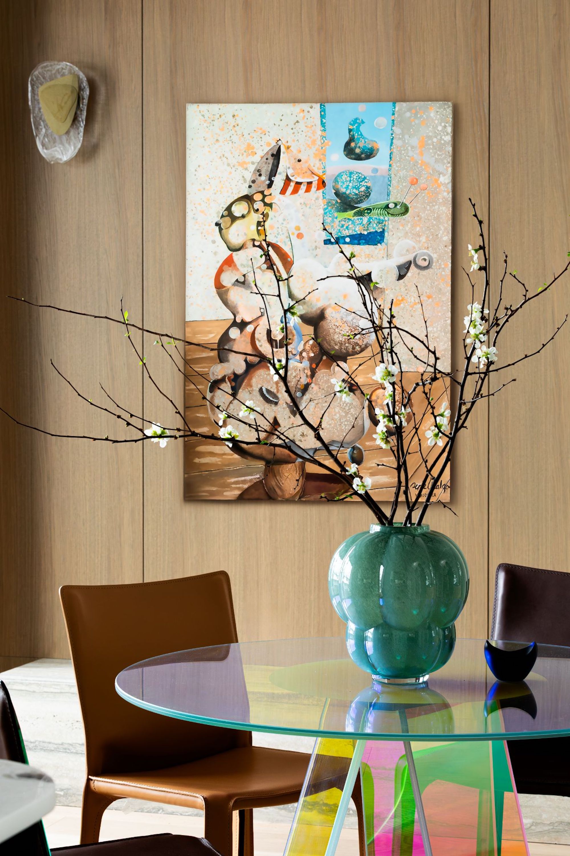
The Glas Italia dining table, an opportunity to experiment with an unexpected design choice, helps liven up the city’s gloomy weather with its “beautiful, shimmering effect and rainbow shadows.”
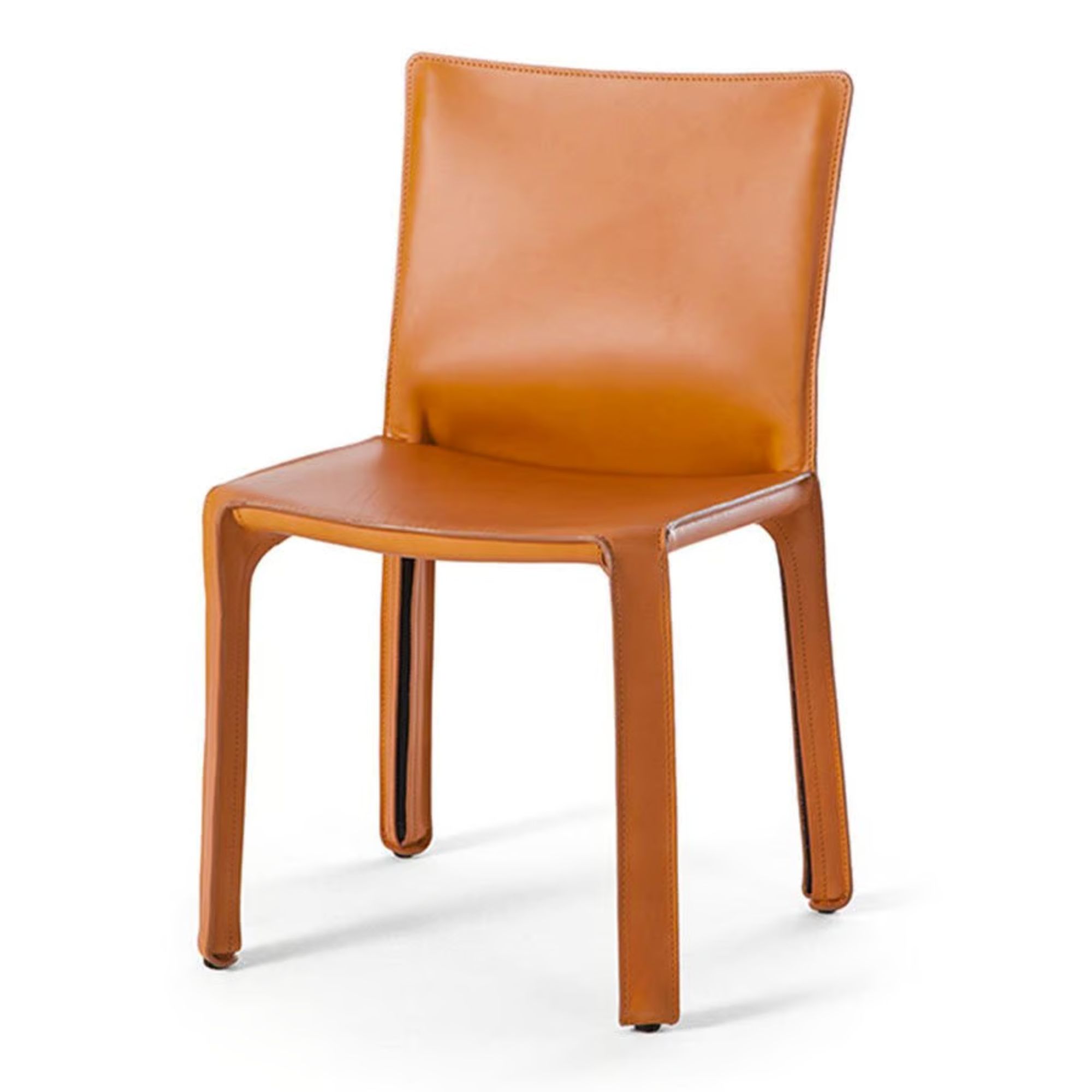
“The city has nearly 260 days a year of gloom and rain each year, so I wanted something happier and lighter in the space,” she says. Cassina Cab chairs in varying leather tones anchor the translucent table.
In line with this spirit of designing for future residents, the designer used market research to help decide some of the materiality — “neutral yet timeless” elements like white oak millwork, travertine, hardwood flooring, and the right balance of concealed storage.
“In this area, there are a lot of families, high-income individuals, so we aim for the same clientele — usually 30s with one or two kids — so we consider those factors when designing,” she notes.
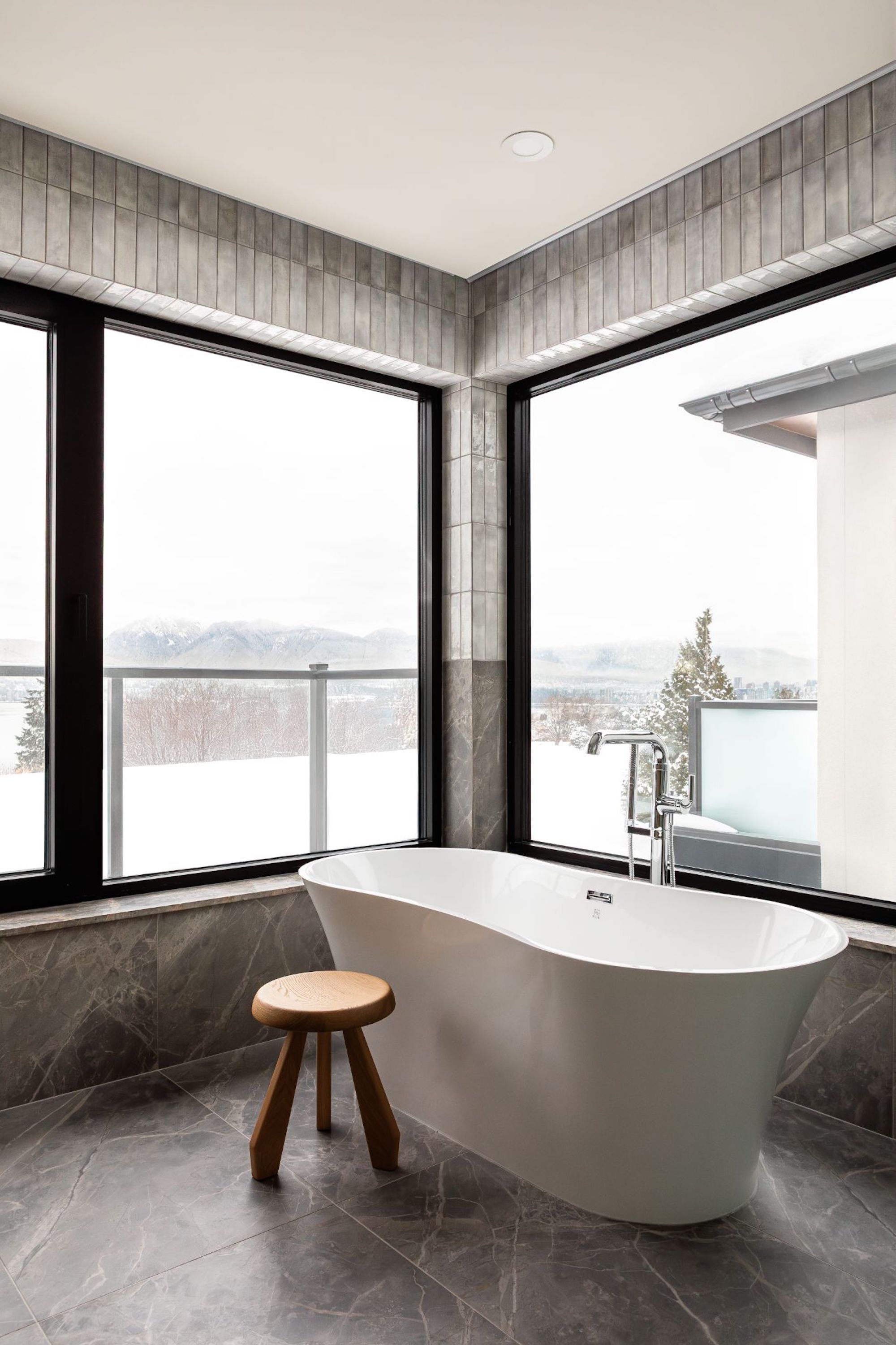
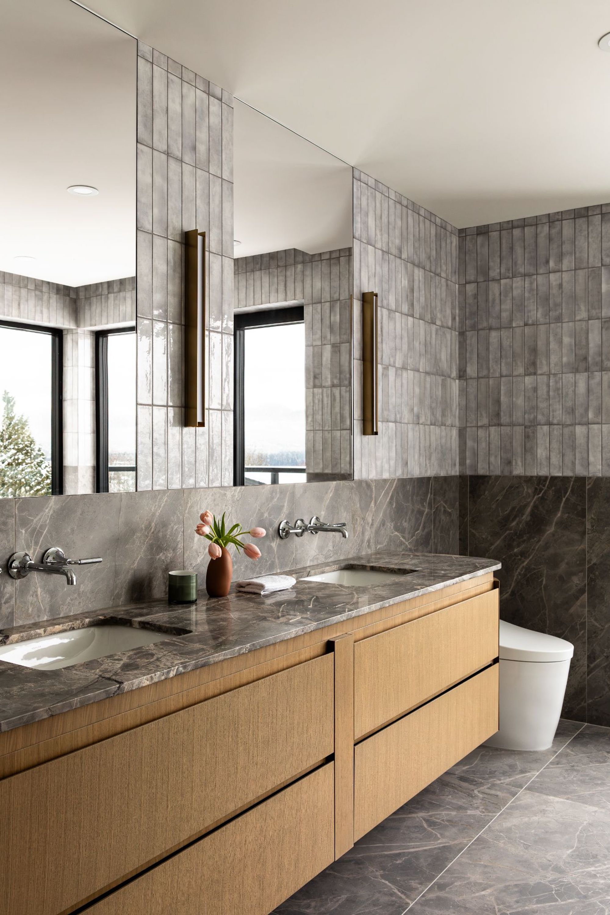
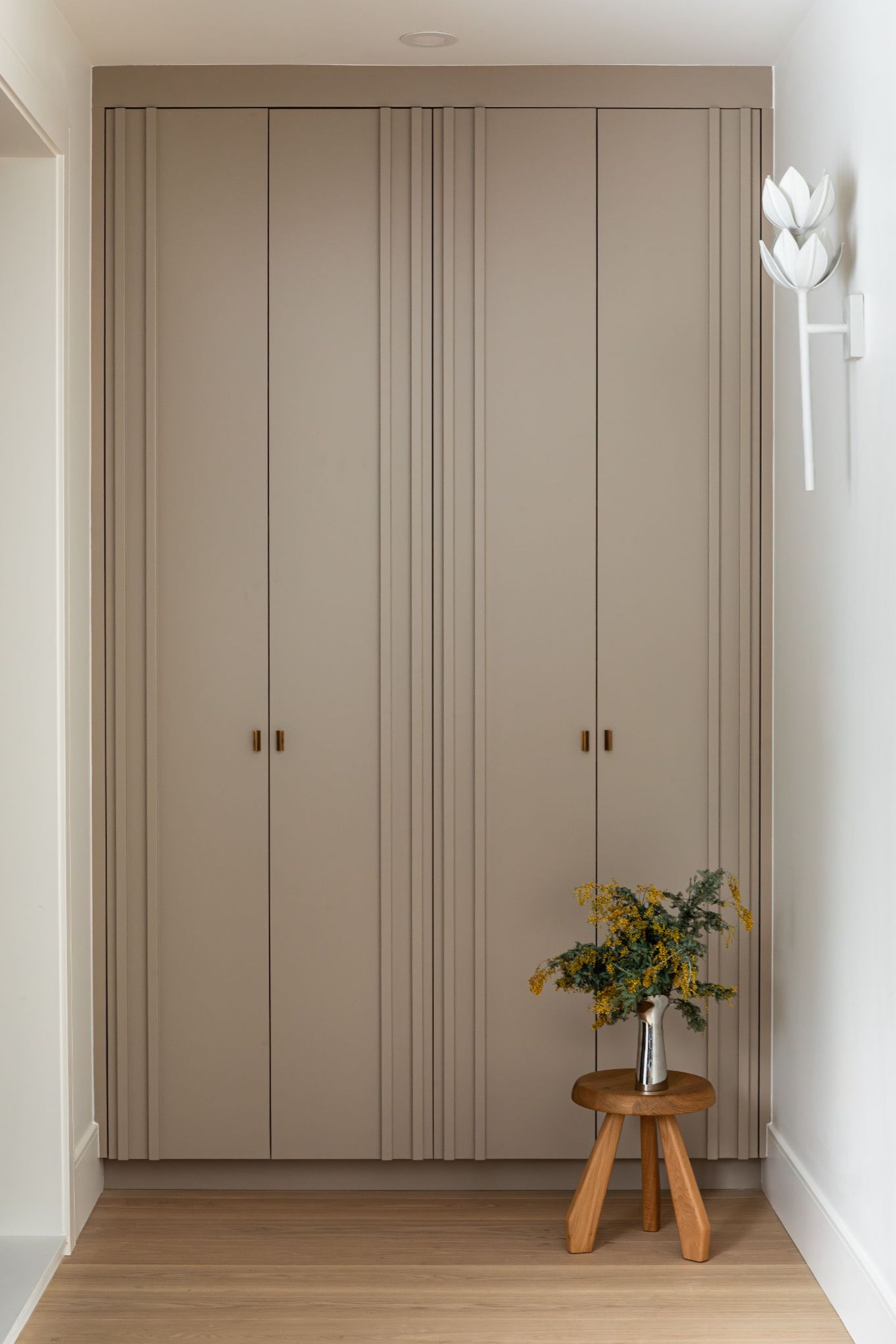
In the living room, built-in storage cabinets are completely recessed. “You touch it and it opens,” she describes. Maximizing functionality while maintaining a sense of spaciousness was key, as she found creative ways to optimize every inch of space without compromising on comfort or aesthetic appeal.
“Balancing the need for efficient storage, smart design choices, and high-end finishes required a lot of thoughtful planning,” she remarks.
In the living and dining areas, visual harmony is achieved by repeating key materials such as white oak millwork and flooring alongside warm travertine accents. These elements flow seamlessly from one space to the next, creating a sense of unity.
“Clean lines and simple forms guide the eye across the open layout, making the entire area feel more expansive than it actually is,” she notes.
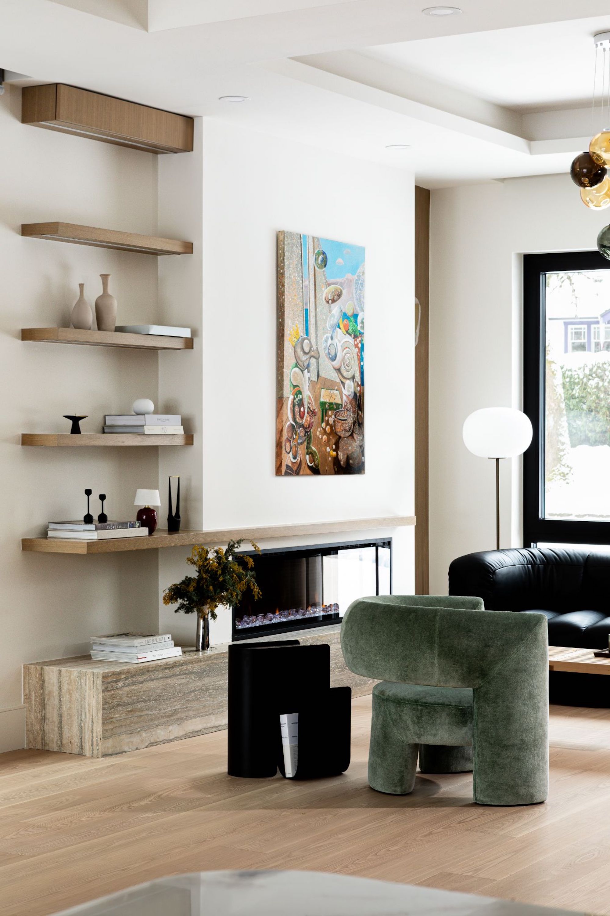
In addition to collection-worthy furnishings, art is treated as a focal point. Works from contemporary painter Pepe Hidalgo blend effortlessly with the interior’s palette, while those subtle moments of blue, green, and red introduce a dynamic energy.
Still, it’s the kitchen that may be the designer’s favorite space. It not only reflects who the client is and how he uses the space, but will surely appeal to a future owner with its rich textural elements and precision.
“The home breathes with quiet confidence, offering moments of understated luxury within a framework of serene simplicity,” she says.
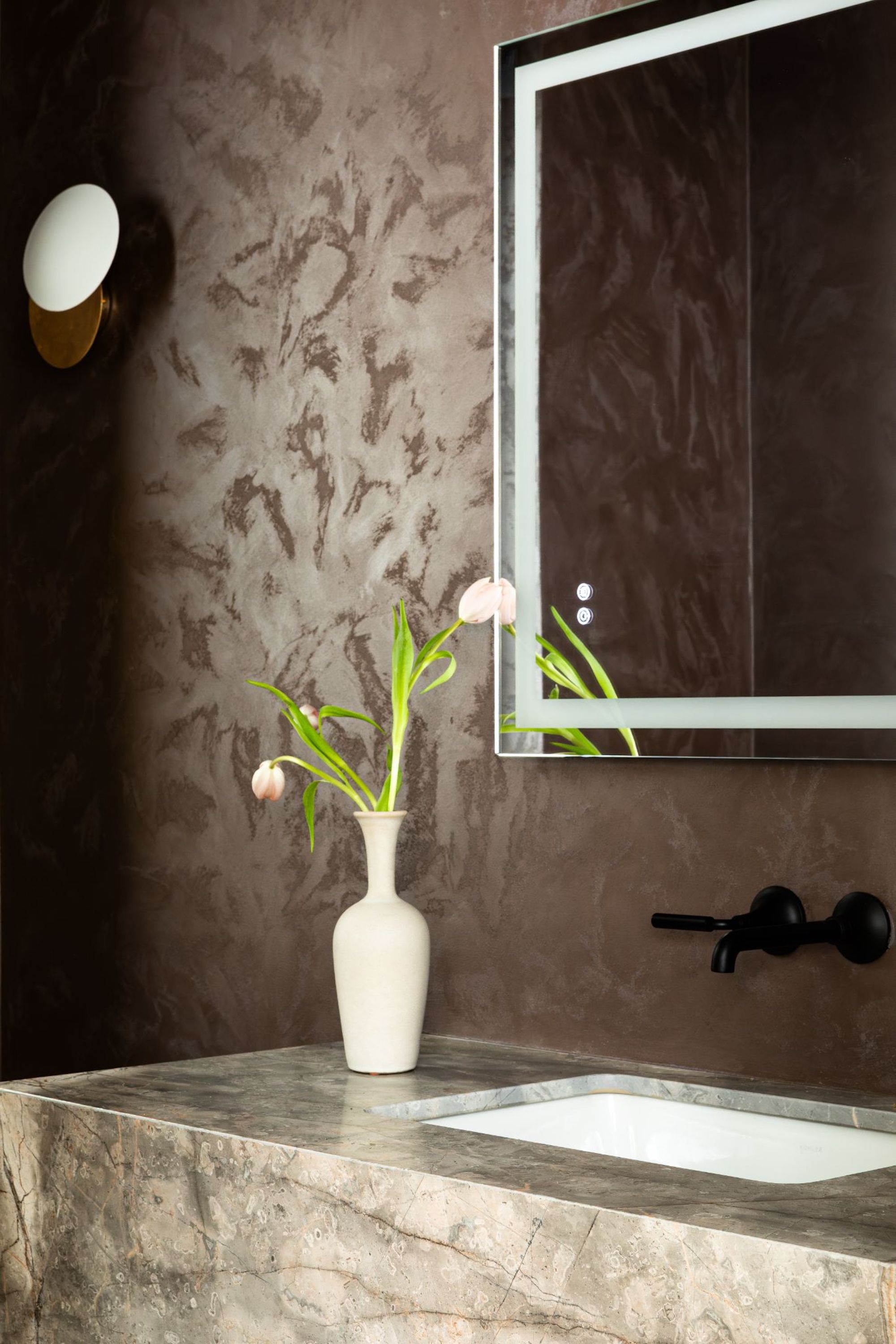
The powder bathroom is equally textural thanks to plaster walls and a marble vanity.
Shop the Look
Lauren Jones is a Texas-based writer who covers everything from architecture to interiors, sustainability, art, and travel. Apart from writing for publications including Architectural Digest, Dwell, Wallpaper, and, of course, Livingetc, she has also worked in-house at Scandi flooring company, Stuga, and custom cabinets and door maker, Semihandmade.
