This kitchen reno uses the perfect minimalist palette - 'these two colors create a feeling of space'
This contemporary home with gorgeous bones was given a makeover where the choice of light colors and subtle patterns complement and enhance its light-filled architecture
It’s rare that one finds a contemporary build that is not just a rectangular box. On this occasion, a 5,900 square-foot home in Austin featured beautifully high vaulted ceilings and archways, with natural light pouring in. Decorated in a Spanish Revival style and featuring a lot of wood, dated lighting, and furnishings, it needed a redesign that would not only respect the building’s impressive bones but emphasize them too. The challenge was that the redesign needed to make a difference, but not so much that it would compete with the architecture of the space.
The homeowners needed the property to be a comfortable retreat, and while positioned in the Hill Country, to embody a spirited urban feel that could accommodate their international art collection seamlessly. The space was transformed through the use of some subtle, but impactful changes: light colors that enhance the natural brightness of the rooms, subtle patterns, and furniture volumes that nod to the architecture of the space, creating a completely new atmosphere that exudes calm, and a feeling of timeless aesthetic suitable for a modern home.
The impressive new kitchen is an ode to the building’s architecture
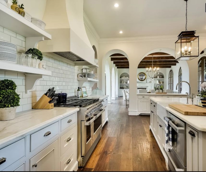
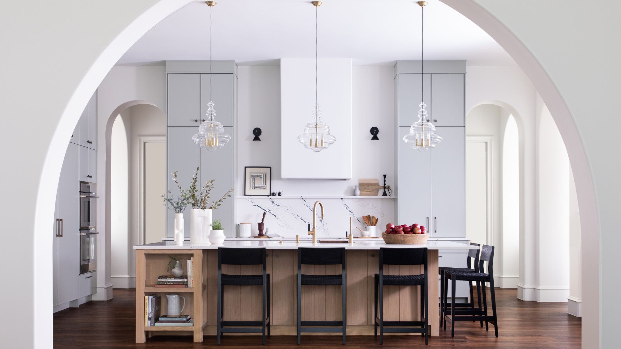
The most impressive transformation in the house was the kitchen. Previously a dark space with dated cabinets, metro tiles, and tired hardware, it did not stand out or make use of the incredible potential the tall ceilings and arches that were seen throughout the house gave. ‘The home, originally built in 2012, already had great bones including vaulted ceilings, expansive arched openings, and a moderately open floor plan, but it needed more character and detailing,’ Laura Britt, Britt Design Group, tells me of the space where now a transformed kitchen is filled with light, looks imposing and is aligned with the expectation one gets from entering such an impressive space.
The trick is in the color palette
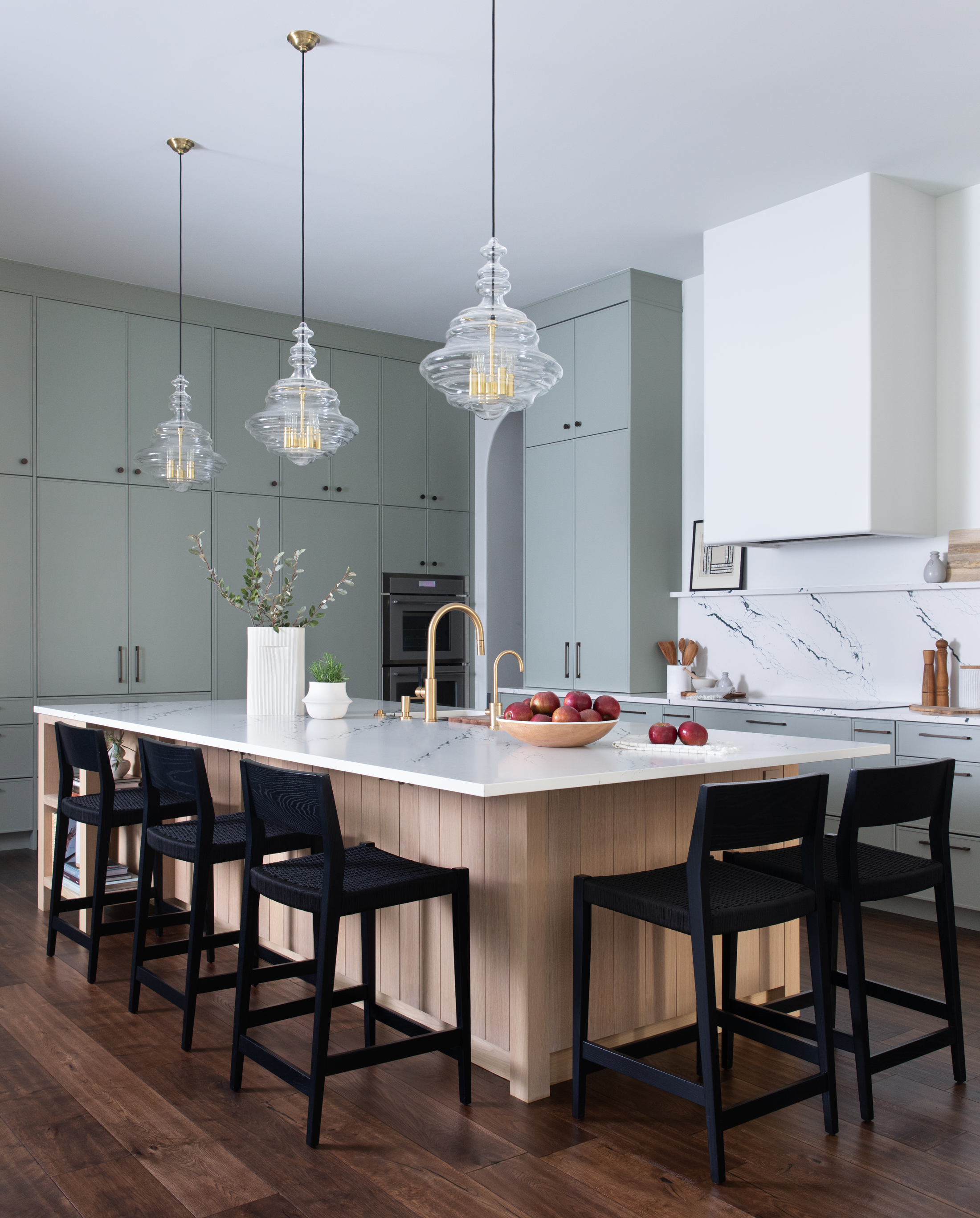
Tall kitchen cabinets stretch out all the way to the ceiling, showcasing their impressive height. The choice of clean white emphasizes the generosity of the space and bounces off the natural light to create a feeling of openness and brightness. However, the carefully selected accents of color and texture palette ensure the space does not lack warmth - and in fact, this clever minimalist color pairing actually increases the feeling of space. ‘The team updated the kitchen with a vivid, yet durable, Cambria countertop which coordinated beautifully with the custom soft sage color cabinetry. French white oak provides warmth to the space using ribbed and paneled detailing for depth and texture,’ explains Laura.
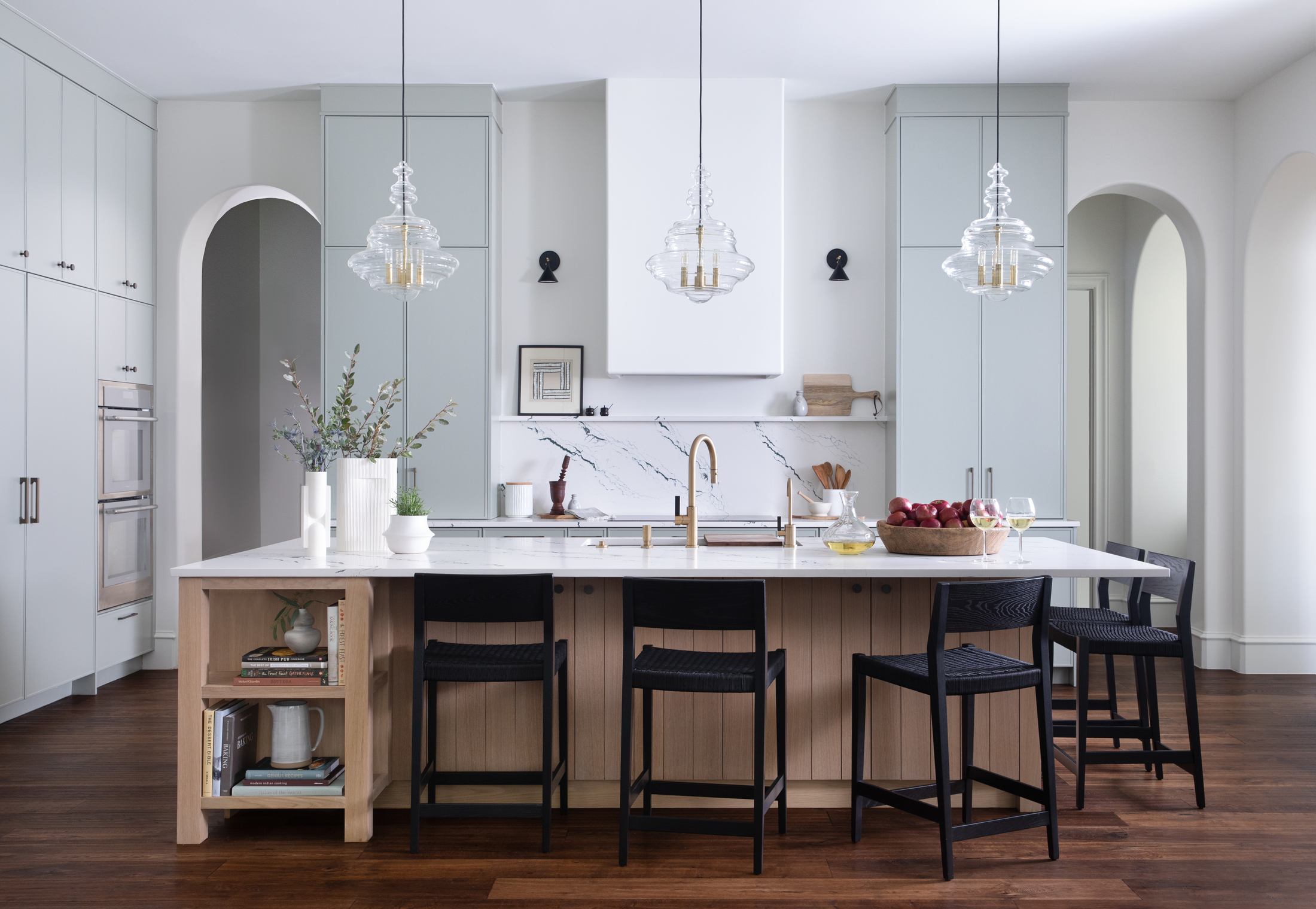
The symmetry of the kitchen vaulted openings is mirrored by the symmetry of the two tall cabinets positioned next to them, while the orientation of the design is centered through the main archway which beautifully frames the kitchen, further adding to its appeal.
An old-fashioned look re-envisioned to create a timeless and comfortable home
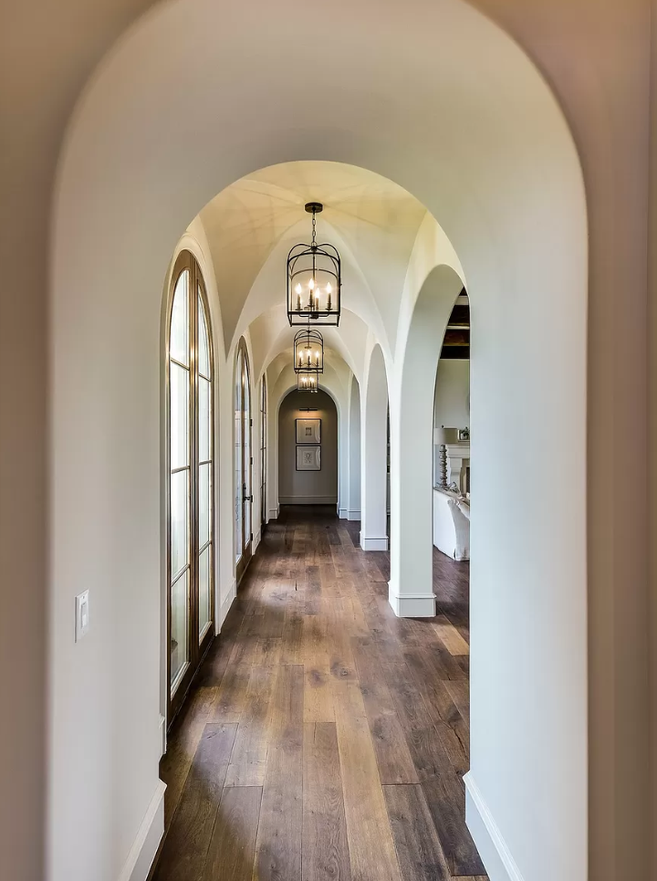
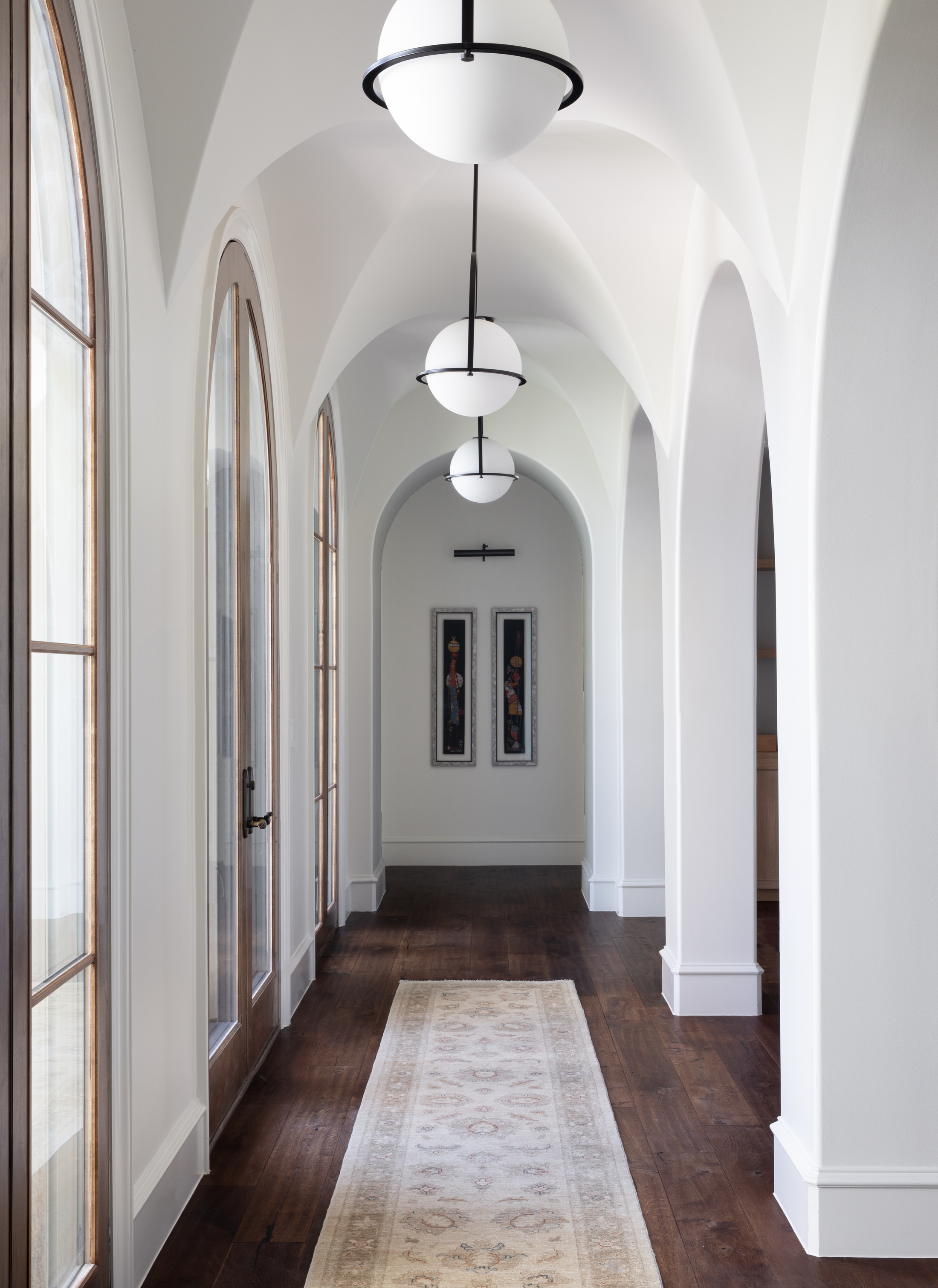
The changes that were made throughout the house were like a filter applied over the existing, old-fashioned scheme. In the hallway, through a simple change of tone in a crisper, lighter off-white for the walls and ceilings, new lighting, new flooring, and the addition of art, the atmosphere created suddenly becomes steeped in modernity, while not losing any of the grandeur of the vaulted ceiling and archways.
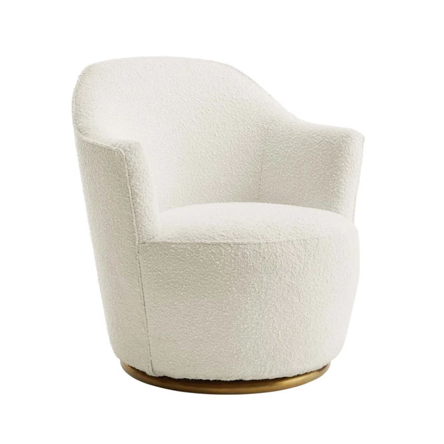
In the living room, the once traditional fireplace, clad in wood trimmings, was re-imagined with modern steel and stone. The informal living coined the coffee room, is now a place to curl up in soft white boucle seating that stays true to the home's minimalist palette, while the vast ceiling height gives a great opportunity for dramatic floor-to-ceiling drapery. The rounded tops of the cabinets mirror the rounded alcoves and archways.
The Livingetc newsletters are your inside source for what’s shaping interiors now - and what’s next. Discover trend forecasts, smart style ideas, and curated shopping inspiration that brings design to life. Subscribe today and stay ahead of the curve.
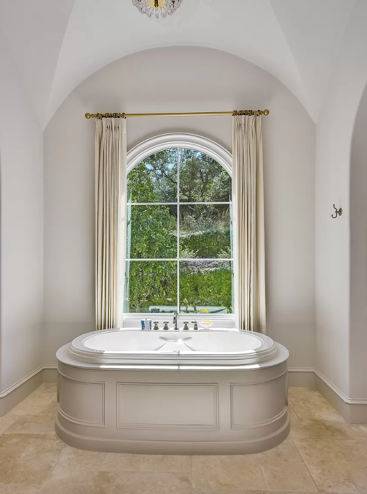
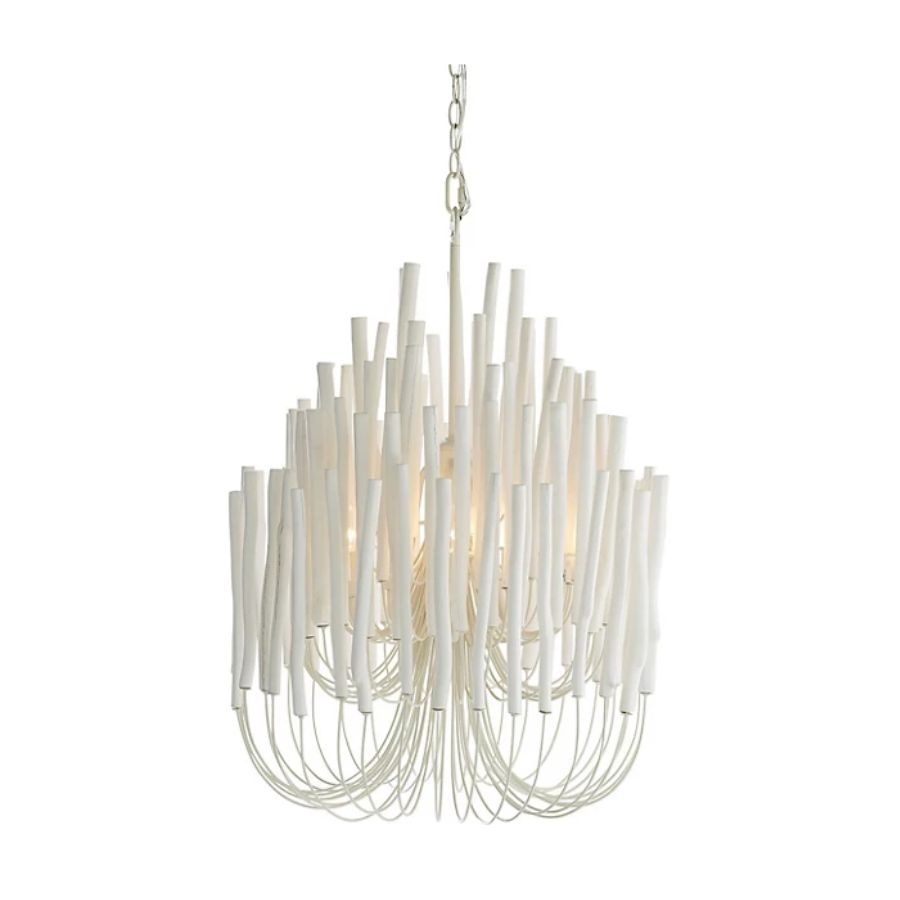
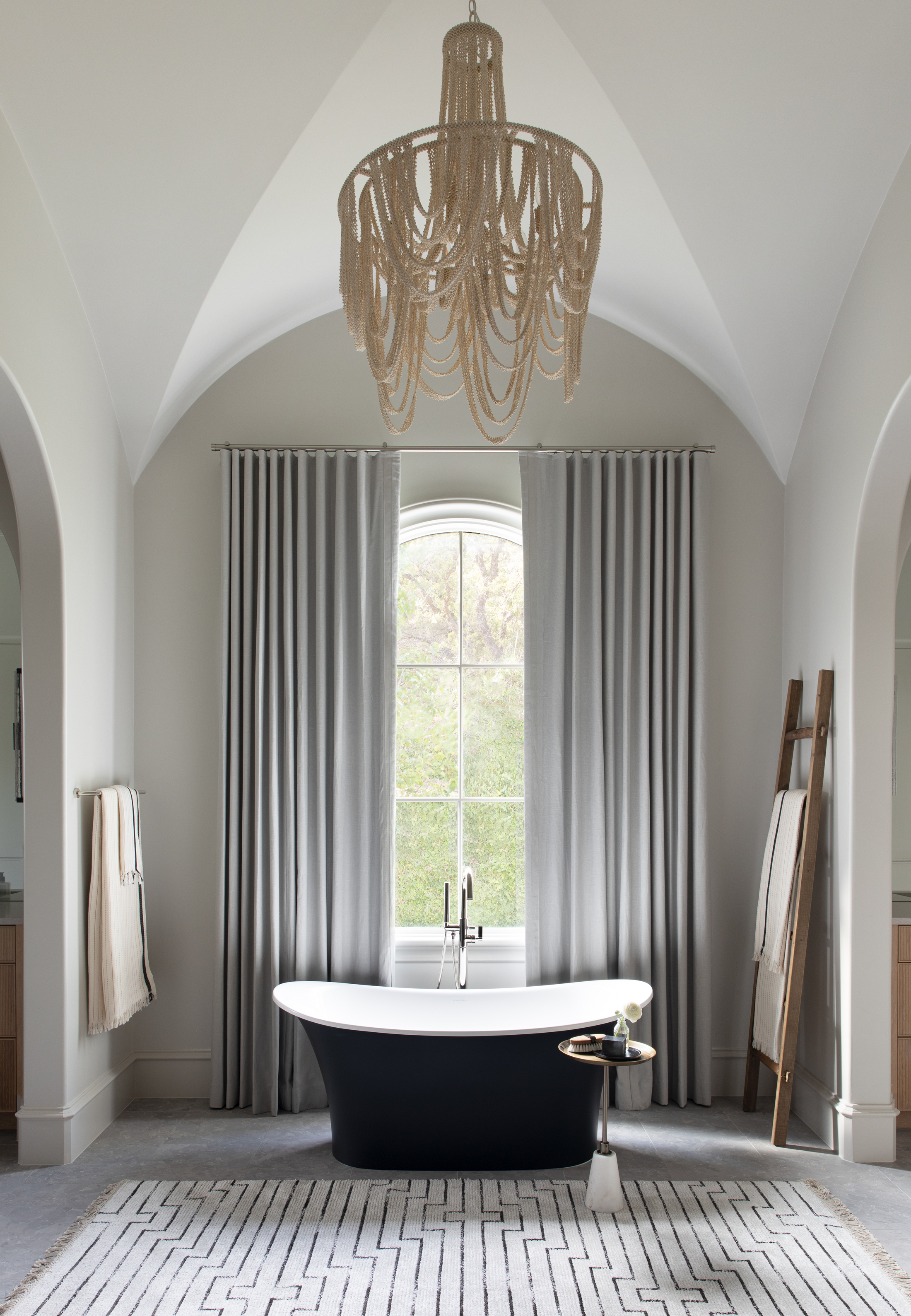
In the updated primary bathroom a stately feel is continued through ‘the drama of a matte black freestanding tub, romantic sheers, and a glamourous beaded chandelier,’ says Laura. The addition of a printed, soft rug in front of the bath tones down the stately feel of such dramatic architecture, and makes the space inviting and warm.
A lighting and finishes update turned the look of the space around
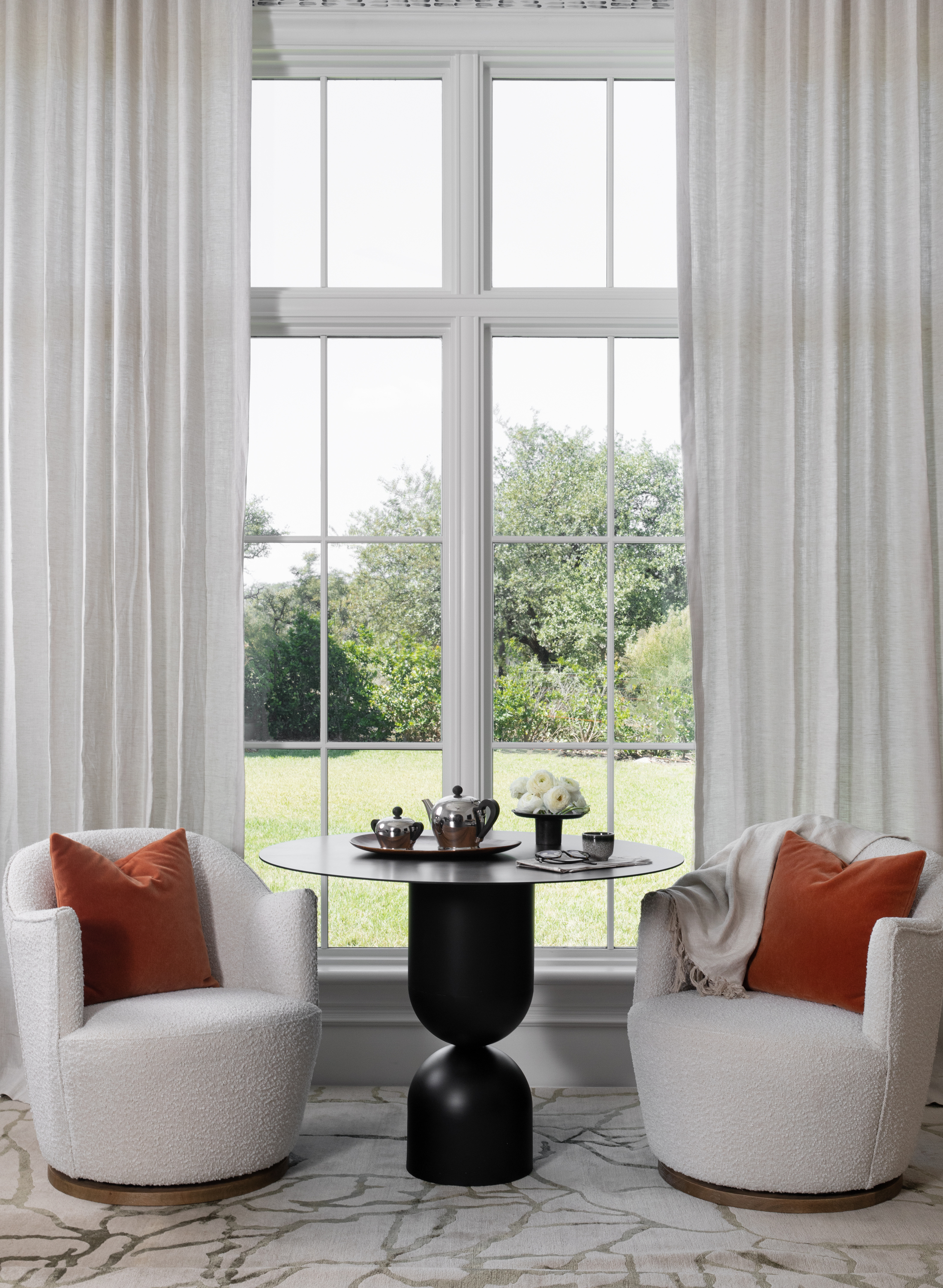
The lighting and finishes were also updated throughout to a more contemporary style using woven, textural, and bold statement pieces, while the owners’ taste for different cultures reflected in beautiful prints. ‘Fortunately for us, the client was not intimidated by color and pattern, which presented an exciting opportunity for bold statements throughout,’ says Laura Britt. Patterned rugs in light, warm colors can be seen in the living room, coffee room, and hallway, while a beautifully patterned blue wallpaper adds interest in the coffee room behind a vaulted bookcase.
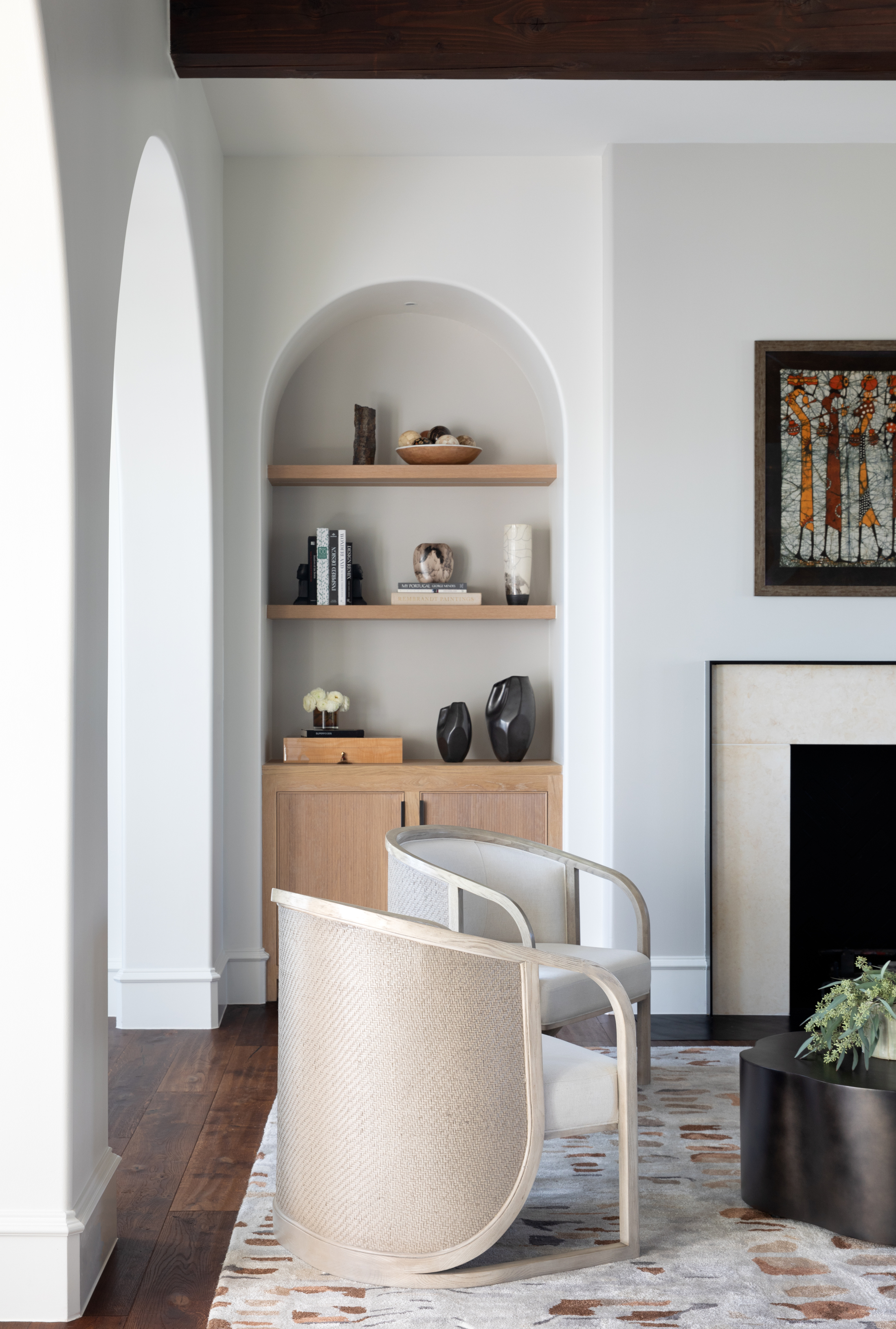
‘We saw the architectural potential of the existing home but needed to update it to match the European client's well-traveled, cosmopolitan style. Their stories, artwork, and expressive personalities greatly informed our work,’ adds the designer.
Through the design process, this home was taken from old-fashioned and lacking character to a bright, modern yet cozy design that is both respectful of the impressive architecture but equally inviting and open. A beautifully put-together home, with a timeless spirit.
Get the look of this timeless design with these buys
Raluca formerly worked at Livingetc.com and is now a contributor with a passion for all things interior and living beautifully. Coming from a background writing and styling shoots for fashion magazines such as Marie Claire Raluca’s love for design started at a very young age when her family’s favourite weekend activity was moving the furniture around the house ‘for fun’. Always happiest in creative environments in her spare time she loves designing mindful spaces and doing colour consultations. She finds the best inspiration in art, nature, and the way we live, and thinks that a home should serve our mental and emotional wellbeing as well as our lifestyle.
