Pantone unveils 315 new trend-based colours
With over 2,625 colours in total, we're sure that describing, categorising and naming them all is no easy feat!

The Livingetc newsletters are your inside source for what’s shaping interiors now - and what’s next. Discover trend forecasts, smart style ideas, and curated shopping inspiration that brings design to life. Subscribe today and stay ahead of the curve.
You are now subscribed
Your newsletter sign-up was successful
Pantone has added 315 new hues to its roster of shades, and launched two new ways to make colour-picking easier for design professionals.
The 315 colours have been chosen by Pantone to reflect present-day and forecasted trends, and have been taken from every corner of the colour spectrum, including purples, oranges, yellows, browns, neutrals and taupes, greens, whites, greys and black.
The colour company, which famously picks a colour of the year, also announced their new digital solution that helps designers create products with better colour accuracy.
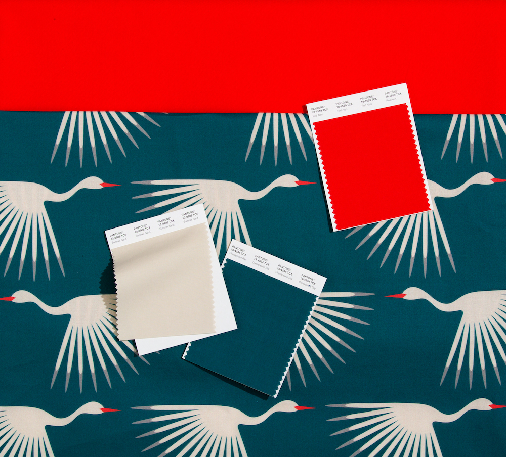
New shades of red include Fire Whirl, Adrenalin Rush and Watermelon.
Read Also:PANTONE REVEALS ITS COLOUR OF THE YEAR 2020
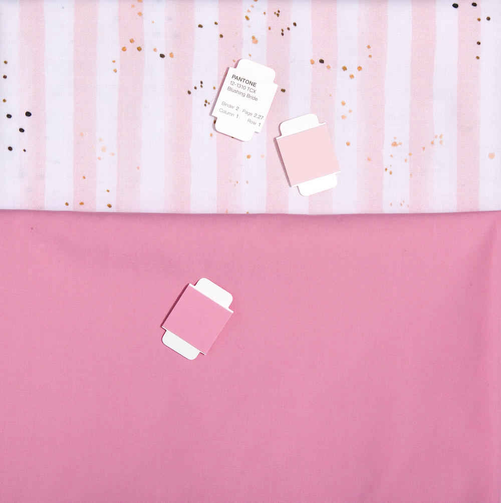
There are over 50 new shades of pink, a colour that the brand believes has 'embraced new meanings and relevance beyond it's traditional gendered and child-like status'. Among them are Slightly Pink, First Blush and Tender Touch, as well as more “evocative” shades such as Sangria Sunset and Viva Magenta.
Read Also:The most popular Little Greene paint colours, according to the internet
The Livingetc newsletters are your inside source for what’s shaping interiors now - and what’s next. Discover trend forecasts, smart style ideas, and curated shopping inspiration that brings design to life. Subscribe today and stay ahead of the curve.
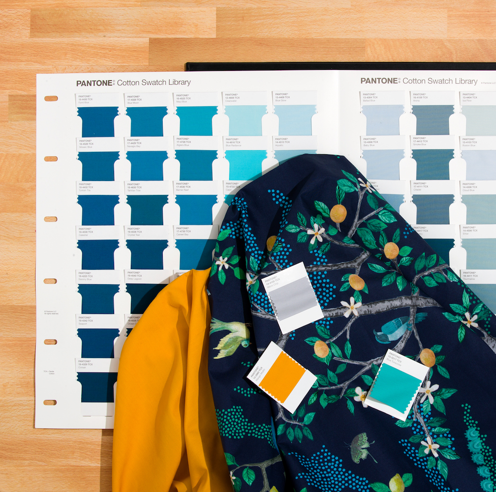
Blues have been expanded with the ethereal Endless Sky and Ebb & Flow as well as an icy blue named Frozen Fjord, while brighter, green-infused shades like Exotic Plume and Gulf Coast are meant to evoke a more summery, tropical feel.
The 70 new blue shades also incorporate a more fashion-inspired take with denim colours such as Soft Chambray and Rain Washed.
Read Also:Cool paint ideas for walls that are graphically glorious
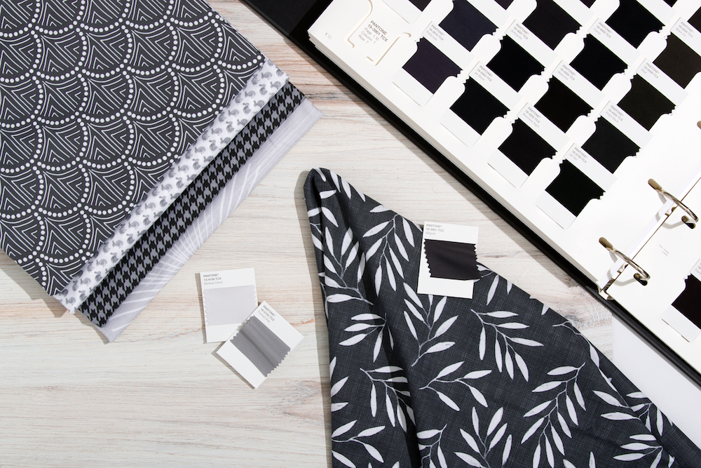
Some of the added shades – such as Weathered Teak and Island Fossil – are supposed to offer a nuanced take on neutrals and taupes, which Pantone thinks are 'too often seen as a single colour' but can offer endless subtleties.
With over 2,625 colours in total, we're sure that describing, categorising and naming them all is no easy feat!
Read Also:28 Chic And Stylish Paint Colours For Your Bathroom
But Pantone's announcement wasn't solely about a colour update. All of the new shades have been added to Pantone's Fashion, Home + Interiors Colour Specifier – a pair of ring-bound binders filled with removable coloured slips of paper or cotton that those working in the creative industries can use to develop tonal palettes for projects.
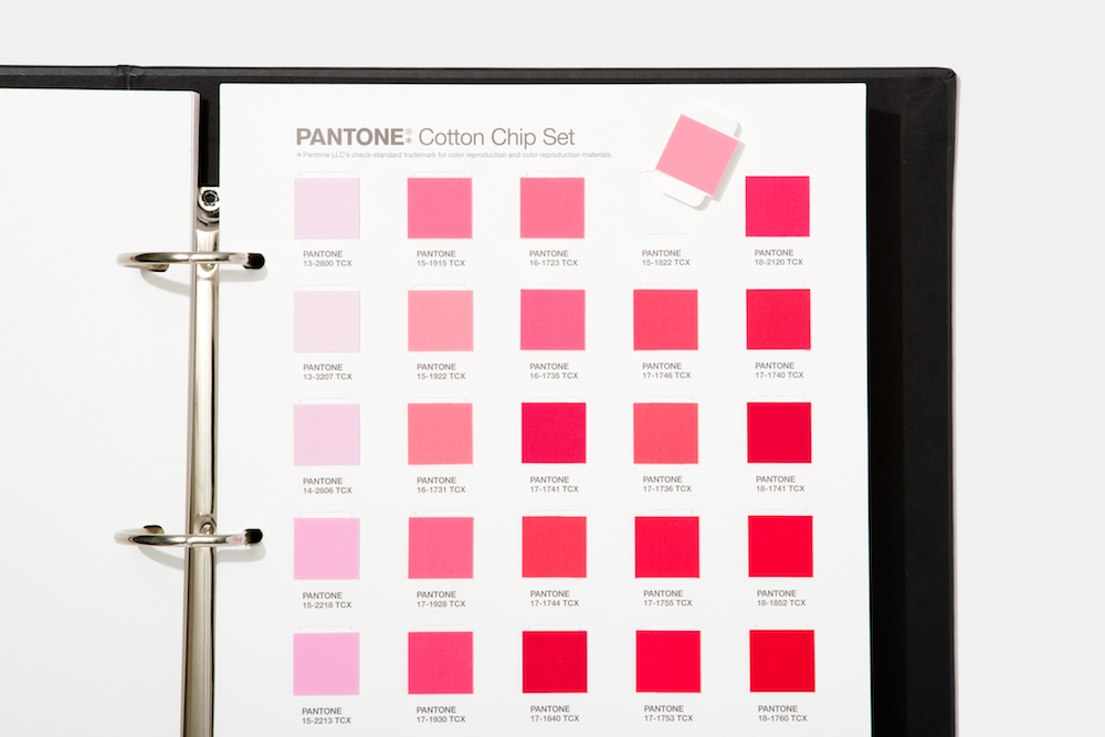
Read Also:Rugs As Art: It's Time To Swap Your Paintings For Something More Textural
Hues inside each binder have been grouped together to form 'colour families' – a move that Pantone hopes will make selecting shades an easier process.
The Pantone Fashion, Home Interiors Colour system is targeted at those who work in clothing and product design. The colours work across mediums, from cotton to plastics, pigments and coatings.
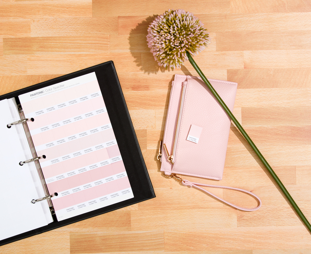
Read Also:The interiors trend that's going to be EVERYWHERE in 2020
Featuring the complete palette of 2,625 colours arranged by colour family, design professionals can now find and choose that perfect precise shade faster than ever, enabling designers to turn inspiration into a product reality more quickly.
The launch of the new shades has also seen the company create Pantone Connect, a management system and extensive colour library that can be merged with digital design tools like Photoshop, Illustrator and InDesign to provide final delivery of colours into design files.
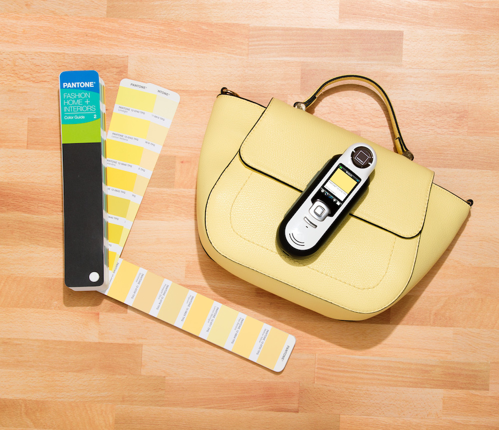
Read Also:Trending: Ladder Ideas For Every Room
The digital suite introduces Pantone's coloursinto designers' software programmes, helping creatives to have a better control over the exact colour outcome of projects by giving all designers access to the exact colour codes.
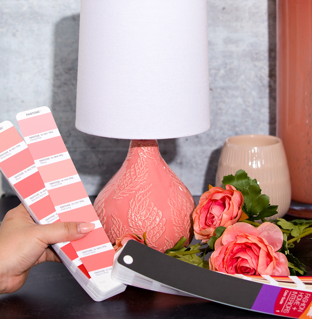
Having digital access to each of Pantone’s 2,625 colours enables designers to seamlessly streamline projects and guarantee better accuracy.
Pantone explains: 'When a designer in one country communicates and specifies in Pantone, they know without question their colour intent will be immediately understood by their production partners across the world, making colour management easier and more reliable.'
Read Also:Trending: Textured walls. New season wallcoverings are going 3D

Lotte is the former Digital Editor for Livingetc, having worked on the launch of the website. She has a background in online journalism and writing for SEO, with previous editor roles at Good Living, Good Housekeeping, Country & Townhouse, and BBC Good Food among others, as well as her own successful interiors blog. When she's not busy writing or tracking analytics, she's doing up houses, two of which have features in interior design magazines. She's just finished doing up her house in Wimbledon, and is eyeing up Bath for her next project.