Tile Trends — Every Design-Forward Look to Have on Your Radar
Meet the most covetable tile shapes, materials, colors, layouts, and looks for the season ahead
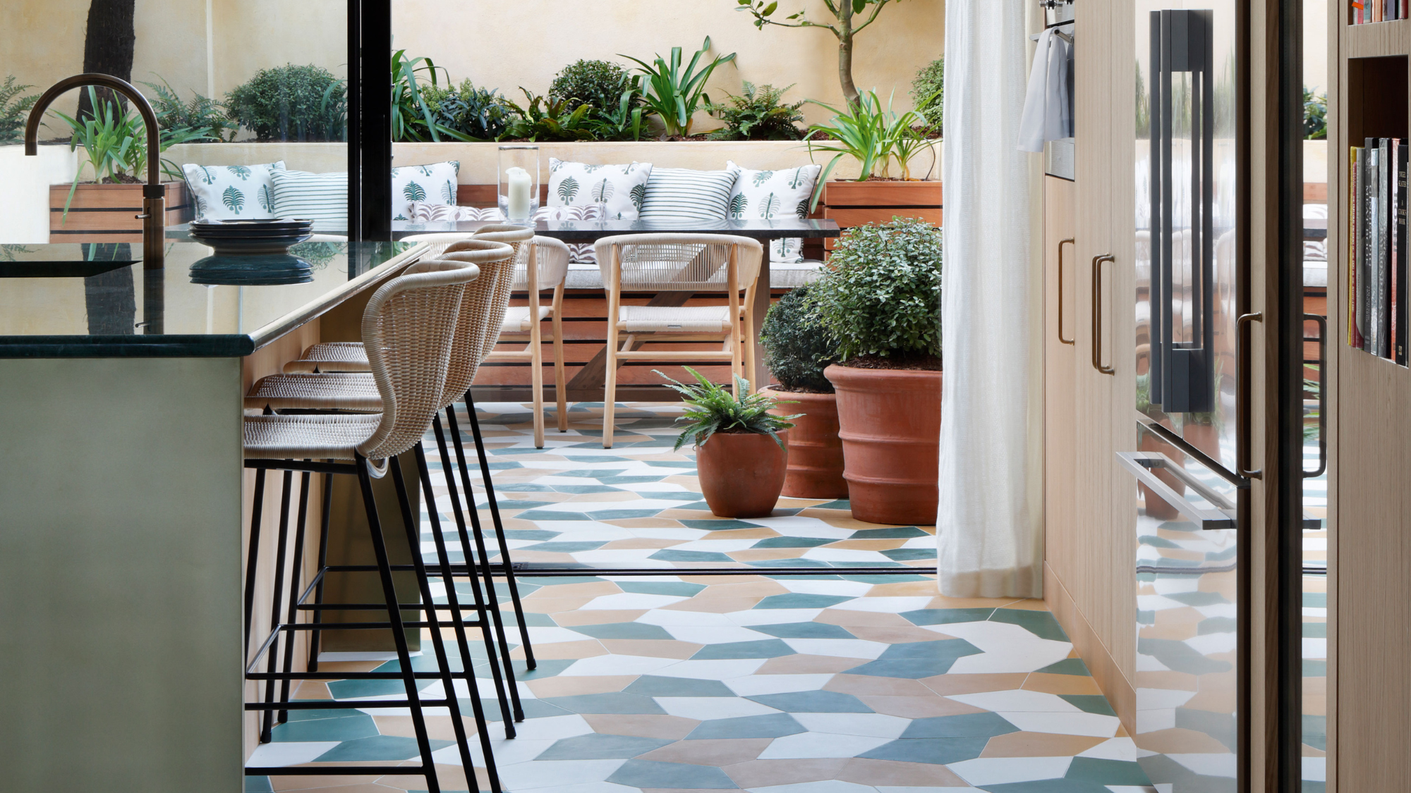
There can be a lot to think about when choosing tiles for your home: shape, color, application… the list goes on. Throw trends into the mix, and you might find yourself frozen by the endless possibilities.
One of the most important considerations, however, is taking these interior design trends and creating a blend that is not just your own, but which reflects the story of your home, too. ‘There's a shift towards more eclectic and bespoke designs, designing for YOU and not for a trend or a specific style,’ explains design director Ariel Schuster.
So, how to narrow your choice? I spoke to designers to come up with the checklist of the biggest and best tile trends to watch out for and get creative with, whether in your kitchen, bathroom, entryway, or even pool house. This is what they told me.
Article continues belowThe Shape: Geometric
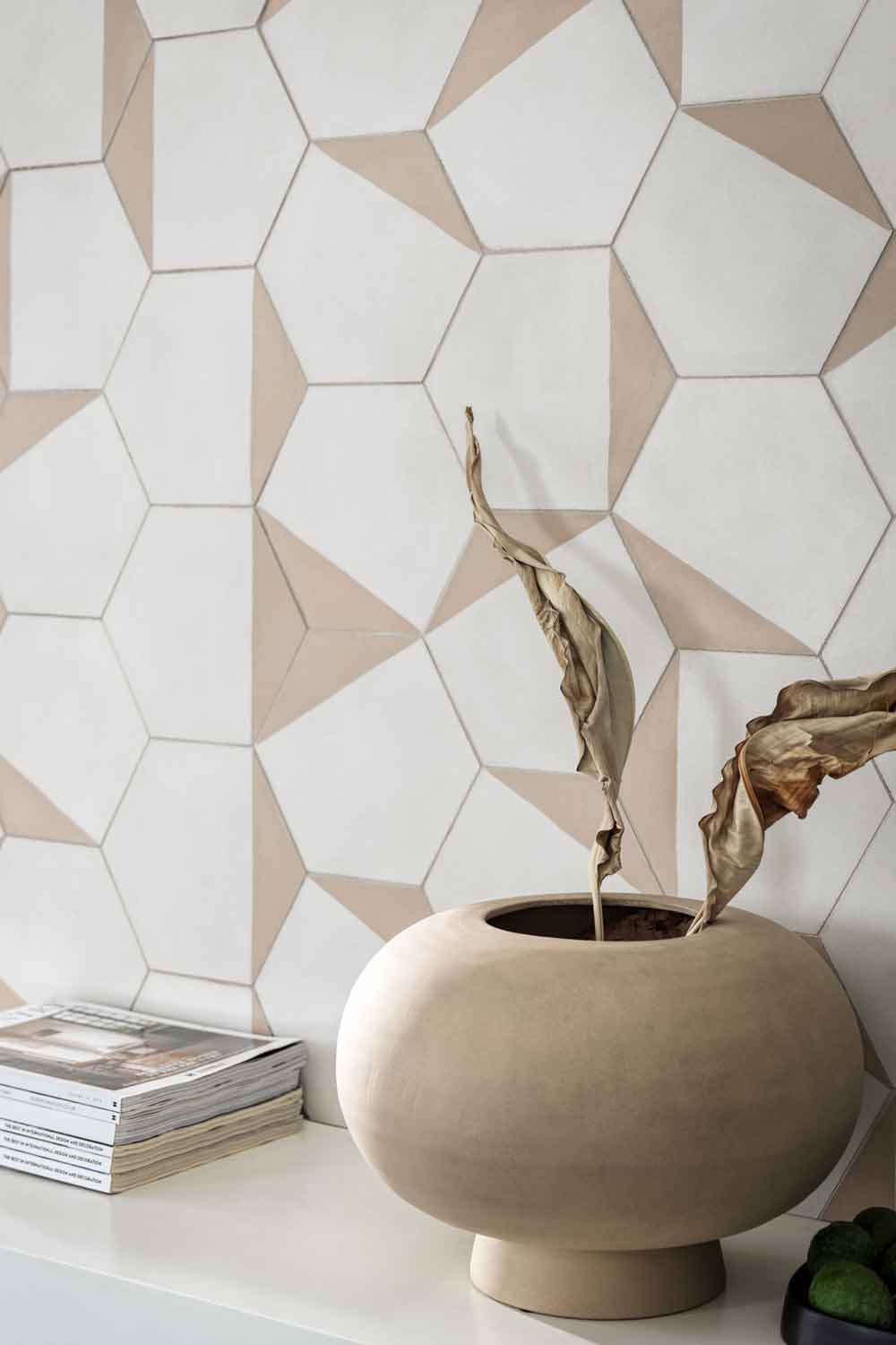
First, think of the shape. This is the most important step as it sets the tone of the overall effect and will impact the way pattern and color are perceived – the aim is to pick a shape that doesn’t create a sense of visual clutter, so stick to straight lines and angles.
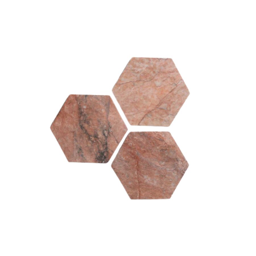
For a fresh look, designers are leaning towards geometric tiles, especially for kitchen tiles. ‘Look for hexagons, and oversized squares for a modern update,’ interior designer Vyianca Soto tells me.
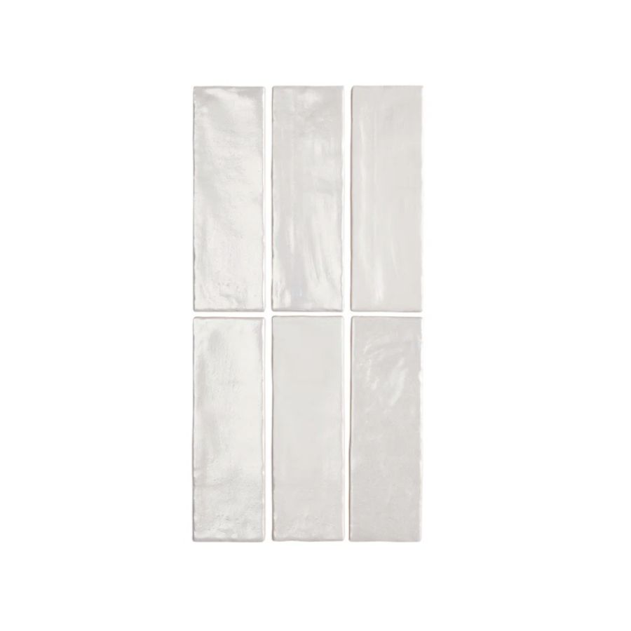
For bathroom tiles, she advises to opt for long, narrow tiles, that can be stacked or used in a herringbone pattern for a more sophisticated look, like in the space above
The color: nature inspired
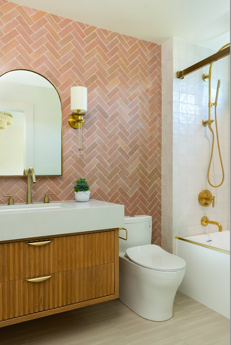
In recent times we’ve been turning to our homes to create a sense of calm, and the colors of the year have played an important role in achieving this. While there is still some room for bold tones that make a statement, in 2025, color trends are turning towards muted, nature inspired colors that instil a sense of tranquillity. ‘Muted pastels like sage, blush, or soft terracotta bring subtle color and a spa-like tranquillity,’ says Vyanca.
The Livingetc newsletters are your inside source for what’s shaping interiors now - and what’s next. Discover trend forecasts, smart style ideas, and curated shopping inspiration that brings design to life. Subscribe today and stay ahead of the curve.
If you want to achieve that sophisticated, hotel like look, pick a monochromatic palette and play with different tones of the same color. You can add depth, and make muted tones look more interesting by using a texture surface tile.
The finish: textured
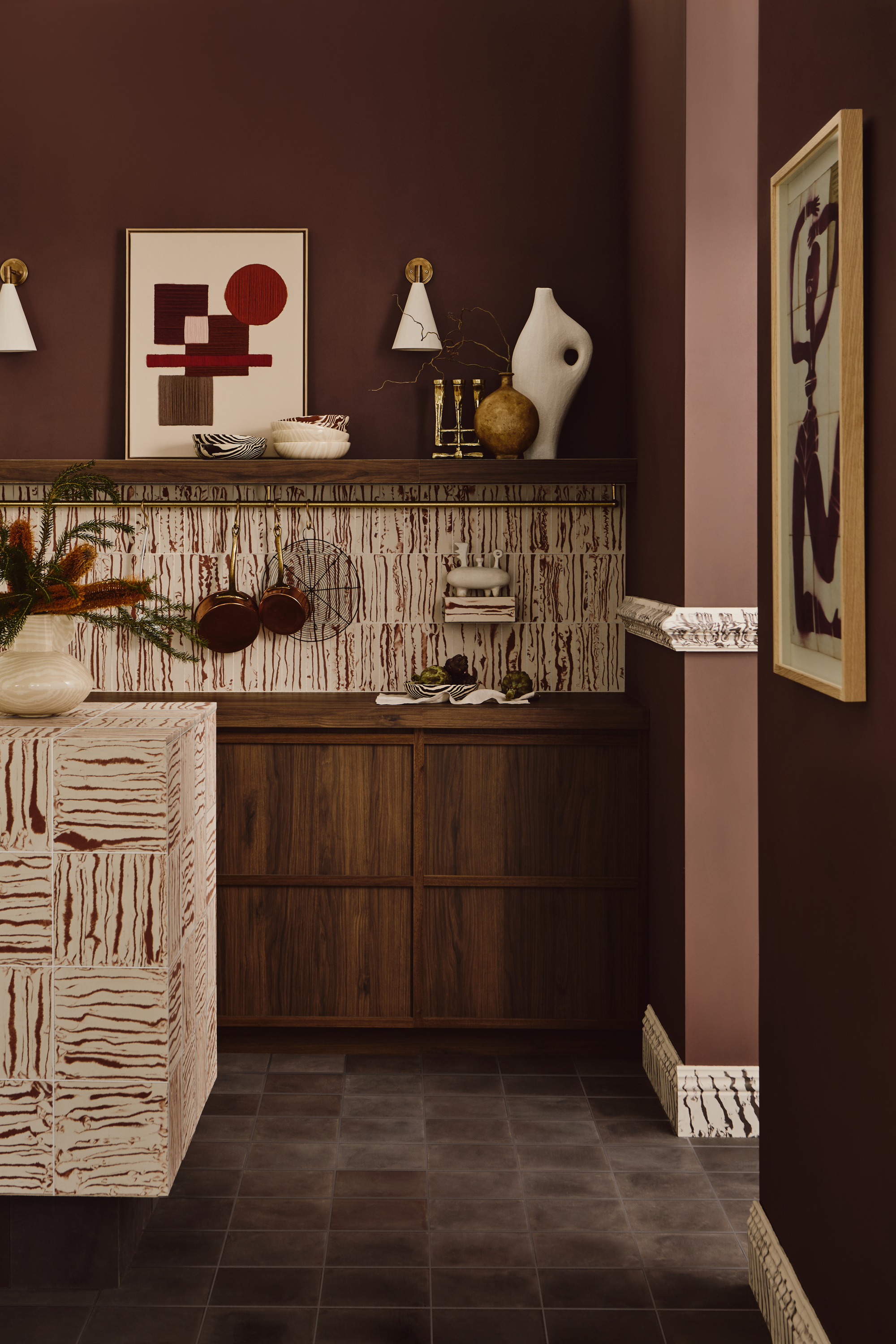
The finish of a tile is a detail that is often an afterthought, but it should be one of your top three priorities after shape and color. The finish is what adds depth, interest, and is often the secret to achieving that elevated, designer look.
Interior designer Thea Bloch-Neal likes a tile with a handcrafted feel. ‘Imperfections will blend naturally, adding charm without the maintenance hassle,’ she tells me.
‘In terms of texture, we’re seeing more fluted stone tiles as well,’ says interior designer Jesica Shaw. Thea agrees and adds that ‘they’re a beautiful way to add texture and a unique touch to your kitchen or powder room that will age gracefully over time.’
While fluted textures will be popular in 2025, Vyanca advises to also consider ‘tiles with grooves, hand-moulded edges, and matte finishes that feel artisanal and timeless, especially when paired with softer, natural hues,’ she says.
The pattern: retro vintage

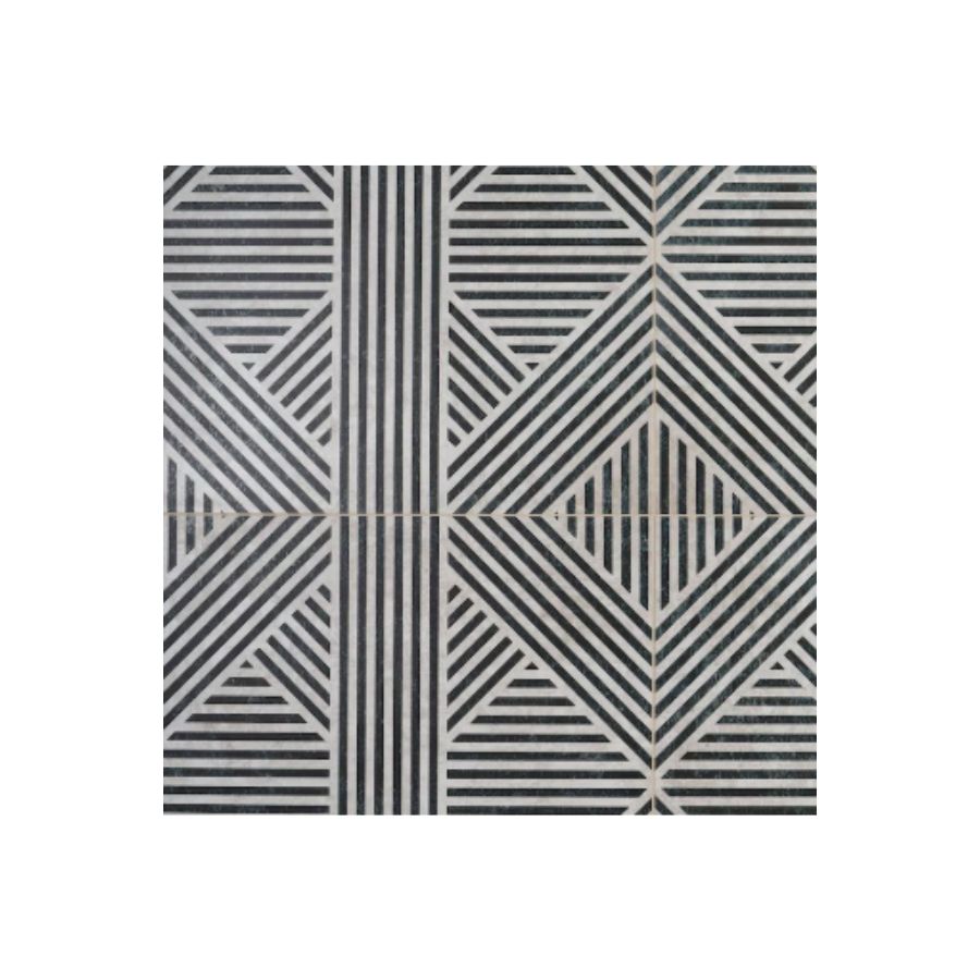
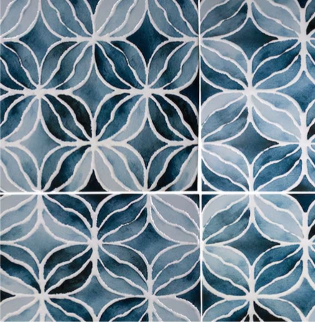
Vintage style patterns are making a comeback in 2025, and they are a great way to bring character into your home when a block colored tile doesn’t feel like quite enough. Remember you can decide how much or how little you use patterned tiles – be that on a whole area or just as an accent, it’s a great opportunity to think creatively.
‘We expect to see the love of vintage-inspired patterns continue to grow,’ says tile specialist Kiara Perdomo. ‘Retro designs like checkerboard, herringbone, or art-deco patterns are combined with more modern color palettes and finishes for a chic aesthetic,’ she adds. ‘Printed and patterned tiles in vintage-inspired designs (think ’70s influence) are perfect for feature walls or shower niches,’ explains Vyanca.
The scale: large format
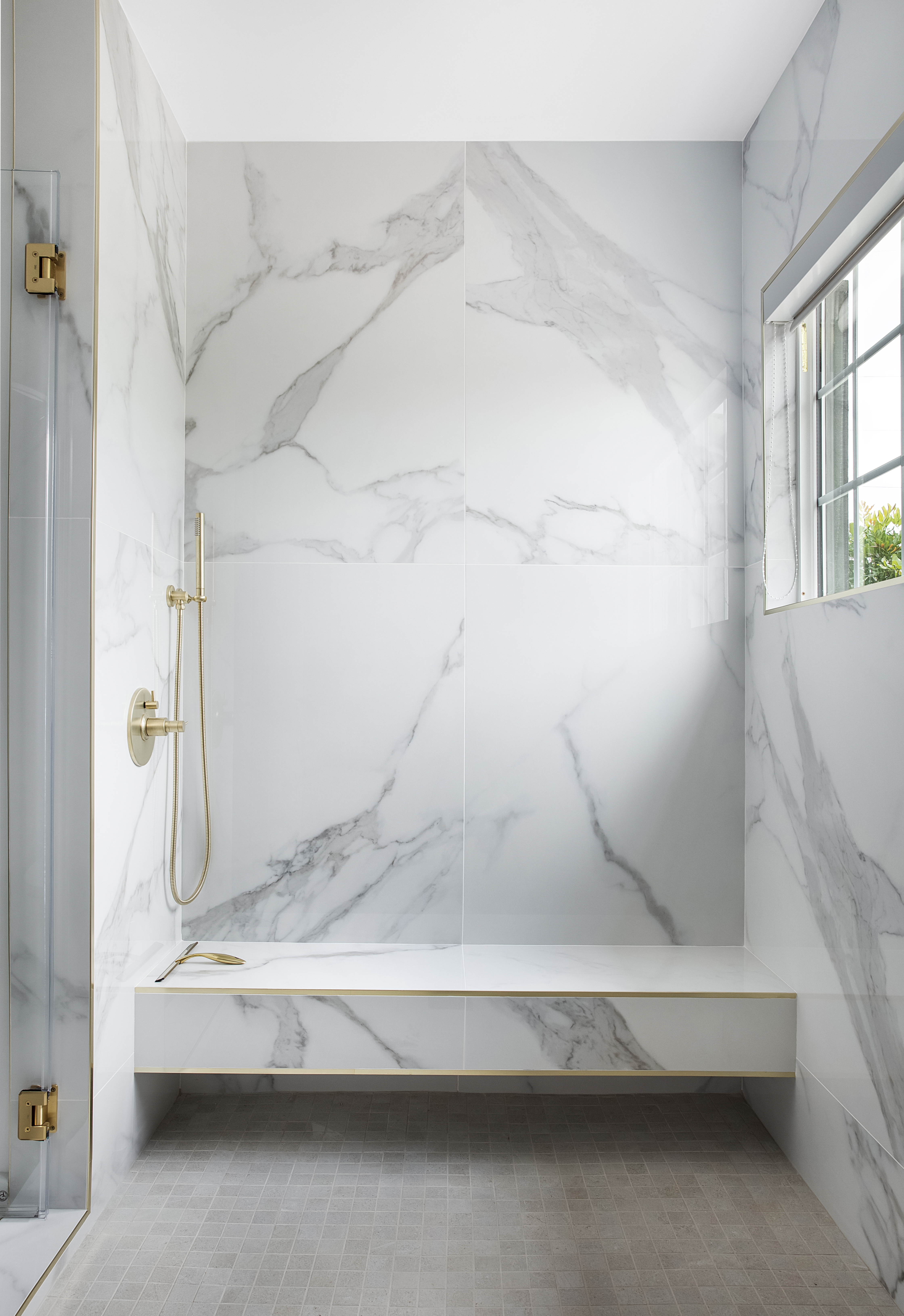
While tile trends lay no rules, and the only rule you should really follow is your own taste, they do offer us new ideas, inspiration, and the opportunity to change things up and bring a breath of newness into a home. There has been, in recent times a preference for tiles on a smaller scale, aiming to achieve a romantic, more feminine look.
However, in 2025, designers are looking forward to using tiles on the larger side. ‘In terms of scale, large format tiles are very popular,’ says Jessica. ‘People are leaning toward large-format tiles with fewer grout lines, especially in bathrooms and kitchen backsplashes, for a cleaner, more expansive look,’ explains Kiara. ‘Large tiles with minimal seams are becoming popular on floors and walls, contributing to a modern, open feel while reducing maintenance,’ adds Vyanca.
The application: linear

And now that you have your tiles ready, what are trends saying about layouts? Although the patterns might be vintage-inspired, such as this subway tile layout, and the colors soft and muted, the application should balance the scheme with an overall modern, linear look.
Vyanca tells me that stacked or herringbone patterns add a modern and sleek aesthetic. But there’s still room to get creative. Don’t be afraid to play with the application and the patterns you create. Take Vyanca’s advice and think of fresh ways to use traditional tiles.
FAQs
What color and style of tile is always on trend?
If you’re looking for a timeless aesthetic, Vyanca advises to opt for neutral tones like soft greige, creamy white, or muted taupe in matte or honed finishes to ensure enduring appeal.
In terms of style, Design Director Ariel Schuster says timeless, traditional motifs in repeating patterns, such as the classic checkerboard layout, have been resurfacing. ‘These timeless patterns always have a place in the home,’ she explains.
Raluca formerly worked at Livingetc.com and is now a contributor with a passion for all things interior and living beautifully. Coming from a background writing and styling shoots for fashion magazines such as Marie Claire Raluca’s love for design started at a very young age when her family’s favourite weekend activity was moving the furniture around the house ‘for fun’. Always happiest in creative environments in her spare time she loves designing mindful spaces and doing colour consultations. She finds the best inspiration in art, nature, and the way we live, and thinks that a home should serve our mental and emotional wellbeing as well as our lifestyle.
