5 Unexpected Color Combinations I'm Stealing From Little Greene's 27 New Paint Shades — From Teal and Tangerine, to Olive and Poppy Red
Striking teals next to warm oranges, bold yellows with rich purples, and soft pinks next to delicious browns — the pairs are unexpected, yet exceptionally stylish

It's the start of the end-of-year, and as things start to wind down, color-of-the-year predictions roll out. So far, we've seen a lot of greens, blues, and warm, earthy tones, all signaling a grounding evolution in interior design. And, while Little Greene didn't announce a singular shade set to define 2027, the brand instead launched a refreshed 'Colors of England' and 'Color Scales' palette, which includes 27 new and refreshed shades.
As an indecisive person, I love it when paint brands provide options — a palette rather than a single shade means more inspiration and guidance for how to decorate with color in your home. Sharing this knowledgeable insight is the ethos of Little Greene's release. The brand explains that it examined color trends over the past decade and how they have evolved to decide what upgrades to make to its 'Colors of England' card and the 'Color Scales' offering, which includes 22 new colors and expanded color families.
So, learning how to combine colors and create harmonious schemes is the goal here, and I must admit, I was truly taken with some of the combinations in Little Greene's new palette. Striking teals next to warm oranges, bold yellows with rich purples, and soft pinks next to delicious browns — the pairs are slightly unexpected, yet exceptionally stylish. Basically, there's ample inspiration to gain from the brand's latest release — here are the five color combinations I'm currently obsessed with.
1. Teal and Tangerine

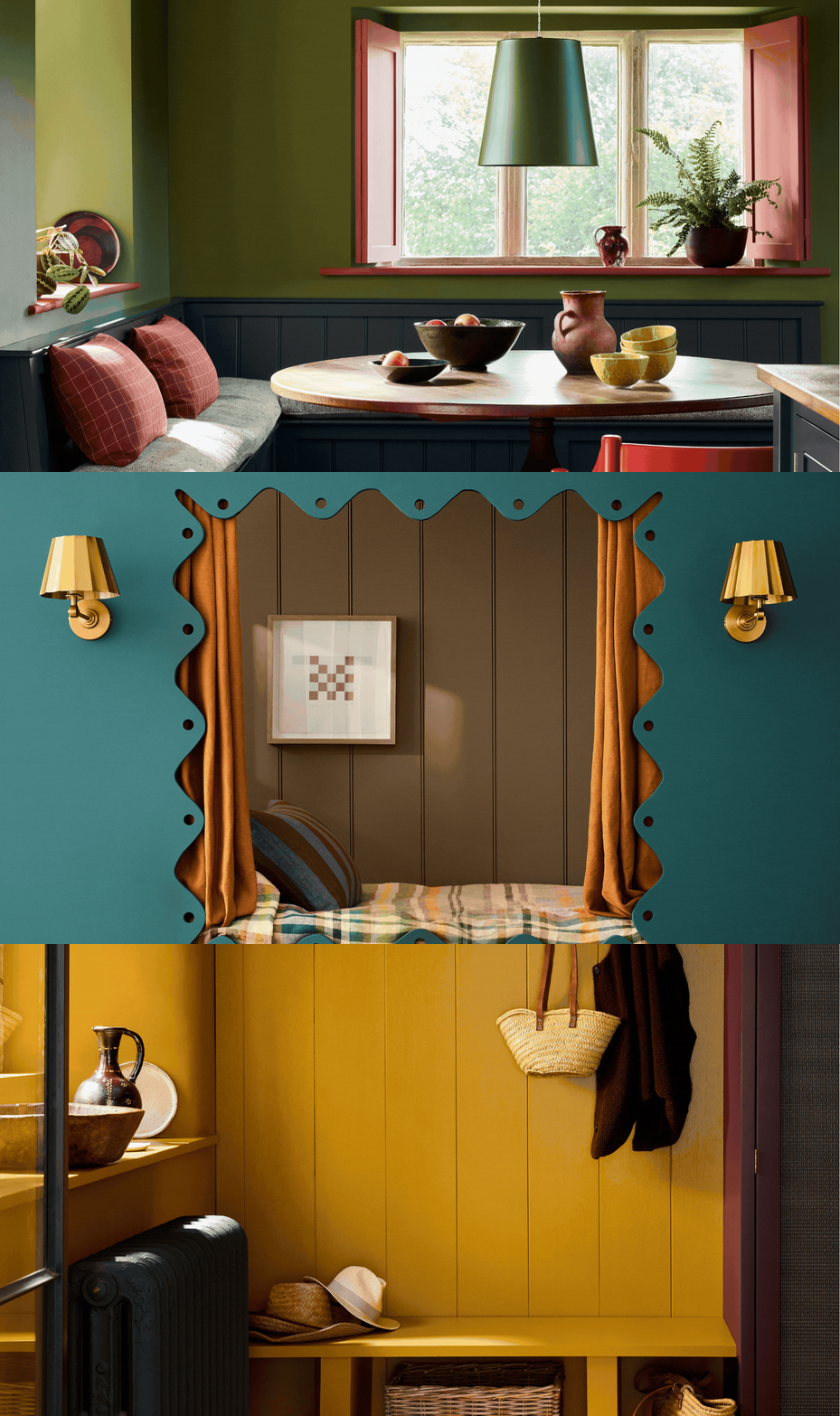
Rome is definitely a shade for people who want to experiment with color — it's bold and entrancing in all the best ways.
Image credit: Little Greene

Though striking, Ashes of Marigold is tempered with a touch of black to deliver a warm, earthy terracotta orange that feels both fashionable and liveable — especially when contrasted with a soothing blue.
Image credit: Little Greene
I can't necessarily say that I am totally surprised to see orange and teal paired together, but this high-chroma combination is definitely more on the unexpected side. Decorating with blue is scheduled for a 2027 revival — whether it's a calming light blue, like Celestial Blue, or a deep, sophisticated blue like Rome. And the common theme is a clear shift away from cold undertones. This makes these shades even easier to pair with their natural complement: orange.
Orange and blue sit directly opposite one another on the color wheel, so when used together, they create strong visual contrast, allowing each shade to enhance the depth and character of the other. Ruth Mottershead, color expert and creative director at Little Greene, says, "The earthy warmth of Ashes of Marigold is beautifully offset by the tranquil, mid-toned Perpetual Blue, creating a scheme that feels both vibrant and grounded."
"When pairing complementary shades, consider using the warmer color on larger expanses where its enveloping ambience can be fully appreciated, while introducing the cooler shade through woodwork, cabinetry, or architectural details to provide contrast and definition," she adds. "The result is a scheme that feels confident while maintaining a natural sense of balance."

Ruth Mottershead is one of the UK's most respected experts on color. She heads up the creative studio for the iconic paint and wallpaper manufacturer Little Greene, translating the brand's eighteenth-century roots into beautiful contemporary designs.
2. Ochre and Aubergene

The warmth of the yellow reflects beautifully off the deep purple in this entryway.
Purple and yellow together are probably one of the trickiest color combinations to pull off. Yes, purple and yellow are complementary colors, but they are both rather obscure colors when it comes to interior design — especially in these bold variations.
But again, warmth is the key. A rich aubergine leans into the reddish side of the color wheel, while ochre is a sunshine-inspired shade with strong orange tones. There is a lot of warmth happening here, making this specific pairing of Brulee and Cordoba from Little Greene exciting for contemporary interiors.
The sunshine-y golden yellow next to the rich, brooding aubergine makes for a very satisfying contrast in design. Plus, you'd have an easy time complementing this combination with warm neutrals like chocolate brown and soft mocha.
3. Olive, Navy, and Poppy Red

This combination feels incredibly timeless but still in line with current fashions.
If any color is having its revival moment, it's green (not that decorating with green could ever go out of style, though). Green color trends are currently drawing on natural hues that have an unexpected flair — punchy olives, chartreuses, and yellow-toned teals. And Little Greene's new palette is making a fabulous case for how to style these shades.
Bright olive (Hillside, one of Little Greene's new shades), bold red (Tuscan Red), and navy (Dock Blue) are the combination here, and it's as timeless as it is exciting. Green and red are complements on the color wheel, and for that reason, I will always argue for their use outside of Christmas, too. Then throw a pop of navy into the mix? It's the perfect contrast — almost a grown-up take on decorating with the primary color palette, if you ask me.
"Greens and blues feel at home in both period and contemporary properties," adds Ruth. You could even throw a mid-tone blue into this palette. "Perpetual Blue is a mid-to-deep blue that has a hint of green, which responds beautifully to changing light and adds a touch of warmth," the color expert adds. None of these colors dominate when all together, yet the contrast ensures the space feels engaging and dynamic.
4. Mocha and Bubblegum


This combination feels neutral with more warmth.
Image credit: Little Greene
We've become quite used to a chocolate brown in a contemporary palette, but this year is bringing a softer, milk chocolate-taupe shade to the forefront. And what goes better with this rose-tinted brown than a soft, dusty pink? I wasn't expecting to fall in love with pink and brown this year, but here we are.
And for this combination, we are really making the most of Little Greene's new shades — Marle (a mid-tone brown with ochre undertones), Flight Pink (a deep mauve with plenty of pink in its makeup), and Parlour (a delicate plaster hue). Plus, combining these warm, cozy neutrals makes a more interesting neutral color palette; there's a little rosy warmth that will never feel cold or flat in a space.
Milk chocolate mocha and ballet slipper pink? Did someone say chocolate box interiors? I'm getting major cottage core vibes from this pairing, in the best way.
5. Sky Blue and Lime


Lastly, I was surprisingly taken by this sky blue and lime color combination. While this duo could easily read as more youthful, the nuanced tones make it feel fresh and lively — perfect for those restorative moments in an interior. So what are the Little Greene shades to look for? Deep Celestial Blue (part of the color scales family) and Citrine.
Decorating with light blue will always create a serene space to unwind in, but I love that the pop of lime creates a characterful juxtaposition. At first, it's slightly unexpected, but the warmth in both of the tones creates a beautiful, zingy pairing. So fresh.
Learning how to pair colors properly opens the door to creating an interior palette that feels perfectly fitted to your taste. Little Greene is serving up plenty of inspiration this season, especially if you want to experiment with anti-trend color combinations in the upcoming year.
For more inspiration like this, be sure to subscribe to the Livingetc newsletter.
