The 'Grown-Up' Way to Decorate With Light Blue — This Shade Shouldn't Just "Be Resigned to the Baby's Room"
We explore how to bring the lighter intonations of blue into your home in a contemporary and thoughtful way

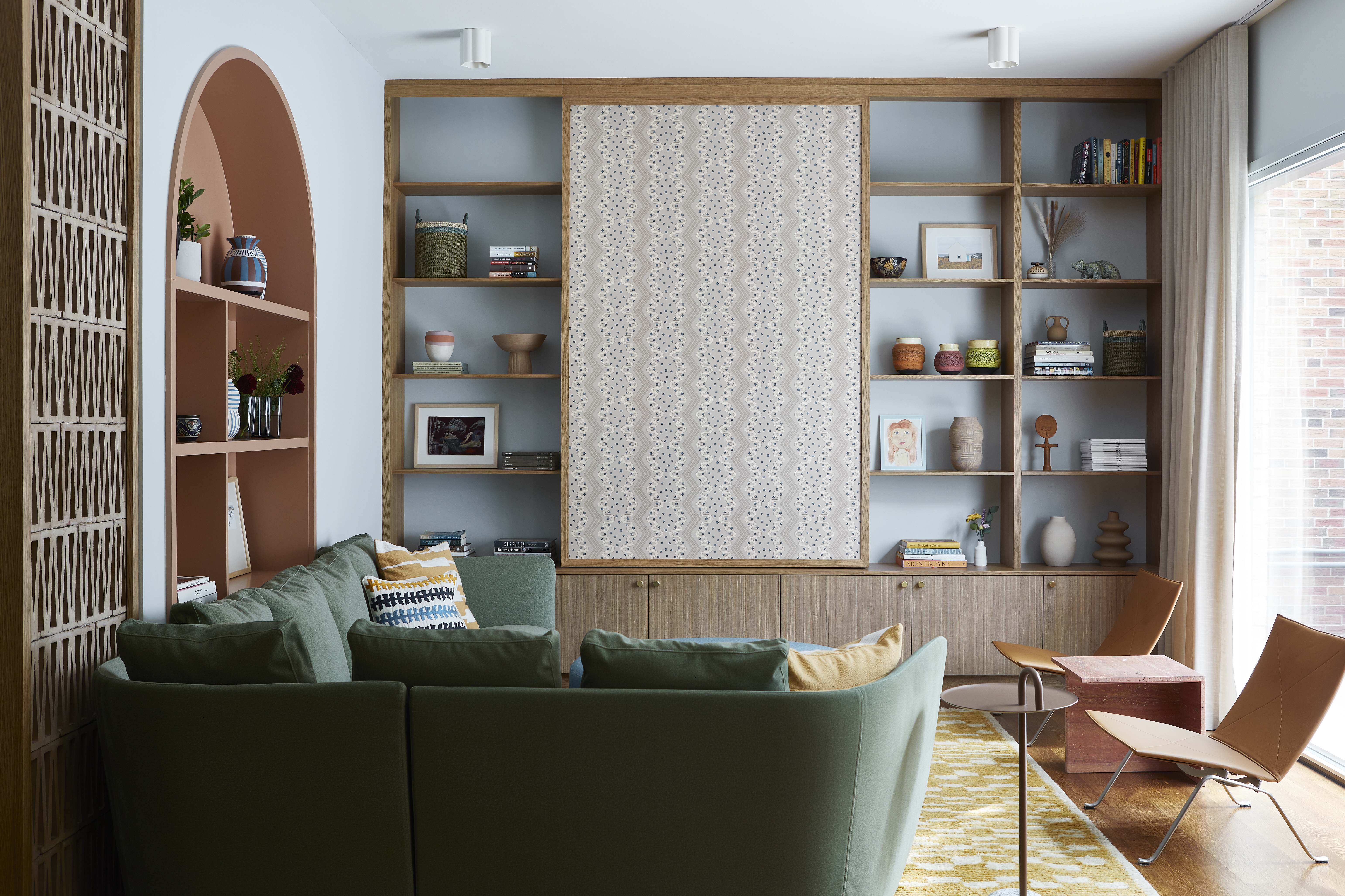
Light blue. It conjures images of the sky shifting around dawn, of glimmering shallow seas, and of woodlands scattered with spring bluebells. But when it comes to decorating with light blue in the home, does work in a contemporary way? Oh, it can, and it will.
The lighter intonations of blue feel soothing. We can all sense it. They’re the toned-down cousins of the more-in-the-spotlight blue shades such as navy, cobalt, azure, sapphire, and cerulean — pushed back and more distant from the drama of such bolder tones, and instead, their personalities are cool and laid back. Their names tell the stories fairly well: baby blue — so soft it’s nursery-room-ready; powder blue — chalky, washed-out and vintage with a delicate charm; sky blue — we’ve already spoken about that; ice blue — the coolest of them all, summoning visions of just-about-color hidden in hunks of ice and cornflower (at a push), summery and deeper than the rest but still carrying a gentle, petal-like quality.
So how to bring light blue into the house in a way that feels grown up, up-to-date, and like it’ll work past dawn, that is both welcoming, and ready for all seasons? What mood does it create in the home? And what are the colors that go with light blue?
Article continues belowDecorating with light blue need not be resigned to the baby’s room and never seen again. It’s a tone with complexity, subtlety, and built-in tranquility that truly deserves a spot in your beautifully curated home — let’s explore why.
1. Lean Into the Lightness
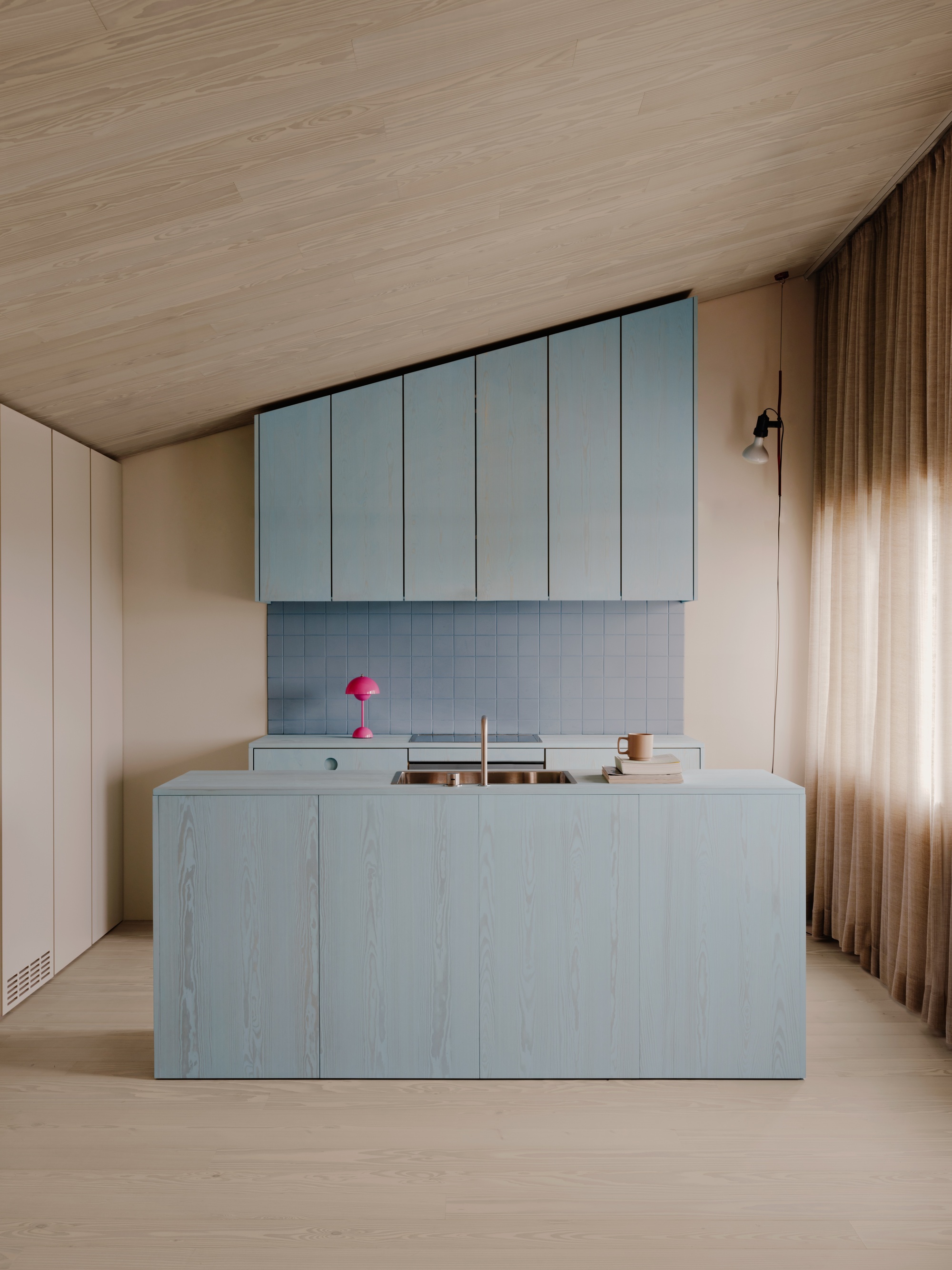
Light blue, though introducing color, doesn't tend to feel overwhelming.
There’s a spectrum of light blues. The two that leap to mind are, ‘light blue’ and ‘pale blue’, which sound like they should be descriptions of the same thing, but no, no. ‘Light blue’ is blue… with light added to it, so it’s brighter and lighter than mid-range blues. ‘Pale blue’ is a desaturated, more washed-out blue, but no need to get bogged down in rules and scientific specifics — we all know what we mean.
When you think of light, pale, pastel-y blues it’s like floating on an infinite cool lake surrounded by silence and the smell of… fresh, crisp, nothingness. In the home, they whisper soothing stories and instill a hushed grace. Their appeal is subtle yet pervasive, creating an atmosphere of relaxation that’s never overpowering and effortlessly fills a room with calm, openness, and a sense of space. From light blue living rooms and beyond, the shades bring a touch of elegance without overwhelming the senses. Light blues feel refined in interiors, offering a quiet sophistication that doesn’t demand attention but gently commands respect.
Their subtle and inherently calming nature also means decorating with light blues is a great entry point for the decoratively color-nervous. "Light blues are great colors to add a bright and crisp energy into a space, and it’s a shade that’s relatively easy to accept by people who are a bit afraid of incorporating strong colors into their homes," says Kasia Kronberger, founder and principal designer of Studio Bosko. "It’s a perfect starting point to working with color — I always say that it’s like bringing blue sky inside, and who wouldn’t want that?"
The Livingetc newsletters are your inside source for what’s shaping interiors now - and what’s next. Discover trend forecasts, smart style ideas, and curated shopping inspiration that brings design to life. Subscribe today and stay ahead of the curve.
Kasia Kronberger is the founder and principal designer of Berlin-based interior design and architecture practice Studio Bosko. Known for creating personality-filled spaces, Kasia initially built her career in fashion and is a certified trend forecaster, Kasia’s projects focus on high-design liveability, as well as a strong appreciation for art and color.
2. Bask in the Breeziness
Their link with the organic — as well as how they are likely already, at least partially, present in the home thanks to windows (weather dependent), means that introducing soft blues into the home feels like drawing nature's exterior inward. Many of us are innately drawn to tones that evoke the outdoors as they bring a sense of zen and thus are frequently used to create restful environments. "Thinking about blue brings a sense of peace," agrees Jennie Trethewy, co-founder of Studio Far West. "It’s a mentally soothing color encouraging serenity, orderliness, and tranquility, and light blue in particular will bring a sense of calm, airy space to an interior."
The unique sky-on-a-spring’s-day-ness of soft blues is a boon for creating spaces that emanate open expansiveness. The tones make small rooms feel and look larger, lifting the atmosphere and drawing in a fresh breeze; the shades are like a visual exhale, fostering a subtle sense of freedom and flow that encourages movement. "Using such soft, light shades across all surfaces in a compact room blurs the boundaries of the space, making it feel larger, airier, and more luxurious," agrees Jennie Trethewy.
That said, while they’re muted shades, light blues are by no means weak. They carry a quiet strength in their ability to still the mind and bring balance inside. In a world often filled with louder, more assertive colors, pale blues offer a delicate yet unmistakable presence, encouraging a sense of calm amidst the chaos of daily life — making light blue bedroom ideas good options to consider.
Jennie Trethewy is co-founder of Interior Design and Architecture studio, Studio Far West, based in St Agnes, Cornwall. The firm’s work is inspired by the ever-changing natural landscape of the West Coast, where soothing tones such as blues and greens play a huge role. In their view, designing interiors is like telling the story of a person or a place.
3. Crack the Color Combos
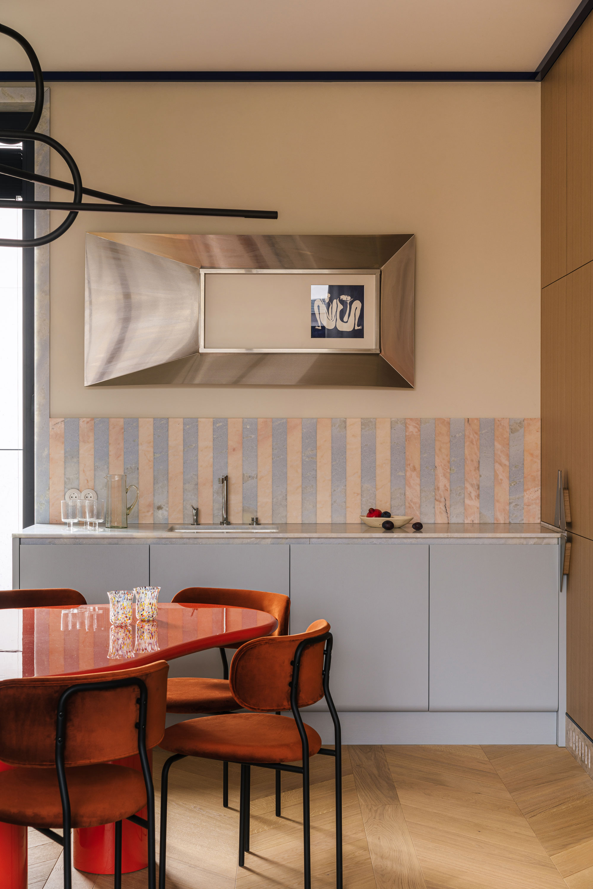
Blue goes with a surprising number of different colors.
Some might call light blues neutrals, and while they — along with many pale tones — can support other colors and drop into the background due to their gentle natures, combining them with other hues, such as these light blue wall combinations, is a much more powerful and impactful visual statement than it would be were they pigment-less or beige-y shades.
Thanks to their obvious natural links, pale blues are friends with as many colors as the sea has fish and flora. Organic shades work naturally with the tones, sure, but pastel blues aren’t afraid of more surprising color combos either. "Light blues pair perfectly with all colors of nature: different shades of wood, forest greens, sand, clay, plaster, and many types of natural stones…" says Kasia Kronberger. "I really like how light blue pairs with terracotta. A bit of a salty, greenish shade of light blue works beautifully with earthy tones of burnt clay, and a bit of a sweeter, baby blue works wonders put together with chocolate brown or walnut."
"Incorporating neutral shades like white, cream, or beige to an interior scheme can create a visual balance with a light blue. That being said, we try to avoid the coastal cliches of a blue-and-white interior," says Cornwall-based Jennie Trethewy. "And pairing light blues with red tones like burgundy and pillar box red produces a sophisticated, romantic color scheme — the vibrant contrast elevates the impact of both colors."
I’m a fan of a pale blue and more eyebrow-raising tones such as cherry red, or the likes of faded yellow (delicious) and a very carefully chosen peony-style (and very much not for babies) pink. Then there’s still so much to try when decorating with light blue, such as lavender, plum, or deep purple for something ethereal and dramatic; greens such as olive, emerald, and forest for some lively earthiness; or a peach, burnt orange, or coral for some bold warmth (plus orange and blue are complimentary colors on the color wheel, giving them a naturally pleasing contrast).
4. Unlock the Undertones
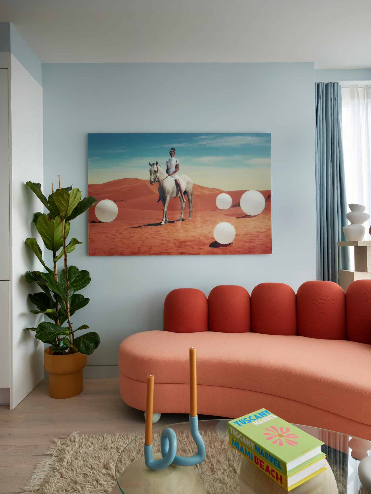
Not all light blues are the same — and the undertone will change how it reads.
The undertones of a color are what make it lean warm-ish or cool-ish, and altering the undercurrent of a light blue shade just a touch has a dramatic effect. "Traditionally, light blues are considered as a cool color. However, they can definitely have a warm hue, especially those that have a little bit of a green or yellow pigment, while red undertones make them seem particularly cold, towards lilacs and purples" sums up Kasia Kronberger.
Light blue paint colors with warm undertones such as a subtle infusion of green or a dash of yellow, have an inviting, sunlit quality. These blues feel fresher and softer, like fresh foam on a churning sea or the sky on a bright day.
Violet undertones transform a light blue into something dreamy, whimsical, and — shockingly — that nudge at purple. They’re like the last traces of twilight, rather than the early morning of classic pale blues. In shadow, they take on a cooler, more subdued feel, while in brightness they appear softer and warmer.
Some light blues have cool undertones with hints of gray, which creates a diffused effect that feels understated and serene. These blues often seem muted and restrained, like the quiet stillness of a foggy morning. In natural daylight, they can appear crisp, while in lower light or shadow they often take on a moodier quality, which softens in warmer lighting conditions to sometimes hint at a faint greenish or taupe-like tint.
For more inspiration on decorating with light blue, these light blue kitchen ideas are packed with ways to fill the heart of the home with this contemporary shade.
Amy Moorea Wong is a color authority and contemporary interior design writer who has specialized in all things decorating for over a decade. Amy is Livingetc magazine’s Colour Expert, Interiors Editor at The Glossary magazine and a Contributing Editor at Homes & Gardens magazine, and she frequently contributes to an array of global publications to share her insights on interior design zeitgeist. Her book Kaleidoscope: Modern Homes in Every Colour explores a collection of cool colorful homes fizzing with creativity, surprises, and inspiration.


