Red and Beige is the New Designer Favorite Combo — Here’s Why (and How to Make it Work)
This dynamic duo is warm, vibrant and exciting – we spoke to interior designers to find out everything you need to know about using it

The Livingetc newsletters are your inside source for what’s shaping interiors now - and what’s next. Discover trend forecasts, smart style ideas, and curated shopping inspiration that brings design to life. Subscribe today and stay ahead of the curve.
You are now subscribed
Your newsletter sign-up was successful
Every so often, a power duo emerges from the dozens of color combinations used by interior designers as a winning formula. We saw it with teal and terracotta, periwinkle and bright red – and now the latter has found its new favorite companion in beige.
Designers have been employing beige and red in increasingly confident ways, using this color trend to bring dynamism to a scheme – in fact, it’s one of the top combinations used in spaces that tap into the unexpected red theory, too. Warm and welcoming, confident and forward-thinking, we can’t get enough of this duo of hues.
Intrigued? We spoke to interior designers to find out everything we need to know about this color combination – and how to use it to the very best effect.
Article continues belowWhy do designers love beige and red?
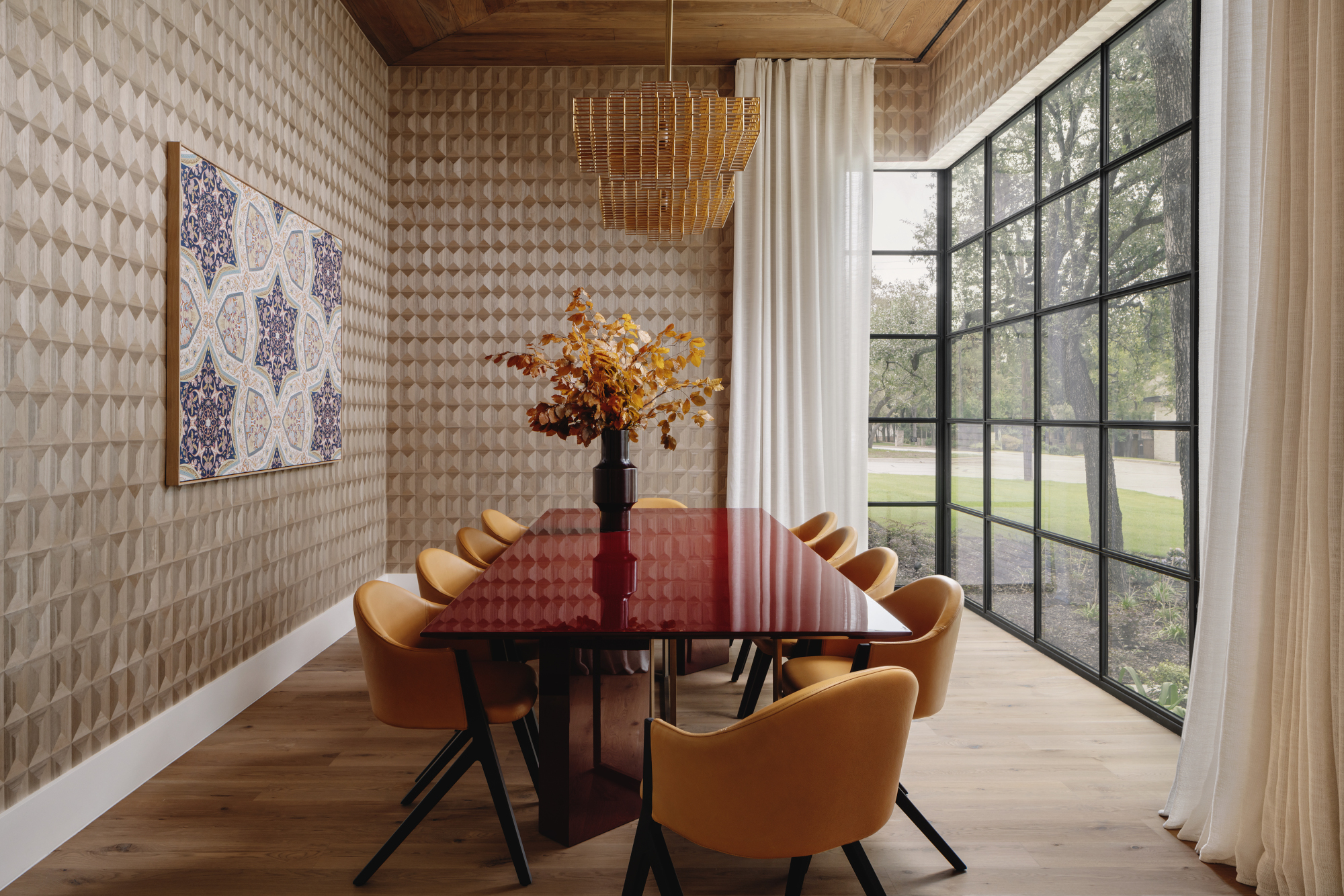
There’s something of a nostalgic air about this color combination. ‘This palette was quite popular in the past and remains a timeless choice, evoking a retro-chic ambiance,’ says Ola Jachymiak-Bigo, interior designer and founder of her eponymous London and Paris-based design studio. ‘Red certainly adds warmth and dynamism to the room, especially when paired with neutral, warm beige tones, imbuing the interior with a timeless appeal. The effect also depends on the shade of red used; while some shades may impart a more modern and youthful vibe, others, less bold, could maintain a timeless charm in the space.’
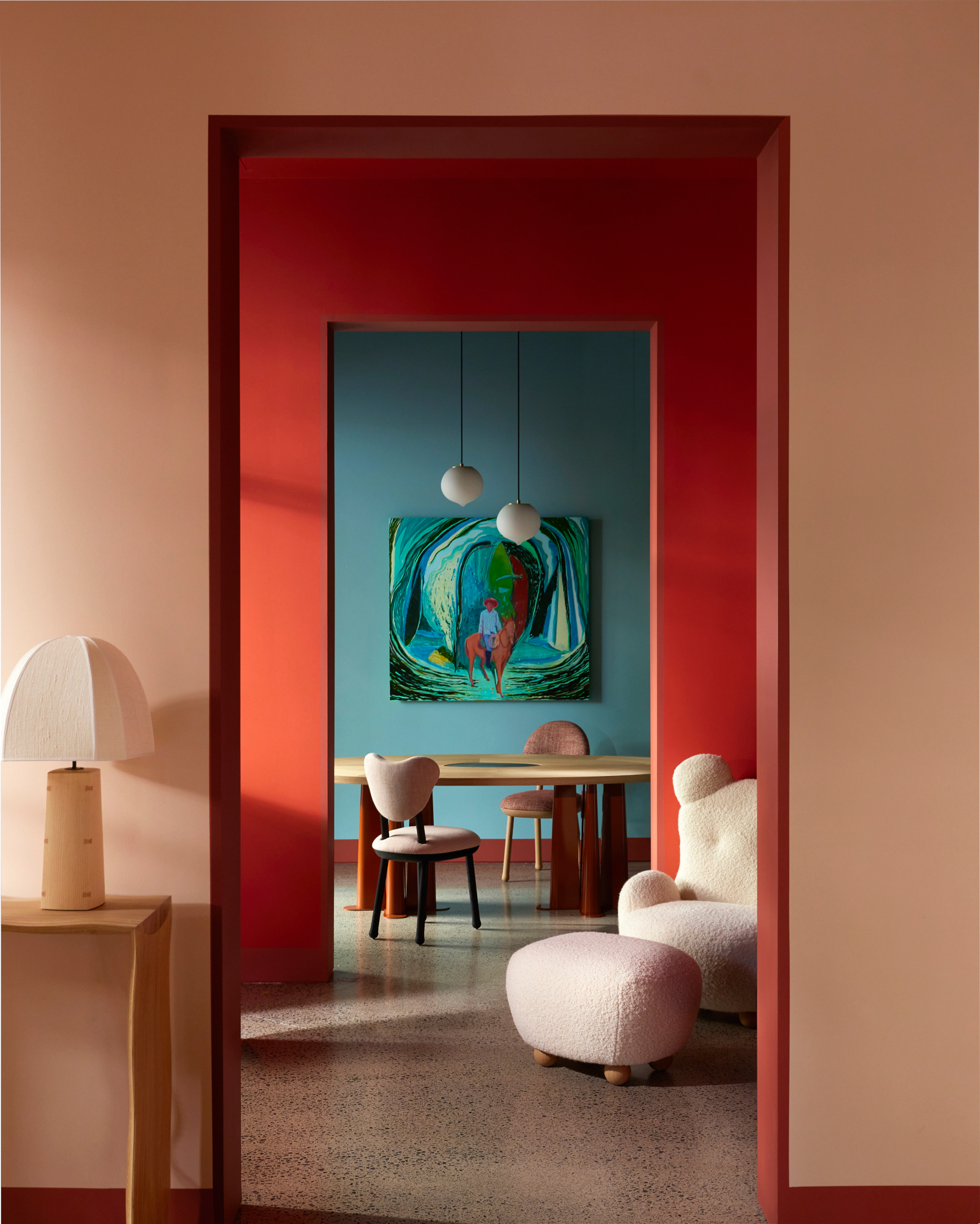
Of course, color theory plays a part in why these shades work so well together. ‘Red and beige belong to different color families – red being a warm color and beige being a neutral color – so they work together to activate a space,’ says Cori Pfaff, senior designer at Texas studio Ashby Collective. ‘The warmth of the red balances the neutrality of beige, creating a visually pleasing combination.’
‘The combination of these color works well because they share a similar undertone of brown,’ adds Mauricio Lobeira, co-founder of Texas design firm Ten Plus Three. ‘Red has the ability to activate a space, and works well if used on certain accents. Beige, on the other hand, is a very neutral and classic color which never goes out of style.’
How can you use beige and red together?
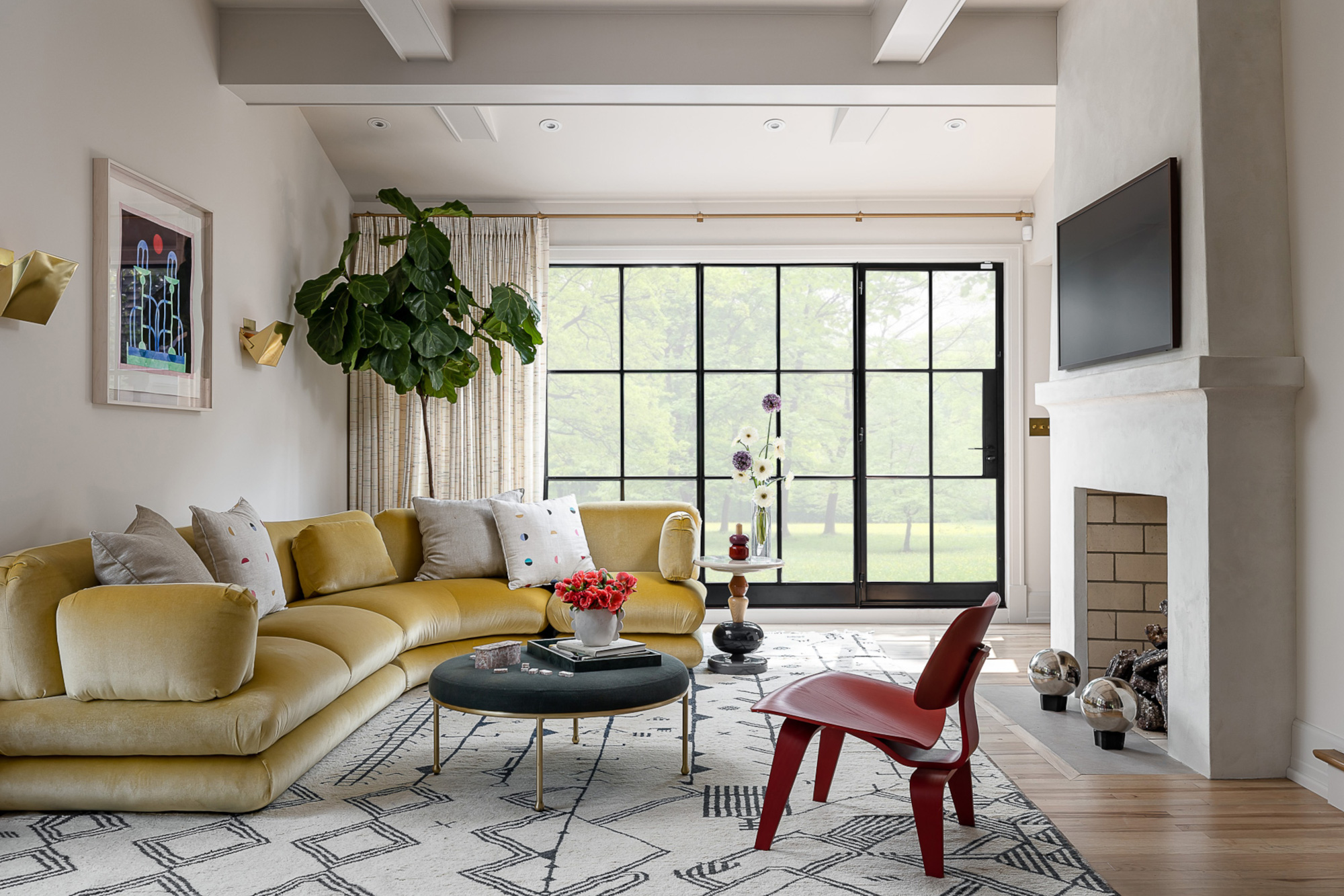
In the most part, beige should take the lead as the dominant shade in a scheme like this, designers agree. ‘Traditionally, walls are where you place color because painting is easier than reupholstering or getting all new furniture,’ says Cori. ‘But balancing the bold red within a neutral backdrop is what makes this particular combo work for years to come.’
The Livingetc newsletters are your inside source for what’s shaping interiors now - and what’s next. Discover trend forecasts, smart style ideas, and curated shopping inspiration that brings design to life. Subscribe today and stay ahead of the curve.
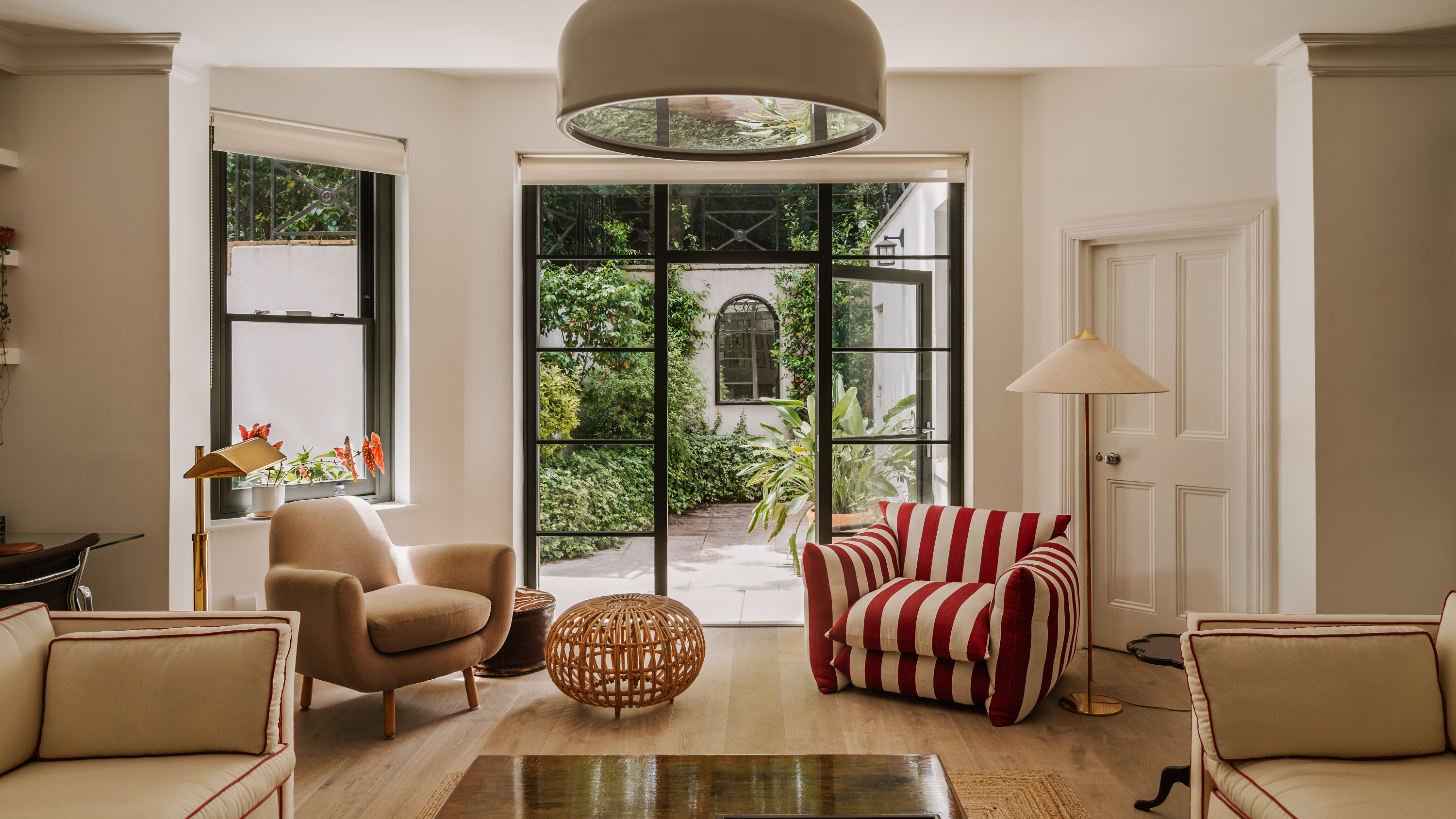
‘I love beige walls with a pop of ruby red as an accent – the look is at once soothing and surprising,’ adds Louisville, Kentucky interior designer Bethany Adams. ‘The key is to not go overboard with the red. Limit yourself to one impactful item – like the drapery, the sofa, or an accent chair – and one or two small accessories to tie it together. That way, the room will seem restrained and elegant, rather than the lavish, sanguine profusion more closely associated with a skinned knee.’
Using the colors in this way means they can work for a variety of spaces – it's a great way to pep up a beige living room scheme, for example. ‘I particularly enjoy using this palette in the daytime areas such as the living room, kitchen, bathroom, but especially the dining room,’ says Ola. ‘It infuses the rooms with vibrancy and complements lively spaces perfectly. Since I prefer quieter tones, the combination of both is bold yet remarkably relaxing. To achieve this effect, it's crucial to cover most surfaces in beige tones and only introduce pops of red sparingly, as excessive use of red can feel overpowering.’
Which shades of beige and red work best together?
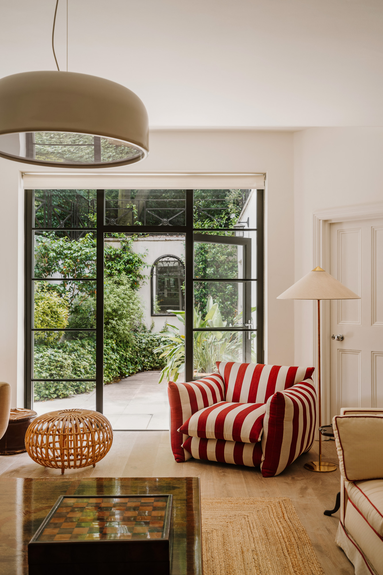
Finding the perfect beige and red shades to use together can be a bit of a balancing act, but the good news is that there are plenty of combinations within this wider color scheme that can work well.
‘The beauty of this color palette lies in its versatility; any shade of beige or red can be paired together seamlessly,’ says Ola. ‘Whether it's a soft, subtle beige or a bold, almost mustard hue, they all complement each other beautifully. Personally, I favor the combination of burgundy red with a stronger beige tone, but I've also experimented with more vibrant red shades in my recent commercial project, and the results were fantastic!’
‘The richer and more vibrant the color, the more sophisticated and timeless the space will feel,’ adds Cori. ‘The vibrant, bold nature of red contrasts beautifully with the soft, muted tones of beige. This contrast adds visual interest and depth to any space or design.’
Which rooms are best suited to this palette?
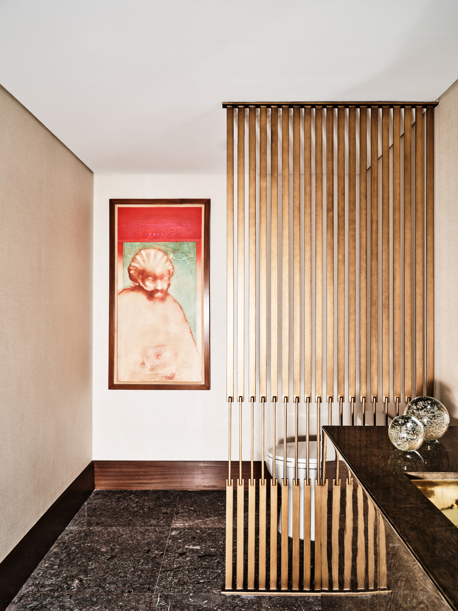
We’ve already discussed the versatility of this color scheme, but designers do make one exception where they’d stay away – especially because of the red. ‘While the shade red encourages conversation and stimulates appetite, I prefer it to be in the background and not the star,’ says Palm Beach-based interior designer Shani Core. ‘I’d use this shade in a living room, powder room or library but avoid it in bedrooms in lieu of a more calming, restful color palette.’
‘I’d avoid using this palette as a bedroom color idea, as red is strong, bold and emotionally intense,’ agrees Mauricio. ‘In bedrooms, we usually go for a more serene and calm color scheme. Beige works well with other combinations in bedrooms. Entertaining rooms such as living and dining room work perfectly with this palette. Red can be incorporated in the art, the wallpaper, or the accessories, giving sophistication and energy to the space.’
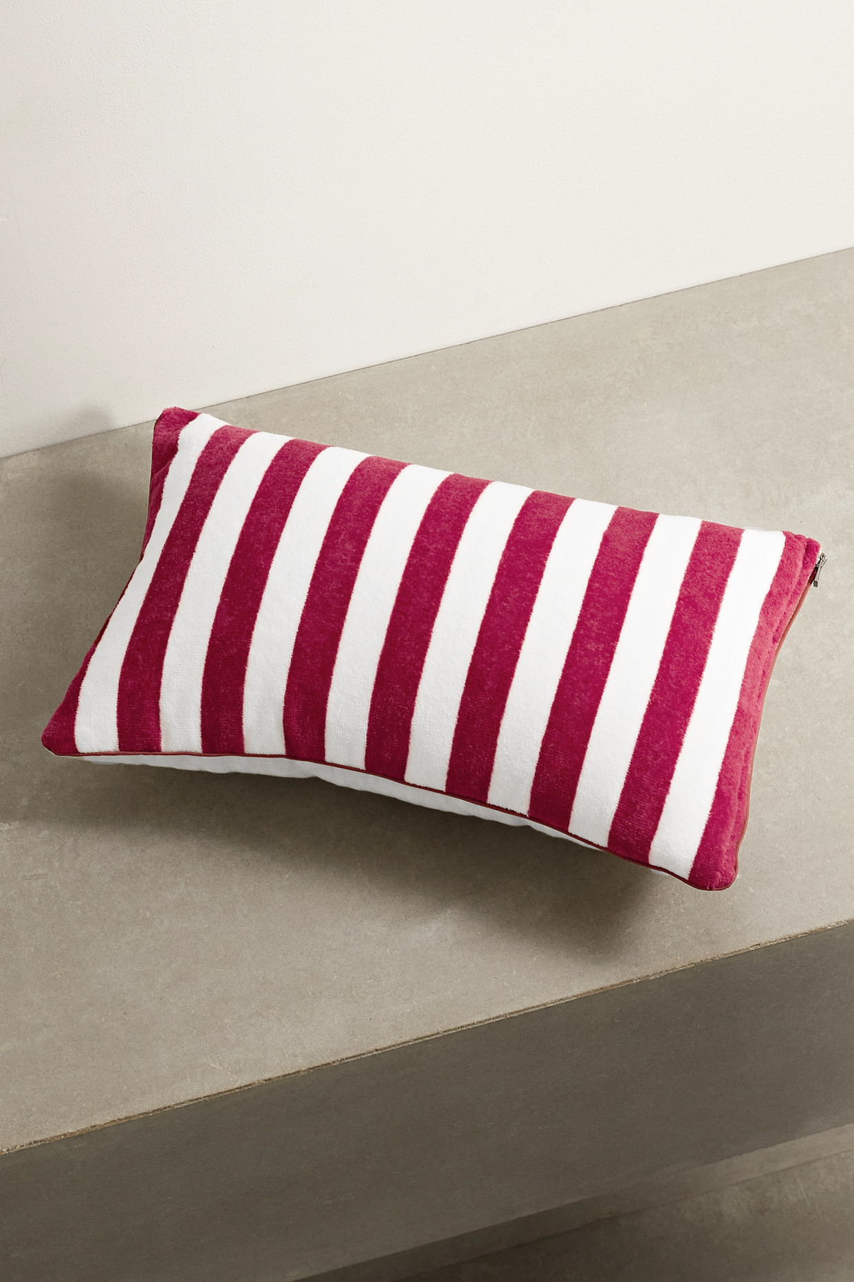
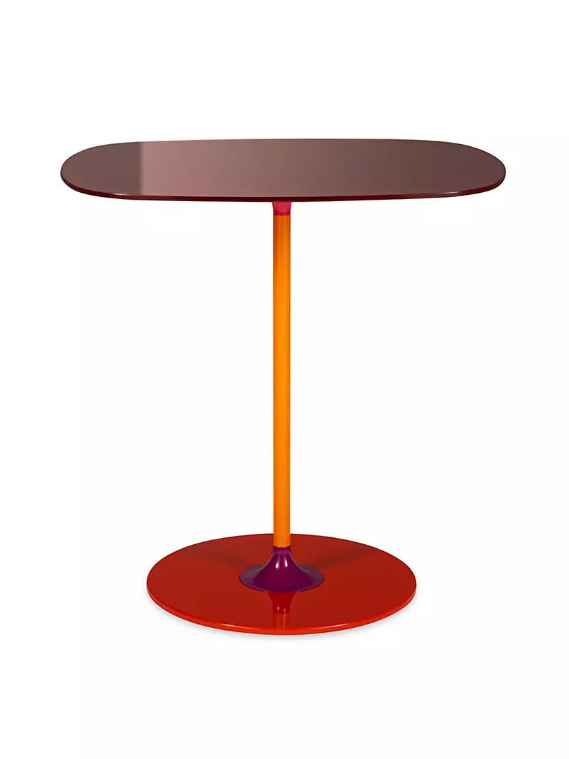
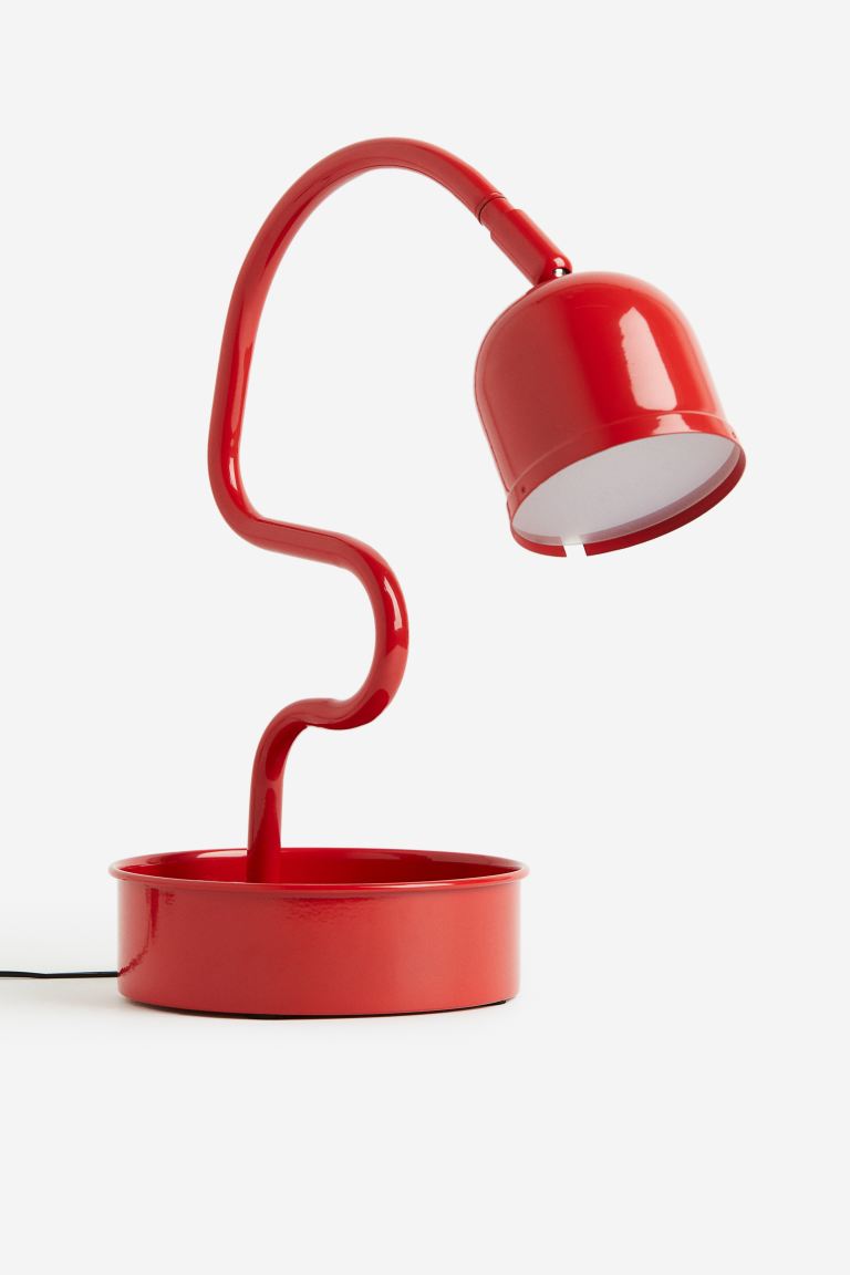
3 red accents to add to a beige scheme

Ellen is deputy editor of Livingetc magazine. She works with our fabulous art and production teams to publish the monthly print title, which features the most inspiring homes around the globe, interviews with leading designers, reporting on the hottest trends, and shopping edits of the best new pieces to refresh your space. Before Livingetc she was deputy editor at Real Homes, and has also written for titles including Homes & Gardens and Gardeningetc. Being surrounded by so much inspiration makes it tricky to decide what to do first in her own flat – a pretty nice problem to have, really. In her spare time, Ellen can be found pottering around in her balcony garden, reading her way through her overstacked bookshelf or planning her next holiday.
