What color should a pantry be? 8 ideas that'll give your kitchen storage some unexpected wow-factor
These vibrant pantry color ideas will make this oft-ignored space a surprisingly charming detail of your kitchen

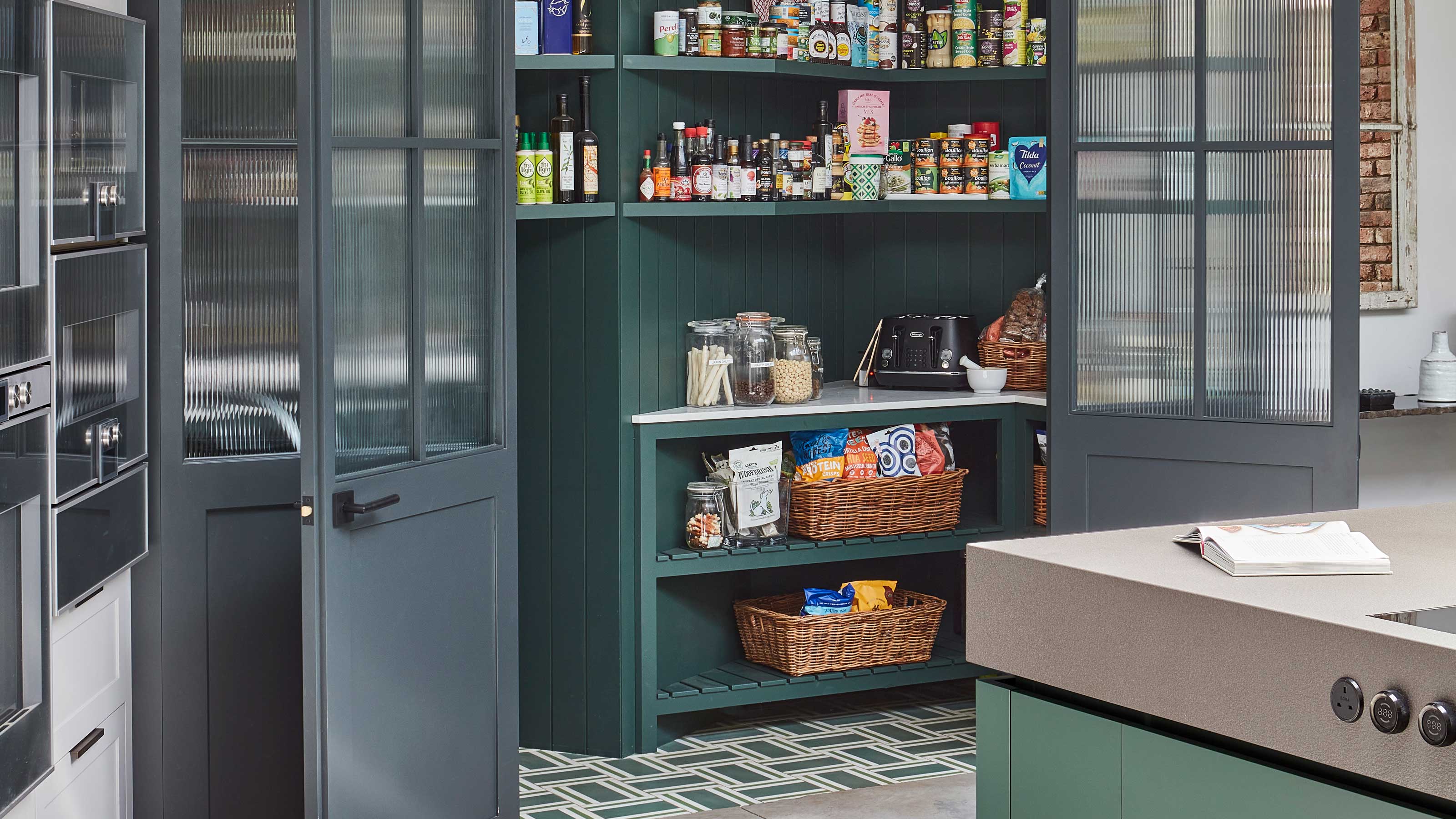
Your kitchen's storage doesn't need to be an afterthought – and we love the idea of making a design feature of something like a pantry by embracing color. It's an idea that can make your home's most utilitarian area full of personality and inspiration, a surprise behind a cabinet door that raises a smile every time you open it.
Whether you're planning a new kitchen, or you're up for a makeover with some paint, then these pantry ideas have all embraced something interesting color-wise – from dark to light – to transform these spaces, and even create a brilliant view from your kitchen, too.
8 pantry colors for a delightful kitchen storage space
So, what color should you choose for a pantry? 'Quite frankly, pantries and kitchen cabinets can avoid trends,' says Mindy O'Connor, principal of Melinda Kelson O'Connor Architecture & Interiors. 'Consider the length of time and investment you are making in the kitchen and pantry spaces and plan for colors that are timeless, neutral or that you know you will personally love regardless of changing trends. Trends on color will come and go and can be played out with changeable decorative items if desired, but rooms that function as the center of family living are better off staying apart from trends and simply focusing on good design.'
There are a few colors that we've seen work particularly well as part of pantry storage, some more neutral and muted, others bold and exciting. Either way, as long as you love it, it's the perfect place to experiment with something outside of your usual wheelhouse.
1. Teal
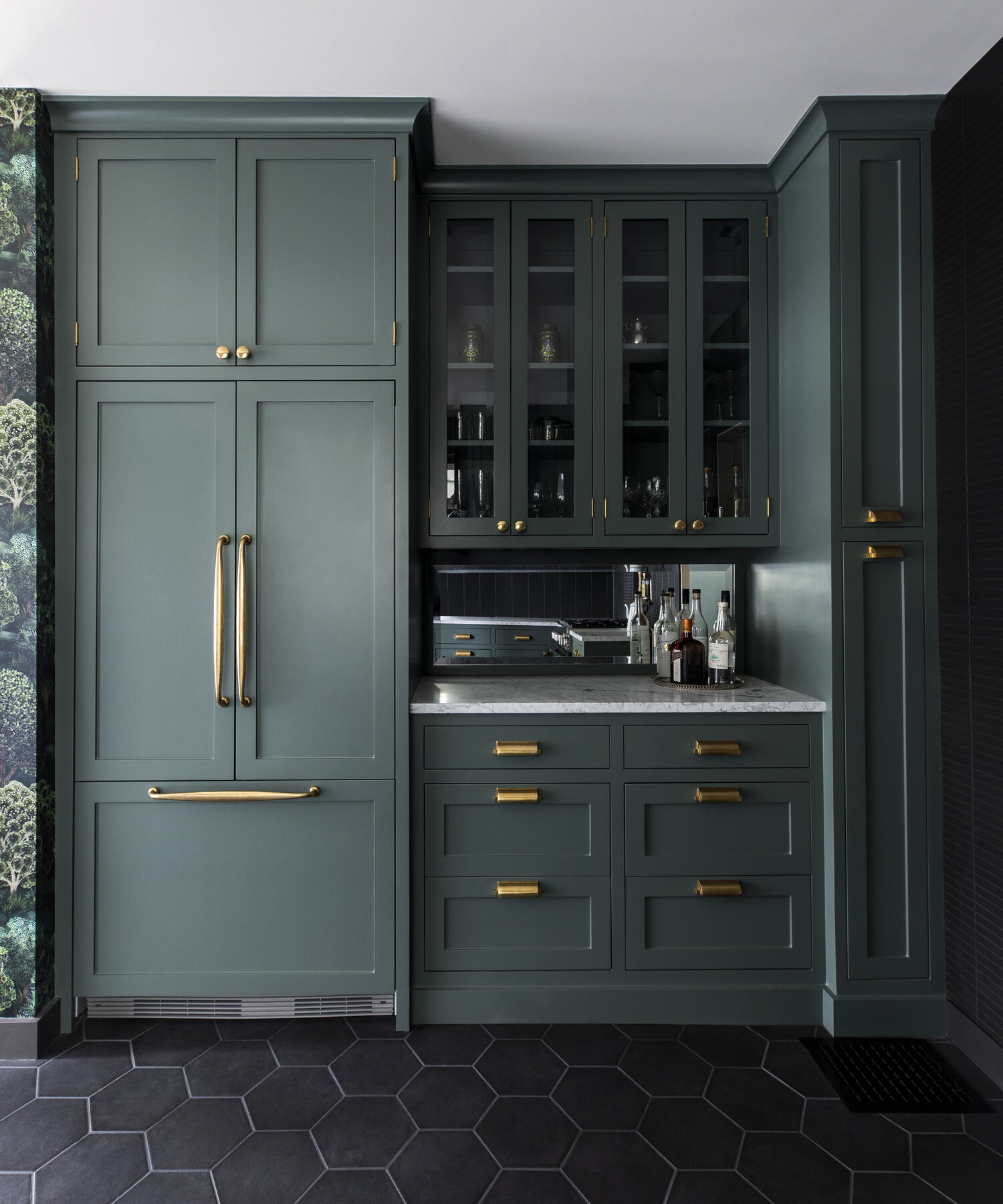
A dark-toned butler's pantry will stand out in a home. A deep green or teal is an excellent color choice especially if you incorporate metallic accents in terms of handles and knobs. The ageless hues pair well with black, peach, white, and honey tones as well.
'While not a big fan of following trends, I have seen a large shift away from the traditional white kitchens and pantries,' says Donna DuFresne, principal at Donna DuFresne Interior Design. 'I love the organic feel of this green pantry; it just reads heart and home, plus timeless elegance.'
'The good thing about pantries is that these can be stand-alone spaces, and are not bound to being the same color as the kitchen,' says Donna. 'But there needs to be some connection and cohesion between the two spaces. For example, if using a different cabinet color on the pantry, using the same tile or countertop material as the kitchen will unify the spaces.'
The Livingetc newsletters are your inside source for what’s shaping interiors now - and what’s next. Discover trend forecasts, smart style ideas, and curated shopping inspiration that brings design to life. Subscribe today and stay ahead of the curve.
Consider this dark green tone that works in all types of lighting, and can provide a room with depth and timelessness.
2. Dark grey
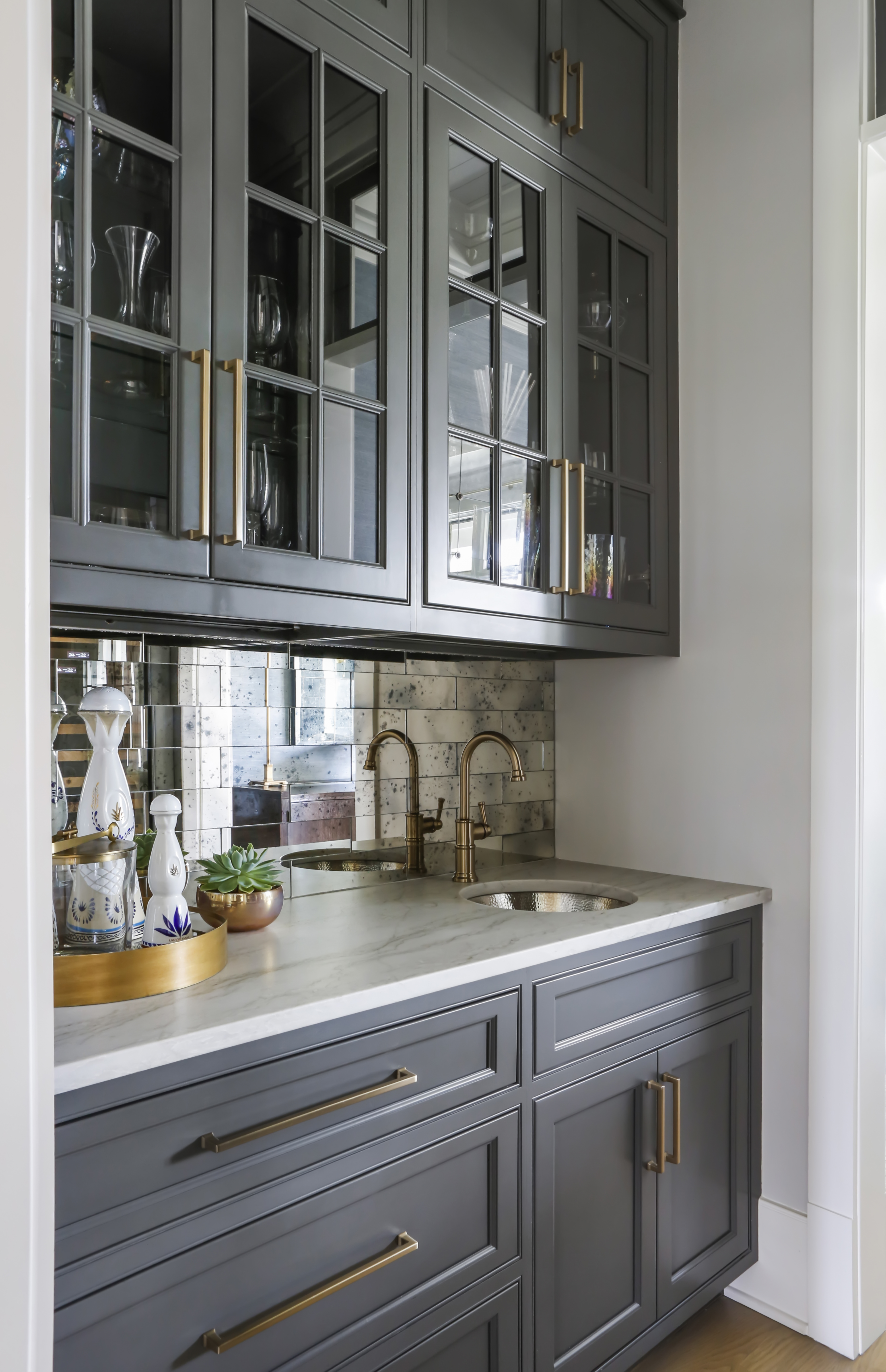
If you're open to making a bold statement in your home but keep in a safe lane with neutrals, dark grey is a perfect choice. This classic, moody tone will give the pantry shelving and cabinets depth, and the overall space, a touch of class.
Also use grey to call attention to your pantry's interesting architectural details, finishes, or fixtures. For instance, if the ceiling above the pantry has stunning crown molding, then a grey cabinet against the white walls and ceiling will look striking. Also, if your cabinets have wonderful molding, the deep tone will allow the detailing to look more pronounced.
3. Sky blue
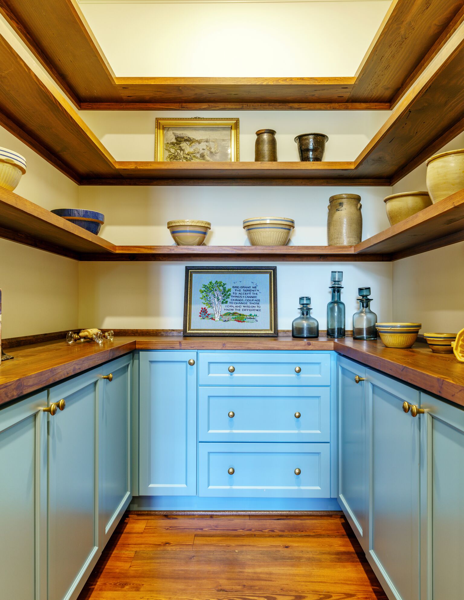
This shade of blue, used for a walk-in pantry, is both soft and uplifting, making this windowless space feel like it almost has a piece of the sky in it.
'These colors are a call-back to the roaring ocean and the soaring sky,' says June De Lugas, founder of June Delugas Interiors, Inc. 'Blue creates a feeling of the same tranquility you find in nature’s true wonders. Being a cool color, it makes walls in a small pantry seem further apart and gives a sense of spaciousness. Pale blue and pastels especially create a sense of light and space. For the walls, I chose Dove Wing, and the cabinets are in Jamestown Blue, both from Benjamin Moore.'
This mid-blue paint has a nice, grey undertone, and a matt finish which keeps the color looking crisp at all times.
4. Yellow
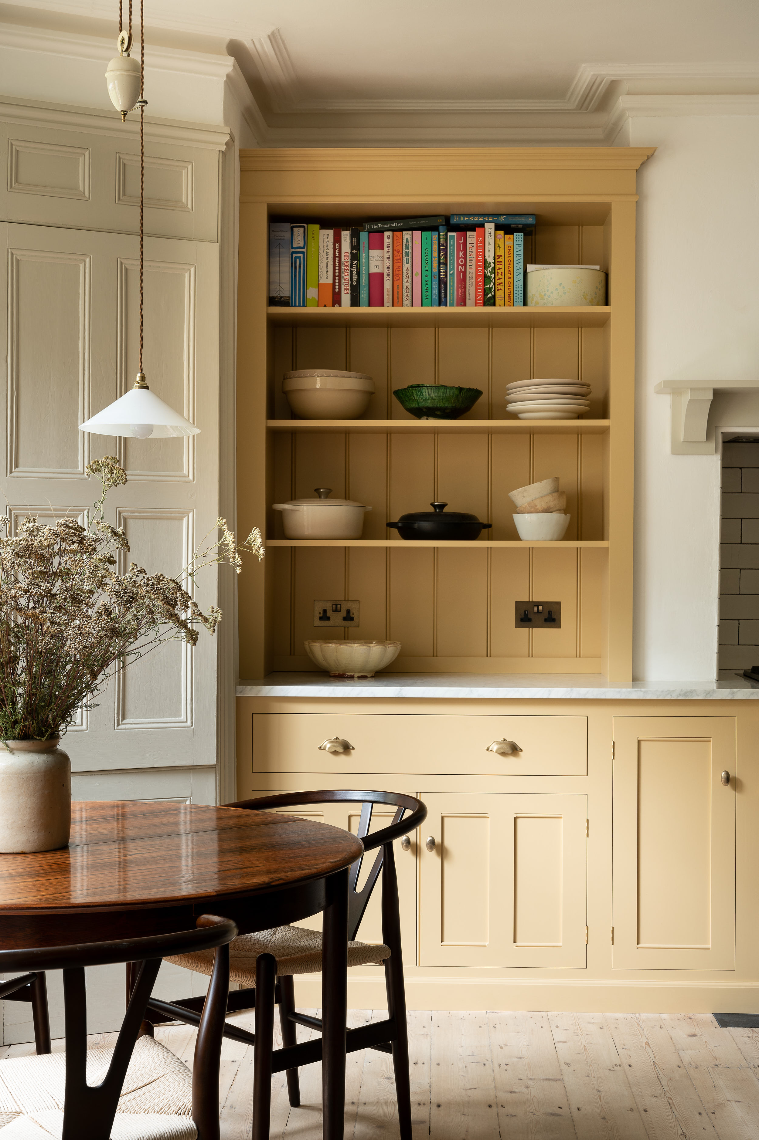
If your kitchen shelves and pantry share space, and you want to highlight or separate the pantry from the rest of the kitchen, a lovely pop color can do the trick. Consider a nice, grounded yellow that's welcoming and invigorating.
Choose a tone with brown or grey undertones, so it maintains the warm and cozy feeling of being in a kitchen, yet adds a slice of cheerfulness to the area. In color psychology, yellow represents happiness and creativity, and is a nice hue to play with, especially in a purely utilitarian space.
Want to add further coziness? Consider wall paneling inside the open shelves, so the pantry receives a touch of texture and movement in its design.
'The pantry is a great opportunity to have a little more fun and implement bolder colors such as a yellow, that might not work in an open, light-filled kitchen space,' says interior designer Mindy O'Connor. 'Most decisions regarding depth and range of color in a kitchen or pantry should be made in consideration of the specific context that includes the light, the scale and design intent of the room and the millwork, the style of the house, the neighboring rooms and how each space will be used.'
5. Red
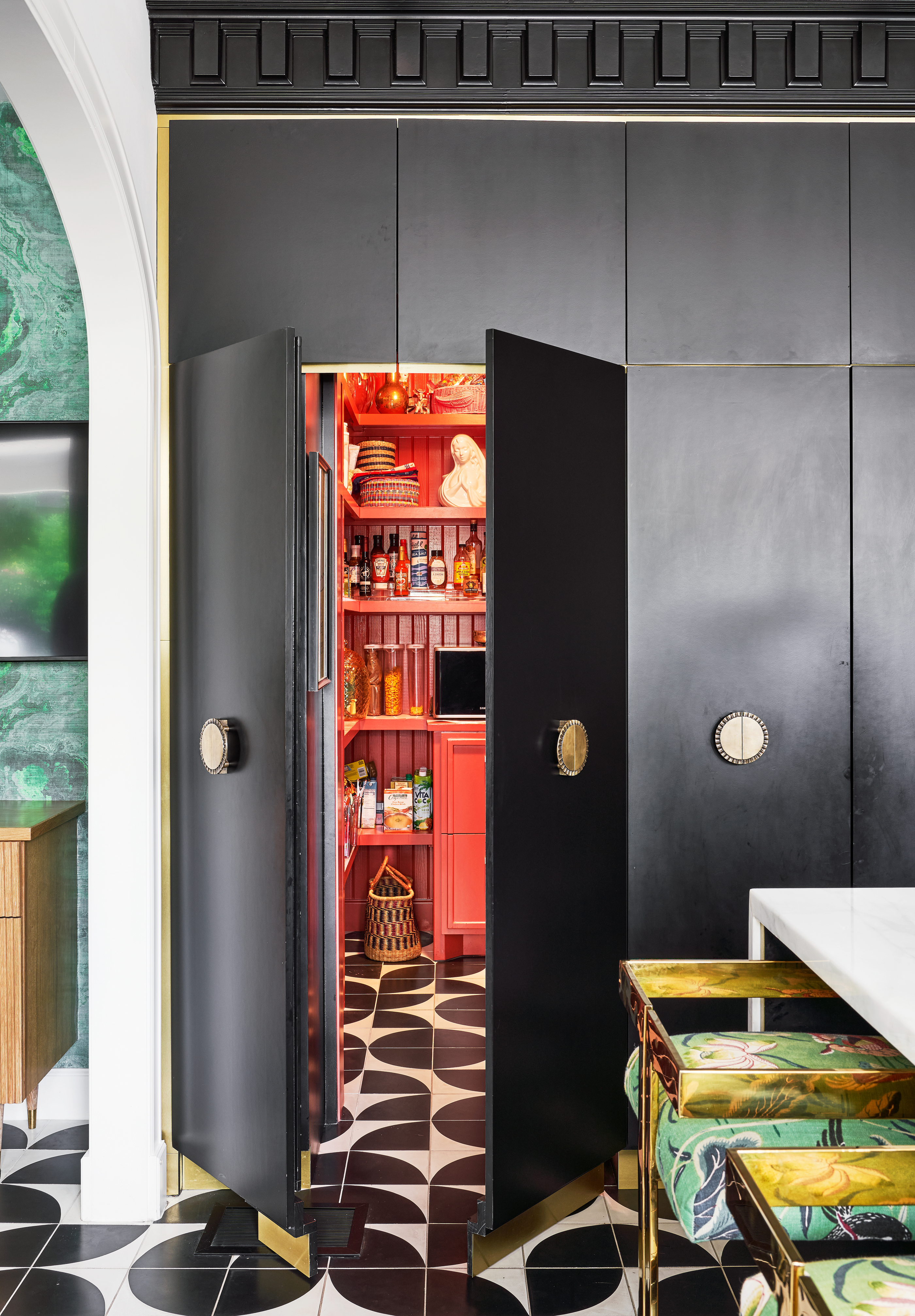
A solid block of a deep and daring color inside your pantry is a great way to make a statement. Imagine, for example, you had a simple white kitchen – you could enjoy a burst of hues every time you open your pantry door.
Case in point: red. If your pantry is a small space, consider coloring your shelves, walls, and even ceiling a delicious red. Color drenching will make a small room feel endless. Plus, according to color psychology, red increases blood pressure and stimulates appetite; an ideal hue in the kitchen!
If an all-red room seems a bit too much, offset it with another tone on the flooring, like in this space designed by Maestri Studio. The black and white tiles on the floor stop the red from feeling too intense.
6. Off white
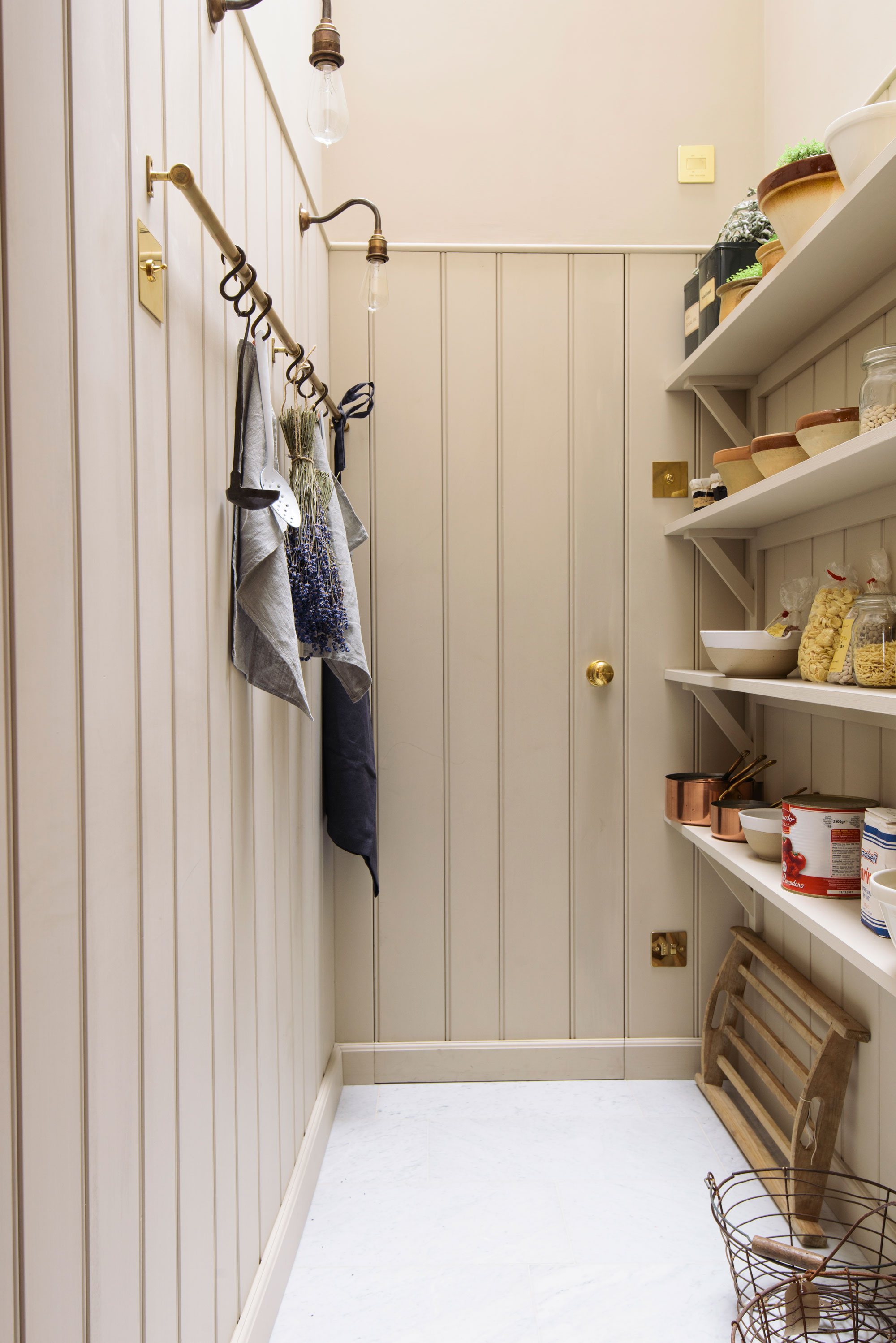
When it comes to choosing kitchen cabinet colors for a pantry, off-white is a wonderful muted tone.
'Choosing a pantry color is a goldilocks situation – you want an interesting color that isn’t too white or too dark as both of those will show wear and tear more quickly,' says Jeff Andrews, founder of Jeff Andrews Design.
'I prefer light tones in a pantry – you want a pantry to be light and bright so that everything is easily and quickly identifiable. You don’t want to create a cave situation. A fun trick is to wallpaper the wall sections in between the shelves in a fun pattern to create interest.'
7. Pink
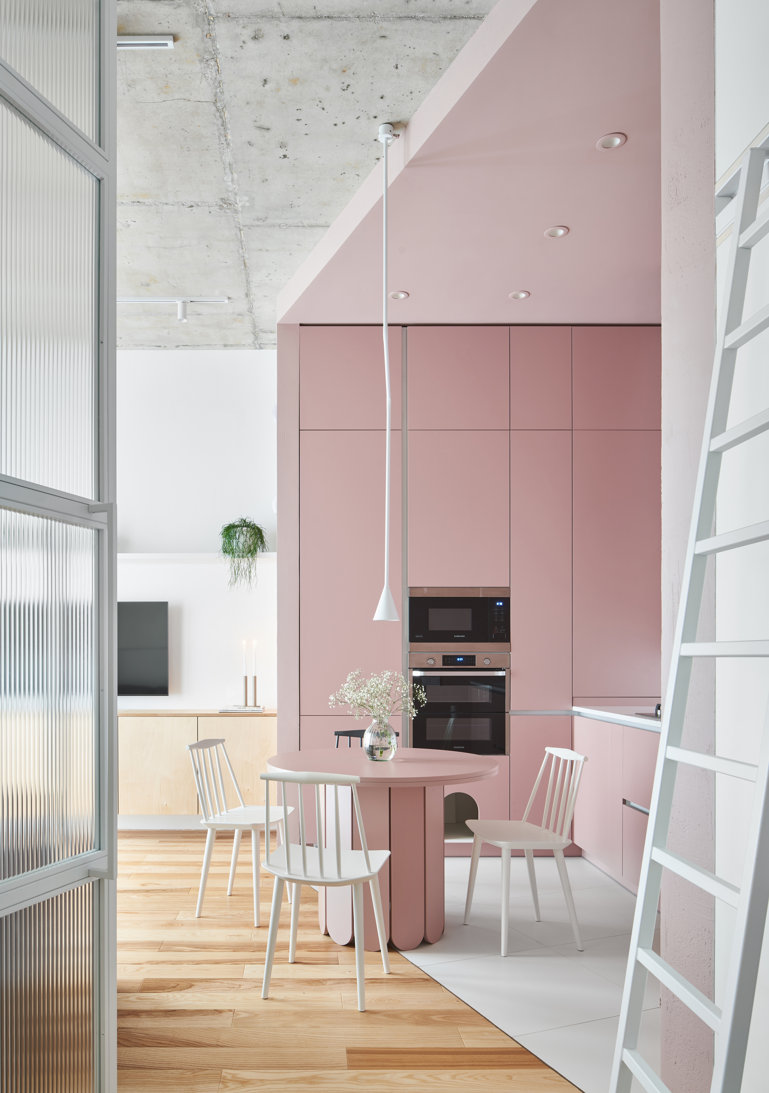
Sweet, charming, delicate, and dainty, pink is a color that represents youth and innocence. For an overall smile-inducing space, consider a pink kitchen along with a pantry in the same tone. Want to create a little balance? Bring in wooden tones, add in a bit of grey, or even a touch of concrete for a grounded scheme.
Inspired by Mexican architect Luis Barragán, this hue is reminiscent of vacations and whimsy. It is an easy-to-wash paint and has a low VOCs.
8. Green
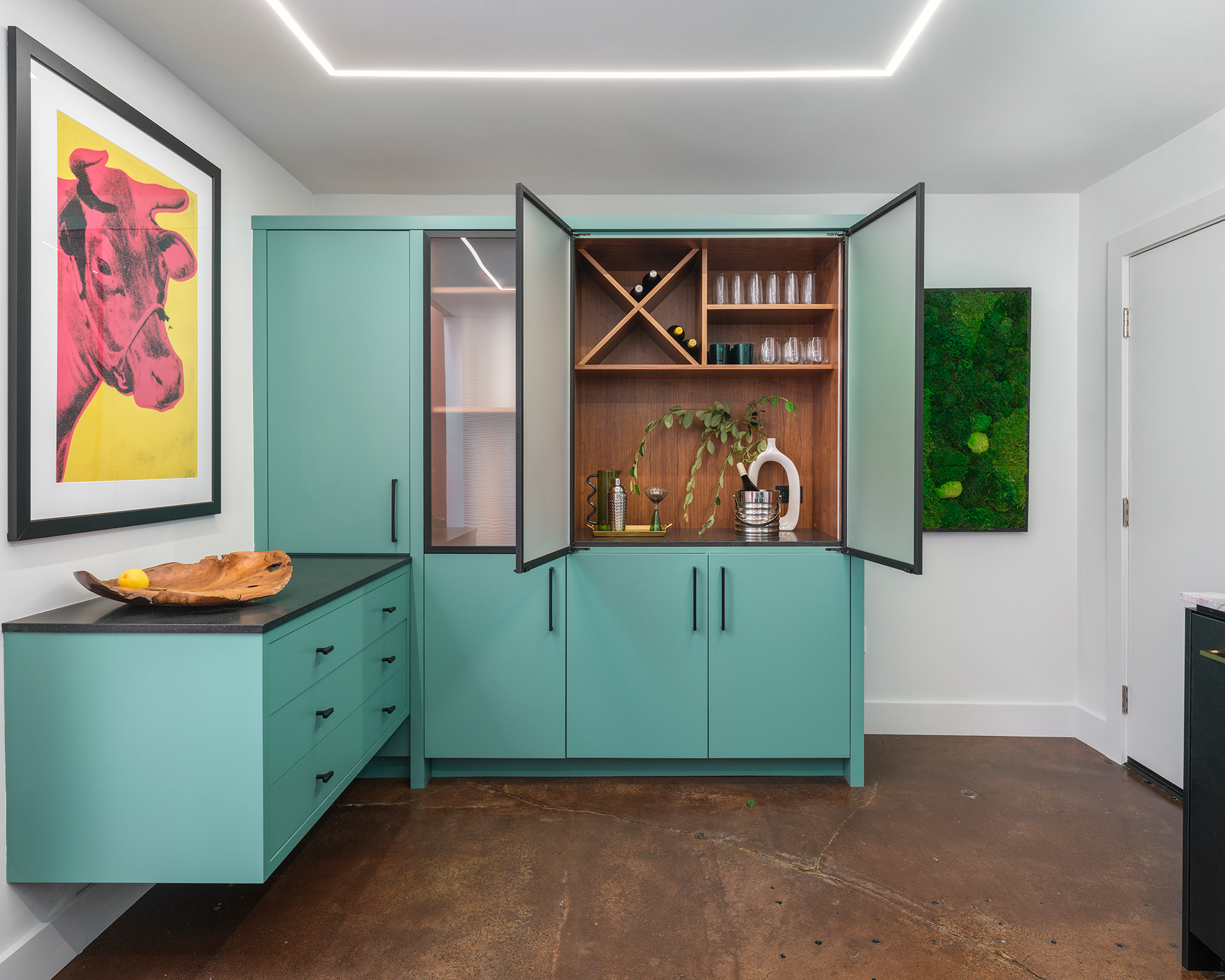
Since many colors go with green, consider pairing this tone with white or black accents; either of the two extremes. Consider a matte finish with this kind of paint though, as a glossy finish can be too overbearing.
'I love using green in the kitchen or pantry,' says Barbra Bright, founder of Barbra Bright Interior Design. 'Greens are calming and pair well with a variety of colors and wood tones. They are reminiscent of nature and a great way to bring the outdoors in.'
'In this space, we used Benjamin Moore's Green Waterbury HC 136,' Barbara adds, 'as it is one of my favorite green paint colors. It has a blue-grey undertone which gives it a fresh, modern feel.'

Aditi Sharma Maheshwari started her career at The Address (The Times of India), a tabloid on interiors and art. She wrote profiles of Indian artists, designers, and architects, and covered inspiring houses and commercial properties. After four years, she moved to ELLE DECOR as a senior features writer, where she contributed to the magazine and website, and also worked alongside the events team on India Design ID — the brand’s 10-day, annual design show. She wrote across topics: from designer interviews, and house tours, to new product launches, shopping pages, and reviews. After three years, she was hired as the senior editor at Houzz. The website content focused on practical advice on decorating the home and making design feel more approachable. She created fresh series on budget buys, design hacks, and DIYs, all backed with expert advice. Equipped with sizable knowledge of the industry and with a good network, she moved to Architectural Digest (Conde Nast) as the digital editor. The publication's focus was on high-end design, and her content highlighted A-listers, starchitects, and high-concept products, all customized for an audience that loves and invests in luxury. After a two-year stint, she moved to the UK and was hired at Livingetc as a design editor. She now freelances for a variety of interiors publications.


