This Melbourne Home Proves That Old and New Can Live Beautifully Together — It's a "Thoughtful Negotiation Between Eras", Says Its Designer
This historic property is now a relaxed family home, all thanks to a refined interior that respects the heritage details
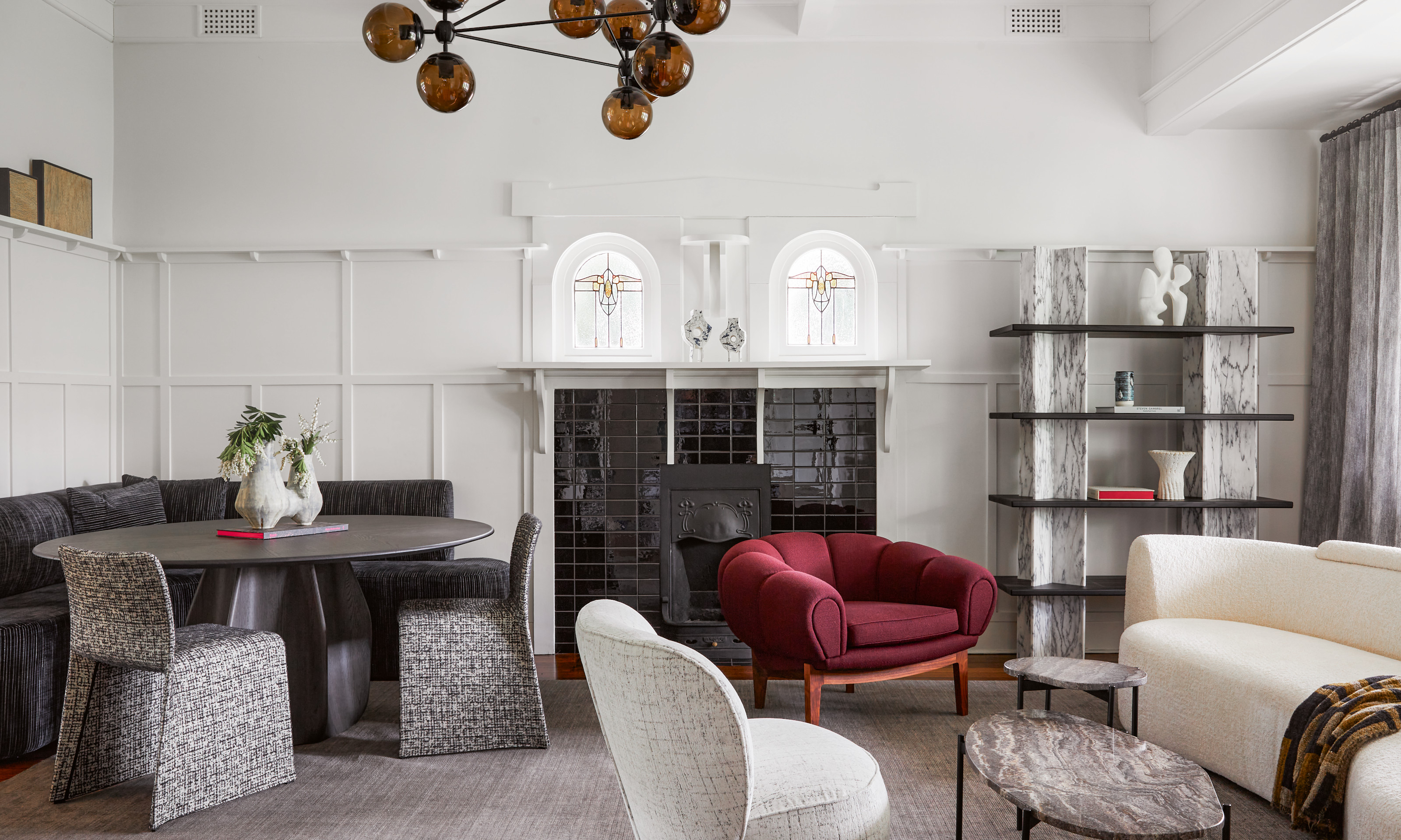
When interior decorator Simone Haag was approached to furnish this historic-turned-modern home in Melbourne, she knew she’d have beautiful bones to work with. The property is located in Malvern’s Gascoigne Estate: an area of architecturally significant homes built in the Australian Federation style, which emerged during the late 1800s.
Having initially enlisted interior designer Beatrix Rowe to renovate the building, its owners brought in Simone Haag’s studio to complete the project with a carefully chosen selection of furniture, objects, and art. Working alongside her studio design lead, Cindy Phillips, Simone was tasked with modernizing the house to better suit the owners’ taste and lifestyle, while respecting its heritage.
"The clients sought a calm, restrained interior, but needed the confidence to inject some extra personality into their home," she explains. "Practical choices were also required to meet the requirements of family life with two young girls."
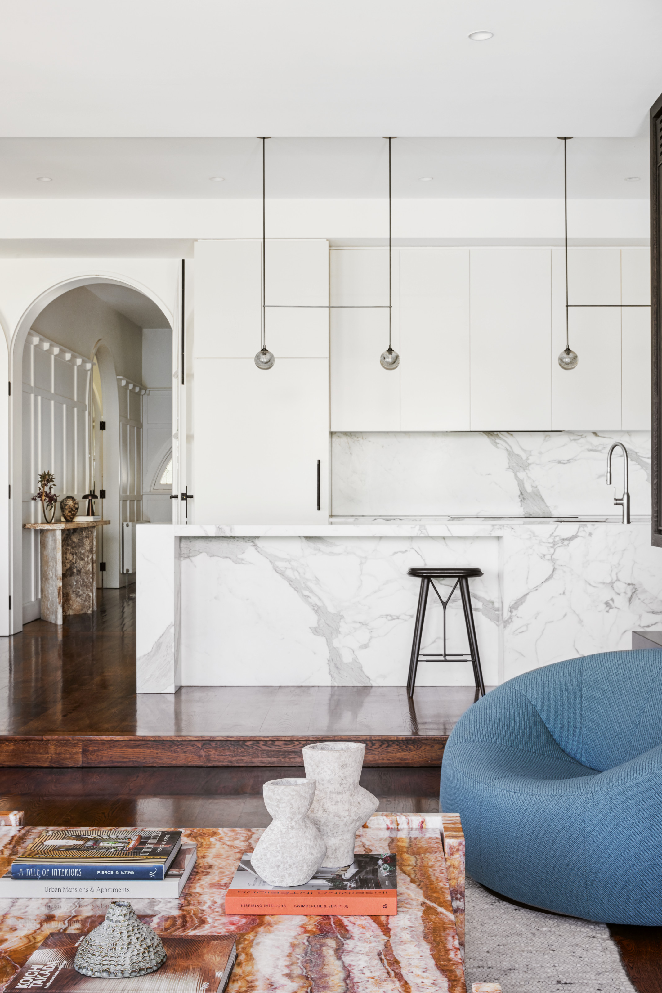
The work of Melbourne interior designer Beatrix Rowe, this monochrome modern kitchen features an abundance of pale marble that contrasts beautifully with the dark timber floors — the perfect neutral backdrop for Simone to select the furnishings for.
Set across two storeys, the home features two living spaces facing the front, with a kitchen and dining area beyond, and bedrooms and bathrooms above. The front rooms presented the biggest challenge, as they had originally been painted white in an attempt to brighten them.
"I have never known a client regret bringing color to their walls, but there was some initial reluctance to lean into a darker shade for these spaces," recalls Simone, who reached a compromise with the homeowner, resulting in the deep-blue shade that now defines the modern living room.
The color choice is an effective counterpoint to the otherwise serene white scheme, which enhances the home’s generous proportions.
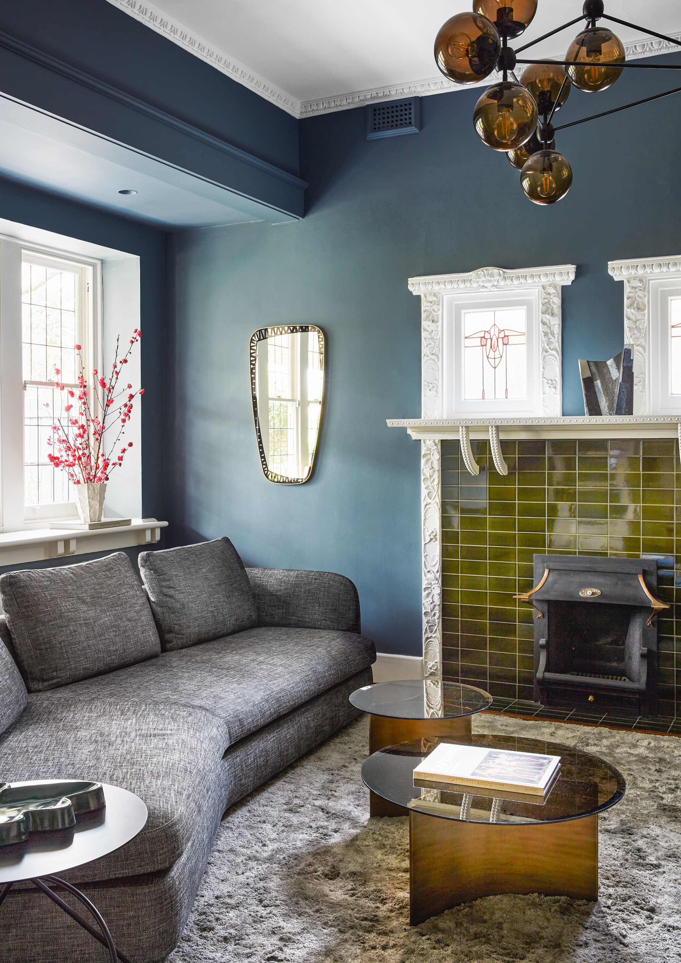
"We encouraged the client to create some depth and drama in this room with a deep blue shade," says Simone. "The whole family loves to use this space."
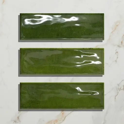
Olive green adds warmth and an element of the unexpected to this scheme — follow its lead with these metro tiles.
Simone and Cindy were keen to offset the architectural formality of the two living areas without compromising their period charm.
The Livingetc newsletters are your inside source for what’s shaping interiors now - and what’s next. Discover trend forecasts, smart style ideas, and curated shopping inspiration that brings design to life. Subscribe today and stay ahead of the curve.
"The reading room was a particularly difficult space from a planning perspective, as there are doorways, windows, and fireplaces at every elevation," says Simone of the other front room.
"We decided to utilize the existing dining table and create the built-in banquette to give some rigour to the space, which then allowed for a more relaxed layout."
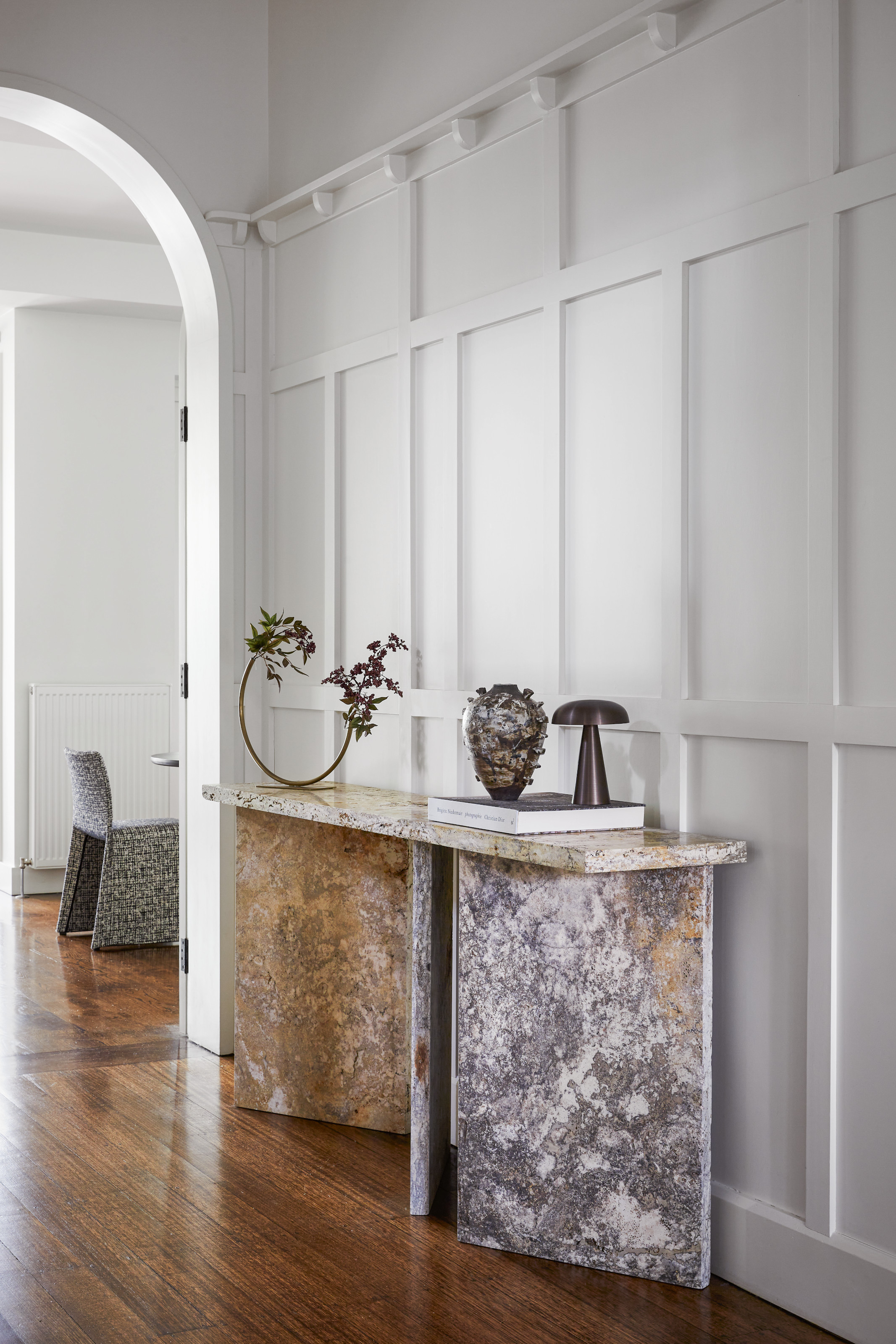
"This console was tough to find," says Simone. "We wanted something distinctive to fit the space and toyed with the idea of customization, but in an uncanny coincidence, Daniel Barbera, a favorite maker of ours, had fashioned this as a display plinth for an exhibition. With some convincing, he allowed us to buy the piece."
A generous entrance hall separates the two front rooms, with sweeping arched doorways on either side that add to the ground floor’s airy feel. The studio selected a Daniel Barbera marble console for the hallway to set the tone from the get-go.
"It’s the first indicator of the interior’s thoughtful negotiation between eras, which we achieved through a dedication to classic pieces," says Simone.
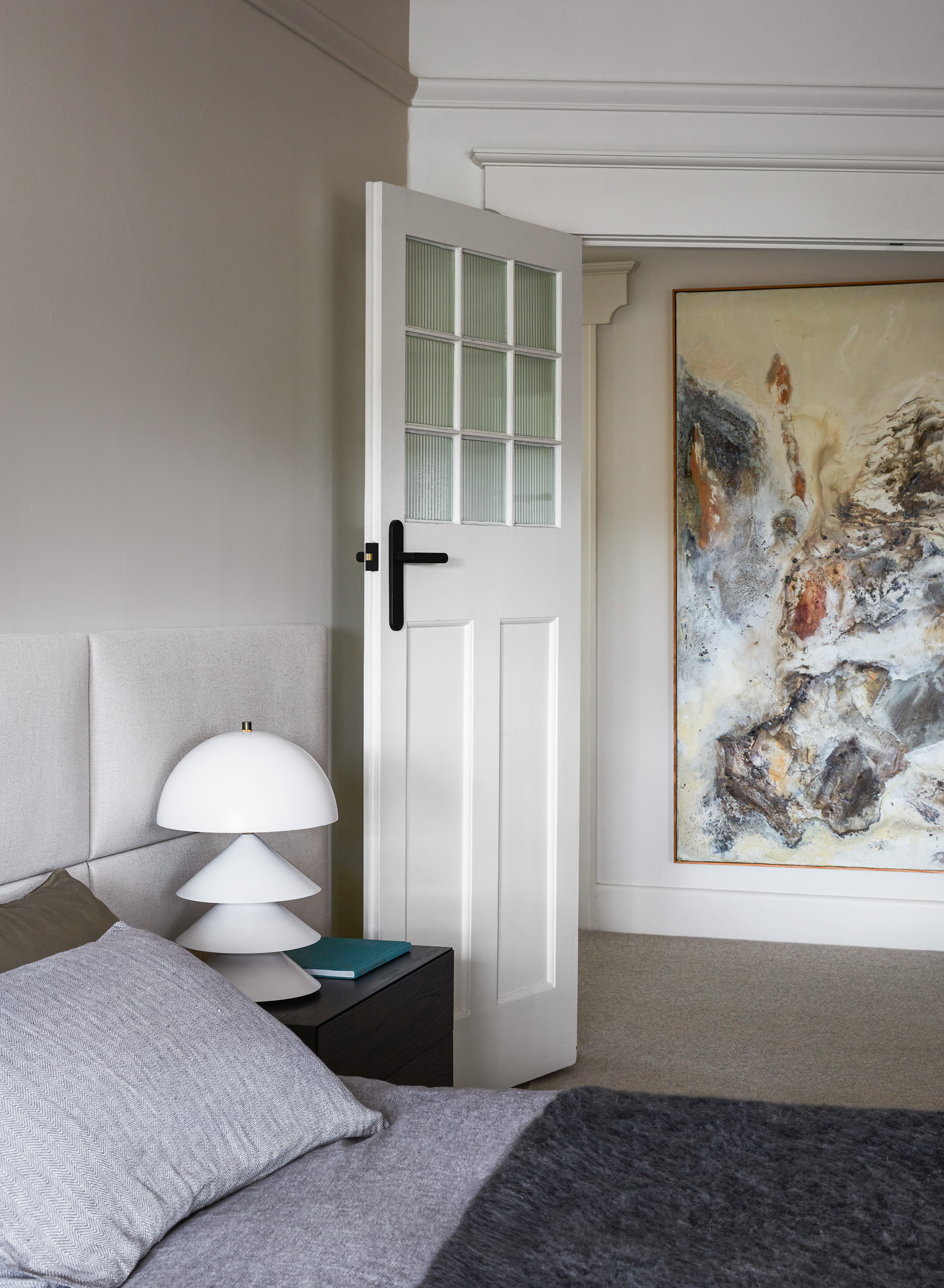
"Other than the linen, art, and objects, the bedroom had been designed before we came on board," explains Simone. "We chose a beautiful, large painting to hang in the corridor, opposite the doorway. This means it can be enjoyed by everyone in the family, as well as from the bedroom."
This approach extends throughout the rest of the home, where occasional vintage furniture pieces moderate the dichotomy of old and new.
Curved silhouettes echo the arched doorways, while marble accents form a thread that helps to visually link the existing kitchen with the more recent updates.
The result is a clear sense of cohesion that contributes to the elegance and ease of this harmonious family home.
Tessa Pearson is an interiors and architecture journalist, formerly Homes Director at ELLE Decoration and Editor of ELLE Decoration Country. When she's not covering design and decorative trends for Livingetc, Tessa contributes to publications such as The Observer and Table Magazine, and has recently written a book on forest architecture. Based in Sussex, Tessa has a keen interest in rural and coastal life, and spends as much time as possible by the sea.
