This 'Symmetrical' Apartment Takes Minimalist Style and Gives It a Charmingly Parisian Flourish
This art collector's pied-à-terre is a calming refuge in the heart of the city

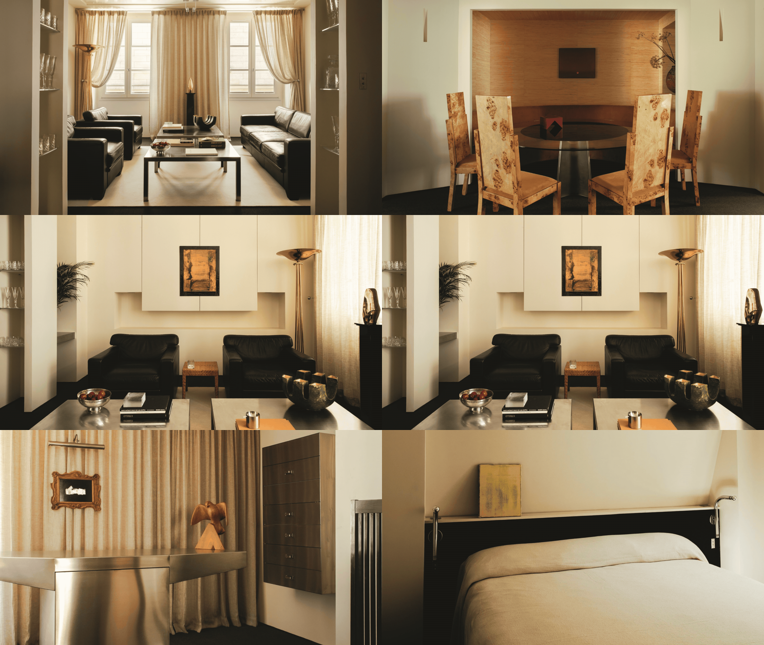
There's been a lot of talk about the return to 90s minimalism recently, a move towards more muted palettes, with straight lines and stronger silhouettes dominating design. It's an aesthetic defined by restraint, by knowing how to make an impact without doing too much. And this Parisian apartment might just make the strongest case for it we've seen yet.
Positioned on rue du Mont-Thabor, in Paris' 1st arrondissement, this modern home benefited from the luxury of location, only steps away from many of the city's most attractive landmarks, including the Louvre, Place Vendôme and the Tuileries. It made for a logical setting for the owner of this property, a passionate collector of both art and design.
But while the owner had a vast collection to furnish his home with, the original apartment wasn't yet in a suitable state to give these pieces the background they deserve. This is where the team at Le Cann came in. "The brief was to completely rethink the space," explains Guillaume Fantin, co-founder of the Parisian design firm. The owner wanted this small apartment to function as his pied-à-terre, with an atmosphere that would feel "both theatrical and intimate," with his collection of art functioning as the beating heart of the home.
This collection of iconic pieces of art and design is the foundation around which the rest of the design was created. Much like the city itself, in this home, it creates the flow of the space and how you exist within it. It's the ultimate Parisian pied-à-terre, not just for the owner, but for anyone who chooses to rent the stunning home on Airbnb, too.
The Brief

The softly gilded ceiling is reminiscent of famous architectural designs from the Viennese Secession movement.
Image credit: Alice Mesguich. Design: Le Cann

The simple, geometric presence in the living room has some clear brutalist influence.
Image credit: Alice Mesguich. Design: Le Cann
Working from effectively a completely blank canvas, Guillame had the freedom to cast a wide net of inspiration, looking across various eras and styles, developing a healthy arsenal of references.
The visual language of brutalism, both in architecture and design, functioned as one of the primary reference points, with all its coldness and minimalism. But so too did the Viennese Secession movement, with its highly gilded, immersive style, a stark contrast to the reticence of brutalism.
They were drawn to the simplicity in the architecture of Adolf Loos and his pared-back, unadorned buildings, as well as the refined luxury in the designs of Jean-Michel Frank and Marc du Plantier.
These icons of the modern era were certainly crucial to the design process, but the influences were by no means limited solely to this period of history. Their style also draws from the masterful understanding of proportion and symmetry found in the buildings of Ancient Greece and Rome.
For the team at Le Cann, there are no limits to where inspiration can be drawn from. They don't confine themselves to one specific time or culture, instead opting for a global, all-encompassing approach to design, drawing from "Italian design for its boldness, and Japanese art for its philosophy of emptiness and embrace of imperfection."
All these various details and styles are poured over and distilled into a new idiosyncratic approach that is distinctly their own. As Guillame explains it, "Our own signature is simple volumes and pure lines with an obsession for symmetry — what we call a 'neoclassical reminiscence'."

The living room functions as the home's central point, with the rest sitting in its orbit.
In blending these various styles and references, Guillame was able to develop a truly transitional style, making for a timeless approachability to the design.
This approachability became particularly important to the home. Although it wasn't the initial intention, as the project progressed, it became apparent that this home would function not solely as a pied-à-terre for the owner, but for the public too, listed for rentals via Airbnb.
Although the home was not initially designed to function as an Airbnb, there was a degree of hospitality integral to the original brief that translated naturally to this new use.
As Guillame explains, "The project was conceived from the outset to host guests generously: three independent suites and a fluid circulation path around an octagonal vestibule." There is a sense of flow to the space, as well as an emphasis on privacy, allowing guests to retire to their own distinct suites and gather again in the central living space once recharged. "It is a space designed to be lived in and shared."
The Process

The collector's artworks and ceramics are built into the architecture of the home.
Image credit: Alice Mesguich. Design: Le Cann

Frosted glass brings a cool, soft light into this bathroom.
Image credit: Alice Mesguich. Design: Le Cann
Positioned on the first floor of a late-19th-century townhouse, this building fits into a category of Parisian homes known as 'Hôtel Particulier'. In their original forms, these buildings would have functioned as private residences, housing one family across their many floors. But over the years, many of these impressive townhouses have been converted into flats, allowing the opportunity to maximize the real estate in this desirable part of the city.
But as a result of this, the individual lots can often be characterized by an awkward, fragmented layout. Instead of viewing this as an issue to solve, Guillame allowed this reality to lead the way in the design of this home. "That fragmentation actually became our starting point," she explains. "We wanted to undo the cellular plan and create fluidity."
To introduce a better flow to the home, Guillame went about building a new floor plan, rethinking how each space related to one another, and finding a way to create an essential link between them all.
"The octagonal entry hall with faceted panels became the pivot that distributes the living room, dining room, kitchen, and the three suites — a strong geometry serving a new sense of openness," explains Guillame. This new layout modernized the space, introducing a degree of connection that didn't exist before.

"The kitchen, in particular, was crafted from stainless steel with meticulous attention to detail, creating a sense of rhythm and repetition that highlights the technical nature of the material," says Guillame.
But beyond the fragmented layout, Guillame's primary challenge revolved around the relative lack of direct light that the apartment received. "Light is quite rare there, so we also worked hard to amplify it." In this task, stainless steel plays a key role.
Repeated across the kitchen and the living room, this material acts as one of the most distinctive features of the home, dominating the material palette with its cool, chromatic shine.
For the team at Le Cann, decorating with stainless steel was a no-brainer. Not only does it create a visual connection to the brutalist designs they've long admired, but in smaller, dark spaces, it helps create the illusion of more space. "We love the visual vibration that this material brings," Guillame explains. "Since the apartment lacked natural light, we multiplied perspectives and reflections — using acid-etched glass partitions, light cream-colored curtains, and lacquered ceilings — complemented by brushed stainless steel, which captures and diffuses light."
There's a contemporary, almost futuristic feel to the shiny material, especially when combined with a sculptural quality, as with the kitchen island, but there's also something timeless about it, working beautifully alongside the softer, antiqued finishes.
The Design

The bed frame and bedding are kept intentionally minimalistic, allowing the bathtub to command the attention.
Image credit: Alice Mesguich. Design: Le Cann

The mottled, plaster finish on the walls works to emphasize the natural aging process of the copper tub.
Image credit: Alice Mesguich. Design: Le Cann
There's a clear emphasis on neutral tones in this home, with scarcely a pop of color visible across the entirety of the apartment. But the decision to move away from decorating with color is not a sign of blandness; in fact, it was quite the opposite. Guillame chose to create depth "by layering materials and intricate details rather than relying on color."
A richly textural material palette provided all the degrees of contrast and warmth the home needed. It's a more complex take on depth, relying on the tactility of the materials rather than the brightness of the color palette. Faceted panels and acid-etched glass sit alongside sumptuous velvets and slick leather, building up a layered, dimensional effect.
This neutral color palette further reflects the important role the client's own collection played in the development of the design. "A neutral foundation in shades of cream allows the owner’s key pieces to fully express their character," explains Guillame. These treasures of design were always intended to act as the focal points of the home, with the rest of the design acting as a supporting player, elevating these pieces to their best. Bold colors or eye-catching print would only serve to detract from these designs.
Across the home, the team at Le Cann allowed this collection to lead the way, shaping the rest of the design around these items. For example, Guillame shares, "The primary suite was built around the client’s large copper bathtub, which had been sourced in Spain." The leather living room furniture by Jean-Michel Frank, coffee tables by Maria Pergay, and a dining table by Luigi Saccardo also each played key roles in the design.
"We enriched this collection with artworks, ceramics, bronzes, and objects discovered at flea markets or acquired at auctions — an eclectic style that marries the radical boldness of the 1980s with the elegance of the 1990s."

The velvet banquette seating is constructed to follow the curve of the niche.
If this neutral color palette works to create a sense of cohesion, this is only emphasized by the physical layout of the apartment.
"The octagonal entrance hall serves as a structural core; the geometry, symmetry, materials — stainless steel, lacquer, and fabrics in cream tones — as well as a consistent attention to detail, carry through from one room to the next," says Guillame. It's a thoughtful, considered construction, a clear journey that allows the home to unfold and reveal itself to you.
This narrative structure reflects the home's theatrical concept; it's what Le Cann refers to as 'scenography': "a theatrical, guided journey through the space".
Shop the Style


If this home has made you fall back in love with the 90s aesthetic, these interior lessons from Tate Britain's 90 exhibition will fill you with inspiration.
And for more design ideas, subscribe to our newsletter.
