Before and After — A Small, Old-Fashioned Kitchen Transformed by Timelessly Elegant Cabinets
Without making any major structural changes, the designers of this small kitchen have made classic, yet style-forward choices that have revolutionized the space

The Livingetc newsletters are your inside source for what’s shaping interiors now - and what’s next. Discover trend forecasts, smart style ideas, and curated shopping inspiration that brings design to life. Subscribe today and stay ahead of the curve.
You are now subscribed
Your newsletter sign-up was successful
Giving a kitchen new life doesn't always mean a dramatic remodel, and this renovation of a 750-square-foot kitchen in Washington DC proves it. It was a small but well-proportioned space in need of a style injection, with dated wooden cabinets making the room feel smaller than it actually is.
Liz Levin of Liz Levin Interiors along with Tanya Smith-Shiflett of Unique Kitchens and Baths were keen to take down the heavy, dark elements in the room, swapping them out for not a super modern scheme, but a transitional space that mixes classic good looks with luxurious materials. 'While the kitchen required significant work, we did not need to make any major structural changes to the room,' says Liz. 'This was a pull-and-replace kitchen, awash in classic neutrals.'
A new color palette, well-curated cabinetry, custom furniture, and classic accessories now fill the space. Here, designer Liz gives us the tour of this kitchen makeover, explaining how she made the most of this small space.
Article continues belowBEFORE
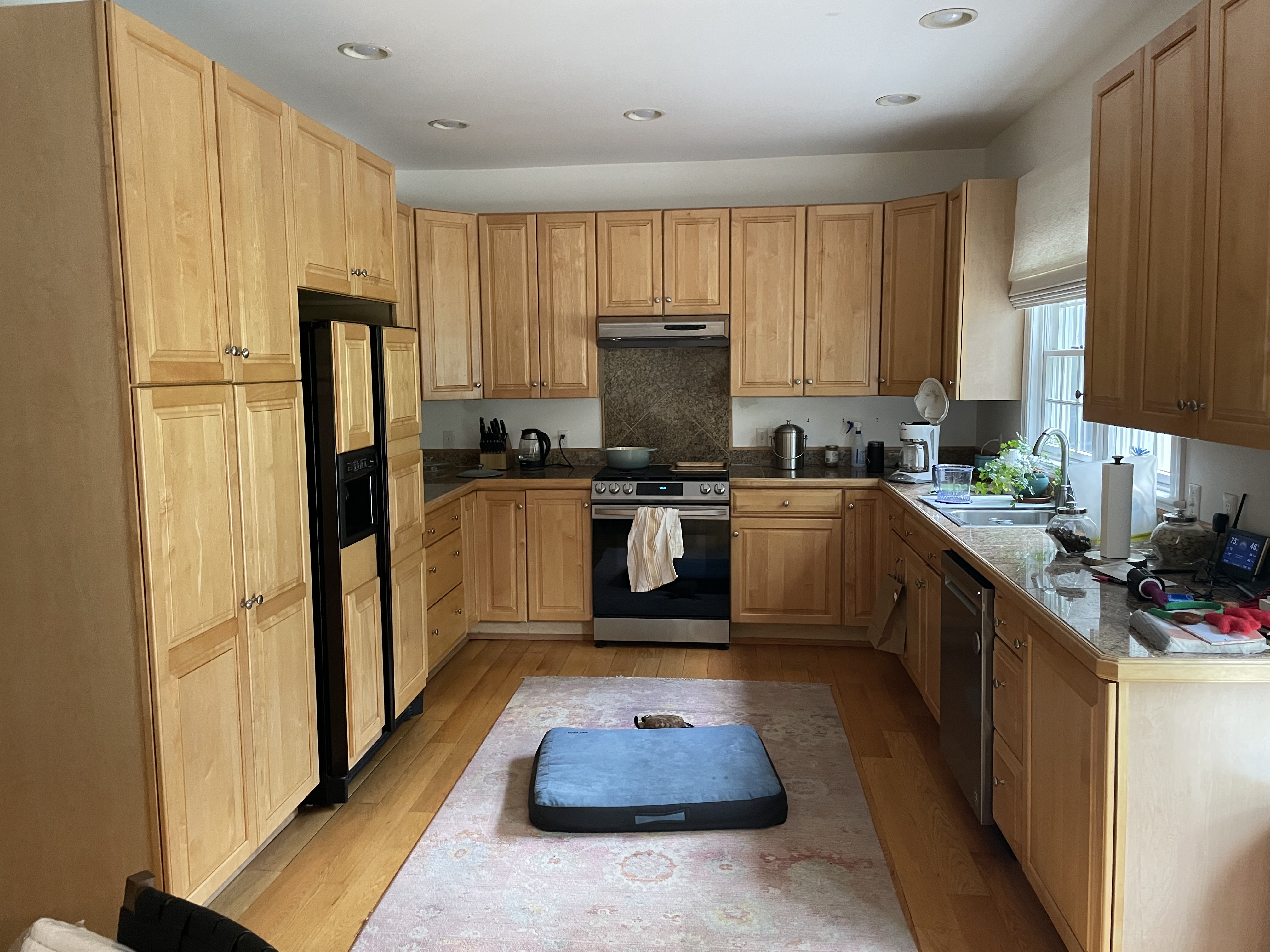
The client desired a modern kitchen that was easy to use and felt like a breeze to work in. The existing all-wood space with a small window and textured walls offered a functional design yet felt top-heavy and unstylish. 'The original kitchen had too much wood on wood with stained oak cabinetry on similarly colored stained oak floors,' says Liz Levin of Liz Levin Interiors. The large molding on the cabinets and dated hardware and window treatments also played a role in the space's worn-out feel, while the kitchen suffered from a most basic of lighting schemes from ceiling downlights.
Along with Tanya Smith-Shiflett of Unique Kitchens and Baths, Liz set to work on this kitchen's remodel.
AFTER
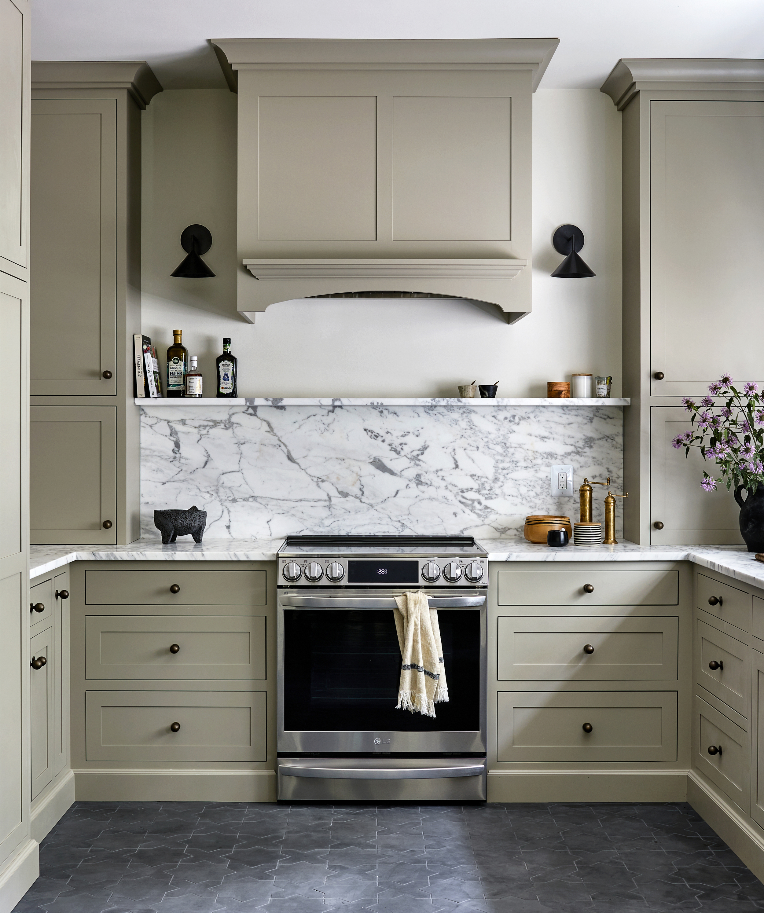
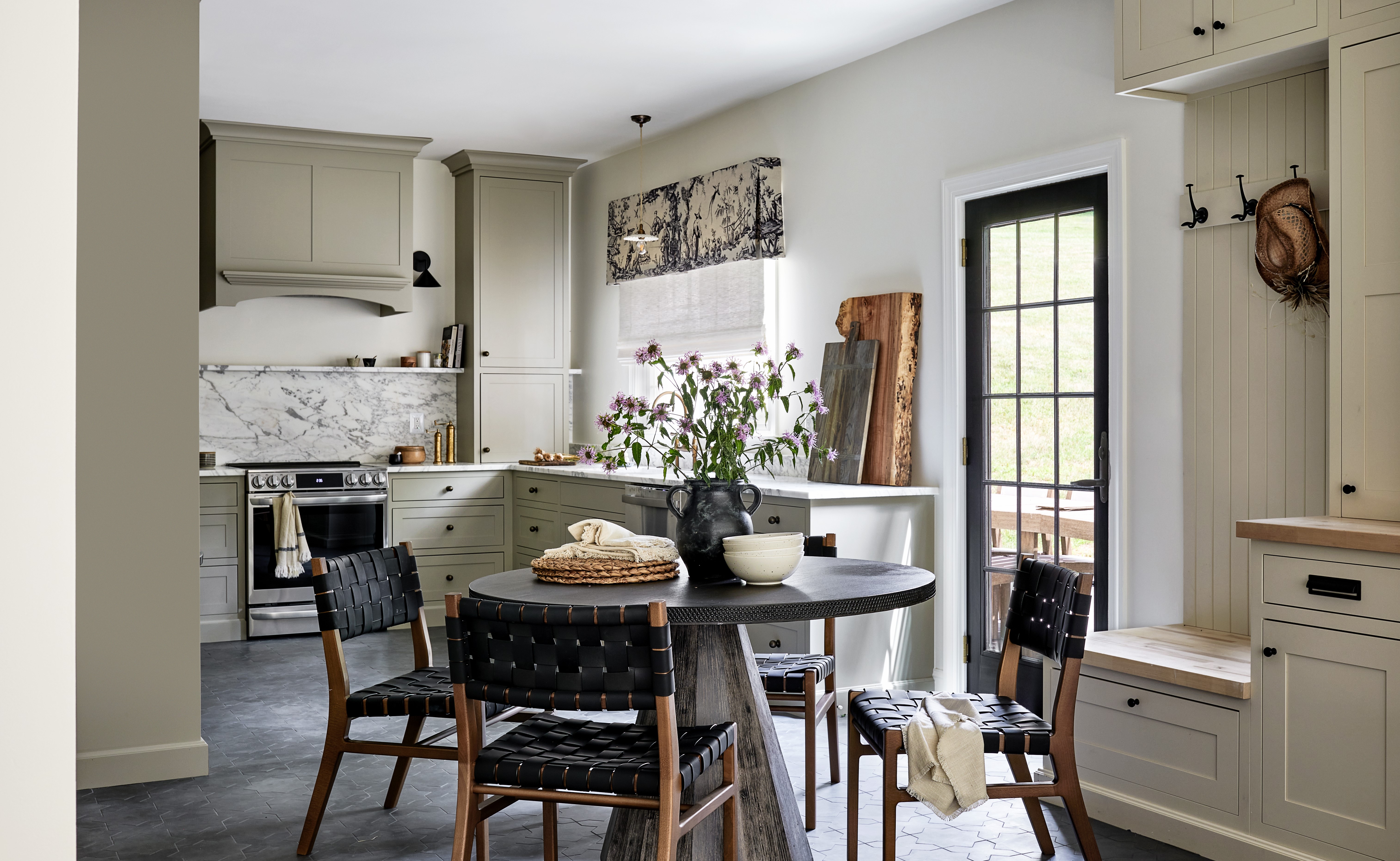
The first order of things to do was to change the kitchen color palette to make the space more airy. 'One of our main things was to change the color of both the cabinetry and flooring which immediately updated the space, and added a much-needed contrast,' shares Liz. 'I see this kitchen as a warm taupe color and believe that it's a classic shade. A white marble countertop bounces light around the room and sconces flanking the stove help alleviate the dated, dark look.'
The kitchen flooring, though dark, looks especially striking against the warm taupe kitchen shelves and cupboards. 'I chose a concrete tile in a charcoal color because it is mudproof,' Liz explains. 'The kitchen side door opens up to a field where the homeowner takes her dog to her expansive garden and walks in the woods. She uses that point of entry often and mud and wet boots wreaked havoc on the original wood floors. The concrete tile looks modern yet has a farmhouse vibe. This is a second home for my client who lives in an urban setting in Washington DC. I wanted to maintain her urban vibe while she spent time in her country home setting.'
The Livingetc newsletters are your inside source for what’s shaping interiors now - and what’s next. Discover trend forecasts, smart style ideas, and curated shopping inspiration that brings design to life. Subscribe today and stay ahead of the curve.
The beautiful taupe kitchen now has an inherently welcoming look. 'I redesigned the first phase of the cottage in a modern farmhouse manner, with a neutral palette utilizing off-whites, charcoal, and browns,' says Liz. 'I wanted the kitchen colors to flow nicely throughout the historic cottage.'
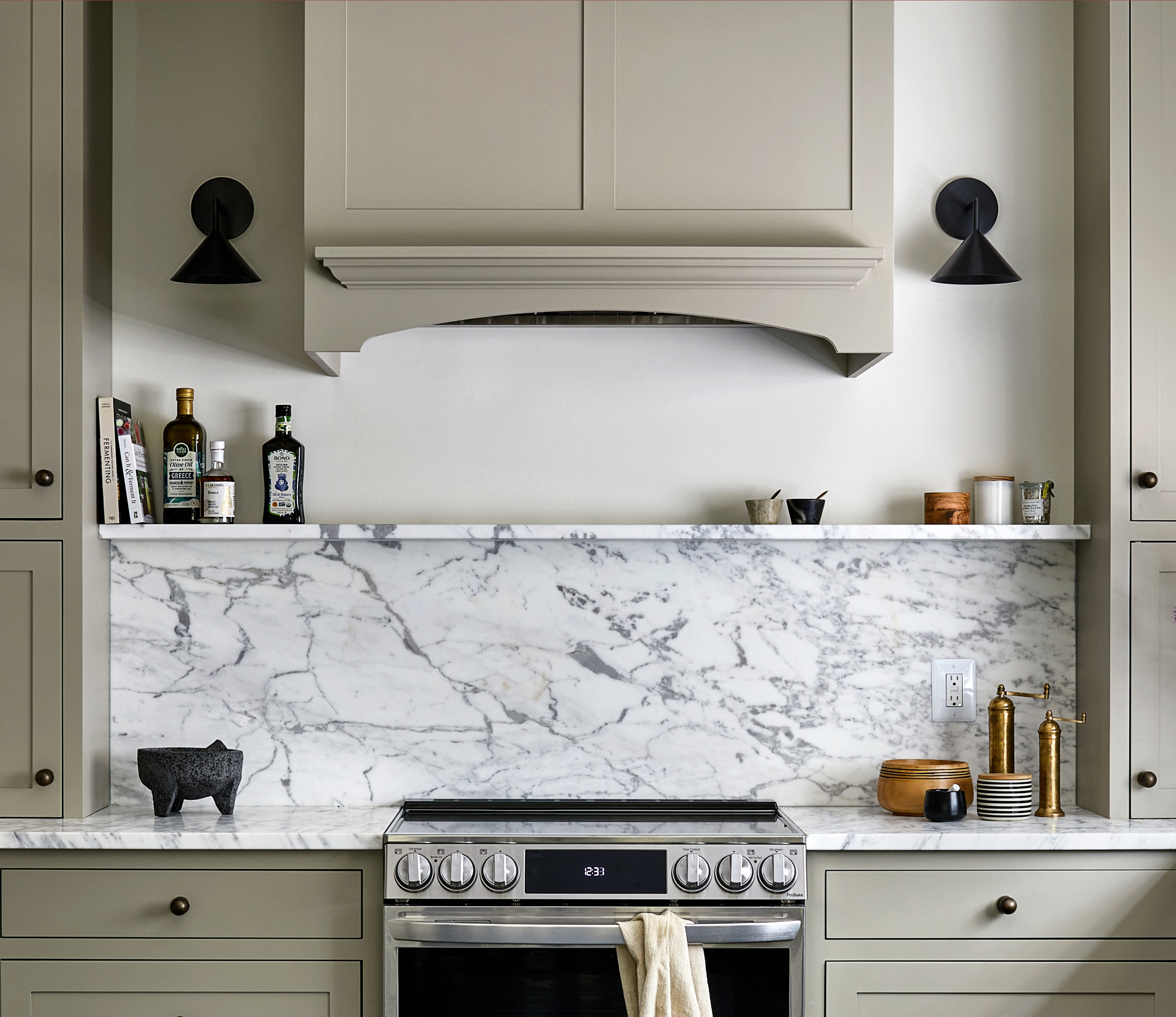
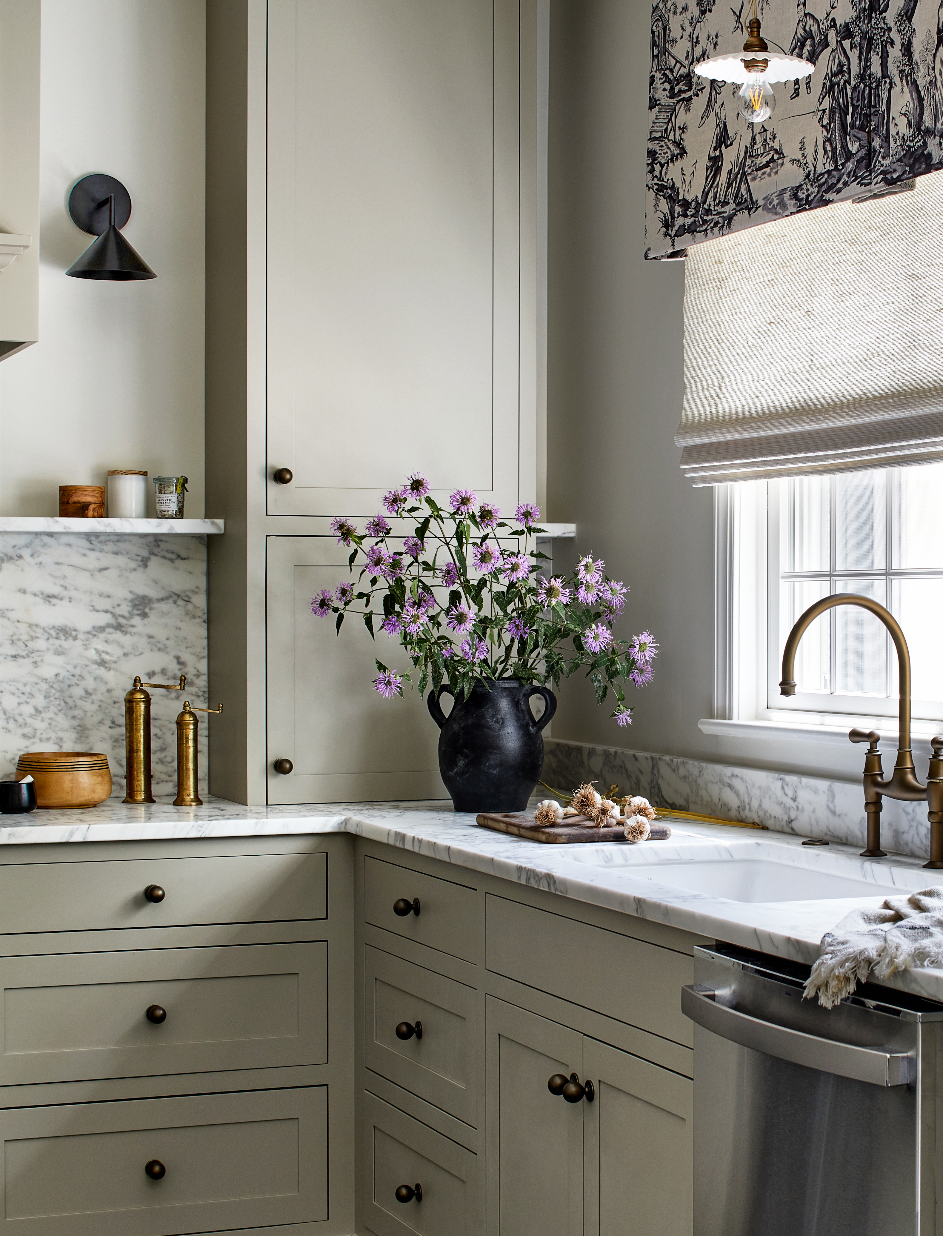
The kitchen's materials have a natural allure, and add depth and layering to the room. The veined marble kitchen backsplash and countertops are highlights that elevate the overall look.
As for the kitchen storage, the designer paid close attention to expanding space with organizers and pull-out drawers. 'The homeowner does a lot of canning from her garden here and loves to cook,' shares Liz. 'She also needed ample pantry space. I surrounded her fridge with roll-out pantry drawer cabinets and hid her microwave and canning equipment inside custom pull-outs. She loved the narrow cookbook bookshelf she has in DC so we replicated that here to the right of the fridge. She does a lot of canning from her garden here and we had to accommodate those supplies here as well. The mudroom pull-out hides her recycling bin and field supplies.'
'The cordless woven grass shade provides texture and is easy to raise and lower for sun protection and privacy, while the Schumacher toile valance adds farmhouse flair and ties in the color palette with the dark charcoal and taupe,' says Liz.

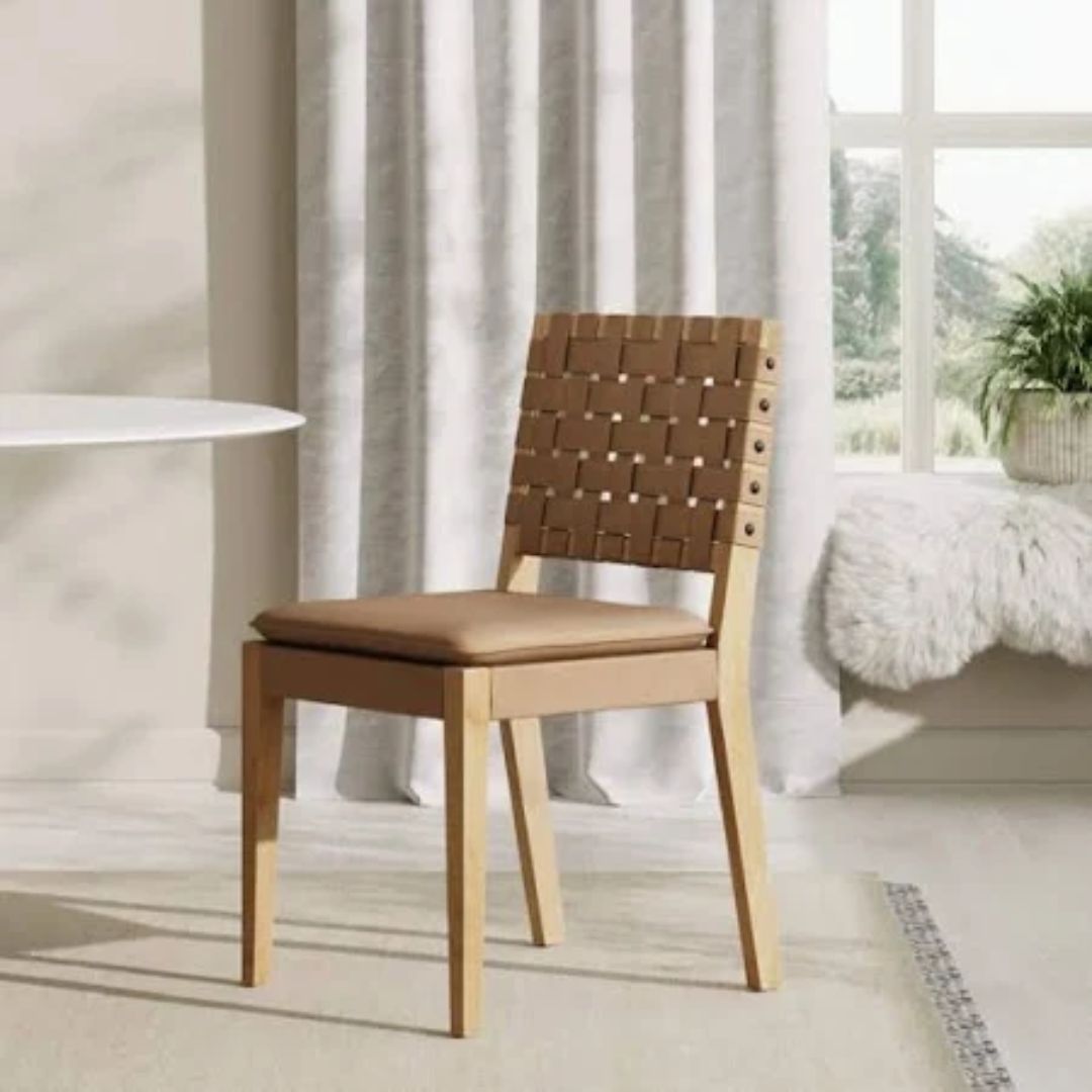
The space extends over to the small dining room, which hosts eye-catching table and chairs. 'The dining table is by Arteriors and the chairs are Williams-Sonoma Home,' Liz says. 'I liked the strong, sculptural nature of the table. The round shape is a nice contrast to all of the right angles in the kitchen. The chairs felt retro modern to me which worked with our urban farmhouse aesthetic.'
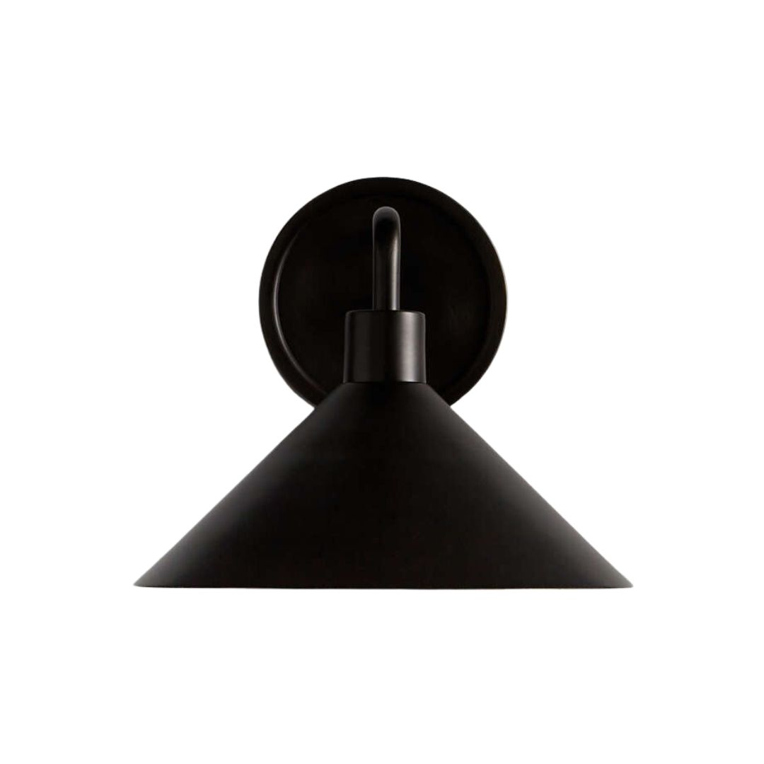
Finally, for the kitchen lighting, the designer decided to take down the ceiling spots and replace them with wall sconces and a delicate pendant to task light the kitchen sink. 'The lighting is a contrast of modern and country farmhouse,' saysLiz. 'I love the Devol white ruffle pendant over the farmhouse sink against the modern Visual Comfort & Co sconces in bronze. The hardware is more traditional.'
The updates have made the kitchen feel more spacious than before, and a sense of quiet elegance has been instilled. It's a space that feels effortless, yet so much better considered than before.

Aditi Sharma Maheshwari started her career at The Address (The Times of India), a tabloid on interiors and art. She wrote profiles of Indian artists, designers, and architects, and covered inspiring houses and commercial properties. After four years, she moved to ELLE DECOR as a senior features writer, where she contributed to the magazine and website, and also worked alongside the events team on India Design ID — the brand’s 10-day, annual design show. She wrote across topics: from designer interviews, and house tours, to new product launches, shopping pages, and reviews. After three years, she was hired as the senior editor at Houzz. The website content focused on practical advice on decorating the home and making design feel more approachable. She created fresh series on budget buys, design hacks, and DIYs, all backed with expert advice. Equipped with sizable knowledge of the industry and with a good network, she moved to Architectural Digest (Conde Nast) as the digital editor. The publication's focus was on high-end design, and her content highlighted A-listers, starchitects, and high-concept products, all customized for an audience that loves and invests in luxury. After a two-year stint, she moved to the UK and was hired at Livingetc as a design editor. She now freelances for a variety of interiors publications.

