Wait, Did 'Backrooms' Just Ruin This Yellow Trend Forever? How A24's New Sci-Fi Horror Made Color Feel Creepy
Kane Parsons' directorial debut turns the beloved shade into a mind-bending theater for trauma, delirium, and obsession

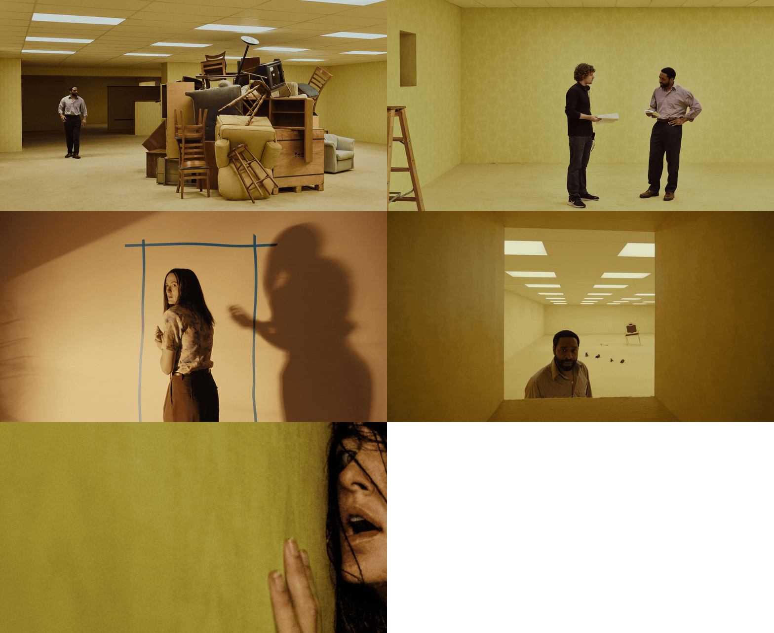
Any child of the Y2K era won't fail to recognize the VHS video game aesthetic that serves as the distinctive trait of Kane Parsons' feature-length directorial debut, Backrooms. A subtle grain envelops the settings that the two protagonists, Clark (Chiwetel Ejiofor), a failed architect and discount furniture store owner, and Dr. Mary Kline (Renate Reinsve), his kind-hearted therapist, appear in — suspended-in-time offices, shops, and parking lots — as their silhouettes traverse them hesitatingly.
Unlike the hazy environments depicted in the filmmaker's viral computer-generated web series of the same title, which Parsons first shared on his YouTube channel, Kane Pixels, aged 16, back in 2022, those of Backrooms still look and feel hyper-real.
The plot of Backrooms is fairly straightforward: a divorcee, Clark, makes ends meet by living inside his shop, Cap'n Clark's Ottoman Empire, which he desperately promotes through truly cringey TV ads. He uses the furniture in stock and spaces as his own, until one day Clark finds something in the store — a "place" as he calls it, or better, a never-ending maze of identical-looking, near-butter yellow rooms revealing flashes of alternate worlds, tucked behind an inexplicably permeable wall. The very maze that, as Backrooms progresses, threatens to get both Clark and his therapist swallowed up in a spiraling journey through memory, delusion, and trauma.
What has this yellow color trend got to do with it? According to Karen Haller, the leading international authority in applied color psychology, pretty much everything...
How the Yellow Palette of 'Backrooms' Made the Film's "Mentally Unsettling" Atmosphere

Actors Chiwetel Ejiofor and Renate Reinsve, photographed on the set of Backrooms, Kane Parsons' feature-length directorial debut, which is out via A24 this week.
"There's something deeply unnerving about being trapped inside an environment that almost feels normal but never fully settles emotionally," Karen tells me. "The yellow of Backrooms doesn't immediately signal danger. Instead, it creates a lingering psychological discomfort through familiarity and lack of relief, which becomes more unsettling over time."
In a modern home, this color and, more specifically, its buttery nuance, have been having a moment recently because of how "its softness can create a sense of cheeriness and optimism within an interior scheme".
The yellow that clads the weary wallpaper and seemingly ever-expanding walls of Cap'n Clark's Ottoman Empire isn't exactly a butter yellow, though. "Although it's still a light, soft yellow, it lacks the freshness and clarity we'd normally associate with that color," Haller says. "Instead, it feels stale and slightly dirty, which completely changes our emotional response to it."

The proof that yellow in artworks (and interiors) can be uplifting, too, Kandinsky's Impression III (Concert) (1991) captures the electrifying pulse and vibrancy of a music-filled evening on canvas.

In 'The Scream', Munch's sickly, churning yellows poison the sky with an almost nauseating unease, as though the atmosphere itself is curdling with existential dread.
Image credit: The Munch Museum, Oslo

One of Rothko's enigmatic abstract compositions, "No. 16 {Green, White, Yellow on Yellow}" (1951) presents viewers with swathes of color that hover between radiance and erasure, suffused with a quiet, aching melancholy.
Image credit: Pace Gallery, London

In 'Seated Bather on the Beach' (1929), Picasso's bone-like yellows render the fractured female form simultaneously sun-bleached and cadaverous, stripping the body of warmth and humanity into a fractured shell of psychological alienation.
Image credit: MoMA, New York

An uncanny, still-life rendition of, quite literally, a Mound of Butter (1875/1885), this iconic canvas by French realist artist Antoine Vollon injects mystery into the everyday.
When researching the canary universe of Backrooms, dreamed up by director Kane Parsons in collaboration with set designer Danny Vermette, countless examples of artworks where yellow doesn't feel menacing but, instead, fantastical and invigorating came to mind — from the obvious, like Van Gogh's Sunflowers (1888) and Klimt's The Kiss (1907/1908), to the niche(r), such as Kandinsky's moving painted rendition of what it feels like to become completely absorbed in live classical music, Impression III (Concert) (1991).
Despite the recent resurgence of yellow kitchens, bathrooms, and bedrooms, there is an ambivalence to yellow, Karen notes. Its ability to speak to the multiple, contrasting sensations that compose the emotional spectrum is evident in the canvases presented above.
"The specific yellow, the lighting, the context in which the color is used, and how much of it surrounds you all influence how we experience it psychologically," explains the color psychology expert. "In a home, a softer butter yellow balanced with natural light and other colors can feel comforting and uplifting. In Backrooms, being surrounded by this flatter, dirtier yellow under cold blue, fluorescent lighting creates something far more disturbing."
Why the 'Backrooms' Universe Feels Both "Familiar Yet Slightly Uncomfortable"

"The yellow of Backrooms doesn't immediately signal danger. Instead, it creates a lingering psychological discomfort through familiarity and lack of relief, which becomes more unsettling over time." — Karen Haller
If anything, the sense of unease triggered by Backrooms' tarnished settings reflects how our relationship with the meaning of yellow has shifted over time, she sustains.
"Historically, and still within many interiors today, softer yellows connect us with warmth, light, and optimism," Karen says. Over the last few decades, "the more muted yellow employed in the film became linked to ageing office spaces, institutional interiors, and nicotine-stained walls."
The Backrooms yellow is the kind of yellow that now feels familiar yet slightly uncomfortable, "because many of us unconsciously connect it with spaces that feel tired, stale, or emotionally draining to spend time in," Karen says.
A 'Slow Burn' Horror Rooted in Memory and Color

Karen describes the palette of 'Backrooms' as "stale, suspended, and disorientating, creating the sense that time has stopped while your nervous system remains on edge".
Image credit: Courtesy of A24

"In 'Backrooms', the repeated use of this yellow across walls, ceilings, and patterns creates a sense of visual monotony, which can make viewers feel trapped, disoriented, and overstimulated at the same time," she adds.
Image credit: Courtesy of A24

The result lets both the protagonists of the film and those watching it wondering the same thing: "Have I been here before? Is this real, or a fantasy?"
Image credit: Courtesy of A24
From a psychology perspective, the way this yellow has been applied to most surfaces in Backrooms feels mentally unsettling rather than openly frightening. It might look like something you have clearly seen before, but "it's emotionally off, almost like an old office, waiting room or corridor you can't quite place in time and space," she adds. "I'd describe it as stale, suspended, and disorientating, creating the sense that time has stopped while your nervous system remains on edge."
Throughout the movie, which also stars Lukita Maxwell, Avan Jogia, Mark Duplass, Finn Bennett, and Robert Brobroczkyi as part of the store staff and the many, creepy entities stuck inside the labyrinth, "the repeated use of this yellow across walls, ceilings, and démodé patterns creates a sense of monotony, which can make viewers feel trapped, disoriented and overstimulated at the same time."
The brain, Karen says, naturally looks for variation, rhythm, and visual relief within a space, so when the same muted yellow continues throughout the environment under cold neon lighting, it can become difficult to judge distance, direction, or even how large the space really is. "That's why the environment can feel claustrophobic despite appearing expansive, because the brain loses its normal sense of orientation within the space," the color psychology expert explains.

Sometimes reality gives way to fantasy or, worst, a fever dream. Kane Parsons' instant cult Backrooms is in cinemas from this week, and we predict the psychological horror film to be big.
From an interior design perspective, the color-drenching effect intensifies this, letting the yellow practically consume the entire space. "The walls, ceilings, flooring, and lighting merge into one continuous experience, removing the visual contrast and variation our brains naturally look for," Haller continues.
"That immersion creates a space that feels psychologically inescapable, which fits perfectly with the film's themes of horror, trauma, and obsession."
As the latest A24 hit takes to movie theaters around the globe starting this week, the dilemma remains the same: will Clark and Mary find their way out of the Backrooms? Or instead, will we, too, remain caught in the thick web of modern anxiety, existential dread, and alienation that anchors the plot?
Kane Parsons' Backrooms is out now in the UK and globally
Contemporary life's mundanity is a hot subject for cinema and TV in 2026, or so reveal some of our greatest film stories, from a restaurant inspired by the dystopian thriller Severance to new-age spy series Ponies and fellow A24 release The Drama, quickly followed by Rosebush Pruning. Dive into our archives to discover how set designers and interior moguls are turning to decor to inject the ordinary with a sense of escapism, nostalgia, and awe.
