Q: The freshness of blues is really appealing, but they can look a little cold — what should I look for in the ideal blue paint?

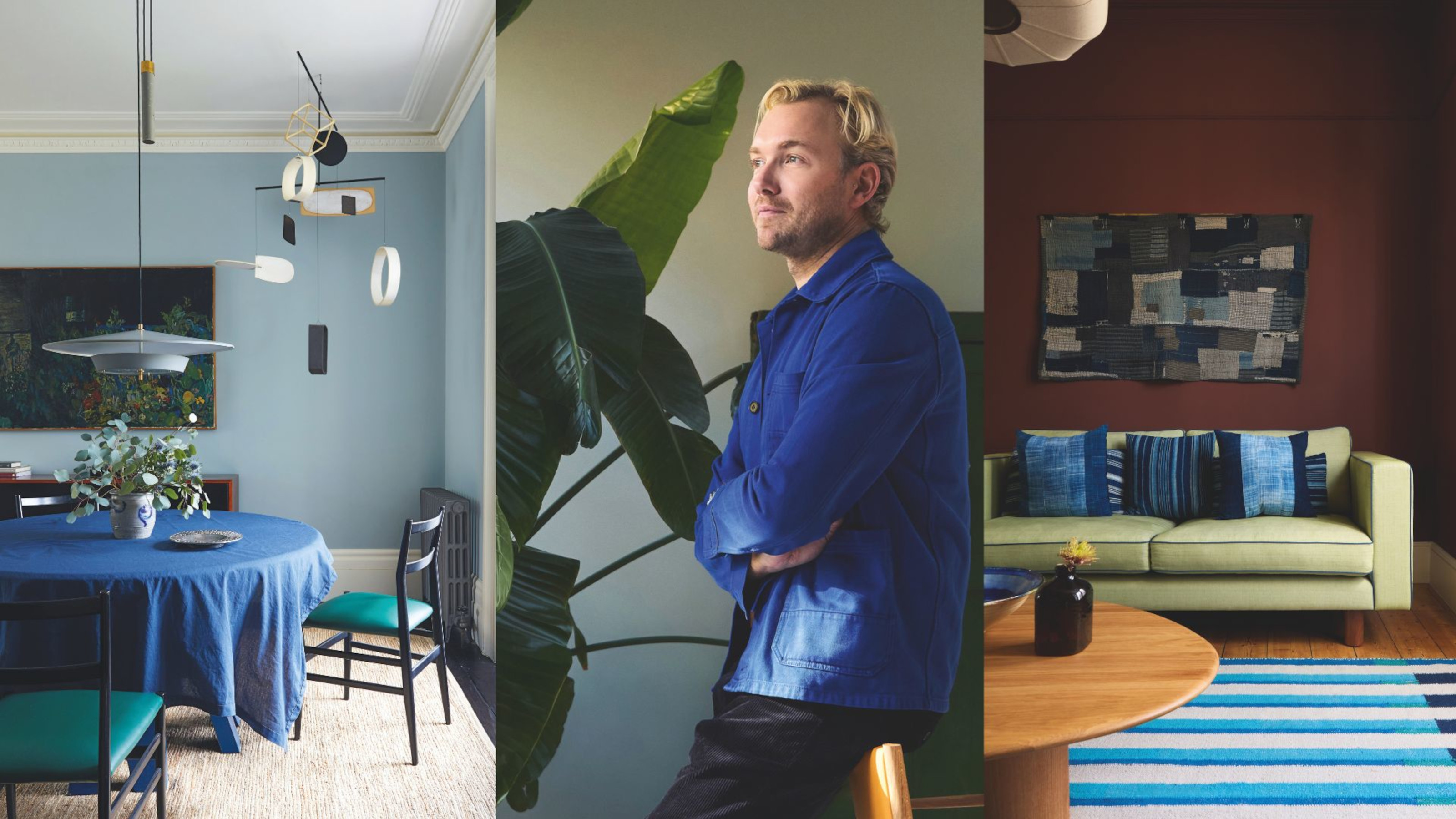
Tom chose Aerial Tint by Edward Bulmer Natural Paint for the wall, as its hint of pink pigment helped it feel warm.
Finding the best blue paint can be a really difficult one, as yes, blues can be tricky, and rely solely on what sort of light a space has. Steer clear of blue in north-facing spaces, where many blues become something else far too quickly. Anything bright goes cold, and with warmer blues, which tend to have a bit of red in them, they end up as lavender or lilac.
A shade I love is Aerial Tint by Edward Bulmer Natural Paint, which is really soft and has a tiny bit of pink pigment in it. I used it in a big drawing room that had windows at both ends. In warm light, it came alive, and on grayer days, it managed to retain a bit of its warmth anyway. Pairing it with a navy tablecloth on the table helped to anchor the blue of the walls, stopping it from veering too far in the direction of that pink.
There are a few other blues that I like and that would be worth sampling heavily before you decide to use them fully on a wall. Hawksmoor by Mylands is a really good one, also with a bit of pink in it. Light Blue by Farrow & Ball is a more gray/green version and feels very elevated and grown-up.
Article continues belowQ: Is there a golden rule for how many colors are enough in one space?
I’m actually quite free and liberal when it comes to putting a palette together, but I do keep the 60-30-10 rule in the back of my mind, and play a bit of mathematical trickery with it. That rule says that a room should be 60% one color, 30% another, and then have an accent shade at 10%, which is a fairly neat idea but quite limiting. I will do that to a point, then throw in another 10% to throw it off (and yes, I know that now adds up to 110%!) It helps the space feel so much more interesting.
My rule of thumb is one earthy neutral (as the 60%), one white (as the 30% — and this could well be quite an off-white, to give it depth), one acid color, then one primary shade as the two lots of 10%. It’s not a strict formula, but it creates contrast in design as well as cohesion, and is a good guiding principle.

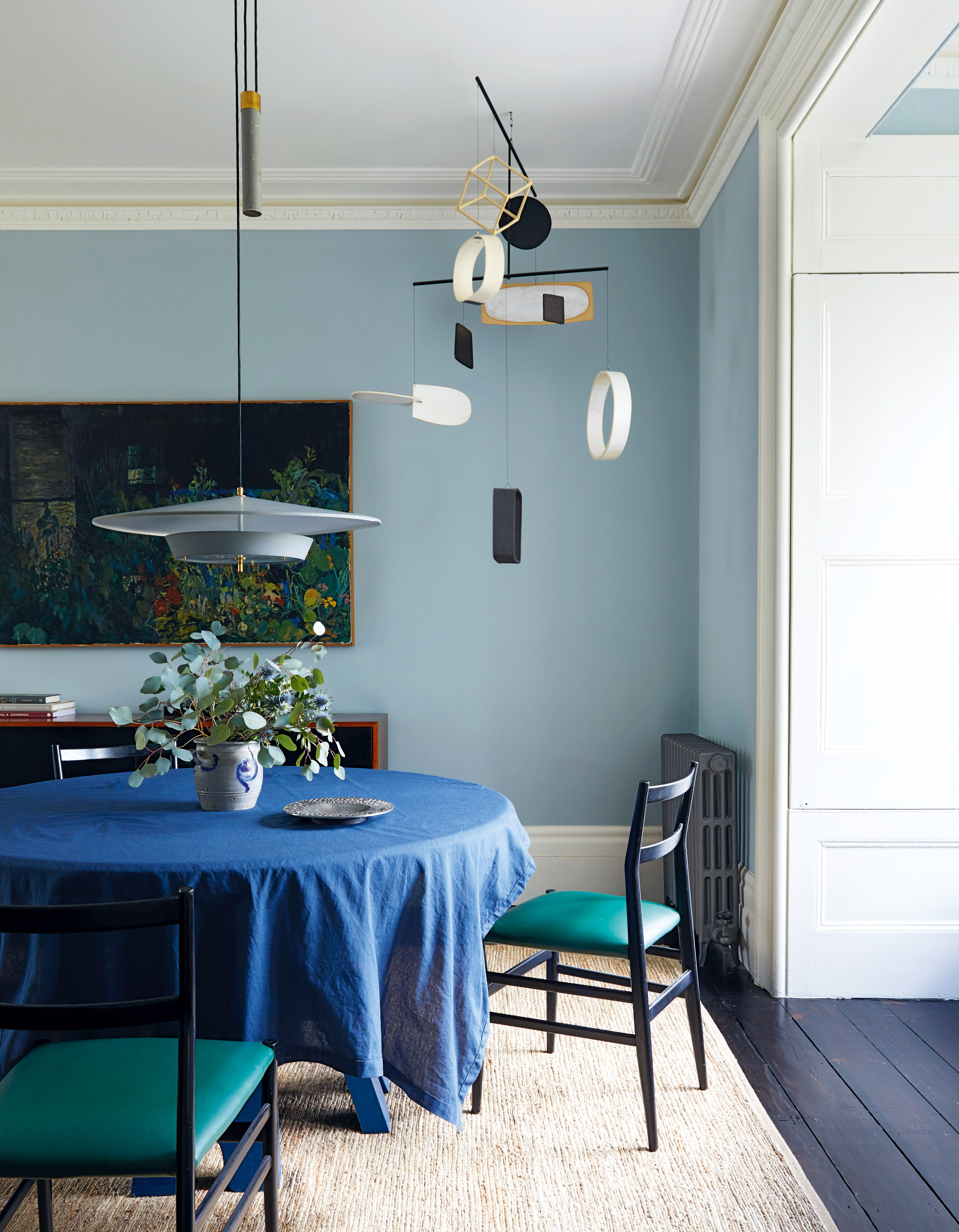
Tom Morris is a London-based interior designer and founder of Morrisstudio. He's known for his bold and joyful approach to color.
Q: I am drawn to deep browns at the moment, but it’s a scary color to use on walls — how should I approach them?

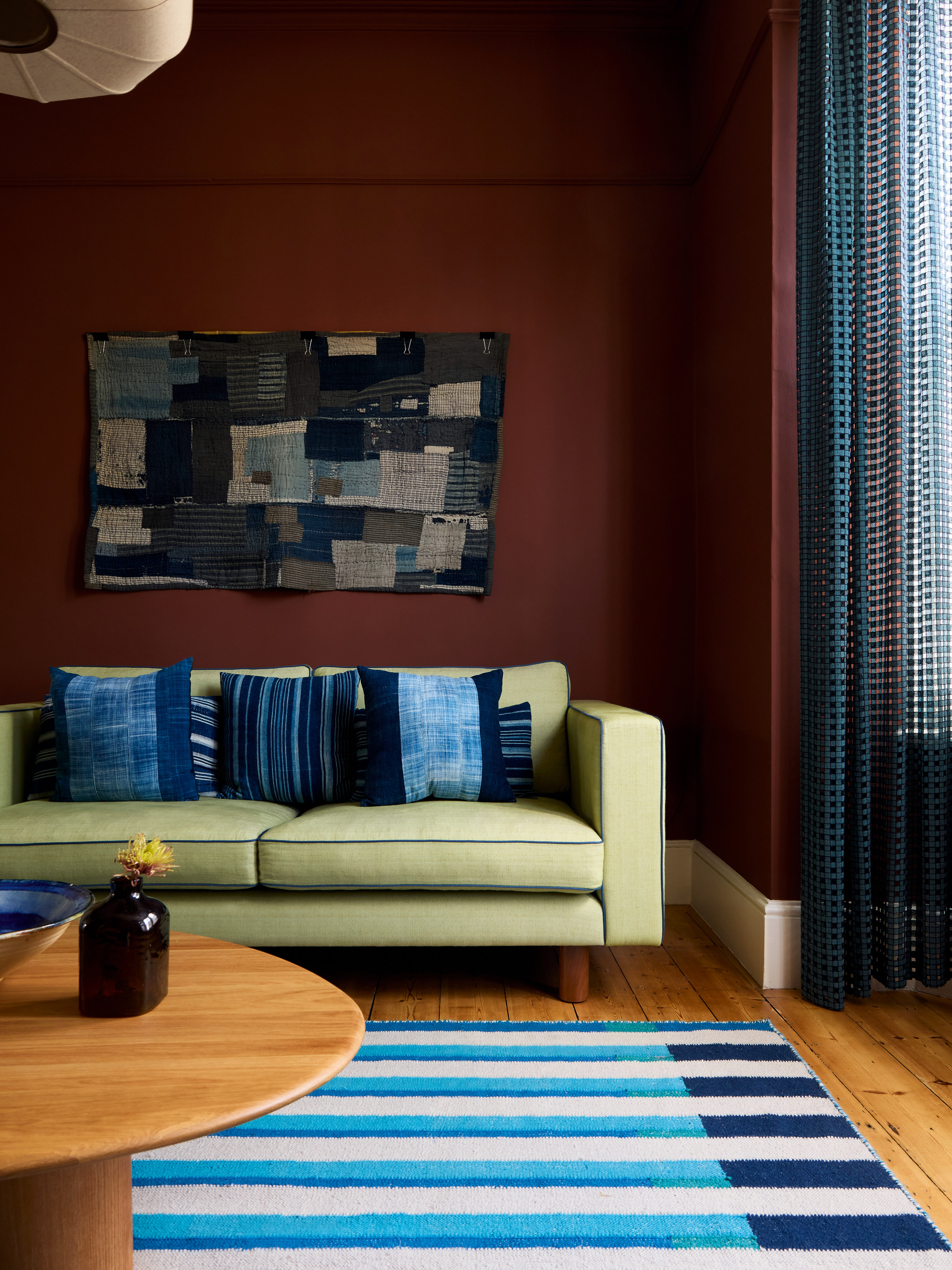
Tom used Masai by Paint & Paper Library for the walls of this west-facing room, which he says pops as the evening light sets on it.
I always veer towards darker colors, and I love anything earthy, but I know they can be a bit intimidating to use, especially on a big scale. But I’ve got to the point where I actually think of brown — even dark brown — as a neutral. Yes, really.
The crucial way to approach decorating with browns is by understanding how they work on different scales. For large rooms that get a lot of light, wonderful chocolate browns work well. They have red tones in them that sing when the sun moves throughout the room in the day. I’m particularly thinking of Cola by Farrow & Ball and Copper Beech by Paint & Paper Library. Everything just pops in front of them, which is how I’ve managed to reframe them as neutrals — they really will work with anything.
The Livingetc newsletters are your inside source for what’s shaping interiors now - and what’s next. Discover trend forecasts, smart style ideas, and curated shopping inspiration that brings design to life. Subscribe today and stay ahead of the curve.
Then, for a smaller or darker space, you want a brown that is less chocolatey and more like soil, with low pigments and a green base. Bronze by Paint & Paper Library is a good example of this: it feels like the classic Le Corbusier palette and is very soft and enticing. And OK, I know I said that every color works with brown, but the one thing I’d avoid is pastels — they tend to get a bit washed out. But a cerulean blue against a brown wall? That’s a winning combination.
The editor of Livingetc, Pip Rich (formerly Pip McCormac) is a lifestyle journalist of almost 20 years experience working for some of the UK's biggest titles. As well as holding staff positions at Sunday Times Style, Red and Grazia he has written for the Guardian, The Telegraph, The Times and ES Magazine. The host of Livingetc's podcast Home Truths, Pip has also published three books - his most recent, A New Leaf, was released in December 2021 and is about the homes of architects who have filled their spaces with houseplants. He has recently moved out of London - and a home that ELLE Decoration called one of the ten best small spaces in the world - to start a new renovation project in Somerset.