How to use paint to change the size and shape of your room
These expert-approved ideas will help turn awkward spaces into cozy, comfortable rooms, using just the power of paint

The Livingetc newsletters are your inside source for what’s shaping interiors now - and what’s next. Discover trend forecasts, smart style ideas, and curated shopping inspiration that brings design to life. Subscribe today and stay ahead of the curve.
You are now subscribed
Your newsletter sign-up was successful
Let’s discuss the power of paint. We’ve all witnessed the instant transformative effect of a fresh lick of paint on a room. It’s a quick, fail-safe, and relatively low-cost way to make a space look as good as new. But that just scratches the surface of its true potential.
In the right hands, paint ideas can become a powerful tool that can change the size and shape of a room. Ok, perhaps not literally speaking, but it’s not far off. ‘Paint is a simple yet effective secret weapon that creates optical illusions to overcome architectural challenges,’ says Georgina Fraser, interior designer and managing director at Jeffreys Interiors. ‘It’s all about what you are trying to highlight or hide,’ she adds.
Clearly, there’s more to paint than we realized. ‘When selecting paint, there’s the general psychology of color to consider, dictated by how clients would like to feel in a space,’ says Georgina. Then, there’s the paint finish and how and where it is applied. All these things combined drastically influence how a space is perceived. Want to make a room seem bigger, smaller, taller, wider, or longer? We asked interior designers how they harness paint’s transformative potential to change how the size and shape of a room are perceived. Here’s what they said.

1. Go lighter for bigger and brighter
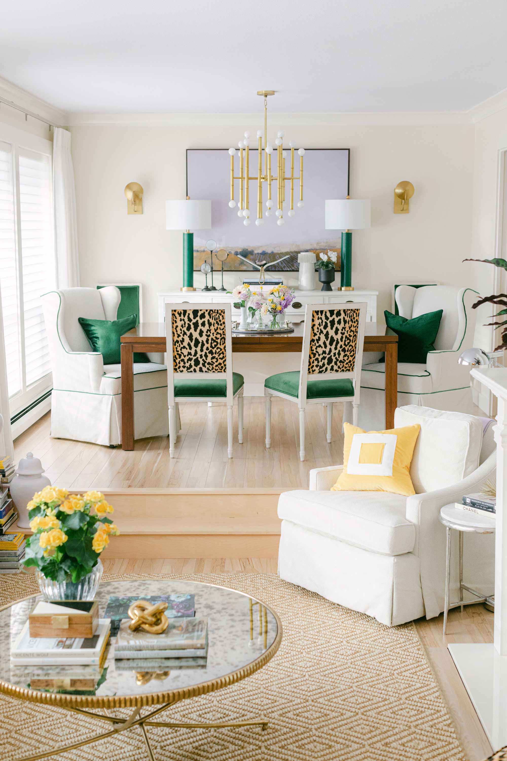
Our instinct to make a space feel bigger and brighter is to paint it white, and we wouldn’t be wrong. ‘Painting a room or house white can make it feel bigger and brighter because white walls are reflective,’ says color expert Maria Killam. ‘However, remember that because they reflect, there’s no such thing as a white that doesn’t change color throughout the day,’ she adds.
Rooms with small windows and low ceilings benefit from light tones because they bounce light around the space, forging a bright, airy, and spacious environment. ‘You can still achieve a bright and airy look with a pale grey, greige, or a complex cream (which are the palest of the beiges),’ says Maria. Cool color schemes help walls to recede, creating the illusion of a larger space.
2. Or dark and dramatic
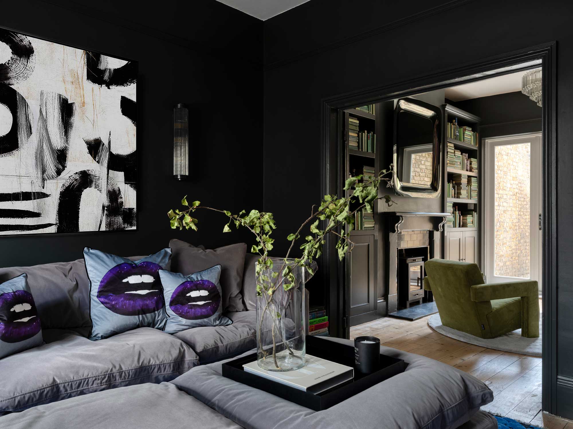
If white walls make a space feel bigger, it seems logical for black walls to make a space feel smaller, but surprisingly, that isn’t the case. ‘Although most people think dark walls make the space feel smaller, it can actually have the opposite effect and make a space feel larger,’ says interior designer Jimmie Martin, ‘especially if you paint the whole room, including the ceiling.’
This paint trick for small rooms works because dark colors absorb light and visually recede, blurring the boundaries of the room and tricking our eyes into perceiving the walls to be further away than they are. Dark shades, like ‘greys and blacks, are great backdrops for more colorful furniture items and really make them pop,’ adds Jimmie. Our eyes focus on the room’s contents, and the walls magically disappear into the background.
The Livingetc newsletters are your inside source for what’s shaping interiors now - and what’s next. Discover trend forecasts, smart style ideas, and curated shopping inspiration that brings design to life. Subscribe today and stay ahead of the curve.
3. Embrace the darkness
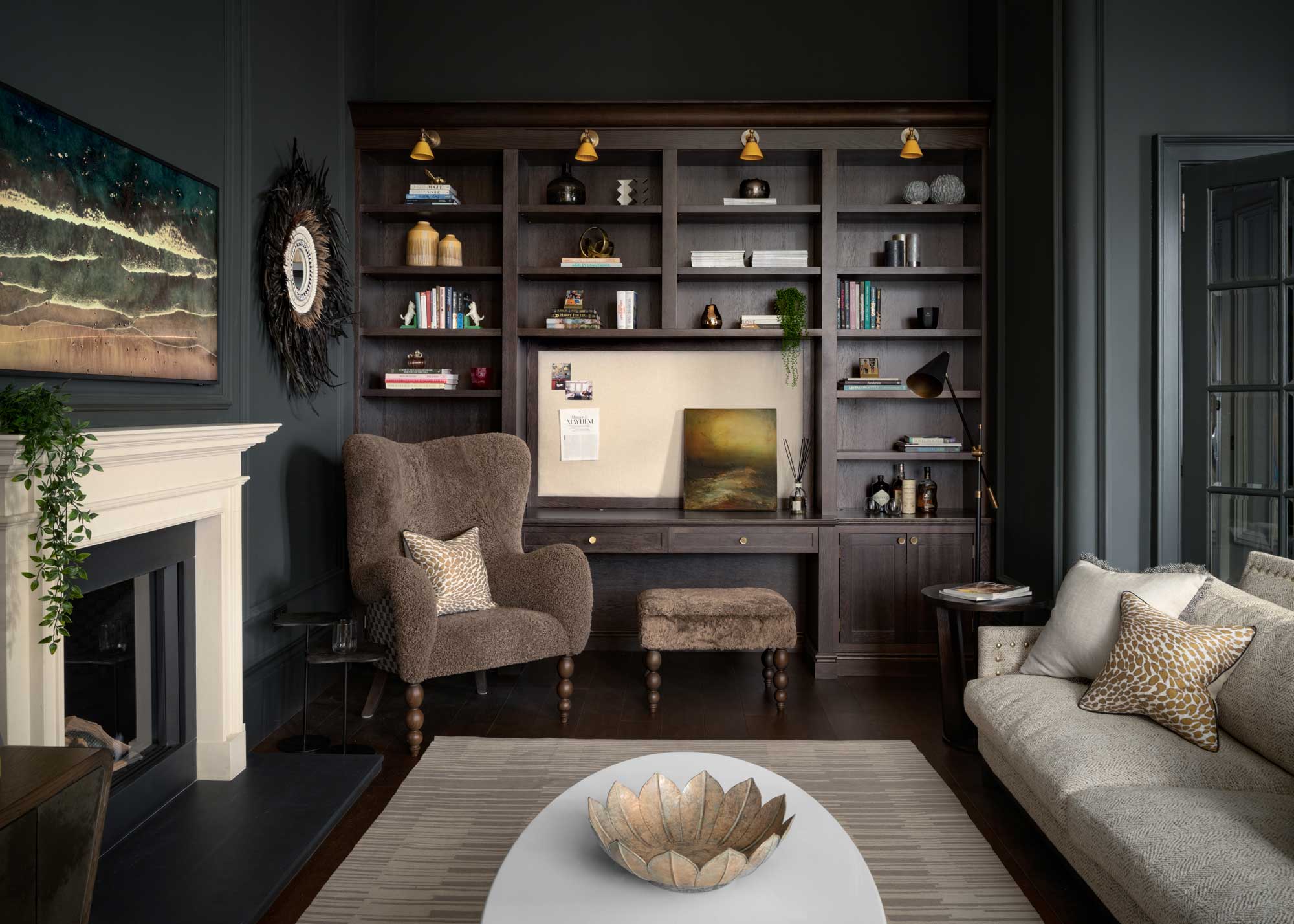
Dark paint can sometimes work better in small, dark rooms than in big, light-filled spaces. Interior designers have been leaning into the darkness to bring drama and intimacy to the likes of small living rooms and bedrooms for a while now.
‘Dark & warm would be the best scenario, especially if the room is poorly lit,’ says Patrick O’Donnell, color consultant and international brand ambassador for Farrow & Ball. ‘Red-based colors are a natural friend to bring in warmth. Think sumptuous deep rose pinks or bricky terracottas, like Red Earth,’ he suggests. ‘Avoid using clean whites on trim too, opting for something softer or darker, like Stony Ground.’
4. Drop the ceiling with a dark shade
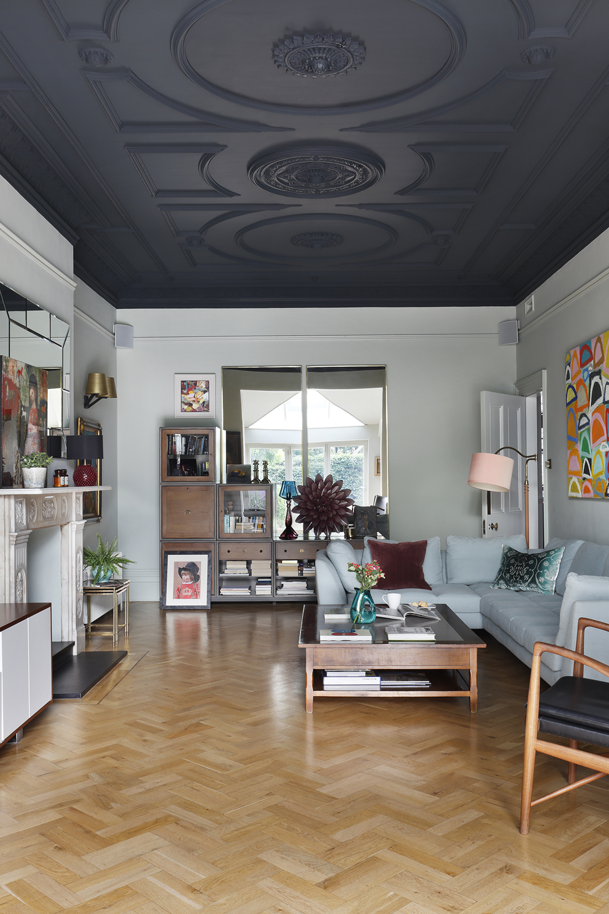
Alas, like many rules, there is an exception; in this case, it’s the fifth wall, aka the ceiling. Ditch the white if you have a small room with overly high ceilings. ‘Clever application of a darker color on the ceiling can balance the proportions of a room,’ explains Georgina. ‘This can be subtle, a few shades different, or a complete contrast.’
A dark painted ceiling drops the ceiling height, creating an intimate, cozy, and inviting setting, and a high-contrast color adds unexpected drama. Though, the wrong color combination can just as easily feel heavy, ominous, and overbearing. To avoid this, stick to a tonal palette.
5. Add height with matching walls and ceiling
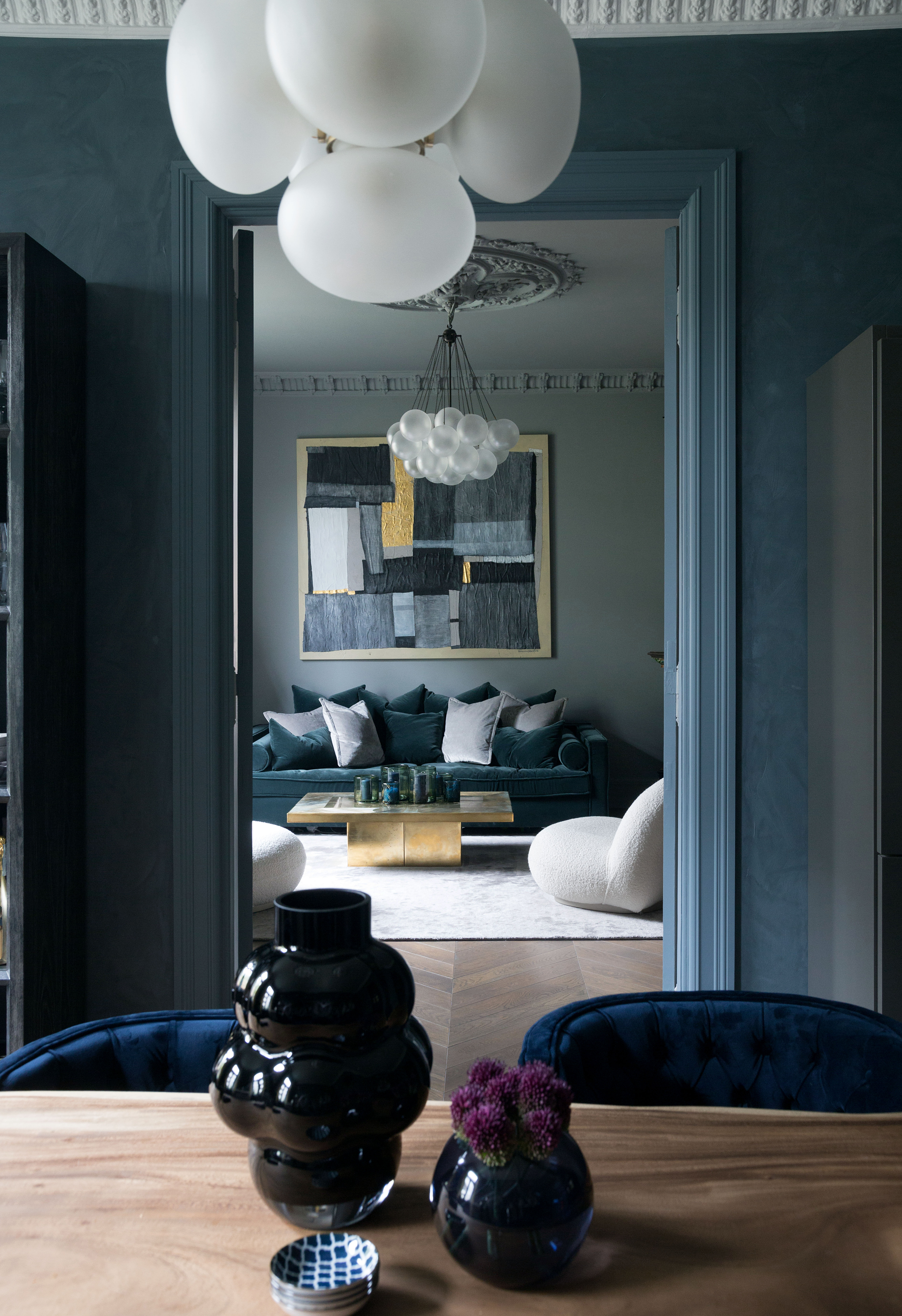
‘If you have a room that is much longer than it is wide, you can use paint to accentuate height by using it floor-to-ceiling in one color,’ says Edward Bulmer, founder of Edward Bulmer Natural Paint. Patrick agrees. ‘This will blur the natural line where ceiling and wall meet,’ he explains.
One continuous flow of color doesn’t allow the eye to rest or focus, creating the illusion of taller walls, and even if your space has architectural detailing, you can still paint ceiling and walls the same color. ‘If your room has period features yet the space isn’t huge, avoid highlighting dado rails or picture rails in a secondary color as this will create strong horizontals,’ adds Patrick.
6. Color drench to camouflage awkward architecture
Take the previous idea, amplify it, and you get a modern phenomenon known as ‘color drenching.’ This paint trend involves painting the entire room in a single shade; walls, ceiling, trims, baseboards, crown moldings, doors, and all. ‘They will still register as a detail but won’t dominate a space and… painting [trims and built-ins] out in the wall color will help ‘extend’ the perceived length of your wall,’ says Patrick. The technique works magic for those more challenging spaces, like attic bedrooms with sloped ceilings and dormer windows.
The concept is the same as before: by painting everything the same color, the awkward lines, and junctions of the room are harder to decipher. By comparison, different shades would accentuate the angles and limitations of the room. 'Crown moldings painted in with the wall will give you solidity and modernity,’ says Edward. ‘Moldings picked out will give you a little delicacy but will only amount to a fraction of the visual weight of the wall, so the architectural integrity is retained.’
7. Pay attention to the paint's finish
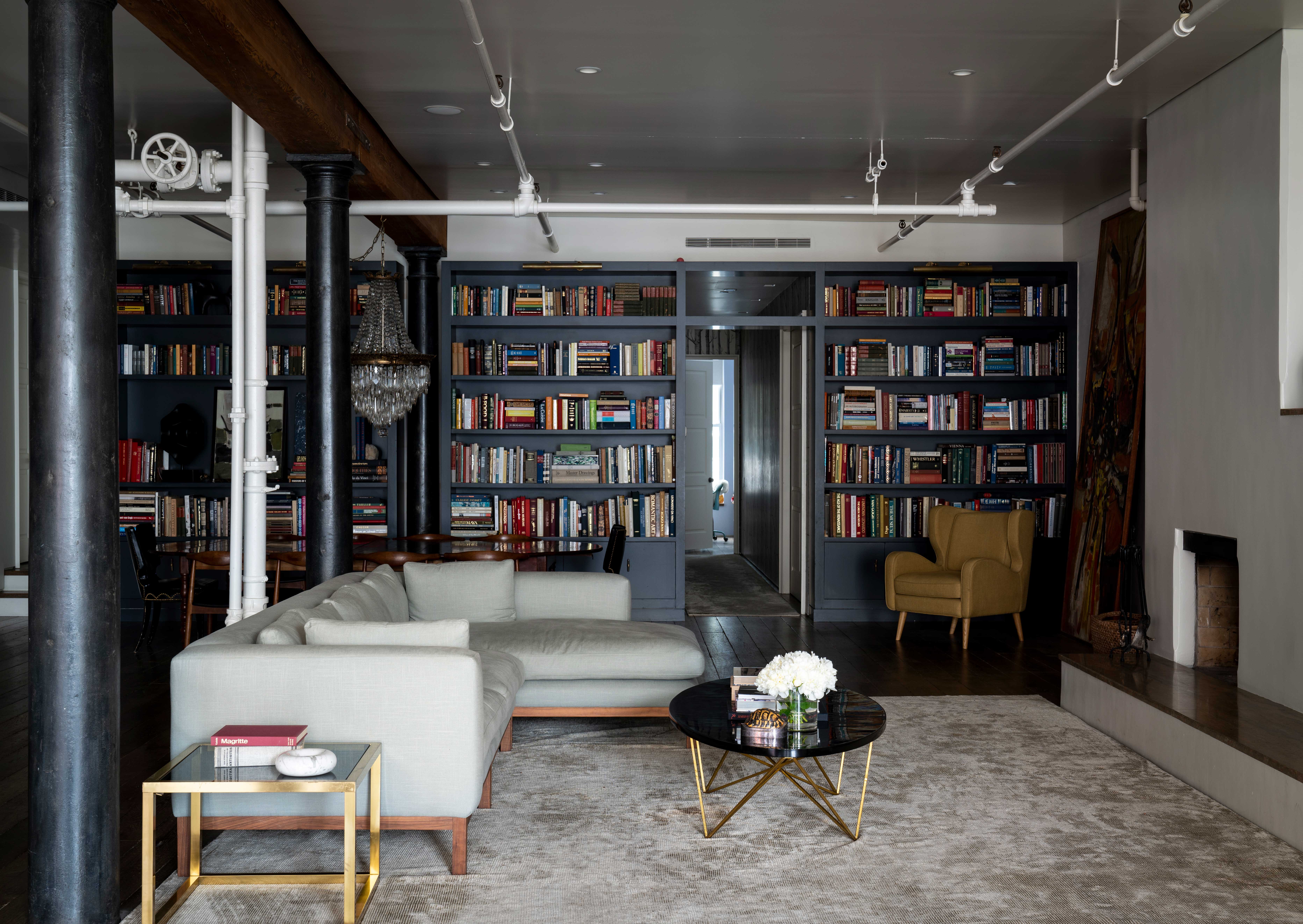
One of the most defining characteristics of paint is its finish, categorized by its light-reflecting qualities or sheen. Flat or matte paint sits at one end of the spectrum with the least amount of shine, while high gloss sits at the other, with a mirror-like quality. In between, there’s eggshell, satin, and semi-gloss. The same color will look entirely different in each paint finish.
‘The more sheen the finish, the more light you will bounce around a space,’ explains Patrick. High gloss paint can help bounce light around a poorly lit room, even in dark shades, making it an excellent tool for making a small and/or dingy room feel bigger and brighter. Because of its mirror-like quality, high gloss painted walls disguise the limits of the space, adding depth with highlights and shadows that dance around with the constantly changing light. Gloss on the ceiling gives the illusion of extra height and creates an atmospheric play of light.
8. Break boundaries with color blocking
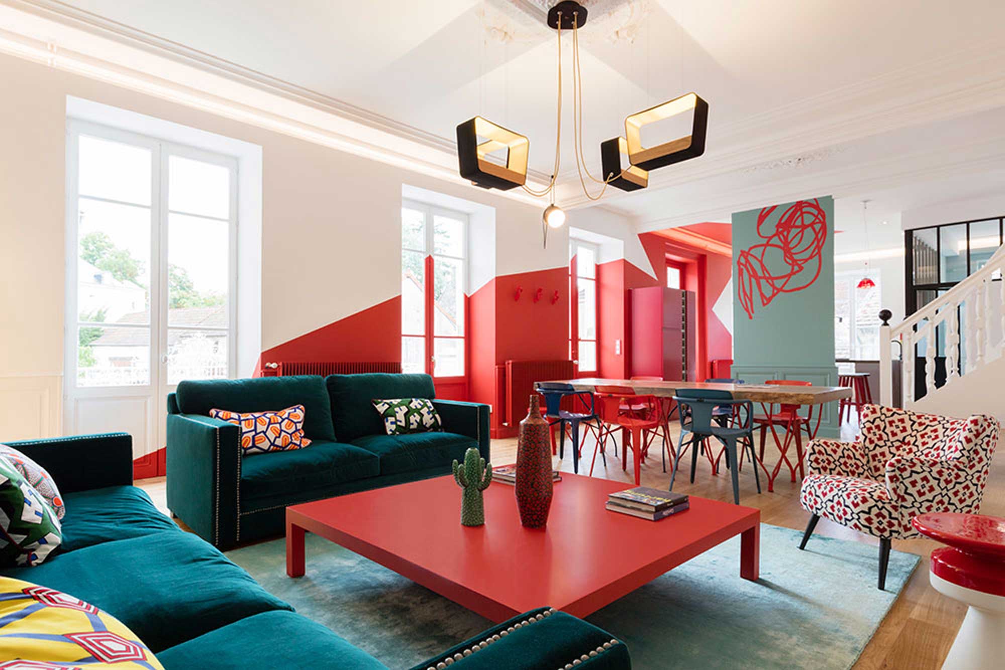
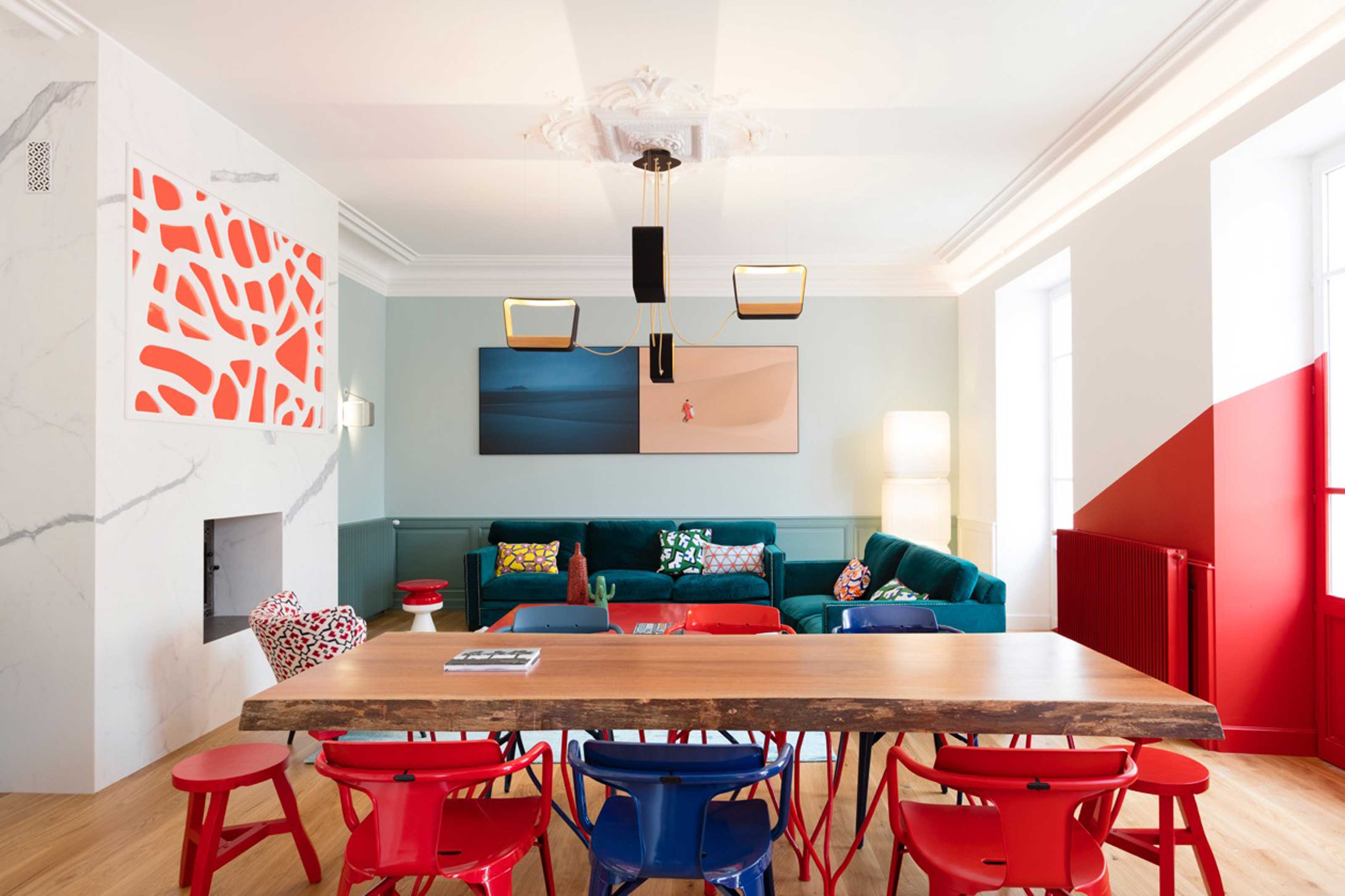
Color blocking walls is a popular contemporary painting technique that uses blocks of solid and often bright, contrasting colors to create a bold statement. But, French interior design studio Faure & Miniau have taken this technique a step further in their designs, using it to break the boundaries of architectural perimeters.
‘We use paint as a tool to erase the notion of a simple solid,’ explains co-founder and designer Pierre-Etienne Miniau. ‘We like to extend the painting of a wall onto a ceiling, sometimes in a classic way and other times in a destructured way, to break this notion of perpendicular wall and ceiling and create a new form, a new volume unknown to the eye.’ There’s no better example of this than the Pop House, with the statement-making block of red paint stretching from the ceiling to the wall across two rooms.
9. Zone the room with color

Color blocking also serves another excellent purpose: zoning. This is particularly effective for large open-plan spaces. ‘Paint makes it possible to create several zones in the same room with just a square of color on the wall, the floor, or the ceiling,’ says Pierre-Etienne. The living area is clearly zoned with color in Pop House with a two-tone block of teal.
‘By placing a sofa in the middle of this square of color, we create a new space,’ he adds. The velvet teal sofa contributes another aqua shade to the zone, further establishing the space as a place to relax and unwind. The soothing, muted blue-green shades are a far cry from the electric cherry red that spans the more dynamic parts of the space, namely the kitchen and dining area.
10. Use color to break up a wall
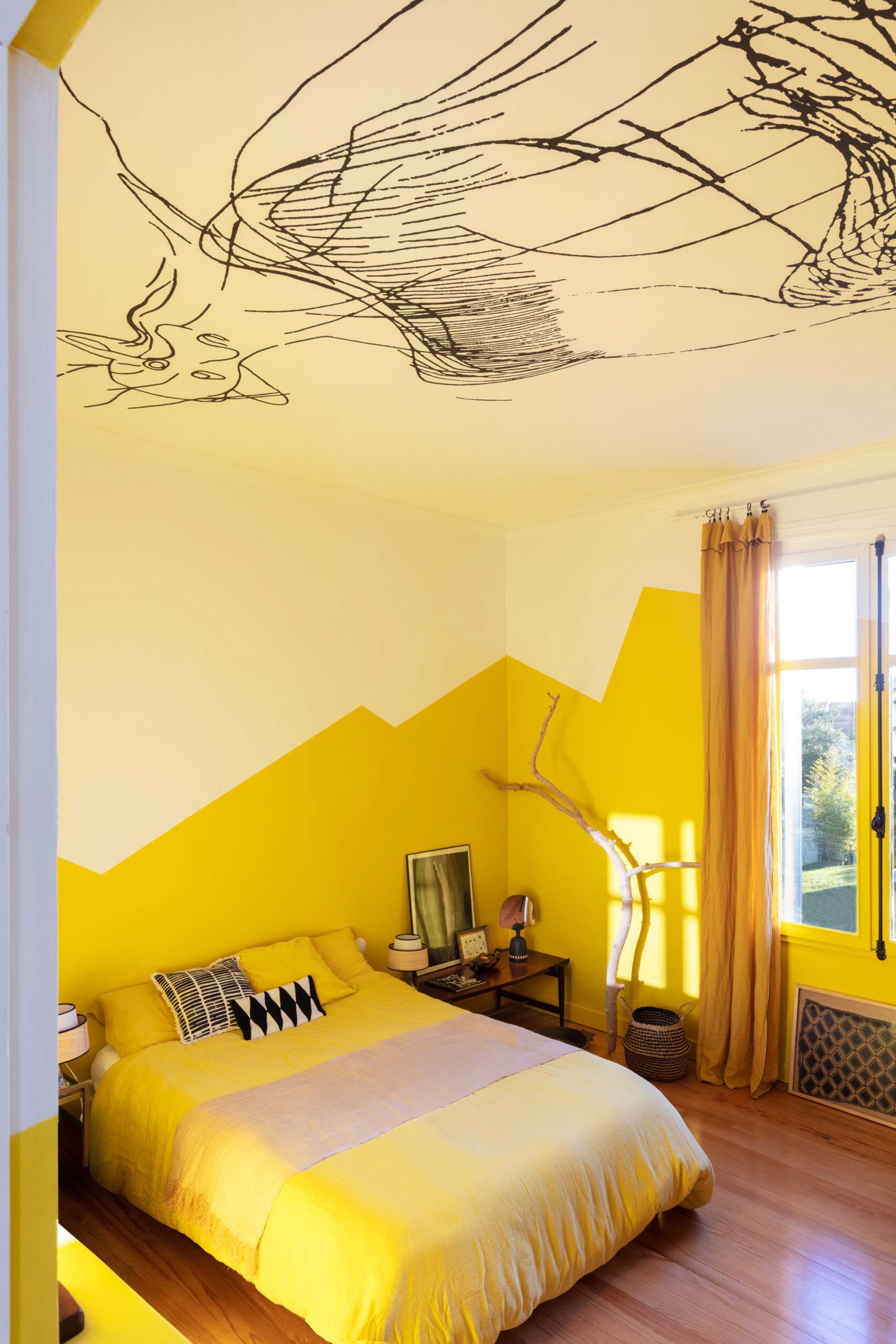
Another paint technique for walls to manipulate the architectural boundaries of a space is to break up the wall with two colors. Pierre-Etienne shows us how it’s done, using the bedroom design for their Fan of Fifties project as an example. ‘The yellow paint on the wall never rises to the ceiling, which means that the volume does not feel like a box but like two entities meeting,’ he explains. This is further reinforced by the staggered cut, as opposed to a clean horizontal line, around the room. ‘We don't know where the wall ends, and the ceiling begins.’
‘We often use mid-height paint in a hallway to break the tunnel effect,’ adds Pierre-Etienne. Half-painted walls, or wainscoting, stretches the space horizontally, making it feel wider than it is. Use a dark shade on the bottom half - or third (waist height is perfect) - of the room and keep it light up top to push the ceiling away and create the illusion of a bright, spacious area.

Sophie is a home interiors writer and all-around design aficionado. With a degree in History of Art and Spanish, she has a keen interest in the influence of art, history, and culture in design. Having lived in Buenos Aires for five years, Sophie is an experienced communicator in both English and Spanish with a professional background in public relations and marketing. Sophie is also an interior design student at KLC, paving the way to tell stories through interiors that inspire, serve and create experiences worth remembering. Sophie currently writes for Livingetc, Better Homes & Gardens, and Foter Magazine.