The joy of colour – picking the right paint for your walls
Choosing the right paint colour for your home is about honouring the architecture as well as your personal taste, says Thyme founder Caryn Hibbert, in her second guest post.

The Livingetc newsletters are your inside source for what’s shaping interiors now - and what’s next. Discover trend forecasts, smart style ideas, and curated shopping inspiration that brings design to life. Subscribe today and stay ahead of the curve.
You are now subscribed
Your newsletter sign-up was successful
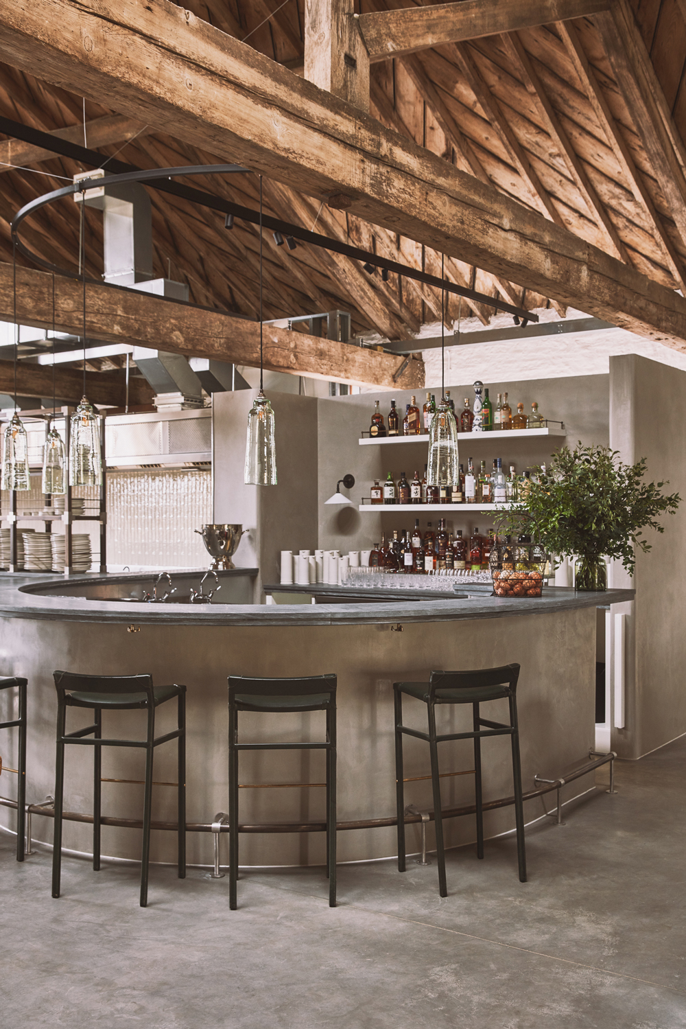
In selecting the colours we used at Thyme, we madechoices that blend with the natural materials of the buildings; the warm pale honey of the Cotswold stone, the grey slate rooves, and the magnificent Douglas fir that was imported from Canada over 200 years ago to create the soaring Ox Barn roof.
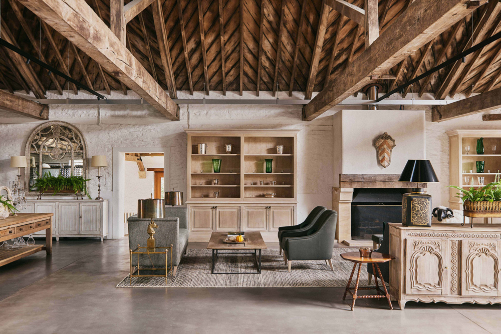
Combining this with inspiration from the soft colours of the gardens and sky, the result is one of harmony and fluidity between the indoors and out.
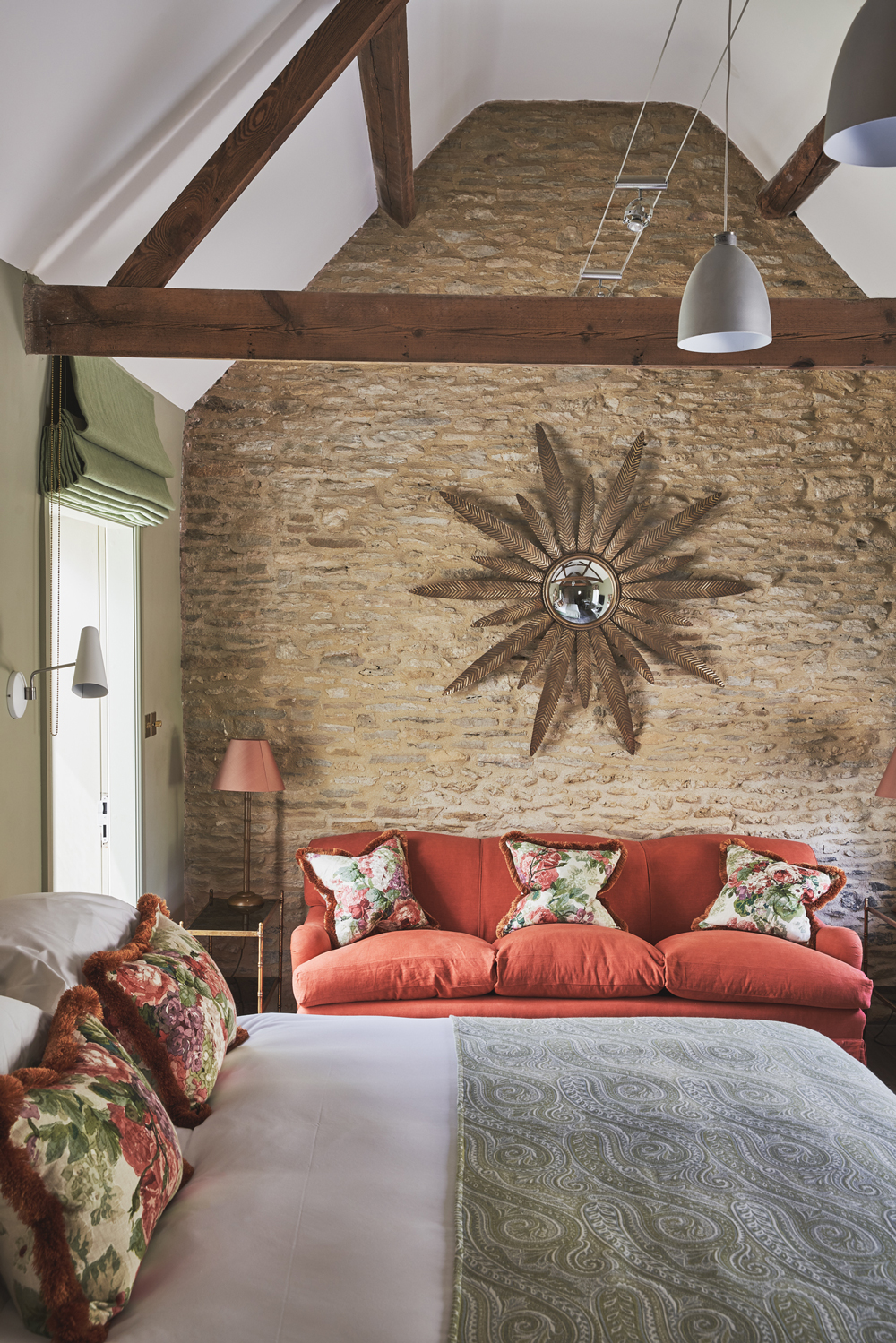
We added a few colour contrasts to define and zone spaces, complement architecture and to establish a visual equilibrium that is interesting without being too noisy or disruptive.
Article continues below 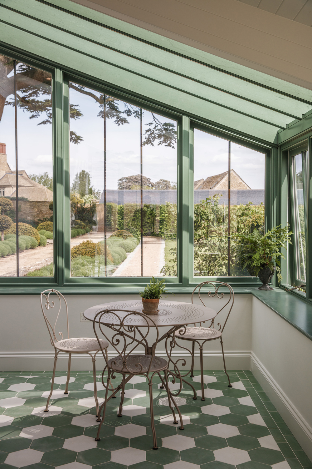
Colours aren't static, they change with the time of day. The intensity, direction and colour of the natural light changes the colours on the walls, and the wall colours are further altered by the room's artificial lighting.
1. HONOUR THE BUILDING'S HISTORY
In all of the main barn spaces we used a natural lime wash slurry and lime paint. This is a very traditional way to finish old and roughly built agricultural natural stone walls, allowing them to continue to breathe and giving a very soft grey white finish, rather than a bright white.
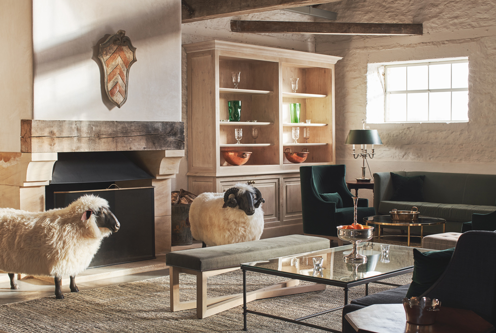
This soft colour creates a natural light that is both restful to the eye and sympathetic to the historic buildings and the slurry ensures the irregular shapes of the building are preserved and continue to shine with no sharp edges disguising their undulating, hand-crafted and ancient form.
Read Also:CROWN PAINT COLOURS FOR 2020
The Livingetc newsletters are your inside source for what’s shaping interiors now - and what’s next. Discover trend forecasts, smart style ideas, and curated shopping inspiration that brings design to life. Subscribe today and stay ahead of the curve.
2. GIVE THE WALLS SPACE
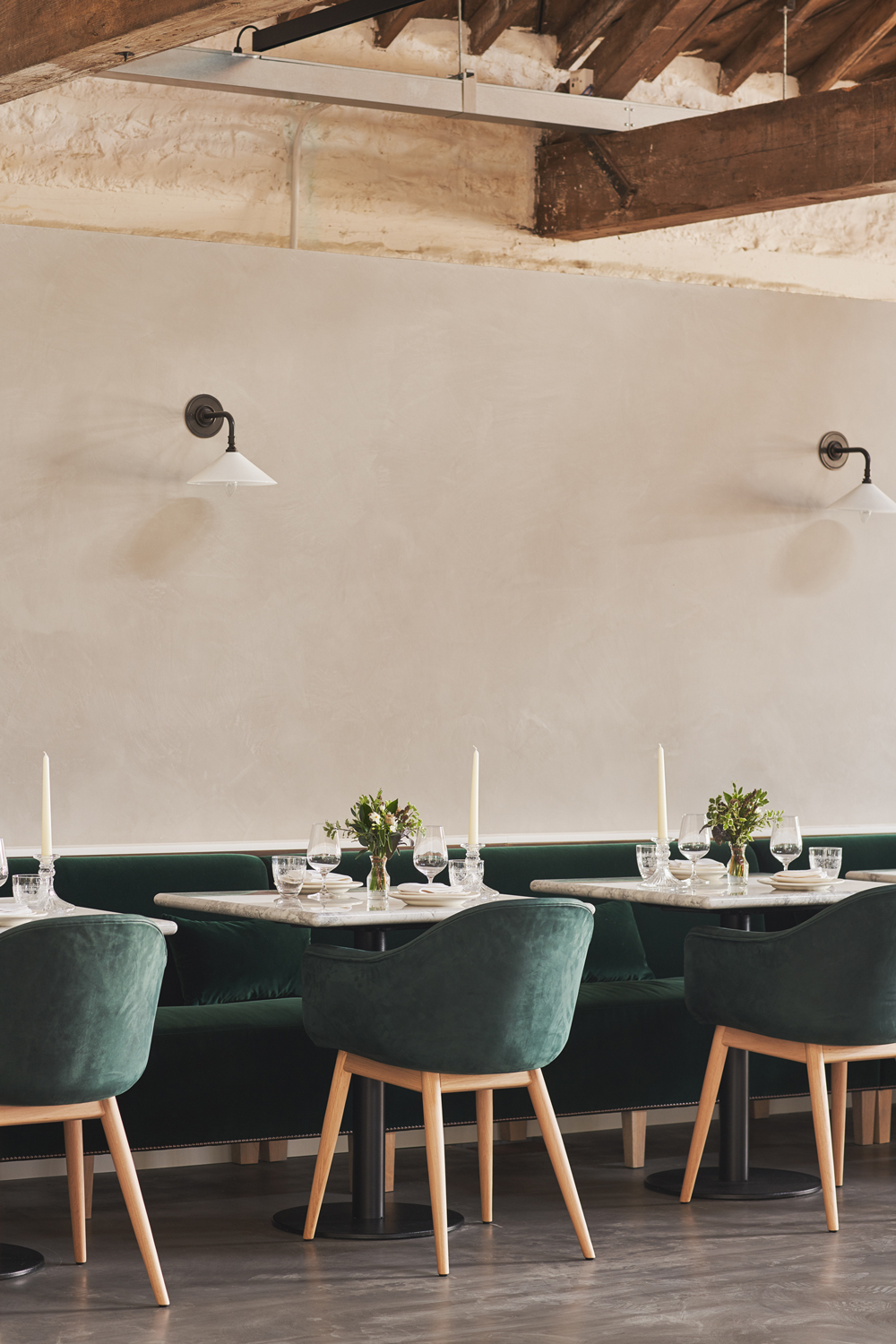
In these huge spaces we ensured that all internal structures and decoration stand away from the walls, so the buildings stand uninterrupted and as pure as possible. We have then used greens, greys and soft browns as the foundation colours to contrast with the lime walls. This gives us the flexibility to layer colour with the seasons, to decorate with whatever flowers are best in the gardens at that moment; wonderful yellows in spring, pinks and blues in summer and oranges and deep reds in autumn.
I have a theory that the natural colours of nature really don’t clash and the dark green and grey foundation of the Ox Barn in particular allow a multitude of possibilities when it comes to adding more colour. This means you are never tired of the space and it is the perfect foil to tell the stories of the garden and the farm.
Read Also:Cool and clever ways with paint
3. GO GREEN
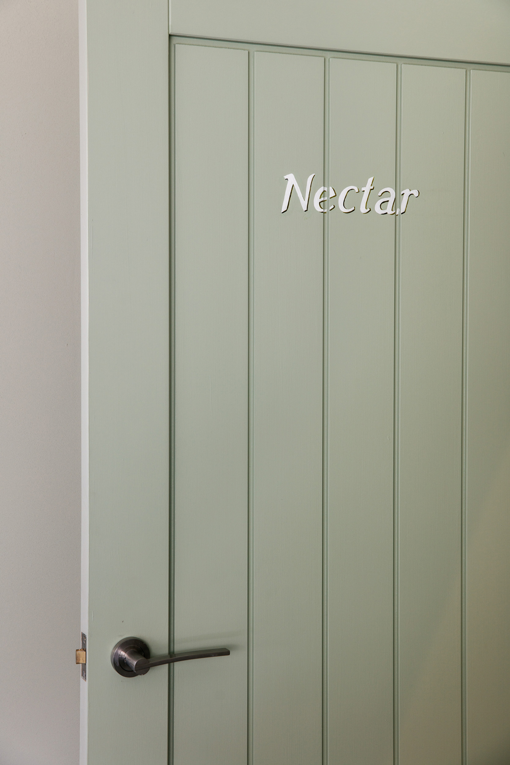
Colour also affects mood. Greens have always been my favourite, the predominant colour of nature it nurtures happiness and tranquillity and is a remarkably versatile and fluid colour. I have often looked and wondered if a wall is blue, green or grey?
Read Also:GO GREEN: HOW TO DECORATE WITH VERDIGRIS
These greeny-greys, blue-greens and blue greys all work as a wonderful, neutral foundation on which to add not only colour but pattern too.
4. CONTRAST AND COMPLEMENT
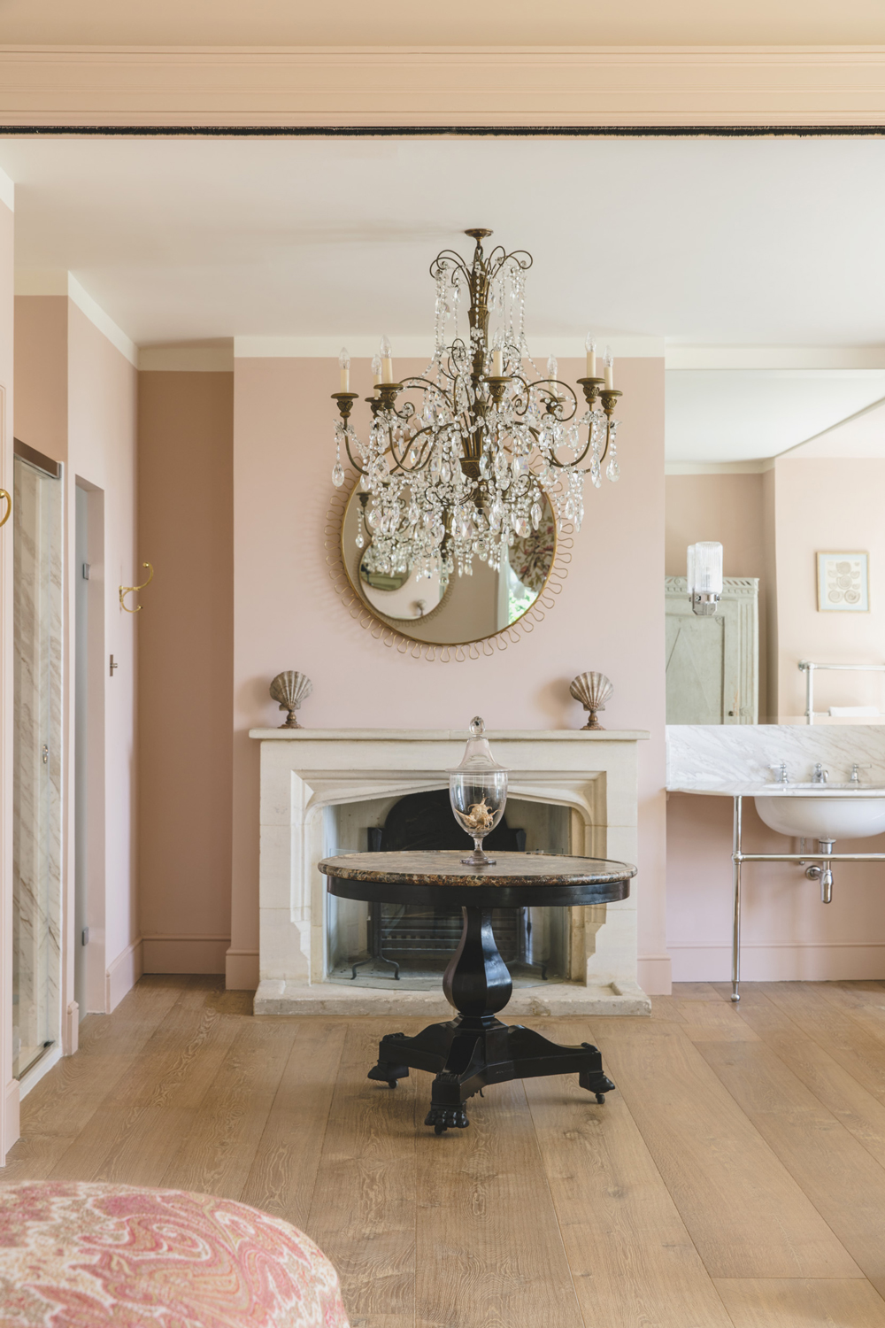
I adore pattern and love to mix them. The trick I found is to ensure that there is some smartness in any scheme. This can be achieved by using colours to accentuate architectural form bringing structure and grounding.
Read Also:Painted Kitchens: Kitchen Colour Ideas
5. STICK TO WHAT YOU'RE DRAWN TO
The overriding lesson I have learnt however is to be brave and to choose colours you like. Any colour when you start painting a room is intimidating and over dominant but will soften once the space is completed.
For a more natural look, paint the wood work the same colour as the walls to create continuity, use a lighter shade on the ceiling and use contrasting colours that complement gently rather than colours that are a stark contrast.
To own a space and to make it yours, be confident, trust your instinct and don’t ask too many opinions, they will all be different and confuse your vision. Above all, enjoy colour, it is one of life’s great pleasures.

Lotte is the former Digital Editor for Livingetc, having worked on the launch of the website. She has a background in online journalism and writing for SEO, with previous editor roles at Good Living, Good Housekeeping, Country & Townhouse, and BBC Good Food among others, as well as her own successful interiors blog. When she's not busy writing or tracking analytics, she's doing up houses, two of which have features in interior design magazines. She's just finished doing up her house in Wimbledon, and is eyeing up Bath for her next project.