CROWN PAINT COLOURS FOR 2020
The Livingetc newsletters are your inside source for what’s shaping interiors now - and what’s next. Discover trend forecasts, smart style ideas, and curated shopping inspiration that brings design to life. Subscribe today and stay ahead of the curve.
You are now subscribed
Your newsletter sign-up was successful
Crown Paints has revealed its new colour palettes for 2020.
Devised by its panel of six colour experts, Crown's three seasonal trends are designed to embolden all of us to use colour in new and unique ways.
The three palettes are Rethink, Direct and Connect.
Article continues belowSee which is your favourite and find out the reasoning behind the results.
RETHINK
According to Crown, Rethink embodies progress.From neo-mint to futuristic pink, the colours are gender-neutral and open to interpretation.
Aligned with science and technology, it is reinventing from the old and using modern processes to create the new.It's a vision that is vital and oxygenating, said to represent forward thinking.
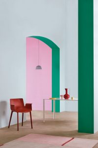
“New tones are revealed in this synthesised collection. The green and pink become allies in generating a powerful artificial environment that engages with the architecture to redefine its lines and angles. It creates the perfect backdropfor light refined furniture to sit as man-made sculptures in its footprint,” says Neville Knott, Crown Colour Consultant.
The Livingetc newsletters are your inside source for what’s shaping interiors now - and what’s next. Discover trend forecasts, smart style ideas, and curated shopping inspiration that brings design to life. Subscribe today and stay ahead of the curve.
See how to decorate with pink.
DIRECT
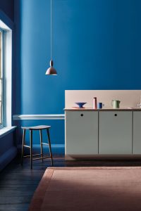
This palette is bright and unexpected, combining sky blue with bold plum and vivid cobalt with mint green.
Crown tell us that Direct is an ode to Lee Krasner, the female artist who became a pioneerin abstract expressionism. As the wife of Jackson Pollock, her work was overshadowed until later in life when she truly discovered her form. As a woman and an artist, she captures the spirit of originality.
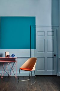
Direct is similarly expressive and non-conformist.There are no conventional colours, each appears to have passed through a digital chromer. Its placement leads the eye and doesn’t conform to certain spaces; breaking free from architectural constraints.Above all, it is fun.
“Direct rejects traditions and restrictions within the interior space and creates new boundaries and divisions with an exciting use of colour blocking. An expressive and energising collection of colours selected to revitalise the home, ” saysJemma Saunders, Crown Colour Specialist.
CONNECT
This palette reflects the colours of the forest, ranging from a midnight oak to a vivid birch.
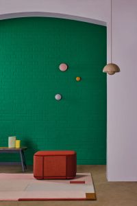
Shinrin-yoku is the Japanese philosophy of forest bathing, which draws on the therapeutic powers of nature.Beyond tradition, it has become a practicalcornerstone of restorative health.Translated to design, this is Connect, according to Crown.
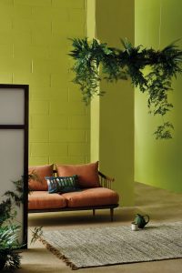
“Drawing from nature, the colour palette is heavy in greens. Never boring, though - with shades ranging from soft mint, through earthy tones of khaki green and mustard yellow, and ending on a deep jade green of Botanical Noir for a statement wall,”Justyna Korczynska, Crown Design Studio.
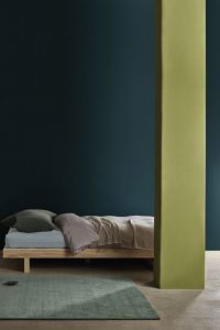
Find out how to decorate with green.
Jacky Parker is a freelance lifestyle journalist and writer, producing a wide range of features for magazines and digital platforms. She has written for Livingetc and its sister titles, Homes & Gardens and Country Homes & Interiors for more than 15 years, both as a freelance contributor and as Acting Digital Editor and Acting Style Content Editor, regularly reporting on the latest interiors, gardens and wellness inspiration, speaking to experts in their respective fields, and discovering the best tips.
Jacky has also written for other publications, including Sunday Times Style, The Telegraph, Architectural Digest, House Beautiful, ELLE Decoration, Red, Grand Designs and more.