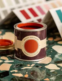
Bold reds are a big new design trend so Farrow & Ball's Joa Studholme explains how to use it
Red tones are trending, but why are they set to dominate designs in 2023? And how should we be using them to decorate?

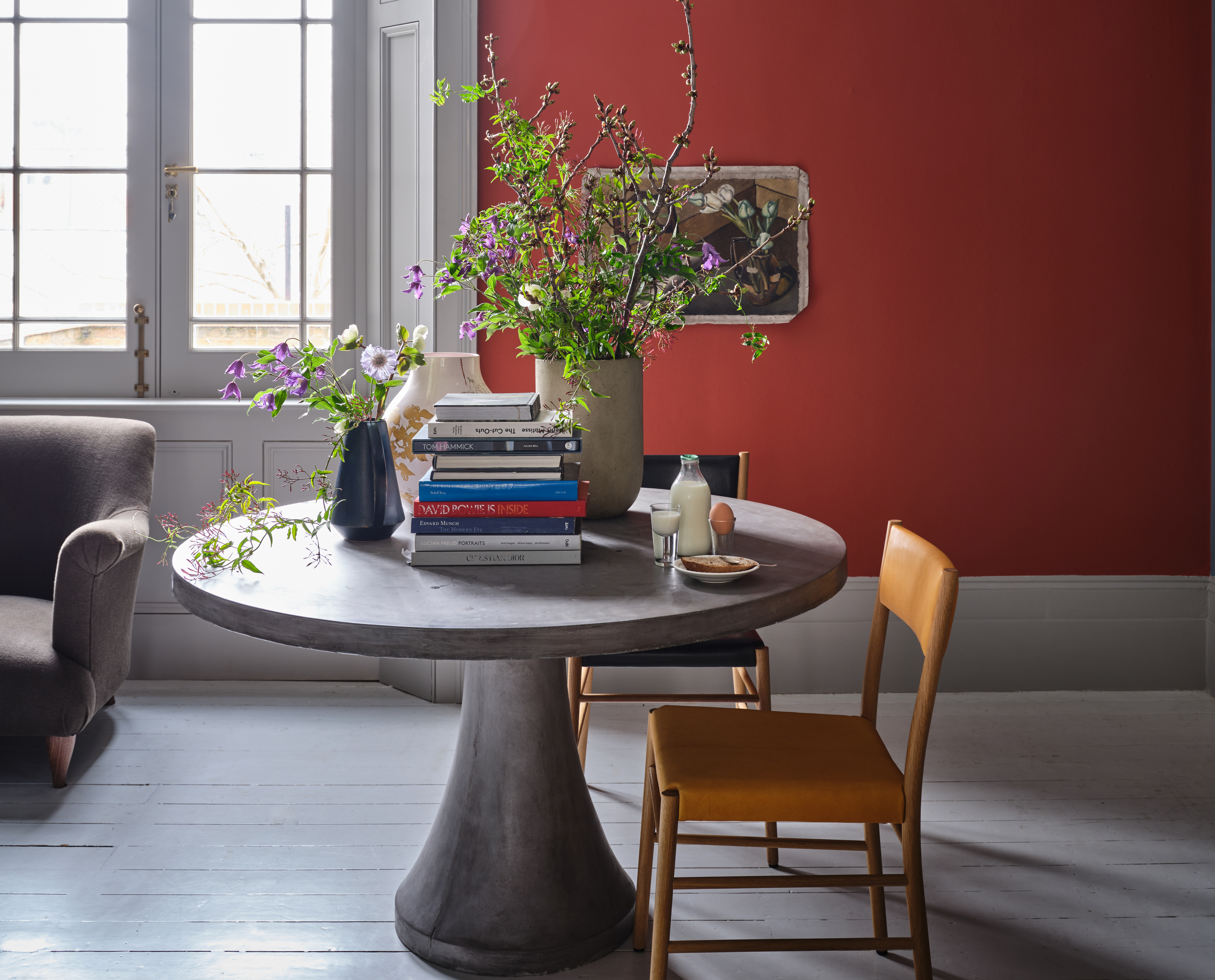
If you haven't yet heard, red tones are trending. The latest color trend dominated our favorite paint brands' forecasts for the year ahead and the flaming shade has been cropping up in designs everywhere in recent months. But why the sudden rush toward red, and how should we be using it in our homes?
No doubt a gorgeous and versatile hue, we wouldn't be doing our job properly if we didn't question the origins of a fresh emerging trend. From earthy, smoky shades to rich, jewel tones, we can almost guarantee that you've witnessed the reclamation of red, too. (And if you haven't, you're bound to notice it now.)
But as is the case with any trend, there's an underlying reason why it's our latest obsession. The colors we use to decorate our homes represent the mood of the moment, and they say a lot about what's going on in interiors more widely. To help us unpick the latest paint trend we spoke with Farrow & Ball's color curator, Joa Studholme, who also shares her advice on how we should use it to decorate.
Article continues below
Joa is Farrow & Ball's color curator and author of various titles including Recipes for Decorating and How to Decorate. Having been with the paint brand for over 25 years, she's a seasoned color and paint expert, developing color ranges and consulting on design projects all over the world, and helping countless customers transform their homes.
Why are reds more prevalent than ever?

A room painted in Graham & Brown's Color of the Year 2023, Alizarin
There's no escaping red at the moment. Red shades were chosen as the Color of the Year 2023 by the likes of Graham & Brown, Benjamin Moore and Dunn-Edwards, all in slightly different variations of course. But why is it such a popular color for our homes right now?
'Without doubt red, with its positive energy, is becoming one of the most important colors in interiors,' says Joa Studholme of Farrow & Ball. 'Post pandemic we all relish more color - and particularly bringing warmer inviting tones into our homes. Bright red shades can create an element of surprise to give us a lift, but kicked back reds create a cocooning atmosphere which is perfect to embrace us and make us feel safe.'
From vibrant scarlets to gentle maroons, it's red's versatility that makes it such an exciting color to inject into the home, but our long standing connotations of the shade can also cause us to hold back. As Joa notes: 'Red is perceived to be a little provocative and can dominate spaces so it takes a bit of thought as well as some confidence to use it in the home.'
She urges caution when contrasting red with other dominant colors. For example, it's a good idea to avoid red walls with white on the trim as very strong contrasts like this can make for an unrelaxed space. Instead, take time to use red in a more balanced way through your color palette with smaller doses.
The Livingetc newsletters are your inside source for what’s shaping interiors now - and what’s next. Discover trend forecasts, smart style ideas, and curated shopping inspiration that brings design to life. Subscribe today and stay ahead of the curve.
Which spaces in the home should we be using reds?
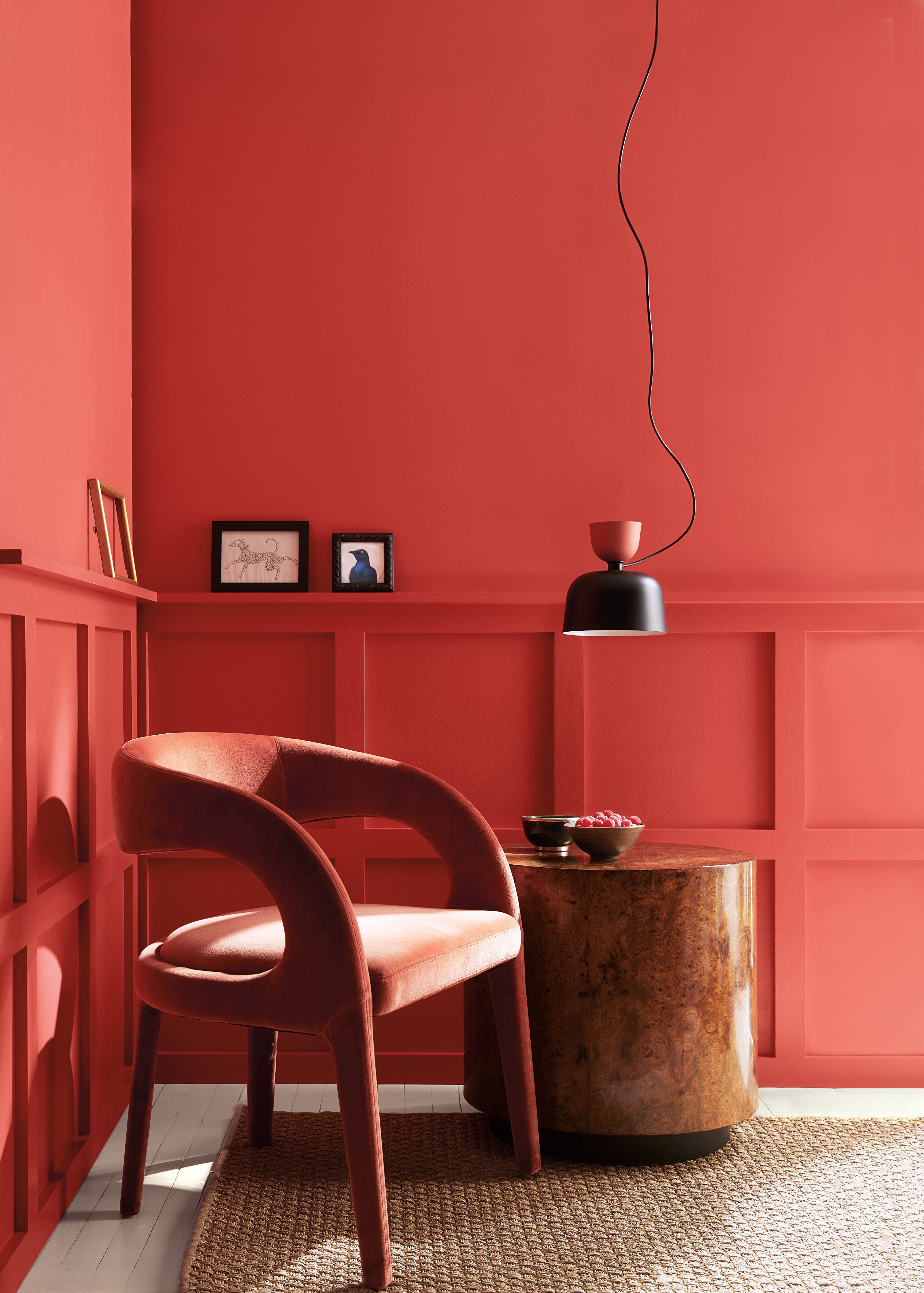
A room painted in Benjamin Moore's Color of the Year 2023, Raspberry Blush
No matter the shade, red is a vibrant and vivacious color. Even the more subtle and understated hues wield a lot of power, making it difficult to know where to introduce your red paint ideas.
In general, reds are best suited to social spaces. 'Traditionally red has been a favorite in dining rooms, and for good reason,' says Joa. 'Nothing feels more welcoming and creates a more intimate backdrop for entertaining.' Rich, heritage reds can make a dining room feel warm and inviting, especially when used alongside soft, ambient lighting.
When it comes to more relaxing spaces, red might not be the best option for creating a calming atmosphere. Despite the fact we often find earthier red shades comforting and enveloping, red actually stimulates us, and from a color psychology perspective, it evokes passionate emotions of dominance and power. As Joa notes: 'most reds just have too strong a personality for bedrooms.' Psychologists also suggests that reds can prevent sleep.
However, there are otherwise to use paint other than our walls. If you think red might feel too overwhelming on the walls of your space, consider painting the floor. 'If used on a painted floor in a neutral room, red can create a very special glow,' Joa adds. 'Strong color used under the eye line is much easier to live with, so kitchen islands or floor units in deep reds feel right on trend with their old world feel.'
You could also adds more subtle accents by painting your furniture. 'Think about using it on a bookcase or inside a cupboard where it can't fail to make you smile,' Joa says.
What about lighting?

A bedroom painted in Dunn-Edwards Color of the Year 2023, Terra Rosa
Be it a red living room idea or a red kitchen, falling in love with a shade can be pretty devastating if you then learn that it isn't complimentary in that room's natural lighting. Luckily red is very versatile, but picking the right tone is important.
In north facing rooms, colors with a warm undertone are essential if you want to prevent the space feeling too cold. The natural lighting can make these rooms feel dark and enclosed so you ought to counteract that with opposing colors. 'These spaces benefit from really warm shades like Bamboozle which will help you achieve a cozy, welcoming atmosphere even in rooms that are lacking in that warm glow of sunshine,' says Joa.
South facing rooms on the other hand receive plenty of natural light during the course of the day. Using too much red in these areas risks overwhelming that warm feeling completely; in fact, paler blue tones will work better at maximizing the light. If you do want to use a hint of red in a south facing room, opt for a sophisticated red based neutral.
East and west facing rooms see very different lighting during the course of a day, meaning complex reds offer a range of different tones in the changing day light. 'The bluer tones of east light in the evening can be warmed by use of Bamboozle, but it will feel even richer in the warm yellow light in the morning,' says Joa. 'In west-facing rooms, as the sun starts to set the space will take on an intense golden glow so reds can be particularly fiery!'
Bamboozle is one of Farrow & Ball's 11 brand new paint colors. This fiery red offers plenty of warmth while the earthier tones within it help contribute towards a grounding space. We reckon it's the perfect inviting tone for a dining room.
How to decorate using Farrow & Ball's 'Bamboozle'
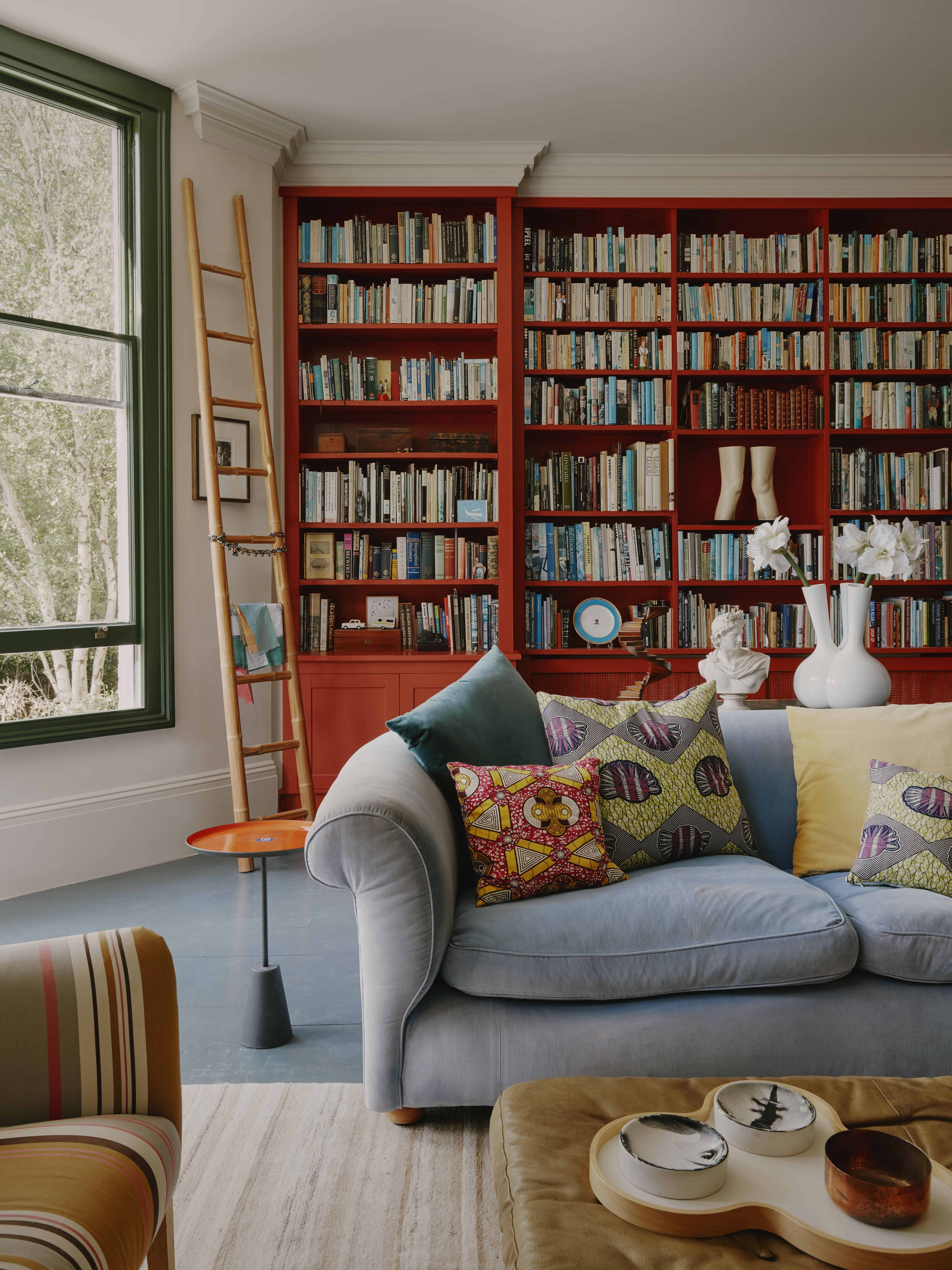
In Farrow & Ball's new range of colors they released Bamboozle, a warm, earthy and spirited red. 'Although it is guaranteed to have impact in your home, we make it with earthy red pigments which are easier to live with than a cleaner primary red,' explains Joa.
'The addition of a touch of magenta and little bit of black pigment (a Farrow & Ball favourite trick) makes it super sophisticated,' she adds. 'So for anyone having trouble committing to a bold scarlet, Bamboozle will give you that special glow without being too intense.'
When it comes to decorating with the shade, Joa suggests experimenting with your paint ideas rather than just using it top to bottom on your walls. 'Think about using a tide line with Bamboozle on the bottom (including the skirting) and warm neutral like Jitney above.'
If you want to introduce the shade to your room in a more understated way, try using it on your woodwork. One of Joa's favorite uses of Bamboozle is on a feature door in full gloss - it makes a fantastic design statement without overwhelming your space!
Lilith Hudson is a freelance writer and regular contributor to Livingetc. She holds an MA in Magazine Journalism from City, University of London, and has written for various titles including Homes & Gardens, House Beautiful, Advnture, the Saturday Times Magazine, Evening Standard, DJ Mag, Metro, and The Simple Things Magazine.
Prior to going freelance, Lilith was the News and Trends Editor at Livingetc. It was a role that helped her develop a keen eye for spotting all the latest micro-trends, interior hacks, and viral decor must-haves you need in your home. With a constant ear to the ground on the design scene, she's ahead of the curve when it comes to the latest color that's sweeping interiors or the hot new style to decorate our homes.
