'It's cosmic glam meets alien chic' – a color expert predicts this out-there palette is going to re-define our homes
'Think saturated hues, hypnotic brights, and sugary pastels,' say these experts from this paint brand


The Livingetc newsletters are your inside source for what’s shaping interiors now - and what’s next. Discover trend forecasts, smart style ideas, and curated shopping inspiration that brings design to life. Subscribe today and stay ahead of the curve.
You are now subscribed
Your newsletter sign-up was successful
Now that we're officially halfway through 2023, we're already itching to find out which paint shades could be the theme of the year ahead. While the last 12 months bought us warm whites, uplifting oranges, and an enduring preference for sage green, experts predict that 2024 will rock the boat with color in a way we've not seen before, and Dunn-Edwards' new palettes are leading the way.
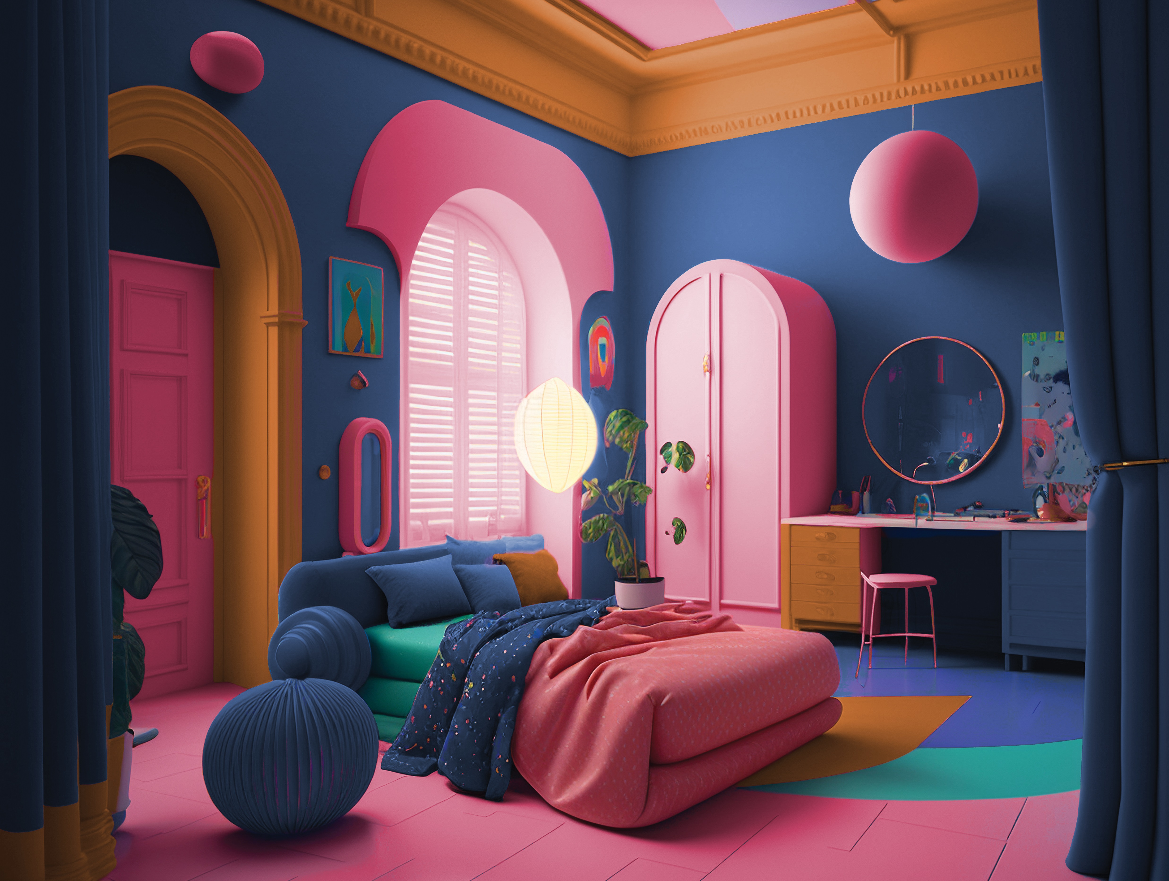
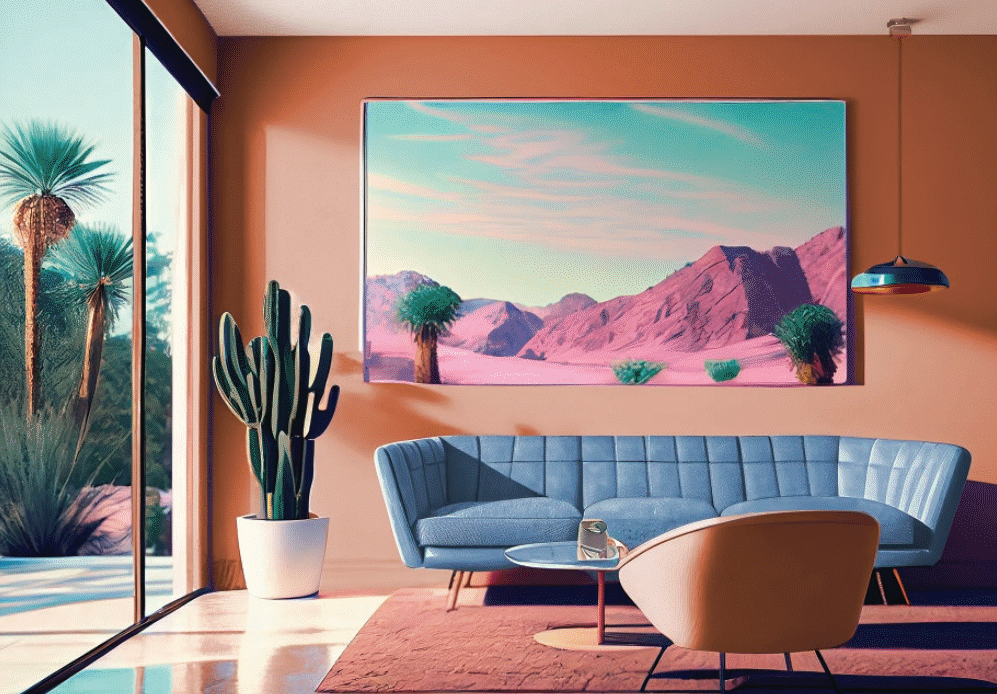
Taking inspiration from emerging movements across fashion, technology, and art, the paint brand just released its latest collection, combining 48 hues across four fresh palettes - and there's one in particular that's caught our eye: View to Wonder. Full of pinks, oranges, and a hint of blue, it projects confidence and optimism with bold, quirky, and cosmic colors. Think saturated hues, hypnotic brights, and sugary pastels, or - as Dunn-Edwards are summarizing it - 'cosmic glam meets alien chic'.
'People have a newfound appreciation for life and the promises it holds, and as a result, we predict 2024 will be the year to break free from the traditional dos and don’ts of interior design,' says Sara McLean, color expert and stylist at Dunn-Edwards. 'This color palettes invites escapism and youthfulness, inspiring us to break the mold and transform our spaces in a meaningful way.'
Article continues belowReady to take your paint ideas out of this world? Take a preview of the palette below alongside some tips on how to incorporate these wackier shades into your home.
Why the cosmic theme?

A space-themed style full of bright oranges and pinks might seem more like something you'd find in a kids' bedroom than a modern living room, but 2024 is the year of the unknown after all. Where, though, did the idea for such an out there palette come from?
'Scientific and technological advances are at the heart of this palette,' says Sara of Dunn-Edwards. 'As we look at how AI is beginning to transform our daily lives, we continue to explore the outer realms of what seemed impossible only a short time ago. The farthest reaches of outer space to the mysteries buried deep under the ocean and ground floors continue to confound our sensibilities and add to the mysteries of life outside of what we see every day.'
According to Sara this translates to our color trends and the way we experiment with tones, exploring new combinations we haven't seen before inspired by journeys of discovery and innovation. Of course, the new generations are also a key determiner of future trends, too, and Gen Z has been a driving force behind this new palette.
The Livingetc newsletters are your inside source for what’s shaping interiors now - and what’s next. Discover trend forecasts, smart style ideas, and curated shopping inspiration that brings design to life. Subscribe today and stay ahead of the curve.
'Gen Z is more receptive to cosmic colors as they have been raised in technology,' says Sara. 'Color has also become a way for them to express emotions as they seek ways to engage in society, heal from the past years of pandemic isolation, and celebrate communities they are part of in both physical and digital worlds.'
How to decorate your home with the 'View to Wonder' palette
Wondering how to embrace such a daring new color palette? Apprehension is totally normal. The last few years have been about pared-back schemes and calming interiors, but zesty spaces deserve their place. Here's how to get started on curating your own.
Be bold

It might seem obvious, but you have to be bold to use these colors in your home, so go in with confidence. 'As this is a story filled with an abundance of color, I see those who lean to bold personalities and a life of maximalism taking the first leap with this palette and using it throughout their homes in any space,' says Sara.
That's not to say that those who lean toward a more conservative approach can't have fun with View to Wonder. 'I suggest looking to spaces ripe for experimentation, such as powder rooms, guest rooms, entertainment rooms, and even smaller spaces like interior doors,' Sara suggests. 'She-sheds and buildings outside the home are also popular as spaces of escapism, making them a wonderful place to experiment.'
Embrace color clashes
Clashing colors can work wonders when used properly. With colors like Nightshade and Vibrant Honey pitting purple with yellow, there are plenty of opportunities to go wild with contrasting shades.
'For the most part, one will pull a hue or two from the palette as inspiration to create their own unique, individual spaces suited to their needs,' Sara explains. 'Versatility is vital as we move into 2024, and many are searching for ways to make their unique stamp on the world – colors like Pink Dahlia, Sedona at Sunset, and Spiced Berry all offer that opportunity.'
Color drench with oranges

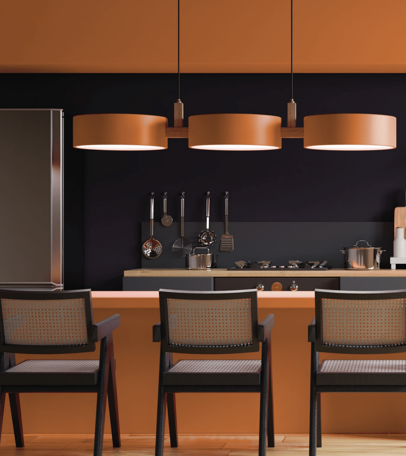
'I can tell you that oranges and blues are strong in 2024, and the warming of color in every part of the spectrum continues,' Sara says. As a hero color for View to Wonder, she encourages color drenching with the shade Nautical which Sara says highlights the power of science, technology, and the mysteries of the ocean and sky.
'Paint a library or entertainment space in this hue, including all walls and any built-ins for a monochromatic base,' she goes on. 'Then add accents of the other colors in the palette through décor and accessories.'
Use alongside eccentric decor
If you're going to go wild with your paint ideas, you could always opt for a maximalist interior design style to match. Use quirky statement furniture, retro finds, and heritage pieces to curate a truly unique space that's as playful and fun as you can make it.
As an example of this sort of application, Sara suggests painting Nightshade on all walls in a dining room in a high gloss finish. 'Then add dramatic surrealist-influenced lighting, a mirror with contemporary framing detail, and surrealist artwork for a mysterious, otherworldly effect,' she adds.
Use pops of color
'For those more apprehensive about embracing many different hues, this palette was also created with the thought that it could be separated into smaller chunks of color and even paired with other trend colors, neutrals, and whites,' explains Sara. In fact, pops of bright shades in otherwise pared-back spaces can have an even bigger impact than when used together.
You could also use several different shades of the same color together in a space for a gradient. 'Try using Prairie Dune in the main living space's upper walls and ceiling with Desert Spice as an accent color on the lower half of the walls to create a sunset feel,' Sara suggests.
Above all, View to Wonder s a palette that encourages you to embrace personality and expression through color. As Sara sums up: 'This is a story about embracing the unknown, always being curious, and embracing life, themes to be enjoyed by anyone, whether you’re into sci-fi color or prefer a softer approach to home design.'

Lilith Hudson is a freelance writer and regular contributor to Livingetc. She holds an MA in Magazine Journalism from City, University of London, and has written for various titles including Homes & Gardens, House Beautiful, Advnture, the Saturday Times Magazine, Evening Standard, DJ Mag, Metro, and The Simple Things Magazine.
Prior to going freelance, Lilith was the News and Trends Editor at Livingetc. It was a role that helped her develop a keen eye for spotting all the latest micro-trends, interior hacks, and viral decor must-haves you need in your home. With a constant ear to the ground on the design scene, she's ahead of the curve when it comes to the latest color that's sweeping interiors or the hot new style to decorate our homes.