5 Welcoming Color Schemes That Will Instantly Energize Your Home
Designers and color experts reveal their five favorite schemes that will make you, and your guests, instantly feel welcome and comfortable
The Livingetc newsletters are your inside source for what’s shaping interiors now - and what’s next. Discover trend forecasts, smart style ideas, and curated shopping inspiration that brings design to life. Subscribe today and stay ahead of the curve.
You are now subscribed
Your newsletter sign-up was successful
The most successful interior designers and the people with the most stylish homes all share the knowledge of not only how to create beautiful interiors, but also how to make them feel warm and welcoming. Spaces meant for living need more than just immaculate color schemes that look good in the pages of magazines, or coffee table books. They need to feel inviting enough to make one feel like they want to walk in, linger, and make themselves comfortable.
There is an art to it, and finding the right combination of welcoming colors is not that straightforward. It is, however one of the most important visual elements that will instantly make your home feel good. Luckily, interior designers and color experts shared with me their favorite, go-to welcoming color trends that you can try for yourself in your own space, and watch it transform.
1. Red undertones paired with airy blue and crisp white
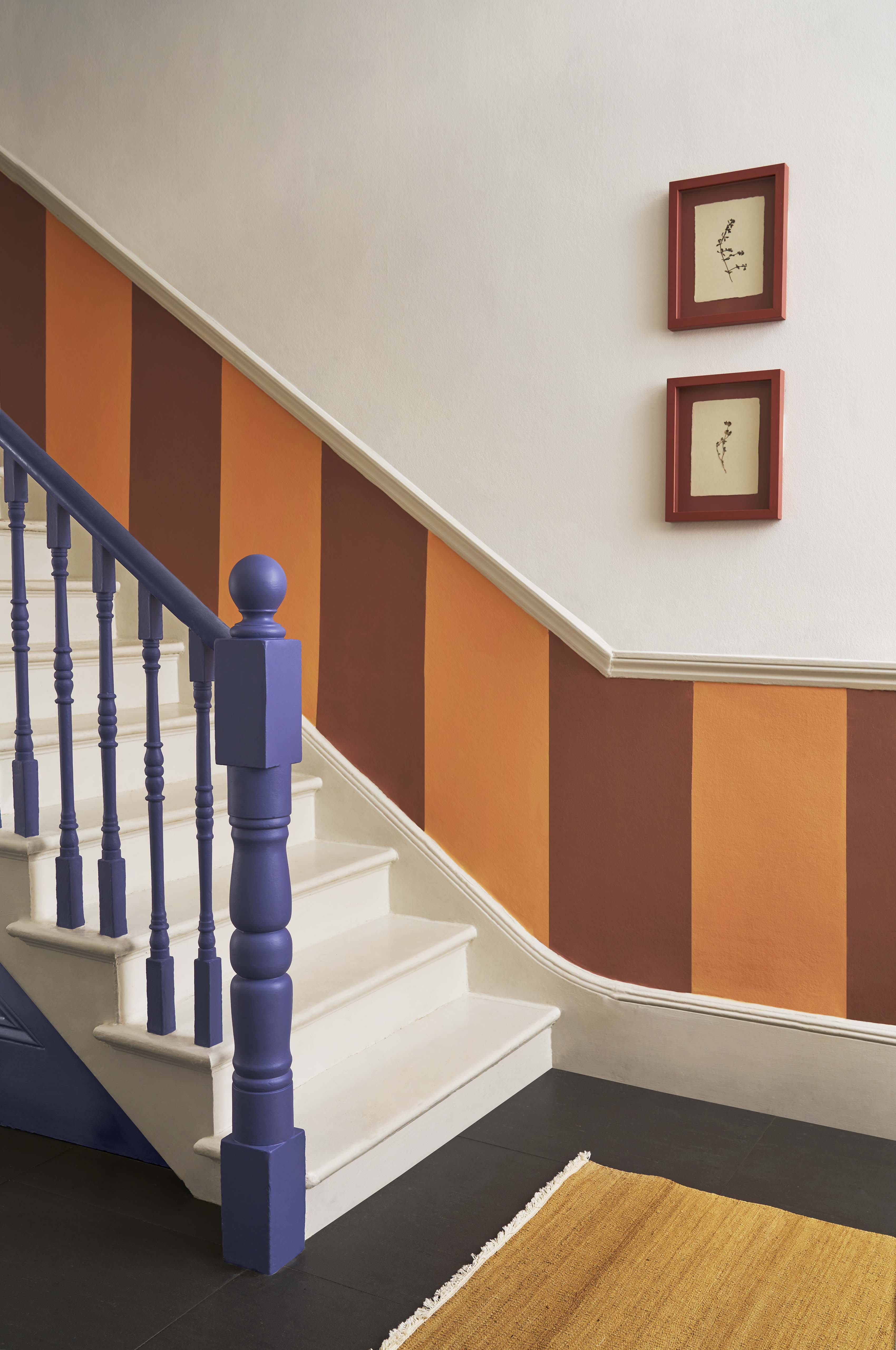
As primary colors, an initial thought might be that red and blue would clash, and look a bit too harsh one next to the other. However, it’s all about balancing the intensity and undertones to get a harmonious look that feels inviting. And if the unexpected red theory has anything to say about it, is that a touch of red is sure to elevate the look of any space. Graphenstone’s color expert Betsy Smith tells me how she’s mixed red undertones with airy blues to create a beautiful hallway scheme.
‘Bold stripes are perfect for a hallway and help the space feel bigger and set a welcoming statement on entry. Here, we have used Gilded Apricot and Cinnamon for the stripes, a wonderful combination of hues. Both have a proportion of red, creating harmony, while the darker Cinnamon prevents the apricot from becoming insipid and allows it to radiate a flattening 'golden hour’ glow into the space. We have kept it contemporary with Marble White and Periwinkle, a rich deep blue with a red undertone, not quite purple, reminiscent of sky and water as it catches the last rays of sunshine,’ she explains.
2. Natural tones of plaster, terracotta, and stone
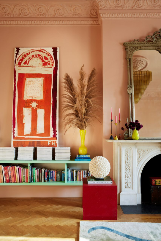
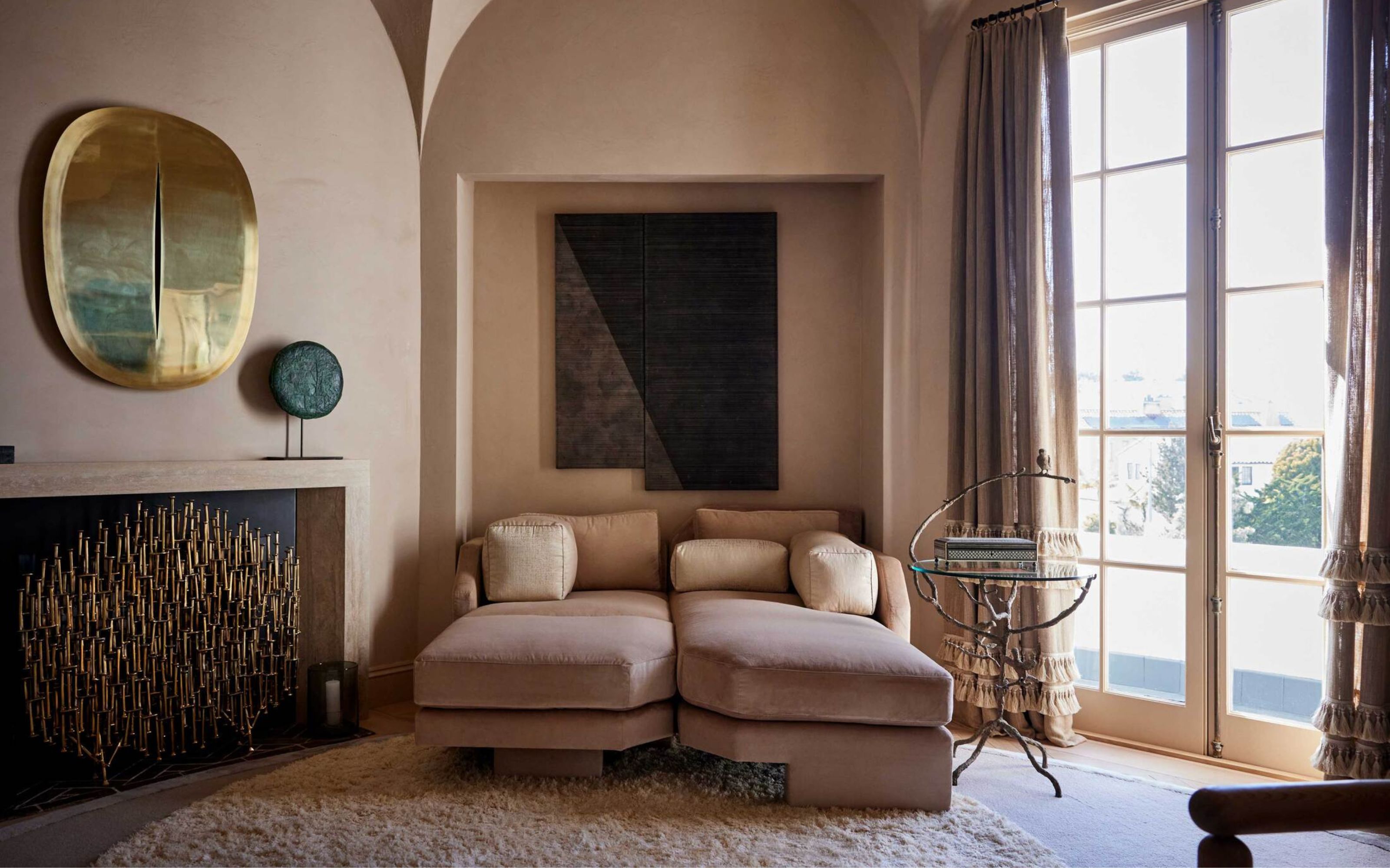
Designers’ love of all-natural terracotta, plaster and stone tones seems to be never ending, and for good reason. It doesn’t get warmer, more inviting, and more sophisticated than this. ‘I love using a combination of pink, tan, clay, terracotta, peach and stone to create a modern, yet warm and inviting living space,’ interior designer Matthew Williamson tells me.
‘These colors are more forgiving than white, warmer than grey and more fun than beige, yet they are subtle enough not to overwhelm the space. At the moment, my go-to neutral is blush or plaster pink – it’s generally a soft and delicate, almost barely-there pink, and I often enjoy using it for all elements of the space, from the walls and woodwork to the ceiling, to create an enveloping feel,’ explains the designer.
3. Orange and cinnamon
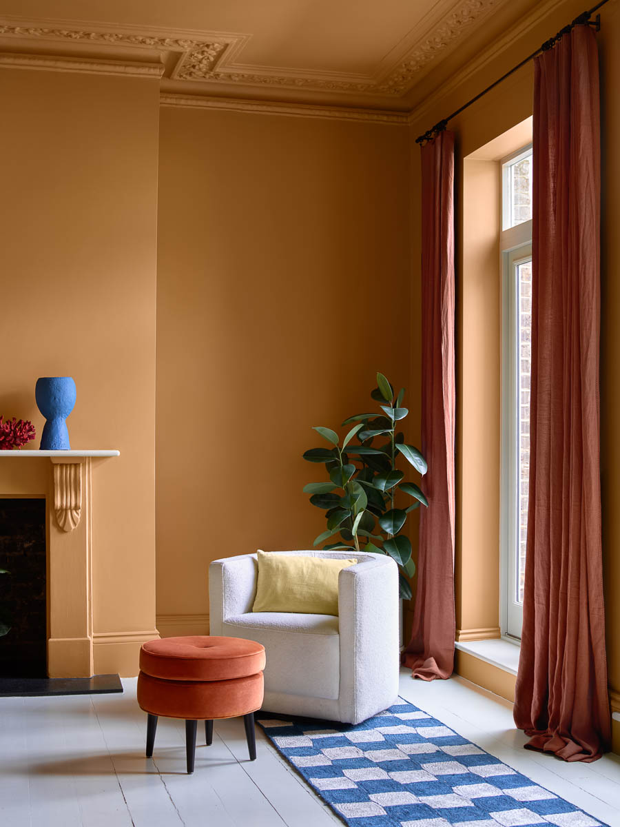
It looks as delicious as it sounds. Granted, it is a bold move to paint your walls orange, but keep it looking as natural, warm, and earthy as possible and it will instantly make your home look not only welcoming, but expensive too. Think Hermes orange and you’ll get the idea. ‘Orange will invigorate any room,’ Helen Shaw, a color expert from Benjamin Moore tells me.
The Livingetc newsletters are your inside source for what’s shaping interiors now - and what’s next. Discover trend forecasts, smart style ideas, and curated shopping inspiration that brings design to life. Subscribe today and stay ahead of the curve.
‘To create a warm and inviting atmosphere consider earthy or spice-toned oranges – think cinnamon. These tones blend beautifully with brown, taupe and wood to create a welcoming feeling for your guests whilst also achieving a sophisticated, classic look that will stand the test of time,’ she explains. Try a warm orange in your home and you might be surprised by how calming it feels to live with.
4. Sage green and highlights of bright pastels
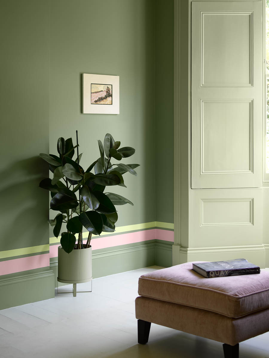
Green is one of the most welcoming colors out there thanks to its connection to the natural world that will instantly create a calming atmosphere. For a welcoming scheme choose natural tones like sage green – it’s so easy to live with and there are lots of colors that go with sage green, like fresh, bright pastels.
‘For a show stopping look guaranteed to impress guests, cover walls in a soft almost sage green and combine with flashes of colour to celebrate architectural details within the room,’ explains Helen. ‘Whether you follow the line of a skirting board with stripes in pretty pastels or inject a flash of fluorescence on an otherwise tonal surface, using paint to create highlights will instantly boost your space,’ advises the expert.
5. Warm yellow and classic neutrals

Like orange, yellow might not be the first option for many of us when it comes to painting our walls. But it’s important to remember that we can start small, with accessories, and work our way up slowly, and choose colors that go with yellow to balance it and bring down any intensity that we could find a bit much.
‘As learned in color theory, shades of yellow can be very inviting as they evoke happiness, are energizing and make people feel welcome and comfortable,’ says interior designer at MDI Luxury Design Ellen Holt. ‘If you combine warm yellows with grays or beige neutrals, you can achieve a sophisticated look while making your home inviting,’ she adds.
Raluca formerly worked at Livingetc.com and is now a contributor with a passion for all things interior and living beautifully. Coming from a background writing and styling shoots for fashion magazines such as Marie Claire Raluca’s love for design started at a very young age when her family’s favourite weekend activity was moving the furniture around the house ‘for fun’. Always happiest in creative environments in her spare time she loves designing mindful spaces and doing colour consultations. She finds the best inspiration in art, nature, and the way we live, and thinks that a home should serve our mental and emotional wellbeing as well as our lifestyle.
