3 Ways to Get Creative With Stand-Out Stair Painting — Ideas for a Bold Look
Stair painting can be an opportunity to have a bit of fun with your interior, and opt for bold, even unexpected schemes that will stand out
The Livingetc newsletters are your inside source for what’s shaping interiors now - and what’s next. Discover trend forecasts, smart style ideas, and curated shopping inspiration that brings design to life. Subscribe today and stay ahead of the curve.
You are now subscribed
Your newsletter sign-up was successful
While you can go for a more neutral, classic look when painting stairs, and many designers will adhere to this, there are also those advocates of the school of thought who think stairs can be a real opportunity to get creative in your home and go a bit bolder than you would in other areas. You can start by thinking of some colors that stand out in other rooms, and bring those in when painting your staircase be that the full steps, just the sides, or the rails and handrail. There really are so many combinations you can get creative with.
If you’re in need of some inspiration, we spoke to interior experts to tell us the bolder ways they’re choosing to painting stairs now. Whether it’s high contrast, a pop (or two) of color, or going full out maximalist, there’s an idea for every modern home.
1. White and two (or more) tones of blue
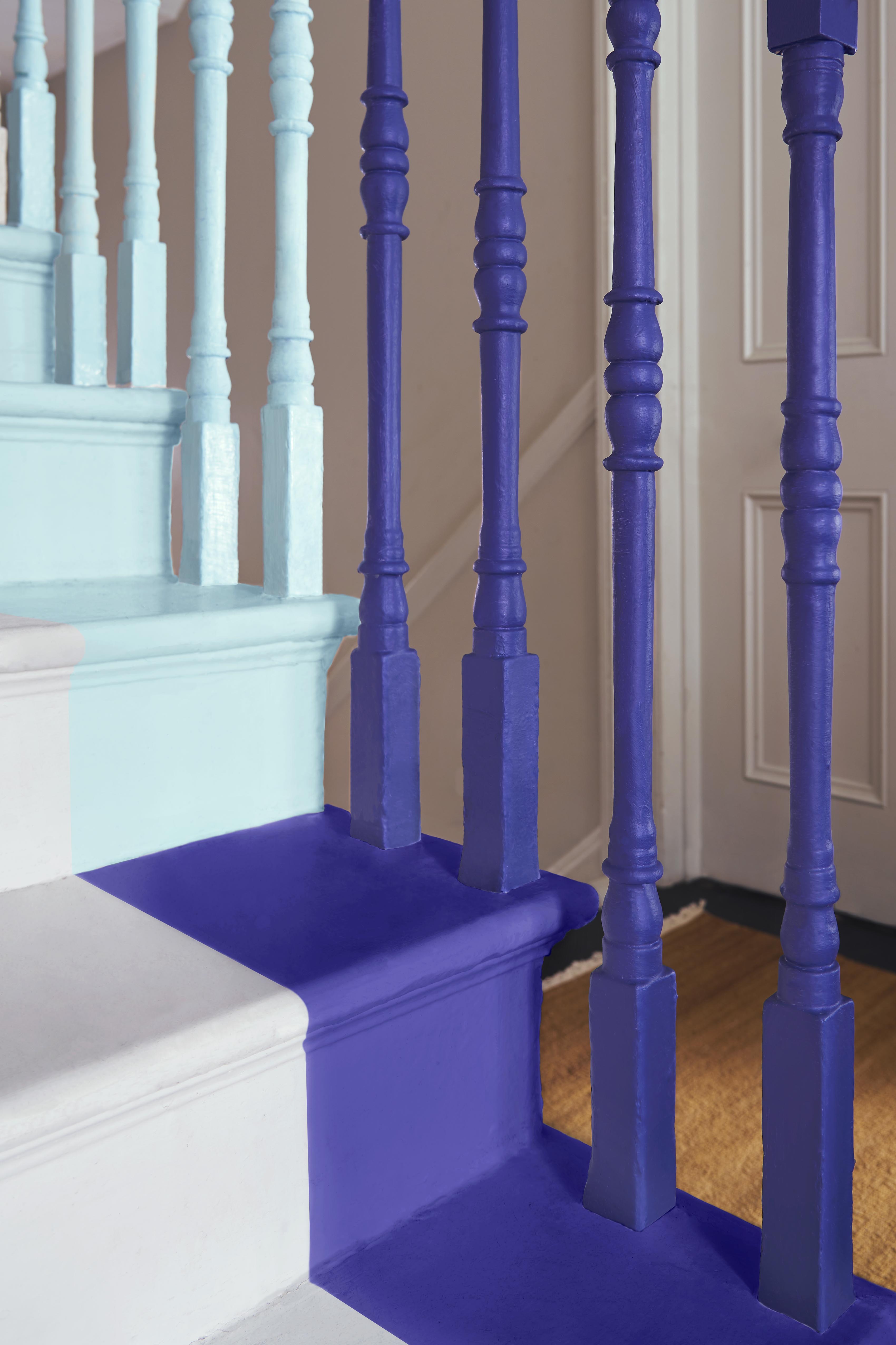
White and blue always look good together, and they create a cheerful contrast. Why don’t you push the combination a bit further, by pairing not one but two (or more) different tones of blue with white as a paint idea? ‘Stairs act as the home's spine, connecting the floors and rooms. A tonal graduation can work brilliantly on a staircase,’ explains Betsy Smith, color expert at Graphenstone.
Here's how you can get the look. ‘Start dark and dramatic at the entryway level for impact and shift the tone a few shades lighter every few steps so that as you move up, the colours gradually become lighter. The shift in tone echoes the flow of up and down and creates a sense of intrigue and curiosity. We have kept it contemporary with a rich deep blue with a red undertone, not quite purple, reminiscent of sky and water as it catches the last rays of sunshine,’ the expert talks us through her process.
If blue is not your color, pick something else that resonates with you, or an accent color that can be found in a different room of your home and you can follow through in the staircase area.
2. Contrasting black and white
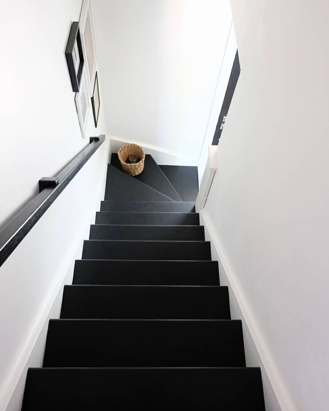
While this is a classic combination that exudes elegance, it is also highly contrasting (it really can’t get any more contrasting than this), so often avoided in homes. If done in excess it can look quite cool and stark. However, used in the right amount, and in the right space, it will be sophisticated and striking.
The stairs are the perfect home for this combination, and Emily Kantz, color expert at Sherwin Williams tells us how to do it: ‘Staircases are a great way to add some fun into a home – and if you’re looking to add a touch of drama, the contrast between Tricorn Black SW 6258 and Alabaster SW 7008 does just that’. If you paint your steps in black, don’t stop there, and pick-up the color again on the handrail. Artworks with black frames will also carry through the accent for a more cohesive look.
The Livingetc newsletters are your inside source for what’s shaping interiors now - and what’s next. Discover trend forecasts, smart style ideas, and curated shopping inspiration that brings design to life. Subscribe today and stay ahead of the curve.
3. Go maximalist
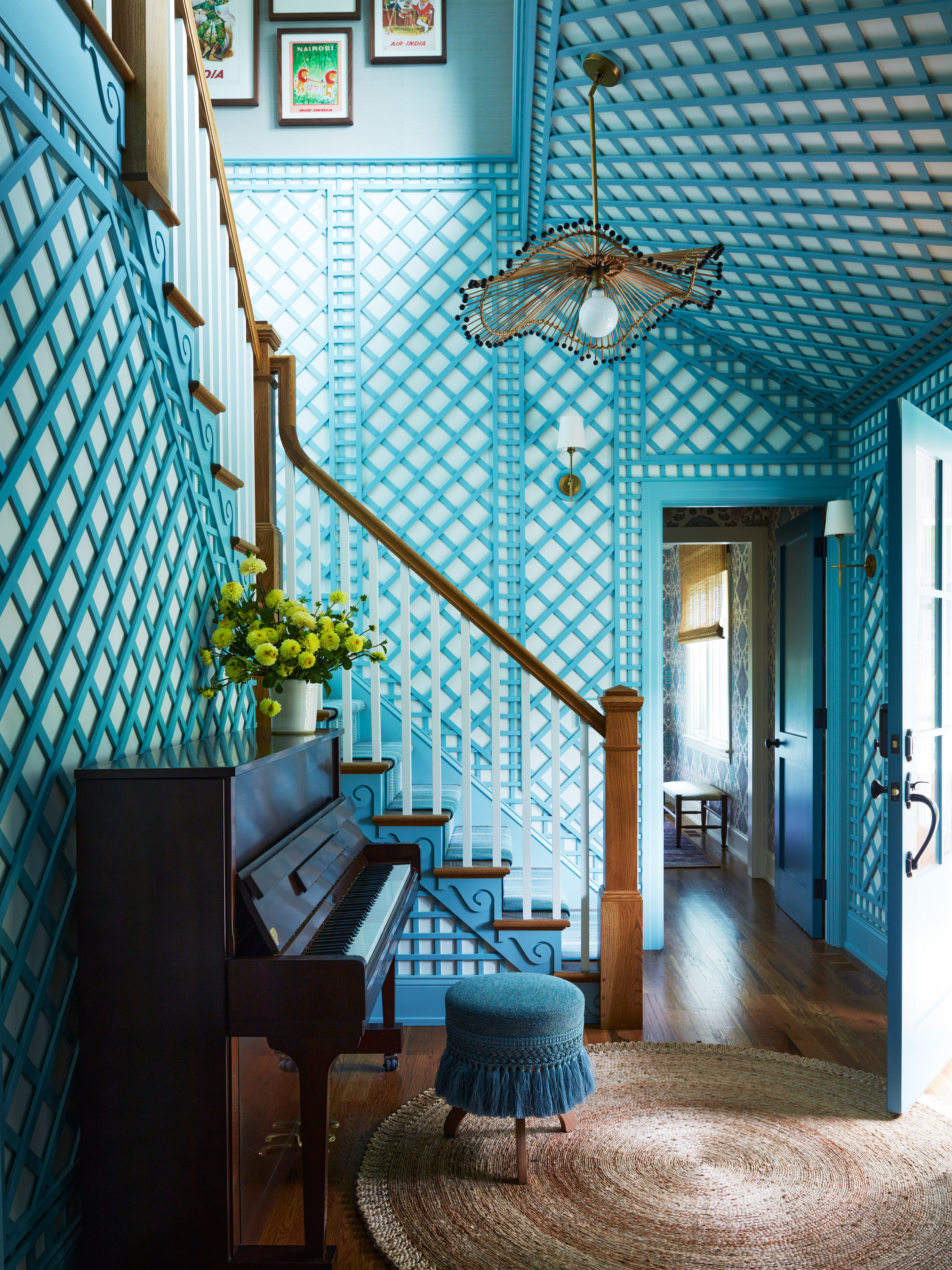
Saving this for last, as it’s not for the faint of heart. Remember the stairs are at the core of your home, connecting all the floors, and are a high traffic area you will spend time in. If you’re ready for it, take the opportunity to create a look that stands out, and pick a monochromatic color theme that you’ll use on the stairs, walls, and accessories. Avoid it all looking flat by thinking different tones, textures, and patterns, like in this joyful example by Mendelson group.
‘The latticework was a must-have from the client. The seafoam green color makes it stand out as fun and light-hearted, reflective of the client’s personality. This element makes everyone happy as soon as they walk in the home,’ explains Gideon Mendelson. The designer balanced the color element with details of white and natural wood that ground the scheme and avoid it from feeling overwhelming. Look closer and you’ll see the beautiful wave-like details on the sides of each step, that add up to a very charming hallway and staircase.
Raluca formerly worked at Livingetc.com and is now a contributor with a passion for all things interior and living beautifully. Coming from a background writing and styling shoots for fashion magazines such as Marie Claire Raluca’s love for design started at a very young age when her family’s favourite weekend activity was moving the furniture around the house ‘for fun’. Always happiest in creative environments in her spare time she loves designing mindful spaces and doing colour consultations. She finds the best inspiration in art, nature, and the way we live, and thinks that a home should serve our mental and emotional wellbeing as well as our lifestyle.
