5 Wall Colors for Living Rooms We've Fallen in Love with Already this Year
From uplifting and easy-to-live-with to dark and moody — these are the living room wall colors that have caught our eye recently
The Livingetc newsletters are your inside source for what’s shaping interiors now - and what’s next. Discover trend forecasts, smart style ideas, and curated shopping inspiration that brings design to life. Subscribe today and stay ahead of the curve.
You are now subscribed
Your newsletter sign-up was successful
Our living rooms reveal a lot about who we are — our tolerance for clutter, our taste in art, and the color palette we're most drawn towards. When it's time for a change, we shake up our living room color ideas for a scheme that feels more reflective of who we are now, as tastes and trends change.
Redecorating our living rooms with some fresh paint color ideas is not only a personal and expressive process, but it also has the power to change how we feel in our living spaces. The right hues can make us fall back in love with our homes and feel inspired to be our best selves.
Here are the five living room wall colors we have fallen in love with already this year.
1. Deep brown
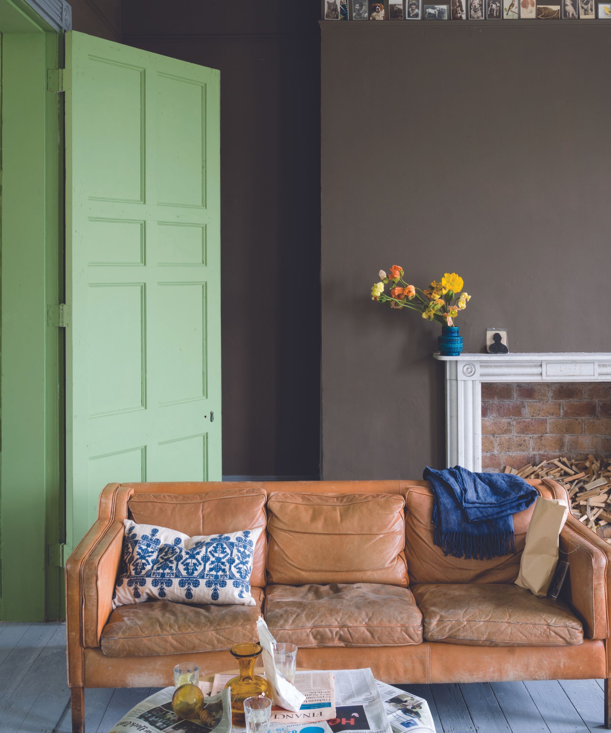
We have seen some stunning brown living room ideas on our social media feeds lately, with many neutral lovers opting for browns as part of a more earthy scheme. Brown is one step up from a warm beige or taupe, bringing a more emphatic look, and as the image above demontrates, it can have a deeply calming effect. From soft mocha tones to bolder colas and mahogany shades, a brown living room feels grounding and invigorating.
'As the living room is the place we are all drawn towards after a long day, looking for a well-deserved retreat and restorative atmosphere, we love the calming impact of the deep browns reminiscent of the natural world, such as Salon Drab,' says Charlotte Cosby, creative director at Farrow & Ball.
2. Mid-tone blue
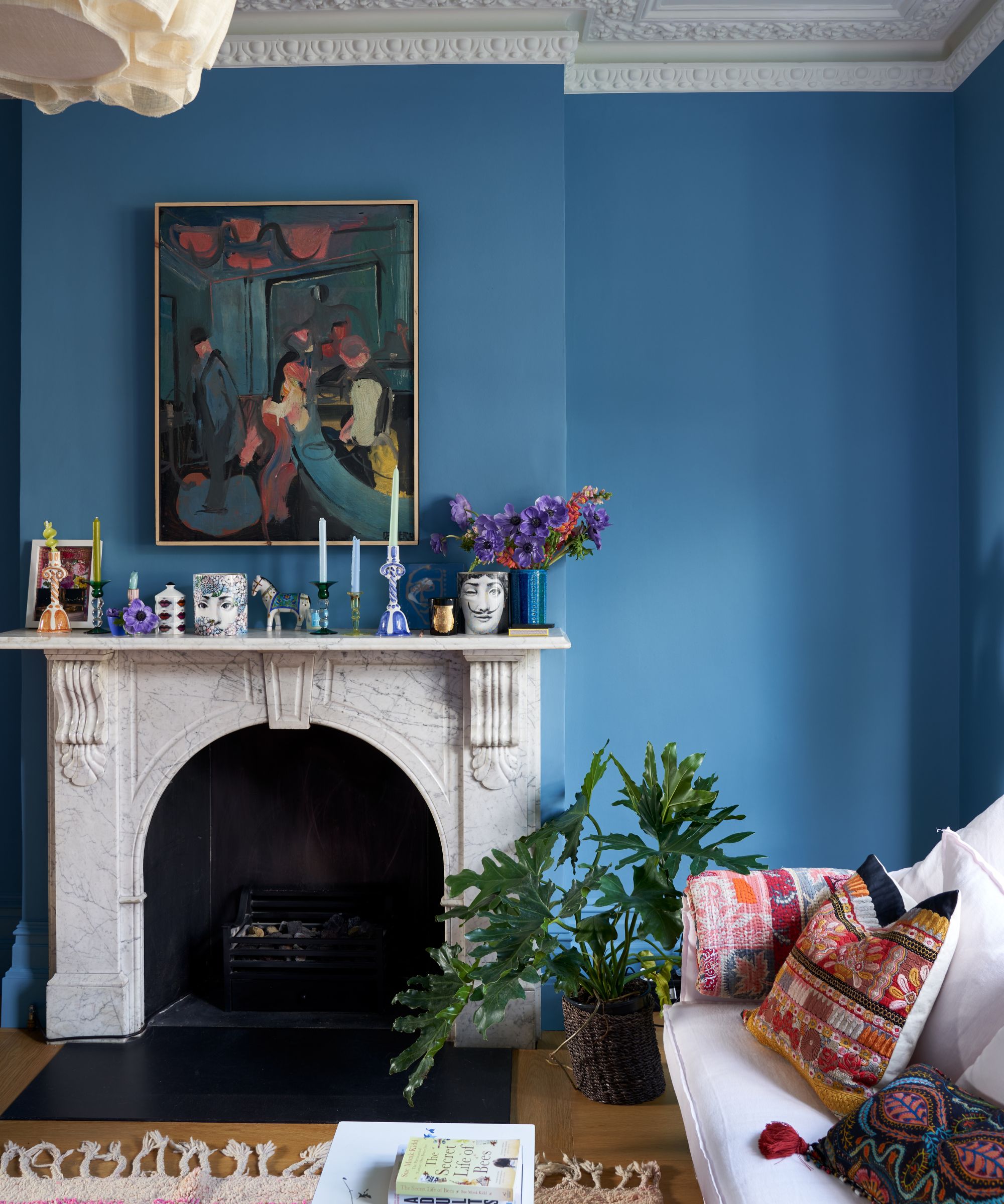
The past few years have seen a return to nature in the world of interiors, so it was no surprise that this year's Color of the Year nominations included uplifting blues, such as Valspar's Renew Blue. As shown in the traditional yet boho living room above, mid-tone blues have an alluring appeal, but given their associations with nature, they never feel trendy.
'A mid-tone blue with a touch of black pigment provides a subtle, and beautiful, statement that’s easy to live with,' agrees color expert Charlotte Cosby. 'Or for something different, you can create a statement wall using a delicate wallpaper such as Farrow & Ball's Atacama.'
The Livingetc newsletters are your inside source for what’s shaping interiors now - and what’s next. Discover trend forecasts, smart style ideas, and curated shopping inspiration that brings design to life. Subscribe today and stay ahead of the curve.
Helen Shaw, marketing director at Benjamin Moore says that primary colors are having their moment right now – from mid-tone blues to cheerful yellows. 'These brights are a great way to elevate any living room scheme,' Helen says. 'For a statement look, color drench the walls, skirting boards, and even the ceiling.' A monochromatic color scheme will create impact while acting as a blank canvas for layering complementary colors in your furniture and accessories. Sea Reflections by Benjamin Moore and Blue 05 by Lick are soothing but don't fade into the background.
3. Grey Black
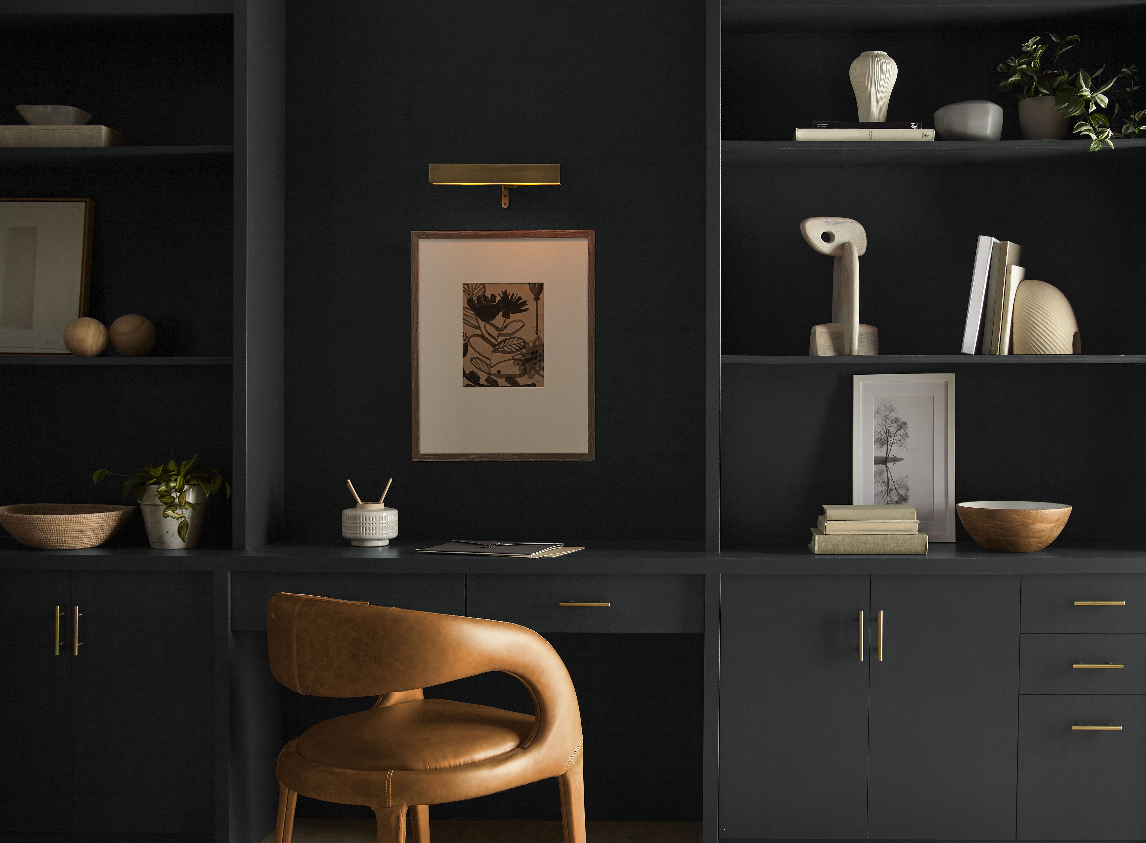
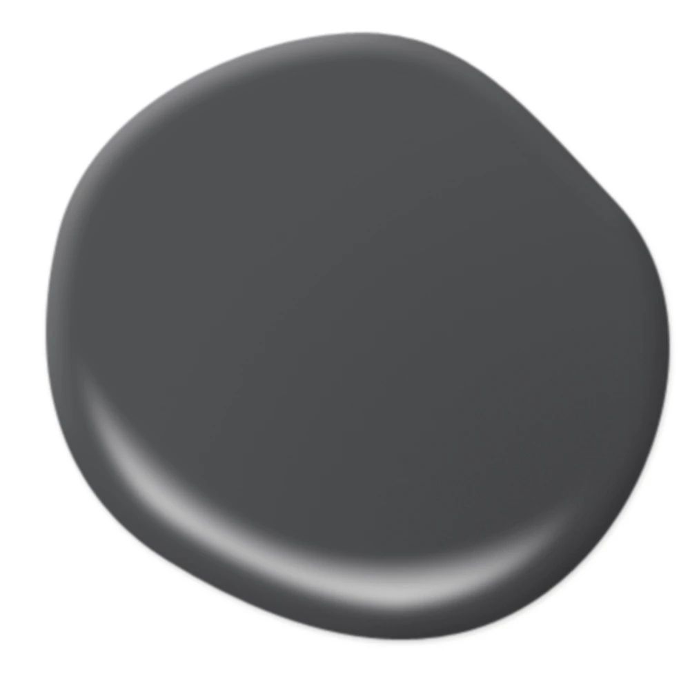
We all have unique, personal connections and reactions to color, but when Behr unveiled their color of the year, Cracked Pepper, we were instantly impressed and excited by this moody and seductive tone. Cracked Pepper is a sooty black with undertones of charcoal grey and creates a distinctive backdrop for any darker living room scheme.
'For those looking to make a dramatic, yet sophisticated statement in their living room, I recommend Behr’s 2024 Color of the Year Cracked Pepper,' says Erika Woelfel, vice president of color and creative services at Behr Paint Company. 'Cracked Pepper is a versatile soft black that will instantly elevate not only the room you’re in but the way you feel in it. Both timeless and modern, this infinite hue accentuates the liveable spaces we create life moments in.'
4. Green
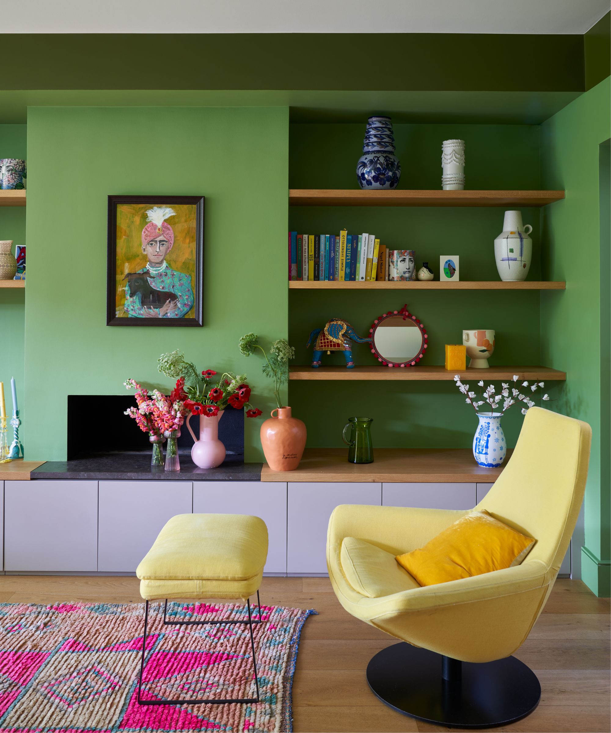
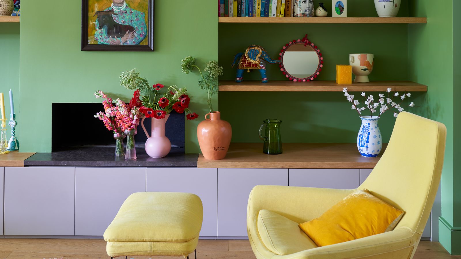
Green is a failsafe living room wall color that we turn to time and again because of its ability to create a calm and cozy space. We recently mentioned Farrow & Ball's Bancha in our feature on ways to combine green and grey in the living room, which is a deep green particularly well suited to smaller living rooms, according to Farrow & Ball creative director Charlotte Cosby. 'Consider taking it over the walls and ceiling, as this will blur the limits of the room, and create an illusion of space.'
Erika Woelfel at Behr says she has been loving Behr's Balance Green recently — a blend of pale greens such as celery, sage, and jade. This softer shade imparts a gentle sense of mental, physical, and emotional stability. 'It’s the perfect shade if you want to introduce color to a room, while maintaining an overall serene, neutral scheme,' says Erika.
5. Earth-toned pink
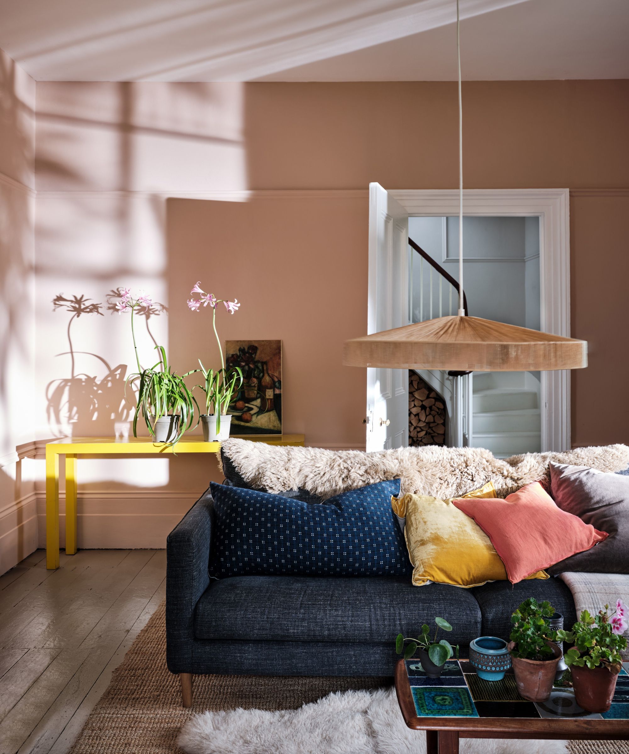
Our living rooms are a great opportunity to express our personality and create a space that we truly love. They are also much-used spaces, so we need something comforting and easy on the eye. For this reason, an earth-toned pink is ideal, creating a subtle statement while feeling cocooning and grounding.
Color expert Charlotte Cosby recommends a gentle, earth-toned pink for living room walls, and as one of the colors that make a living room look bigger, earthy pink is definitely one to consider for snugs and smaller spaces.
Are white walls in for 2024?
Whatever your personal design style might be, white will always work. It brings a fresh and clean look, and you just can't get a more timeless living room color. However, it's always best to go for warm white tones to prevent things from feeling stark. For example, you could consider Benjamin Moore's Swiss Coffee, which is a favorite of interior designer Kathy Kuo.
'It's a color that works beautifully in just about any living room,' Kathy says. 'It's a super-sophisticated warm neutral with just a hint of green in the undertone. The result is welcoming but also very upscale, and it can be easily paired with both warm and cool color schemes.'
Helen Shaw at Benjamin Moore's top tip for using white without the clinical feel is to choose whites with red or yellow undertones, and to layer textures such as dark woods, tactile bouclé textiles, and sleek stone surfaces such as marble and quartz. Or, if you decide you'd prefer some subtle color, you can read our guide on light paint colors for living rooms.
Millie is a homes writer and journalist renting in North London. She contributes regularly to Livingetc, Ideal Home and Real Homes. As well as covering shopping trends online, she loves vintage furniture, candles, Interior Design Masters and a Facebook Marketplace bargain. She has previously written for Fabulous, Stylist and Marie Claire.
