Inside a modern apartment where white walls are the backdrop for quirky antiques and sculptural modern designs
A stylish Russian home with a touch of French flair

The Livingetc newsletters are your inside source for what’s shaping interiors now - and what’s next. Discover trend forecasts, smart style ideas, and curated shopping inspiration that brings design to life. Subscribe today and stay ahead of the curve.
You are now subscribed
Your newsletter sign-up was successful
We're constantly researching, writing and experimenting with how to make white walls less... bland. Despite the fact we all love a crisp white wall there seems to be this inherent need to cover them in a gallery wall, paint them some bold on-trend hue or paste over them with a wallpaper. But, as this beautiful apartment proves, white walls can make just as much of a statement as any pattern or color. The lack of color itself is a statement. And as well as ensuring a space always feels light and airy, a blank white wall really allows for furniture and decor to be the focus. Against a white wall you see every line, every shape, every color, nothing is lost and it makes for such clean, elegant spaces. So white walls were the obvious choice, and in fact a jumping-off point, for the interior design of this modern home.
The apartment was renovated by Moscow-based design studio Molbo Buro. It was a total overhaul of the space – new walls, new floors, new doors, and those stunning new French windows. A new floor was added too, to make room for an extra bedroom, bathroom and study. Let's take a tour...
Open plan living room
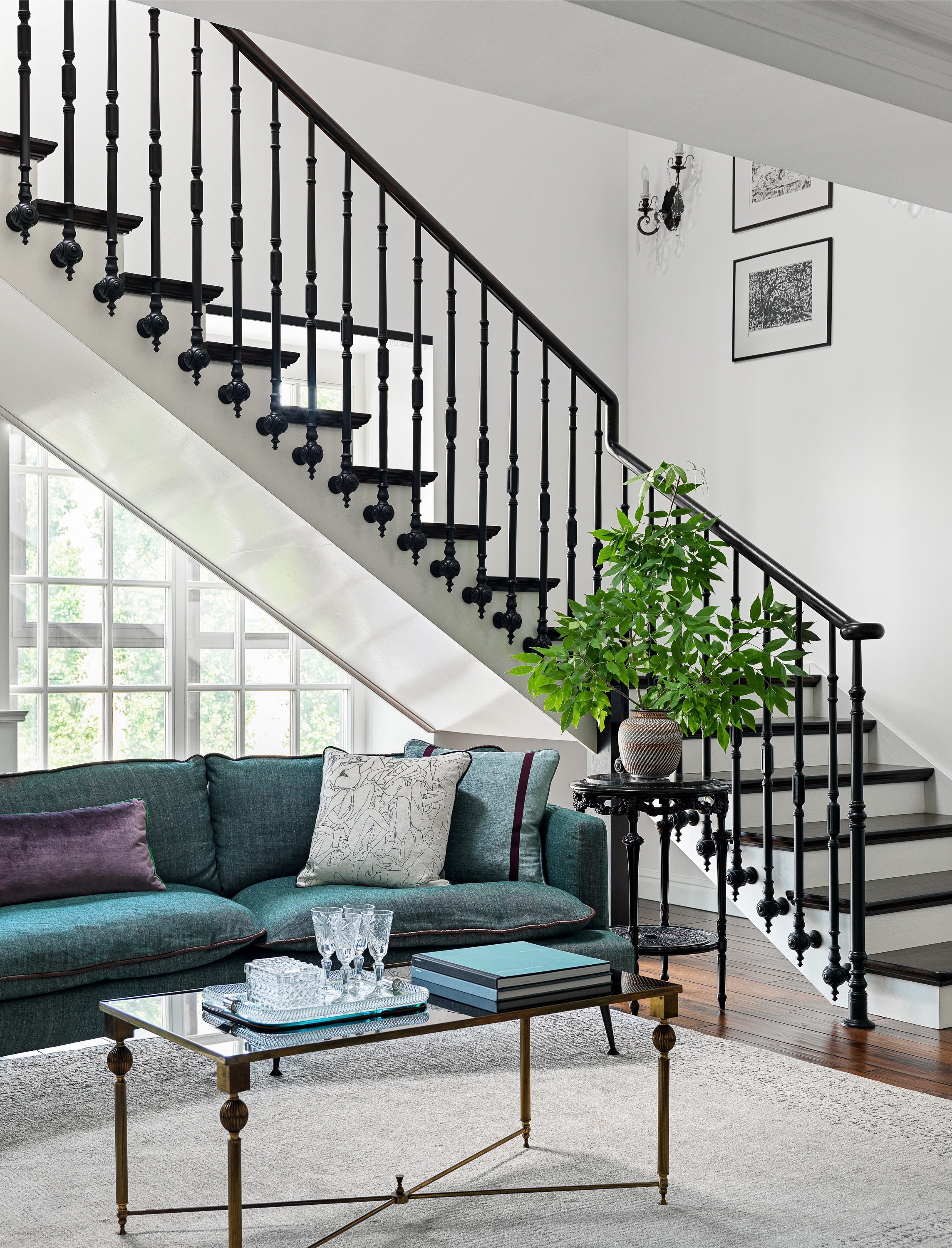
Unusually, the staircase sits the in center of the main living space, creating a striking but beautiful focal point in the room. The design of the staircase, like a lot of the interiors, was inspired by French architecture and is the perfect balance of form and function. The balustrades are detailed enough to make you notice them, with the elegant shape and unique circular carvings at the base, but they aren't so ornate the stairs totally overwhelmed the room. They act almost like a sculpture in the living room, complimenting the shapes and style of the rest of the furniture.
Article continues below 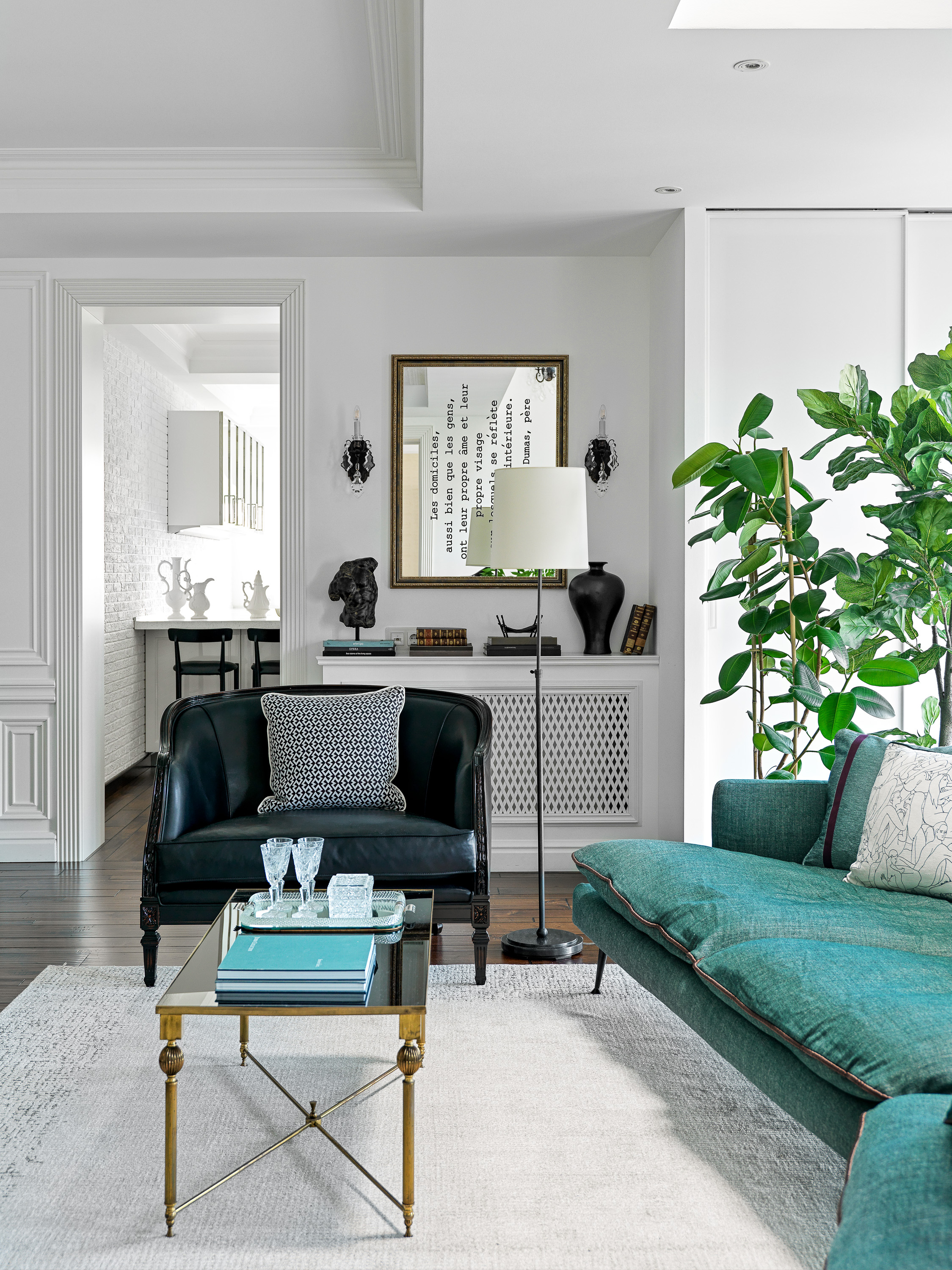
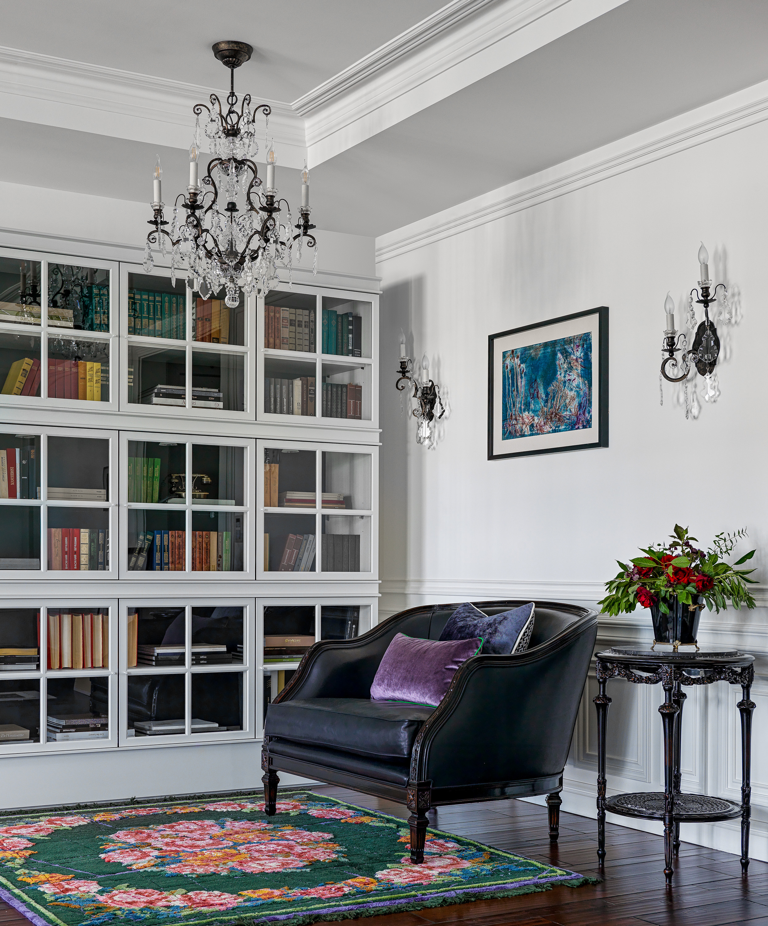
Along the wall on the far side is a small library, adding another zone to this open-plan space. It feels different over here, there's still the elegance of the main sitting area but it is cozier and more old-fashioned almost with the dark antique furniture. Both the books and the vibrant rug add more deep and rich colors to this part of the room, furthering that cozy feel.
This space is in fact the perfect example of how rugs can be used to divide an open-plan space. The larger minimalist neutral rugs grounds all the furniture in the center of the room, the edges of the rug almost act like walls of which the furniture is laid out within. Then in this corner, you have the small rug, a second 'room' within a room. It makes it more obvious that this is a separate space with separate functions and style.
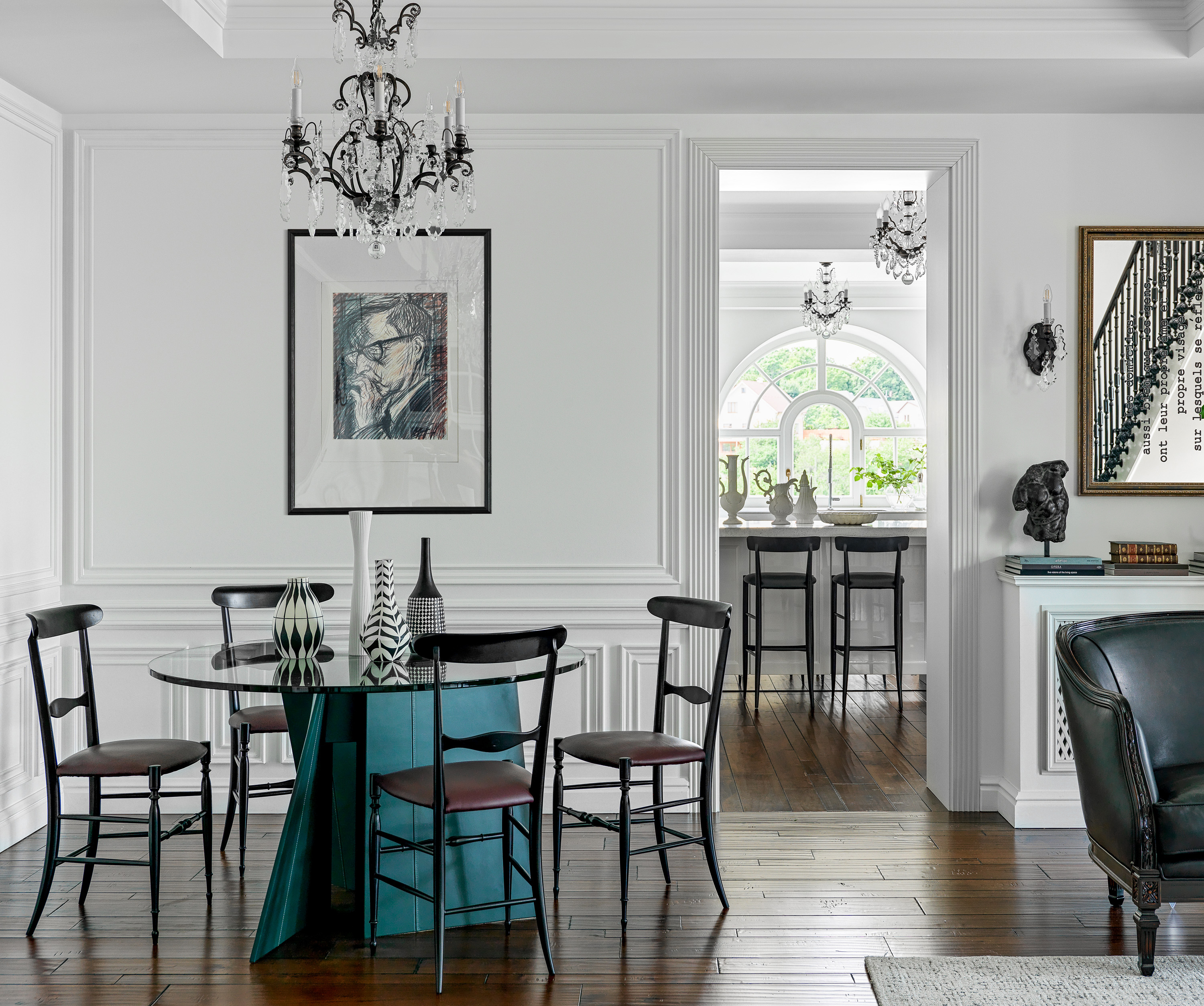
Just before the open door frame into the kitchen is the dining area. The blue of the leather table legs mirrors that vibrant teal of the sofa, connecting the space and giving that cohesion you always want in an open-plan space. However, it's positioning so close to the kitchen and the way the strategically placed chandelier sits perfectly above the dining table does make this space feel separate from the cozy, tactile materials of the living area.

Kitchen
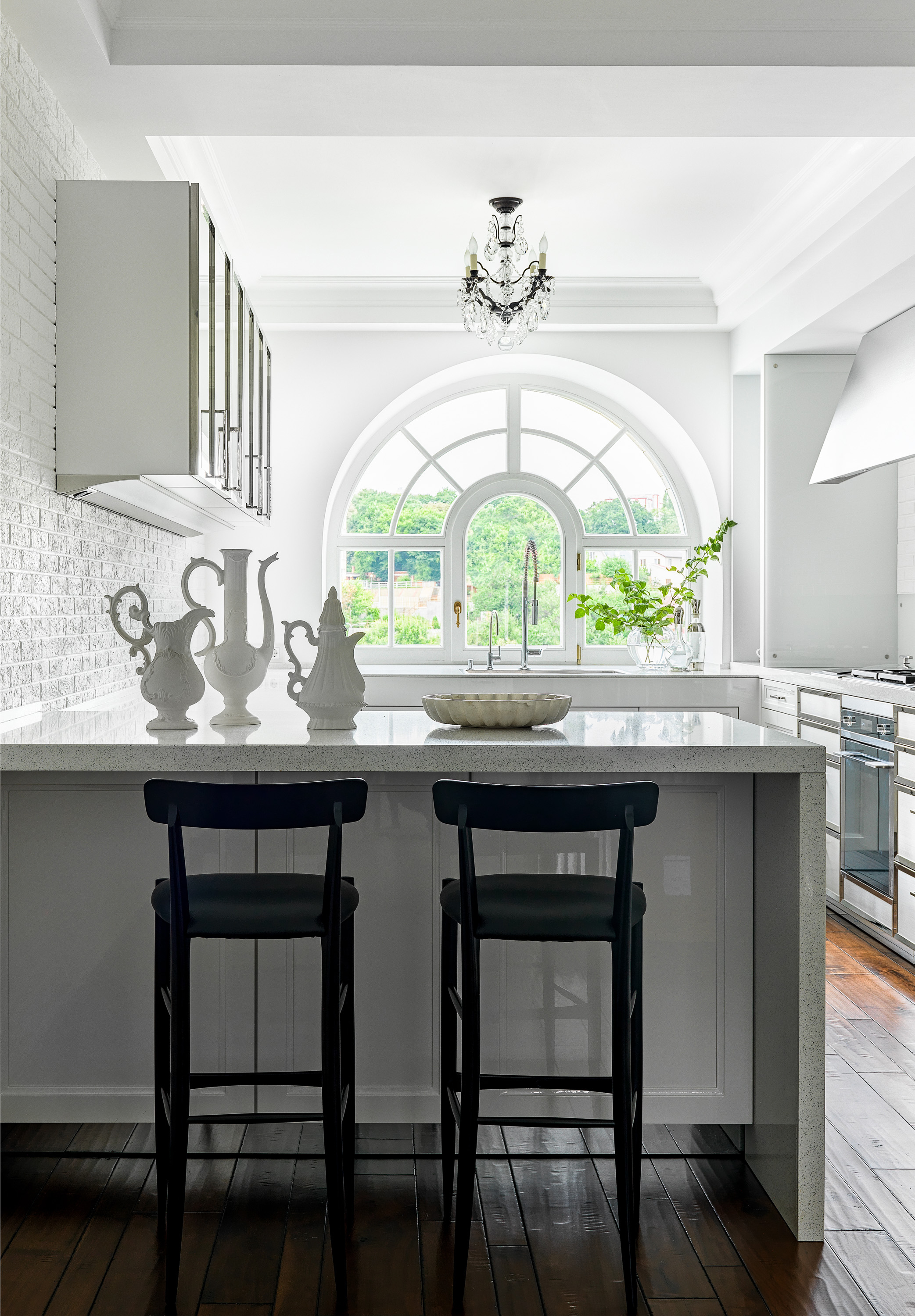
In the kitchen, an all-white scheme sits with the deep oak flooring, with those darker, natural tones and textures grounding this very crisp white space. It's in fact texture that gives this room most of its interest. As well as the floor, the walls are clad in painted white brick, adding just a touch of pattern and differentiating the walls from the minimalistic sleek gloss worktops.
The Livingetc newsletters are your inside source for what’s shaping interiors now - and what’s next. Discover trend forecasts, smart style ideas, and curated shopping inspiration that brings design to life. Subscribe today and stay ahead of the curve.
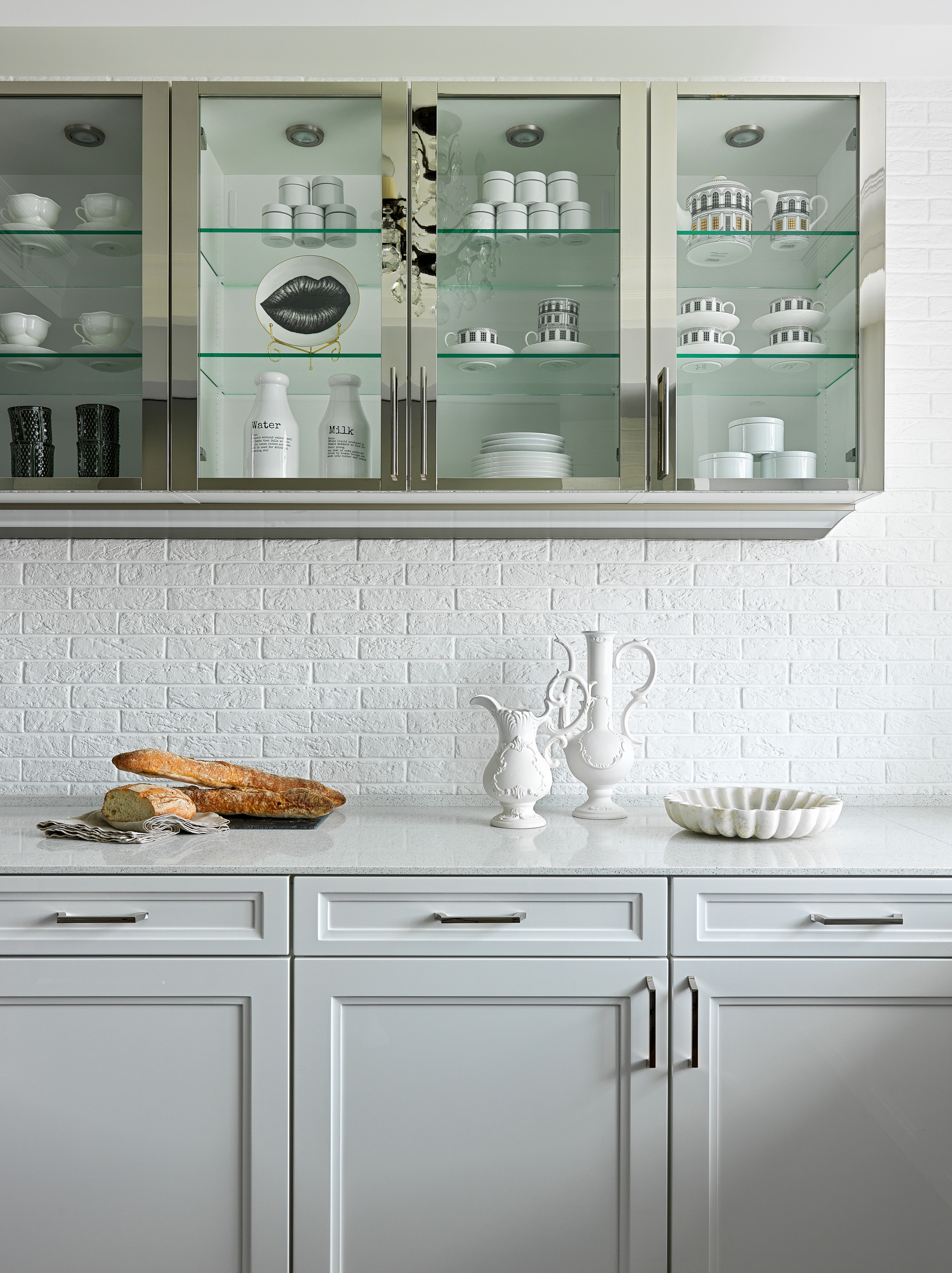
The wall cabinetry introduces more texture and mix of materials too with glass fronts and elegant mirrored doors. There might not be much color going on here but, far from feeling flat because of the monochrome scheme, that blend of wood and brick and glass and metal really gives the room depth. And note the mirrored kickback, such a small detail but it really expands the space and creates the allusion of a much larger floor space.
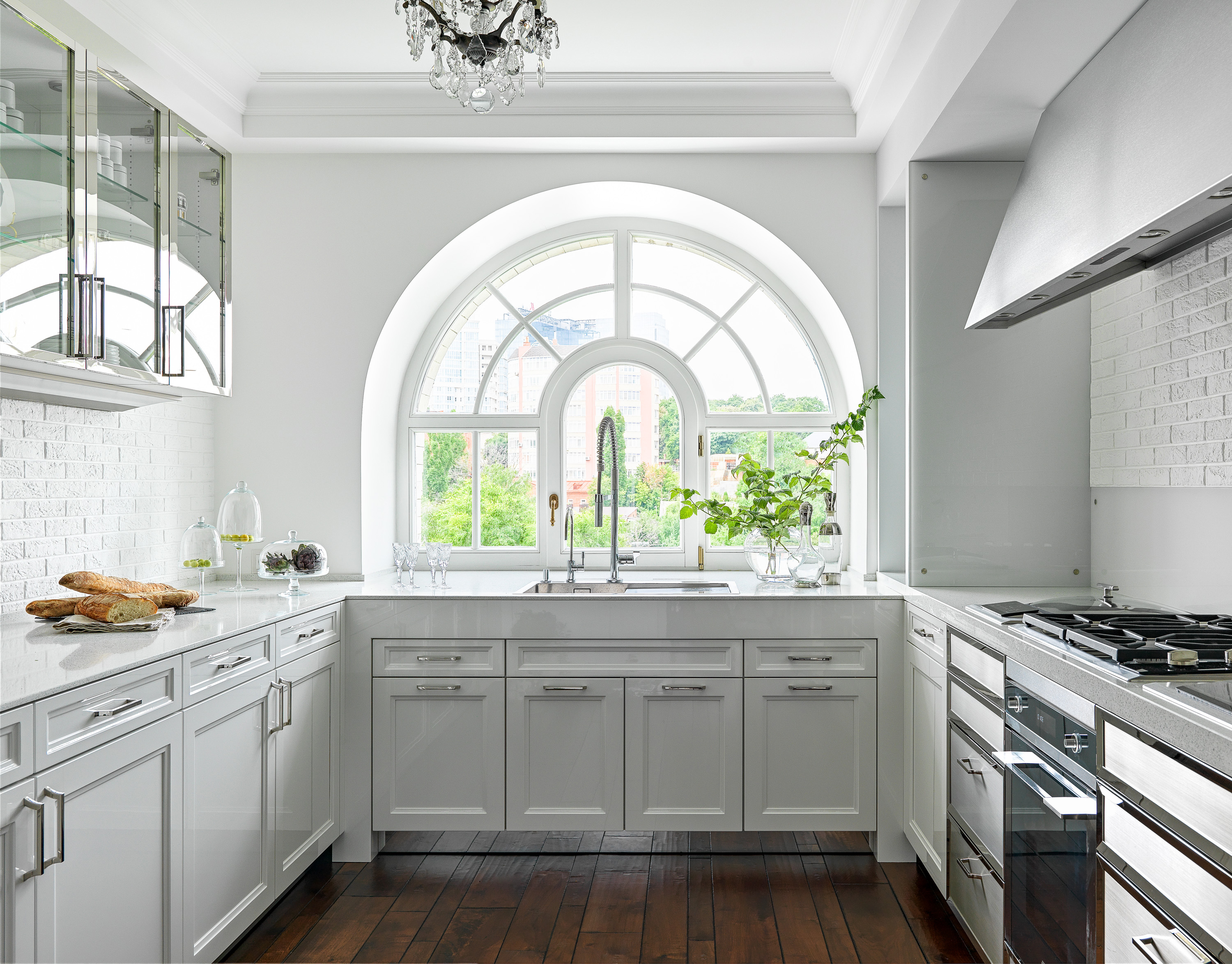
- Be inspired by more modern kitchen ideas.
Hallway
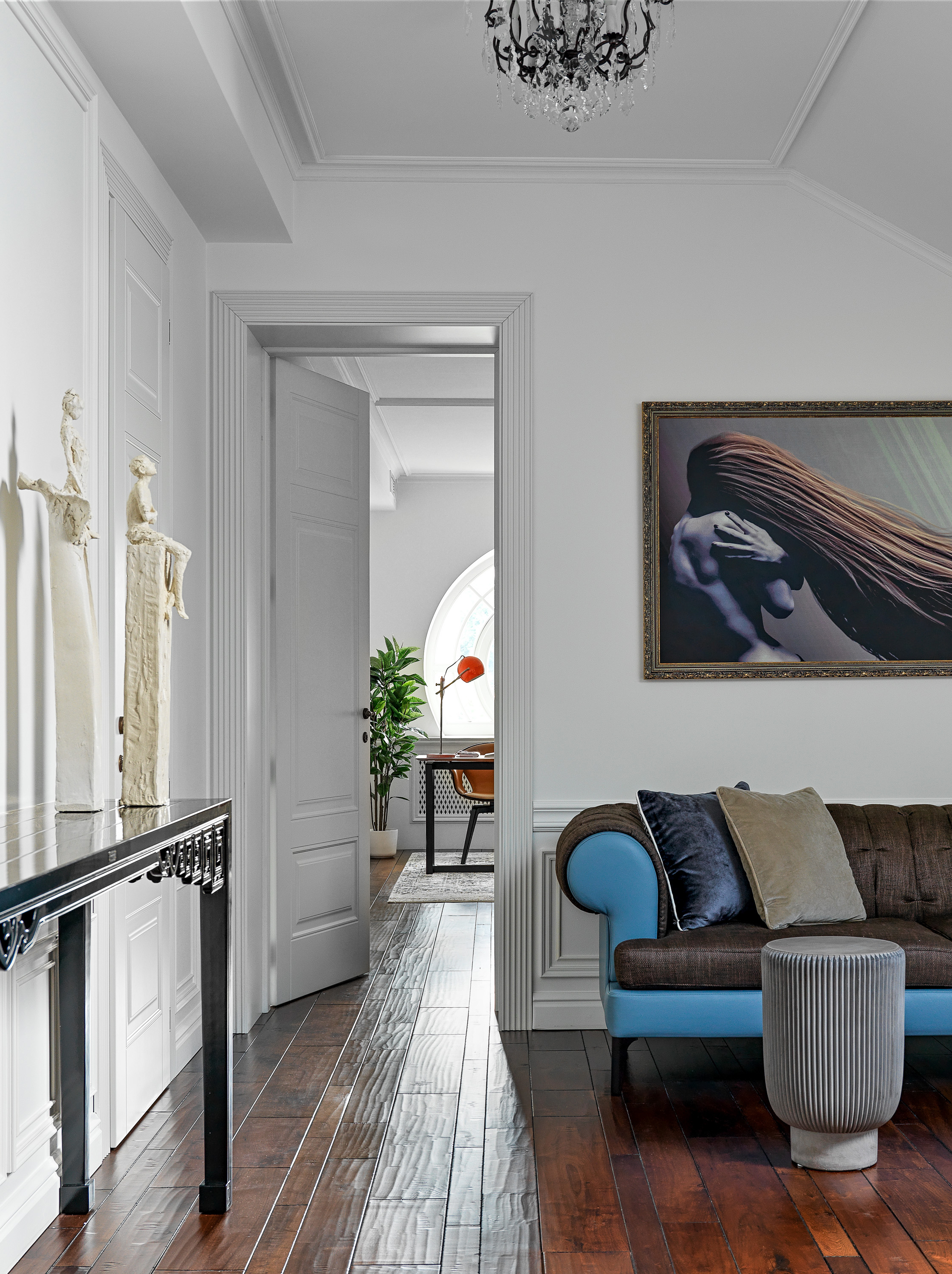
To even call it a hallway definitely undersells this space, it's more of a second living room designed as a more relaxed, laid-back area with a more intimate feeling than the formal open plan sitting room below. It's also a place for the homeowner to display her impressive modern art collection, so the room does instantly have a slightly different, more contemporary vibe to the main living space, although those beautiful solid oak floors and the classic moldings link the rooms.
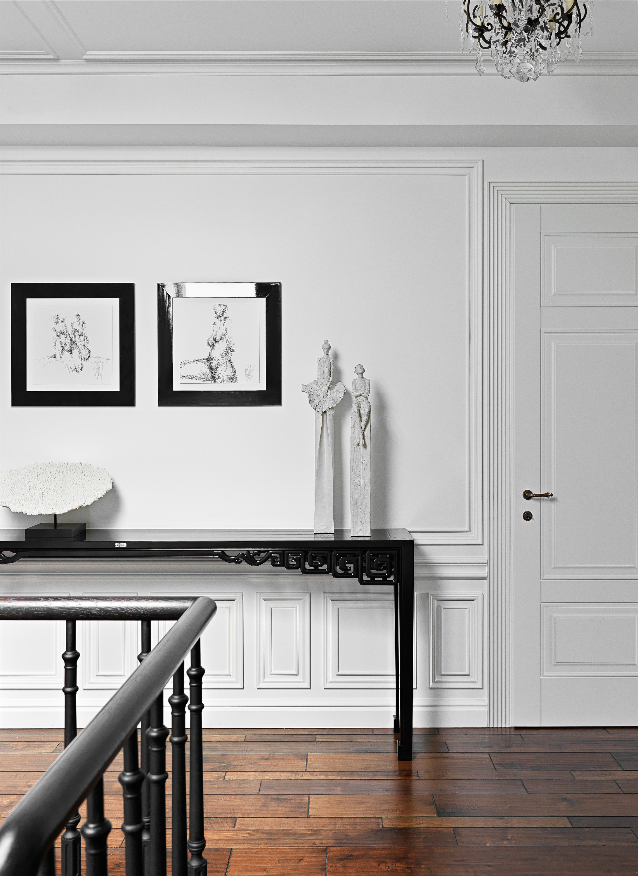
- Find more hallway ideas in our full gallery.
Master bedroom
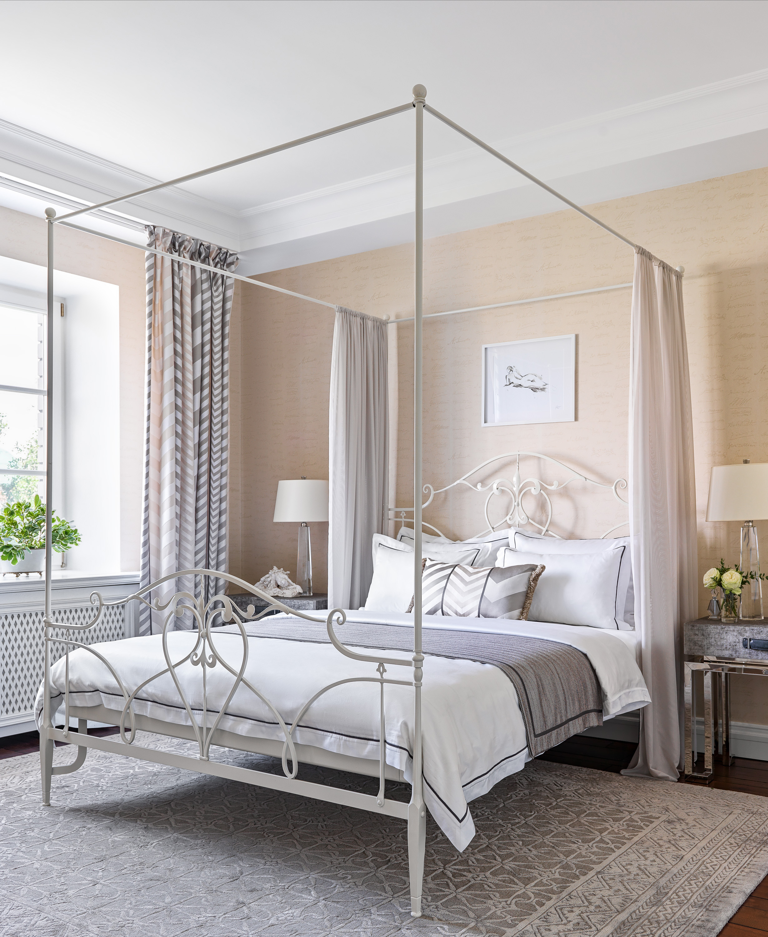
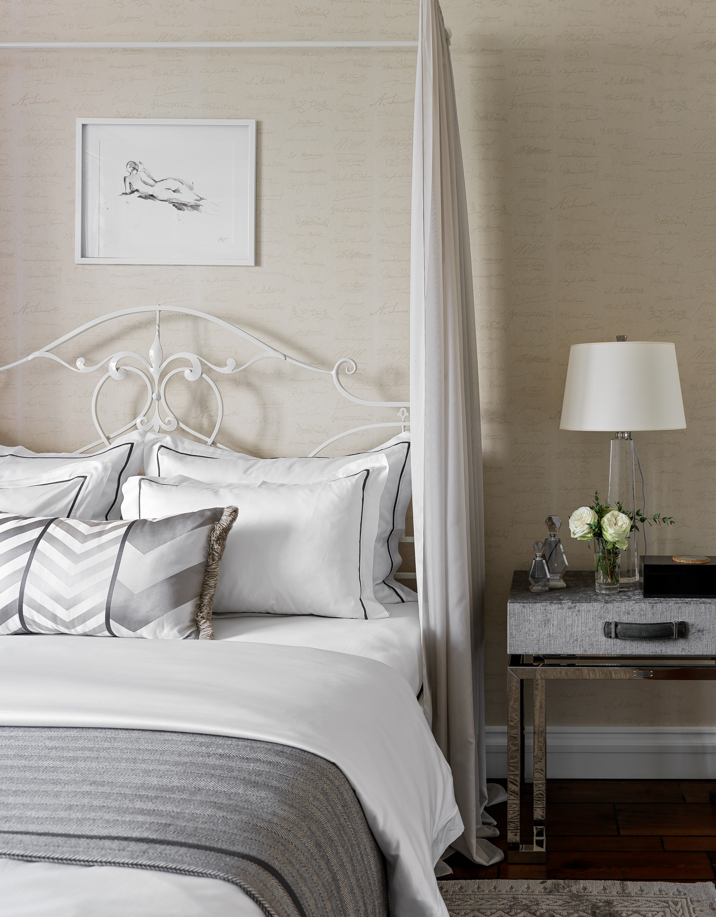
There's a much softer color scheme in the master bedroom than in the other rooms. The walls, which are covered in Andrew Martin wallpaper, have a gentle pinkish apricot undertone, giving the space an instant warmth that counterbalances the grey and silver accents. The layers of textiles add to the softness too, with swathes of gauzy fabric surrounding the bed and floor-length curtains in corresponding greys and pinks adding to the romantic feel.
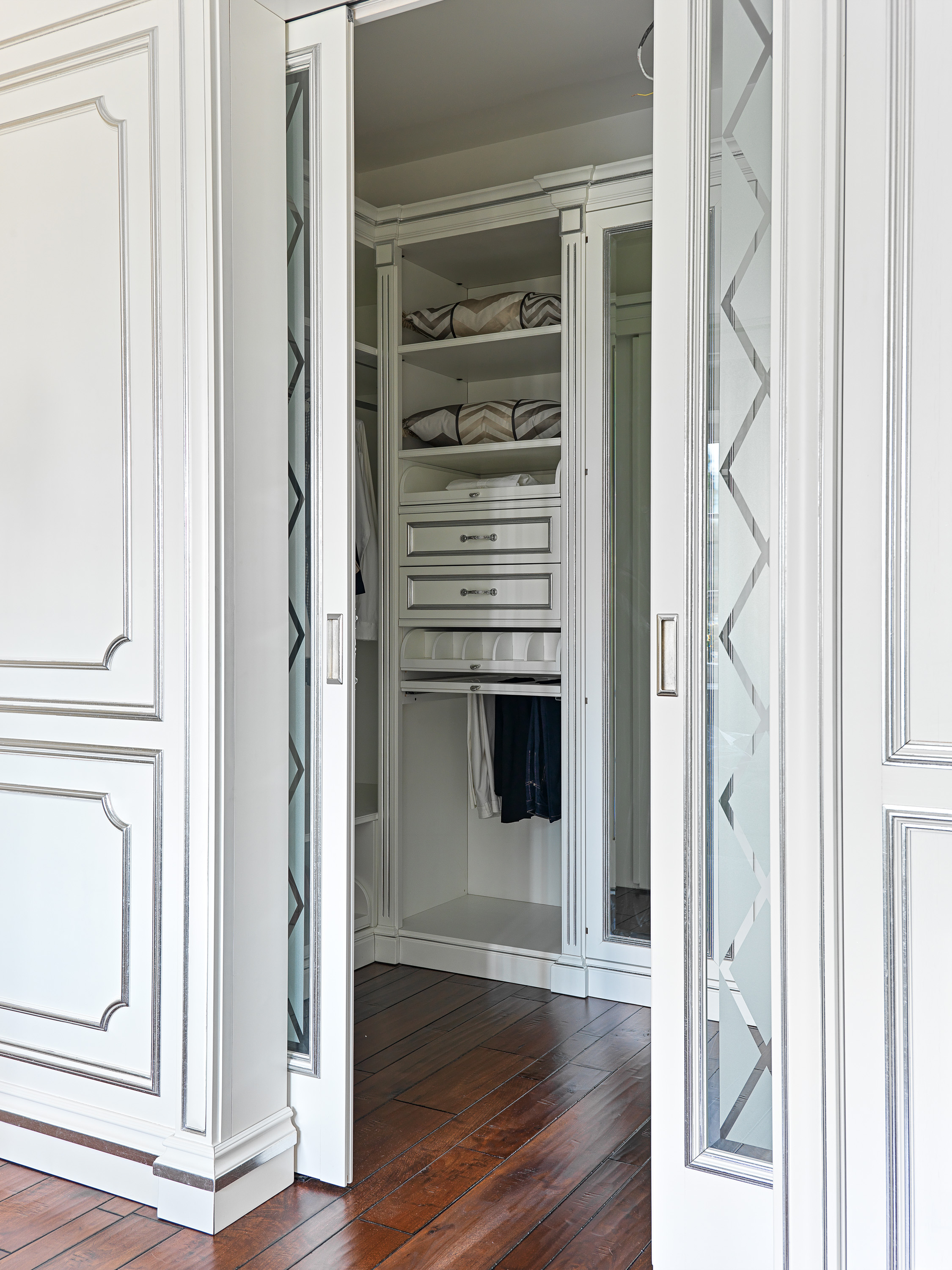
A custom made walk in wardrobe hides behind pocket sliding doors.
Family bathroom
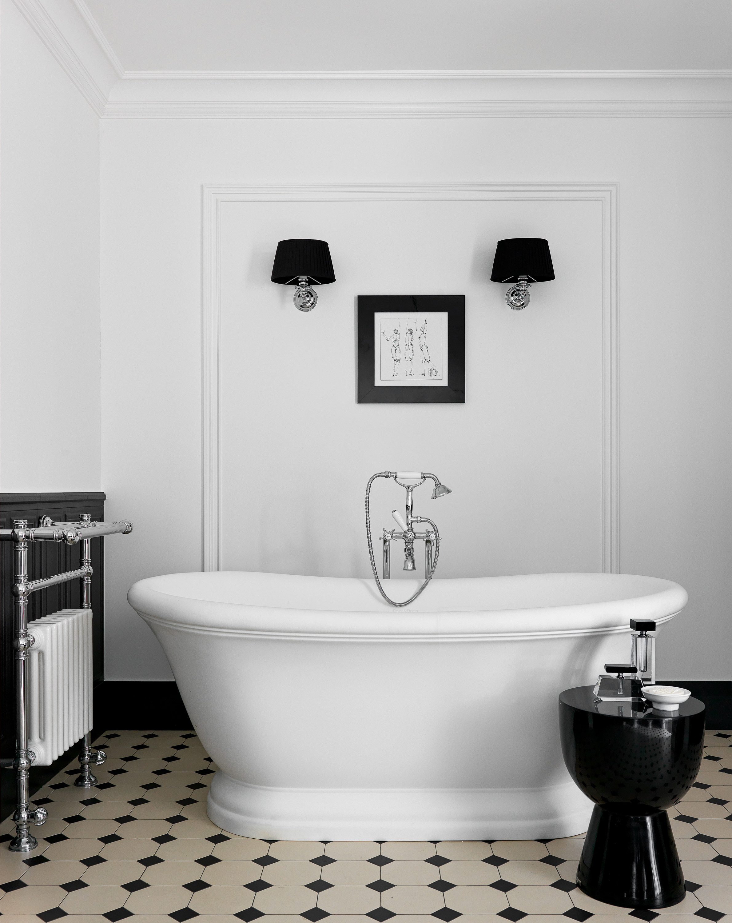
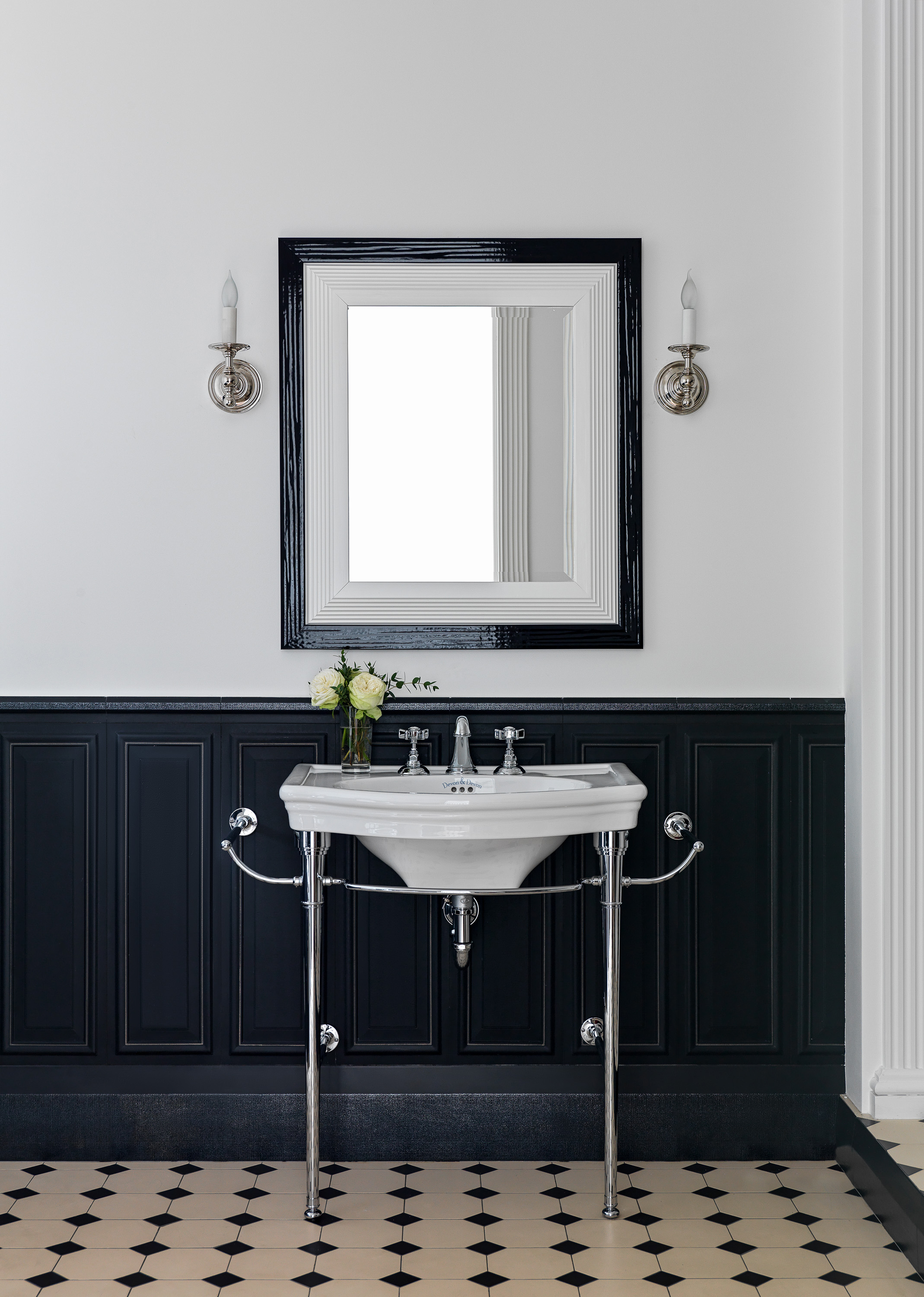
The spacious family bathroom has a chic black and white scheme. There's a mix of contemporary and traditional in the design, the floor tiles feel original as does that paneling, and even the fixtures fall more on the side of traditional. And yet the simple colors and the small touches of modern furniture create that quirky blend of old and new.
Children's bedroom
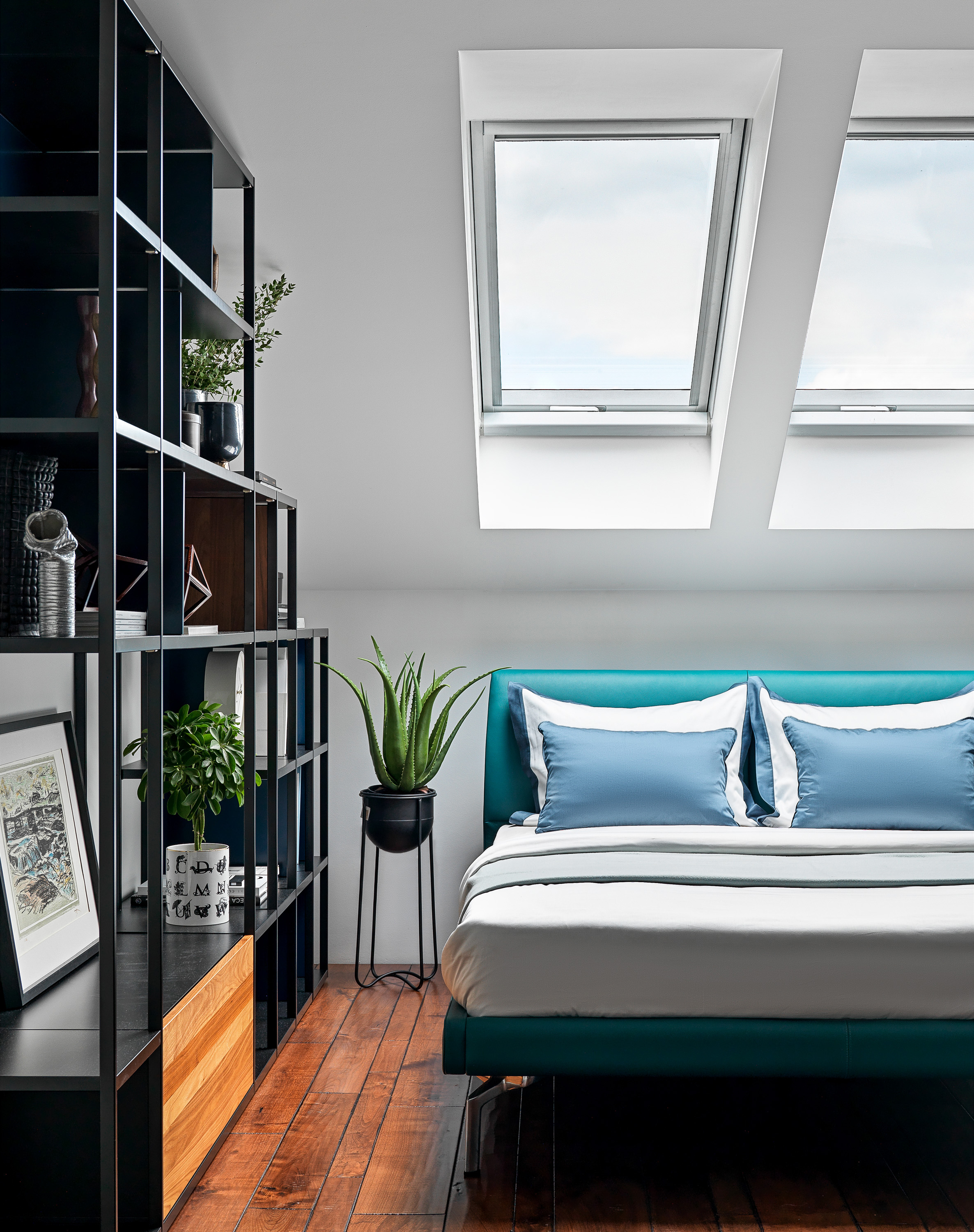
The attic was a complete remodel. The roof was removed and reconstructed to create a larger, lighter, and more airy space. The children's bedrooms are situated up here, along with a study and the family bathroom. There's a more contemporary, almost industrial feel to the kid's spaces, gone are the ornate shapes and French-inspired decor that can be found in the rest of the house, instead, up here you'll find clean lines, fuss free designs, and strong clear colors.
The bed, a Poltrona Frau design, is chic and simple but that vibrant blue upholstery gives it a fun and modern twist that's perfect for creating a kid's bedroom design with longevity.
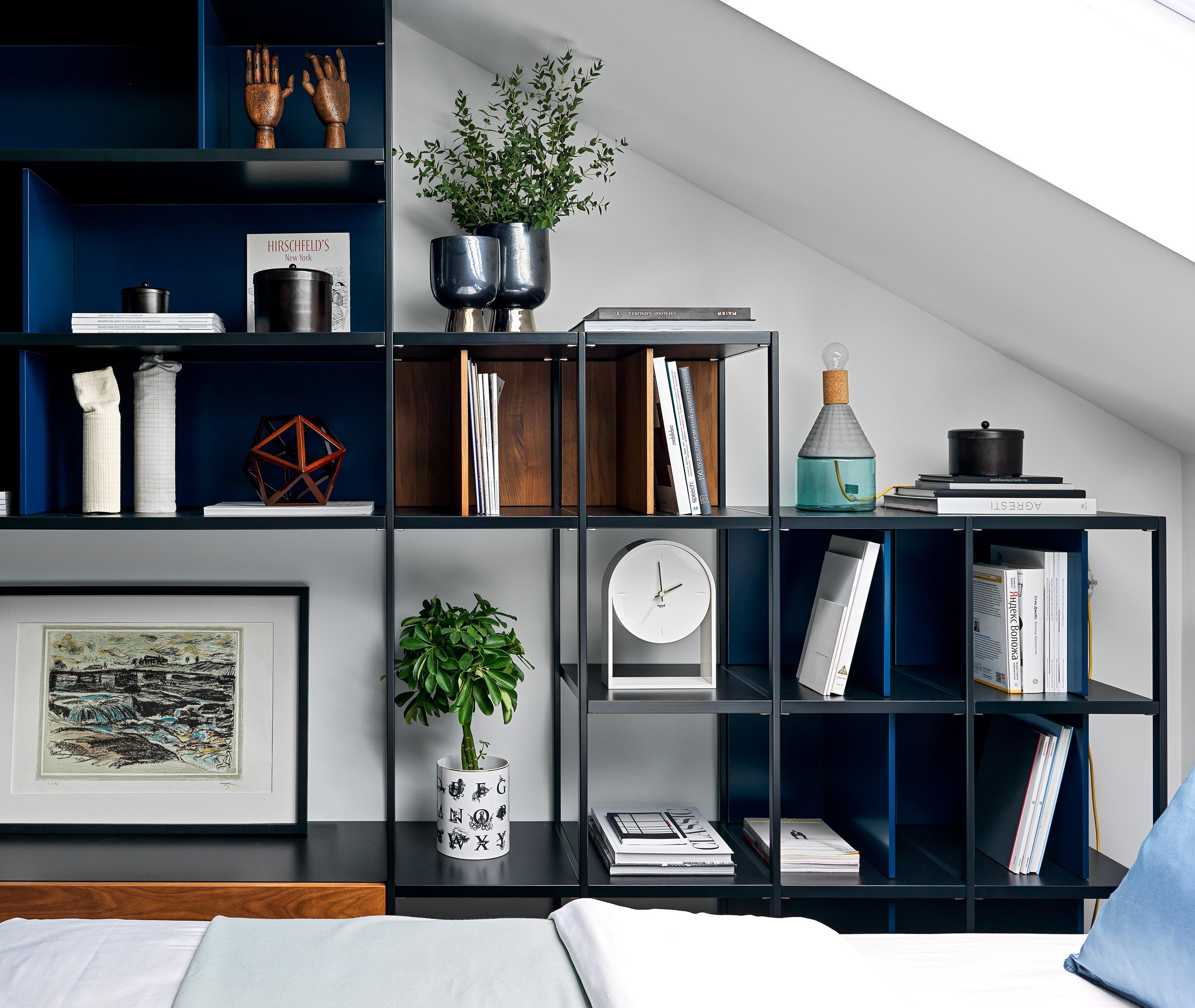
Rather than opt for built-in storage in the eaves, which would have boxed the room in and made it feel smaller, the square open shelves adds a cool focal point to the room, a place to add personality and decor, as well as use for extra storage.
Study
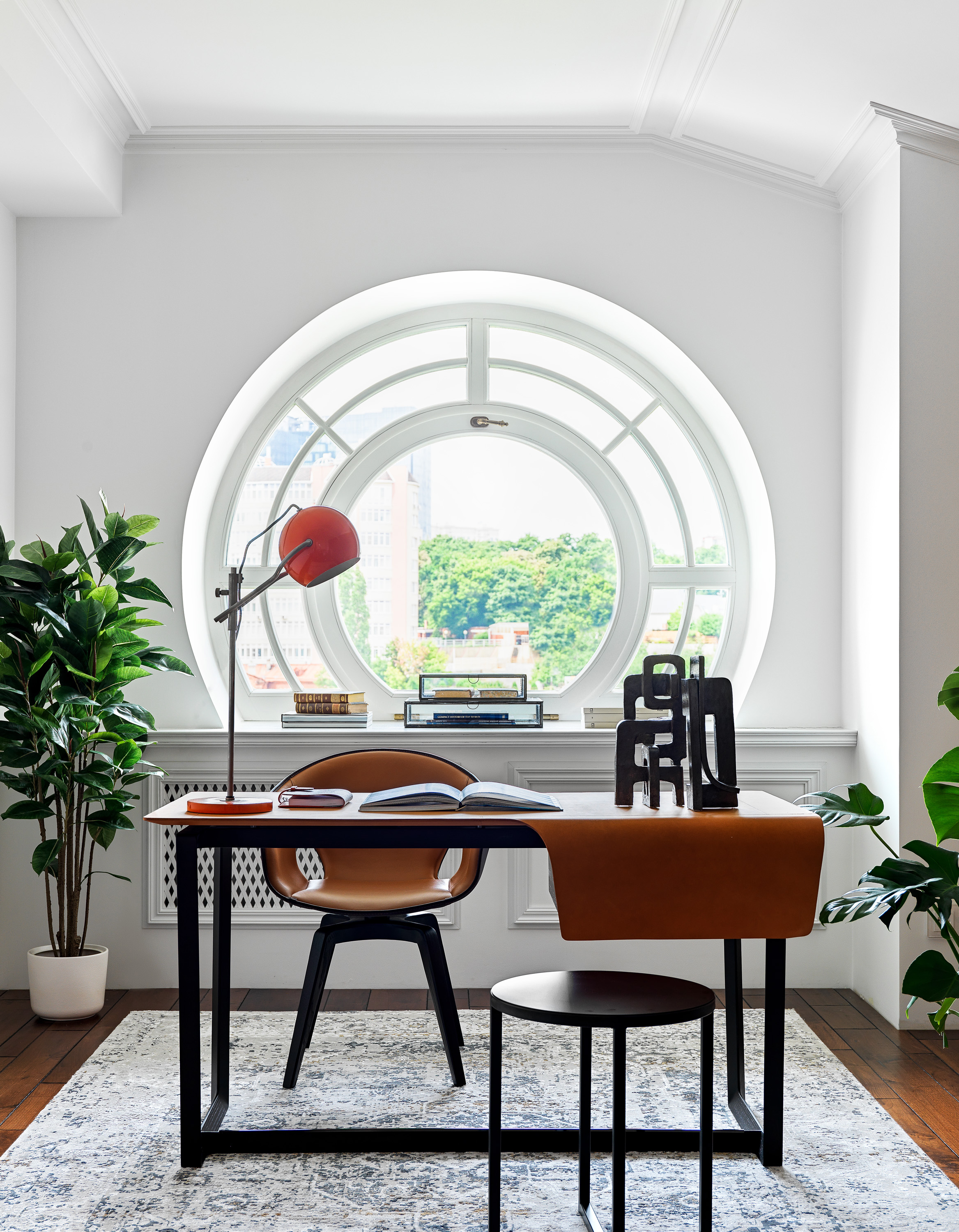
Despite being part of the new loft conversion, the study has a much older feel to it. It's like it's an original part of the building with its detailed cornicing, reclaimed wooden floor, and of course that beautiful circular window.
As in all the rooms, the crisp white walls are the perfect backdrop for the bold lines of the contemporary furniture, the clean black shapes really stand out and create a lovely contrast with the more traditional space they stand in. Add amongst those lines there are curves too that mirror the unique window – the Poltrona Frau armchair, the stool, even the quirky vintage lamp add to the mix of shapes.

Formerly the Digital Editor of Livingetc, Hebe is currently the Head of Interiors at sister site Homes & Gardens; she has a background in lifestyle and interior journalism and a passion for renovating small spaces. You'll usually find her attempting DIY, whether it's spray painting her whole kitchen, don't try that at home, or ever-changing the wallpaper in her entryway. She loves being able to help others make decisions when decorating their own homes. A couple of years ago she moved from renting to owning her first teeny tiny Edwardian flat in London with her whippet Willow (who yes she chose to match her interiors...) and is already on the lookout for her next project.