These are the world's most popular paint colours
Discover the world's most popular paint colours... from lights to neutrals and darks to brights, the results might not be quite what you expect...

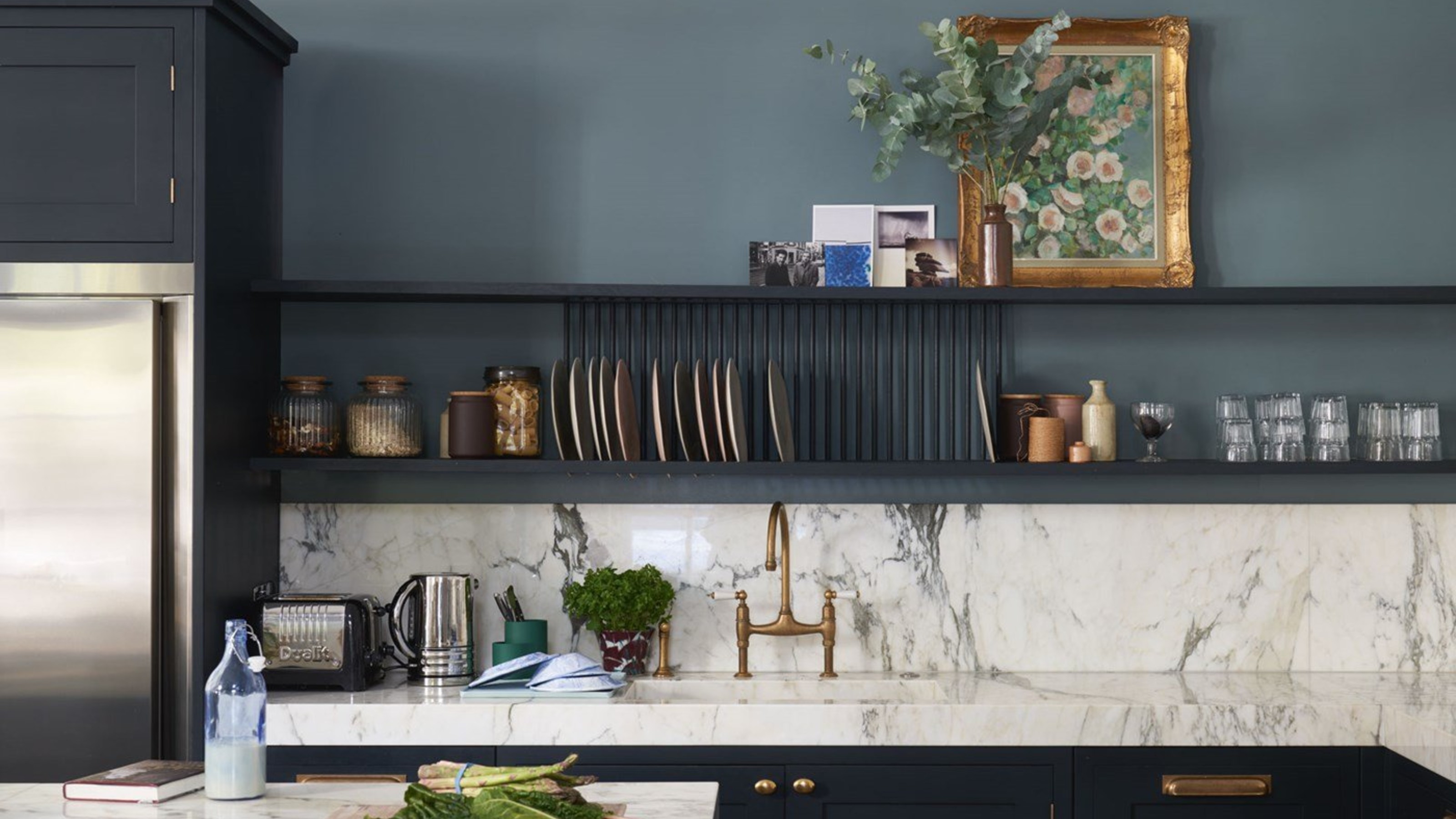
Ever wondered what the world's most popular paint colours are? Instagram enables us to make a pretty good guess, with a bit of digging allowing us to track how many times a particular paint colour has been tagged on pictures uploaded to the platform.
And with a lick of paint proving a quick, easy and affordable way to completely change the atmosphere of a room, many of us are switching up our wall colour more often than ever before - and sharing the results on our social media - meaning there's plenty of data to reveal the past year's top paint trends.
So, are the most popular paint colours greys, greens, whites or blues? Or are there some curveballs thrown in with unexpected shades taking the top spots?
Read on to discover the most popular paint colours of the year... they might not be quite what you were expecting...
1. PARIS GREY, ZOFFANY
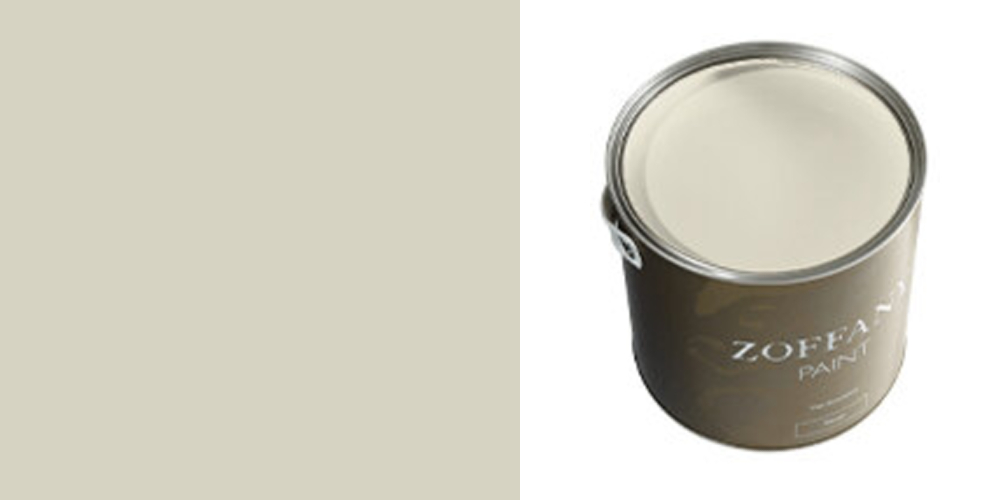
Paris Grey by Zoffany was the most ‘Instagrammed’ paint colour of 2020, with over 23,971 photos uploaded. A soft creamy-grey colour, Paris Grey is inspired by the elegant chateaux of the French capital. Its popularity is probably down to its versatility and simplicity; this colour is easy to accessorise and works well in pretty much any room.
2. GREEN SMOKE, FARROW & BALL
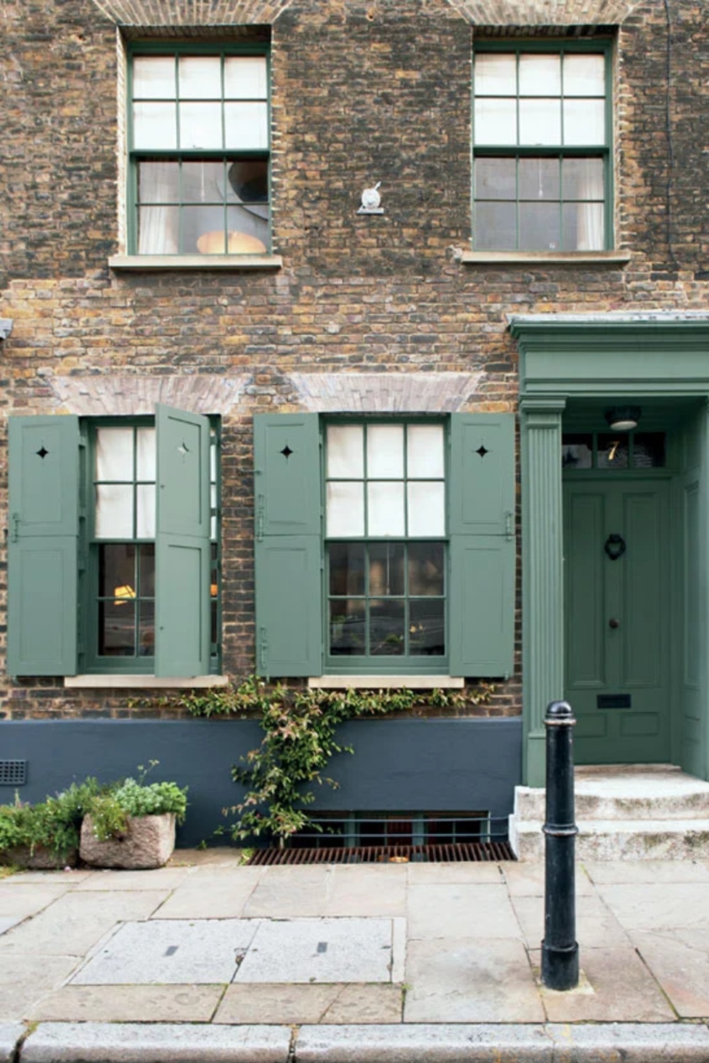
Perhaps due to our need to bring more nature into our homes, Green Smoke by Farrow & Ball is the second most popular paint colour according to Instagram.
Its bluey-green tones are calm and soothing, and it works well in either a modern or period property. Paired with white woodwork it feels fresh and contemporary, whilst its deep tones work just as well with darker colours for a more dramatic or heritage look. No wonder it's clocked up more than 21,000 tags on Instagram.
The Livingetc newsletters are your inside source for what’s shaping interiors now - and what’s next. Discover trend forecasts, smart style ideas, and curated shopping inspiration that brings design to life. Subscribe today and stay ahead of the curve.
Find more ideas for an entranceway update in our edit of the best front door ideas.
- Buy now: Farrow & Ball Green Smoke Estate Emulsion 2.5L
3. FRENCH GREY, LITTLE GREENE
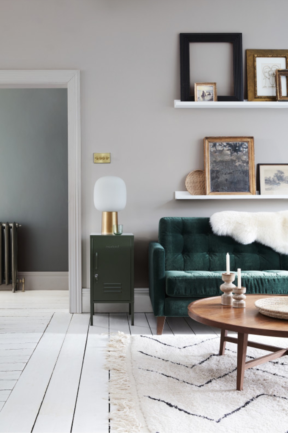
French Grey by Little Greene is the third most popular paint colour, and also one of the most popular neutrals according to interior design experts who tipped the lighter shade of French Grey Pale to be one of the best white paints for walls in our ultimate decor edit.
Uploaded to Instagram nearly 14000 times, design-savvy DIYers clearly agree. Find more options in our round-up of the most popular Little Greene paint colours.
4. BANCHA, FARROW & BALL
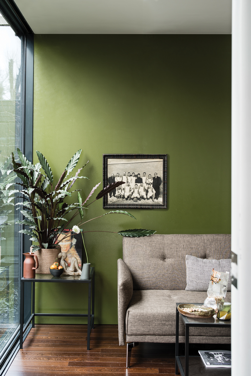
An intense hit of earthy green, Bancha by Farrow & Ball is great for statement wall colour.
Taking its cue from mid-Century shades this leafy green looks great contrasted against rich wood tones, and will bring warmth to a darker space.
It might seem a surprising choice to some, but with nearly 10,000 uploads on Instagram it shows homeowners aren't afraid to go bold.
5. JITNEY, FARROW & BALL
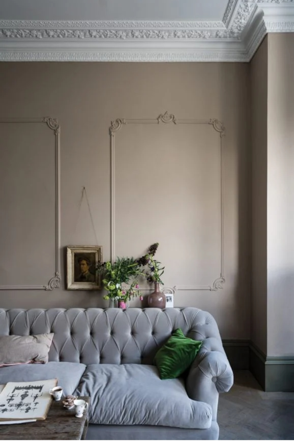
This pale pinky-brown tone is a soft and comforting shade, echoing the colour of sun-faded plaster.
A deep neutral, Jitney by Farrow & Ball is much loved by a wide range of interior decorators, coming in as the fifth most popular paint colour on Instagram.
6. SULKING ROOM PINK, FARROW & BALL
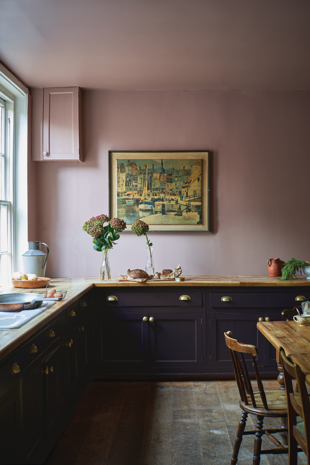
We want to paint a room in it purely for the name, and it seems we aren't alone because Sulking Room Pink by Farrow & Ball is the sixth most popular paint colour on Instagram.
Its carefully balanced formula makes it the perfect grown-up pink, with warm, earthy undertones rather than any hint of pastel.
Find more pinks that aren't sickly sweet in our pink kitchen ideas.
7. HALE NAVY, BENJAMIN MOORE
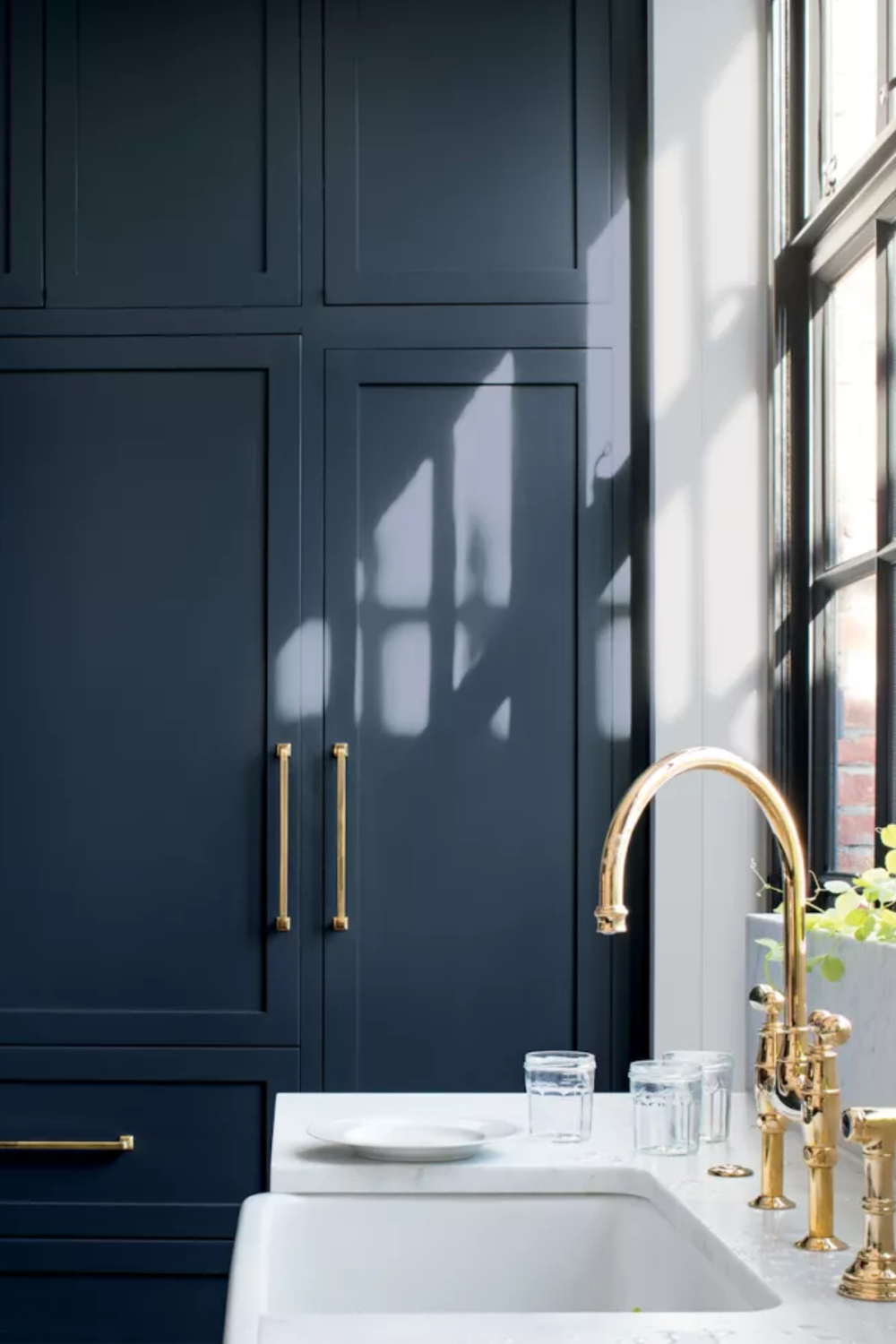
Hale Navy is the perfect colour for kitchens and dining rooms. Whether it’s for a statement wall, or cupboard doors, this hue breathes a lot of energy into the space and is incredibly stylish. It also works well for exteriors, and front doors, or smaller porch areas. The colour is strong and gives off a feeling of power and strength.
Read Also:Gorgeous Blue Kitchen Ideas And Inspiration
8. DENIM DRIFT, DULUX
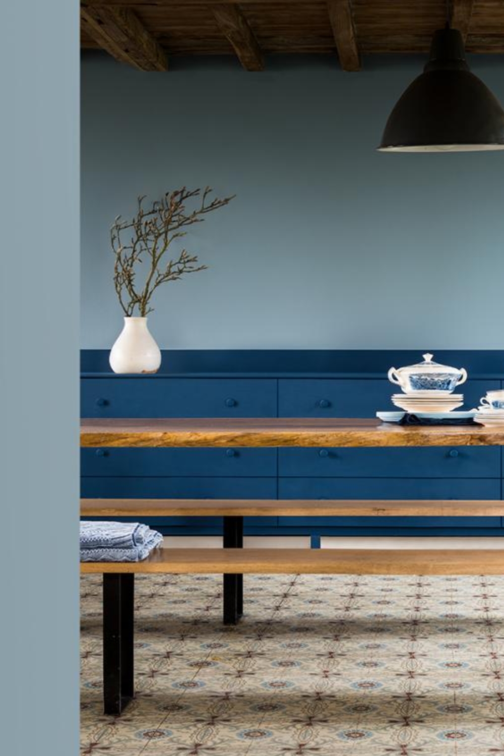
One time winner of the brand's Colour of the Year accolade, Denim Drift from Dulux is a paint colour that's still going strong.
Its popularity is likely due to its warm tones, which offer the bold tones of blue, without the risk of the coolness the colour can often bring to a room.
Perfect for adding some coastal hues to a space, the colour is fresh against white, or offsets more vibrant tones.
9. SPICED HONEY, DULUX
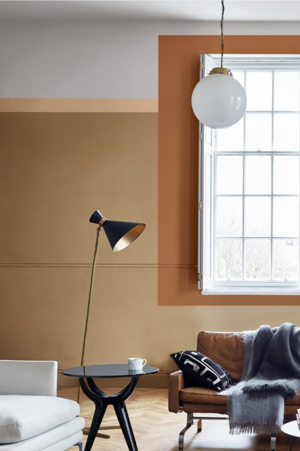
Hot on the tails of Denim Drift came Spiced Honey from Dulux, the brand's Colour of the Year 2019.
Its popularity has obviously extended into the next few years, as it remains in the top ten of most popular paint colours.
The golden turmeric-inspired tone is warm, cosy and inviting; perfect for creating a cocooning effect in darker North-facing rooms.
10. PURBECK STONE, FARROW & BALL
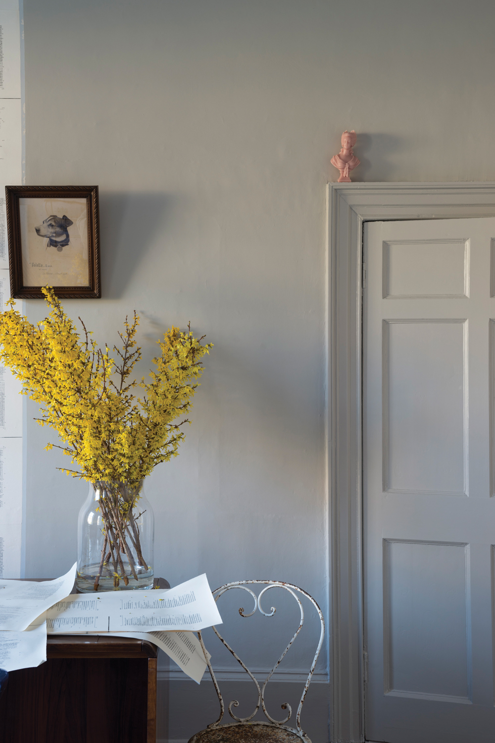
Purbeck Stone from Farrow & Ball is one of the brand's most popular neutrals, so it's no surprise to see it making its mark on the homes of Instagram.
An understated stone grey, the warm tones work well in either North or South-facing rooms where the pink undertones create a soothing and restful scheme.
11. SKIMMING STONE, FARROW & BALL
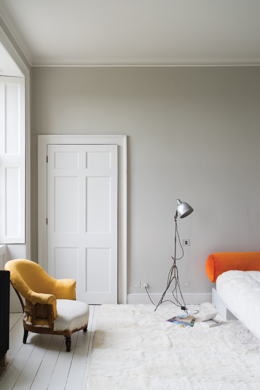
Skimming Stone by Farrow & Ball is a particularly popular paint colour for bathrooms or bedrooms. It can be dressed up, or down, though complementing it with brighter colours tends to work best for a modern look.
Match with wooden floors, soft furniture and dramatic wall accessories such as paintings and large mirrors.
12. POLISHED PEBBLE, DULUX
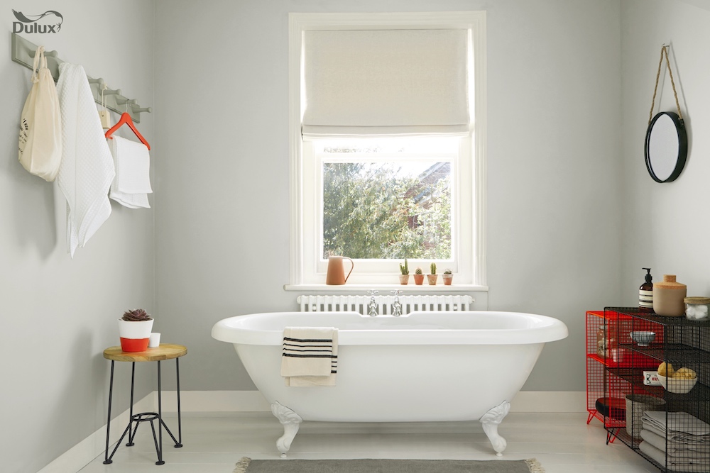
Polished Pebble is a popular colour as it opens space, and makes a room feel bigger and brighter. It’s a good colour for staircases, hallways, reception areas and porches, and reflects the light well.
13. SETTING PLASTER, FARROW & BALL
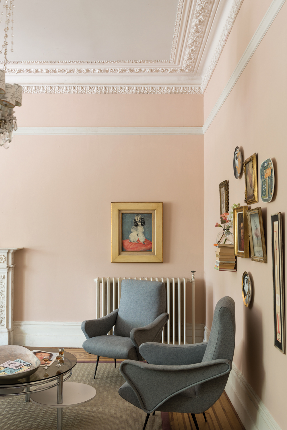
Farrow & Ball's Setting Plaster is a beautiful backdrop colour, and is more popular in older, larger houses and rooms. It works well with darker browns, and creams, and light greys for a more modern look. It almost gives a historic feel when added to a room, and makes you feel welcome.
14. DE NIMES, FARROW & BALL
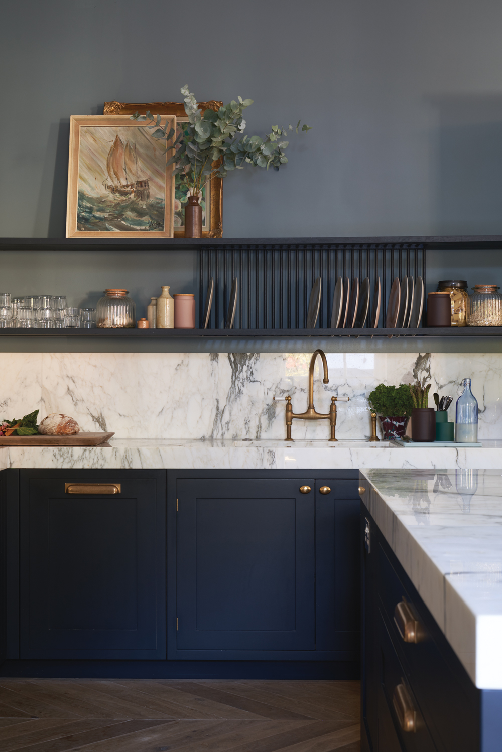
This is elegant, stylish, and instantly uplifts any room. It has a royal feel to it and holds dominion over other shades. It works particularly well against oak wood and natural, rustic elements.
Read Also: Moody Blue Living Room Ideas
15. CHIC SHADOW, DULUX
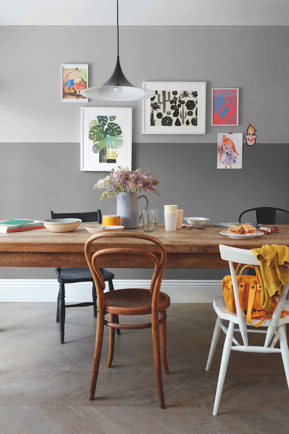
Chic Shadow by Dulux is of the most popular shades of grey, as it is bold, yet subtle. It works best when paired with both bright and dark colours, so match yellows with blacks, and blues with dark browns. It also creates a calming emotion and is a grey that works nicely with metallics.
Read Also: Gorgeous Grey Living Room Ideas and Gorgeous Grey Kitchen Ideas

Lotte is the former Digital Editor for Livingetc, having worked on the launch of the website. She has a background in online journalism and writing for SEO, with previous editor roles at Good Living, Good Housekeeping, Country & Townhouse, and BBC Good Food among others, as well as her own successful interiors blog. When she's not busy writing or tracking analytics, she's doing up houses, two of which have features in interior design magazines. She's just finished doing up her house in Wimbledon, and is eyeing up Bath for her next project.