Paint Ideas for Walls — 29 Inspiring Ways Designers Use Paint in Modern Homes
These paint ideas for walls are clever, inexpensive, and a simple way to transform the look of your home

Hugh Metcalf

Paint ideas can easily and effortlessly elevate spaces, add drama, or sometimes even create the illusion of height and depth in spaces. When it comes to interior design, a fresh lick of paint on your walls is also one of the more accessible ways to embrace a new trend or transform your space for a more contemporary look.
'Color is back and it is bold,' says Nadia Watts, founder of Nadia Watts Interior Design. 'Matte earth-inspired surfaces, contrasting tones like burnt orange, burgundy, coral pink, and mustard... they all make a big impact. Metallic tones can also make quite the statement with copper, steel grey, and brass with the right paint techniques.'
No matter the size or scale of your home, there's a good paint idea for every space. The designers of these 29 creative spaces may have chosen a specific color for their schemes, but each can be easily changed to match your home decor. If you're looking for inspiration for your next paint project, take a look at these impactful ideas.
1. Opt for an artisanal application for a rustic feel

One of the best ways to embrace modern rustic decor is with an artisanal paint application such as lime wash or Roman clay. 'Artisanal painting techniques can add an aged or even Romanesque look,' explains Amy Youngblood. 'This technique is great for a more traditional, rustic space. By mixing plaster of Paris with paint for a pancake batter-like consistency you can create a thicker medium that can be brushed on in a free-flowing fashion that results in a very unique custom look.'
For a more subtle look with dappled nuances in color, try Roman clay (paint pictured above in this zen living room). 'Similar to Lime Wash, Roman clay has depth and variation in the color,' says Jamie Davis, co-founder of Portola Paints. 'It's applied with a putty knife or trowel and will typically be super smooth and soft to the touch. Roman Clay lends a rustic originality to interior surfaces with a modeling marble-like effect, comparable to Venetian plasters but with a more subtle, organic appeal.'
2. Use red rust hues to imitate brick

If you love the look of exposed brick but your home doesn't feature such raw materials, you can imitate the look with a rust red paint idea. While it might be a bold choice, there are plenty of colors that go with red, and it works beautifully when paired with a warm neutral as seen in the bedroom above.
'Our clients on this project were so wonderfully open to color throughout their home,' explains the designer behind the space Liz Hoekzema, director of KLH Homes. 'Having moved to Michigan from NYC, they were used to seeing brick in spaces both interior and exterior for years, so this became one of our first jumping-off points.'
'We pitched the thought of bringing the singular rust red hue up onto their bedroom ceiling, and for an even more boutique-hotel vibe, down the walls, to highlight the ceramic bedside sconces,' Liz continues. 'We love how each stripe dies into the warmth of the sculpted vintage nightstands - pieces we had hoarded away for years, waiting for the right project.'
3. Color drench a room with paint

Color drenching makes using bold paint colors surprisingly minimalist. Using the hue all over a room reduces the visual clutter, letting the color take center stage. You could consider painting ceiling and walls the same color but if you want to take it to the next level, paint the trim, doors and windows too.
In this bedroom, the paint color has even been matched to the flooring. 'This all-blue bedroom was designed as an immersion in color,' says Nicole Ficano, director of interior design, associate, at Workshop APD. 'Tying in the hue from the sky outside, we used the same monochromatic scheme found throughout this penthouse apartment, but with a playful spin. The painted ceiling adds height and drama to the space while contrasting pieces like the white boucle sofa feel grounded.'
4. Create interesting "architecture"

In this modern living room, the designers at Urbanology Designs had to figure out how to fill a large blank wall. They turned to paint to add some interest, and the resulting painted arch adds a new architectural sense to the otherwise boxy space.
'Painted arches are versatile and can be used as a focal point in any room which is why I love the trend,' says Erika Woelfel, VP of color at Behr Paint Company. 'They can be used to help a space feel relaxed, bring visual interest, and they catch everyone’s eyes when they walk into the room.'
5. Highlight a staircase with paint

Painted staircases can make your home's transitional spaces so much more interesting. 'In this townhouse, we decided to recreate a Moroccan-inspired entryway to give the entrance a wow factor and set the tone for the rest of the house, so we chose the "blue Majorelle" as a starting point,' say Sabrina Panizza and Aude Lerin, founders of PL Studio.
'Here the staircase is the element that connects all the rooms and creates cohesion and balance,' Sabrina goes on to explain. 'We painted the stair risers as well as the stringer fascia and capping to create a focal point and give the staircase an exciting twist without having to make any other changes. We also used paint to incorporate optical illusions like the arches and the "trompe l'oeil" staircase to create a different dimension and a bit of an unexpected, magical atmosphere.'
6. Zone spaces using color

Zoning a room with wallpaper aside, you could zone or define specific areas in your home using color. Tones can be used as a way to connect rooms – for instance, colors used in the exteriors can be repeated in a bedroom or kitchen, creating a lovely connection between all areas in the home.
'We used the terracotta tone to define and recreate the exterior look inside this room,' says Gonzalo Pardo, founder of Gon Architects. 'The yellow colored walls show the continuity with the bathroom, and is a tone that was used to fill the space with light, optimism, and vitality.'
7. Make doors pop with paint

When it comes to painting interior doors, if you are open to adding drama and intrigue, choose a bold hue. Generally, bright colors add energy to a space while more muted tones help create a soothing and tranquil feel. For a kids' bedroom or a playroom, a brightly painted door will do well, but if the room is a more calming space like a reading room or bedroom, you might want to go ahead with a lighter tone.
'Oil-based paints are known for their durability and smooth finish,' say Sabrina and Aude. 'They are a good choice for high-traffic areas and where you need a tough, long-lasting finish. However, they have a stronger odor, require mineral spirits for cleanup, and take longer to dry.'
According to the designers, gloss or semi-gloss finishes are excellent choices for doors and joinery as they are easy to clean, highly durable, and provide a sleek, polished look. 'If you favor a more matte look, eggshell finishes work well,' they add. 'These have a slight sheen and can work on joinery for a more subdued appearance.'
8. Consider dark-painted walls to highlight art

Purchased a lovely, expensive artwork and want to give it the pride of place? While there are several considerations like how high to hang art above furniture, you also want to ensure the wall you hang it on allows the piece to shine. One way of doing so is by painting the wall a dark tone. Perhaps a color used scantily in the artwork could be used on the wall, in a deeper tone for a cohesive feel. This will give a gallery-like effect to the home.
'Paint color and finish can completely transform a space and serve as a canvas for the rest of the design,' says Barbra Bright, founder of Barbra Bright Design. 'I chose red for this space in part because I wanted it to reflect my design style – bold! It is also a color that I knew would highlight the art and finishes in the room.'
9. Create whimsy with pastels and half-painted walls

Have a large living room that's missing an interesting architectural detail? Create one with paint. As a wall paneling alternative, you can divide the room into equal halves with half-painted walls - a paint technique that can give a new, fresh dimension to the room.
'For this psychologist cabinet, our client wanted a space where his patients could wind down, open their hearts and minds, and dream,' say Sabrina and Aude. 'We wanted them to almost be transported into a different dimension. It was also important to create a space that wasn’t too "overwhelming" or distracting; the design of the room needed to help relaxation, without interrupting the flow of thoughts.'
In light of this, the designers limited the clouds to the ceiling where they created an illusion of a relaxing blue sky, and chose a soft pink hue for the walls to create a dreamy, calming space.
10. Use metallic paints to add luxury

Gold has been making a big splash in home design, showing homeowners how to decorate with jewel tones. The luxe color adds a classic metallic touch to spaces, marrying it with other on-trend materials like marble and brass for the ultimate chic statement. When it comes to interesting paint techniques, gold leafing is a lovely, modern touch.
'When I first walked into the home, there were these bronze sculptures everywhere that looked like Giacometti's – but they were the work of the client's mother, who is now in her 90s and is creative, strong, and passionate,' says interior designer Jeremiah Brent. 'I was also stunned by an accumulation of Mesoamerican pottery that had been collected over more than 30 years. That’s where we started pulling out patinas and finishes on walls, that reflected the pottery and the bronzes. They had never really been showcased before.'
11. Go bold with outdoor paint

It's the season for outdoor living, so let's start our journey into paint with a much-overlooked source of decorating joy – outdoor paint. Create a colorful backyard with creative paint ideas. Just ask interior designer Jess Piddock, founder of King Celia Studio, who decided to go bold in her own colorful backyard design.
'I painted all the rendered exterior walls in the garden and courtyard in this peachy pink because it's uplifting whatever the weather and also looks great with greenery,' says Jess. 'I had to use different colors in the garden and courtyard because the light levels are so different (and if I’d have used exactly the same they wouldn’t actually match). The paint matches the courtyard tiles, some of the interior woodwork, and the pattern matches my kitchen tiles. Repeating elements is a great way to create rhythm between the spaces.'
12. Paint a room's entryway

Want to embrace color, but not across the whole room? Interior designer Sophie Chapman from the Vawdry House used a clever trick for this kids room paint idea you should try.
'For rooms that start with a bit of a corridor, a great way to add impact is by painting the entrance in a single bold color and painting the rest of the room in a neutral tone,' Sophie explains. 'This is a top tip for those who love color but are wary of going too far. With this approach if you need to refresh or change the color at any point you aren't committed to doing the whole room.'
13. Make a bold move with your trim

When you want to do something bold, your first thought may be to pick a vibrant shade for the walls, but you can make just as much of an impact by using paint ideas to highlight smaller details. How about light walls with dark trim?
'We work with a lot of color and pattern and have learned over the years that people live happily with patterns when the eye has space to rest in the room,' says Emilie Munroe, founder of Studio Munroe. 'When combining a lot of different colors in a space, a more neutral wall can provide relief and help the whole palette hang together better, as in this kitchen-diner design where the wall and door trim is painted in a soft, dusky red.'
'Working with clients that had such a bold vision made this home a joy to design,' adds Irene Astrain, co-founder of Astrain Scheldt Architects. 'This color palette is such a success because it hangs together throughout the other rooms in the house, too.'
14. Design in a modern mural

Wall murals can feel like a lot, and when it comes to paint murals vs wallpapers, there's also a lot of work that needs to go into making sure the proportions work well with your space. However, in the best examples, wall murals become a part of the fabric of your space.
'Frescoes are where art becomes architectural,' says artist Florence Bamberger. 'It makes interiors become truly artistic, graphic and unique. This mural is inspired by the surroundings and the native terracotta of the Provence region, where the home is located. When the fresco is directly inspired by a personal story, or by the story of a house, it makes a lot of sense and seems to have been there always.'
15. Don't forget the ceiling

Painted ceiling ideas have become a hugely popular trend recently. Whether you're opting for something bold, or something that creates a calming effect for your space, painting with plain white overhead is taking a backseat to a more colorful approach.
'We wanted this bedroom to feel serene and calm, like a warm spring day,' says Emilie Munroe. 'Because the background color of the wallpaper is aqua blue, using white on the ceiling would have actually felt high-contrast and jarring. By matching the aqua on the ceiling, the room now feels cozy and grounded.'
16. Go bold with the color blocking trend

The modern trend for color blocking focuses around painting abstract shapes on your walls, ceilings and more, creating simple, yet bold murals in varied color palettes. In some instances, they're more effective than others, and in this design by interior design and architecture firm Zero9, this creative space has been designed in conjunction with the placement of furniture to highlight certain aspects and zone the room with color.
'The living room is a visual treat right from the entrance door with its pop of colors and an experimental color blocking which uses the walls and floor as the canvas for this artistic expression,' explains designer Prashan Chauhan. 'The furniture complements the visuals with its sharp contrasts in form and color.'
17. Combine paint and paneling

Paint and wall paneling have always made easy partners. Paneling makes for an obvious feature wall, for example, while wainscoting lends itself to creating rooms that can be split through the middle with color.
However, there are also designers who look to disrupt this easy-going relationship by introducing elements of color blocking walls outside of the natural end-points of paneling. Paneling, in many ways, feels so structured that this disruptive use of paint brings a freedom to it, while also giving more traditional paneling styles a sense of freshness.
'Paneling serves a practical purpose of softening acoustics and protecting the walls,' says Poppy Peace, group creative director at Milc Interiors. 'There are a variety of options available, from more traditional styles like wooden beading to fabric-covered panels which echo a contemporary look and give a comforting feel to a room.'
18. Play with pattern by painting stripes
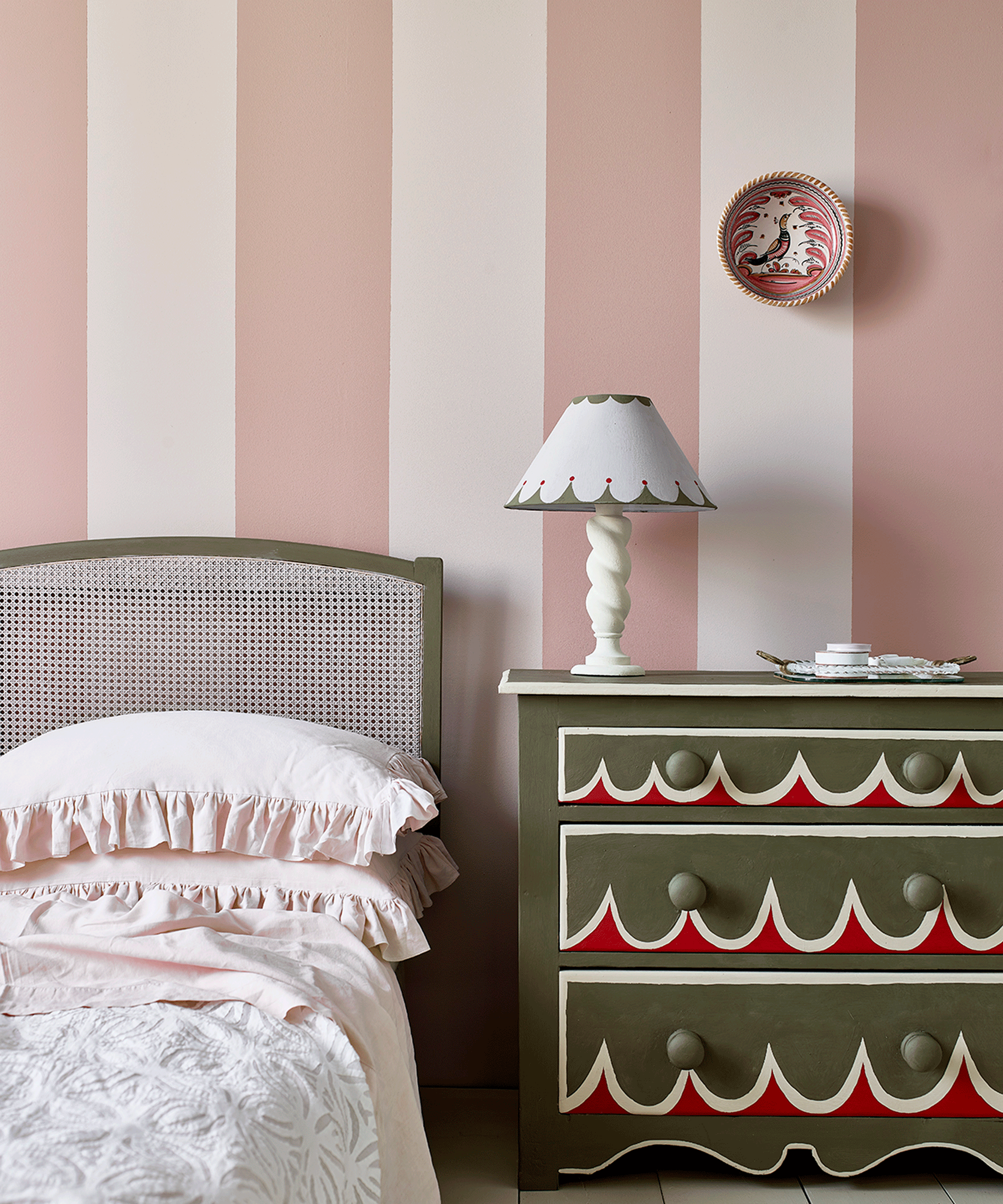
For a whimsical decorating idea that makes use of more than one color, take pattern to your walls by painting stripes. 'Stripes are a great way to make a bold statement and the contrast between the paint colors will obviously affect how bold or subtle the wall is,' says interior designer Amy Youngblood of Youngblood Interiors. 'I recommend them as an accent wall especially if your room is small as to not overwhelm and close in the space.'
While it might take a bit of extra effort, knowing how to paint stripes on a wall isn't as difficult as it seems. 'When painting stripes, take your time to accurately tape off the stripes as this will really affect the accuracy of the lines. Vertical stripes can make a room with low ceilings look higher, while horizontal stripes can make a small room look larger.'
19. Paint built-ins to match walls
Color drenching refers to a relatively new paint trend where you paint the ceiling and walls the same color. You can also, even, include the trim, doors, crown moldings and more in your one-color scheme, painting the entire space in a single shade. The effect? Not only does it create a pared-back canvas to decorate, lending a modern look even to spaces featuring more traditional architectural details, but it also plays with the dimensions of the rooms by blurring the lines between the ceiling and the walls.
'These days with all the chaos in the world, creating a cocoon in one's personal space is more important than ever,' adds interior designer Lia McNairy of LALA Reimagined. 'This is why we love to paint the ceiling, walls, crown molding and baseboards all in one color to give us a sense of security and make one feel like we are living in a jewel box. Small rooms are perfect for experimenting with a bold color and especially a powder room to get your feet wet without having to make a huge commitment elsewhere in the house!'
20. Transform with two tone walls

Two-tone walls with the introduction of a dado rail that runs between the colors is one of the most on-trend ways to transform a room. What is dado rail? It's an architectural molding often found in most Georgian, Victorian, and Edwardian houses where period features have been preserved or restored. They are used in modern interiors to provide a break between the lower portion and upper portion of a wall and a fun opportunity to use a variety of wall-coverings or colors within the same room.
'For the chic hallways, we painted the lower half of the walls a creamy coffee color and used a light neutral on top then added a smart black dado line and black door frames to create a strong visual connection,' explains Sevverine Lamonglia, lead designer at Soho House. 'Two-tone walls can transform a space, it adds depth and detail to a wall. It is also easy to do and a cost-effective way of adding character.'
21. Match your skirting with the wallpaper

A really easy way to update your bedroom colors (or colors in any room really) that doesn't require a complete overhaul and most likely an afternoon of relaxing DIY is by painting skirting that is often kept simple in a bright hue.
'Skirtings and cornices don’t have to be an off-white and eggshell and gloss don’t have to be left just for the woodwork,' says interior designer Octavia Dickinson. 'While decorating a bedroom, I picked out colors in the wallpaper and painted the skirtings in a bright glossy blue which instantly modernizes the room and frames the wallpaper.'
22. Color contrast adjoining rooms

Choosing contrasting colors in adjacent rooms and considering how room colors look when viewed from one to another is a clever way to create a flow of hues throughout the space.
'When deciding what colors to use in two adjoining rooms consider the conversation between the spaces,' says interior designer Natalie Tredgett. 'Our eye is drawn to warmer colors, so lead with a pink, coral, or terracotta to naturally draw someone in that direction. Then create layers and complexity by making the next room a cooler color like green, teal, or blue.'
23. Blend different tones with an ombre application

If you can't decide on one color trend to decorate your walls, why not embrace multiple? Ombre walls are a great way to blend all your favorite shades for a decorative gradient effect that makes a real statement.
'An ombre technique, this look can add a soft flow yet interest to your space,' says Amy. 'Ironically, this technique is very similar to painting stripes. The trick is to select three colors in the same color field and paint each in stripes starting with the darkest at the top and blending well with a brush before the paint dries.' You can also wet your brush as you go to help blend the colors together.'
24. Layer a symphony of whites

Is going all white really a color update when it is one of the most common color choices when decorating an interior? Far from ordinary and safe this lovely white kitchen belonging to designer Caroline Feiffer layers a symphony of whites in an array of finishes and features highlights of glossy white marble and burnished silver details from kitchen accessories and exposed pipes.
'I love a gallery approach to designing in general, using a white space and for objects to be able to stand out without any noise,' says Caroline Feiffer, founder of Studio Tutti Meme. 'I therefore naturally turn to whites and especially warmer whites as these give a sense of sunlight flushing in. The color in this kitchen from our old townhouse apartment, features a brighter matte white on the walls, the beams a more glossy and a bit warmer hue, and for the kitchen a warm white from Farrow and Ball called Pointing No. 2003, a warm and delicate white.'
25. Take color to the window frames

Your window frames are the perfect canvas to experiment with paint too. For a feature, you could use an accent color to decorate your windows, or to make your woodwork act more cohesively, try painting it to match other elements in your space, as in this living room paint idea by Studio Munroe.
'Here, we used the same color paint on both the trim and ceiling, so the floral wallpaper was the star of the room with the lovely architectural woodwork details clearly taking the backseat,' says Emilie. 'If we had highlighted the casework in a separate paint color, the room would risk feeling overwhelming or chaotic with each element vying for the front stage.'
26. Embrace the trend for glossy finishes

Inspiration for paint ideas is everywhere and borrowing from your favorite restaurants and design-led haunts is an exciting way to bring a little bit of that social buzz home. Take this space for instance, drenched in gloss paint that uplifts the vibe of the interior.
'The color palette was inspired by Grand Sicilian Manorhouses,' says Andy Goodwin, founder of Fettle Design. 'We utilized pale yellow polished plaster with a high gloss finish and applied it with a brush to ensure that the strokes create movement and texture. Using high gloss paint finishes helps to ensure the available natural light bounces around the room.'
27. Give old floorboards a new lease of life

Painted floorboards are a classic look, and you can create so many looks to suit your style from super simple whitewashed boards to checkerboard flooring or stripes as can be seen here.
'To effectively paint floorboards keep in mind that good preparation is the key to a good result,' says Julia Mack, founder of Julia Mack Design. 'To start, determine the existing top finish then remove it by trying a mix of hot water and soap for a wax finish or for polyurethane. Start by hand sanding, being certain not to scratch the floorboards. If this proves to be an impossible task, contact a professional who can come in with a professional operator and the precise machinery for your project.'
Once prepared, you can then, apply paint following the lengths of the floorboards as evenly as possible. Use 'a 4" roller followed by a wide brush in a feathering manner, being mindful not to mistakenly touch the baseboards with paint,' adds Julia. 'Let dry overnight then do a light sanding and vacuuming followed by an even and smooth second coat.'
28. Use paint to revive old furniture

Upcycle tired furniture to breathe new life into old pieces. A great weekend project, you can give a big boost to your interior by repainting chairs, tables and stools. Bright yellows, bold blues, vibrant reds, and rich emerald greens are our favorite choices for invigorating old furniture.
'There are lots of paint options for repainting furniture so think carefully about the intended use for your piece,' says Julia Mack. 'Latex is the most widely available paint but if your piece is prone to heavy use, like kitchen chairs for example, odds are that you'll get chips on a regular basis. Consider instead an eco friendly chalk or milk paint, both which are less heavy than a traditional latex. Plan to apply several coats until you get the desired finish and keep in mind that it dries fast giving you a chance to easily build in both depth of color and texture.'
29. Go paintless and embrace a raw plaster finish

Raw limewash paint walls have a beautiful texture and inject a subtle, earthy wash of color to your home. They provide a wonderful canvas for brighter colors to shine too, from pastels to bold neons like in this light-filled bathroom by interior designers Holloway Li.
'Don’t use any paint at all and retain the raw plaster look,' advises Alex Holloway, founder of Holloway Li Interior Architects. 'We found a sealer called PROTECTiT100 that binds the raw plaster so it doesn’t leave a dusty deposit and means the space captures the raw feeling and is a lot easy to repair and patch over time, without having to repaint the whole room each time.'
What brand of paint should I buy?
First things first, work out your budget. There are certain paints that cost a lot more than others, and while you may be paying for a better overall finish on the walls and easier application, you can still achieve great things with more budget offerings.
Paint preferences are specific to who you are and how you like to paint. Ask for recommendations from friends or even contractors, but if you check out the reviews online, you're likely to find just as many negative as positive ones, depending on who the person is and the sort of paint they like to use.
If you're hung up on a particular shade from a high-cost brand, it may be possible to color match with a cheaper, custom-mixed paint company. However, bear in mind that the make-up of the paint actually effects the final look in the room and how the light hits it, so it's impossible to perfectly replicate this element.
Where should I start painting a room?
In general, all rooms are painted from the top down, so if you have a ceiling to paint, start there before doing the walls.
Most painters and decorators advocate for 'cutting in' first – this is where you paint around the edges with a paint brush – before using a roller to fill in the rest of the wall.
What paint ideas can I create with tape?
Decorator's tape is a useful tool for getting the best finish when it comes to how to paint a room, but it can also be used to create interesting paint effects on your walls and more.
Tape can be used to mask out areas for a color blocked scheme. For example, while you could even use tape to create stripes or a grid-like design too. Many people have found tape useful for angular, geometric wall designs, though these have fallen somewhat out of fashion for more organic shapes, which would need to be painted freehand.
3 paint products to create an eye-catching interior

Type: Waterborne Alkyd paint
Price: $79 per gallon

Type: Water-based paints
Price: $40 for 3 litres

Type: Acrylic paint
Price: $75 for 3.7 liters
