Ombre walls are having a moment – these 5 rooms have the best, most elevated versions of them
This bold decorating trend is making a comeback - but designers are taking a different approach to gradient walls this time around

There was a moment in time when ombre walls were everywhere. If you could get your head around how to paint one, it was the DIY project to turn to for instant, dramatic impact.
As quickly as they became an interior design trend, they seemed to disappear, too - replaced by newer paint trends like limewash and the rise in textural wall finishes.
However, we've noticed the ombre making a return in design of late, but under a slightly new guise. These 5 rooms with ombre walls bring together the soft, yet graphic nature of gradient painting schemes with these textural effects, including rough-plastered walls like stucco, proving that the ombre wall can still work for a modern scheme.
1. This dramatic color-drenched ombre

When the ombre wall was the big thing in interiors, we hadn't quite arrived at another paint trend that's defining how we decorate our homes currently: color drenching. The last incarnation of the ombre paint effect existed almost entirely as an accent wall, while these days we're seeing designers painting the ceiling and walls the same color for a modern look.
This bedroom, designed by Russian design studio Le Atelier, shows just how these two trends can intersect with a bold black and white ombre. The ceiling is painted black to match in with the walls, while even the carpet is color-matched with the base of the ombre.
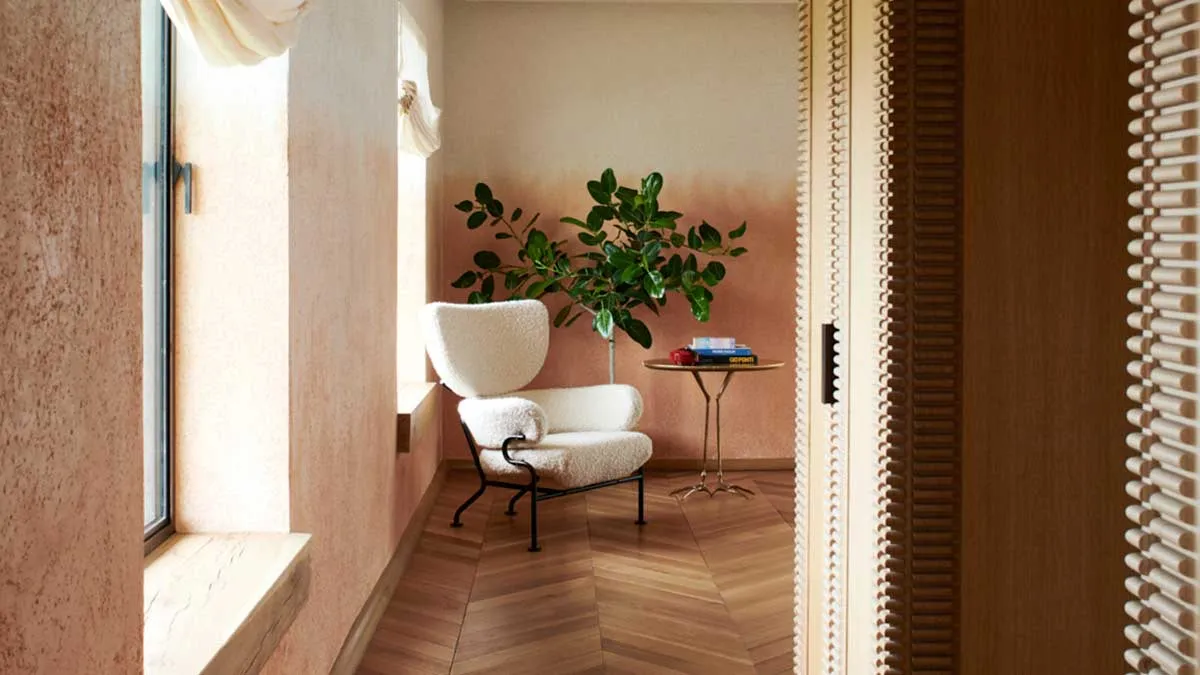
2. This 'apricot' ombre

For an even more elevated approach to the ombre wall, it's possible to specify plastered walls with this color-shift - retaining the natural texture of the walls. In this modern bedroom by Ike Baker Velten and Kligerman Architecture & Design, the soft apricot ombre feels like it has real depth, thanks to the method used to achieve the look.
'The architect, John Ike, had a vision for the primary bedroom with ombre walls,' says Mia Jung, director of Interiors for Kligerman Architecture & Design. 'Typically, we choose the wall color after the furniture, but here I selected the color first. We connected with a plaster worker that was able to match the apricot shade and I told him where to place it on the walls.'
3. This monochromatic backdrop for a colorful living room

One of the easiest ways to achieve a faultless ombre is with wallpaper, as demonstrated by this modern design in the living room of interior designer Justin Charette.
'I’m not a large fan of accent walls,' Justin tells us, 'but in this particular case I did think it was necessary. The wall across from the ombre wall already had a large piece of art. I didn’t want art to compete with this piece, and I thought mirrors would reflect too much light from the nearby windows.'
Even though it's an accent wall, this design specifically feeds into the same ideas as color drenching, removing a contrast where the ceiling meets the walls which can help the room look bigger. 'I like this ombre wall because it creates a sense of height in a relatively short space, and I hate when wallpaper has a harsh line from paper to paint,' Justin says. 'The black-to-white ombre blends in beautifully with the white ceiling.'
4. This kitchen wall with golden touches

To make your ombre look more elevated, choosing a subtler color transition is an easy way for your idea to feel a little more effortless, but that doesn't mean that it's going to lack drama.
In this kitchen designed by French design studio Le Berre Vevaud, an ombre wallpaper designed by Solène Eloy incorporates metallic gold elements that balance out the mottled, almost-grungey gradient of the design. The result is a spectacularly sophisticated kitchen, especially where it draws out the colors of the statement kitchen island.
5. This two-tone colorful powder room

The ombre walls featured so far all have one thing in common - they're some variation of color to neutral gradient. However, if you're someone who is happy to embrace the more-is-more approach to color in your home, you can switch up that white base for something more colorful and even more dramatic.
For this powder room, Texas-based design studio Ashby Collective created a gradient with two colors of waterproof plaster to add the wow-factor to this small space. It's gentle sheen really highlights the beauty of this plaster finish, and the rich, jewel-like tones of the colors chosen.
3 of the best ombre wallpapers

Price: $7.50 per foot

Price: $33.33 per roll
Coverage: 72 square foot

Price: $4.65 per foot
