Hold the Boring Room Colors — This Juicy Orange Is the Shade Creative Designers Are Using for Energetic, Modern Schemes
Mango Swirl is bold, saturated, and will instantly make any room you use it in more memorable

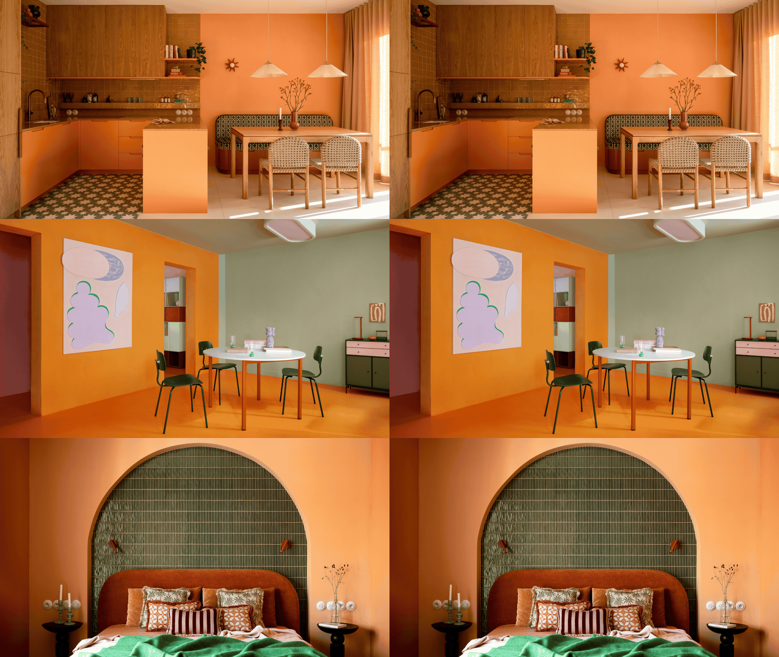
To me, July is peak summer. June marks an exciting beginning to the season, and August hosts the long dog days, but July? July is steadfast, full of sunshine, and the idea of holidays, picnics, and long evenings seems endless. Which all leads me to believe that Livingetc's color crush this month was no coincidence. Mango Swirl is a zesty orange that bleeds into all of the best moments of summer.
Mango fruit, oranges, tropical flowers — when this shade appears in nature, it leaves a memorable impression. And the same could be said for using Mango Swirl in your interior design. Who forgets an orange-drenched room? Yet, decorating with orange is too often avoided. The color gets a bad reputation for feeling dated or distracting. I get it, orange is intense, but when you give a shade an identity, it becomes more palatable.
That's why Mango Swirl feels more approachable and exciting. Its yellow undertones are warming, and its saturation is exciting. In a design moment where color trends are currently favoring the bold, why not try your hand at one of the most underrated colors in design? Here's everything you need to know about July's color crush, Mango Swirl.
What Color Is Mango Swirl?

A drench is going to be rather bold, but with the right pairings, it's so unique.
Image credit: @ur_bureau

Paired with the light sage green, Mango Swirl feels surprisingly calm.
Image credit: Montana Furniture
Just like how our previous color crush, Pomegranate Pop, isn't just 'red', decorating with color takes on a stronger identity the more specific you get. And like with every hyper-specific color, Mango Swirl isn't just orange. It's bolder and brighter and has a softness that gives it an elevated, nuanced edge.
Technically speaking, Mango Swirl sits between yellow and red on the color wheel, but leans slightly more yellow. These yellow undertones are what give Mango Swirl its vibrancy and zest. But, of course, you need to consider how lighting affects paint colors, too. Darker rooms will bring out its reddish tones, while direct sunlight will make it feel like a vibrant ray of sunshine. There is a very subtle, peachy softness that makes Mango Swirl feel that much more approachable and familiar — think of it as a saturated take on those iconic Italian color palettes.
Oranges, like Mango Swirl, can definitely be intense, but when used correctly, they evoke feelings of energy, warmth, and creativity in the home. Use this shade in spaces where you want to invite conversation and connectivity — below are some ideas to help inspire your next Mango Swirl-ed space.


How to Use Mango Swirl in Your Home

Playing with light and texture in a Mango Swirl room will instantly elevate it.
So, the big question: how do you decorate with such a saturated color in interiors? Well, there are a few ways you can go with Mango Swirl (and each results in a room destined to turn heads).
A Mango Swirl color drench will obviously be the boldest way to decorate with this hue. It may seem crazy, but when done well, it can work beautifully. The key is to rely on a tonal drench rather than a flat application of the color. Paint trim, doors, and bookshelves a different shade of orange to create visual depth and keep Mango Swirl from feeling too overwhelming.


All of the different moments of Mango Swirl in the cheery bedroom tie the scheme together.
Or rely on colors that go with orange in the room to help tone down Mango Swirl's intensity. "While pairing with other saturated colors would look great on paper, the reality is it would create a much too vibrant space to fill a room completely with this color and others like it," color expert Amy Krane tells me.
For instance, Mango Swirl is gorgeous with hot pink decor, but in a room, something softer or a neutral color palette would look more elevated as a base.
Amy suggests moodier colors, too: "I like it with brown, dark greens, and charcoal gray," she says. "Or, it would be great with navy blue, its complement."
Alternatively, "accent pieces of Mango Swirl against a dark or neutral background would work," adds Amy.

Amy Krane is an architectural color consultant who was trained by the founder of the International Association of Color Consultants/Designers of North America, Frank Mahnke. She regularly contributes to interior publications on all things color and is the host of the design podcast, Let's Talk Paint Color.

You can always use Mango Swirl as a beautiful accent moment. Just a single pop brings a room to life.
Decor is probably the easiest way to try your hand at decorating with Mango Swirl. It takes the pressure off of making a disastrous painting mistake or accidentally overwhelming a room.
For instance, Amy says, "It would make a smashing sofa or another piece of upholstered seating in an otherwise neutral room." An accent chair in Mango Swirl provides the same contrast as design techniques like the 'Unexpected Red' theory.
"Mango Swirl shouldn't be the only loud blast of color in the room," adds Amy. "There ought to be a few more applications of it dotted around the room." Perhaps an orange lamp or decorative vase to tie it all together.
Alternatively, there are specific moments where Mango Swirl always works well. For example, Amy recommends it for kids' bedrooms. Or you could even bring orange into your garden (it's a major garden furniture color trend, after all)... "Or even a front door color in a home painted a very dark color," adds Amy.


Orange doesn't have to be a shade that's scary to use in interior design. Joyful colors have their place when done well, and can elevate a room from plain to personalized and unique.
For more inspiration like this, be sure to subscribe to the Livingetc newsletter.
