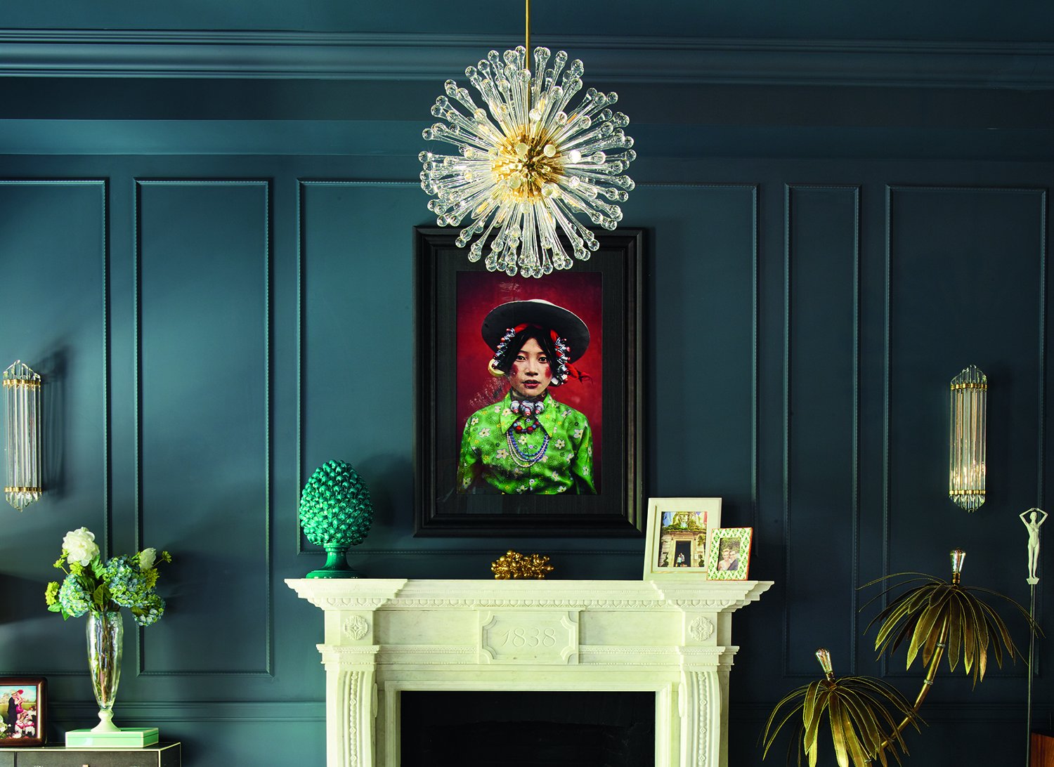
Hague Blue living rooms are having a moment. In fact, nothing feels more now than this rich, indigo color, daubed on sitting room walls and details. Why not call it? Hague Blue, a paint which has been an enduring favorite on Farrow and Ball's chart, is the shade of winter 2022. There, I said it.
Sophisticated and rich, Hague Blue living rooms lend themselves to the new mood. 'How people want to decorate has recently shifted,' says the designer Lee Broom. 'Look at what we’ve all been doing the past year or so. Stuck at home, we’ve been getting experimental, honing culinary skills or learning how to make cocktails. Now, it's about bringing that into the real world and, like in the 1970s, there is a huge shift towards home entertaining and creating spaces to have friends and fun times in. Anything that is a bit playful and glamorous and dramatic.'
And no one color could be more playful, glamorous and dramatic than Hague. 'It has nuances to it that can make it look deeper blue in the dark and then its green notes come out to play in sunlight,' says Patrick O'Donnell, Farrow and Ball's brand ambassador.
Article continues belowIt also has grey undertones, making Hague Blue a neutral shade of paint for people who want to be more daring with their living room ideas. So I've asked the experts how to get it right.
Hague Blue living rooms - the expert guide
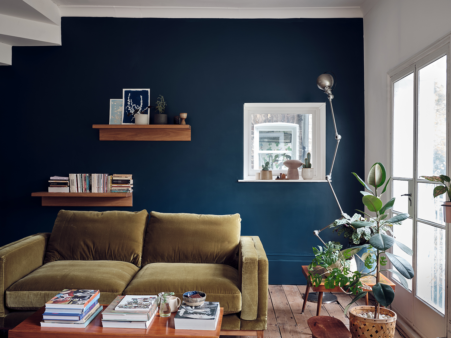
1. Let Hague Blue elevate a bookcase
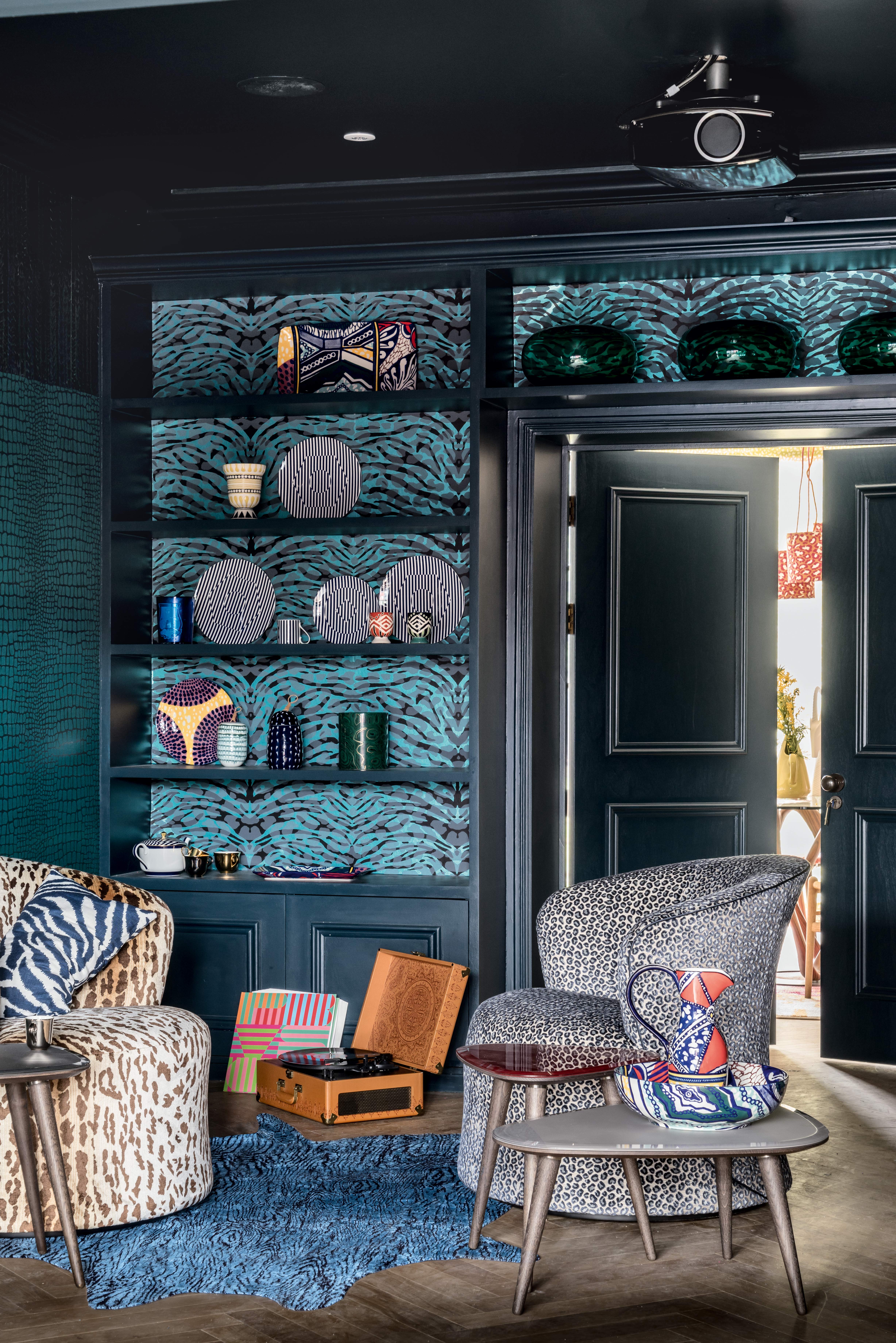
As one of the most versatile modern living room paint colors, Hague Blue can be used to create a dramatic statement on fitted furniture.
'Hague Blue can be very impressive, even when used solely on a bookshelf,' says Patrick O'Donnell. 'Use the modern eggshell finish, and you'll see those green undertones start to come out - it will take on an almost petrol-like quality.' A fantastic entry level approach to playing around with the shade.
2. Pair with flowing curtains
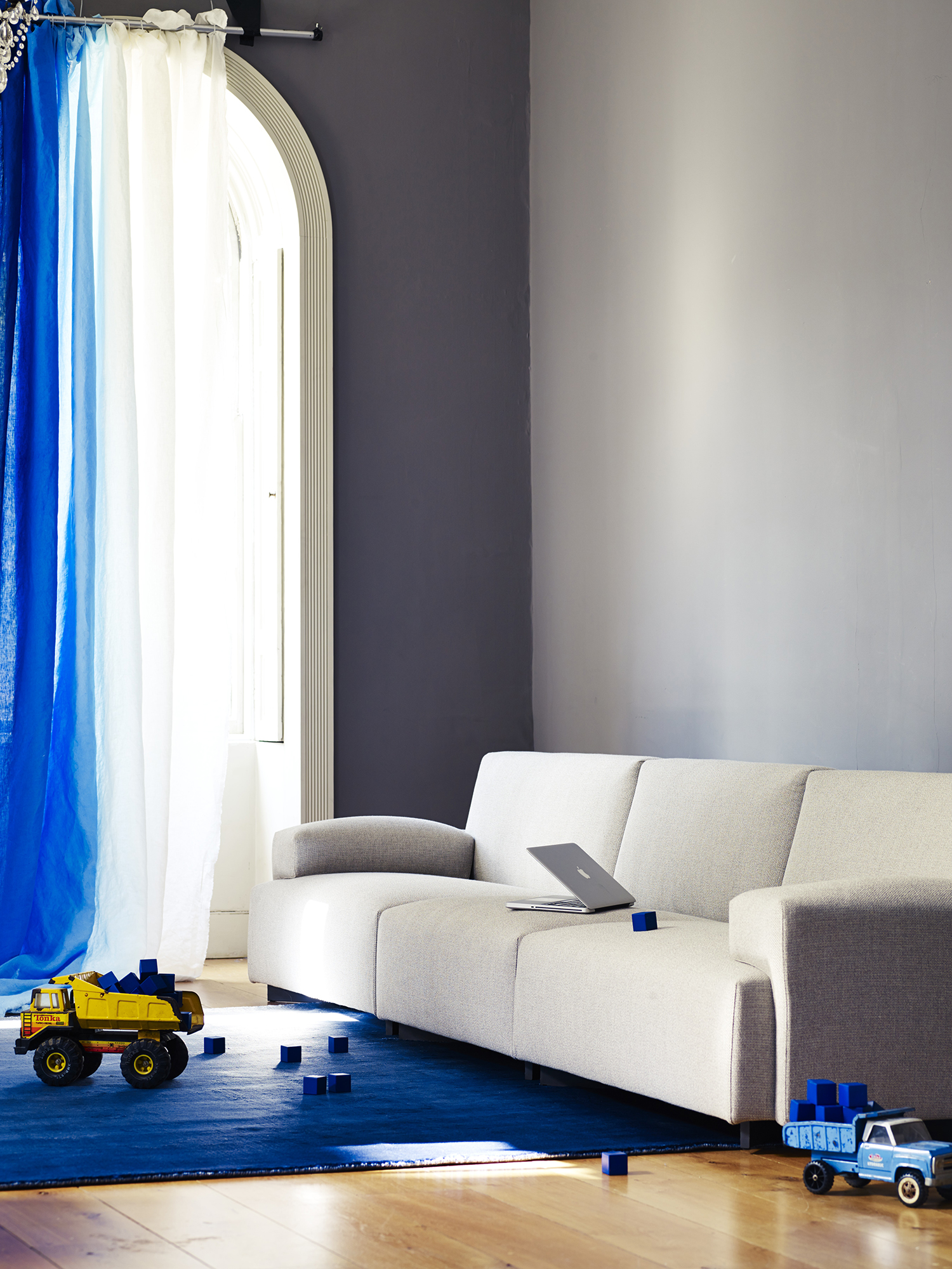
Sofa by Poliform, Walls in Hague Blue, Farrow and Ball
The magic of Hague Blue means it has a tendency to look dark in dull spaces, light in brighter areas. Both walls above are painted in it, but because of the light, the wall facing the window almost seems a different shade.
The Livingetc newsletters are your inside source for what’s shaping interiors now - and what’s next. Discover trend forecasts, smart style ideas, and curated shopping inspiration that brings design to life. Subscribe today and stay ahead of the curve.
That's not the only trick to bring out the playfulness of this magical shade - living room curtain ideas come into their own here. 'Due to its almost neural tone, it can be easily combined with a variety of colors,' says the interior designer Eva Sonaike. 'I'd also suggest pairing it with flowing natural linen curtains for texture to break away from the seriousness of the dark tone.'
3. Complement Hague Blue with Old White
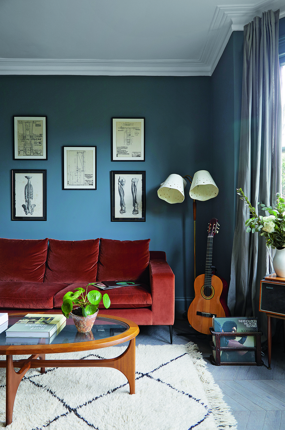
Wall in Hague Blue, ceiling in Old White, both Farrow and Ball
The great thing about working with Farrow and Ball's color chart is you can always find complementary shades which work perfectly together. For a more traditional approach to these living room trends, Patrick suggests pairing Hague Blue with Old White, as seen above, used on the ceiling.
'Elegant and traditional, Old White is the ideal partner if you want a space that is really liveable,' Patrick says. 'It has a slight dirtiness to it, it's not a brilliant white, and Hague Blue will pick up its green notes well. And vice versa.'
4. Drench the room in Hague Blue
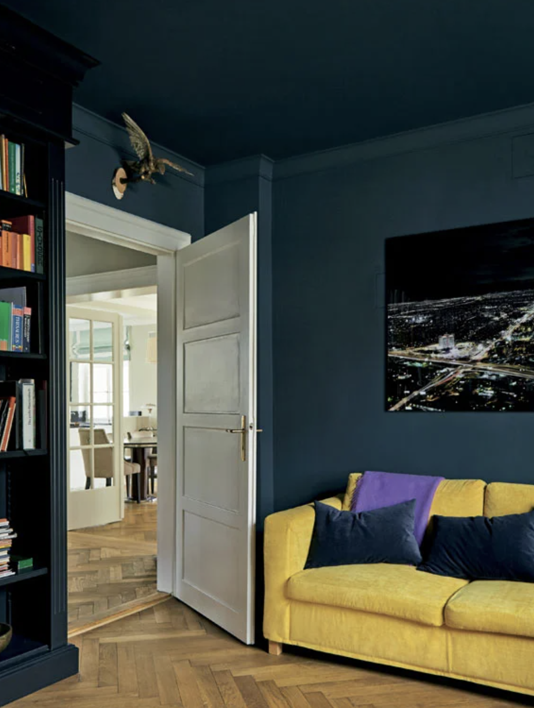
When it comes to maximalism in interior design, sometimes this isn't about having things, but about going all out with color. Step forward Hague Blue.
'I love the depth and richness of Hague Blue,' says interior designer Eva Sonaike. 'This shade of blue represents knowledge, power, integrity, and seriousness. If you have enough natural light sources, I would recommend using Hague Blue across a whole living room, including the ceiling for a dramatic effect.'
That definitely doesn't make it a dark scheme, however. 'To lighten it up I would bring in statement furniture, such as a large, bright velvet sofa for color,' Eva says.
5. Use Hague Blue as a backdrop to art
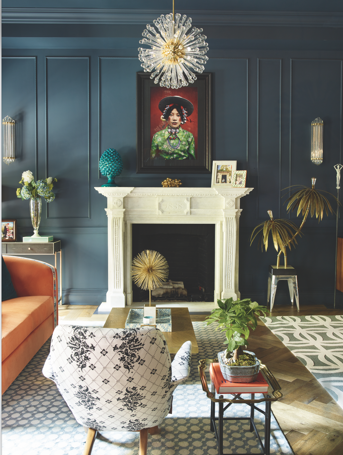
Design by Rebekah Cauldwell
Designer Rebekah Cauldwell, who created this scheme above for her own home, says art is the most important part when it comes to how to design a modern living room.
‘Art is always part of the picture for me,’ Rebekah says. 'Our collection is simply about who and what we have connected with at times in our life, whether a color, a mood or an idea. For me these final elements are what gives a house soul and a touch of magic.’
It's no wonder she chose to place such revered objects in front of Hague Blue walls, then, as Patrick O'Donnell says it's the perfect shade. 'Hague Blue is fantastic for hanging art,' he says. 'It makes all the artwork come alive.'
6. Add a striped wallpaper
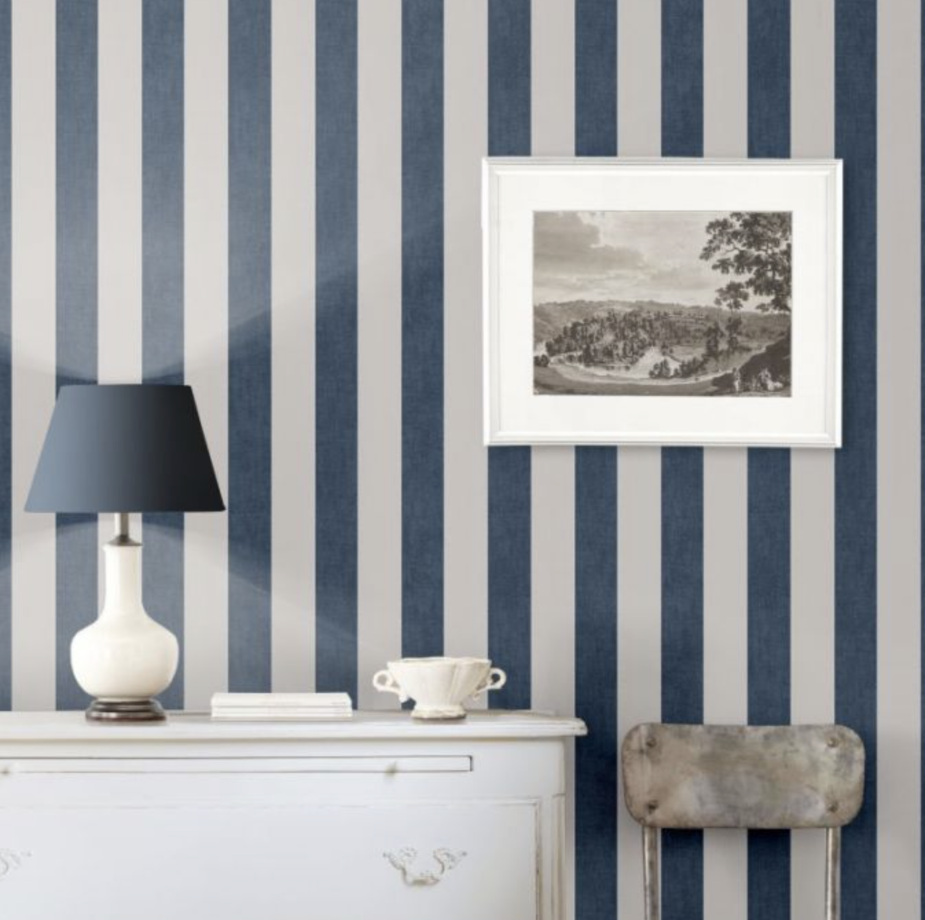
Mapleton Stripe wallpaper by Ralph Lauren
Designer and Livingetc columnist Minnie Kemp knows all about elegant living room ideas.
'There is no messing around with Farrow and Ball's Hague Blue,' Minnie says. 'It’s a color that exudes order. I wouldn’t want to see it used across an entire room but instead dashed cleverly on woodwork to give a tailored, chic feel to the room.'
Minnie thinks a great way to use the shade is to combine Hague Blue with carefully chosen living room wallpaper ideas. 'Why not combine with Ralph Lauren's “Mapleton Stripe” wallpaper– this is very Hamptons.' As seen above, with a lampshade in a fabric akin to Hague Blue, it's a smart pairing.
7. Group with primary colors
Minnie Kemp's New England-style approach isn't her only suggested for Hague Blue living rooms.
'For something a bit more unusual I would paint the walls in Farrow and Ball's Sudbury Yellow and use Hague Blue for cupboards and leading edges of bookshelves,' Minnie says. 'Inside the bookshelves and for the cornicing I would use Farrow and Ball's Picture Gallery Red. The three colors complement each other without being too overbearing.'
8. Contrast with Studio Green
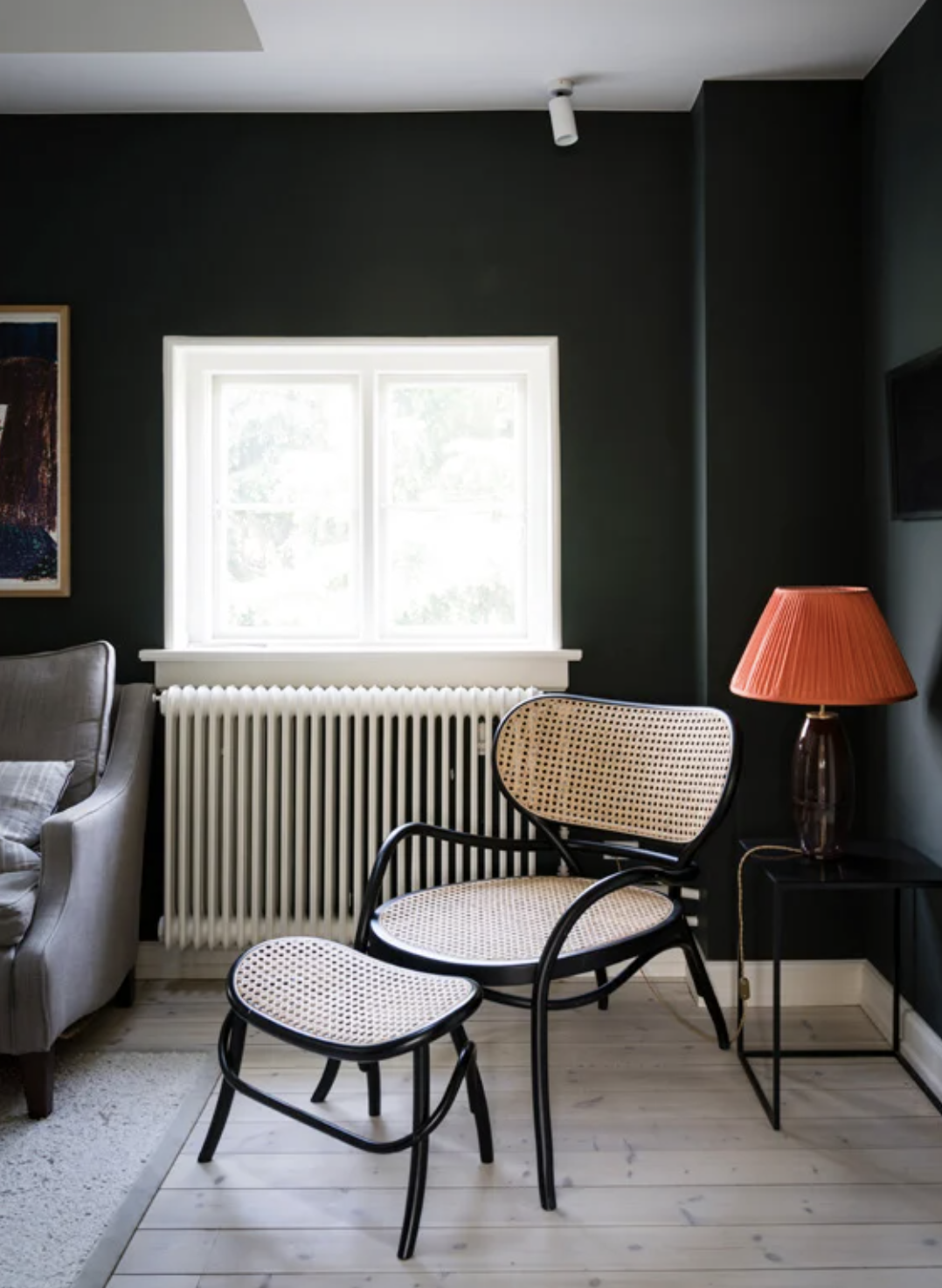
Patrick O'Donnell has a different idea for a color to pair with Hague Blue, and thinks Farrow and Ball's Studio Green is ideal. It's on the walls above (sadly we couldn't find a picture of the two of them together, but hopefully you can imagine a deliciously dark space).
'If you want something really bold, please put Studio Green with Hague Blue,' Patrick says a surprising take on colors that go with green. 'The blackness of the green just really lifts the dark blue and feels really modern. Use that on Studio Green on the skirting, and architraves, with Hague Blue on the walls.'
9. Make it with pop with orange accents

Charlotte's Locks by Farrow and Ball
While Eva Soniake suggested using bright velvet furniture in Hague Blue living rooms, Patrick O'Donnell thinks it's ripe for a little weekend DIY project.
'I love to upcycle, to make do with pieces I have and give them new life,' Patrick says. 'Painting side tables in Farrow and Ball's Charlotte's Locks would really pop.' The contrast of the orangey red seems to glow against the deep blue. 'It would look really beautiful,' Patrick adds.
What colors don't go with Hague Blue?
The beauty of Hague Blue is that it magically works with most colors. However, Patrick O'Donnell says it does not go with with grey or yellow. 'Greys wold be too dirty and drab,' he says. 'They would bring out the quietest tones of Hague Blue and stop it from looking so fantastic.'
Patrick also advises against canary yellow with Hague Blue. 'Yellows would be too primary,' he says. 'They would be too much of a contrast. However, if you live in an open plan space, you could have Farrow and Ball's Indian Yellow at one end and Hague Blue at the opposing end, to help you zone the space. Just make sure not to put them next to each other.
The editor of Livingetc, Pip Rich (formerly Pip McCormac) is a lifestyle journalist of almost 20 years experience working for some of the UK's biggest titles. As well as holding staff positions at Sunday Times Style, Red and Grazia he has written for the Guardian, The Telegraph, The Times and ES Magazine. The host of Livingetc's podcast Home Truths, Pip has also published three books - his most recent, A New Leaf, was released in December 2021 and is about the homes of architects who have filled their spaces with houseplants. He has recently moved out of London - and a home that ELLE Decoration called one of the ten best small spaces in the world - to start a new renovation project in Somerset.