5 colors you should never paint a home office according to designers
If you want to create an inspiring space that encourages productivity, these are the colors to avoid in a home office

The Livingetc newsletters are your inside source for what’s shaping interiors now - and what’s next. Discover trend forecasts, smart style ideas, and curated shopping inspiration that brings design to life. Subscribe today and stay ahead of the curve.
You are now subscribed
Your newsletter sign-up was successful
The colors you paint your home office are potentially the most important colors you will choose in your whole home. Sure your bedroom, living room, and kitchen might be the most lived-in rooms, but actually (especially if you work from home) where do you spend the most hours of your working week? Your home office.
And we ask a lot of a home office. It needs to be inspiring and stimulating, but also soothing and stress-reducing. Not too distracting but interesting enough to keep us motivated. These rooms need to be functional but also be a space we want to spend time. Now paint shades are pretty much infinite nowadays, and choosing a color can be a long process, so we (and our favorite designers and paint experts) are going to help you out by cutting out the colors to avoid.
'The best way to look at this is to consider your job - and color psychology - which can help with your choice. For example, creative people can be inspired by bolder colors such as burnt orange or zingy yellows - making an ideal canvas for the walls.' explains Patrick O’Donnell from Farrow & Ball. 'However, more data-driven people will respond better to space, perhaps enveloped with blues and greens to help focus the mind. The main thing is to consider these elements before committing to color and avoid anything that will cause distraction, un-inspire, and not make you want to use the space.'
Article continues below 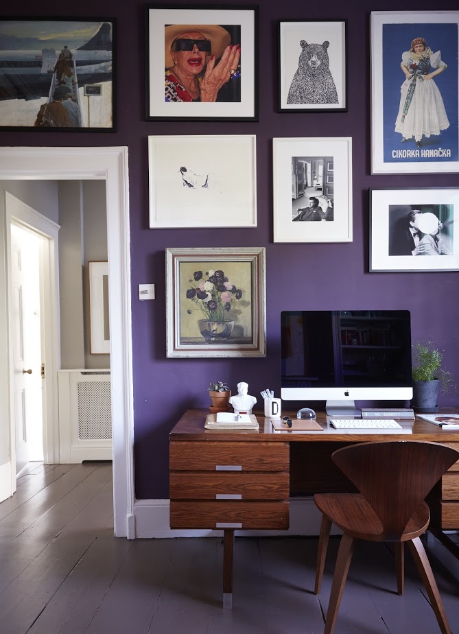
5 colors to avoid in a home office
1. Bright yellow
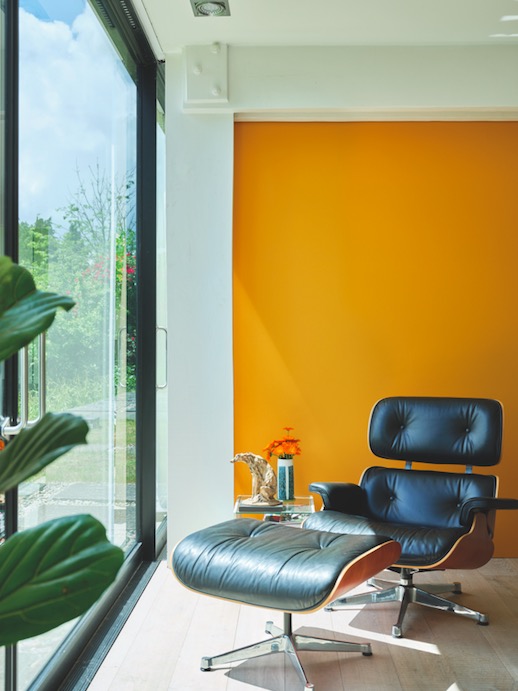
We love a sunny yellow room but as with any bold color trends it's tricky to get it right. It's a shade that can work in a home office in its more muted, softer forms, but go too bold and primary and you'll find yellow overstimulating and distracting.
'Yellow inspires clear thinking as it stimulates the left side of the brain, but be mindful about how vibrant and bright it is.' explains Emma Bestley, Co-founder and Creative Director for YesColours. 'Opt for a muted, calm buttery yellow so it’s not too intense for the space. You want to create a positive sunny feel rather than a disruptive shade which distracts you, therefore be cautious of using zingy bright yellows as this can break concentration.'
'In a home office it's all about avoiding colors that are highly saturated.' explains Tash Bradley, color expert at Lick. 'When you are working, of course, you want to be stimulated, but you don't want to be overly stimulated and you want to avoid being irritable. Avoid bright yellows, bright oranges, bright reds, I'd stick with your greens, teals, and blues and pinks.'
2. Crimson
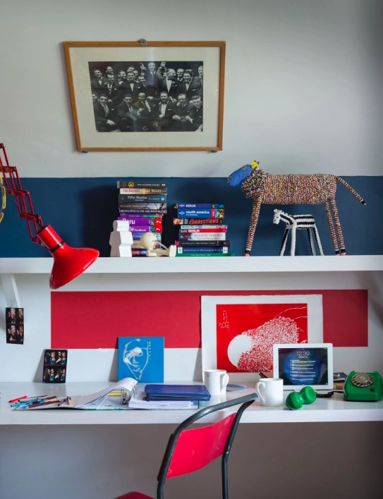
'Red should be carefully considered when used in any area of the home, but especially the home office. It’s a color we associate with warning and alertness and when the color is used in large quantities it can spark an agitated feeling. Instead of primary red, look for a deeper plum or a muted terracotta for a soothing scheme.' suggests Emma Bestley.
The Livingetc newsletters are your inside source for what’s shaping interiors now - and what’s next. Discover trend forecasts, smart style ideas, and curated shopping inspiration that brings design to life. Subscribe today and stay ahead of the curve.
'Painting your home office in shades of red can be quite intense and somewhat distracting, as it is synonymous with feelings of danger and warning signs, so not optimal for a working space.' adds Tobie Lewis, Head of Marketing, Brand and Digital Communications at Valspar. 'Saying that, red can actually stimulate melatonin and help with memory, so if you are opting for a red, we recommend using a pink shade with hints of red instead.'
If you want to bring red into your home office, do so in small accents rather than big swathes. Pick a piece of red furniture or a statement desk light for a retro feel. Or experiment with paint ideas and add a touch of bold red in a shape around your desk, like an arch or a stripe as can be seen here.
3. Black
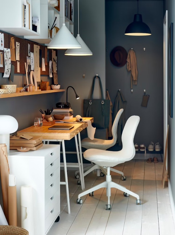
You want to walk into a home office and feel enthused right? And while your morning coffee might have a big play in your enthusiasm levels, the color you choose for your home office can of course affect your motivation too. Dark colors like blacks and browns just aren't going to encourage high energy. So we'd say avoid these very dark colors in large amounts in your home office, especially if you are decorating a small home office, it will feel cave-like and claustrophobic.
But there are dark colors we think can work. As designer Elizabeth Hay says, 'I don’t think you want a workspace to feel too dark and oppressive, if you do want to go for dark colors such as a dark green make sure to balance it out with some fresher tones or white.' A deep velvety blue can be a wonderful home office color too.
4. Cool blues
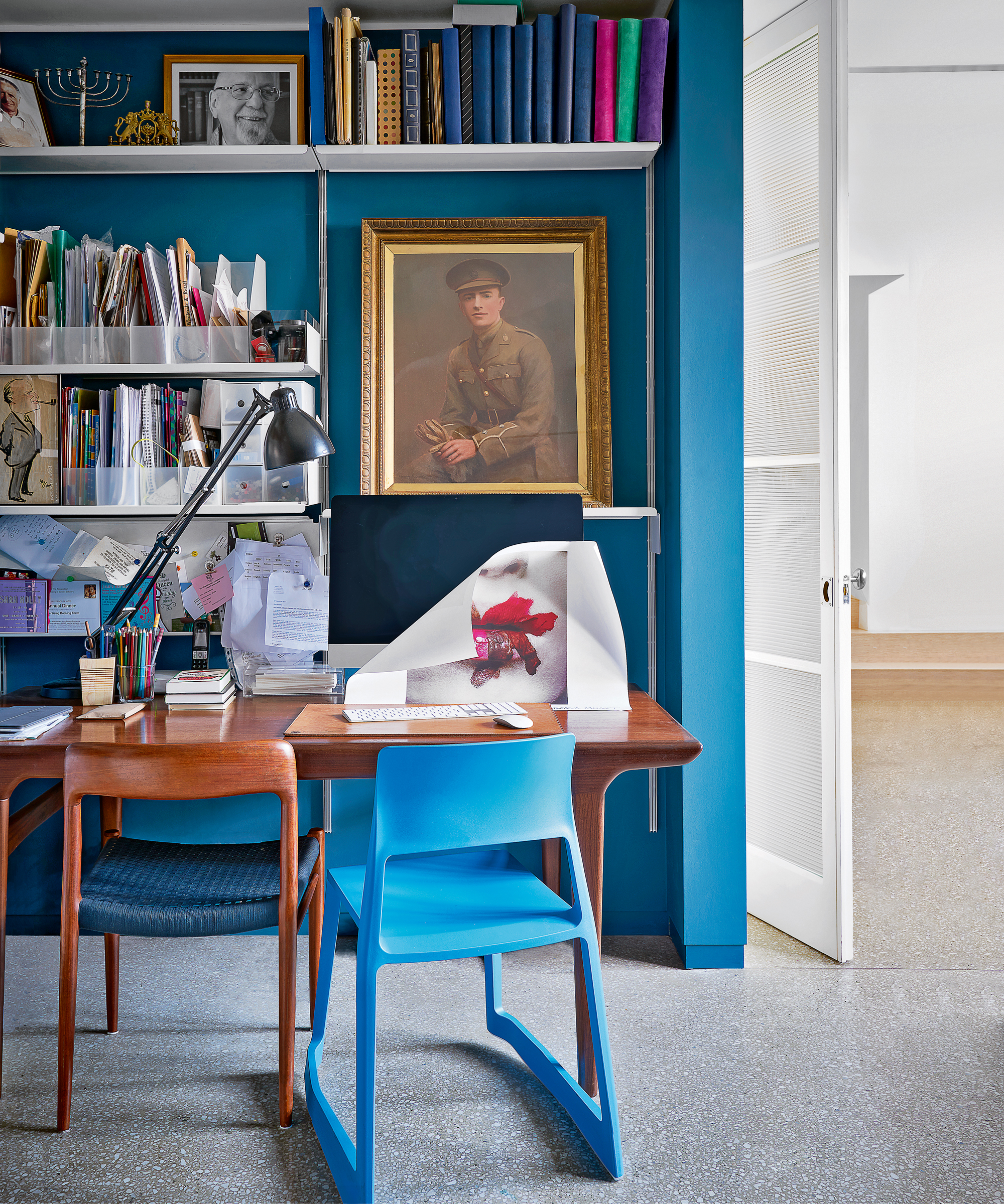
Blue can, in fact, be one of the best colors for a home office, however, there are thousands of blues to choose from and not all of them will have the lovely calming and soothing effect you are after.
'Avoid cool colors such as icy blues or lilac, which may give the space a chilly feel - particularly as a computer screen gives off a blue cast. Soft yellow or pink hues provide a warmer and calming environment to work in. Busy wallpapers can be distracting in a workspace, so should also be avoided.' says Saskia Howard, Creative Director at Howark Design.
So look out for warmer blues with pink undertones that have a softness to them, or go for a deep blue that always has a cocooning but invigorating effect as seen here. Pair it with warm woods and lots of crisp whites for a dreamy home office paint idea.
5. White
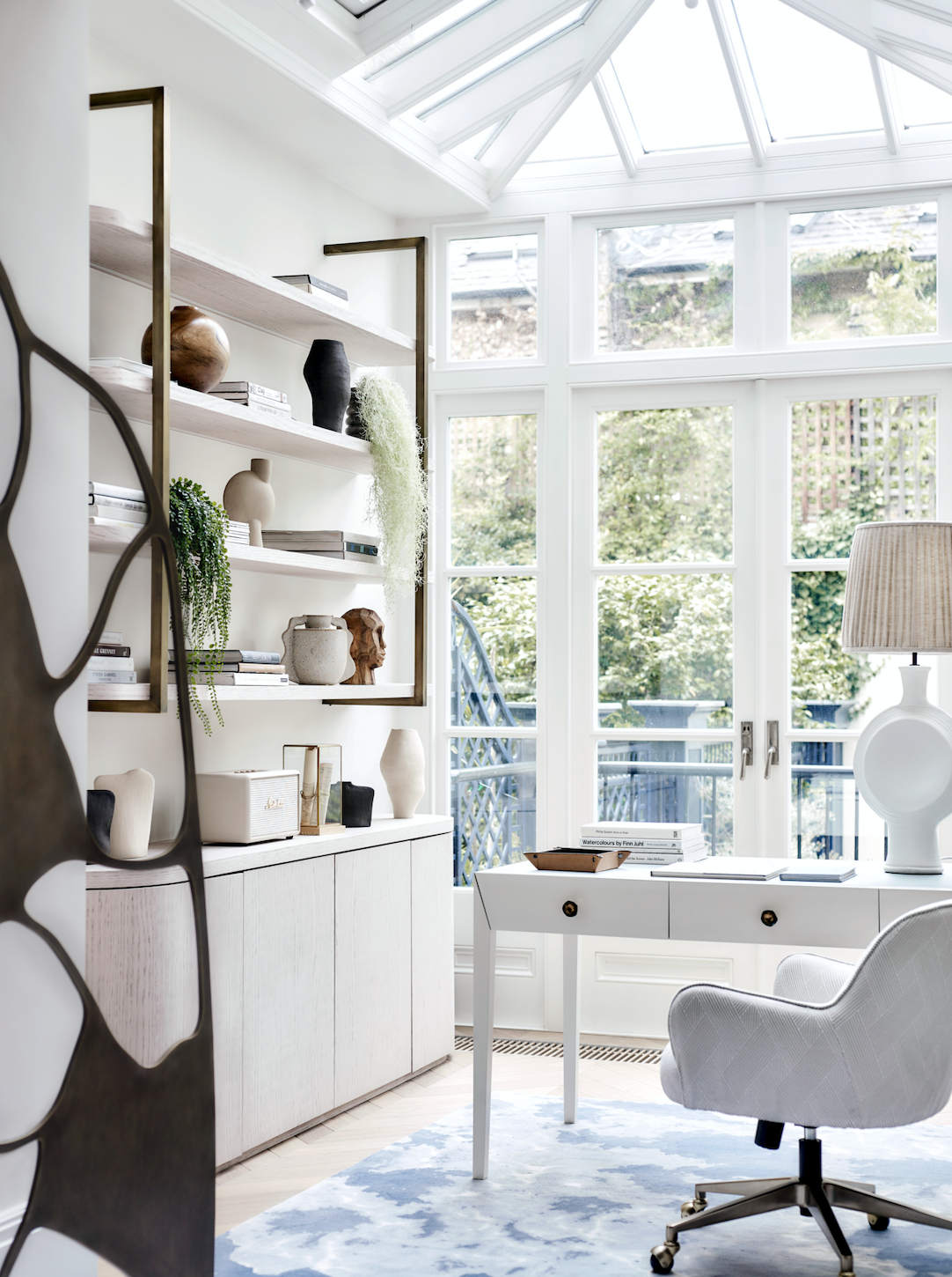
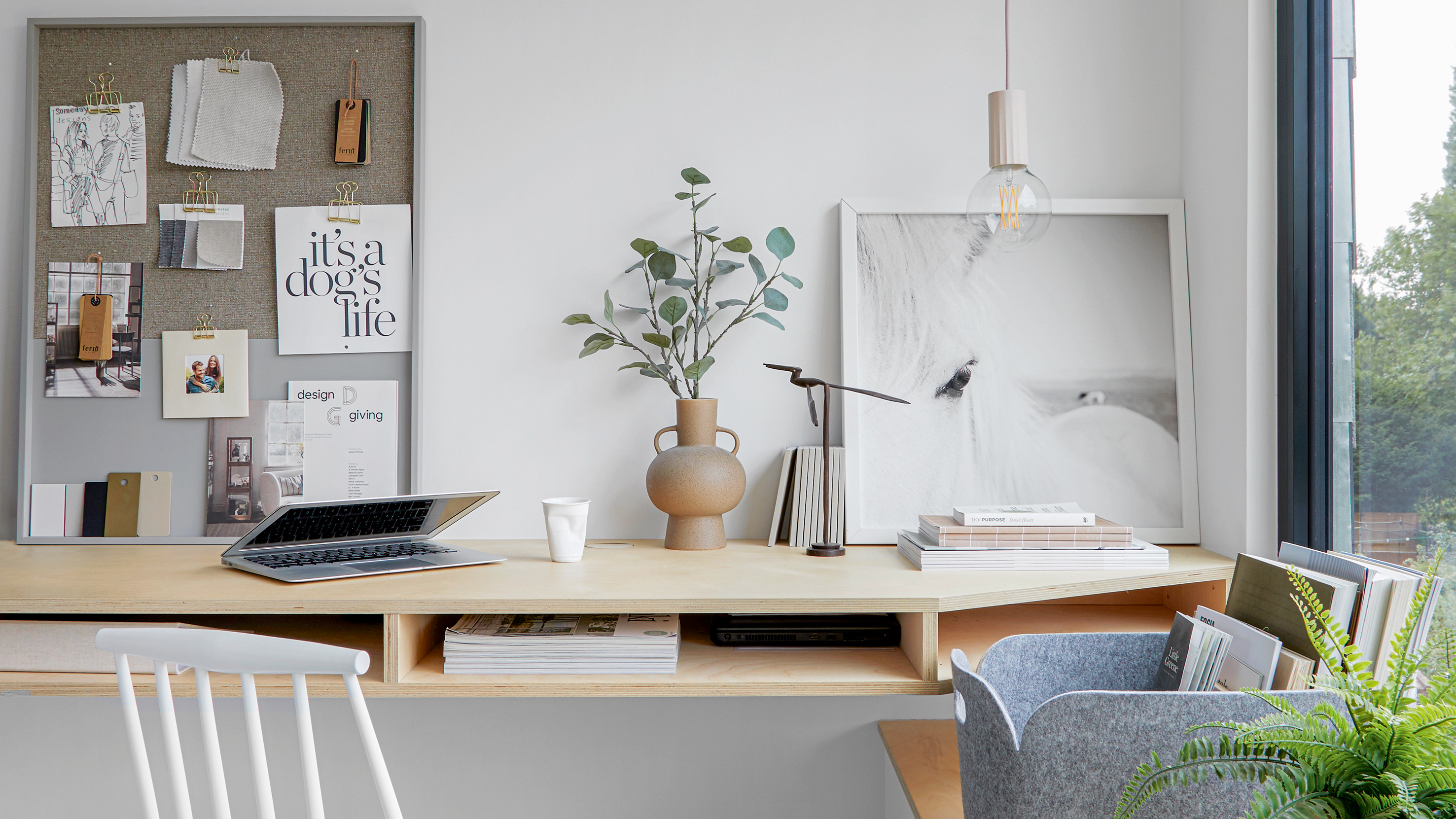
All white rooms can feel quite clinical, and since home offices tend to be very practical spaces by nature, we'd say avoid using lots of white. Especially very clean, crisp pure whites. Unless of course, you are after a very minimalist modern home office vibe – just be sure to add in some wooden accents or houseplants for a touch of warmth and dark colors to ground all the white.
'I would say that an office is somewhere that people spend a great deal of time during the day, so it needs to have some interest but avoid being too overwhelming.' explains Clare Tilbrook of Fenwick & Tilbrook.
'Unless there are loads of interesting spaces or pictures, avoid using just white paint on every surface, it can become too sterile and therefore block creativity. On the other hand you don’t want a room that is all bright red or yellow to work in, very bright colors can become overwhelming and induce a feeling of anxiety or stress.'
What colors are best for a home office?
'The best colors for a home office are colors that make you feel creative, that help to clear your mind. The color of the mind is blue, it's the most mentally stimulating or soothing color, so a dark blue home office is sensational.' explains Tash. 'Dark green is a great color for a home office too, as your eye doesn't have to adjust to the color green. Pink really helps with creativity so another great one to try out.'

Formerly the Digital Editor of Livingetc, Hebe is currently the Head of Interiors at sister site Homes & Gardens; she has a background in lifestyle and interior journalism and a passion for renovating small spaces. You'll usually find her attempting DIY, whether it's spray painting her whole kitchen, don't try that at home, or ever-changing the wallpaper in her entryway. She loves being able to help others make decisions when decorating their own homes. A couple of years ago she moved from renting to owning her first teeny tiny Edwardian flat in London with her whippet Willow (who yes she chose to match her interiors...) and is already on the lookout for her next project.