This achingly cool London home might have the most calming color palette we've ever seen
Subtle tones are peppered with deep indulgent hues in this Kensington apartment, demonstrating how neutral doesn't have to mean bland

Nestled in the heart of south Kensington, London, and neighboring the famous Hyde Park sits this fourth floor apartment, part of a Victorian mansion block. Local designer Tala Fustok has transformed the modern home's interior to suit the surrounding grandeur outside, complete with a serene neutral scheme punctuated by clever uses of color that we couldn't resist sharing.
Tala Fustok Studio was entrusted to design a calming residential space using a style inspired by the owner’s European and North African travels. Soft shades in the bedroom evoke the setting sun, whilst stone textures and earthy-toned textiles offer a harsher contrast. Running throughout all these features is the remarkable balance of neutrals alongside pops of warm color.
The southwest-facing, four-bed home has been enriched with subtle tones peppered with deep indulgent hues, demonstrating that a dominantly neutral and understated palette doesn't have to equate to a bland space. To create a sense of energy, Tala played confidently with bolder statements to build a backdrop for artwork and simple furnishings to enhance the calming powers of this soothing sanctuary.
Article continues below'For this project, we wanted to create a classic space that complemented our client’s lifestyle, whilst also honoring their extensive travels around Europe and Morocco,' Tala says. 'We ensured that nods to these regions peppered the space to integrate those passion points within our client’s home.'
Below, she explains how she took inspiration from nature to curate such a calming color palette, with tips on achieving the look in your own home.

From a young age, interior designer Tala Fustok has had a constant passion for interiors and design, and these same influences have informed her style now seen throughout her work. Her studio takes a fully immersive approach that creates unique atmospheres inspired by their client’s identity. Committed to creating timeless spaces with an innate sense of theatre, and a dash of the unexpected, the studio pushes boundaries in the world of design.
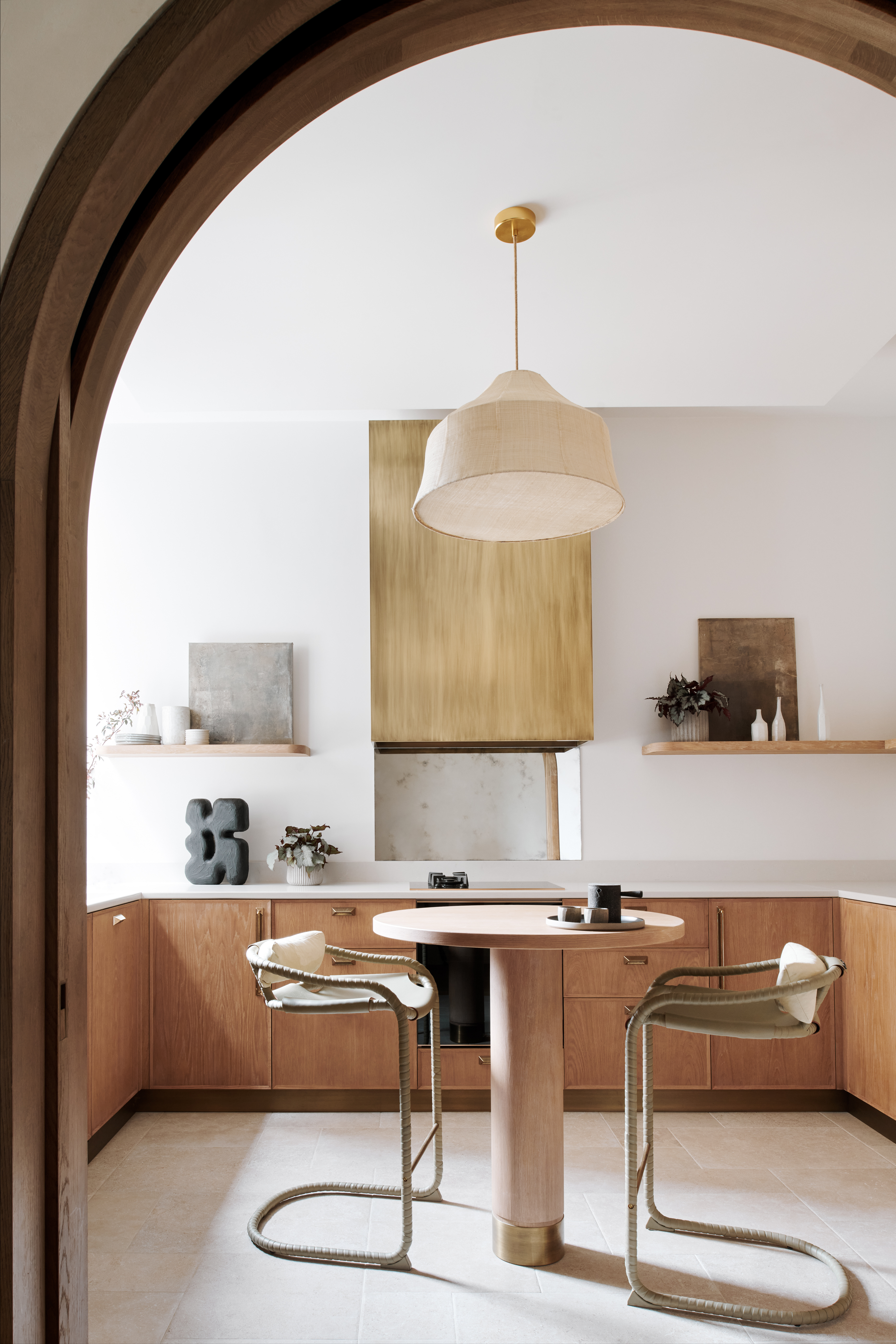
Upon entering the home, the serene neutral color scheme is instantly established thanks to Tala Fustok Studio's mindful design. 'The palette had to ooze a sense of calm, making the client's home an achingly cool oasis to wake up in, amid London’s bustle,' she comments. 'I like to blend raw and refined materials such as oak, bronze, concrete, brass and timber, to bring harmonic tension.'
The minimalist style space features warm brown tones in the timber cabinetry, punctuated by the metallic-effect golden oven hood and brass accents for the hardware. Tala believes this helps to introduce personality to the space, something she encourages us to try when curating our own palettes. 'This may be through soft pastels, bold fall tones, or more glamorous golden shades,' she says.
The Livingetc newsletters are your inside source for what’s shaping interiors now - and what’s next. Discover trend forecasts, smart style ideas, and curated shopping inspiration that brings design to life. Subscribe today and stay ahead of the curve.
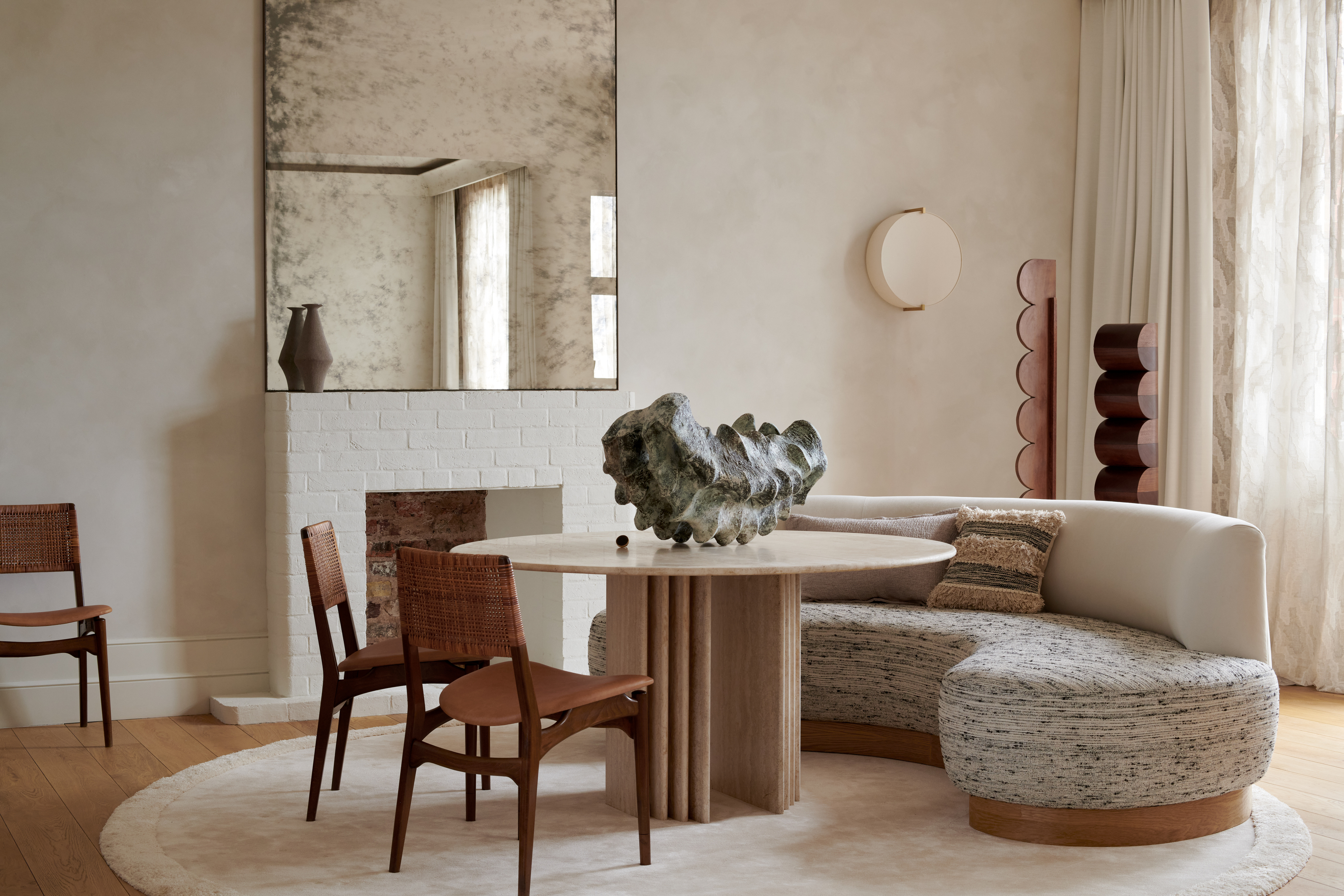
The scheme runs through to the apartment's dining room which boasts an unusual centerpiece by Vessel Gallery, a London brick ivory-painted fireplace, and a 1970s Italian vintage travertine table alongside a curved sofa for convivial dining.
'The stone items add a weight to the space, grounding it through the slightly darker hues, whilst pieces such as the neighboring snug sofa - presenting the choice of relaxed dining - adds that ingredient of pure comfort that the space was crying for,' Tala notes.
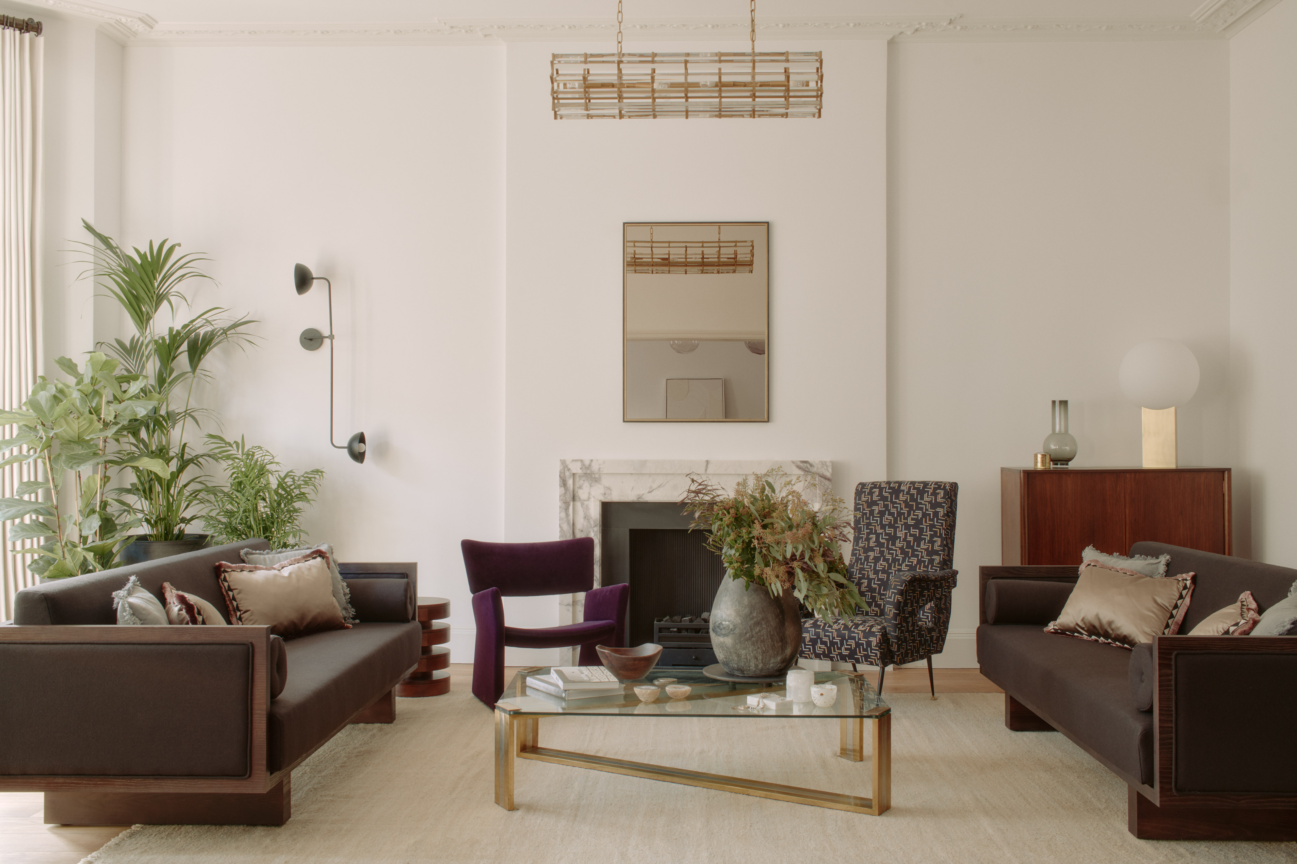
Structural work was carried out to open up the living and dining room areas to aid a bright and airy atmosphere that makes these rooms feel more spacious. In the living room, more color has been introduced through the accent sofas and seating. The deep purple armchair, the splash of green in the houseplant, and the punctuated brass accents culminate to create a sense of luxury while also injecting vibrancy into the home.
'In comparison to many of our other projects, we were fairly modest with our color pops,' admits Tala. 'That’s not to say it doesn’t have as great an impact, just in a different, less riotous way.'
The use of textiles to introduce color, as opposed to paint ideas, has a more subtle (and less permanent affect). 'It’s important to give rich fabrics and the combination of juxtaposing shades a voice to mask the noise of a white wall, and bring character to a room,' Tala explains.
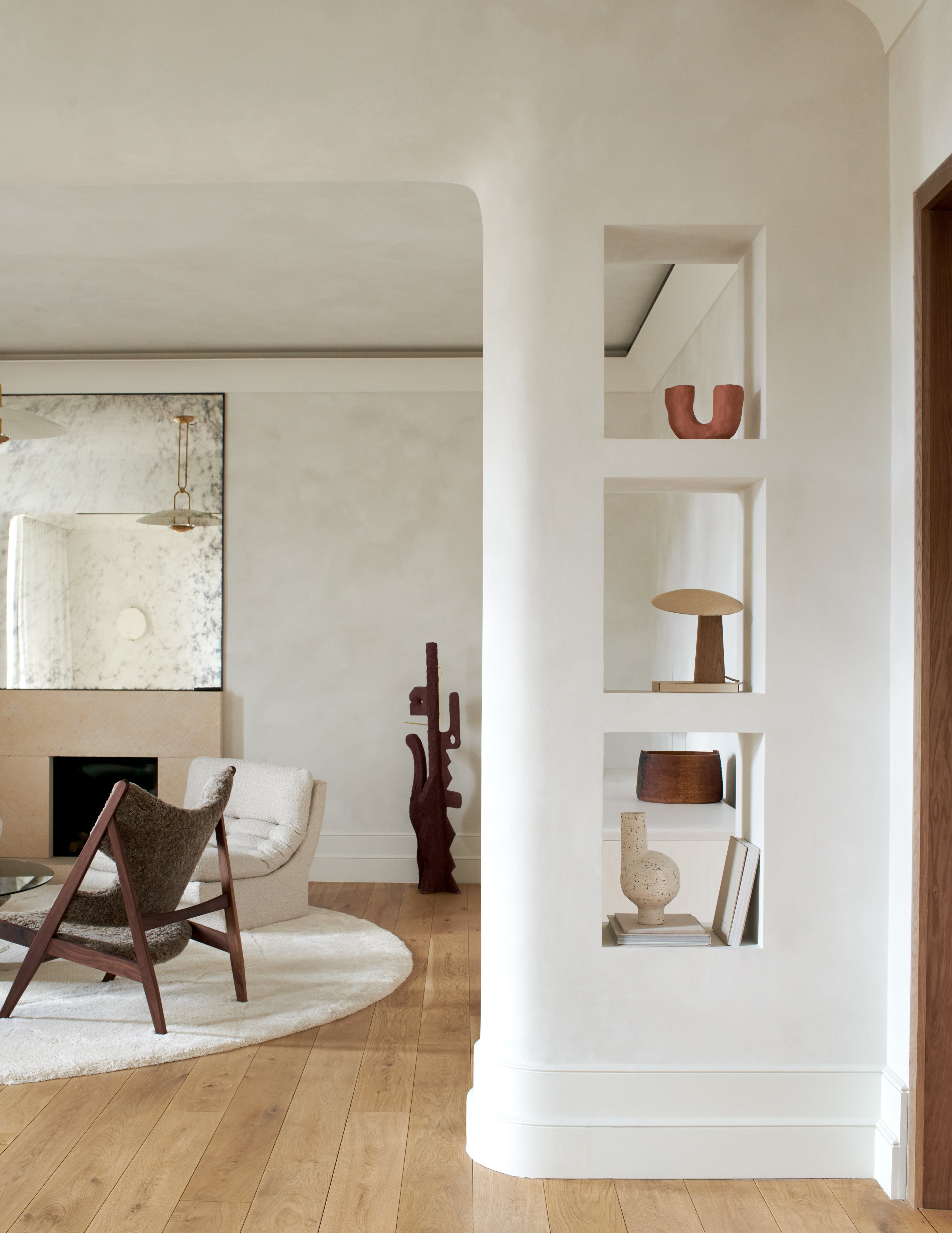
Large curved walls between the dining and living quarters integrate shelving to nest the finds from the homeowners' travels. This living room area also features a travertine fireplace below a large antique mirror. A cloudy patina drapes the walls, softening the space and echoing the surrounding stoneware, whilst a shaggy area rug adds more comforting texture.
'Often one thinks of color introduction as solely projecting paint onto a wall, yet there are many ways of doing this - from sculptures, lamps and plants, to fabrics, furniture and artwork - that all contribute to the art of story-telling,' says Tala. 'Just keep in mind that often having a stripped-back palette can open up a host of new possibilities to introduce patches of fun and romance as a contrast to a neutral canvas.'

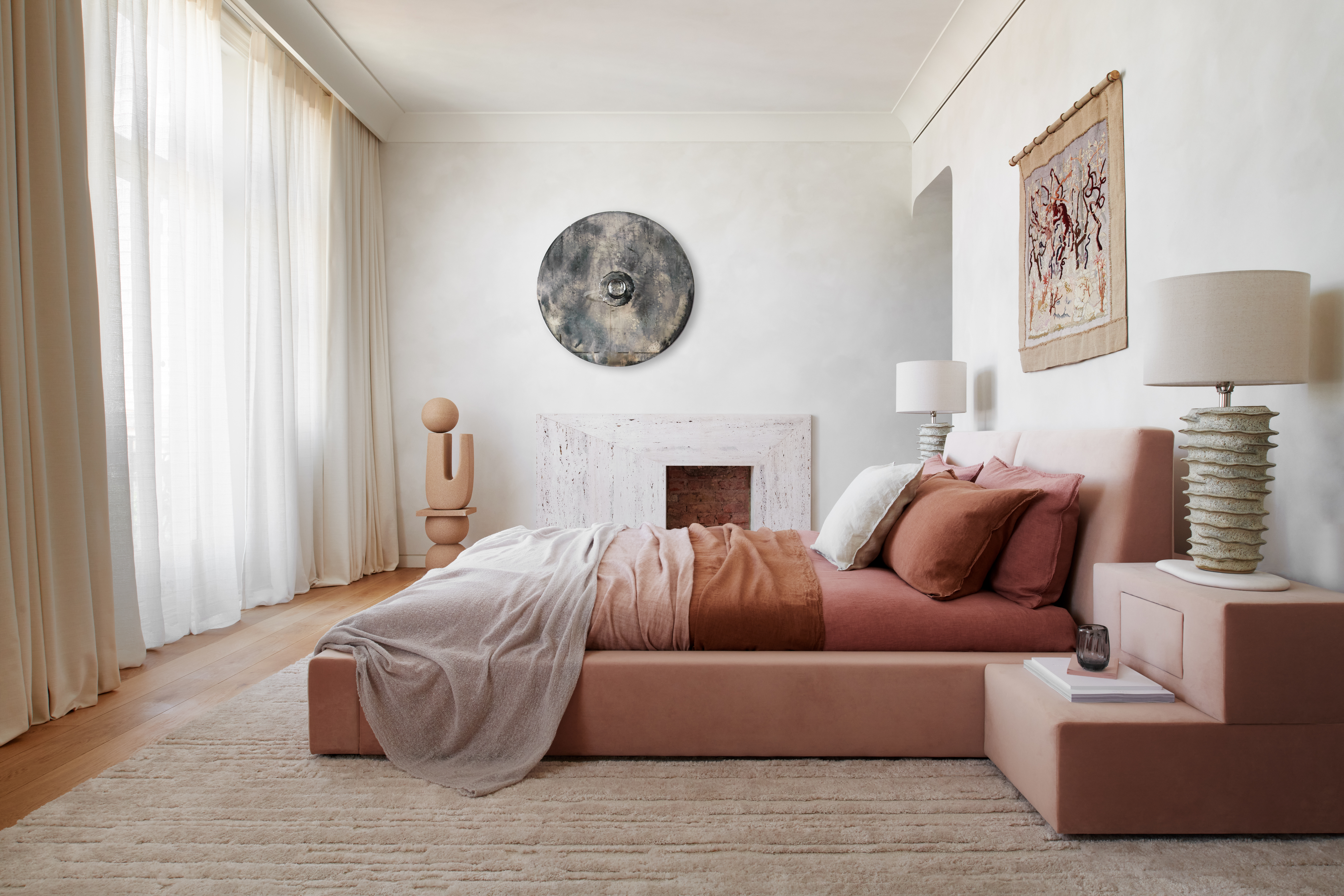
Two bedrooms were merged to form a larger bedroom where a bespoke 1960s-inspired dusty pink bed takes center stage. The dominant earthy pink tones signal a marked departure from the all-beige scheme found elsewhere thus far.
'I always seek to feature doses of the unexpected within my work, transforming an everyday space with that element of surprise,' explains Tala. 'You can do just that with color - as long as you’re honoring the architecture and surroundings of the building, considered pockets of energy will naturally complement a somewhat neutral backdrop.'
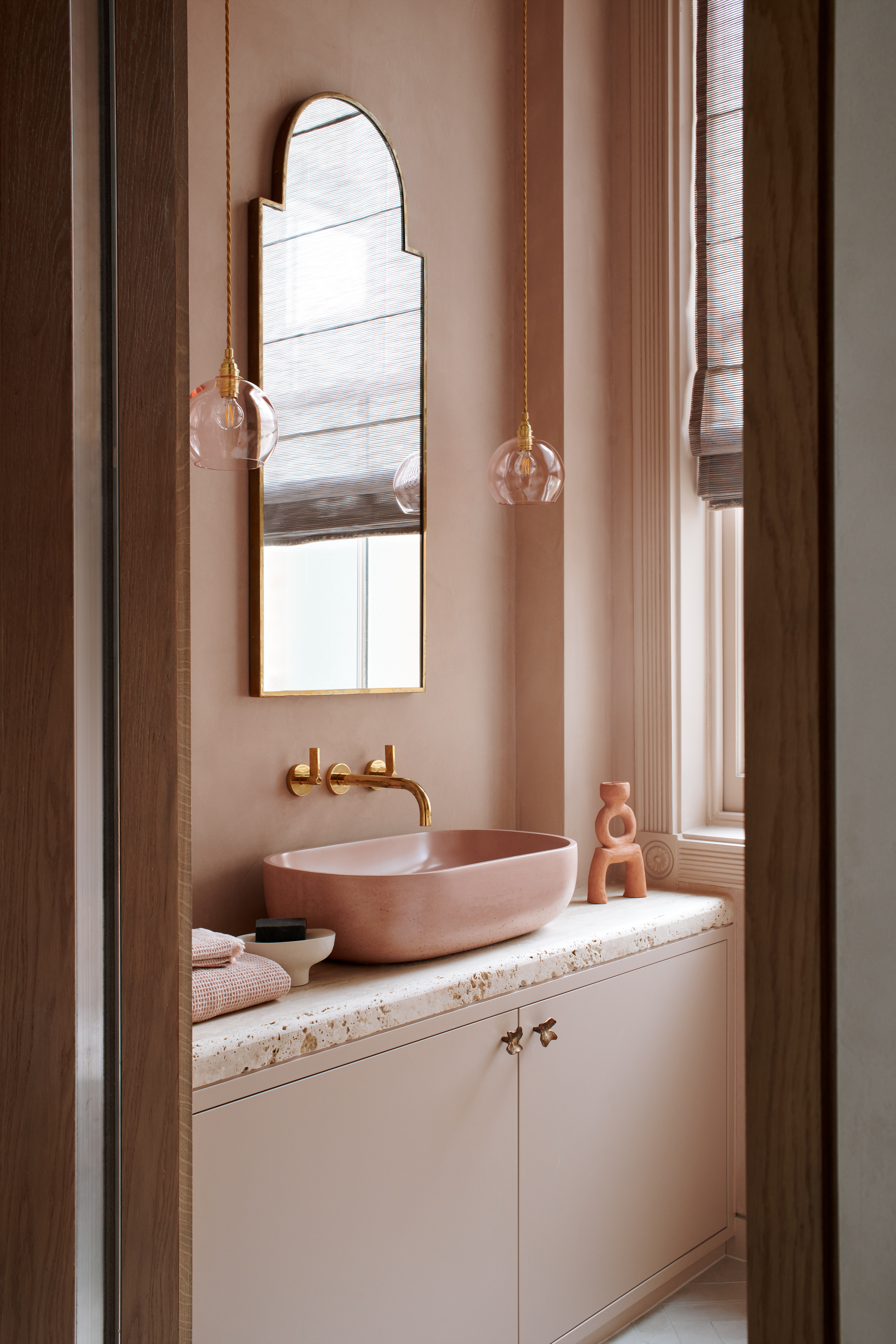
A bordering powder room of the same dusty pink houses a matching pink concrete sink with brass wall-mounted taps, flanked by pendant bulb lighting. We love how this pink bathroom idea remains at once chic and sophisticated whilst playful and fun.
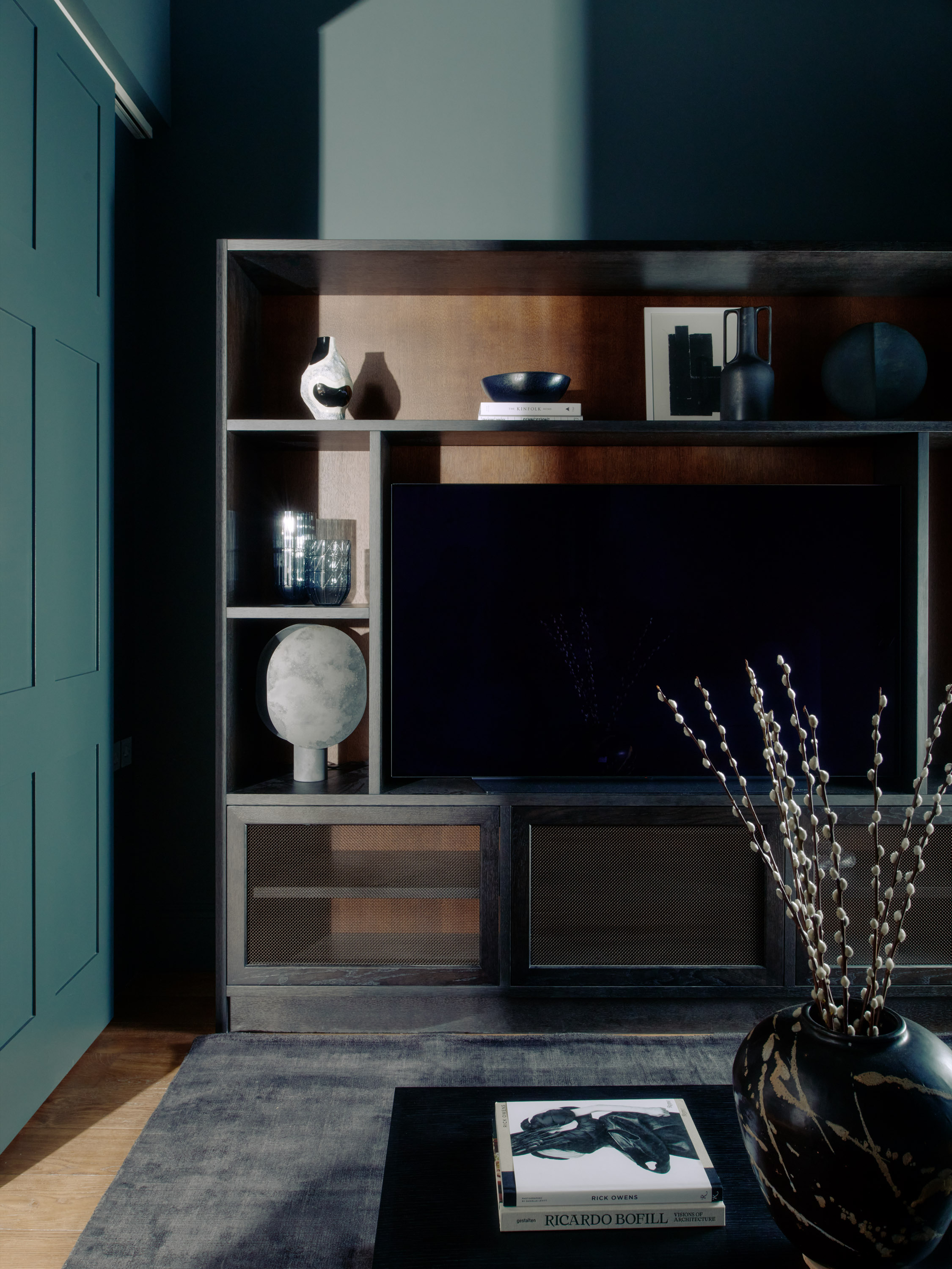
Other rooms are similarly punctuated with bursts of smoky toned colors, like the rich teal blue of this space, emphasized by the dark tones of the shelving and decor. 'Statement color blocking can be very powerful in the home - through ornaments, artwork, furniture - defining a zone, dividing multiple spaces, establishing personality, or essentially disrupting and distracting from a neutral area,' Tala notes.
'And finally, don’t be afraid to embrace some of the neutrality and its calmness,' she adds. 'Often less is more and overworking a space can be unnecessarily disruptive. We'll be carrying these words of wisdom throughout the rest of our future designs, that's for sure!

Lilith Hudson is a freelance writer and regular contributor to Livingetc. She holds an MA in Magazine Journalism from City, University of London, and has written for various titles including Homes & Gardens, House Beautiful, Advnture, the Saturday Times Magazine, Evening Standard, DJ Mag, Metro, and The Simple Things Magazine.
Prior to going freelance, Lilith was the News and Trends Editor at Livingetc. It was a role that helped her develop a keen eye for spotting all the latest micro-trends, interior hacks, and viral decor must-haves you need in your home. With a constant ear to the ground on the design scene, she's ahead of the curve when it comes to the latest color that's sweeping interiors or the hot new style to decorate our homes.