Before & After: This Mid-Century Pasadena Home is Toned Down with a Japandi Touch
The designer owner of this Buff & Hensman home merges its Mid-Century heritage with her love for Japanese-inspired style


Until recently, this Buff & Hensman home in Pasadena epitomized the Mid-Century style its architects were so closely associated with. Since then, however, it's been given a contemporary twist, toned down with a Japanese touch inspired by the surrounding beauty of the San Gabriel mountains.
Designer and owner Stephani Gan wanted to honor her home's Mid-Century heritage while infusing a much-adored Japandi style. It isn't always easy to limit the enduring influence of a Mid-Century California home, but this beautiful transformation proves that it's possible to retain that 1950s charm while still modernizing a space and curating it to personal taste.
Before getting to work, most of the interior was in complete disarray. Stephani had to reconfigure the layout and completely renovate the home, while replacing the roof, AC, furnace, and electric. She added soft, minimal luxury through high-end materials, finding beauty in imperfections to create a peaceful living environment that felt personalized (while also being durable enough for her young child).

'I was always inspired by my travels to Japan,' says Stephani. 'I want to bring the serenity feeling into this house and I knew from the start that the view and the luscious oak trees and eucalyptus trees around the house would be what guide the design inside - even the interior paint is called pale oak!' Keen to find out more? Here's how Stephani turned this dated and dilapidated space into a functional modern home fit for her family.
Living room

Upon first seeing the home, Stephani (@ganstephani) was so swept away by the beautiful vistas that she didn't realize what a huge undertaking the renovation would involve. The views beyond the plethora of floor-to-ceiling windows were beautiful, but even their astounding beauty wasn't quite enough to see past the home's foundational issues. 'The windows had gaps that were open to the outside due to the house settling, and the deck was eaten by termites,' she says. 'That being said, the house has good bones. I love Mid-Century design, and I wanted to keep and embrace the architecture of the house.'
This meant that Stephani and her team replaced all the windows with dual panes, and custom-made them to look like they were original to the house. 'We let more inside in by adding and expanding more windows, to bring more light into the house,' she says. Once these problems were resolved, Stephani could turn her attention to the living room, putting her personal twist on the existing Mid-Century style.

Having pared back the overwhelming wood tones with some contrastive colors, the main space now feels much softer. The darker tone of the ceiling beams offers a moody contrast that feels so sophisticated, as does the surrounding furniture, culminating in an organic Japandi-style space that's far more relaxing.
When deciding what feeling she wanted to convey upon entering the house, Stephani says three words came to mind; serene, peaceful, and warm. 'My husband was hesitant when I told him I wanted to paint the house black, and paint the walls a neutral beige color, and use dark cabinetry. I don't blame him, after all we do live in California where everything is light,' she explains. 'Nothing is wrong with that, but I have this vision that was inspired by our favorite place we stayed in Kyoto, and I wanted to bring that feeling here in California.'
Dining Area

Prior to the renovation, the open-plan kitchen dining area lacked depth and dimension with the overbearing amount of wood tones. Despite a stylish Mid-Century Modern aesthetic, the large airy space wasn't maximized to its full potential, creating an imbalanced feel.

The eat in kitchen now feels much more characterful, with bold dark wood tones that contrast beautifully with the white accents, especially the oversized lamp shade that ties the kitchen and dining spaces together.
Stephani also replaced the table with a dining bench, a decision that makes this space feel far more convivial. 'The house itself is not massive in size and I thought putting individual chairs would be too much and would make the space feel crowded,' she notes. 'I always like to incorporate what is functional for us as a family and our lifestyle. I have an 8-year-old son, and wherever we travel and go out and eat, he's always drawn to benches! We want the space to feel more casual where everyone can gather near the kitchen which is the heart of the family.'
Kitchen

The adjoining kitchen now showcases a beautiful marble countertop and zellige tiles. Contrasted with the dark cabinetry, it's really making a case for moody kitchens. 'I was actually looking for tiles for the bathroom and when I stumbled across Zellige tiles from Zia tiles, I knew this was the one for the kitchen,' Stephani explains. 'It has that imperfectness that I love, the irregular size with the color palette that reflects the evening pink sky from the outdoors and gives that beautiful reflection when the sun hits it.'
This tiling also wraps into an open shelf, rather than upper wall cabinetry, an increasingly common design choice that makes for a far more minimalist space. 'I didn't want to do cabinets and it would make the space feel heavy,' Stephani says.
She goes on to explain that she had a surplus of tiles after originally intending to tile the entire kitchen wall. 'A light bulb came up to use it as a shelf that goes across the kitchen,' Stephani explains. 'Embrace the mistake, sometimes it can be the best invention you can make. That shelf is the star of the kitchen, a minimalist blend with function which is part of the Japanese way of living.'

The pairing of form and function can be seen elsewhere in the kitchen, too, where built-in cabinets house practical appliances such as her microwave, as well as offering plenty of stylish storage.
It was her visits to Kyoto that sparked Stephani's appreciation for Japanese design. 'I stayed there several times and fell in love with the people, culture, and design,' she says. 'The Japandi Style I bring to this project is not about the look, it's mostly about the way of living and embracing the serene feeling this space gives.'
Bedroom
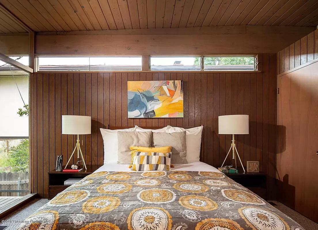
Before Stephani made her mark, the cabin-style bedroom was encased in wood paneling which, despite its cozy feel, made the space feel small. 'I originally wanted to save the wood clad, but being original to the house it was old, moldy, and had this strange smell - it just wasn't salvageable,' she explains. 'We also found out there was no insulation whatsoever in the bedroom with one electric outlet and no closet space. I just wanted a serene space for the bedroom where I just want to cuddle up all day!'

Now the space offers exactly that. White walls, light wood flooring, and the dark paneled ceiling combine to form a beautiful neutral color scheme for the perfect sleep sanctuary.
'We replaced the sliding doors with Fleetwood doors that fit the aesthetic of midcentury architecture that connects to the balcony,' Stephani notes. 'We knocked down a wall to put a closet in and since the space is not too big, I have to be very clever on how I put in a closet that will also look seamless.'
Bathroom

The dated bathroom featured terracotta tiles and a wooden vanity which made for a warm, Californian feel. Modernity was nowhere to be seen, however, and the space lacked the serenity Stephani longed for.

Now, there's a spa-like bathroom in its place featuring more artisanal zellige tiles, the same marble that's seen in the kitchen, and clean, sleek lines that make for a streamlined space.
Stephani is quick to note that neutral doesn't have to be boring. 'Embrace it by surrounding yourself with things that mean dearly to you, or something that you love from travel or childhood or that tells a story, will bring out this cozy and peaceful feeling,' she says. 'Something we all need after busy and chaotic days and traffic in LA!' She adds that you can incorporate colors through your art, flowers, throws, pillows, or ceramics, too. 'That way if you ever get tired of a specific color, you can change it easily,' she says.
Family room

Before Stpehani's renovation, the bright and airy family room was comforting and cozy, but wasn't as welcoming as she hoped. 'I want it to be warm and have that feeling that home - a place where you feel safe and always want to spend time in,' she notes. 'I tried to use as many sustainable materials, living finishes that will patinated beautifully, and work with local artisans all over the world. Everything has to be about function, and comfort in this house - let's just say my 8-year-old is my most opinionated client!'

The space is now a multifunctional playroom for the family to hang out, but it can easily turn into a guest suite whenever family and friends visit. A desk also offers a place for Stephani to work on her designs from home and, despite the open floorplan, she succeeds in making these separate functional spaces feel distinct.
'We like the idea of leaving it open rather than closing off the space with more walls which makes the space look smaller,' she says. There are different area rugs to separate the space and function, yet feel cohesive to each other since the color of the rug or material is similar to each other.'
The family home has certainly captured our hearts, combining everything we love most about minimalism, the Japandi style, and neutral palettes. Rest assured we'll be using this home to inspire plenty of our future designs!
Get the look

Price: $53
Quantity: 2

Price: $257
Color: Black

Price: $33
Size: 30" diameter
