What are the best trim colors? 7 alternatives to white paint to elevate your room's palette
Here's advice from interior designers on the best trim colors to try for baseboards and crown mouldings, for an exciting, design-forward color scheme
The Livingetc newsletters are your inside source for what’s shaping interiors now - and what’s next. Discover trend forecasts, smart style ideas, and curated shopping inspiration that brings design to life. Subscribe today and stay ahead of the curve.
You are now subscribed
Your newsletter sign-up was successful
Don’t let the best trim color for your room be an afterthought, after all, getting to grips with the possibilities of painting crown moldings and baseboards could mean the perfect finishing touch to the entire scheme. While it’s often the norm to see crown molding and baseboard painted white, adding a pop of color is a great way to introduce an extra layer of interest to your room.
‘If you’re fortunate to have these kinds of architectural details in a room, then celebrate them by choosing a bold paint color idea to create a more interesting look for the space,’ says Laura Stephens, founder of Laura Stephens Interior Design.
Whatever your style, we’ve consulted the experts to gather their suggestions for choosing the best trim colors for your scheme - because even the smallest element of your room deserves its place in the sun.
Article continues belowWhat are the best trim colors?
1. Sage green
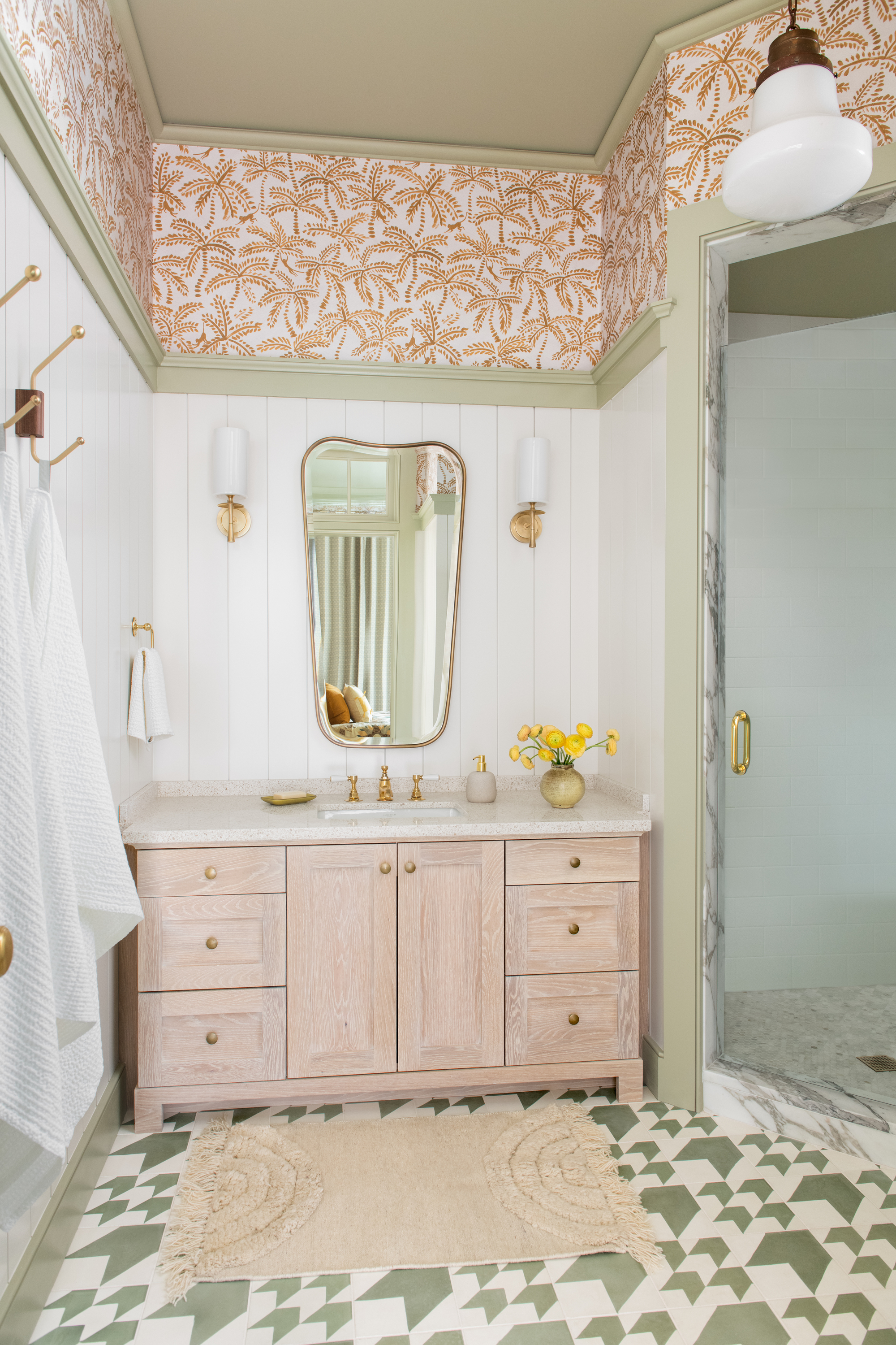
Depending on the style of property you have, trim could actually make up a large proportion of your room's architectural features, so it makes sense to consider alternatives to the traditional white.
‘If you have substantial trim, it’s a really nice idea to draw it out with color,’ says Cortney Bishop, Principal Designer and founder of Cortney Bishop Design. In this lust-worthy bathroom, Cortney selected a serene sage green for the trim to give a magical yet timeless look. Sage can operate as nearly a neutral, but adds a bit more fun. Plus, there are plenty of colors that go with sage green.
Colorful trim is a particularly great addition to a room scheme if you tend to prefer white walls. ‘I love to use white on interior walls, however it can be quite stark and put a lot of pressure on large artworks to add warmth,’ says Cortney. ‘This is why colorful trim is a great solution, as it brings interest along with a sense of playfulness and approachability while maintaining the freshness of white walls.’
2. Yellow
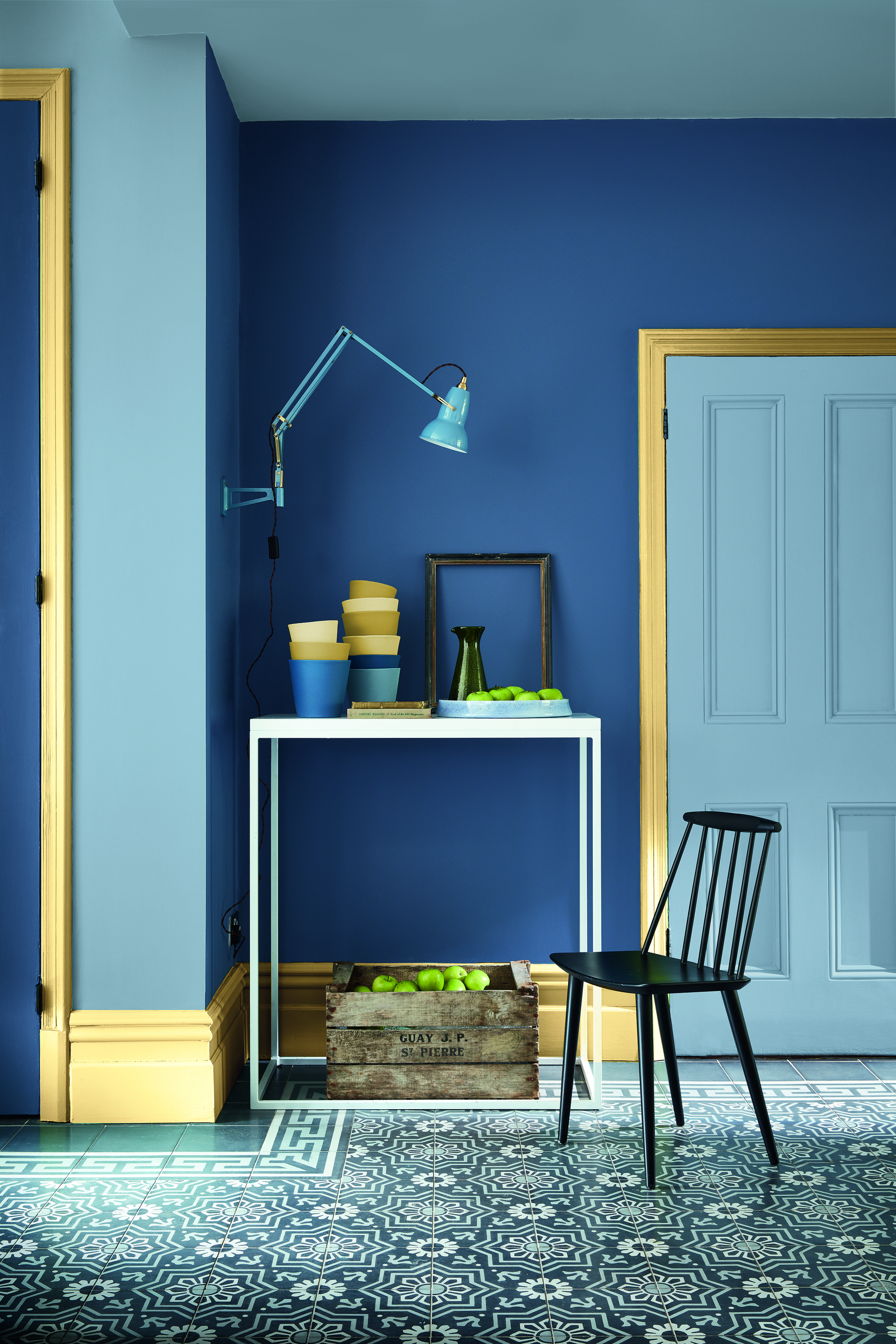
'The move away from white woodwork, ceilings and skirting creates a contemporary, cohesive scheme that feels considered and cocooning,’ says Ruth Mottershead, Creative Director at Little Greene. And yellow is a great choice if you want to add both warmth and style and warm up for an otherwise cool color.
The Livingetc newsletters are your inside source for what’s shaping interiors now - and what’s next. Discover trend forecasts, smart style ideas, and curated shopping inspiration that brings design to life. Subscribe today and stay ahead of the curve.
When it comes to choosing a trim color that will work with your walls, one option is to use the trusty color wheel to work out complementary pairings. Yellow sits in the opposite quadrant to blue on the color wheel, meaning the combination is visually pleasing, offering just the right amount of contrast.
3. Red
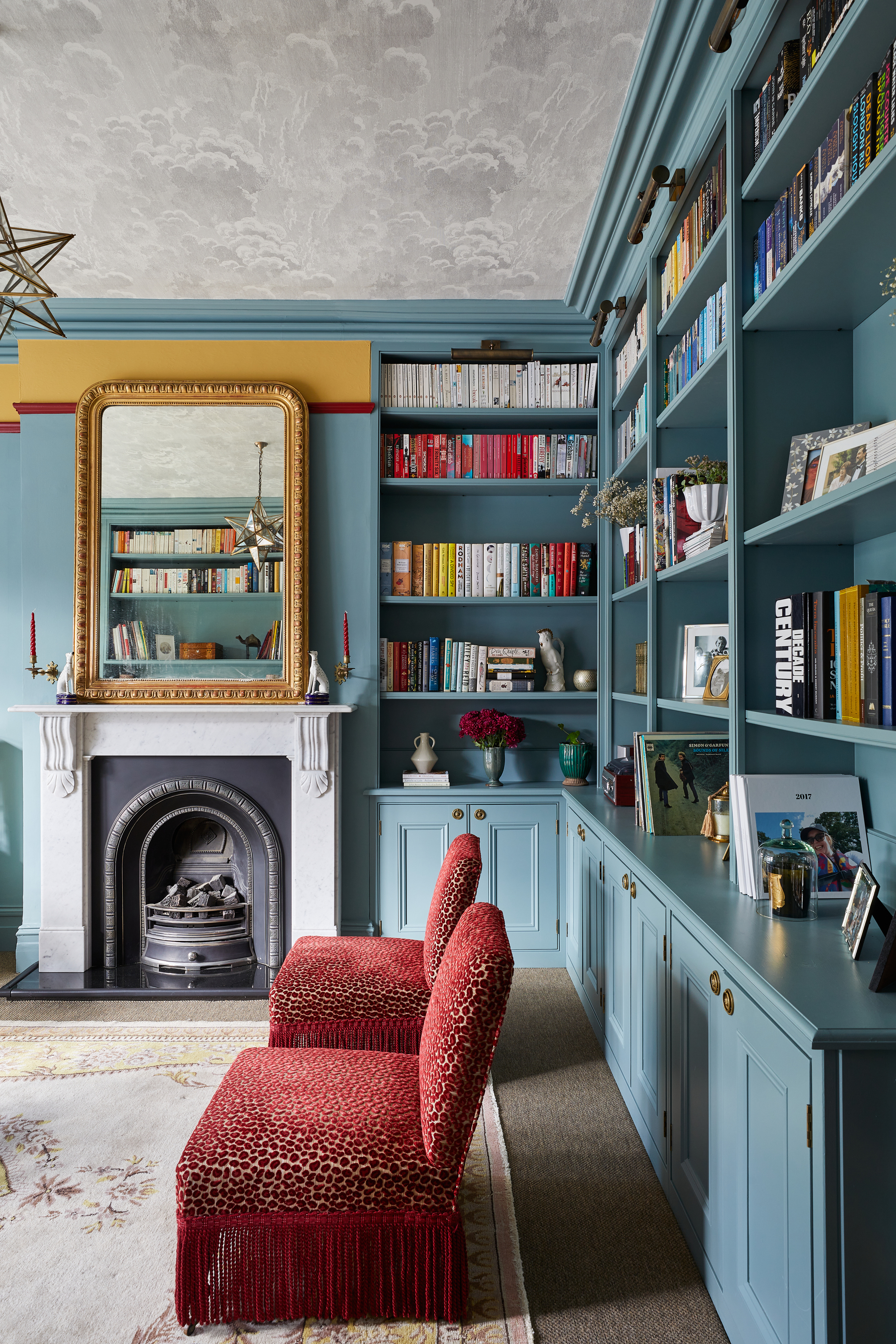
Picture rails and chair rails are often made use of as a meeting point between two colors, with one hue being painted above and another below, so make it even more of a feature by painting it in a bold color all of its own.
In this gorgeous living room, Laura Stephens, founder of Laura Stephens Interior Design, has created an extra layer of contrast and intrigue in this colorful living room by painting the trim red to add separate the golden yellow from serene blue - but it has another important job too; ‘I wanted to draw the eye to the ceiling, because it’s wallpapered in a beautiful Cole & Son paper,’ she explains. ‘The red trim is clever, because it commands the eye and encourages you to look up.’
If you’re wanting to introduce a bold trim, Laura advises finding a tone that already exists in your scheme to ensure cohesion. ‘Pull out a color from elsewhere in the scheme,’ she says. ‘In this room, there are red striped blinds and red upholstery, so the bright red trim connects with other pieces in the space.’
4. Dark green
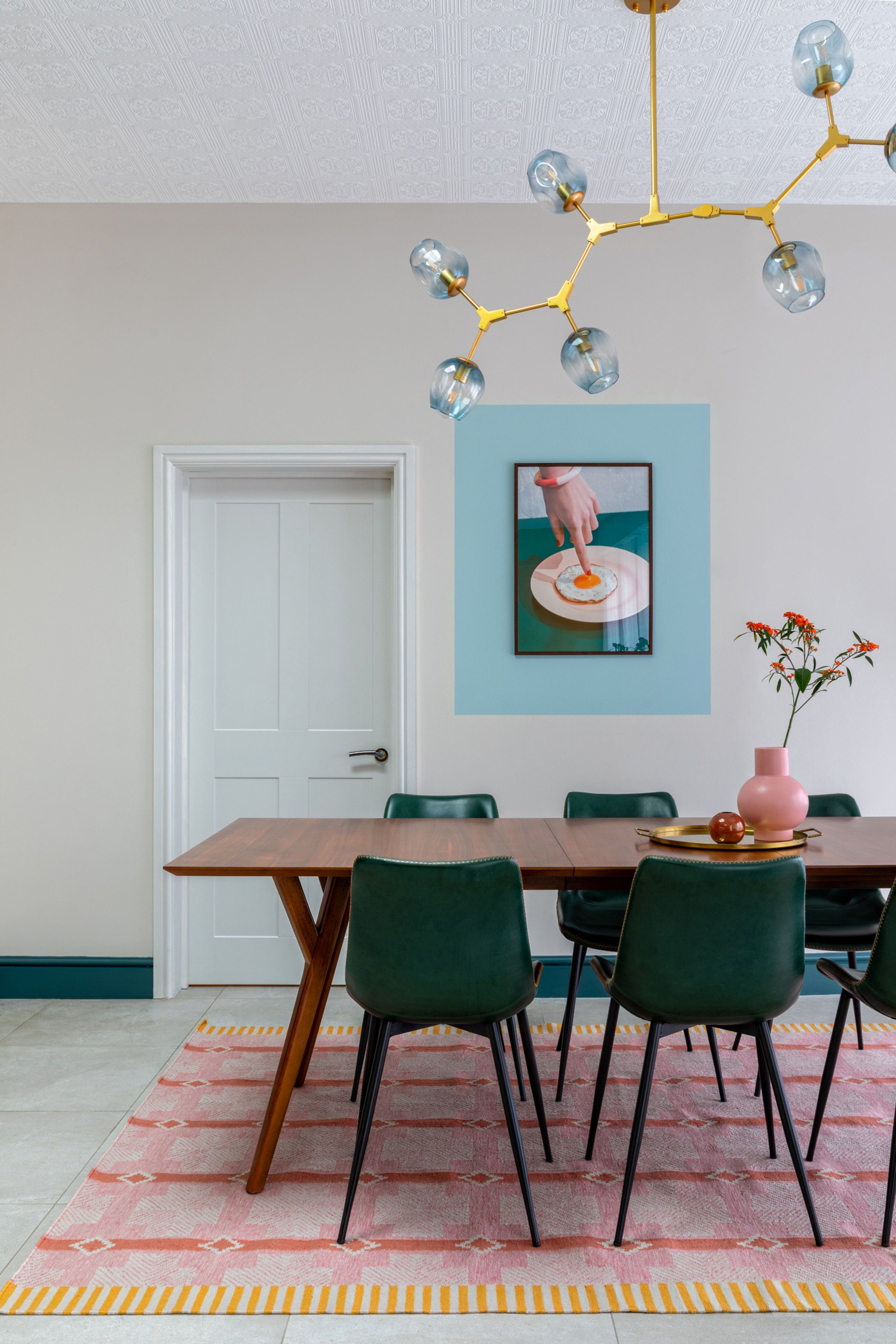
Baseboard or skirting is often neglected in a scheme, but it can actually be utilized as an important design device, as Emma Gurner, interior designer and founder of Folds Inside, explains; ‘Dark green was chosen as it helps to ground the space,’ she says. ‘It also ties in the accent color that pops up in furniture and accessories, as well as drawing the eye around the room to subtly link together open plan areas.’
If you’re unsure of how to choose a color for your trim that works in the space, Emma recommends making use of a paint chart. ‘Paint color charts are always a great help, as they are usually laid out in color and tonal order,’ she says. ‘This will allow you to easily see which colors complement each other.’
You could even choose a monochromatic color scheme incorporating your trim, using different tones from the same color family.
5. Grey
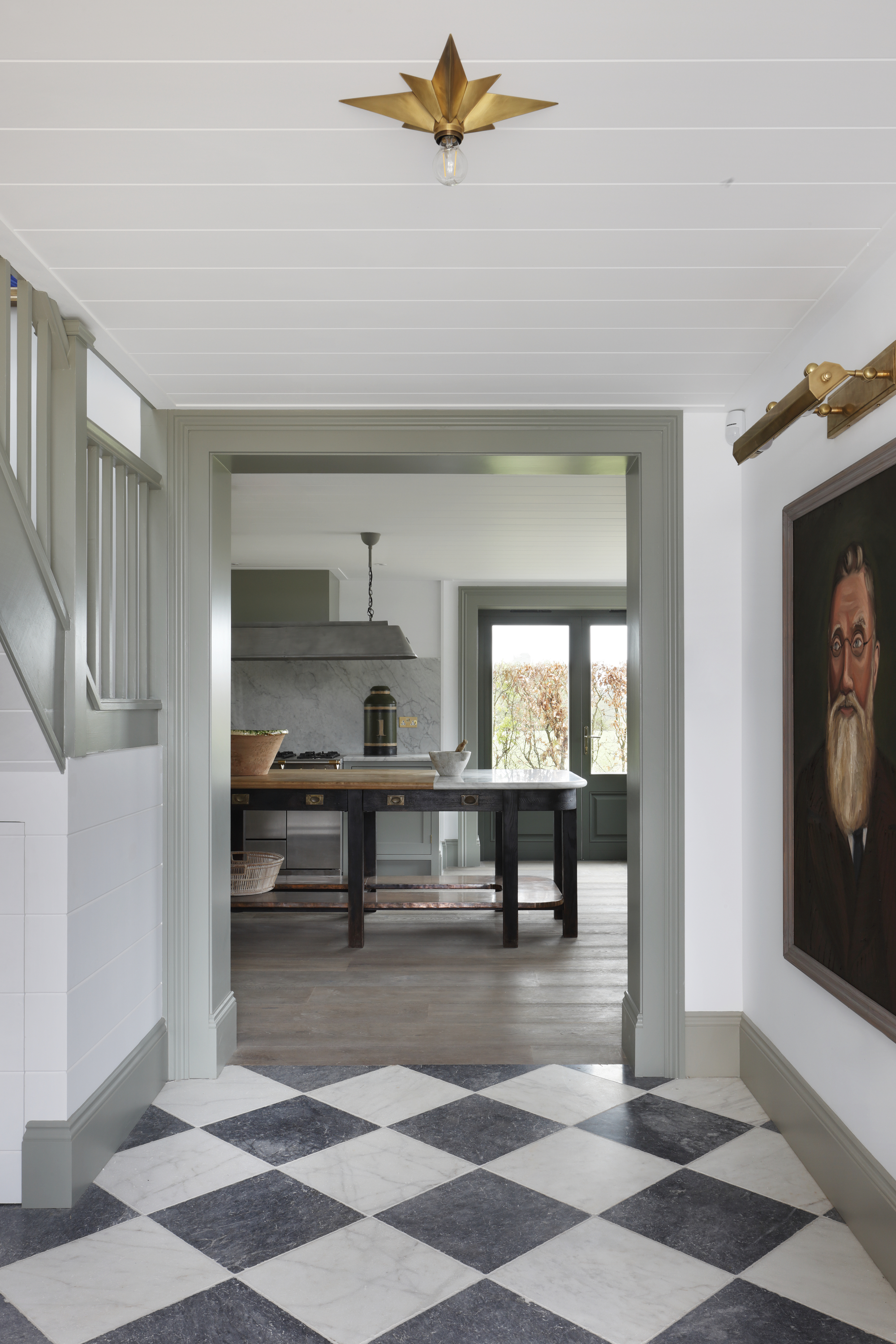
Enduringly sophisticated and reassuringly timeless, painting your trim grey is a brilliant option. Still neutral enough for a pared-back scheme, but with enough weight to provide visual interest, this could be the perfect color if you want to ease into the bold trim look.
‘For expansive spaces like a hall and staircase, we often paint the ceiling and walls in the same natural hue as it stops awkward breaks,’ says Tom Cox of HÁM Interiors. ‘To enliven the scene, we then paint trims and skirtings in a bolder tone. It makes for a sophisticated, tailored effect - plus, you can use accents of this color in adjoining rooms to create connections.’ And of course, there are lots of colors that go with grey, which make it perfect for bridging color palettes between rooms.
6. Blue
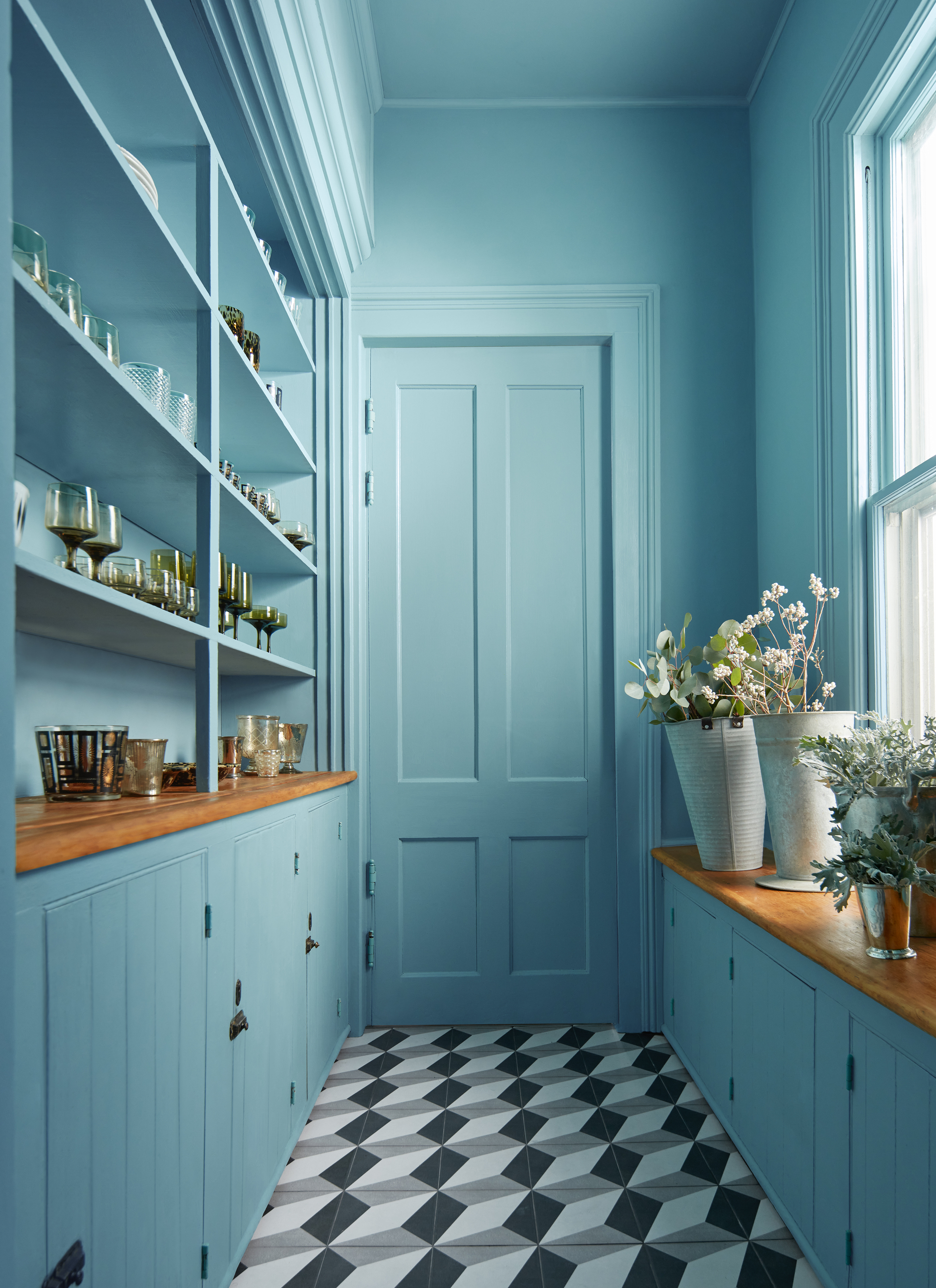
‘For the ultimate statement, create a super-luxe and all-encompassing floor to ceiling finish in one color,’ suggests Helen Shaw, Director at Benjamin Moore. ‘Not only does using a single shade to cover the skirting, walls, ceiling and window frames add a feeling of grandeur - but it can also make a small space feel more expansive because the lines and edges are blurred.’
Perfect in some of the more awkward spaces such as utility rooms, pantries or cloakrooms, the all-over treatment is a great way to maximize a feeling of space as the eye line doesn’t get interrupted by jarring white trim. ‘Move away from the ease of opting for white everywhere,’ says Helen. ‘Instead, consider a cozy mid-tone over every surface to maintain an airy feel which isn’t broken up with distracting white trims.’
7. Lilac
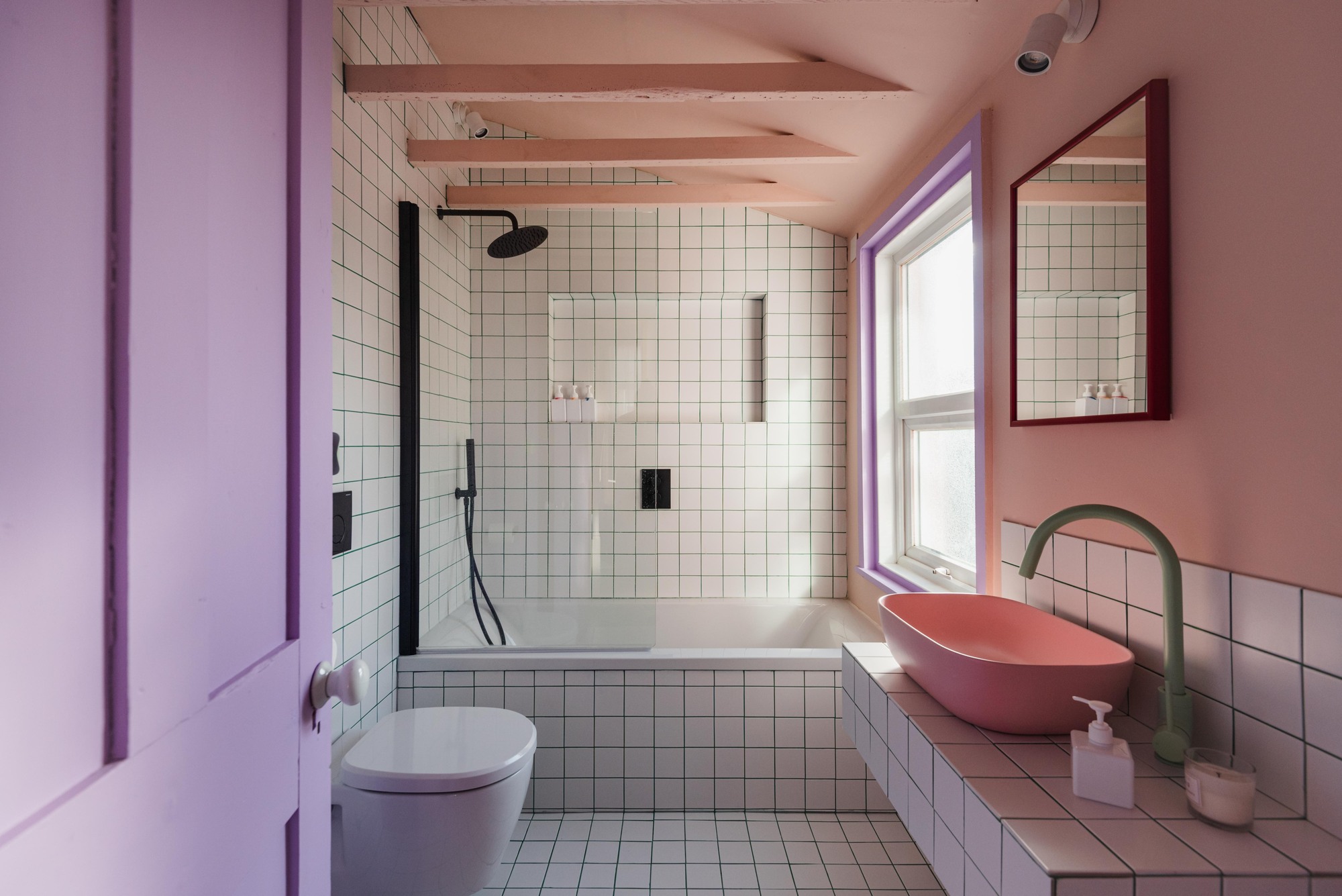
Not a color you may immediately think of for interior trim, but when introducing a pop of color is the aim of the game, lilac is a brilliant choice. Sitting pretty with pink tones, it also works beautifully with olive greens, sunny yellows and will add an element of intrigue to white and grey schemes.
‘When it comes to choosing your trim color, you really need to consider what style you’re going for,’ says Natasha Bradley, Lick’s Director of Interior Design. ‘Trim colors definitely don’t always have to be white - and if you are someone who wants to keep the wall color quite neutral, going for a contrasting woodwork is a really fun way of injecting personality and character to the space.’
Used in combination with colors that go with purple, lilac can create a fresh, fun color scheme used on trims.
How do I choose a trim color?
When it comes to choosing a color for your trim, white is a failsafe that will work with most schemes. However, trim can also be a great place to add some color and interest to a room. If you’re not sure where to start, Helen Shaw at Benjamin Moore recommends exploring different tones within the same color group.
‘You can use color scales to pick a lighter or darker tone within the same color family if you wish to achieve a more subtle look and ensure the colors on the wall and trim blend well,’ she says. ‘Use the lighter tone on the walls and ceilings, and darker tone on the woodwork or vice versa.’
For a bolder look, you can opt for more contrasting colors - and the color wheel can be your friend in helping you work out these pairings. You can also look elsewhere in your scheme to find a tiny accent of color that you might like to pull out and use more boldly across trim.
There is also the option of going for an all over treatment across every surface in the room. ‘Painting the trim the same color as the walls is a really great technique to open up the room,’ says Natasha Bradley, Lick’s Director of Interior Design. ‘The fact there is no contrast to the walls and woodwork really opens up the space.’
Interiors stylist and journalist Amy Neason was the Deputy Style and Interiors editor at House Beautiful for years. She is now a freelance props and set stylist, creating work for a range of national publications and brands such as Imogen Heath. She has previously worked at Established & Sons, and her skills include styling still life and interiors shots for editorial features and sourcing unique products to create inspirational imagery.
She is particularly respected for interpreting seasonal trends into feature ideas and style stories.