THE PROPERTY
A converted and extended Victorian pub in south London. The old bar now houses the entrance hall and a guest bedroom; steps lead into the new part, with three further bedrooms, a dressing room and family bathroom. The living areas are upstairs, with a terraced kitchen-diner, a living room and a WC.
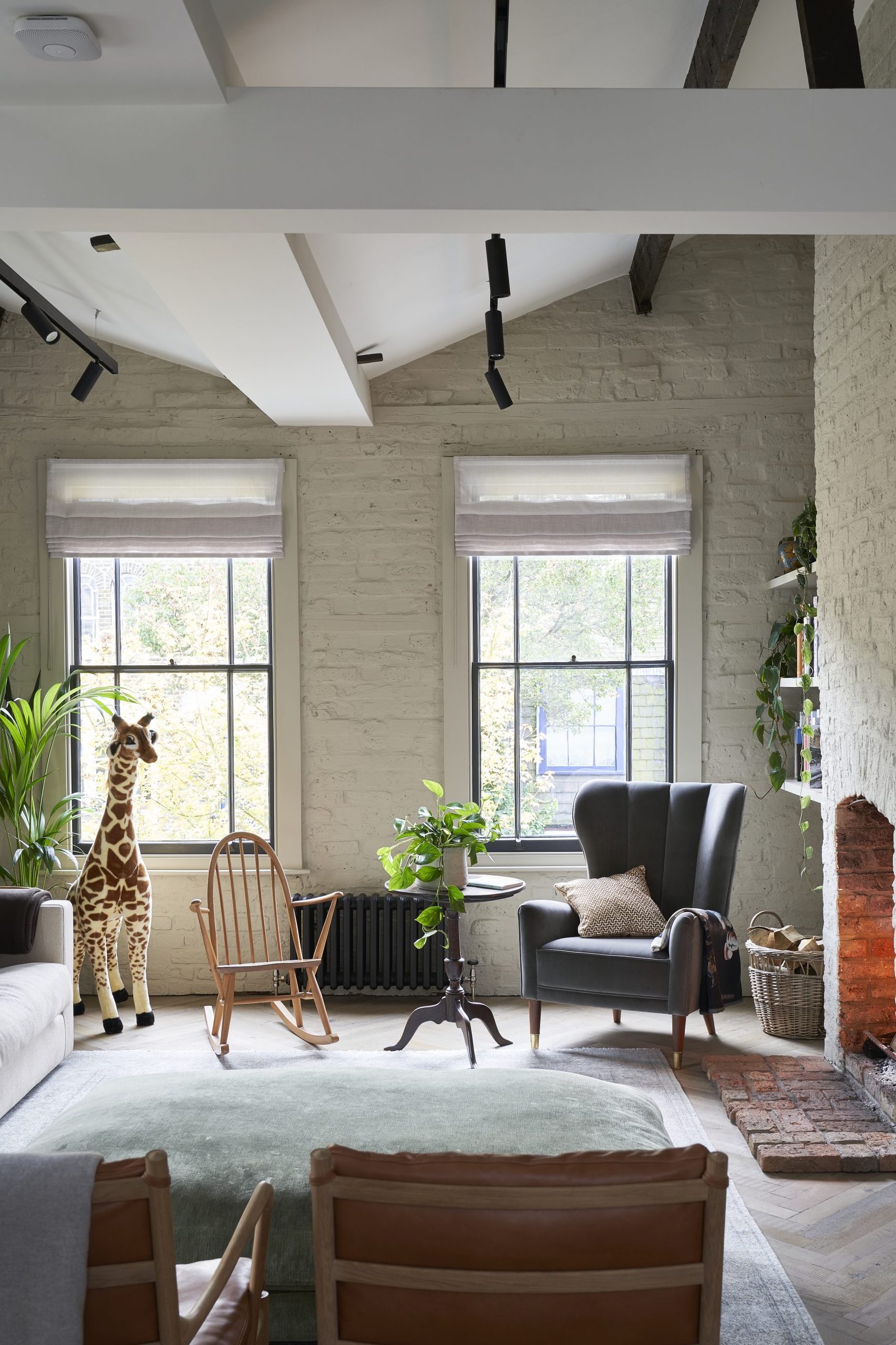
Palest greens, delicate foliage and natural materials give this home’s lofty spaces a serene feel, but it wasn’t always the case. A doorway with ‘Public Bar’ etched into its frosted glass is a reminder of the building’s previous life.
‘It closed in the 1970s, but I’d guess it was a proper local boozer with dark corners and a snug,’ says the owner who, with her husband, created its fresh feel.
Article continues belowThe pub had already been converted, but the couple, with the help of Areta Soare from Glenn Howells Architects, largely rebuilt the added wing and then reworked the interiors. The result is a calm, contemporary home that connects cleverly to its outside spaces.
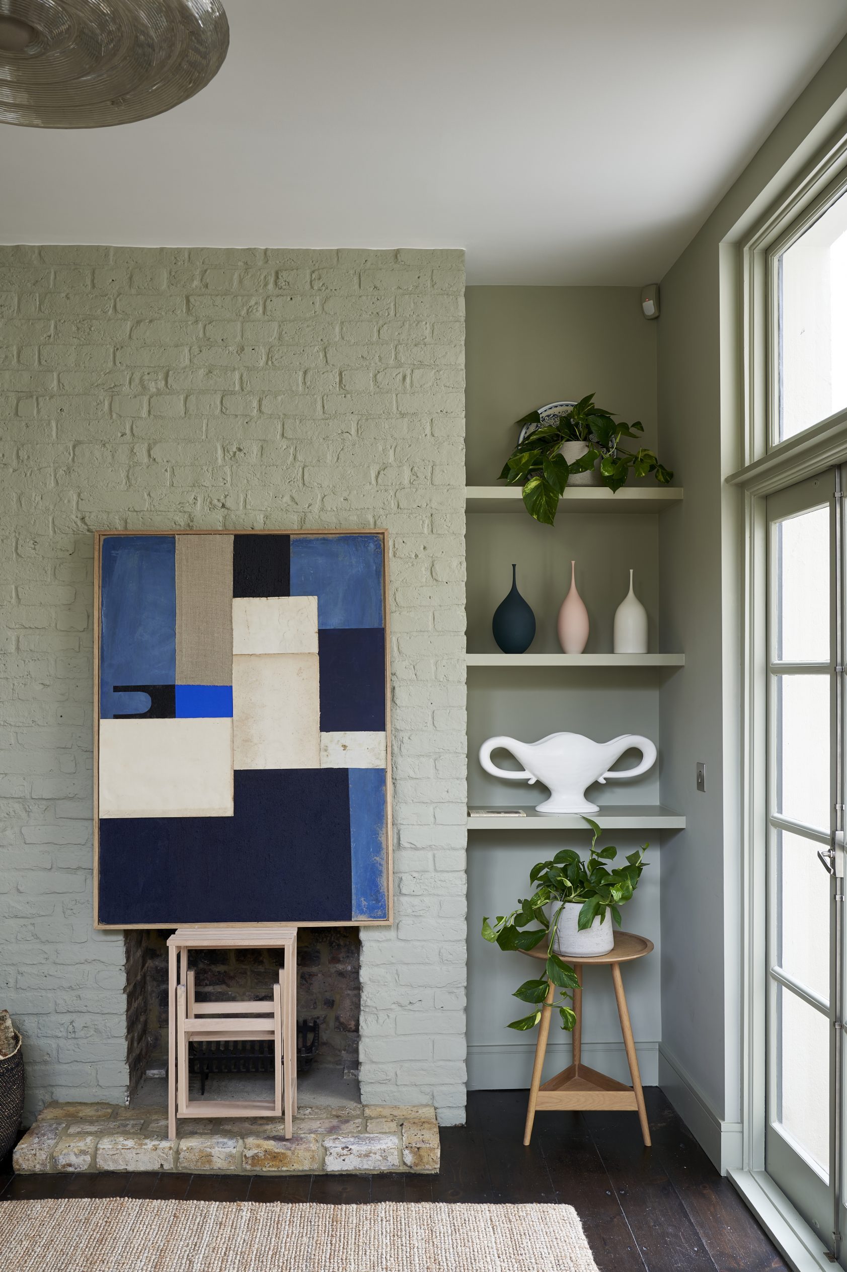
Yet celebrating the structure of the building lies at the heart of the redesign. ‘We wanted to take an authentic approach, with an emphasis on the raw materials,’ says the owner. So the gritty brickwork has simply been lightened with paint and ceiling beams have been highlighted with dark finishes.
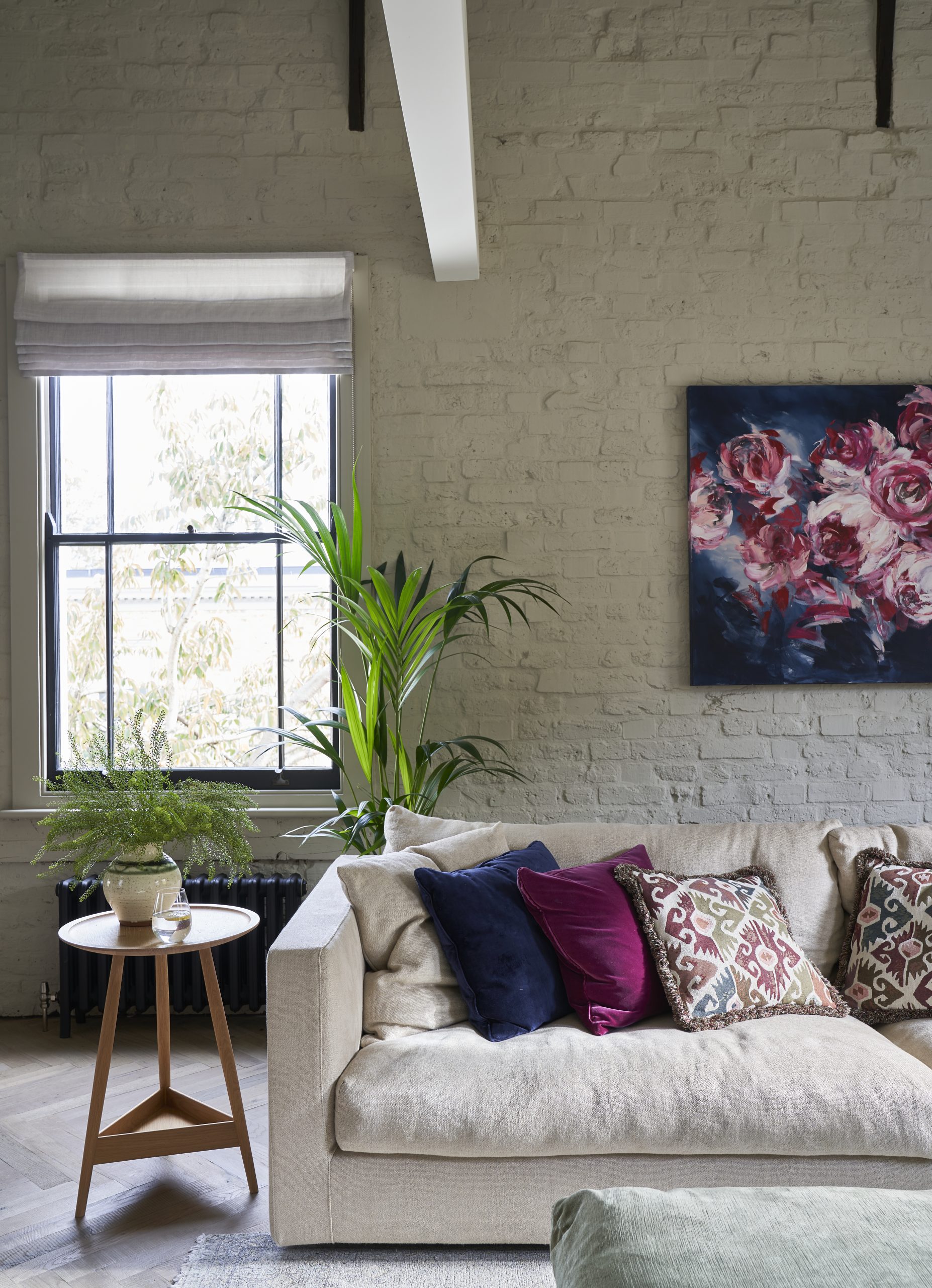
The focus on texture is followed through in the interiors. They opted for a palette of earthy easy greens and greys, woven rattan and well-crafted furniture, from mid-century chairs by Hans J Wegner and Ole Wanscher to modern designs by Pinch.
The materials are key to this house’s style. In the new-build areas, they include hand-cut bricks, concrete flooring and Carrara marble. In the Victorian part, reclaimed parquet flooring was chosen for the living room, replacing old boards that couldn’t be saved. Original sash windows were refurbished and the frames painted black, their lines echoed in Crittall-style glazing in the adjoining kitchen-diner.
The Livingetc newsletters are your inside source for what’s shaping interiors now - and what’s next. Discover trend forecasts, smart style ideas, and curated shopping inspiration that brings design to life. Subscribe today and stay ahead of the curve.
This was an ‘upside-down’ house when the couple viewed it, with living spaces on the first floor – and they opted to keep it that way. ‘You get so much more natural light in an upstairs living area,’ they say.
What they did add, however, was a roof terrace. ‘It’s like an extension of the kitchen, so the children can play inside and out, and it connects us to the garden.’
HALL
The front door opens into this wide, welcoming space that once housed the pub’s bar. The flooring is original and was treated with a dark finish.
To help the unusual layout work, they used different materials to ‘signpost’ the sociable and more private areas of the house. ‘The bedrooms on the ground floor are carpeted and feature soft hues to define this as our quieter, night-time space. As visitors enter from the hallway, they are subtly beckoned upstairs to the lighter living spaces, which have wood and concrete underfoot.’
KITCHEN-DINER
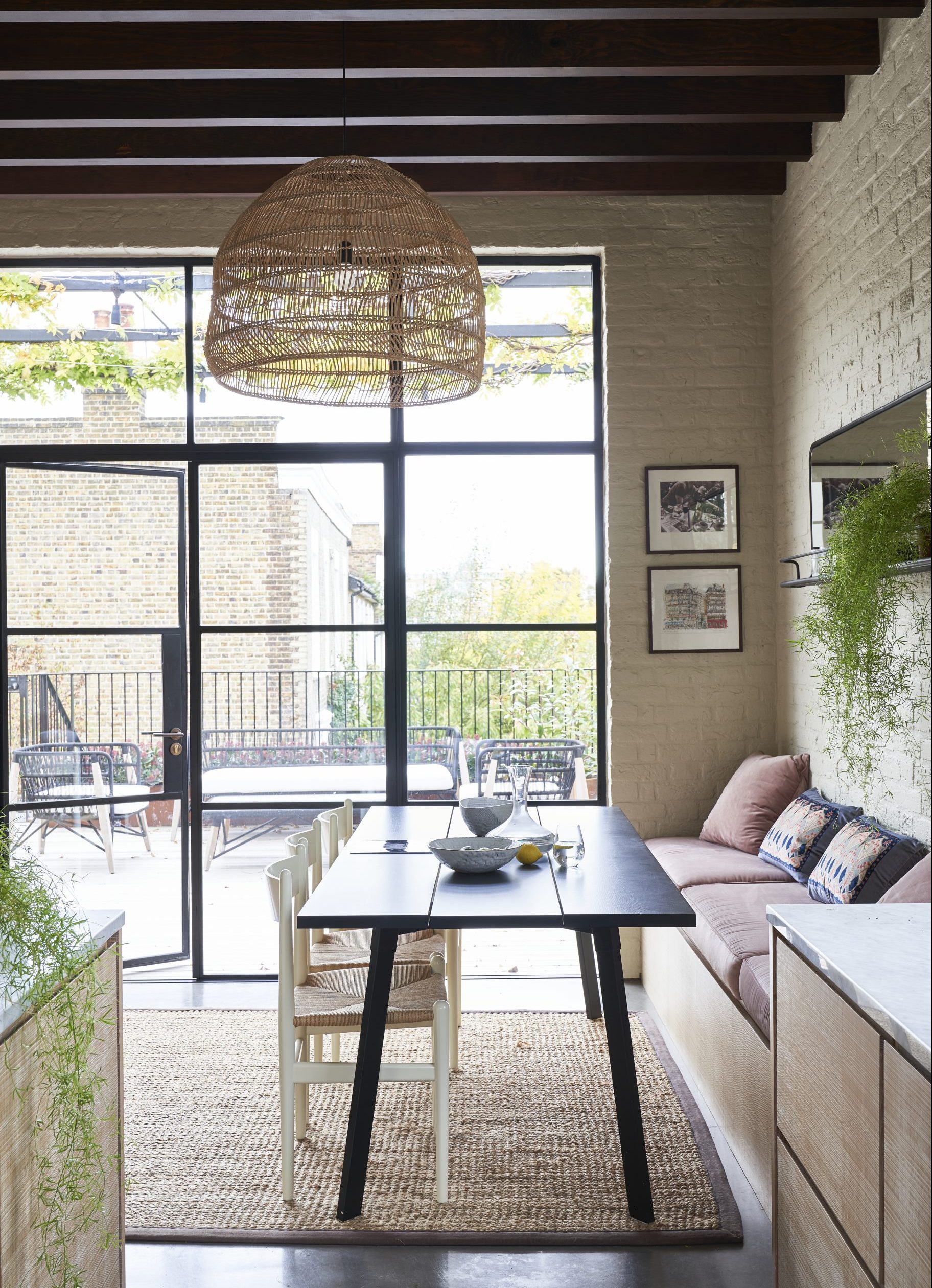
Up here, flow-through spaces, natural tones and contemporary art keep things open and easy. Everywhere in this home, materials are seen at their simplest and best – from the pitted surface of Victorian brickwork to the sections of smooth concrete in the dining area.
This space leads on to a roof terrace, where the family eats in warmer months. Frondy plants and large-scale glazing add to the feeling of openness. The dining table was repainted to give it a crisp, dark silhouette.
KITCHEN
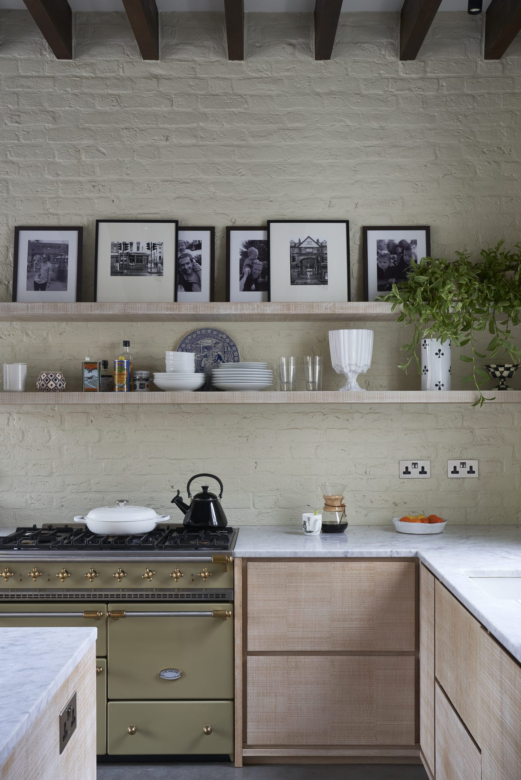
After a long search, they found a wood veneer for the cabinet fronts with an understated horizontal grain pattern that balances texture and simplicity.
‘It’s a wood veneer with a sawn-edged finish that we gave a diluted white wood wash to bring out the grain,’ says the owner.
LIVING ROOM
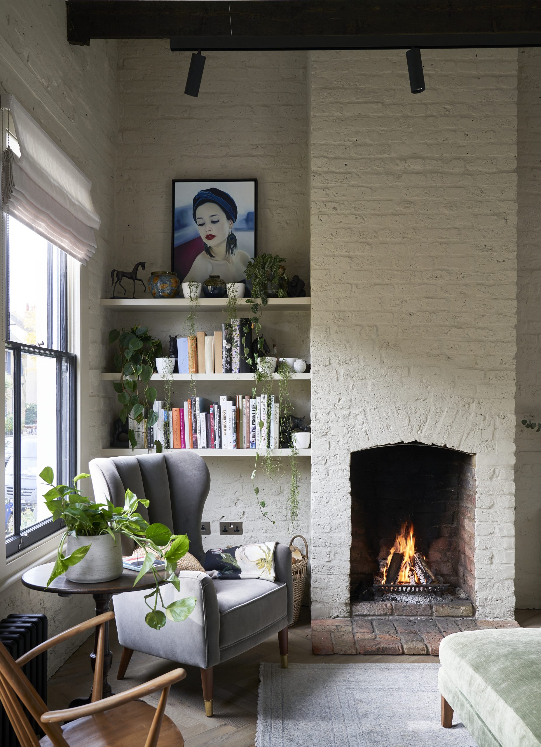
Contemporary and cosy meet beautifully in here. The walls were previously a less restfulraw brick red: ‘As soon as we painted them, it made a huge difference,’ say the owners.
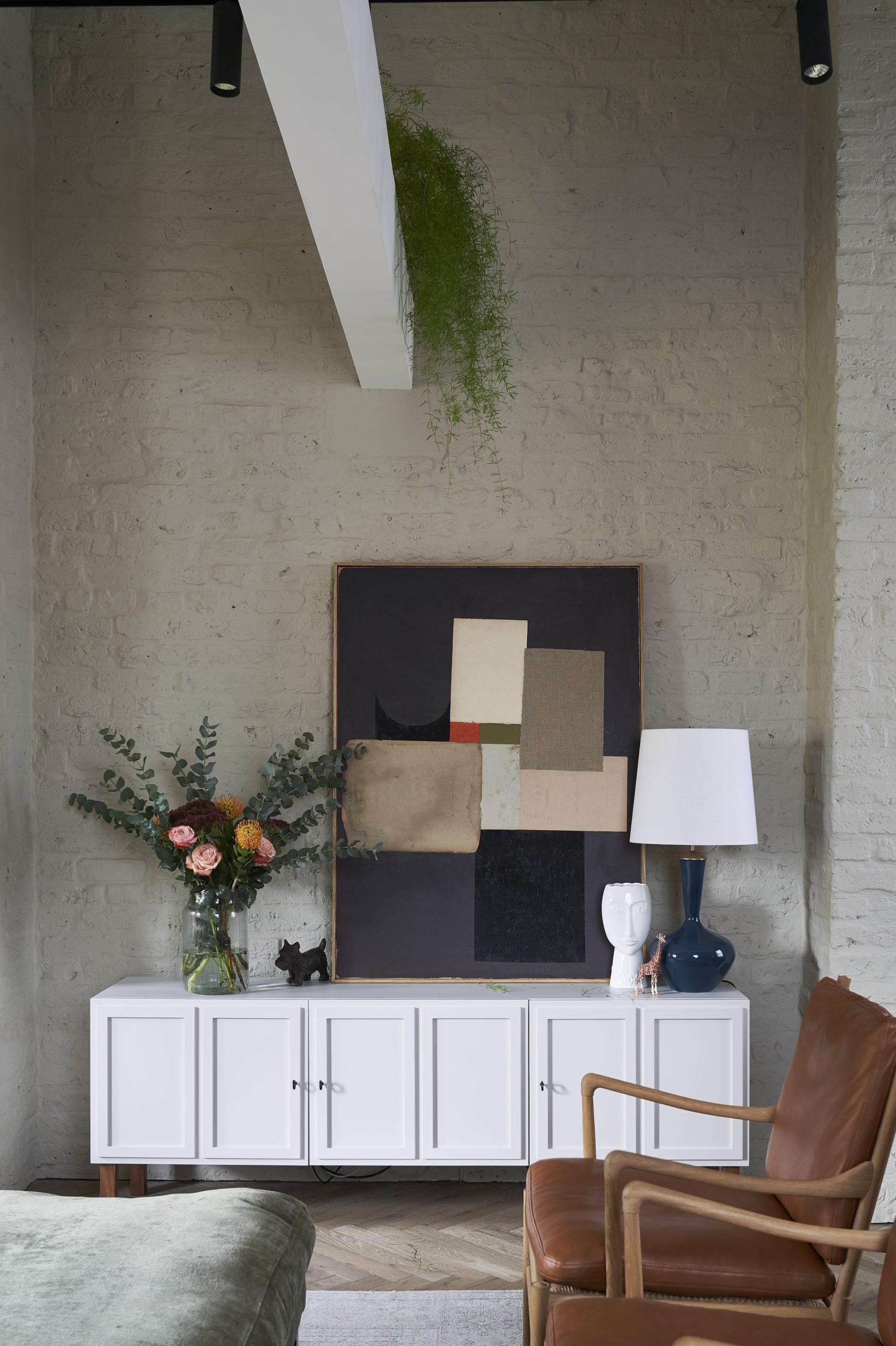
The simplicity of the airy, vaulted space is emphasised by window frames outlined in black. A long-line sideboard echoes the beam above, from which foliage is draped, while bold artwork and textured cushions bring depthto the muted backdrop.
MASTER BEDROOM
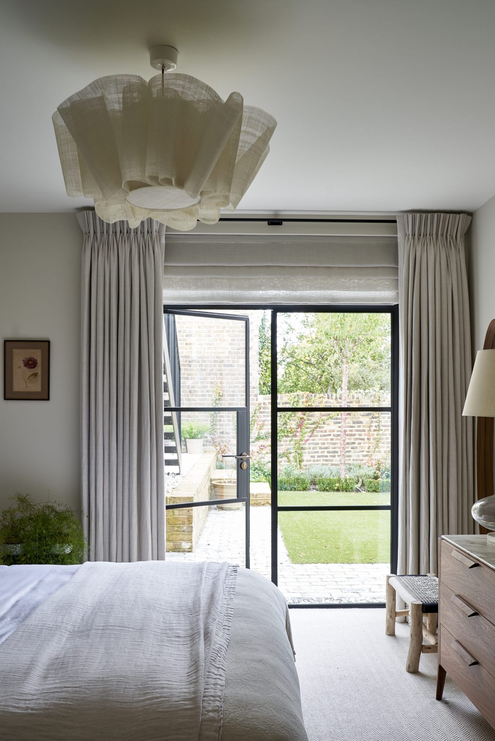
Neutrals create a soft, cosseting vibe instead of a minimalist one. The room connects to the garden via slim-profile Crittall-style glazing.
MASTER EN SUITE
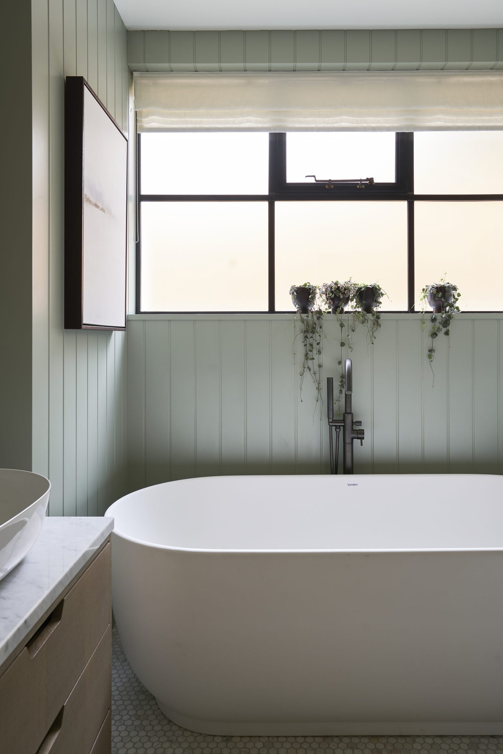
Delicate foliage complements the natural, pared-back scheme. ‘These sweetheart vines are my favourite,’ says the owner. ‘The colours are amazing and they’re like little dangling hearts over the bath.’
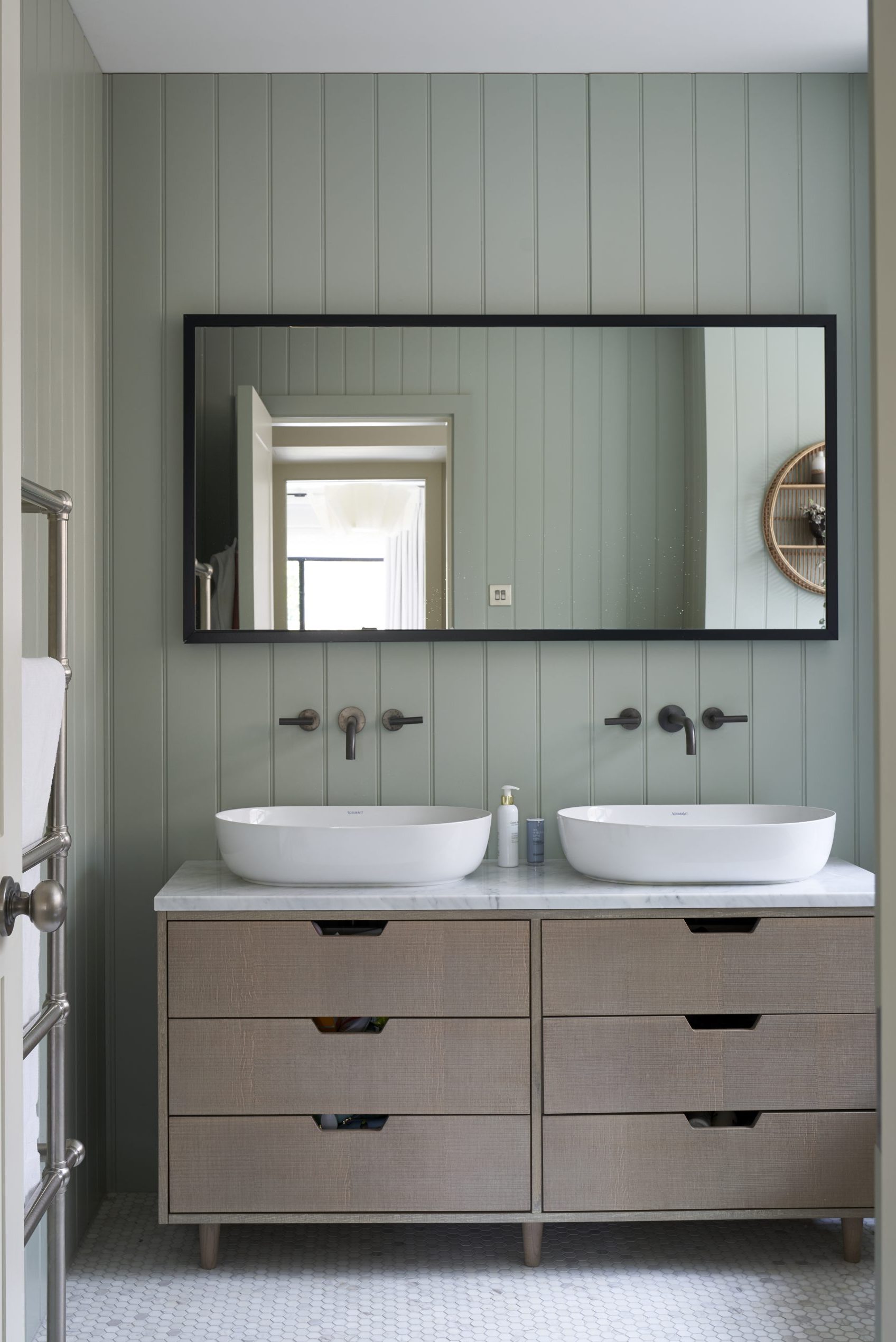
The symmetrical arrangementof twin basins on a beautifully proportioned vanity unit keepsthe peaceful theme of the decor.
BEDROOM
This bright, inviting room – complete with original frosted glazing – was once the public bar of the pub.
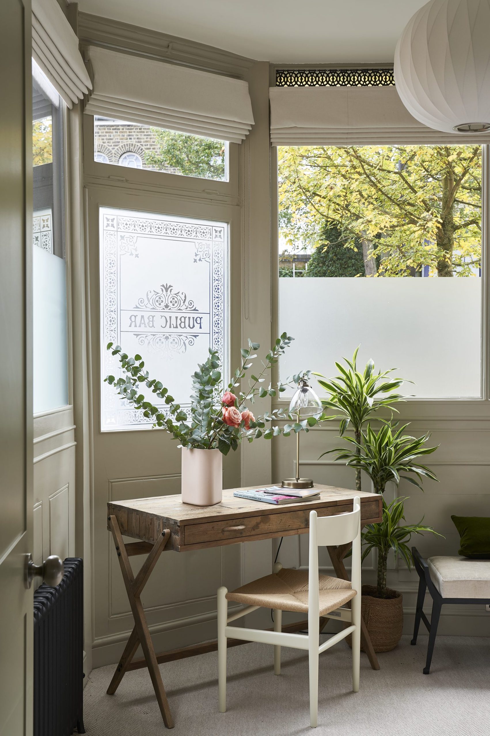
‘There’s no artifice here. Our home is half old, half new. The two parts relate to each other, but in a stripped back, honest way,’ they say. ‘Even with two toddlers running around, ‘that creates an air of calm.’
Photography / James Merrell
Architecture / Glenn Howells Architects
The homes media brand for early adopters, Livingetc shines a spotlight on the now and the next in design, obsessively covering interior trends, color advice, stylish homeware and modern homes. Celebrating the intersection between fashion and interiors. it's the brand that makes and breaks trends and it draws on its network on leading international luminaries to bring you the very best insight and ideas.