“Cabernetcore” is the Deeply Chic, Marvelously Moody Trend We're Predicting Will Be Huge in 2025 — 6 Decors I'm Buying Right Now to Get Ahead of the Curve
Not oxblood. Not burgundy. 'Unexpected red’ without the baggage. I selected six decors in the sumptuous shade to enhance every inch of your home

The Livingetc newsletters are your inside source for what’s shaping interiors now - and what’s next. Discover trend forecasts, smart style ideas, and curated shopping inspiration that brings design to life. Subscribe today and stay ahead of the curve.
You are now subscribed
Your newsletter sign-up was successful
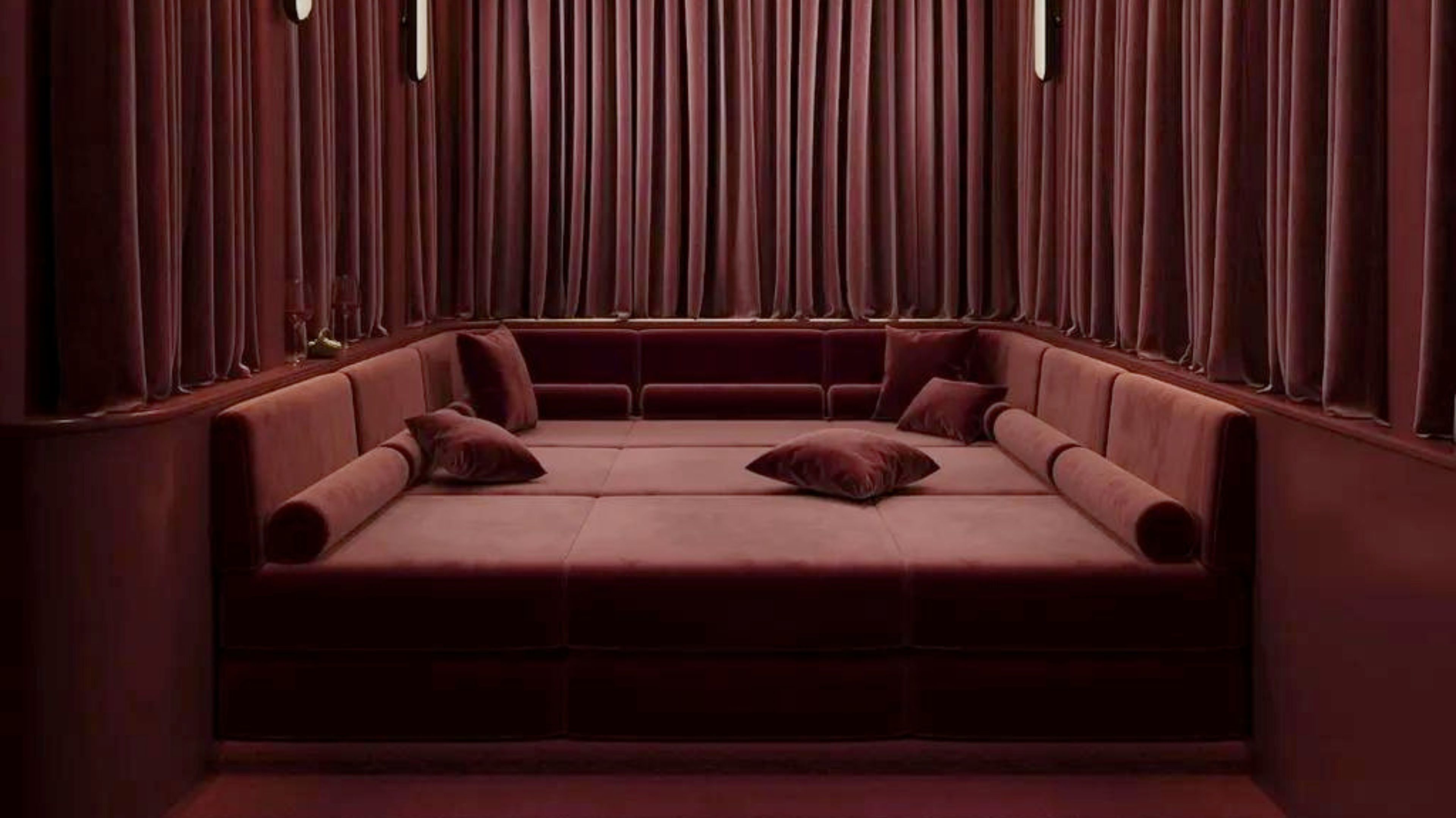
Jewel tones in fall are about as groundbreaking as florals in spring. Still, there’s one hue on everyone's lips at the Livingetc offices: "cabernet." Our editors predict this savory red will dominate the rest of this season and linger well into 2025.
Not oxblood. Not burgundy. Just the rich, velvety decadence of one of wine’s darkest reds. Like a glass of the adult beverage on a chilly evening, it’s the kind of color trend that invites you in — warm, elegant, and, dare I say, demure.
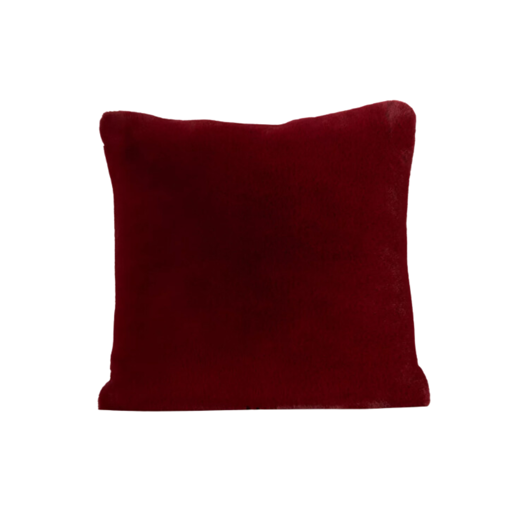
“If there were ever a time for burgundy to trend, it'd be the fall, when cozy browns, burnt oranges, and weathered silvers reign supreme,” says my style editor counterpart, Brigid Kennedy. “Think ‘unexpected red’ without the baggage,” she adds. “While cherry red needs space to thrive (lest it overwhelm), this deep burgundy plays well with others." Use it as an accent or a main shade — anything goes. For the former, try a cabernet table runner or armchair (Brigid says this bolster pillow is calling her name); the latter, directly on your walls.
Basically, all corners of your home are fair game for this sophisticated shade. I’ve found six pieces to help you paint the town cabernet — starting now. Trust me, this hue is here to stay.
Price: $30
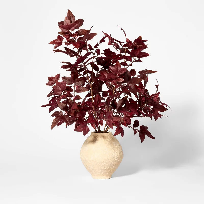
Cabernet-colored leaves make for a rich and versatile accent. Whether placed by the entryway, on a credenza, coffee table, or even as a dining centerpiece, they set the tone. I love that this potted faux arrangement isn’t done in monochrome — the beige ceramic pot gives it that effortlessly "lived-in" feel that doesn’t try too hard.
Price: $249.99, Was: $687
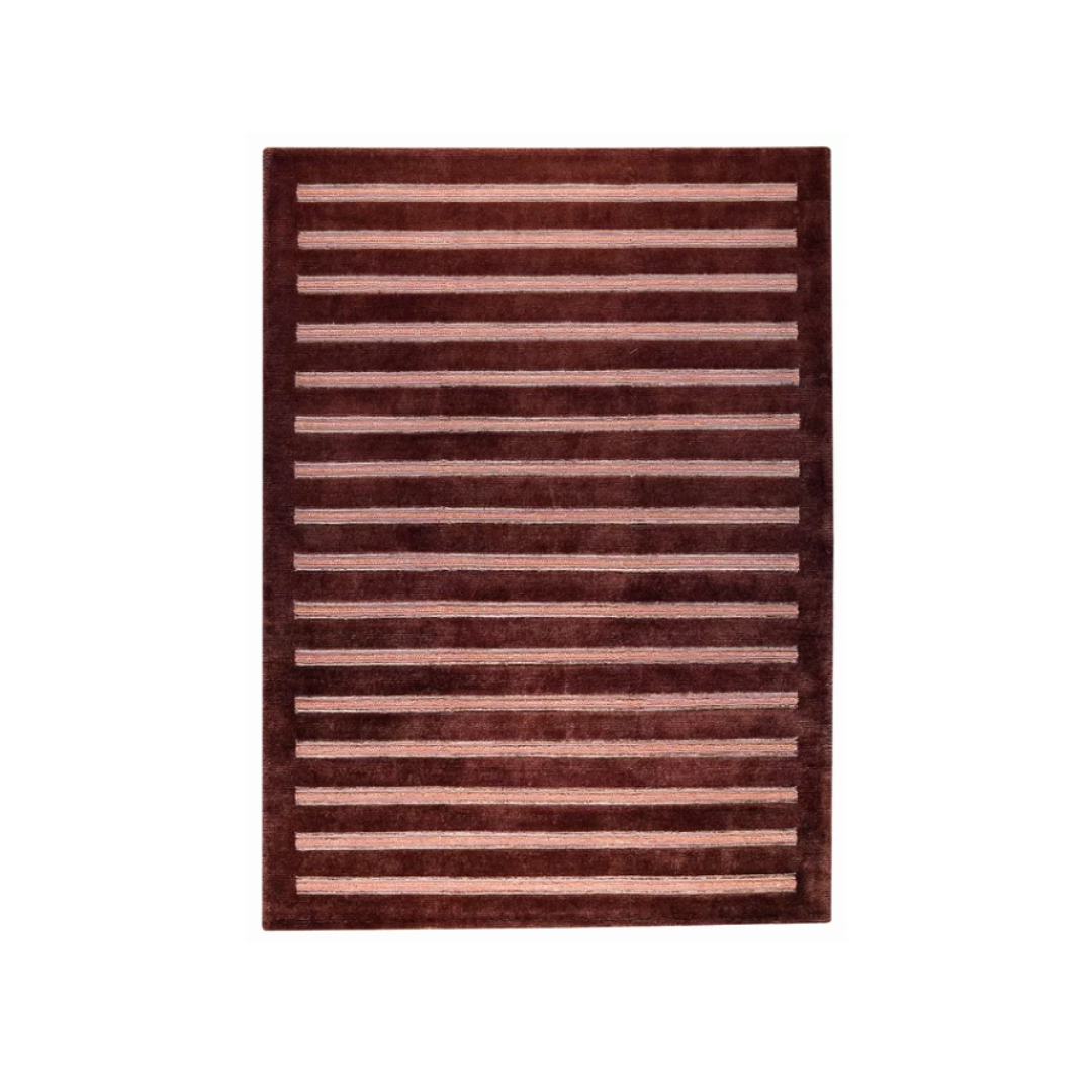
This is one of the best rugs I've seen in some time! Cabernet and pink — a match made in heaven, like the red velvet cake of color pairings, it's rich, decadent, and just sweet enough. It pairs beautifully with deep walnut woods or lush emerald greens, but for something unexpected and of the moment, try a pop of sky blue. Opposites on the color wheel = major contrast.
Price: $110
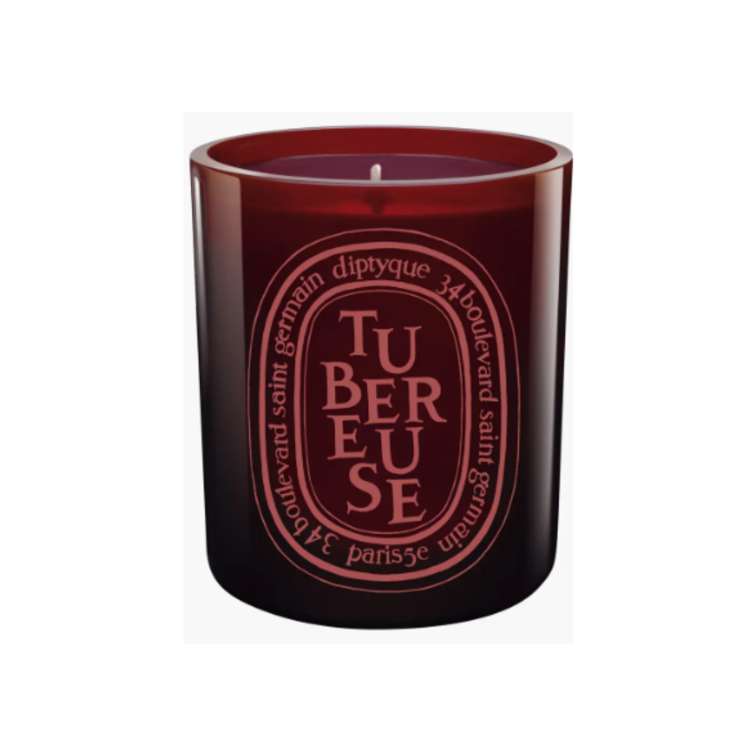
Even the most die-hard Diptyque fan might not have this special red vessel edition. Vampy and totally autumnal on the outside, but the scent? A delicate surprise. Inspired by slender white tuberose flowers from Southern India, it’s fresh and green, with a hint of fruity sweetness and a creamy twist. It’s one of the best candles to break from the usual pumpkin spice — florals with a sultry, cozy vibe, perfect for fall or, honestly, all year long.
Price: $48
Faux fur feels apt for the season, but I’m a firm believer it’s a year-round indulgence — it just makes everything feel…fancier. That’s especially so with the decadent wine pairing in this pillow. It adds so much depth to any space, but beyond that, it’s impossibly soft and plush. Say hello to your new favorite couch companion.
Price: $129
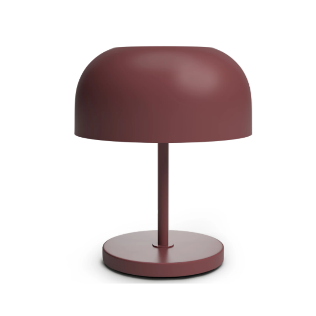
Not to state the obvious, but this no-fuss, no-frills lamp is so sophisticated. Sleek, clean design, all metal, Article’s Oslo lamp is a mid-century dream, the kind of piece you’d imagine on Don Draper’s desk. It brings a moody contrast to more eclectic setups, like that stack of books you’ve been collecting over the years.
Price: $399
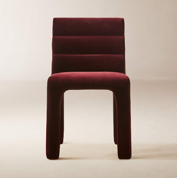
This Brett Beldock-designed chair may be marketed for dining, but I say it’s capable of so much more. Sure, a set of six would make a statement (and I’ll live vicariously through you), but even as a standalone piece, it’s a showstopper. With deep channel-tufted velvet and bold architectural lines, it’s the best seat in the house. Pair it with a leather magazine holder, and settle in.
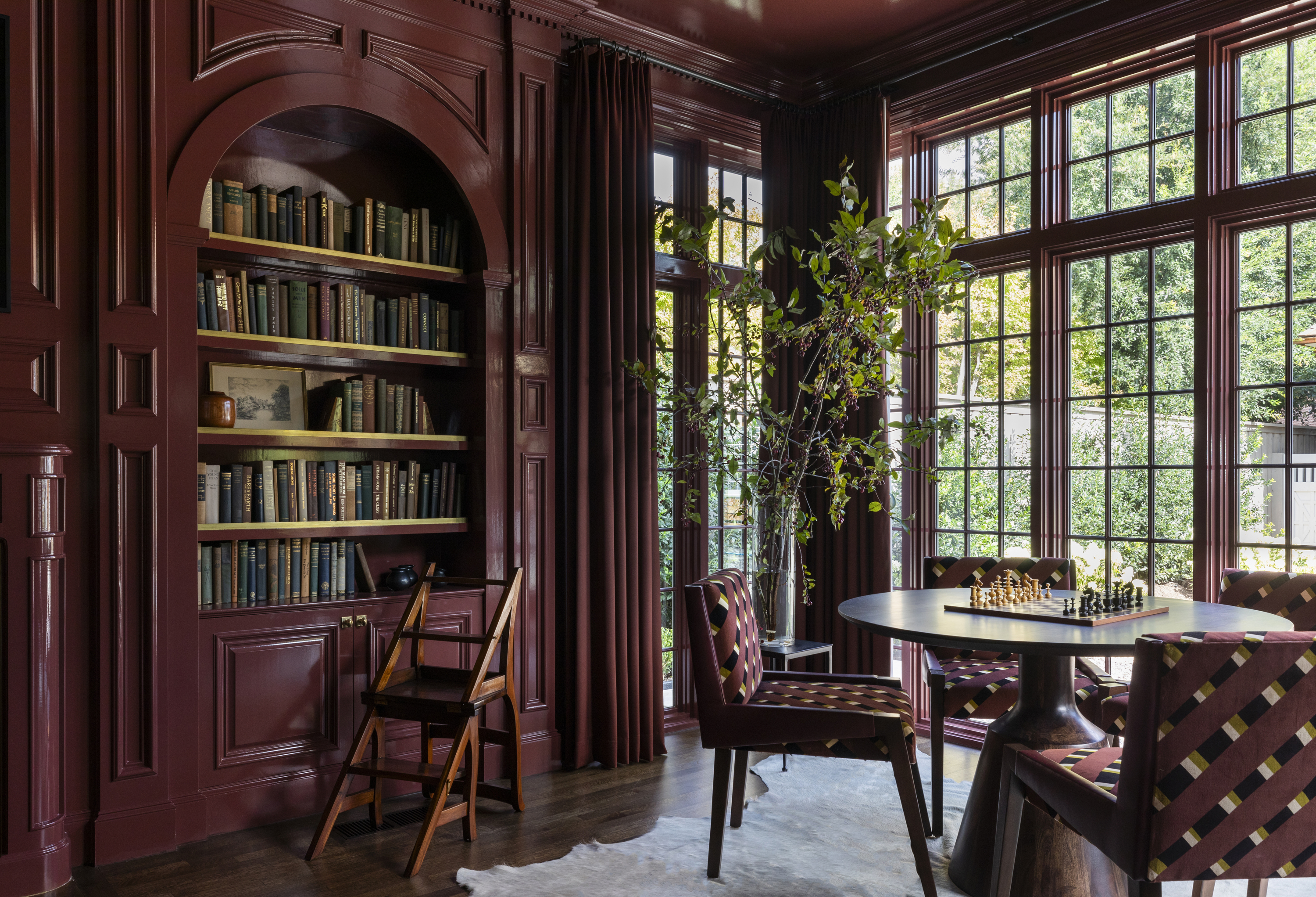
"I've used Cabernetcore around my house long since before the term was coined — as a rich-toned wall color and in numerous accessories," says Lucy Searle, Livingetc's Content Director. "I'm a big fan of double drenching, and although it's not easy to find colors that go with red, this particular tone is easy to coordinate with: match it with spice shades, such as cinnamon or turmeric and deep browns for a color scheme that feels enveloping through fall and winter, and rich and bold from spring through summer."
The Livingetc newsletters are your inside source for what’s shaping interiors now - and what’s next. Discover trend forecasts, smart style ideas, and curated shopping inspiration that brings design to life. Subscribe today and stay ahead of the curve.

Formerly covering fashion at L’Officiel USA, style maven Julia Demer brings her love of design to Livingetc’s world of interiors. As the title’s New York-based Style Editor, Julia's work reflects a sharp eye for detail and an innate passion for aesthetics. Her journey began with a strong foundation in design, honing her craft at renowned establishments like The Row and even establishing her own eponymous fashion brand. Julia’s design background is evident in the way she thoughtfully curates shopping edits, always maintaining a focus on emerging trends while preserving timeless sensibilities. For Julia, fashion and interiors go hand in hand, reflecting her lifelong commitment to perfecting the art of style.