Which Two Colors Should Not Be Used Together in Your Home? 'Stay Away From These 4 Combos,' Say Experts
Color experts list out some of the most unpalatable pairings for interiors, and offer alternatives that look better

The Livingetc newsletters are your inside source for what’s shaping interiors now - and what’s next. Discover trend forecasts, smart style ideas, and curated shopping inspiration that brings design to life. Subscribe today and stay ahead of the curve.
You are now subscribed
Your newsletter sign-up was successful
Wondering which colors do not go together? You're not the first one pondering over this decorating dilemma. Certain colors may seem like a great idea but when used in interiors can create a jarring look, or completely throw off the scheme of the rest of the home.
To help you identify these colors, we reached out to experts. These are the pairings you need to steer clear of and instead, follow these color trends for winning combos.
1. Avoid Pink and Black, Use Pink and Neutrals Instead
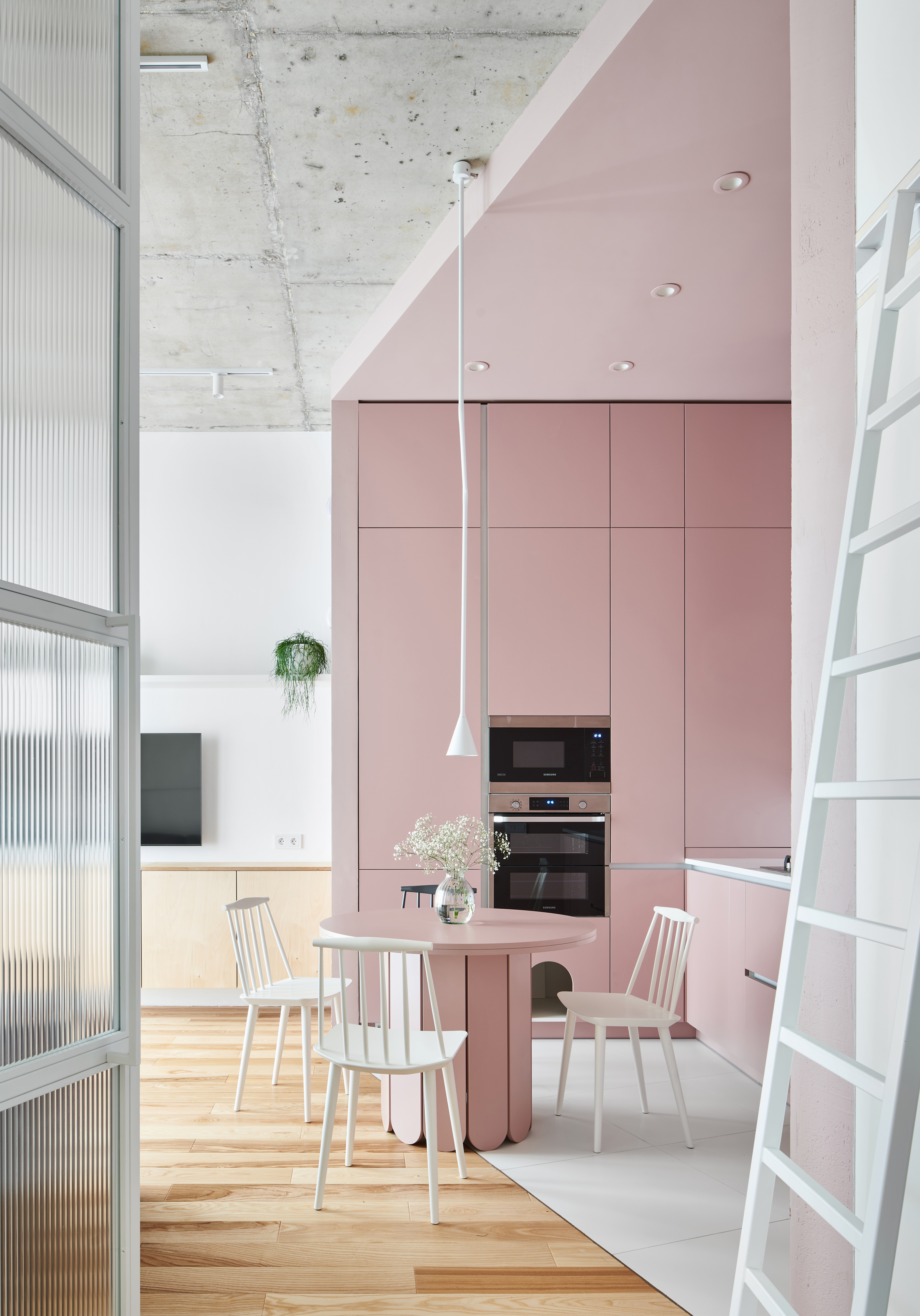
While color blocking walls are a great way to add character and style to an interior, you want to be sure you're choosing the right tones. Certain colors can feel a bit too extreme together, especially if they're both used liberally. One such pairing is black and pink.
'Pink and black can create a jarring contrast which is not ideal for interiors, especially if you're using the bright tones,' says Jane Lockhart, founder of Jane Lockhart Design. 'The two offset each other in a stark way and create an uncomfortable visual. Instead, I'd suggest pairing pink with neutral tones like grays, dark grays, cream, and even chocolate for the right visual balance.'
Plus, many colors go with pink so the possibilities are endless. In the picture above, the soft pink works wonderfully when paired with white furniture, and other other wooden elements. If a neutral pairing feels less impactful, consider a combo of pink and blue, or pink and green.
2. Avoid Orange and Yellow, Use Orange and Brown Instead
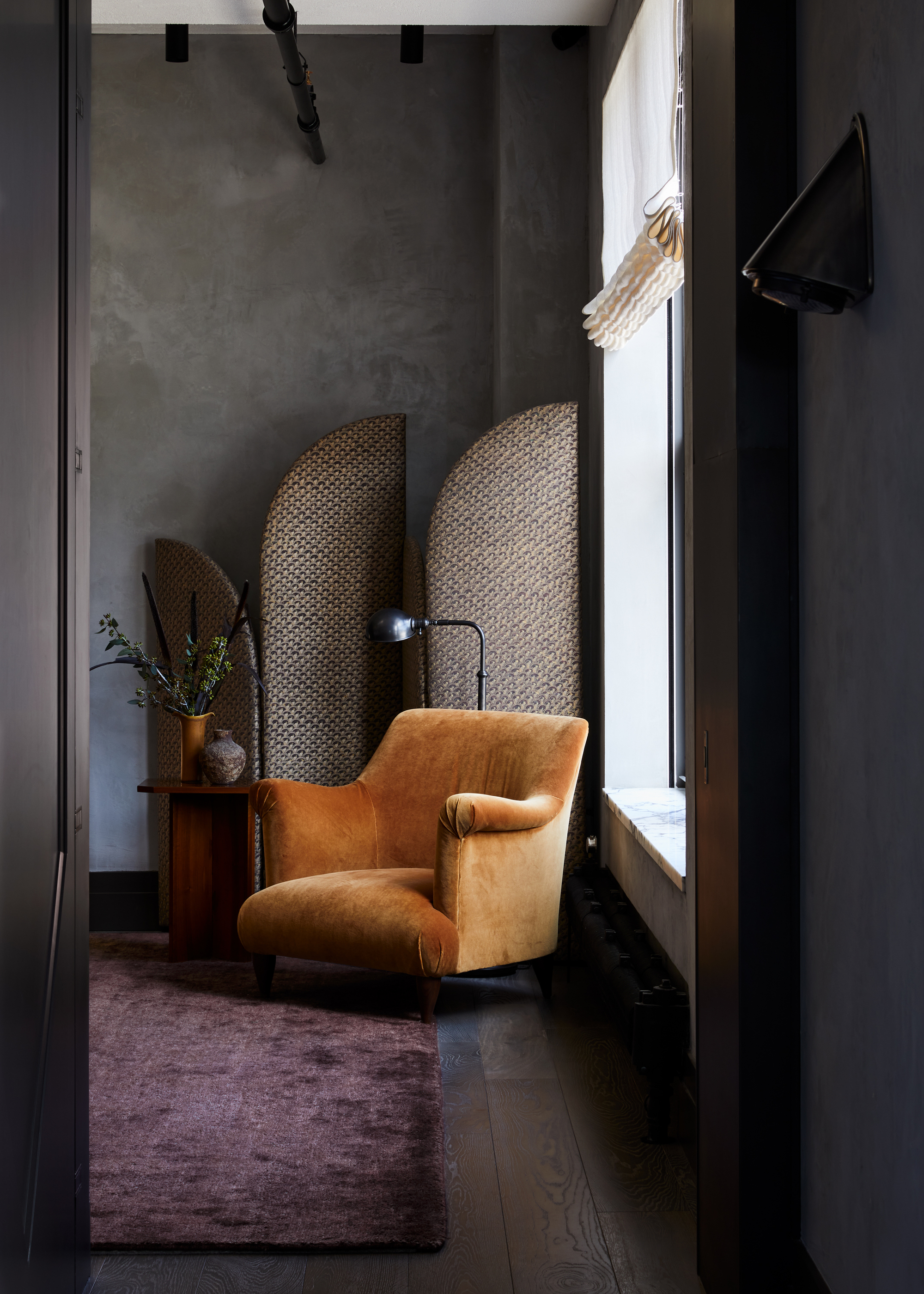
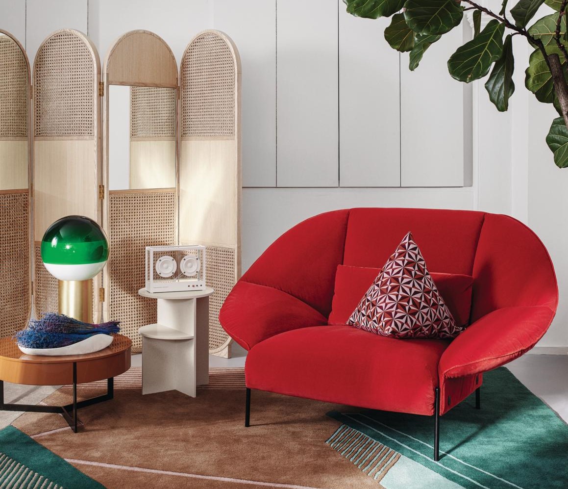
Both orange and yellow are individually wonderful fall palettes and can create the most calming interiors (especially if you're using the more muted yellow). But when the two tones are used together in their bright incarnations, they can create a visual that is hard to live with.
'In my opinion, orange and yellow should never be paired together,' says Lucie Ayres, founder of 22 Interiors. 'They are too jarring as a pair, however, if you want to do an orange, you can pair it with a rich brown, deep navy, or almost black-green for a more relaxing palette.'
The Livingetc newsletters are your inside source for what’s shaping interiors now - and what’s next. Discover trend forecasts, smart style ideas, and curated shopping inspiration that brings design to life. Subscribe today and stay ahead of the curve.
Other colors that go with orange are cream, beige, and green. These will help create a more timeless palette.
3. Avoid Purple and orange, Use Purple and pink instead
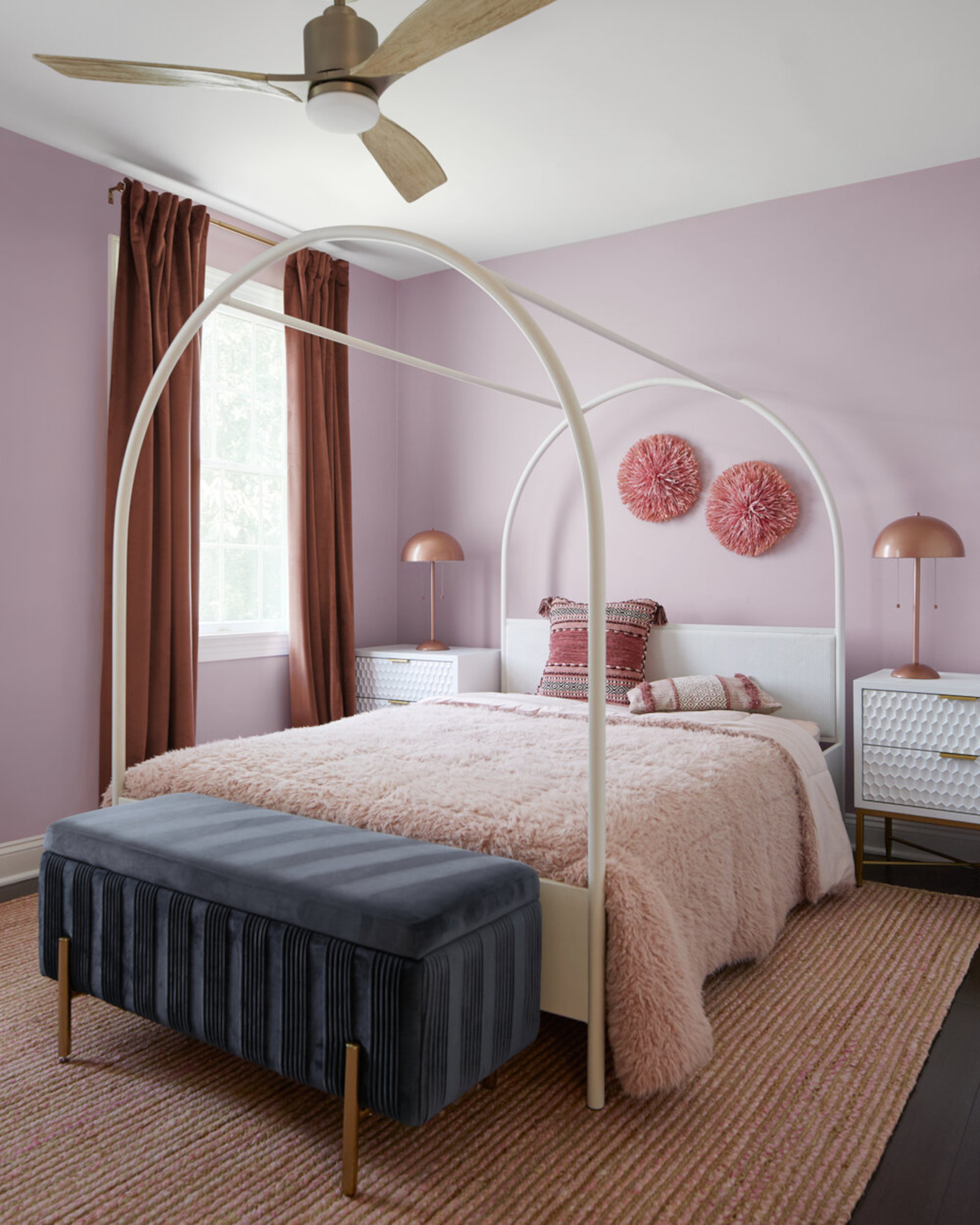
'When I think of which two colors should not be used together, for me it all depends on the color tones,' says Grey Joyner, founder of Grey Joyner Interiors. 'For example, orange and purple. These are great tones for sports team jerseys but not colors that should be used together as part of interior design. It's better to use softer palettes that feel timeless.'
'A good idea is to choose natural shades like eggplant, lavender, and lilac for a more grounded effect, especially for those who fear overly saturated spaces while looking for the positive feelings of joy and calm purple can offer,' says interior designer Sarah Barnard of Sarah Barnard Design.
Lavender in particular has a soothing quality, and many colors go with lavender such as green, white, and pink. Layer in these colors together for a dainty interior.
4. Avoid Red and green, Use Red and gray
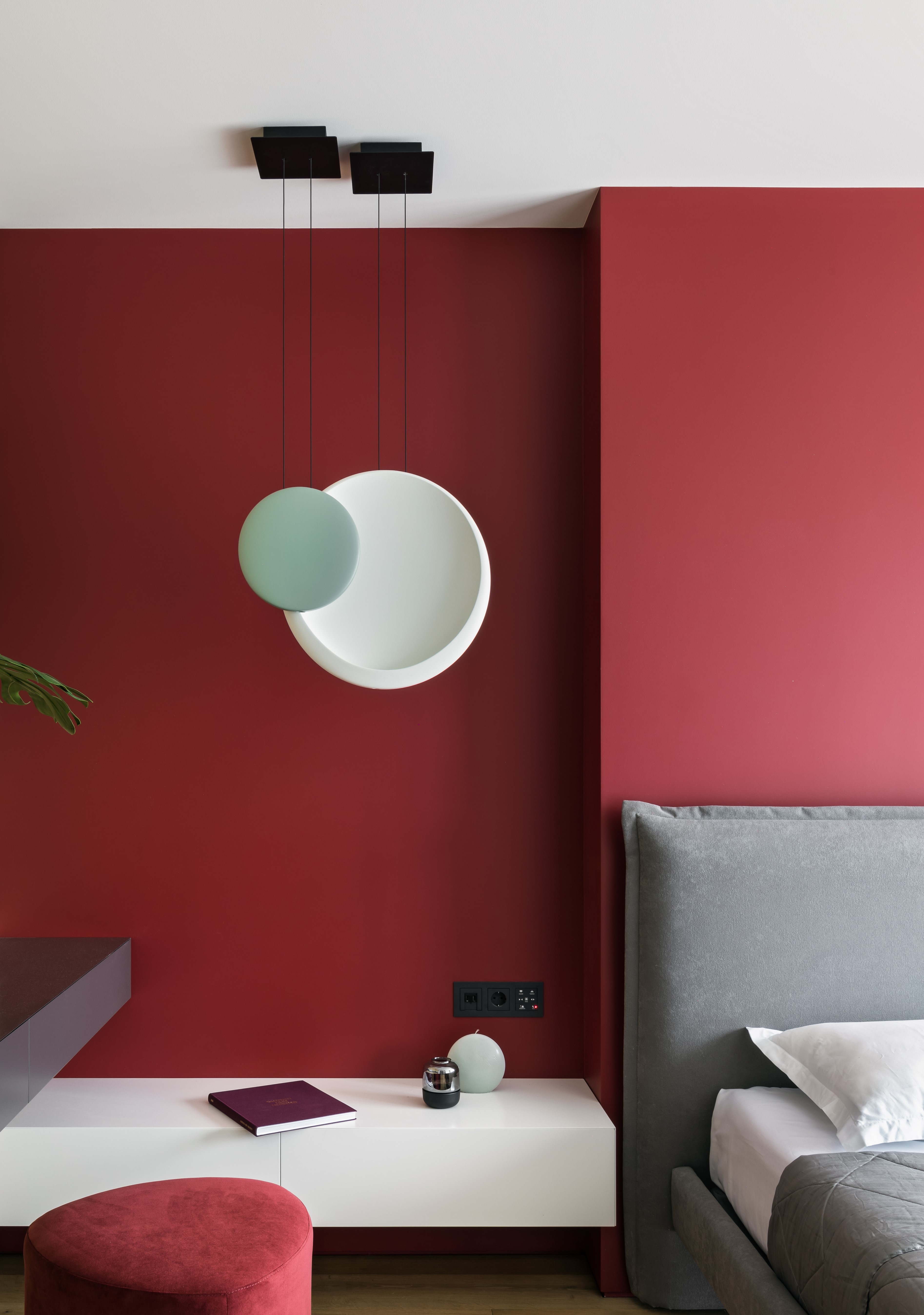
A Christmas classic, red and green obviously makes for a winning color scheme for the holiday time, but this palette usually cannot shake free of its festive connotations to be a part of our home the rest of the year.
'Instead of pairing red with green, pair red with a neutral like a charcoal grey to make it pop yet look smart,' says Jane.
Among the easiest colors that go with red is gray, and a wonderful pairing this is. Grey helps ground and mute the stark red, and helps create a more livable interior.
Do note that if your heart is truly set on red and green, there are ways to play around these hues.
'There are many shades of red and green that go together beautifully such as soft green with a rusty red that looks incredible,' say interior designers Jenna Choate-James and Mariana Ugarte of Interior Fox. 'It's all about avoiding the primary colors and playing the shades in between if you want to avoid a festive feel.'
3 on-trend colors to buy

Aditi Sharma Maheshwari started her career at The Address (The Times of India), a tabloid on interiors and art. She wrote profiles of Indian artists, designers, and architects, and covered inspiring houses and commercial properties. After four years, she moved to ELLE DECOR as a senior features writer, where she contributed to the magazine and website, and also worked alongside the events team on India Design ID — the brand’s 10-day, annual design show. She wrote across topics: from designer interviews, and house tours, to new product launches, shopping pages, and reviews. After three years, she was hired as the senior editor at Houzz. The website content focused on practical advice on decorating the home and making design feel more approachable. She created fresh series on budget buys, design hacks, and DIYs, all backed with expert advice. Equipped with sizable knowledge of the industry and with a good network, she moved to Architectural Digest (Conde Nast) as the digital editor. The publication's focus was on high-end design, and her content highlighted A-listers, starchitects, and high-concept products, all customized for an audience that loves and invests in luxury. After a two-year stint, she moved to the UK and was hired at Livingetc as a design editor. She now freelances for a variety of interiors publications.

