Before & After — This Condo Now Looks Clean and Crisp Thanks to a Fresh Contrasting Color Palette
The once-dated Calgary home is almost unrecognizable after receiving a bright and airy makeover

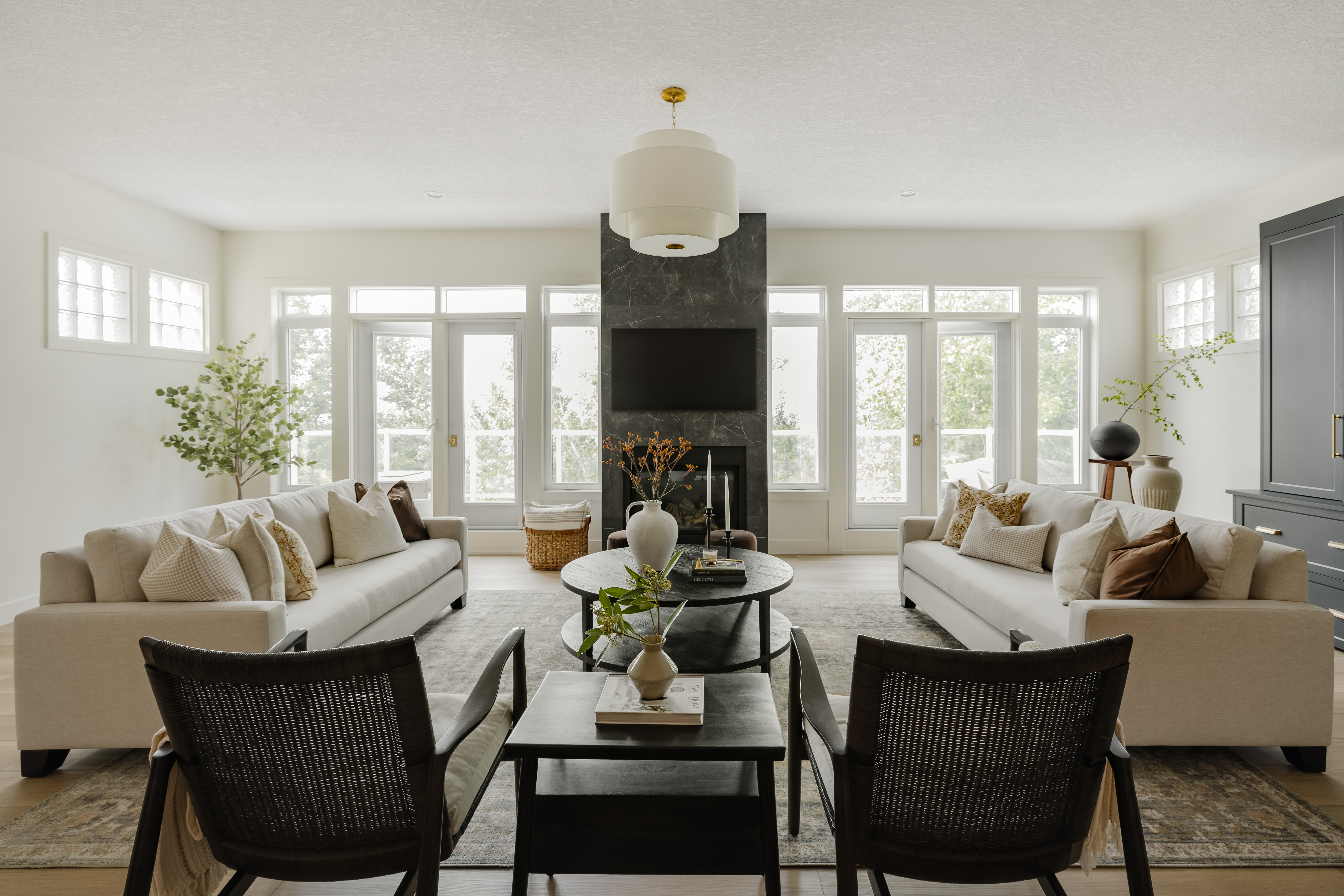
Nothing screams dated like a dark home overwhelmed with mahogany tones. Believe it or not, that's exactly what this Calgary condo used to look like before receiving a fresh makeover. By opening up the space and relying on a clean, crisp, and contrastive color palette, this design team turned a bland, lackluster space into the elegant and sophisticated haven you see before you.
A big focus of this project was the entryway and kitchen, spaces that were closed off and not conducive to the convivial feel the homeowners longed for. "Our client sought to transform her dated condo, with a particular focus on making the kitchen more functional," explains Aly Velji, the interior designer behind the transformation. "She envisioned a space that was updated yet retained a sense of warmth, as she frequently entertains guests. It was essential for the design to be timeless, given the significant nature of this renovation."
With contemporary updates, built-in storage solutions, custom millwork, and a cohesive color palette, the new modern home achieves exactly that. Not only does the floorplan now flow much more freely from room to room, but the simple, clean tones make the space feel so fresh. It truly is a masterclass in modern decorating.
Article continues belowKitchen
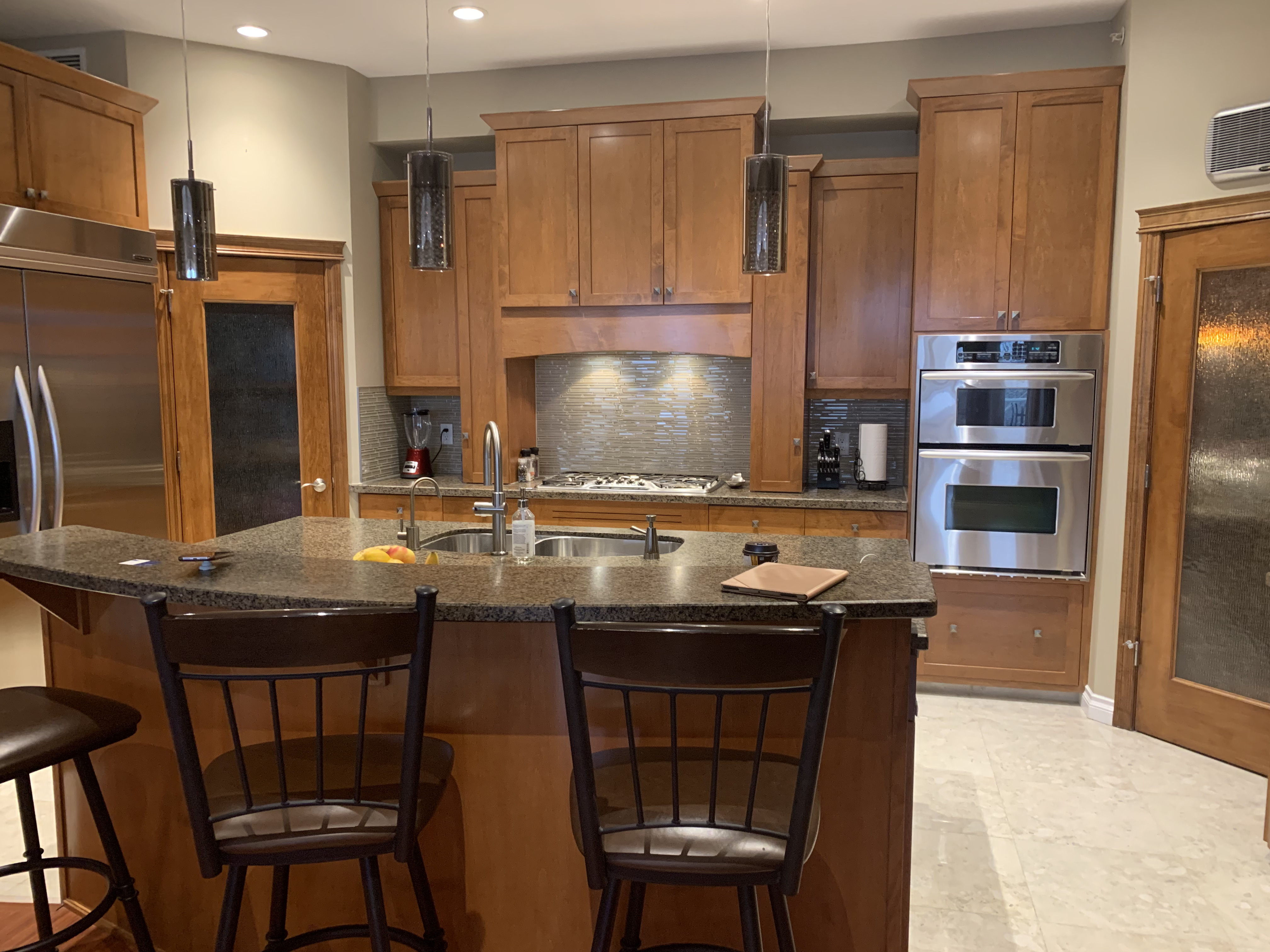
The dated kitchen was the primary focus of this renovation. To modernize the floorplan but retain the distinct kitchen space, Aly Velji and his team squared off the kitchen. They then added custom millwork that incorporated a built-in pantry, a space with open shelving for a coffee bar area, an integrated hood fan with a beautiful plaster detail, and a generous new island that allowed for more storage and seating. The new kitchen idea has completely transformed the space from dark and dingy to bright and inviting.
Much of this is thanks to the simplicity of the black and white color palette - a theme seen throughout the rest of the home. "We chose the contrasting black and white color palette to ensure the space exuded a timeless elegance," says Aly. "The dark accents unify the design, providing cohesion and depth, while the lighter elements, such as the wall color and kitchen cabinets, contribute to a light and airy atmosphere. The original space was quite dark, so we aimed to completely transform it, creating a bright, inviting, and sophisticated environment."
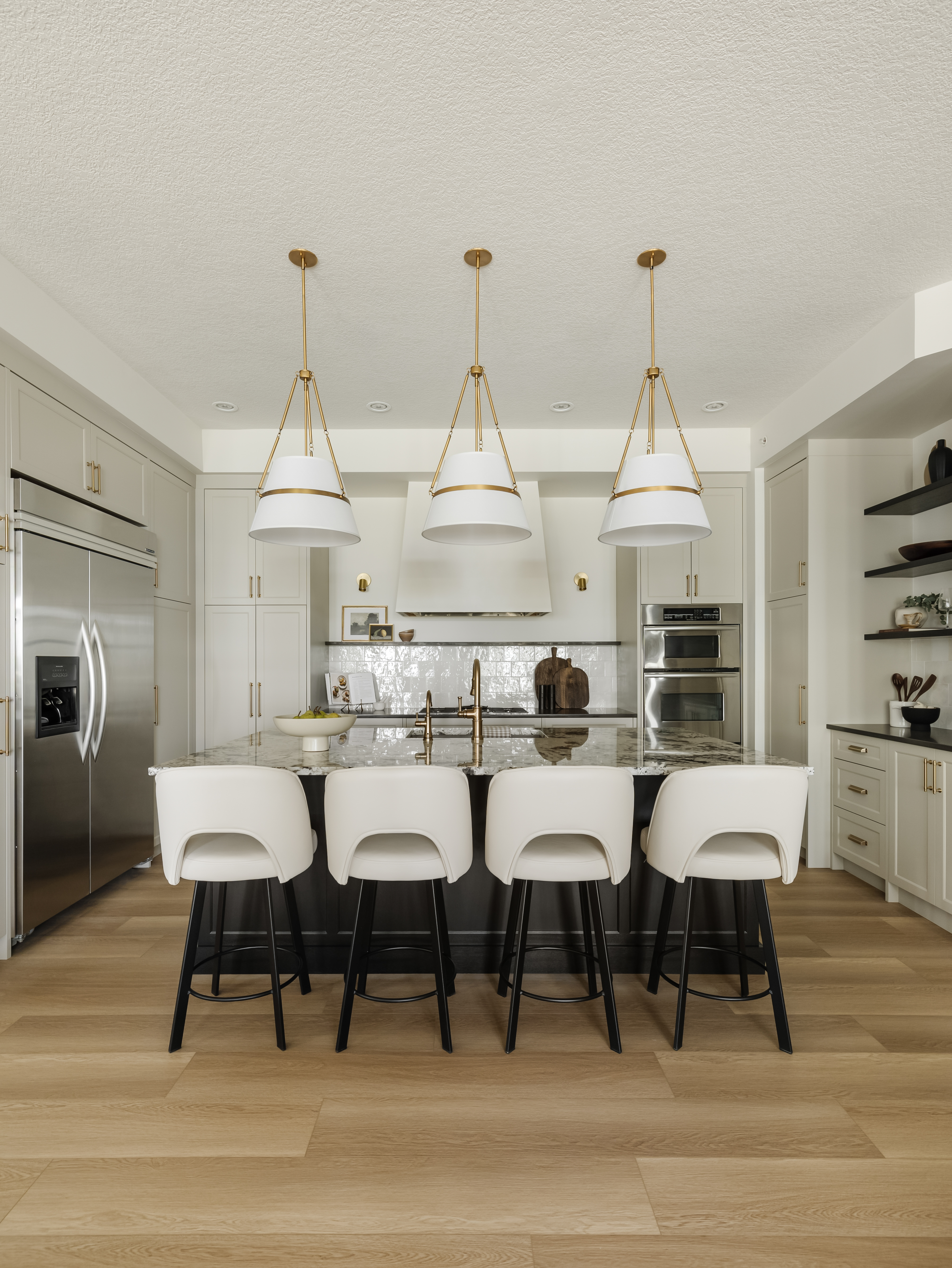
Updating the space for the modern day was key to the redesign, but longevity was also at the forefront of Aly's mind. The result is a simple yet chic kitchen that promises to endure for years to come. Even the more "trendy" details - such as the brass hardware and lighting accents - are easy to interchange at a minimal cost.
Functionality was a priority, too. "By removing the corner pantry, we were able to square off the kitchen, thereby creating additional space in the entry closet," Aly explains. "This allowed us to introduce more functional pull-out pantry storage. We eliminated the upper cabinets and integrated the hood fan with a beautiful plaster finish, which helps to open up the visual space. Meanwhile, the floating shelf adds a decorative detail, perfect for housing accessories, while the sconces on either side of the hood enhance the aesthetic appeal."
The Livingetc newsletters are your inside source for what’s shaping interiors now - and what’s next. Discover trend forecasts, smart style ideas, and curated shopping inspiration that brings design to life. Subscribe today and stay ahead of the curve.
Since this is a condo, this is a relatively small kitchen, so Aly ensured he maximized space as much as possible. "On one side of the pantry, we installed darker floating shelves to make use of an awkward angled wall, providing additional storage for decorative items, cookbooks, and more," he says. The island also features hidden storage for pots, pans, and recipe books. "Aesthetically, the island's base, crafted from dark oak, creates a striking contrast and sets it apart from the perimeter cabinets," Aly adds.
Living room
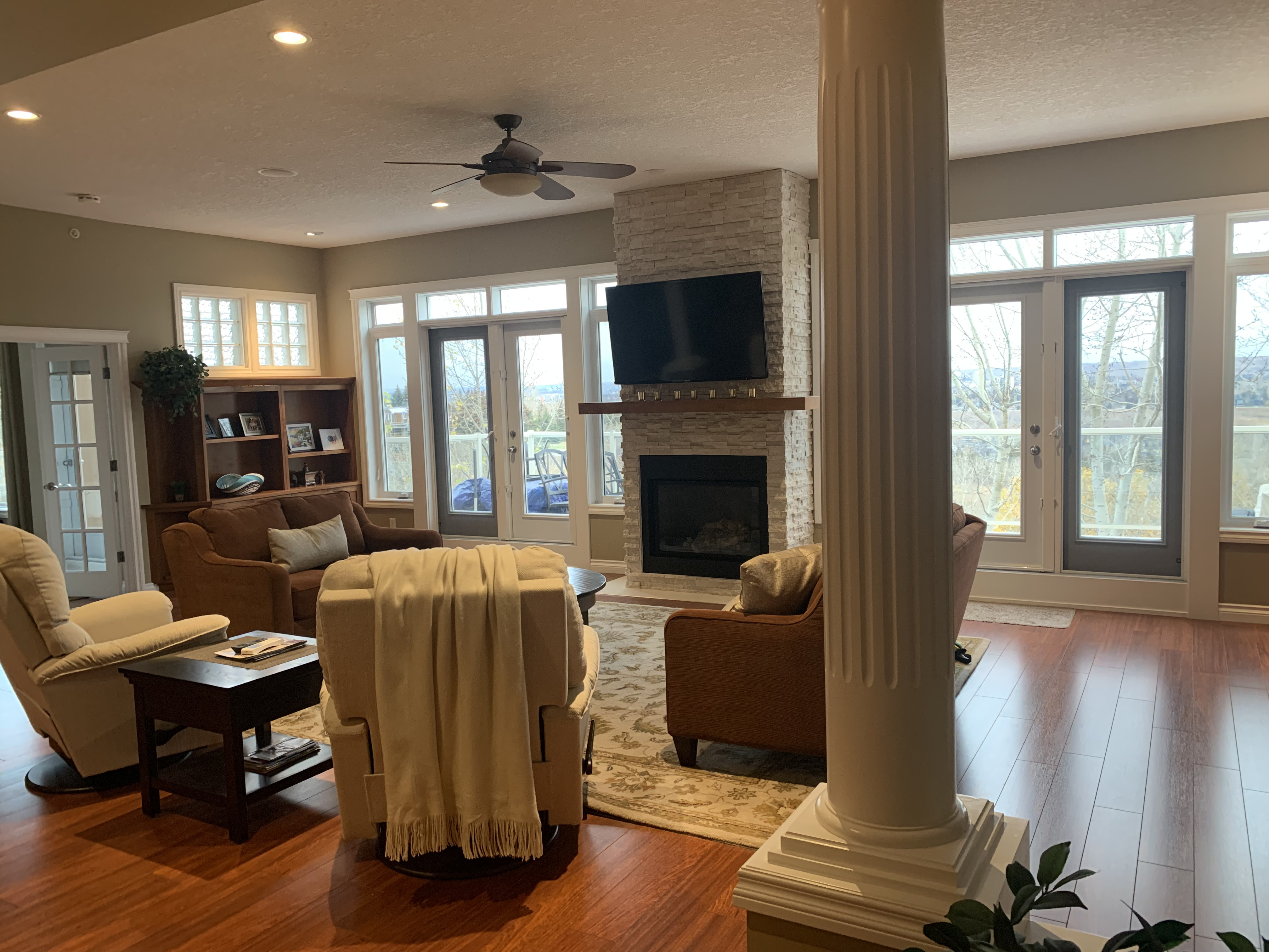
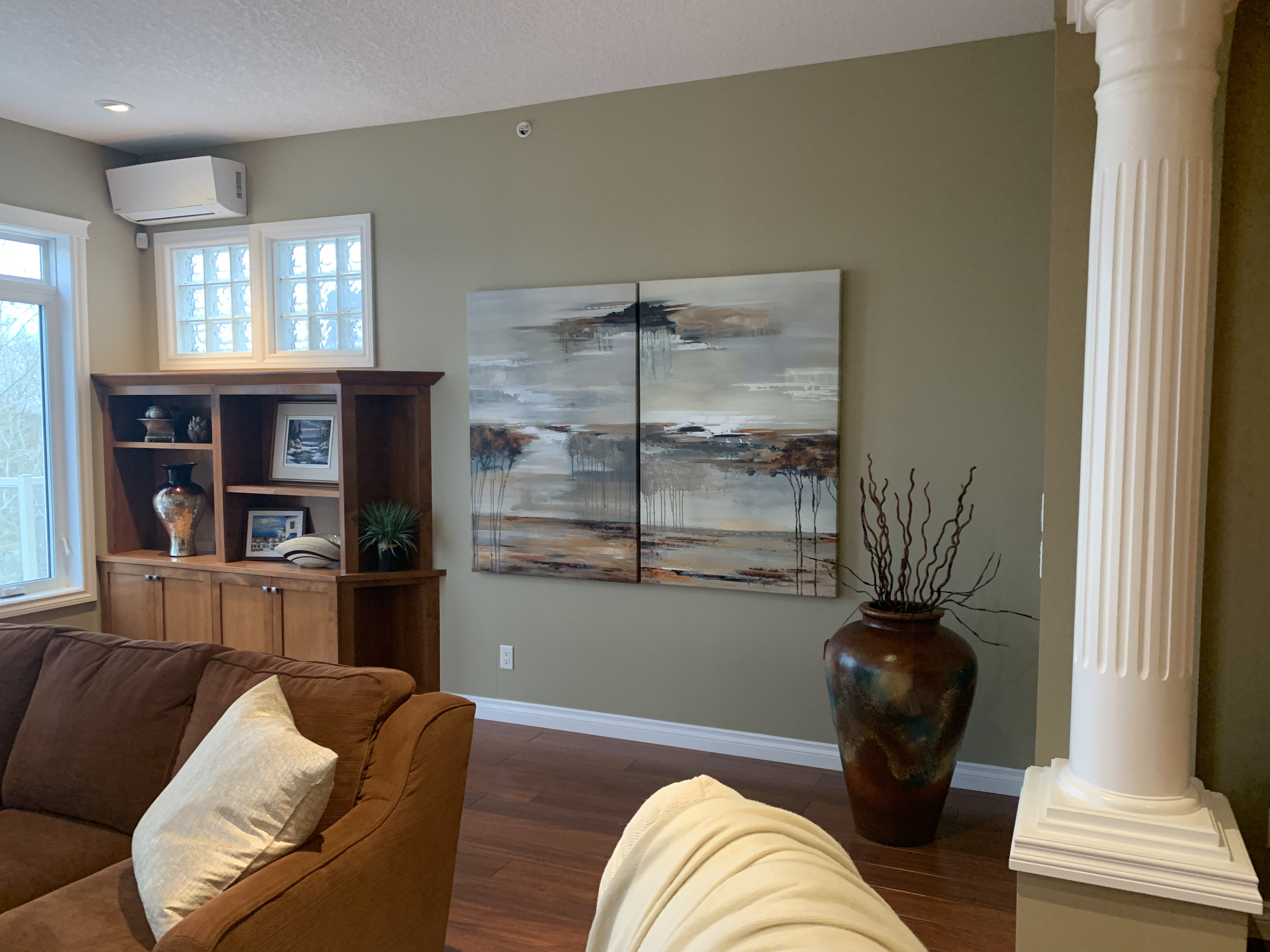
Before the renovation, the living room felt equally dark with clunky columns that made the room difficult to navigate. To modernize the room, Aly squared the columns off and removed the base to make them look more transitional. "The original columns were re-clad with a simple molding detail and then painted out white to make the space feel less heavy," he says. "We also decided to arch the spaces in between for some softness and to carry in the arch detail that we incorporated in the entryway."
There was also a focus on introducing timeless furniture in this room, so a mix of modern and transitional pieces - along with some inherited antiques - were used. "One of my favorite details is how the space feels curated over time," notes Aly. "We incorporated several of the client’s cherished antiques, blending them with new pieces to add a modern touch. This mix of old and new is a hallmark of our design philosophy, bringing a sense of history and personality to each space."

The updated living room idea feels so bright and airy, largely owing to the simplicity of the light color palette, peppered with black accents. "Painting out the space in a lighter color really helps to create a bright and airy feel in the living space," notes Aly. "The dark marble that we clad the fireplace in helps to create a nice focal point in the living space and helps with contrast. Overall, the furniture that we selected was kept lighter in tones with a more organic feel."
Get the look
Also of note is the integration of a desk space within this communal area. As more of us work from home, dedicated areas for productivity are in high demand. While a home office might be the ideal option, not all of us have the space to designate an entire room to working. And, even if you do have a separate home office elsewhere, a desk area in a shared living space allows you to work without isolating yourself from the rest of the family. A living room home office idea like this one is a brilliant option, and makes great use of what was once dead space in this condo's living room.
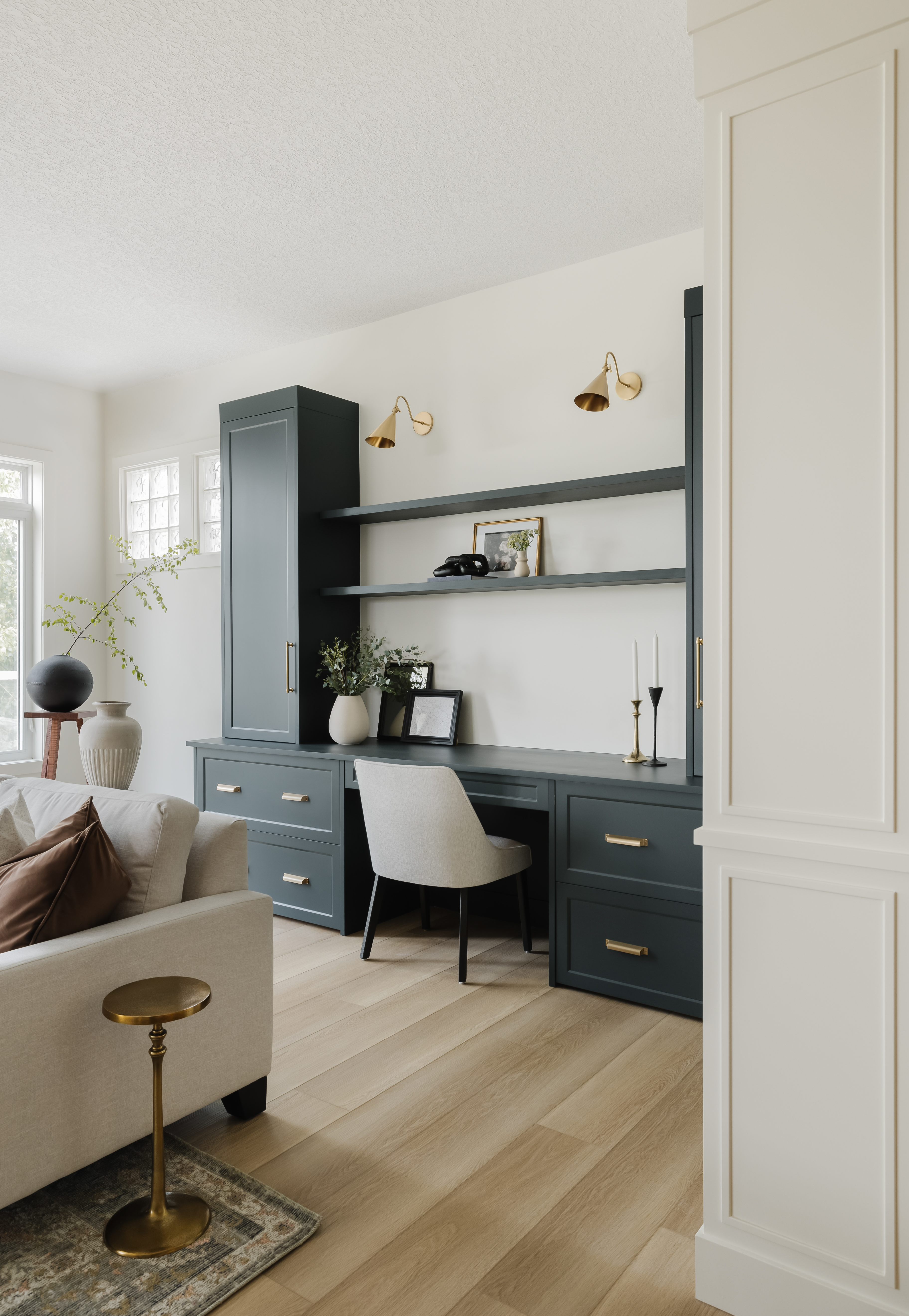
What's more, thanks to Aly's attention to zoning, this desk area still feels completely distinct from the rest of the space. "The homeowner lacked a dedicated office area, making this the ideal spot for a study nook where she could use her computer, handle correspondence, and pay bills," Aly explains. "To distinguish this area from the rest of the living room, we chose a rich deep green color for the cabinets, setting it apart from the other millwork in the home."
According to Aly, zoning rooms with color is one key way to differentiate distinct areas. "You should also use rugs, lighting, or furniture arrangements to define different areas within an open space. This creates visual boundaries while maintaining an open feel," he adds. And, lastly, he advises us to make our layouts purposeful. "Plan the layout to ensure each zone has a specific purpose and flows well with the rest of the space," says Aly. "Creating multifunctional areas in a home not only optimizes space but also adds versatility, making it more adaptable to the homeowner's needs."
Get the Look for Less
Bedroom
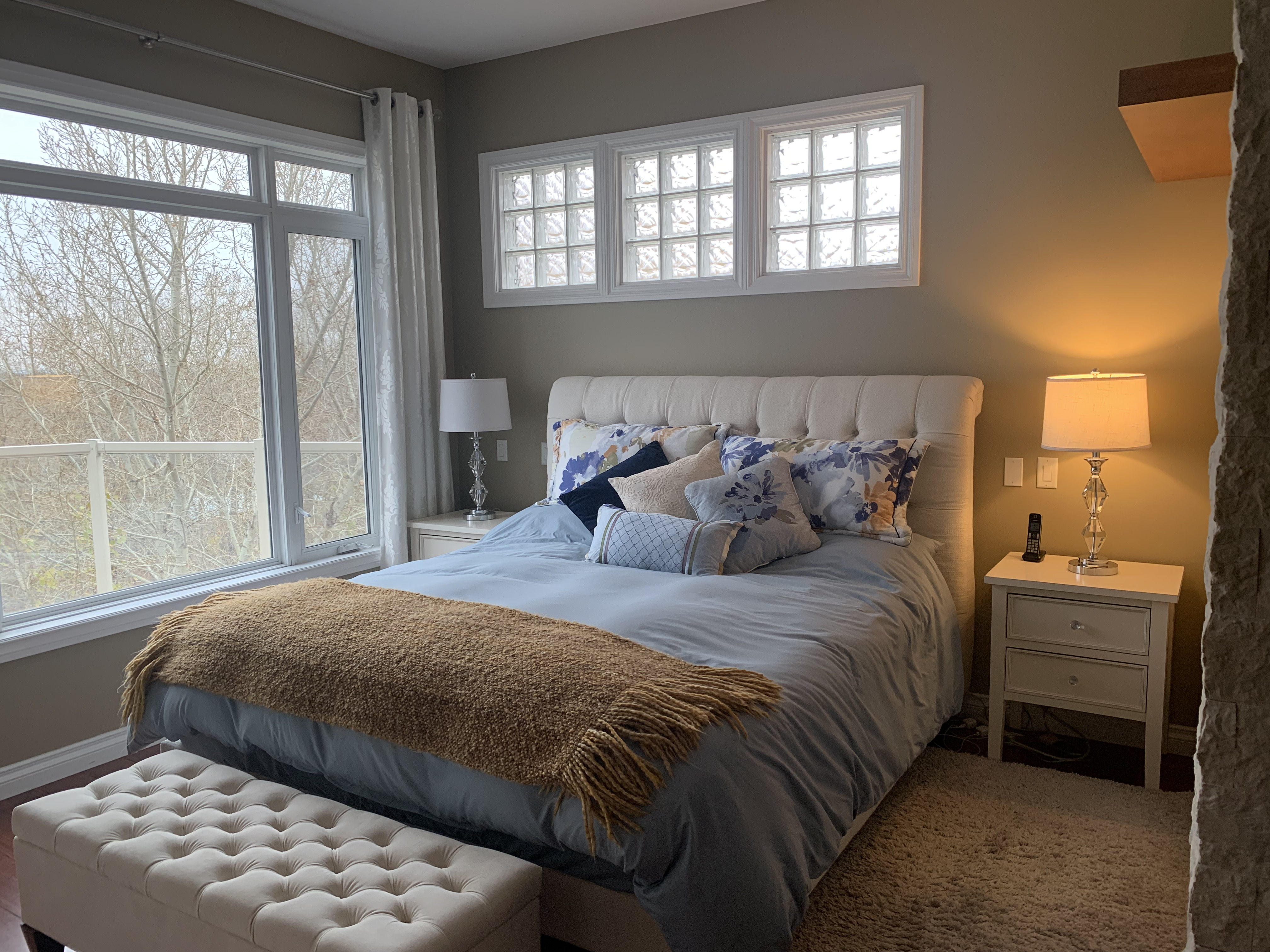
Before Aly and his team worked their magic, the main bedroom idea featured unique details such as glass brick windows and a stone accent wall, but the overall design failed to draw attention to these intriguing focal points. These were two features the homeowners were keen to retain, and Aly was determined to pay homage to them in the renovation.
By choosing a neutral palette and opting for a minimalistic style, both the stone surround and the quaint windows make more of an impact. "We chose to retain the stone surround for the fireplace in the bedroom as it added significant texture and warmth to the space," Aly says. "The creamy tone of the stone harmonized beautifully with the overall palette, enhancing the room's cozy ambiance."

He also used these existing features to influence the new design. "The existing stone texture inspired the surrounding design, encouraging us to incorporate complementary elements that emphasize natural materials and soft, inviting hues," Aly notes. "By blending the stone's earthy feel with modern furnishings and subtle decor touches, we created a serene and cohesive retreat."
In terms of changes, the team focused on painting the walls and adding new furniture and decor accents. "The bedroom benefits from an abundance of natural light, so extensive modifications were unnecessary, which also helped manage costs," says Aly. The result is a cozy bedroom idea akin to a nurturing spa retreat.
This renovation proves that sometimes, the best transformations are the simplest of all. With a few tweaks, some furniture updates, and a fresh color palette, this condo is now a serene and sophisticated space with timeless appeal.

Lilith Hudson is a freelance writer and regular contributor to Livingetc. She holds an MA in Magazine Journalism from City, University of London, and has written for various titles including Homes & Gardens, House Beautiful, Advnture, the Saturday Times Magazine, Evening Standard, DJ Mag, Metro, and The Simple Things Magazine.
Prior to going freelance, Lilith was the News and Trends Editor at Livingetc. It was a role that helped her develop a keen eye for spotting all the latest micro-trends, interior hacks, and viral decor must-haves you need in your home. With a constant ear to the ground on the design scene, she's ahead of the curve when it comes to the latest color that's sweeping interiors or the hot new style to decorate our homes.
