You'd Never Think These Colors Go Together, but This Home's Living Room Makes Them Work — Here's How
Our resident color expert explores how the colors used in this family's cinema room create balance with an undercurrent of contrast

The Livingetc newsletters are your inside source for what’s shaping interiors now - and what’s next. Discover trend forecasts, smart style ideas, and curated shopping inspiration that brings design to life. Subscribe today and stay ahead of the curve.
You are now subscribed
Your newsletter sign-up was successful
Design journalist and author Amy Moorea Wong is an expert on color in interior design. To help decode the secrets behind a successful palette, she picks her favorite schemes and breaks them down, from the wow moments to the hidden details, and everything in between.
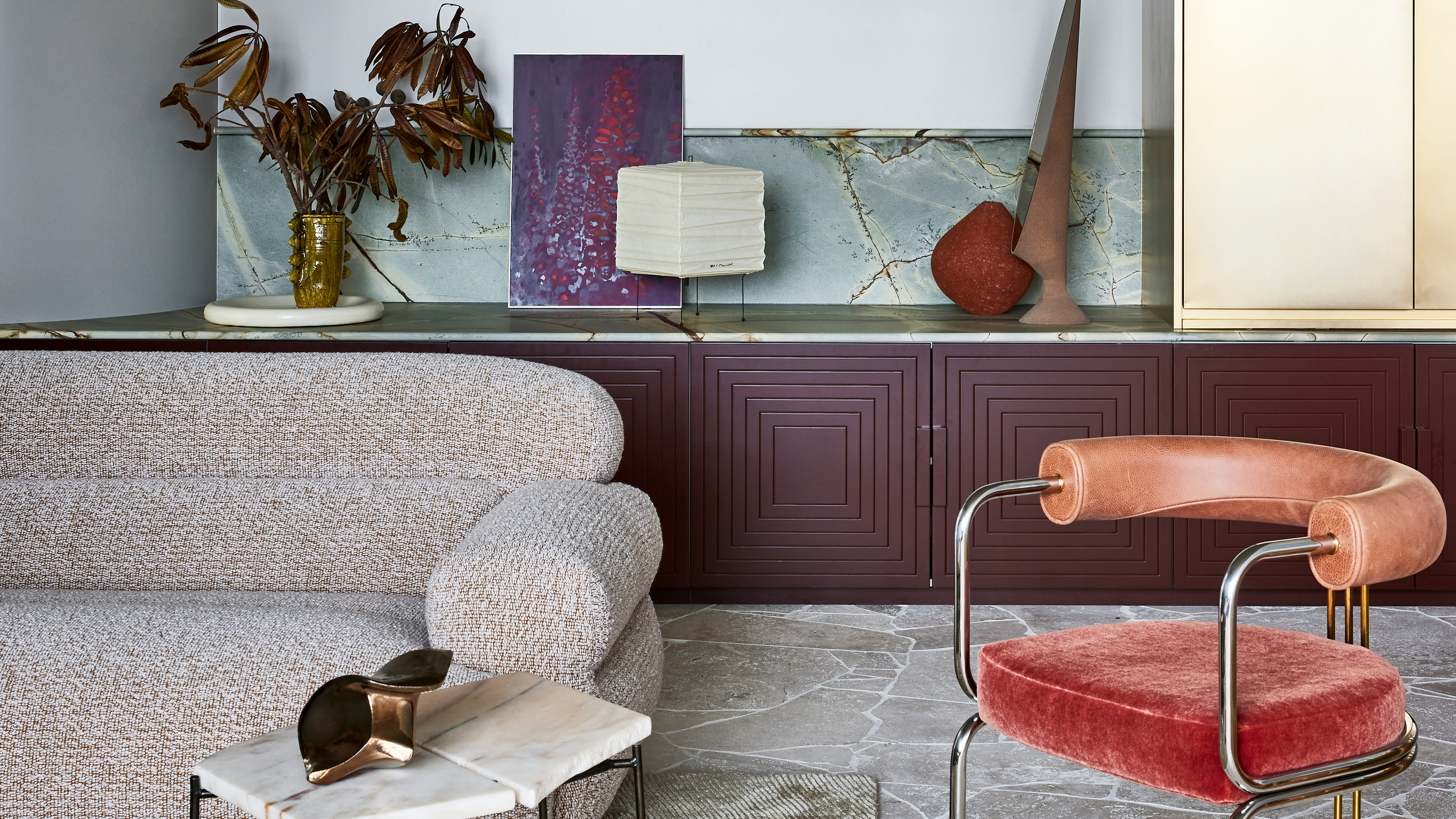
Well, this is a struggle. Where to look first? What most deserves the attention in this decorating scheme... The glowing gold cabinet? The low-but-statement-making purple-y dark red storage? The touch-me-touch-me velvet of the pale red chair? The subtle textures and alluring materials all around? Step back and enjoy it all at once – which is how it was designed, of course – and it comes together like a puzzle, each piece neatly clicking into place.
Are red, blue, gray and beige really colors that go with purple? Yes, but this room is arguing with itself. Okay, it’s more like a friendly debate or some playful teasing, but there’s a slight ruckus, an undercurrent of a tussle, as the dramatic textures and tones strike intense contrast with one another. Warm versus cold. Color versus neutrals. Slick versus textured. Organic versus machined. Rustic versus new. Soft versus hard.
Article continues below"The cool tones are contrasted with the warmth of the brass cupboard, and the warm, neutral palette is grounded with a pop of deep burgundy joinery," says Julie Niass, design director at Australian firm Carter Williamson Architects, creators of this space. "The colors make the room feel warm and inviting, elevated and sophisticated, while the mix of materials adds texture, embracing light and shade."
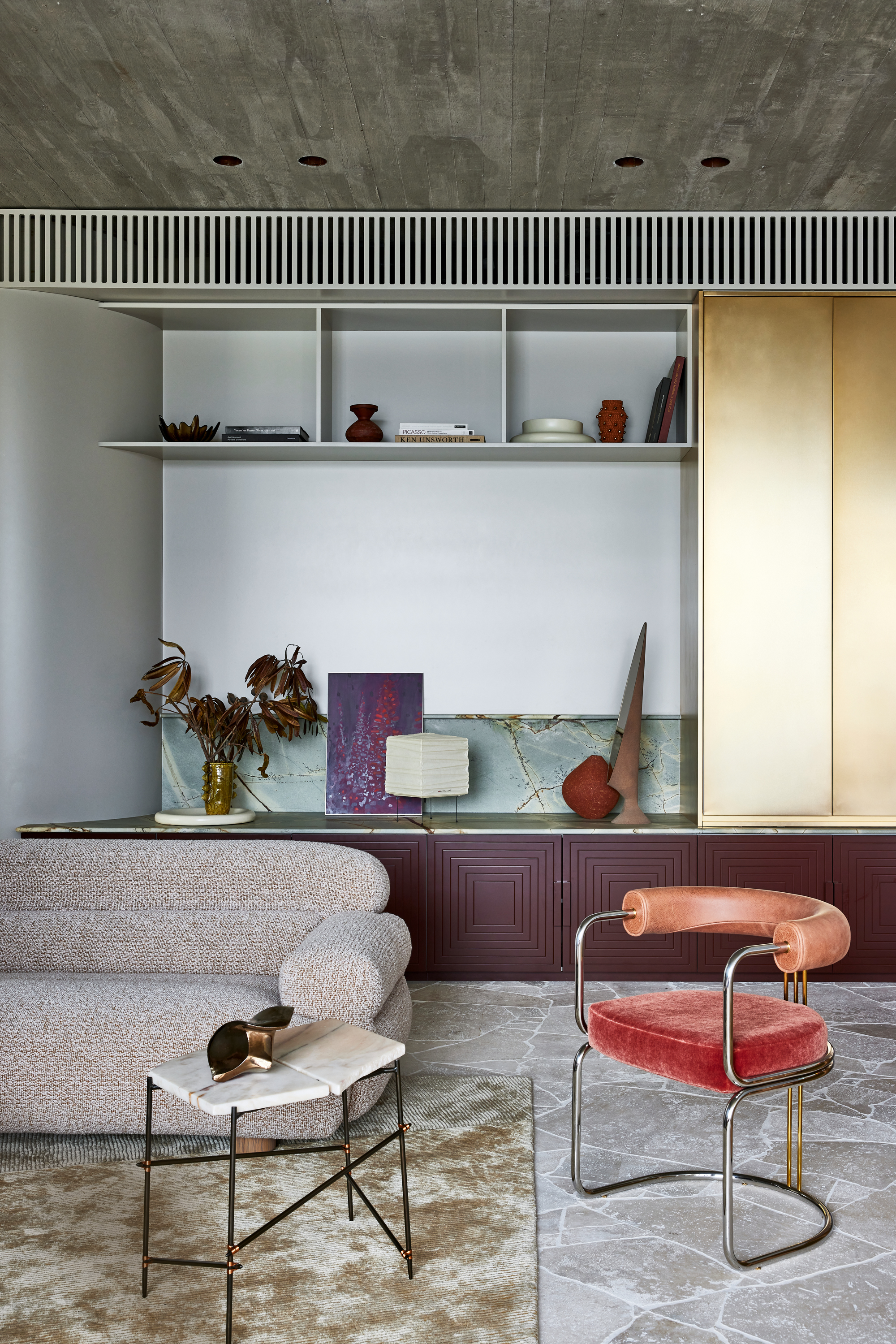
The warmth of the gold cupboard acts as the sun, casting its enriching glow over the colder tones in the space like a warming blanket. It also plays a key role in distracting you from the fact that this is, really, a grey room. Gray above, gray below, gray in the middle. The pops of unusual hues and textures do a great job as distractors from this fact, which is part of this room’s mystique and power. Walk away and you’re not talking about color, not gray, but there it is nonetheless, it's undeniably a gray living room.
Have you seen the odd-color out? The shade that’s hiding, almost camouflaged against the grayness? It’s the pale blue stone tucked splashback-like into the shelving area. It’s very much its own hue, a definite blue-not-grey bringing freshness and personality into the nook and wider room, while also linking to both the surrounding greys with its coolness, and the warmer neutrals with its brown and yellow-toned veining (which also, uniquely to the materials in this space, brings a hit of the organic).
Is that flagstone paving I see at my feet? Yes, yes it is, and that is somewhat of a surprise — grab some pampas grass and we’d be in the middle of a garden in the 1970s. But this living room, as is tradition, is very much indoors. While a hard gray floor can often be cold and harsh in a space designed for relaxation, the uneven sizes of these erratically-placed travertine slabs create a natural, spontaneous feel, inviting the gaze to freely wander through it and explore (in heavy contrast to the room’s overall linearity — minimal gridded shelving, square cupboard design et al).
The Livingetc newsletters are your inside source for what’s shaping interiors now - and what’s next. Discover trend forecasts, smart style ideas, and curated shopping inspiration that brings design to life. Subscribe today and stay ahead of the curve.
A similar effect is echoed above, with the strict lines of the concrete ceiling softened by a patina that feels time-worn and nuanced, while the sofa, chair and rug stand by ready to provide curl-up-here-coziness and warmth.
While at a glance it might seem pared back and controlled, this is a space where the unexpected flourishes. It’s experimental. It’s expressive. It’s exciting. Every surface has its own character, each creating a spark of curiosity, which, when combined, results in a space full of dynamism and life — in a way that’s both calming as well as intriguing.
Build the Palette
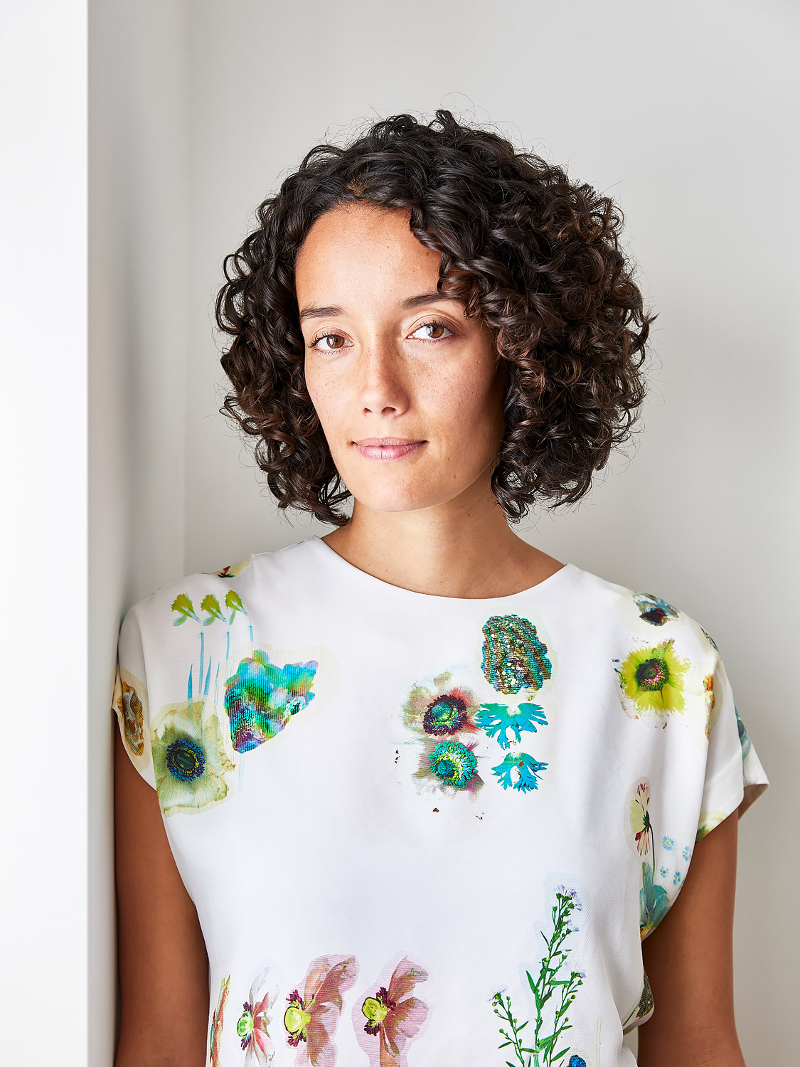
Amy Moorea Wong is a color authority and contemporary interior design writer who has specialized in all things decorating for over a decade. Amy is Livingetc magazine’s Colour Expert, Interiors Editor at The Glossary magazine and a Contributing Editor at Homes & Gardens magazine, and she frequently contributes to an array of global publications to share her insights on interior design zeitgeist. Her book Kaleidoscope: Modern Homes in Every Colour explores a collection of cool colorful homes fizzing with creativity, surprises, and inspiration.


