The 6 relaxing kitchen colors you should be using for calming schemes, according to designers
Create a sense of zen in your kitchen with these designer-approved relaxing colors – from calming greens to dreamy blues

The Livingetc newsletters are your inside source for what’s shaping interiors now - and what’s next. Discover trend forecasts, smart style ideas, and curated shopping inspiration that brings design to life. Subscribe today and stay ahead of the curve.
You are now subscribed
Your newsletter sign-up was successful
We often talk about curating calm in certain, more intimate spaces within the home, like bedrooms and bathrooms – but has it ever occurred to you that your kitchen could be a source of relaxation, too?
For anyone with a busy household (or an intense dislike of cooking), that might feel like a far-off dream. But as kitchen color ideas go, the designers we spoke to for this piece all agree that creating a restful kitchen is important – and it can be as simple a task as choosing the right relaxing color scheme. We asked the experts to share their favorite shades – read on for their ideas.

Ellen is Livingetc's print editor, and an experienced interiors journalist. For this piece, she spoke to interior designers and color experts to get their ideas for relaxing kitchen color schemes that help bring a sense of calm to this busy heart of the home.
Relaxing kitchen colors for a calming space
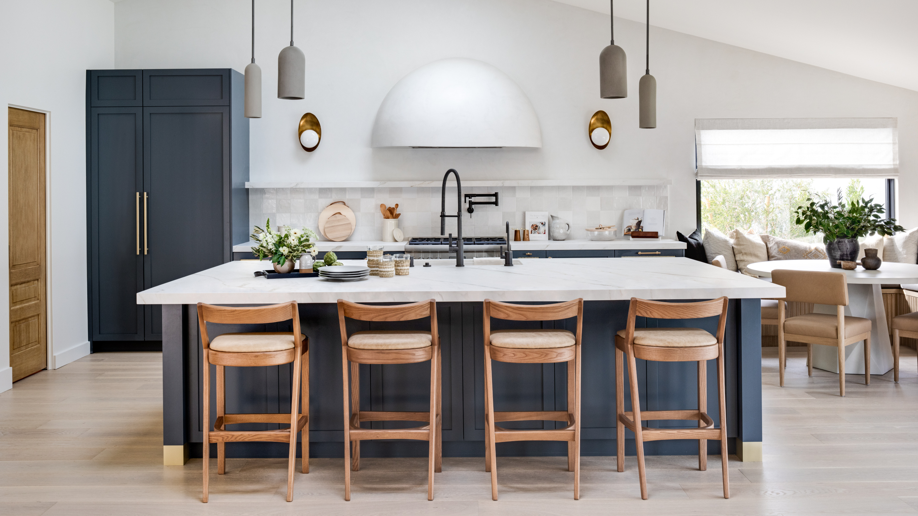
To achieve a restful scheme, it's all about curating a sense of balance, as Californian interior designer Sarah Rosenhaus explains. 'If you're painting your walls, select a cabinet finish that is more neutral to complement the color, keep the counters and backsplash understated or select a paint color that picks up on the tones in your marble slab,' she says.
'When painting cabinets, choose a shade of white for the walls that will complement and allow your cabinets to shine. We love a heavily veined marble, such as Calacutta Viola, with a painted cabinet that picks up on the tones in the marble.'
So, what are the best relaxing kitchen color ideas to use in your scheme?
1. Natural greens
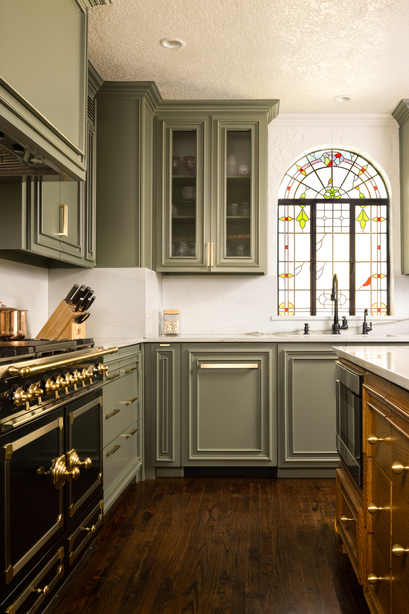
Green's association with nature might go some way to explain why this shade is relaxing – it was one of the top colors recommended by the designers we spoke to. As this kitchen by Maestri Studio shows, it's also versatile – it sits comfortably next to lighter and darker shades, bringing balance to the space.
But which green kitchen ideas work best? 'Shades of sage and olive green are grounding and relaxing,' says Christy Spearman of Atlanta-based Duffy Scott Interiors. 'One of our favorite colors to use in the kitchen is Dried Thyme from Sherwin Williams.'
The Livingetc newsletters are your inside source for what’s shaping interiors now - and what’s next. Discover trend forecasts, smart style ideas, and curated shopping inspiration that brings design to life. Subscribe today and stay ahead of the curve.
'We can look to classic greens – a timeless option for most cabinetry – as one of the best colors for exuding calm,' says Patrick O'Donnell, color expert and Farrow & Ball ambassador. 'Look for something that has a deeper shade, like Duck Green, and temper the weight of this with a gentle pastel to bring softness. Or try flipping this look with walls in a fresh, verdant green like Calke Green and keep cabinetry simple and clean with a classic white.'
2. Pared-down pinks
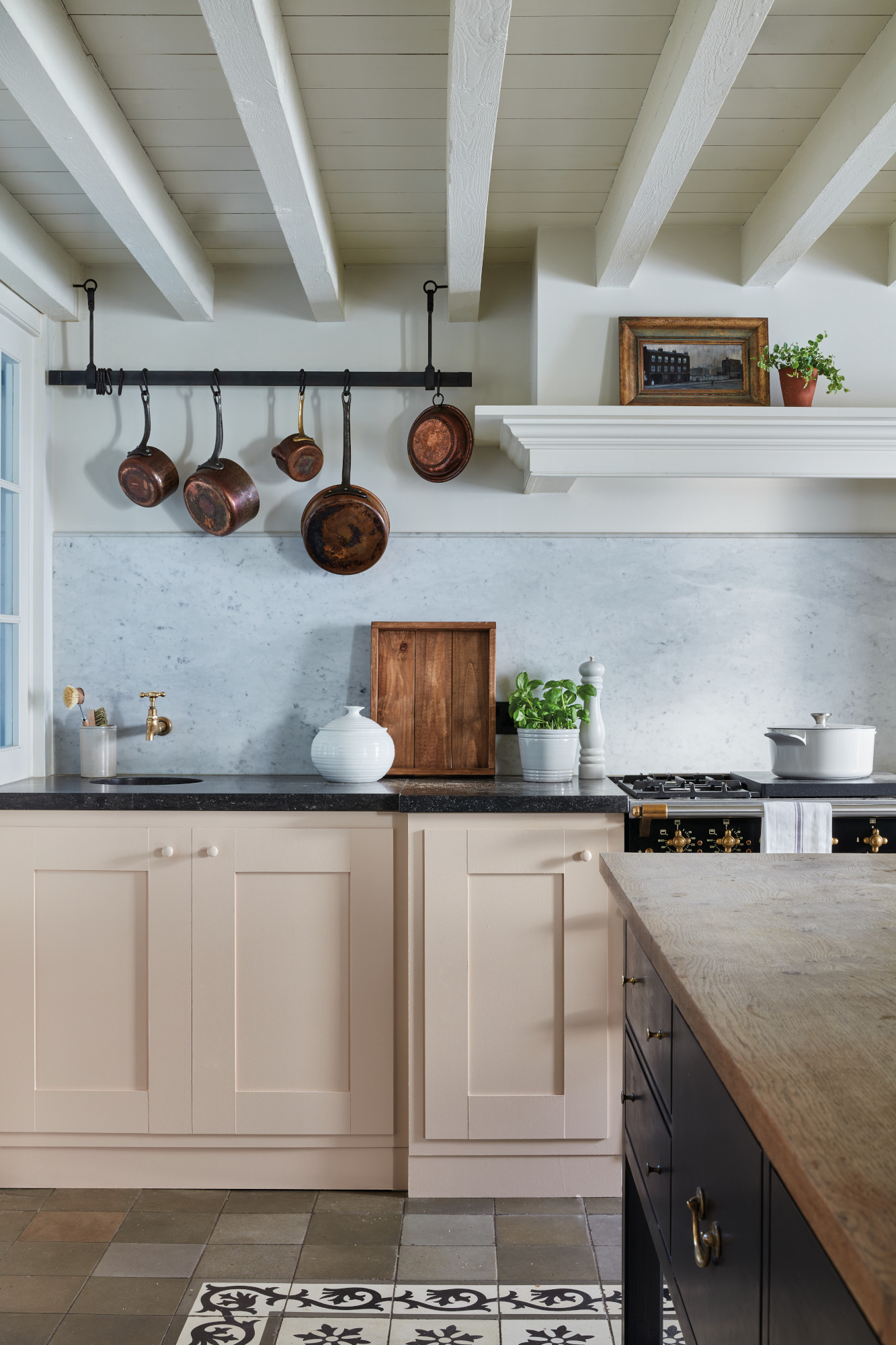
The design world's love for pink shows no sign of abating, but in the kitchen, your best choice for a relaxing scheme is to opt for warm, subtle and grounded tones. To make a pastel kitchen feel fresh, pair it with an unexpected match – like the mix of Farrow & Ball painted cabinets and sky blue backsplash in the space above.
'Pink kitchens also offer a calming environment, especially at the earthier end of the pink palette,' says Patrick O'Donnell. 'Setting Plaster is a dream for cabinetry and will bring warmth to a north-facing kitchen while almost bleaching out to a neutral in a sun-filled space. Team with an empathetic white for walls and trim.'
3. Warm white
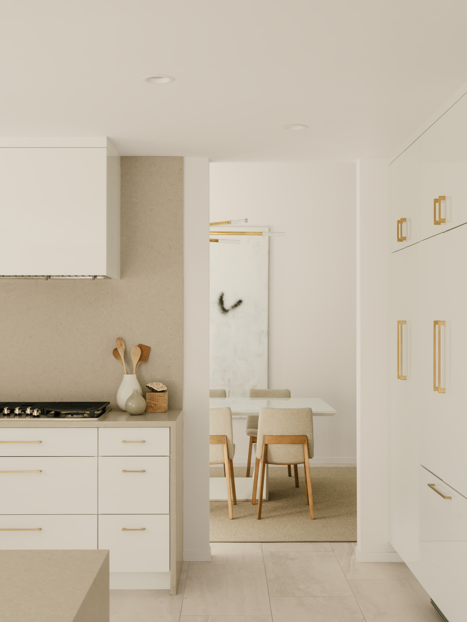
As the rise of warm minimalist interior design shows, a well-chosen white can be the key to a restorative scheme – and that includes in a modern kitchen. Opt for shades with warm yellow undertones and avoid those with cool blue undertones, which will make a scheme feel stark and cold. The above kitchen by New York designer Joshua Smith emphasizes the warmth of the white cabinets with a beige backsplash and gold accents.
'In order to create a relaxing environment, we recommend lighter tones,' says Lina Galvao of New York and Connecticut-based studio Curated Nest. 'For cabinetry, white, taupe, cream, and natural white oak are great options. For walls, we love Benjamin Moore's Chantilly Lace for spaces that get less natural light, and Simply White for a soft warm white.'
To take your white kitchen from bland to beautiful, focus on texture. 'Make sure your selections are interesting texturally and varied enough throughout the space so it doesn't become boring,' Lina adds. 'If done right, you'll end up with beautiful visual depth and interest, as well as a layered, designer look.'
4. Earthy neutrals

Encompassing everything from greige to oatmeal, earthy neutral paint colors for kitchens offer a similar sense of calm to white, but with more depth. 'For me, a calm color palette is one that's rooted in nature,' says Leslie Murchie Cascino of Michigan firm Bonni Wu Design. 'And by that, I mean: does it naturally occur outdoors? That could include earth tones like mushrooms, oatmeals, wheats and weathered grays.'
'I think a peaceful kitchen is rooted in a monochromatic neutral,' says Anastasia Casey of Austin, Texas-based IDCO Studio. In her own kitchen, pictured above, Anastasia used Greige by Clare Paint – 'the perfect calming sage that leans more on the gray side, while still feeling natural and color filled,' she says. 'The cool hues are balanced with warm undertones that are entirely flattering when you’re in the space, throughout various times of day.'
Margaret Naeve, of interior design studio M.Naeve, recommends Farrow & Ball's Mizzle for a relaxing space. 'It’s a very soothing grey green tone that would lend to a calming environment in the kitchen for cabinetry,' she says. 'It would pair nicely with unlacquered brass and a plethora of tile and marble options. I could even see using a contrasting dark soapstone paired with it.'
5. Gentle blue
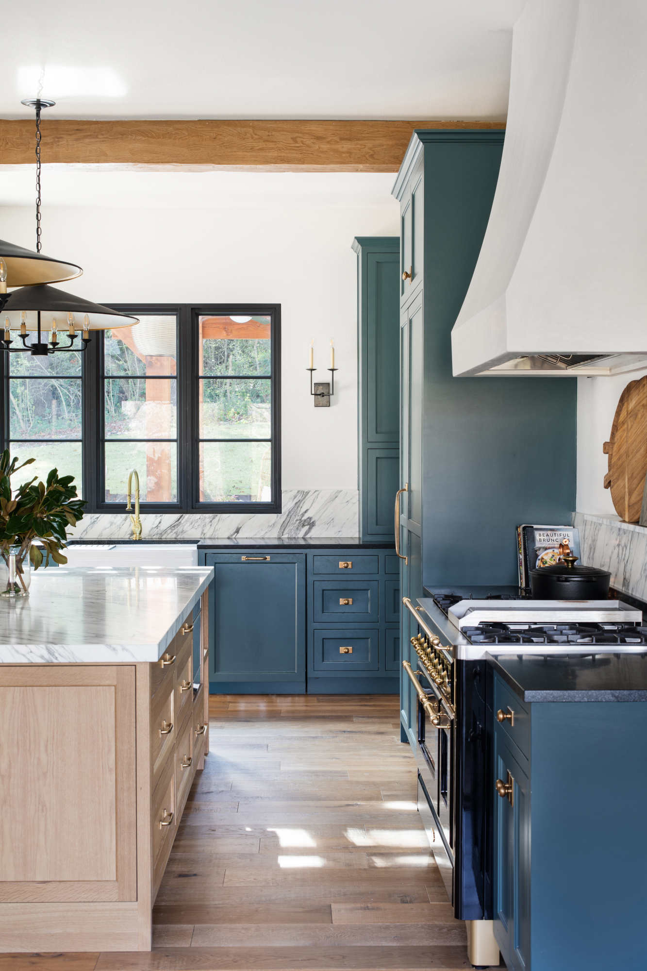
'You can get away with almost any fun pop of color in a kitchen if it is balanced with white as a primary color,' says Noelle Isbell, founder and principal of Manhattan Beach practice Noelle Interiors. 'Blues are timeless: the coolness behind these colors invites warm accents like natural woods and warm metals.'
We've seen sky blue used in kitchens to great effect through marble and tiled backsplashes. Alternatively, there's still something to be said for darker shades. 'We love using a bold or dark color on kitchen cabinetry, such as Farrow & Ball Inchyra Blue, to create a moody and relaxing contrast to bright white walls in other areas of the home,' says Laura Pankonien, owner and founder of Austin-based The Pankonien Group, who designed the kitchen above. 'Layering dark moody colors with other textiles and vintage furnishings creates a calm feeling in an otherwise busy space – the perfect spot to enjoy your morning cup of tea.'
6. Wood tones
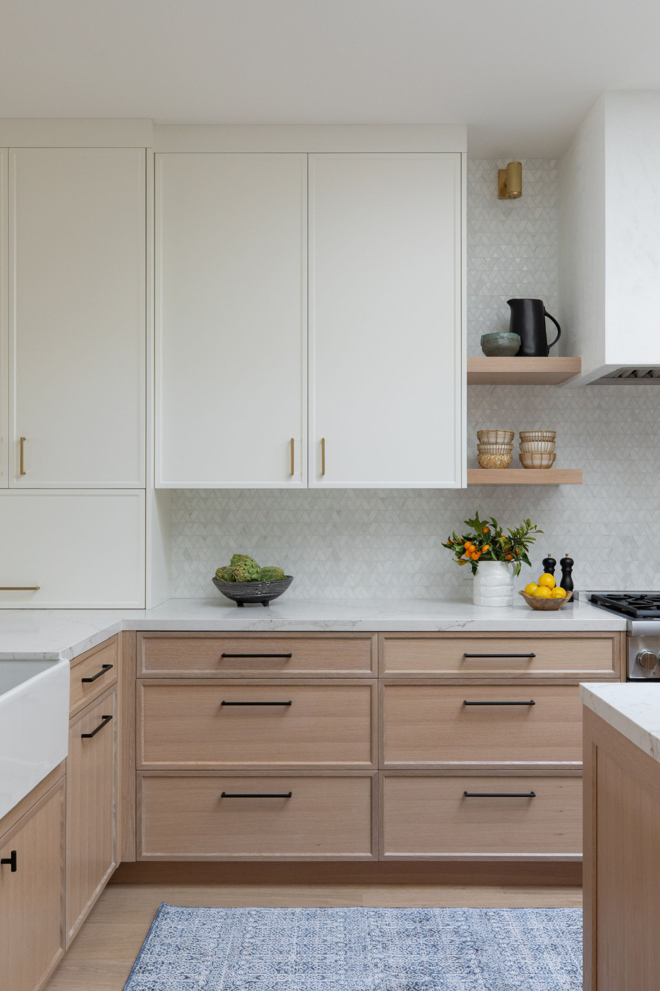
Okay, so it's not exactly a color – but wooden kitchens are a key kitchen trend and a great shortcut to a relaxing space, particularly when paired with white. In the scheme pictured above, designed by Collected Interiors, white oak base units softens the white wall cabinets and adds textural interest.
Wood's relaxing benefits also come down to principles of biophilic design: incorporating natural materials into your space helps strengthen its connection with the outdoors. 'Wood tones evoke a sense of calm, bringing an organic look and feel into your home,' says Ginger Curtis, president of Urbanology Designs.
How to incorporate color in your kitchen
If you're looking to incorporate one (or more) of these relaxing colors into your kitchen, just how should you do so? The simplest way, of course, is to paint the walls. 'It's the smallest commitment,' says Sarah Rosenhaus. 'A great way to add a bit of character is to use a limewash paint or clay finish. They create subtle texture and movement, adding depth and richness to any color.'
However, painted cabinets are Sarah's preferred way to use color. 'They add so much character to a kitchen and instantly makes it feel elevated,' she says. Alternatively, look to your backsplash: 'There are many amazing tiles that you can include in an otherwise neutral kitchen to add a relaxing element of color.'
In rented kitchens, look to the finishing touches to bring in color. 'Soft touch items like draperies or curtains in a breakfast nook are a good choice,' says Amy Forshew, principal and founder of Philadelphia studio Proximity Interiors. These touches can also help to elevate the space from food prep area to something more holistic. 'Depending on the design and color selection, a kitchen can provide a calm space for morning coffee or a soothing glass of wine in the evening,' Amy adds. 'It can be much more than a workspace.'

Ellen is deputy editor of Livingetc magazine. She works with our fabulous art and production teams to publish the monthly print title, which features the most inspiring homes around the globe, interviews with leading designers, reporting on the hottest trends, and shopping edits of the best new pieces to refresh your space. Before Livingetc she was deputy editor at Real Homes, and has also written for titles including Homes & Gardens and Gardeningetc. Being surrounded by so much inspiration makes it tricky to decide what to do first in her own flat – a pretty nice problem to have, really. In her spare time, Ellen can be found pottering around in her balcony garden, reading her way through her overstacked bookshelf or planning her next holiday.