5 flower color combinations to avoid in your backyard for a more harmonious garden palette
Looking for a beautiful backyard where your flower landscaping comes together in harmony? Then avoid these five color pairings

The Livingetc newsletters are your inside source for what’s shaping interiors now - and what’s next. Discover trend forecasts, smart style ideas, and curated shopping inspiration that brings design to life. Subscribe today and stay ahead of the curve.
You are now subscribed
Your newsletter sign-up was successful
With the arrival of spring, our thoughts turn to our backyards, and whether the seeds we planted back in autumn will have survived the long, cold winter, soon to rear their heads. Of course, for those flowers that don't make it through the winter, there is always a local garden center at hand to help you supplement your floral displays. But before heading off, consider the energy your color choice can bring to your garden and whether your choice of flowers will make for a color combination that will work beautifully.
'Colors give off certain energies and it can be helpful to consider how you want your garden to feel when making color selections,' says Kat Aul Cervoni, founder of New York City-based landscape design firm Staghorn. 'For a calming and soothing space, pick cooler colors such as blues, whites, and purples, and greens. For a cheerful space, pick warmer colors.'
Also bear in mind that not all shades in nature’s color work wheel together. ‘There is really no reason to exclude any colors in your backyard; all have merit, perhaps the only rules are about combining colors,’ says award-wining landscape designer, Kate Gould. Here are our top five combinations to avoid.
1. Black and yellow
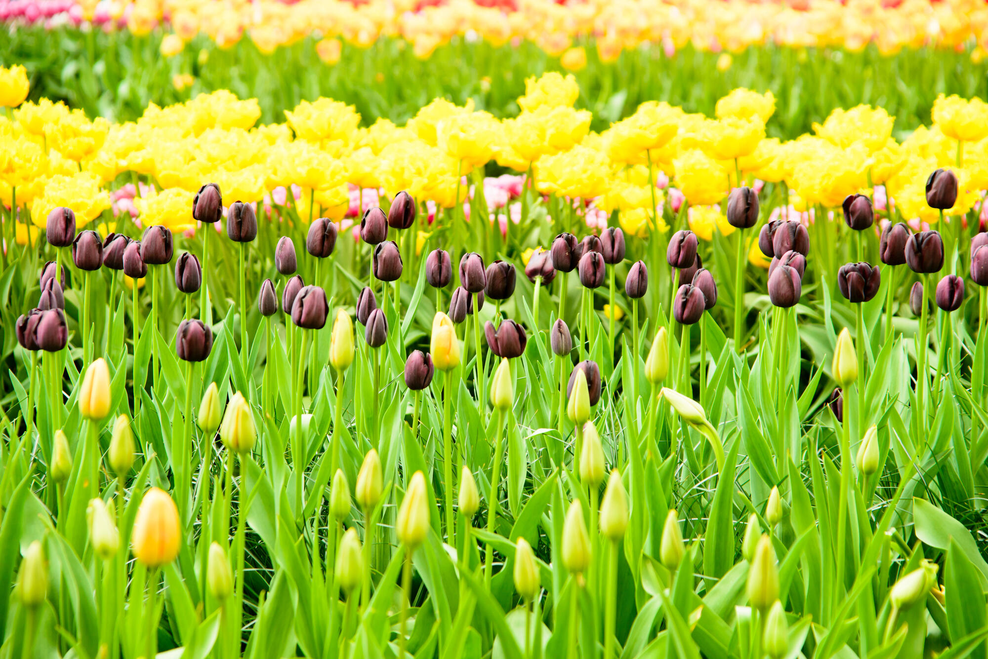
The production of a pure black bloom has long been the horticulturalists’ dream. However, black (or very deep brown or blue) flowers like the black iris, black carnation and black tulip need to stand on their own to really show them off.
'I'm all for color be it a garden just full of whites, all blacks or something outrageously bright – just make sure whatever you do you do with conviction,' advises Kate Gould.
When plotting your flower garden, avoid mixing black tulips with, yellow flowers like daffodils or indeed a yellow tulip unless you wish to create a scheme that visually jars. 'I also don't particularly like the all-black pansy with its yellow center,' Kate says. 'The black is so dark without a hint of any other color and has a sinister feel to it.'
2. Red and white
With red and white, each color on its own can be stunning, planted in large drifts or along with shades of the same. However, put them together and each is fighting for dominance.
The Livingetc newsletters are your inside source for what’s shaping interiors now - and what’s next. Discover trend forecasts, smart style ideas, and curated shopping inspiration that brings design to life. Subscribe today and stay ahead of the curve.
‘Red and white together is a bad idea,’ says Whitney Bromberg Hawkings of flower delivery service FLOWERBX. ‘Superstition says that those two colors together foretell death, so it’s best to avoid mixing the two at all costs!’ Superstitions aside, red and white together create an effect reminiscent of the bunch of flowers you buy from the gas station as a last-minute thank-you gift.
If you're looking for a color to pair with red, turn instead to clashing pink with red, a citrus orange or other bright colors. 'If you want something uplifting and vivacious then bravely pick from the brighter end of the spectrum and don’t shy away from clashing pinks and oranges,' says Kate. Alternatively, go for striking red on its own. Carnations make a bold statement and are proving popular as a cut flower trend.
3. Bright purple with vivid yellow
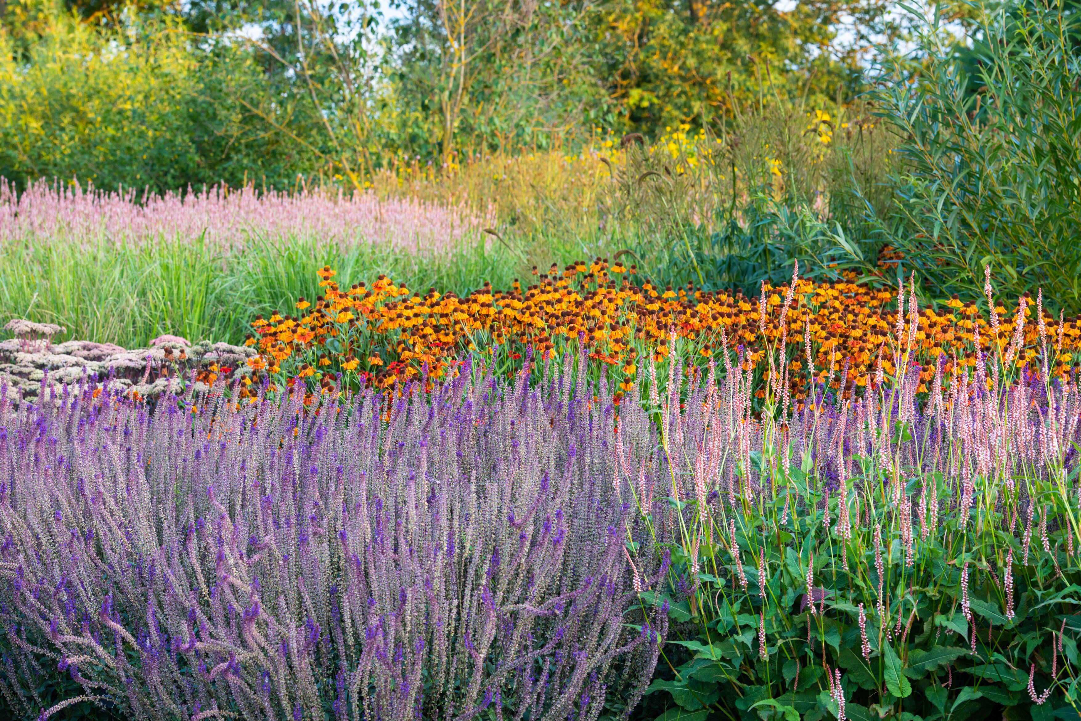
Whereas blue and yellow work so well together (think forget-me-nots and narcissi, or Kniphofia planted with airy purple Verbena bonariensis), moving around the color wheel a notch and replacing the blue with a bright purple introduces a jarring note that makes this particular combination clash. Tone down the purple for something lighter and softer to make this combination less aesthetically jarring.
‘If your wishes are for a calming scheme then select cool colors and limit your palette to a tonal range,' says Kate.
'For a cheerful, energetic space: pick bright, warm colors such as yellows and pinks,' recommends Kat Aul Cervoni, founder of New York City-based landscape design firm Staghorn. 'Look to color theory. Pairing colors that are complementary (opposite each other on the color wheel) will make them appear more vibrant.'
4. Black and red
Nature tells us subliminally to avoid this combination – think black widow spiders. Another combination on the ‘poisonous and unwelcome garden pest’ spectrum.
If you do want to go for a moody, dramatic vibe, Kat recommends looking elsewhere rather than black. 'For a moody, dramatic vibe, incorporate darker-flowering varieties such as deep purple, burgundy, and even brown can add a surprising twist.'
The black barlow columbine has a subtle purple tint to it, as does the black knight hollyhock, or the black satin dahlia has a moody burgundy hint that could work well.
5. Black and white
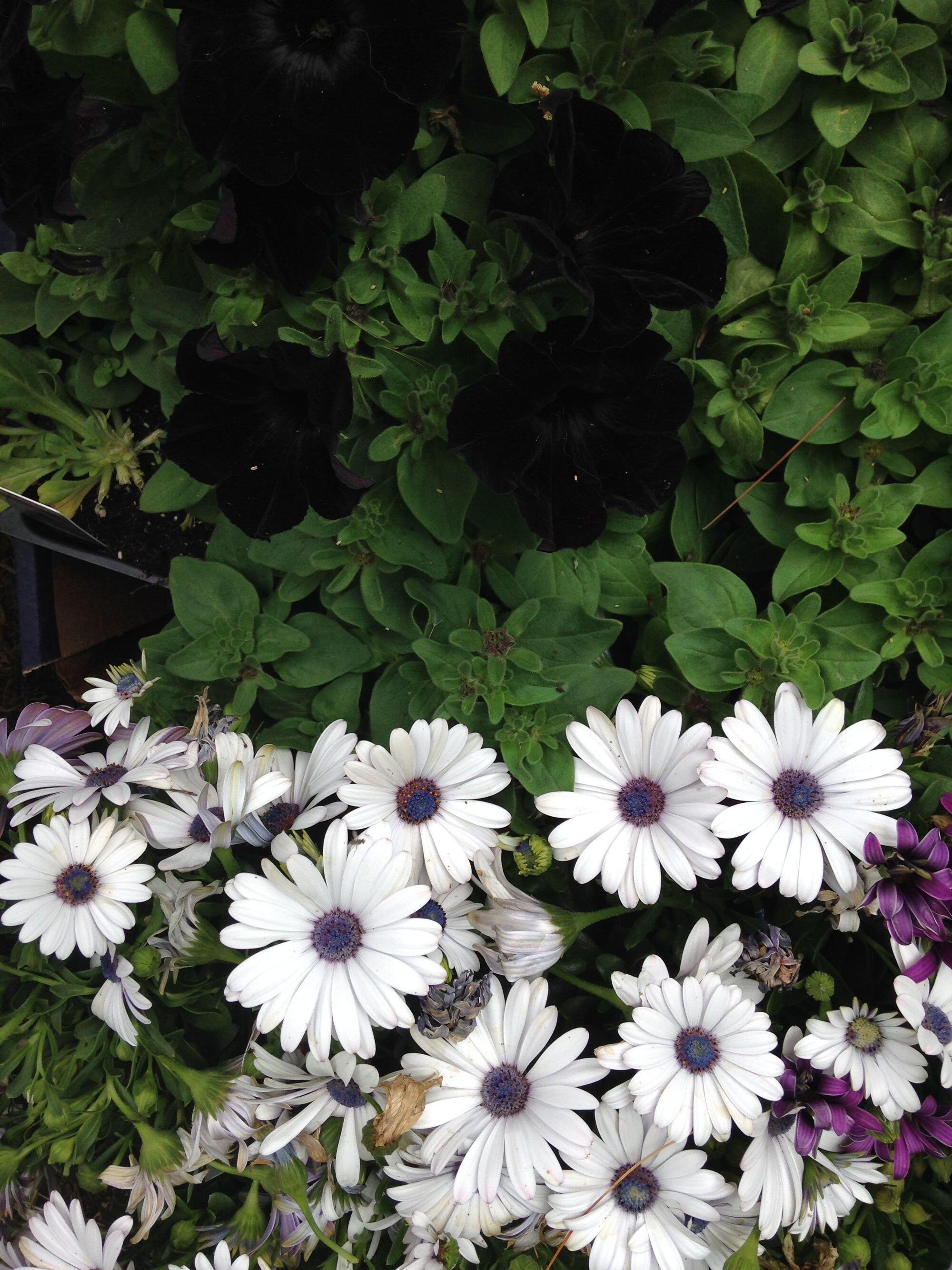
With so many planting schemes to choose from to brighten up your backyard, landscaping with flowers that are monochrome black and white will probably leave you feeling a bit short-changed when you want a vibrant color pop to brighten up a dull day. Black and white has quite negative connotations and can make your backyard feel a little formal.
'A more laidback cottage garden or meadow garden will have a full spectrum of colors that feels more eclectic,' recommends Kat.
This beautiful coffee table book is a great way to familiarize yourself with colors found in the garden, and look at the color theory of how to combine them.

Former content editor at Livingetc.com, Oonagh is an expert at spotting the interior trends that are making waves in the design world. She has written a mix of everything from home tours to news, long-form features to design idea pieces, as well as having frequently been featured in the monthly print magazine. She is the go-to for design advice in the home. Previously, she worked on a London property title, producing long-read interiors features, style pages and conducting interviews with a range of famous faces from the UK interiors scene, from Kit Kemp to Robert Kime. In doing so, she has developed a keen interest in London's historical architecture and the city's distinct tastemakers paving the way in the world of interiors.
