Benjamin Moore's "Black Forest Green" Is 2025's Most Versatile Moody Neutral — Here's How Paint Experts Say to Style the Shade
"Blackened green" can be both a bold accent or neutral backdrop, say designers. We're in

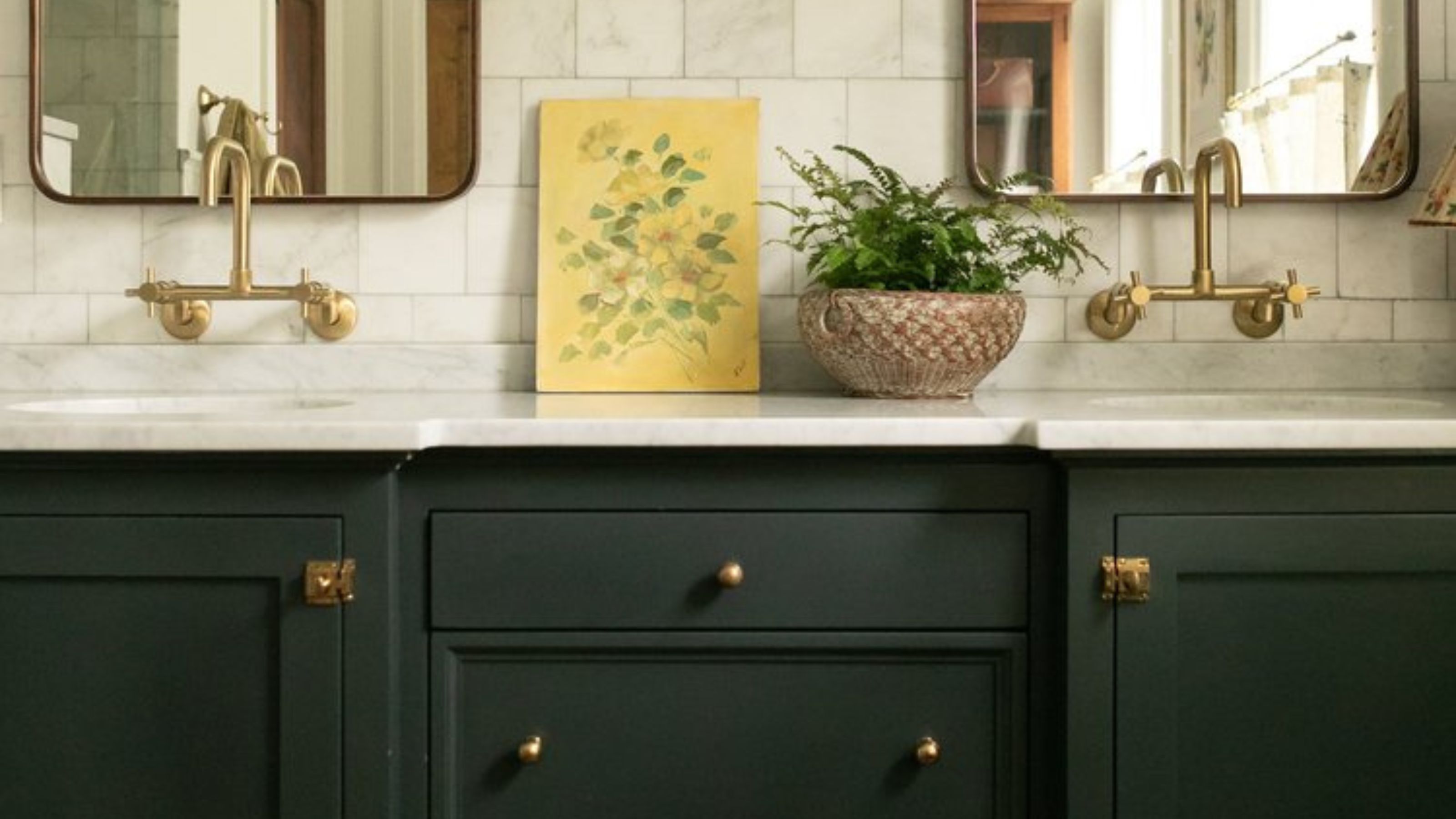
It would be a disservice to lump all varying verdant shades of green together — each tone has its own unique place, its own effect. And there are some specific shades that stand out against the rest. Benjamin Moore's Black Forest Green is one of them. It's the perfect grown-up green; a moody, warm, and relaxing shade that looks like long, winding walks through the forest, where running water trickles by, and thick, fuzzy layers of moss hug the branches of trees. No wonder designers love using it.
Benjamin Moore describes it as a "Blackened shade of green that permeates any space with a sense of reassurance." It has an undeniably relaxing quality; a soothing calmness offered by its rich, deep hue. Originally introduced as part of the brand's Historical Color collection back in 1976, Black Forest Green remains one of the best green paints in Benjamin Moore's range.
If dark colors feel daunting, this popular shade adds depth and coziness, while its cool, blue-green undertones mean it often appears almost teal in certain light, introducing color and vibrancy to a space. We spoke to interior designers to understand how best to use Benjamin Moore's Black Forest Green in your home — here's what they had to say.
Article continues belowWhat makes Benjamin Moore's Black Forest Green so popular?
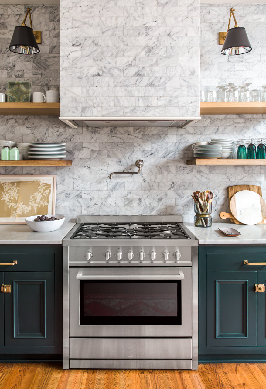
“Black Forest Green is a gripping hue that will add depth and reassurance to any scheme," notes Helen Shaw, international director of marketing at Benjamin Moore. "Its green undertones create richness, offering a softer alternative to black, and a more modern substitute for dark gray. "
It's this softness that makes Black Forest Green such an approachable shade when decorating with green, adds Benjamin Moore's Rebecca Gramuglia. "Its rich depth makes it versatile, perfect for making a bold statement or serving as a sophisticated dark neutral backdrop."
While there is a definite appeal in dark paints, they can often feel stark or overly dramatic for the everyday. The coldness of dark grays and black shades can be off-putting, resulting in a look that is more cavernous than it is cozy. But the warmth of the green undertones in Black Forest Green lends a space an earthy tonality, and decorating with earth tones is an easy way to make a room feel more inviting, and comforting.
Where should you use Benjamin Moore's Black Forest Green?
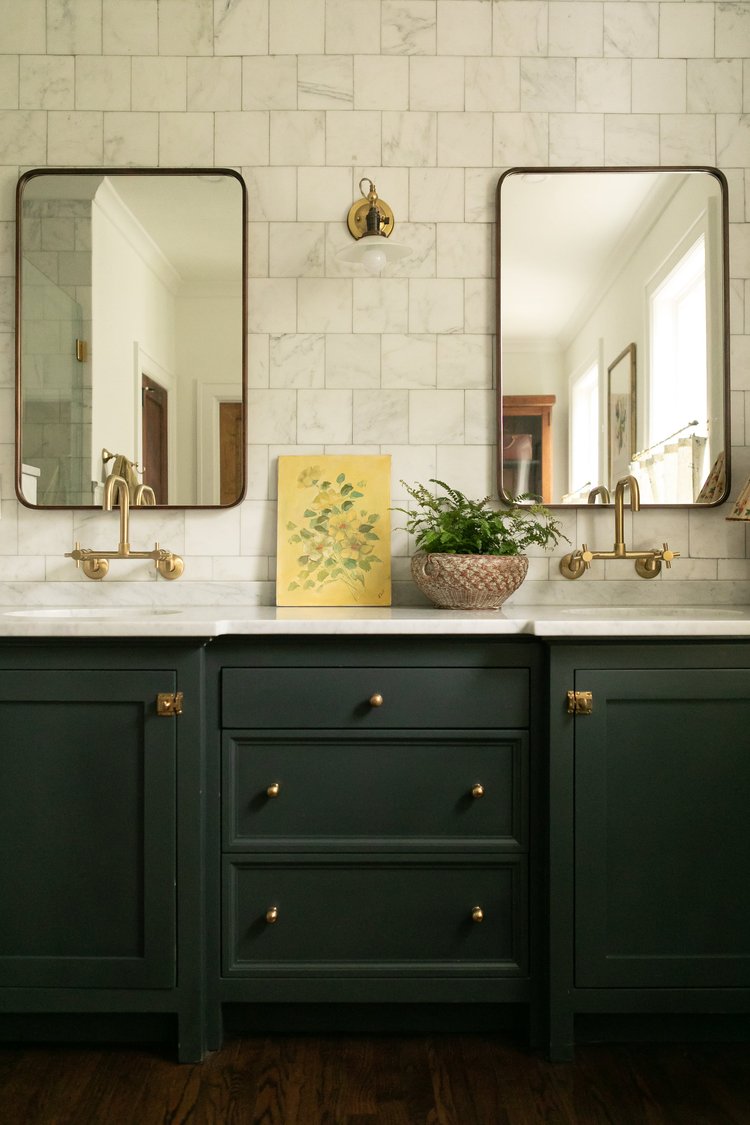
Honestly, there is no room where Benjamin Moore's Black Forest Green won't work. It is more a question of the feeling you want to evoke through your green room ideas. "This darker hue creates a moody, character-filled room and works beautifully in traditional dining or cloakroom schemes when paired with other jewel tones and brass accents," says Helen.
The Livingetc newsletters are your inside source for what’s shaping interiors now - and what’s next. Discover trend forecasts, smart style ideas, and curated shopping inspiration that brings design to life. Subscribe today and stay ahead of the curve.
A formal dining room filled with antique accents and coated in Black Forest Green would feel opulent and romantic. Dark wood, muted metals, rich fabrics complement the tone beautifully, and would add to the vintage aesthetic. Or, to emphasize the tranquil nature of this shade, Rebecca suggests bringing in a sense of calm by layering greens. "It's perfect for green bedroom ideas or in the bathroom — bring the outdoors in with Black Forest Green and lush plants. This soothing palette helps create a tranquil room where you can unwind."
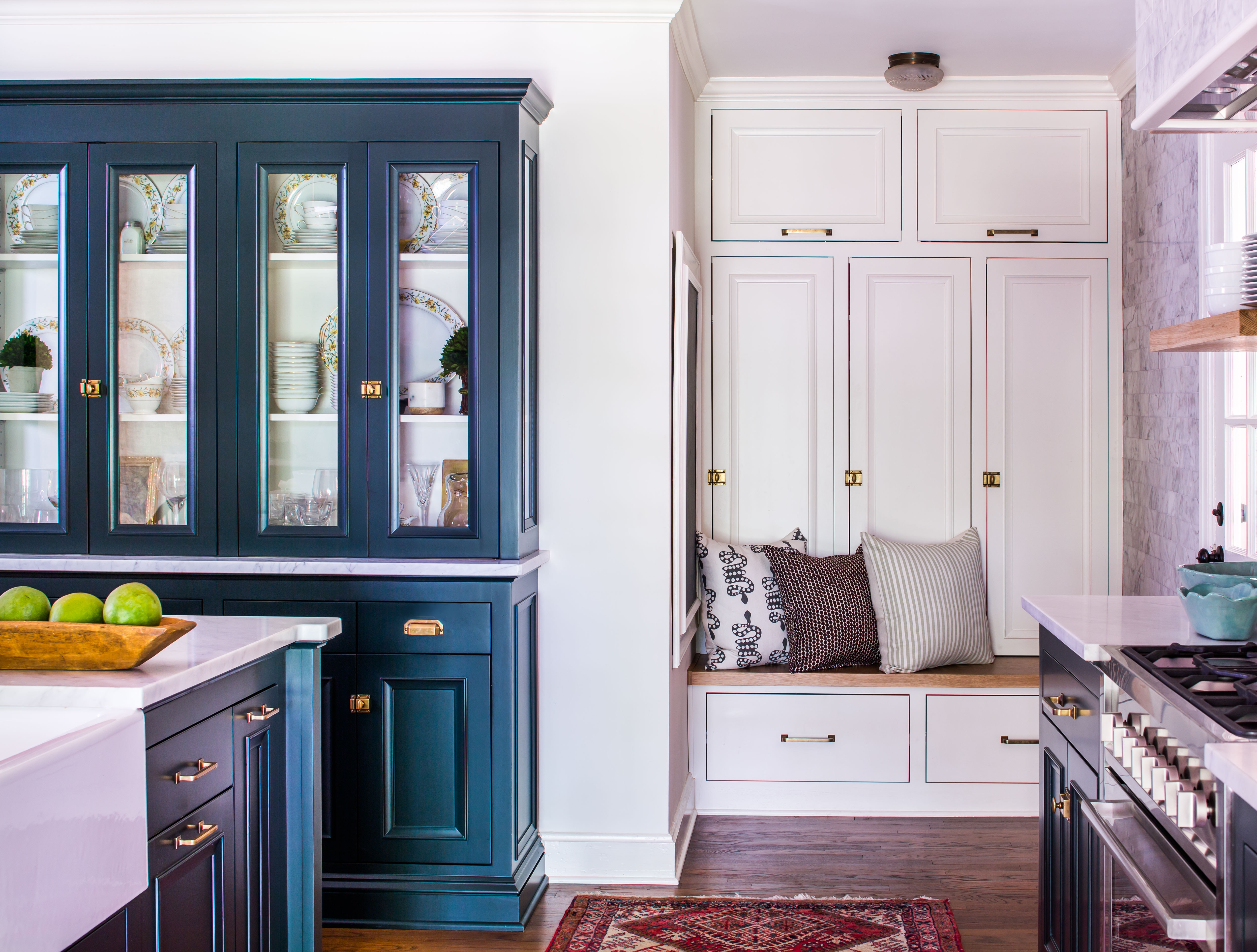
Alternatively, "For more modern settings, it works best when complemented with natural materials to achieve an organic, fresh feel," adds Helen. "This combination is particularly suited to kitchens for an updated take on the green color trends seen in this room in recent years."
Rebecca agrees, adding that "Black Forest Green cabinetry paired with a crisp white marble top and gold hardware brings a modern sensibility to a green kitchen. For a fresh, contemporary look, use off-white as the base color, and introduce colorful accents throughout the room to infuse a playful energy."
What is the best light for Benjamin Moore's Black Forest Green?
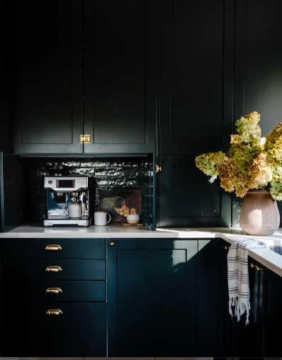
To prevent your room from feeling too dark, it's important to consider how light effects green paint and how it will look in the specific room you're planning to paint. Rebecca says "dark colors work exceptionally well in rooms that flourish with natural light. High ceilings and large windows help feel expansive while the deeper hue grounds the space."
If your space doesn't get a lot of natural light, that doesn't mean you can't use the darker shade, though. "If you don’t get a lot of light, balance Black Forest Green with off-whites or light hues," suggests Rebecca. "Pairing off-white trim and ceilings with deep, rich colors creates a crisp and tailored look while allowing lightness to permeate the space."
What colors go with Benjamin Moore's Black Forest Green?
When considering colors that go with forest green, Rebecca suggests pairing Black Forest Green with "warm grounding hues like Stone Harbor 2111-50 and Kona AF-165. These rich natural shades balance the cool green, resulting in a captivating, harmonious space."
Although this shade is an almost-black green, when used correctly, it won't make your space feel overwhelmingly dark. It's all about what colors you complement it with. To brighten this "blackened shade of green", Helen suggests "pairing it with a light, versatile off-white such as Ashwood OC-47. This color pairing works particularly well when Black Forest Green is added as an accent wall or when it's the main wall color and Ashwood is seen on all millwork, including skirting, picture rails, and doors.”
Or, if lowkey is not part of your lexicon, try pairing the shade with a complementary color for an exaggerated impact. Helen recommends “pairing Black Forest Green with a classic pumpkin hue such as Jack O'Lantern 2156-30 — this complementary color scheme will create warmth and visual impact in any space.”
For an equally dramatic look, Rebecca suggests pairing it with "Newburyport Blue HC-155 or Mars Red 2172-20. Black Forest Green grounds the space allowing these jewel tones to shine. Add a splash of Savannah Green 2150-30 to create a sumptuous, more dynamic atmosphere — perfect for entertaining spaces."
How to style Benjamin Moore's Black Forest Green
Black Forest Green looks great when color-drenched in a space, says Helen. The all-over paint technique is a powerful design tool used to create a seamless, monochromatic look that's not as overwhelming as you may expect. Completely saturating a room in one color allows the space to expand upon itself, creating the illusion of more space.
"This not only adds to the feeling of grandeur but helps to create an illusion of higher ceilings as the lines and edges are blurred," adds Helen. This means color-drenching is also a great alternative for using Black Forest Green in smaller spaces.
And if you are lucky enough to have some interesting architectural features in your home, Rebecca adds that "The depth of Black Forest Green makes it a great choice for highlighting architectural details like millwork. Whether used on living room built-ins or a butler’s pantry, this dark hue paired with crisp white accents strikes a balance between timeless elegance and modern sophistication."
Finally, when it comes to decorating, Rebecca recommends balancing your space with ample lighting, brighter colored accents, and soft textures. "Layering gallery-like artwork and décor pieces will also soften the darker hue, creating a space that feels both personalized and thoughtfully designed," she says.
As such a versatile and elegant shade of green, it's not surprising that a lot of people search for Benjamin Moore's Black Forest Green when researching interior ideas for their home.
Now you've got a good grasp on where, how, and why to use this shade, the next step is to grab a sample and test it in your space (make sure you know how to use paint samples properly first, though).

Maya Glantz is a Design Writer at Livingetc, covering all things bathrooms and kitchens. Her background in Art History informed her love of the aesthetic world, and she believes in the importance of finding beauty in the everyday. She recently graduated from City University with a Masters Degree in Magazine Journalism, during which she gained experience writing for various publications, including the Evening Standard. A lover of mid-century style, she can be found endlessly adding to her dream home Pinterest board.


