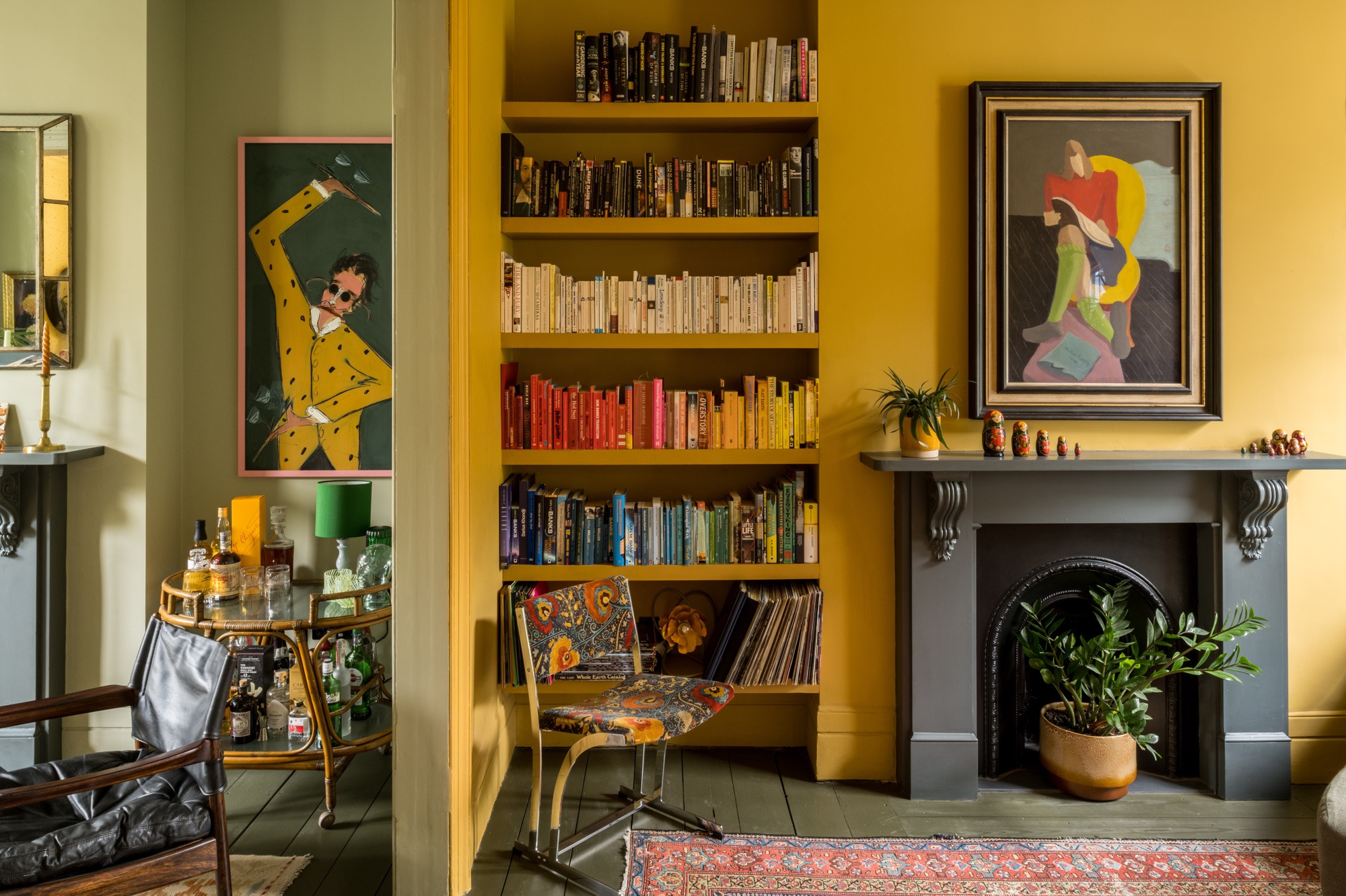
You heard it here first - the rainbow bookshelf trend is over. Designers on what to do instead
The rainbow bookshelf trend has been beloved for years...but the design world is fickle. Here are 5 new book curation ideas to try instead
The Livingetc newsletters are your inside source for what’s shaping interiors now - and what’s next. Discover trend forecasts, smart style ideas, and curated shopping inspiration that brings design to life. Subscribe today and stay ahead of the curve.
You are now subscribed
Your newsletter sign-up was successful
Should you organize your books by color? It's a tough one. A design trend that has taken over Instagram for the past decade, it certainly has its fans. But is its day done? Is color coordination just a bit...try-hard? And if it is what should we do next?
As far as debates go, this is interior design's version of whether that dress was blue or gold. While the thousands of Pinterest posts about it clearly believe it's the easiest way to make books look beautiful, naysayers have suggested that putting your books in rainbow color order is an impractical frivolity (with organizing by author, title or subject matter being suggested as more logical).
Either way, design is moving on, and we've tapped a number of designers who explain how you can use your bookshelves to create a an aesthetic that goes far beyond the rainbow.
Article continues belowWhy you would want to organize your books by color
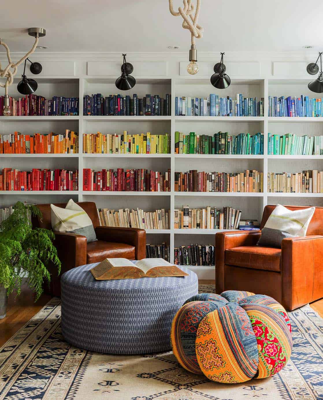
Following the ROYGBIV (red, orange, yellow, green, blue, indigo, violet) color coordinating scheme will create a bold effect in any room, and helps to make your books seem curated. Rainbow book spines work well in a white or otherwise neutral space. They can also be used as a key part of your living room color scheme - pick out an accent color from the display to use in another piece in the room, like the orange pouffe in the space by Hudson Interior Designs above.
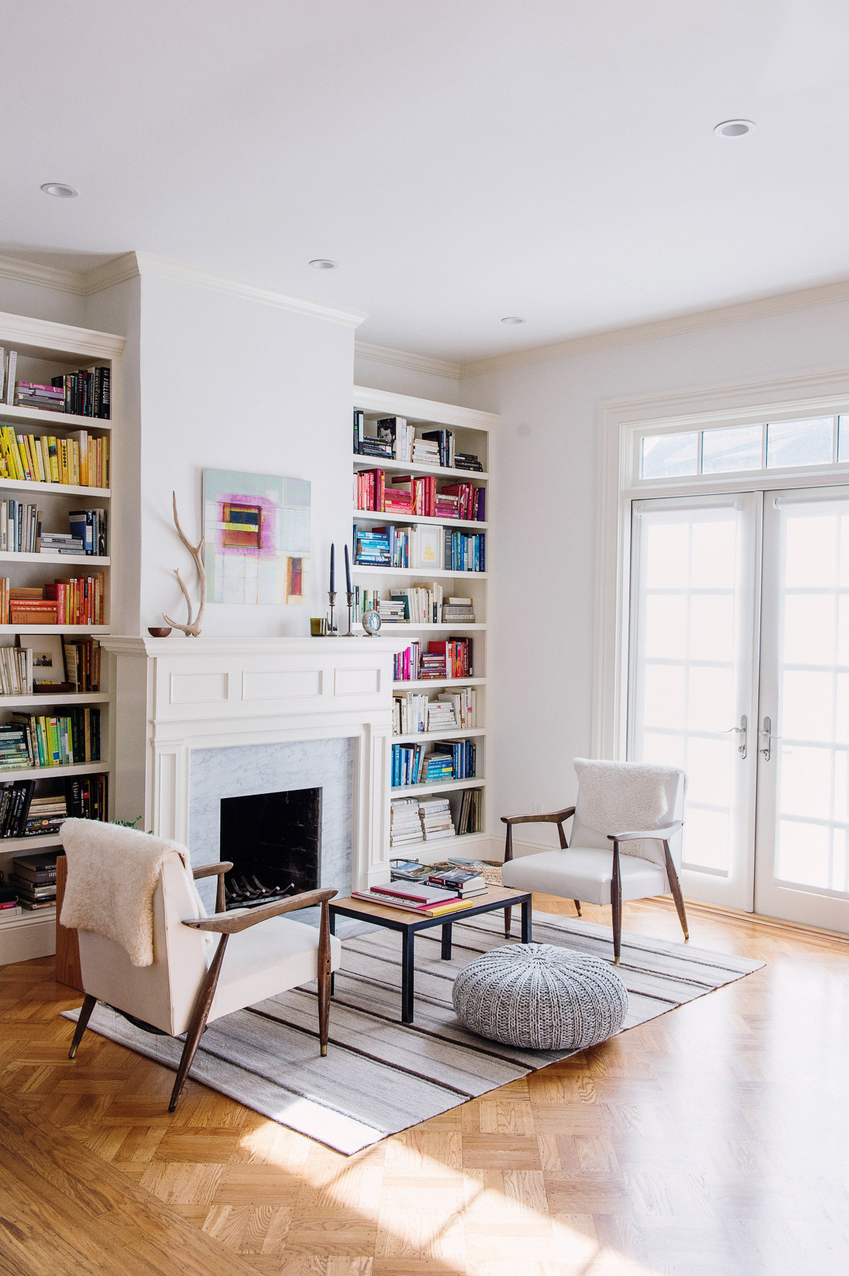
In the room by John Lum Architecture above, the brightly-colored book display is also echoed in the artwork above the fireplace, and brings the otherwise pared-back room to life.
'I went through a phase of ordering all my cookbooks by their colored spines,' says Livingetc's editor Pip Rich, who says he has since stopped doing this because it 'felt a little done. Though at the time I loved it. I found that not only did it give my collection a pleasing sense of order, it was also easy to find the one I was looking for at any given time. I quickly learned which book had which color spine, so it was fast to gravitate to that section and pull it out.'
Why you wouldn't want to organize books by color
Interior design trends move fast. And the fact that people were first doing this a decade ago does give us pause to wonder if, in fact, there are any new ideas.
The Livingetc newsletters are your inside source for what’s shaping interiors now - and what’s next. Discover trend forecasts, smart style ideas, and curated shopping inspiration that brings design to life. Subscribe today and stay ahead of the curve.
Plus with the rise of transitional style, which is all about creating spaces that are filled with personality and vitality, does following a very obvious, rote system really seem very individual to how you live?
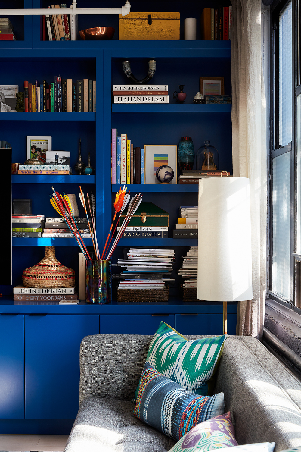
The New York-based interior designer Rayman Boozer of Apartment48 suggests a different approach, as showcased in his apartment, above. 'When choosing how to put books together on a bookshelf, instead of grouping by color, group by theme,' he says. 'You might end up putting books together on a similar subject, or that remind you of a particular moment. The result is a bookcase that tells stories, rather than just looks aesthetically pleasing, and that's a far more meaningful way to live.'
It's a refreshing take on decorating bookshelves, where your own spirit and life comes through to the fore.
What to do instead of a rainbow book shelf
1. Choose one or two colors to focus on
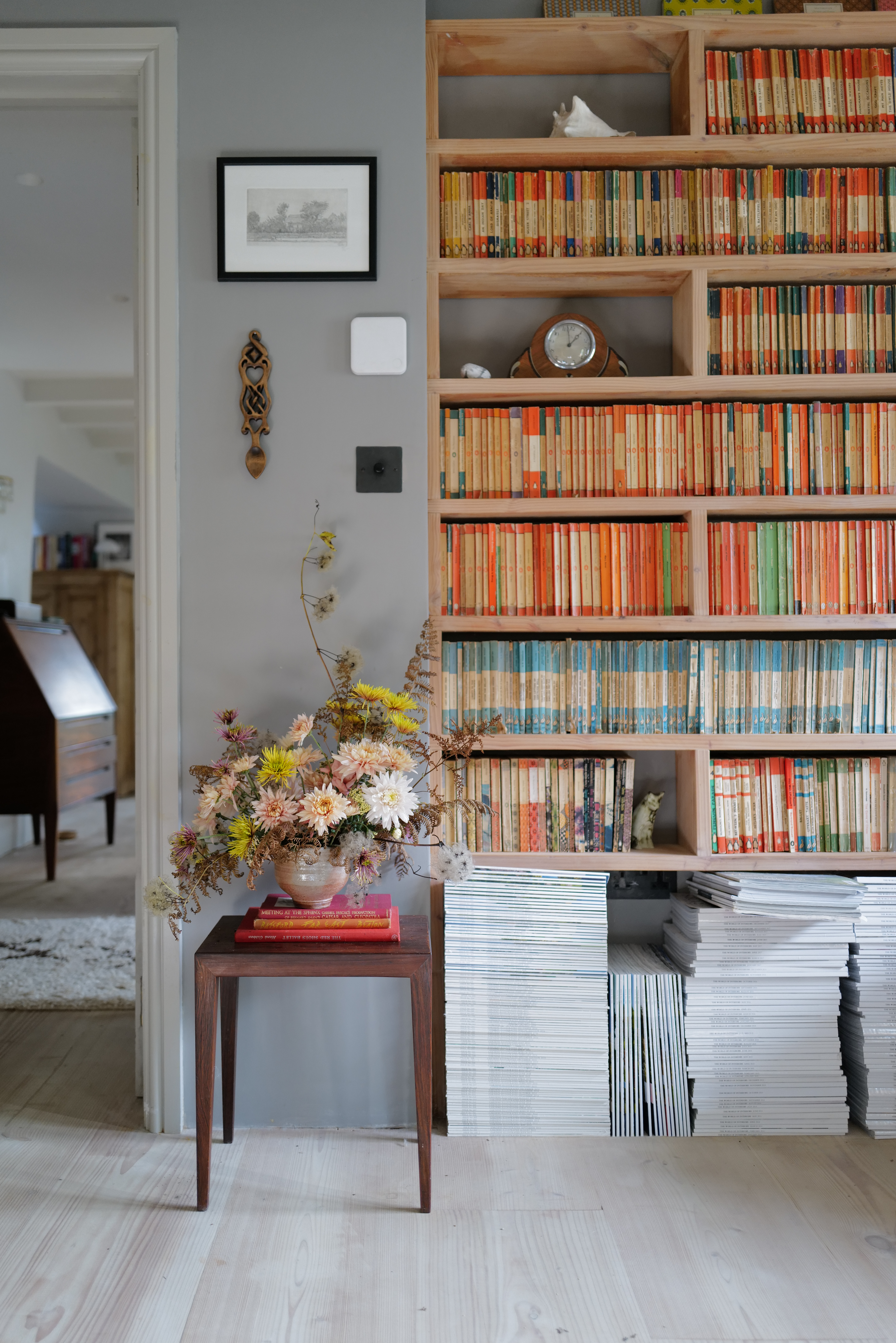
'Organizing books by color creates great visual interest, but if you aren't a fan of the rainbow effect, try to concentrate on one color of book: the orange spine of Penguin classics look fantastic all grouped together,' suggests Melanie Lissack, of Melanie Lissack Interiors.
The effect is shown off beautifully in the home of content creator @christenpears (above),who says the look was actually created organically.
Christen says: 'When we renovated our house a few years ago, it occurred to me that the shallow alcove at the back of the living room was the perfect depth for paperbacks. I asked my builder to make some shelves for me and started to fill them with the vintage Penguin books I already owned. I then began to collect them seriously.
'They’re not deliberately color coordinated but, because each series is a different color (the main series is orange, crime is green, Pelicans blue, etc), they appear that way. They’re actually organised in numerical order of publication.'
True, it doesn't follow Rayman's decree about showcasing your own story, but doesn't it look oh-so-pretty?
3. Channel a vintage display
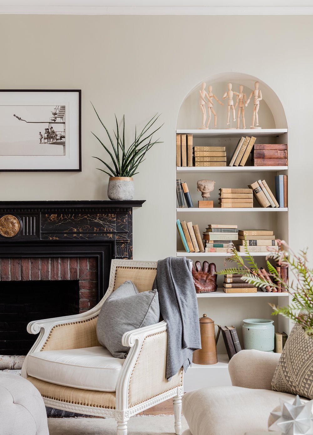
'My top choice for bookshelves is always vintage - it's so much more interesting than a bold, new book spine,' says Jill Goldberg, founder and principle designer, Hudson Interior Designs. These clients wanted us to create a relaxed and calm space. So we utilized some of their older books, and then added in even more vintage books that were worn and neutral.'
The soft tones sit comfortably into this beige living room (beiges and dusky pinks) are grouped together for a curated yet relaxed look, and the final effect adds character and a beautiful 'lived-in' feel to the space.
4. Turn your books around for a neutral coordinated aesthetic
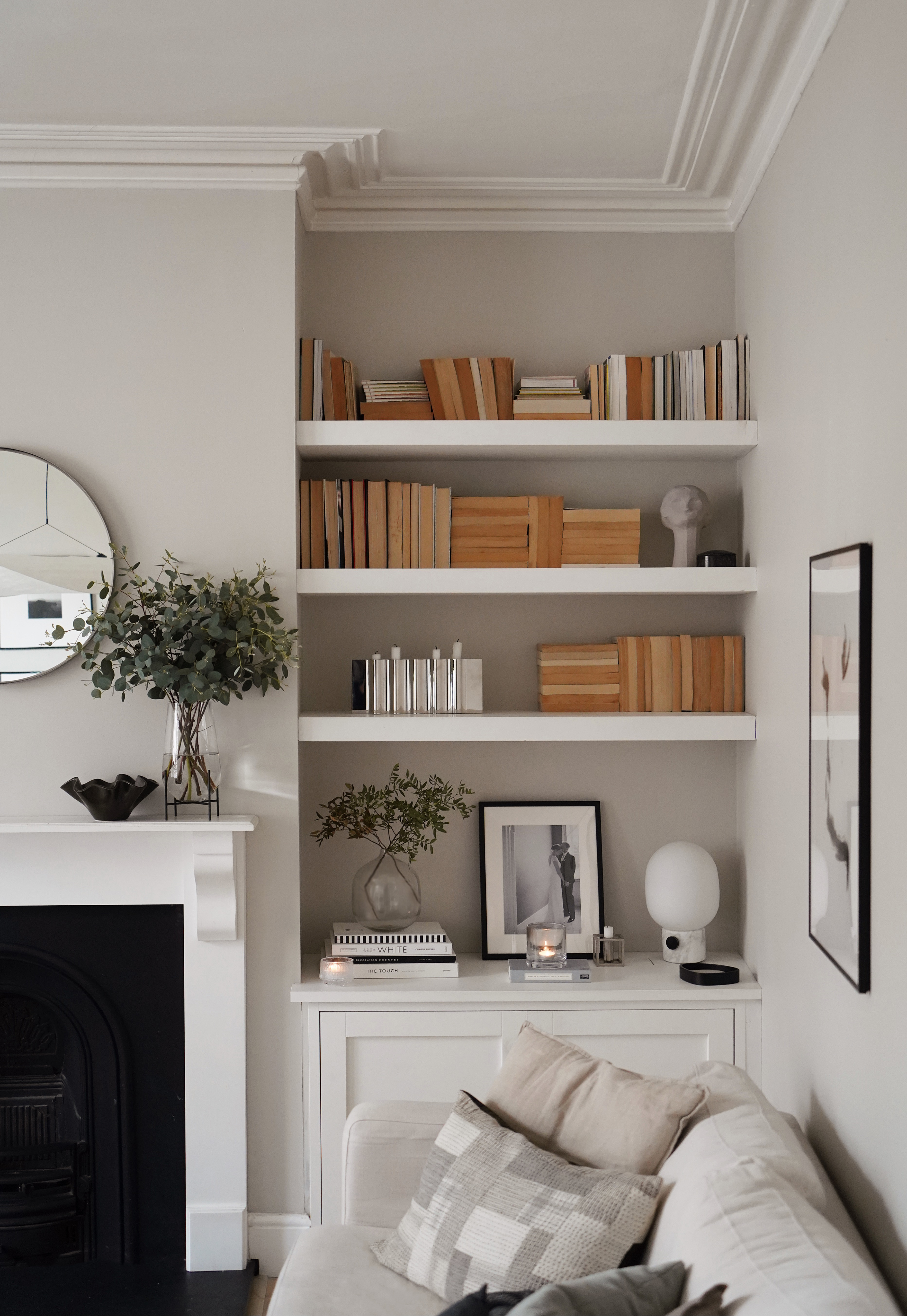
Another idea for color coordinated books is to turn the books around so that the page edges are visible rather than the spines.
'This is only really practical if your books are more for display purposes than reading,' says Melanie Lissack. 'But this concept also particularly suits a neutral, minimalist or soft Scandinavian design decor scheme, as it actually removes the inclusion of 'color' in a room rather than adding it in.'
Abi Dare, of These Four Walls blog, and who created the beautiful space above, shares how this look also helps with a condition she has.
She explains: 'I have a condition called synaethesia, which is when one sense merges with another rather than being experienced separately. It can manifest itself in all sorts of different ways, but in my case it means I see each letter, number and day of the week as a different color - when I'm reading, when I'm writing and even when I'm just thinking. That means my mind is constantly buzzing with color, and I need my home to be a neutral, muted space that acts as a bit of an antidote.
'Turning my books around so they're displayed with the pages facing outwards rather than having lots of different spines on display is part of that, and I also like the texture that the various papers add.'
And, explaining how to style the look, Abi continues: 'The key to making the reverse idea work aesthetically is interspersing the books with vases, sculptures and other objects, so that the shelves aren't dominated by vast blocks of brown.
'I also like to stack the books both horizontally and vertically to create a bit of variation. Practically, I group things together thematically to make it easier to find what I'm looking for, so I know travel books are on one shelf, historical fiction on another and so forth.'
5. Remove or add dust jackets to suit
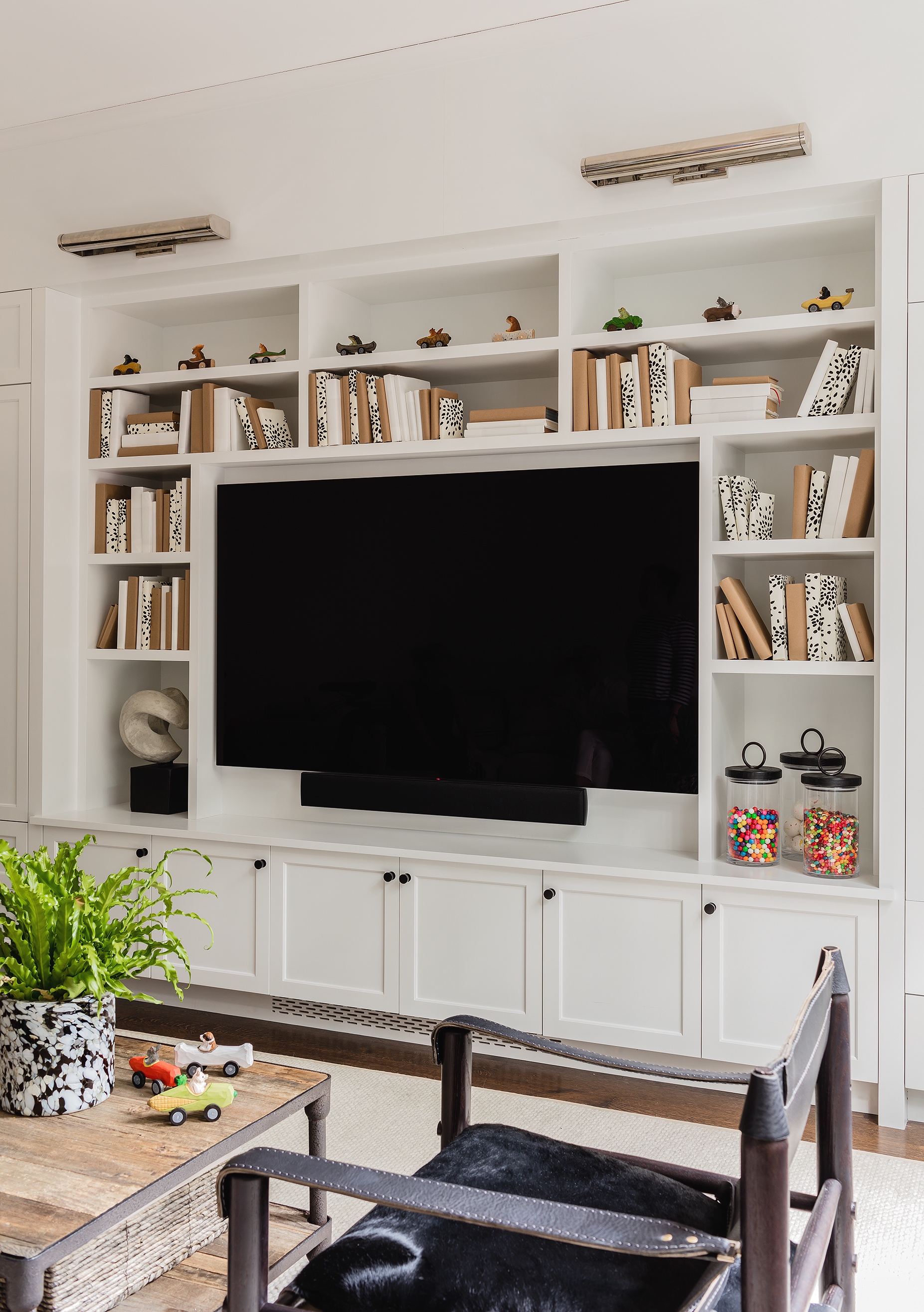
If you want to create a curated, sleek-looking bookshelf display and your books are more of the tattered, torn and higgledy-piggledy variety, you can simply dress them with your color or print of choice.
Hudson's Jill Goldberg says of the room above: 'These clients just wanted something different and fun. The books we had of theirs made no sense in this room, as they were (old curriculum books etc..) so we chose to wrap them in Kraft paper and left over Donghia Fireworks wallpaper.
'Clearly designed for the aesthetic and not for the function of a library. This was also a space that the clients were specifically using as a media room, not reading… So it made it ok to 'lose' the books on the shelves.'
What is the best way to organize books?
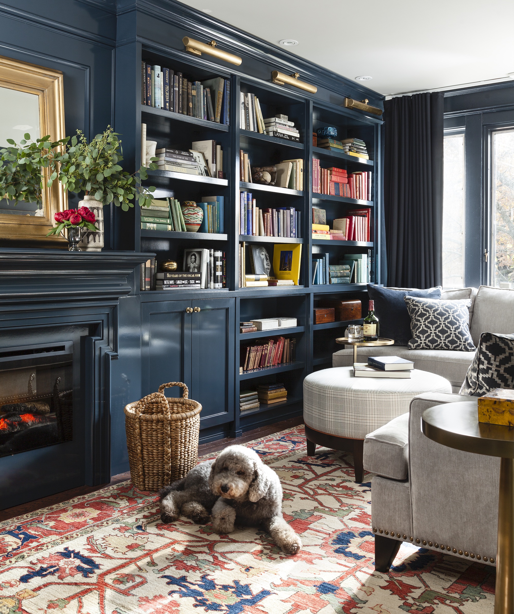
The best way to organize books is, ultimately, personal preference. Mixing books in horizontal and vertical groups helps create a more organic look, and don't forget to add other objet to the display, like bookends, ceramics, or plants for added visual interest.
If, however, you have a large library of books that you need to access regularly, organizing by author or title is a good idea.
Livingetc's edit of the best objet for your bookshelf
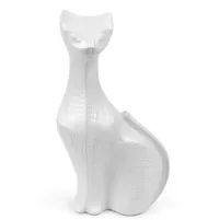
No one does adorable objet better than Jonathan Adler. His take on decor is witty and charming and beautiful - this cat is just one of the many, many pieces that is good enough to go on display
Spectrum pitcher, Anthropologie
Terracotta continues to be a big design trend, beloved for how warm and familiar it instantly makes a room feel. Blend it into your personal book collection.
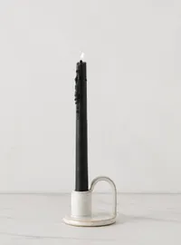
Clarke taper candle holder, Lulu and Georgia
More white ceramic, but the slight speckle here makes this arched candle holder feel very hand-made. It's cute, it's nostalgic and its shape is forward-looking.
Ruth Doherty is a lifestyle journalist based in London. An experienced freelance digital writer and editor, she is known for covering everything from travel and interiors to fashion and beauty. She regularly contributes to Livingetc, Ideal Home and Homes & Gardens, as well as titles like Prima and Red. Outside of work, her biggest loves are endless cups of tea, almond croissants, shopping for clothes she doesn’t need, and booking holidays she does.
