We're itching to decorate with Benjamin Moore's Color of the Year 2023 – this insider explains how it's done
Benjamin Moore's Color of the Year, Raspberry Blush, is a vibrant and vivacious shade we can't wait to decorate with. Their Director shares her tips on how it's done

The Livingetc newsletters are your inside source for what’s shaping interiors now - and what’s next. Discover trend forecasts, smart style ideas, and curated shopping inspiration that brings design to life. Subscribe today and stay ahead of the curve.
You are now subscribed
Your newsletter sign-up was successful
Fall is an exciting year in the design-lovers calendar. Why? Because it's the time of year when all our favorite paint brands announce their Color of the Year while we watch on in eager anticipation. One of the recent colors announced for 2023 is Benjamin Moore's Raspberry Blush, a rich coral red tinged with a hint of pink that's guaranteed to inject newfound energy into any space. We love it so much we couldn't resist a closer look.
Since there's nothing we love more than a bright vivacious color to embrace in our homes, we couldn't let this new interior design trend slip past without learning more about this vibrant shade. Somewhere between a vivid coral, a burnt orange and (fittingly) a raspberry pink, this composite color is dynamic and versatile. Of course we're itching to decorate with it, so we went to Benjamin Moore's Director, Helen Shaw, to find out how.

Helen Shaw is Benjamin Moore's Director as well as Co-founder of Shaw paints. Passionate about color and with over ten years in the paint industry, Helen is a big advocate for embracing our favorite hues throughout the home to make a characterful space that's personal to us. Here she tells us all about how to use Benjamin Moore's new Color of the Year 2023, Raspberry Blush.
Why does Raspberry Blush speak to the mood of 2023?
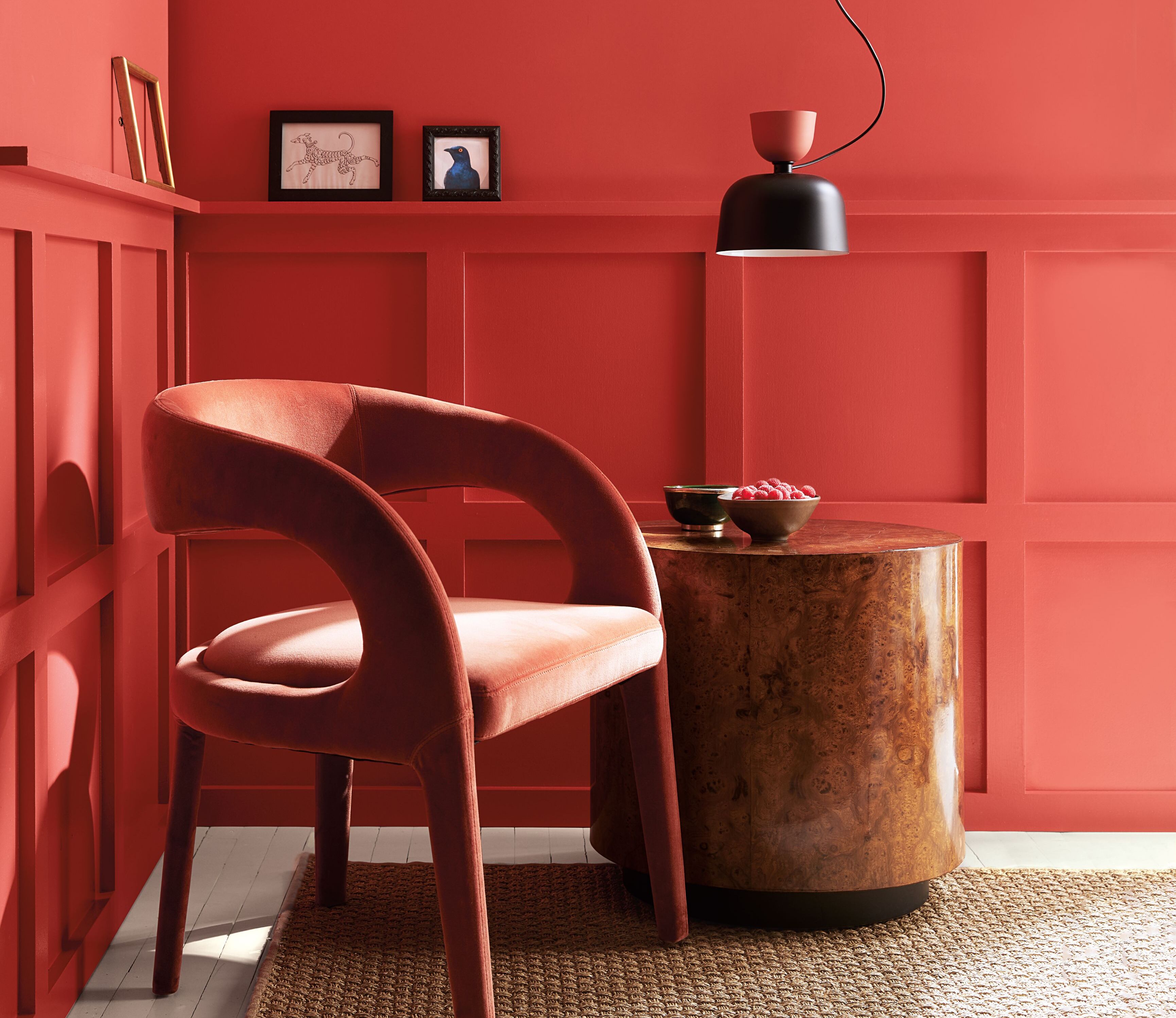
There's no avoiding the fact that paint trends represent the mood of the moment. In a year where earthy and smoky reds have dominated our interiors, it's no surprise that Benjamin Moore's Color of the Year 2023 is a similar shade. However, we wanted to know why they predict a brighter, more optimistic hue better captures the mood of the year ahead.
Article continues below'We're seeing this massive generational change in people's relationships with their homes,' explains Helen Shaw, Director at Benjamin Moore. 'People have moved into a space where the home has a bigger role in their lives, whether it's because they're now working from home more or simply because they're more invested in the spaces that they're in. They're making their homes even more personal to them so everything's becoming much bolder.'
So what does this mean for color? As Helen acknowledges, the last few years have seen the colors in our homes becoming much stronger and far warmer. Naturally then, it made sense for a rich, warm red shade to take the top spot of Benjamin Moore's Color of the Year.
'We've had similar tone to Raspberry Blush in our last Color of the Year collections and they've just become progressively stronger as the years have gone on,' says Helen. 'We felt moving forward to next year, that trend was set to continue.'
Unlike earthier reds such as Farrow & Ball's Bamboozle however, Raspberry Blush is a far more vivid tone. In response to the unpredictable events happening across the world right now, Helen and the team thought this offered a hint of optimism in line with new beginnings. 'People are focussing on controlling and rebuilding their own worlds, and self expression is a big part of that.'
The Livingetc newsletters are your inside source for what’s shaping interiors now - and what’s next. Discover trend forecasts, smart style ideas, and curated shopping inspiration that brings design to life. Subscribe today and stay ahead of the curve.
What colors should you pair Raspberry Blush with?
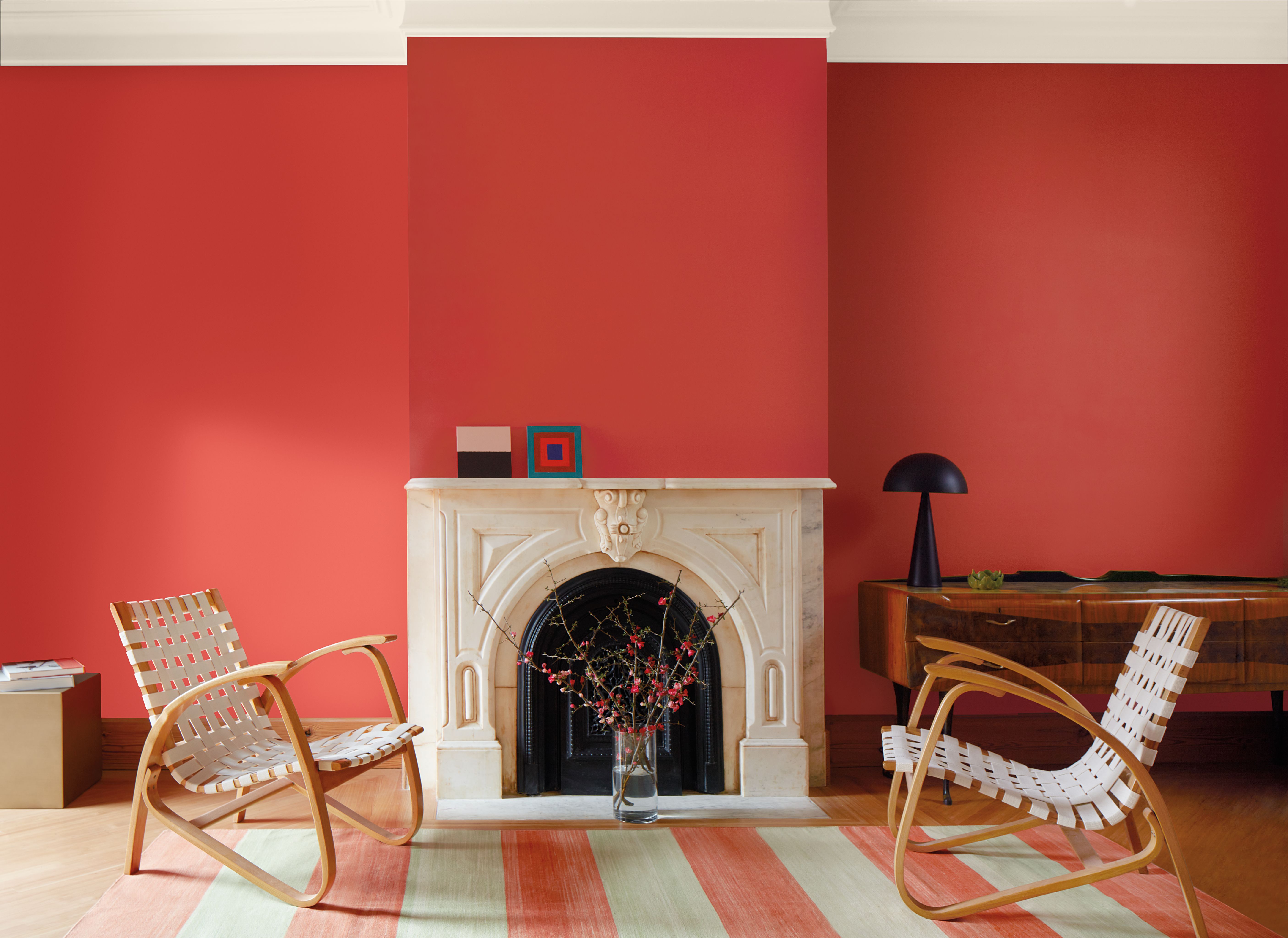
So, how should we go about creating a color palette around this shade? According to Helen, bold and brave is a good place to start if you're wanting to make more of a statement.
'When using Raspberry Blush, you need a color to act as a contrast,' she explains. 'If you put it with a mid tone for example, it's going to get lost. The other color will look less saturated against the vibrancy of the bright red.'
She suggests using it alongside bolder shades in Benjamin Moore's 2023 palette, but keeping the charismatic color of Raspberry Blush center stage. For a contemporary paint idea, use it with the shade Admiral Blue and team it with strong punctuations of white and black for a truly colorful design moment.
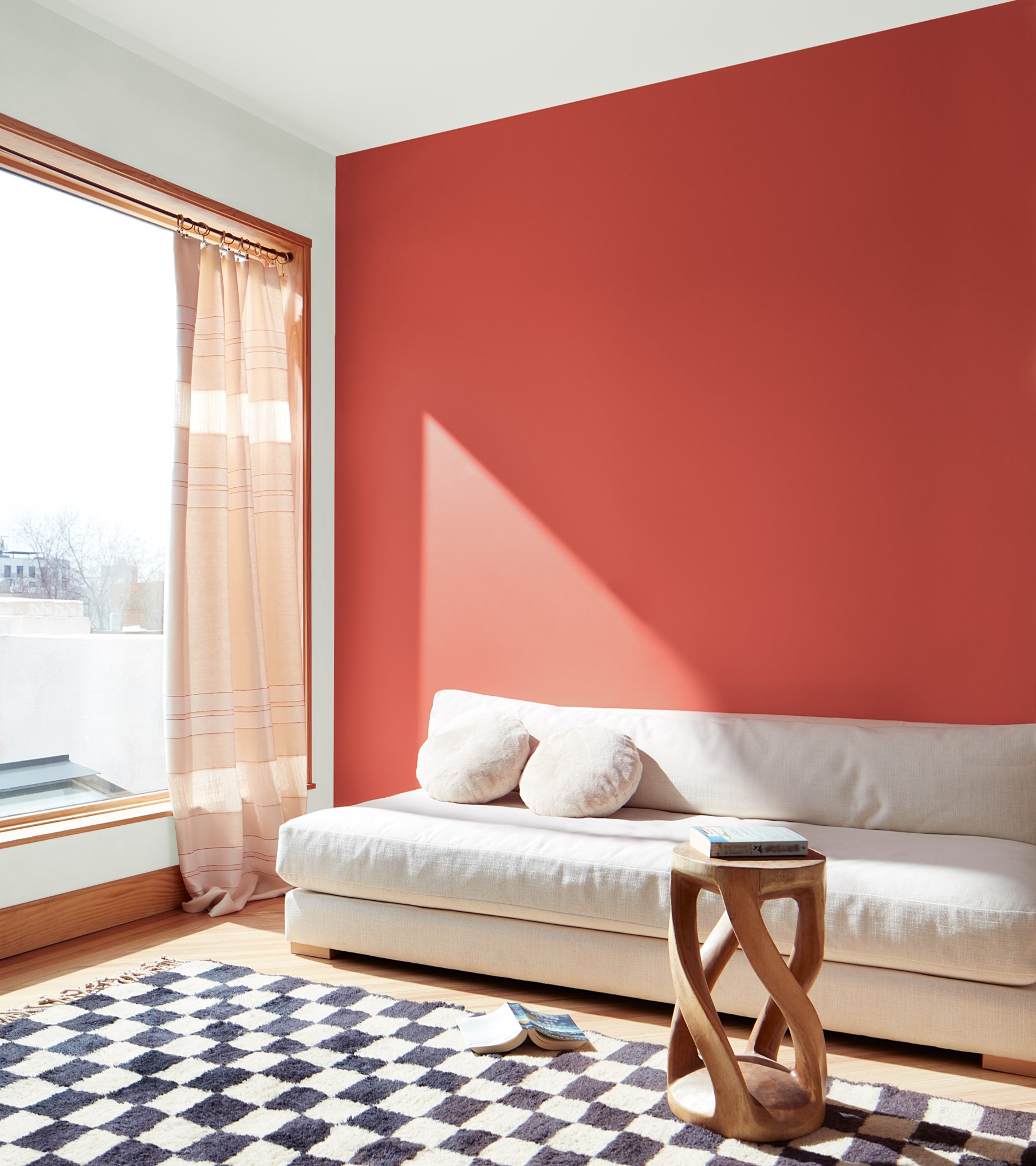
If you're a fan of a more understated interior, Raspberry Blush works equally well alongside neutrals or paler pinks. 'It can work in a more modest way as an accent or as a splash of a feature for a pop of color,' Helen adds. 'You can really dial it up or down, depending on how confident you are as an individual.' If using a neutral, she advises a warm undertone like Etiquette as a main color with an accent of Raspberry Blush.
What lighting should you use Raspberry Blush in?
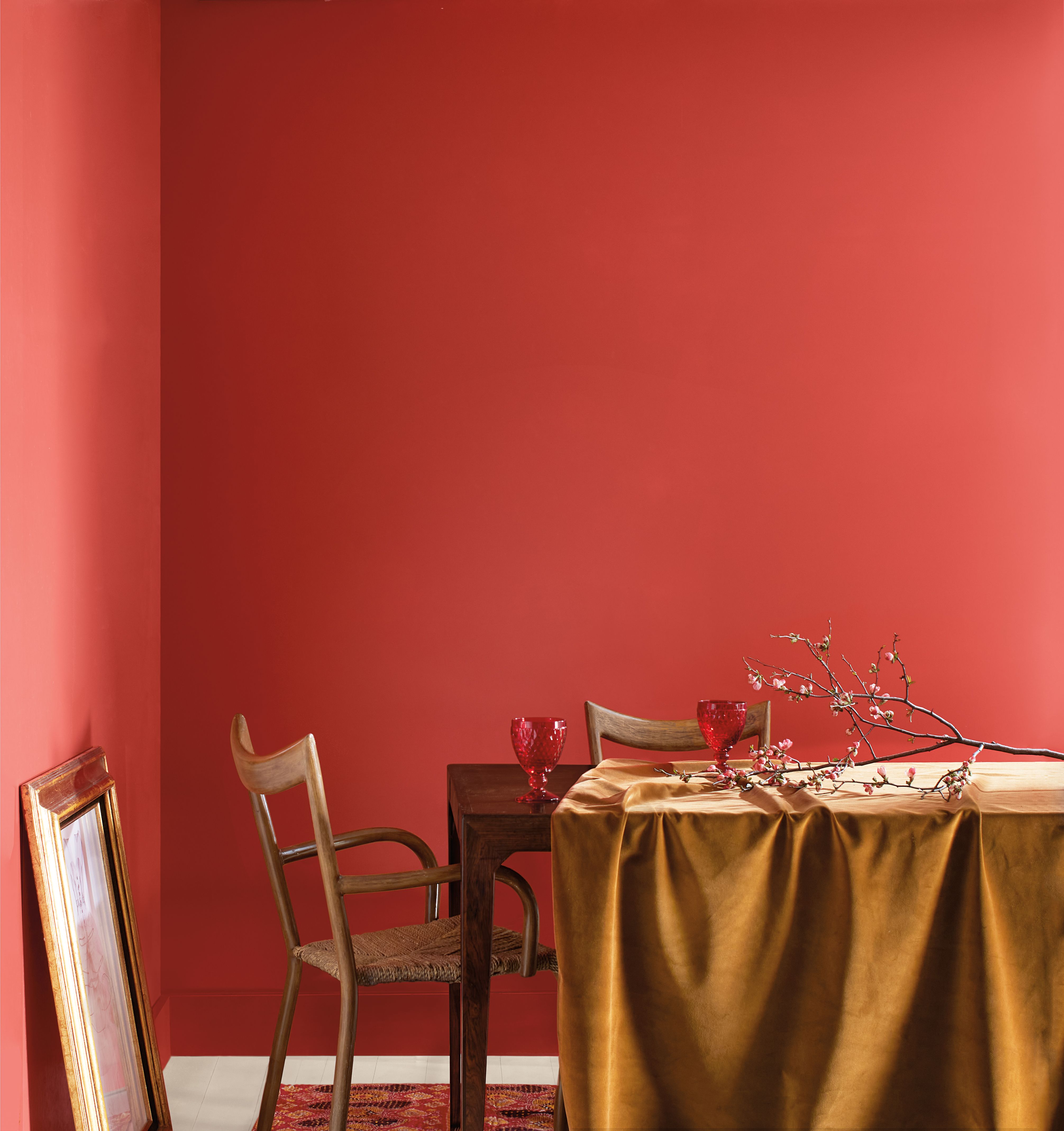
We all know that the natural lighting of a room has a huge influence on how the colors on our walls really appear. You'll be pleased to learn that as such a warm color, Raspberry Blush is versatile enough to work beautifully in most lighting conditions.
'The reason warm colors are so popular is because they're so versatile,' Helen says. 'A warm color in a north facing room feels nice and cozy, while a warm color in a south facing room doesn't become anything other than warm.'
However, in order to truly appreciate the complexity of this shade, Helen explains that using it within a warm color scheme in a south facing room would be more complimentary. 'Raspberry Blush is not a red and it's not an orange, it's in that space in between,' she explains.
'It's one of these kind of composite colors, so in a well lit room you'll see the complexity come through a little more than you would in a north facing space. The dynamic of how the light plays with the color and the nuances within it will be more prominent.'
What rooms should you use Raspberry Blush in?
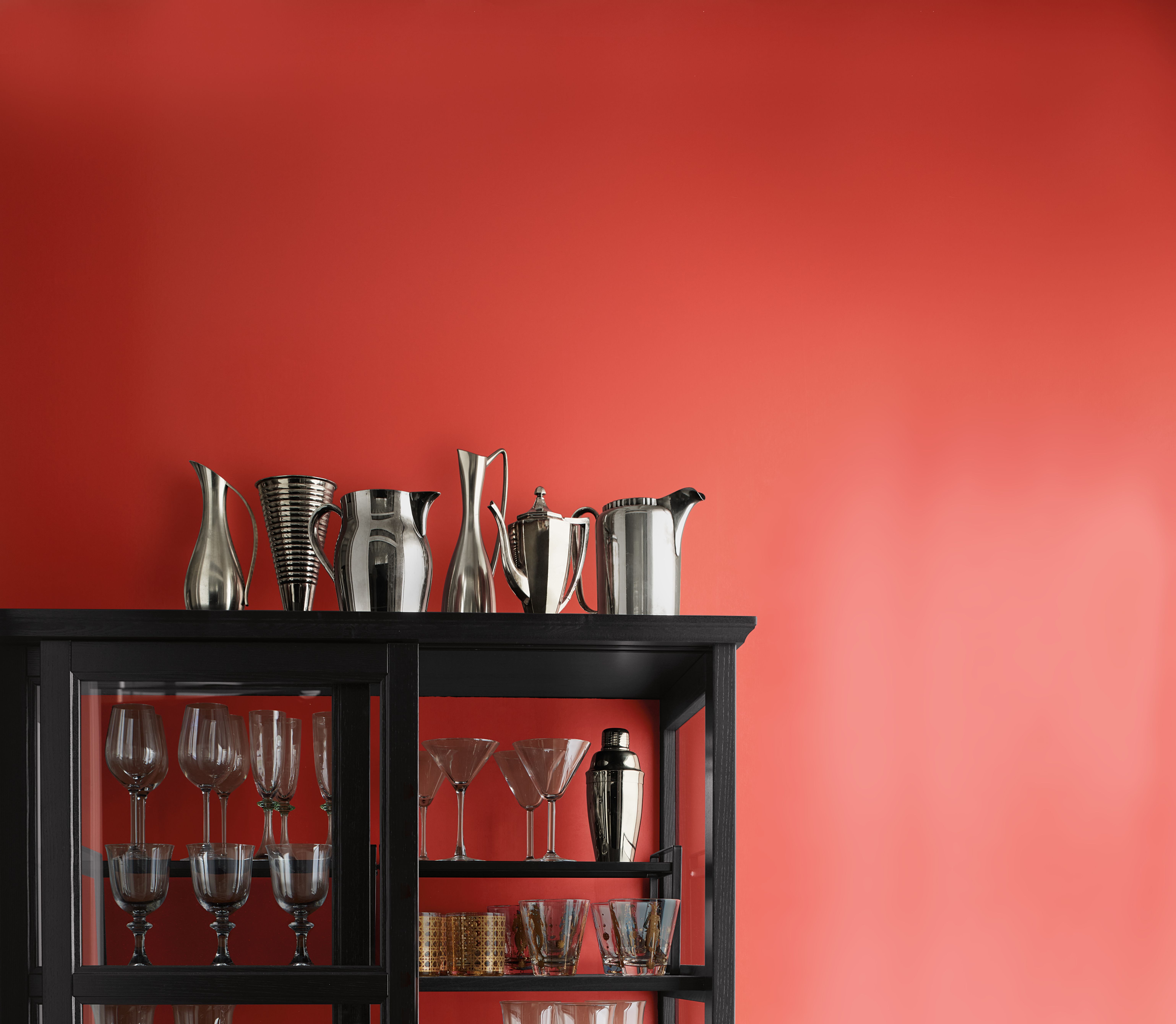
While there's a lot to love about this shade, choosing the right room will be vital. To us, this playful hue has a convivial and fun vibe which lends itself well to more sociable spaces, like the kitchen.
According to Helen, the idea behind Raspberry Blush was to do a more modern take on the rich heritage reds in traditional dining rooms. 'This is a more contemporary color, but still gives that warmth and cozy feel we seek in a dining room space,' she says. Use it in a dining area with curved banquette seating for the perfect spot to host guests.
With regards to less sociable and more calming spaces, there's no reason why you couldn't rule our Raspberry Blush, but as Helen notes, it's not the most relaxing of colors. That said, if you want your bedroom to be bold and uplifting, an accent wall in this shade is sure to seal the deal.
If you want to try a more calming effect in a bedroom or bathroom, use soft adjacent colors like Conch Shell and Cinnamon with natural décor and textures like warm wood, rattan and leather - the perfect relaxing bedroom idea.
Bright and bold or subtle and understated - which look will it be for you?

Lilith Hudson is a freelance writer and regular contributor to Livingetc. She holds an MA in Magazine Journalism from City, University of London, and has written for various titles including Homes & Gardens, House Beautiful, Advnture, the Saturday Times Magazine, Evening Standard, DJ Mag, Metro, and The Simple Things Magazine.
Prior to going freelance, Lilith was the News and Trends Editor at Livingetc. It was a role that helped her develop a keen eye for spotting all the latest micro-trends, interior hacks, and viral decor must-haves you need in your home. With a constant ear to the ground on the design scene, she's ahead of the curve when it comes to the latest color that's sweeping interiors or the hot new style to decorate our homes.