What are the most welcoming colors for 2024? Designers reveal 5 shades to create friendly interiors now and next year
What are the most welcoming colors for 2024? Only top designers know the answer, revealing the paints and hues they're turning to for warm and friendly interiors
The Livingetc newsletters are your inside source for what’s shaping interiors now - and what’s next. Discover trend forecasts, smart style ideas, and curated shopping inspiration that brings design to life. Subscribe today and stay ahead of the curve.
You are now subscribed
Your newsletter sign-up was successful
Some colors simply make your home more welcoming than others. They just invite you in and can make us feel at home in the most foreign of spaces. Color experts have long advocated the benefits the right color can have on our emotions, productivity, and our ability to connect with one another.
To understand which colors are going to be seen as most welcoming for 2024, you need to delve into upcoming color trends. We're starting to see shades emerge like sunshine yellow and burgundy, but how do they fit into how movements like minimaluxe are evolving? Unsurprisingly, when it comes to entertaining spaces, it's warmer tones you're after, though new ways of working with cooler tones can help create a soothing and serene welcome.
What are the most welcoming colors for 2024?
When choosing the right paint color or wallpaper, it can be overwhelming to distinguish the inviting from the excluding. To help decode what will be next year's most welcoming hues we’ve asked interior designers and color experts for their favorites and how to create a truly inviting interior.
Article continues below1. Pink with red undertones
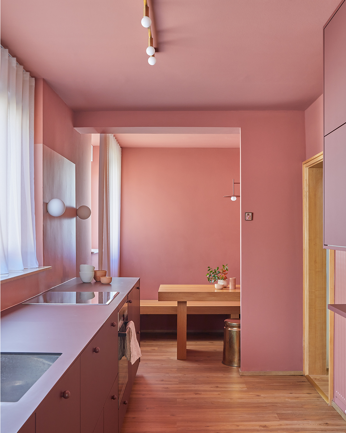
This is not a shy welcome. Bold and inviting, can seem like a daunting design choice at first but in practice, it works to energize and enliven spaces. As seen by German designer,Constanze Ladner’s Haus LFS project. Her use of Farrow & Ball’s Book Room Red paint offers us a dialogue with the room itself, one that is both minimal and beautiful.
“I am a big fan of painting the whole room, including the ceiling, in just one color. It gives me the feeling of a warm embrace and I also coordinate the colors of the furniture to match it. Farrow & Ball’s Book Room Red is a very warm and earthy red. I love how the color changes with the sunlight – from a warm pink to a dark brownish red,” says Constanze Ladner says.
Constance herself advocates for modern ways to decorate with pink and an expressive approach when it comes to choosing your welcoming color. She believes in emphasizing the balance between a reflection of your personal taste and a hue that works with the characteristics of the room.
“I recommend choosing wall colors that give you a warm, safe, stimulating, empowering feeling - depending on the use of the space," she says. "Colors you like to surround yourself with, colors you like to wear, colors that remind you of beautiful memories.”
The Livingetc newsletters are your inside source for what’s shaping interiors now - and what’s next. Discover trend forecasts, smart style ideas, and curated shopping inspiration that brings design to life. Subscribe today and stay ahead of the curve.
2. Grey and yellow-pigmented white
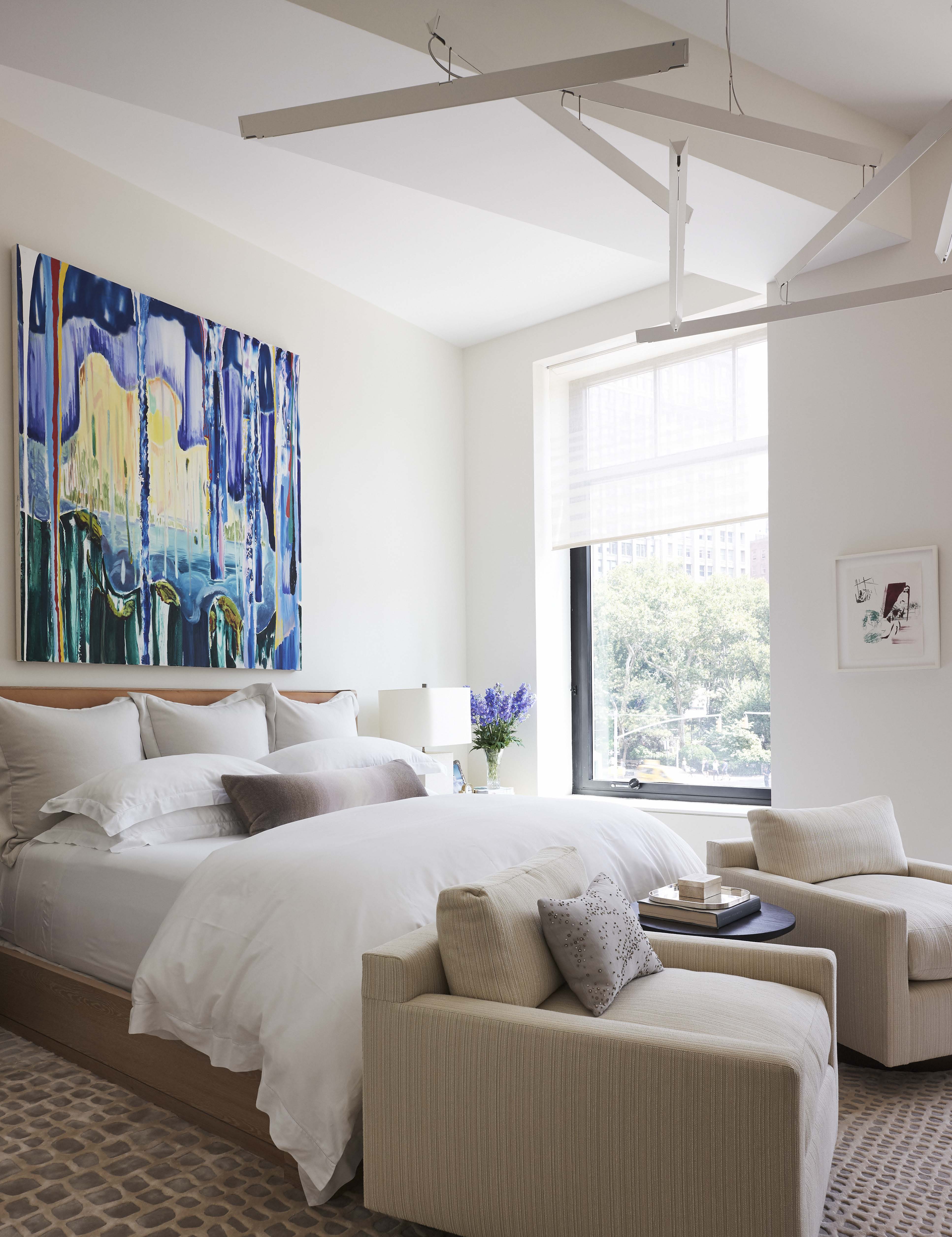
As minimaluxe has shown, white has a life of it's own. Chosen wisely, it's warm, soothing, and yes, seen as welcoming. The right shade of white can provide the perfect canvas for more expressive design elements like artwork and statement upholstery. The trick to getting a white bedroom - or indeed any room - to be welcoming is to find a white with both grey and yellow undertones.
A great example of white hard at work is this charming bedroom design from New-York based studio, foley&cox. The warm and soft white shade opens up the room and reflects all of the natural light within the space. “The color White Dove by Benjamin Moore’s White Classic paint deck is a warm and welcoming backdrop to any space in a home,” says Zuni Madera, Vice President of foley&cox.
3. inky blue

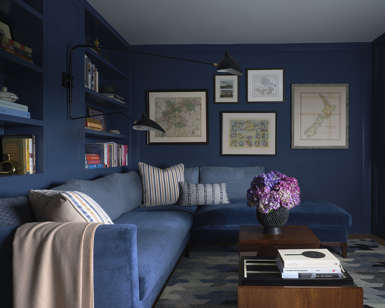
Be brave with your choices by opting for darker jewel tones like ink blue. Transport your guests and yourself somewhere new through this peaceful and compassionate color. Research has shown that darker blues can encourage feelings of confidence and calm, strengthening the case for color choice.
A great example of ink blue at its best is this den room design by San Francisco-based design firm, Studio Heimat, featuring Farrow & Ball’s Stiffkey Blue.
“Don’t be afraid to go bold when it comes to welcoming colors! The color blue exudes peace and tranquility and we love watching the color change as the light changes throughout the day. Dusk is our favorite time, as the color deepens a bit, the orange sunset is a perfect complement to Stiffkey Blue, and it also signals that it’s time for cocktails with your guests,” says Alicia Cheung Lichtenstein and Eva Bradley, founders of Studio Heimat.
4. Sage green
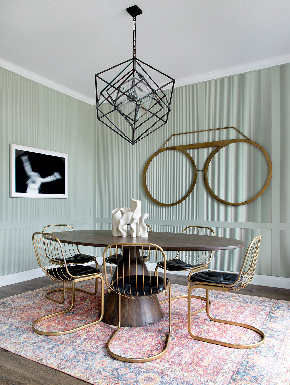
There are lots of colors that go with sage green, which is why it's such a popular shade. But it also has a soothing nature, and this soft hue is the ideal choice for creating a scheme that welcomes and calms the senses in equal measure.
It pairs well with sculptural artwork and furniture as shown in this dining area designed by Austin-based studio, BANDD/DESIGN. "Sage green, such as 'October Mist' by Benjamin Moore, gives off a beautiful, welcoming vibe and is great for cabinetry and millwork,” says Sara Malek Barney of BANDD/DESIGN.
Another aspect of this color that makes it so welcoming is its ability to offer elegance and softness to schemes, it’s gentle in its approach but still makes an impression.
5. Hermes orange

First impressions matter as shown by this vivid front door featuring a welcoming and enigmatic hue, Hermes orange (so named after the fashion house that uses it in its branding). This is a color that marries all the joy and positivity of yellow with the heat and creativity of orange.
“Welcome to the year 2024, where the color orange takes center stage in creating a warm and inviting atmosphere for your interior spaces. Marigold is a vibrant and energetic hue that exudes warmth, enthusiasm, and friendliness,” says Patty Cassidy, Director of Interiors at Ike Baker Velten.
“Remember, the key to using this shade of orange effectively is to balance it with other colors and elements in the space. Combine it with neutrals, such as creams, beiges, or grays, to create a harmonious interior,” Patty adds.
Writer and design expert Faaizah Shah is the founder of The Interiors Consultancy. She has worked with designers such as Staffan Tollgard and design houses such as Sanderson to help them understand and communicate their narratives. She is known for crafting engaging stories and imaginative content, and understanding great decor from her years alongside some of the best creatives in the industry. She is also a contributor to Livingetc.